Photographs consist of formal and visual elements and have their own ‘grammar’. Examples of visual and formal elements consist such as line, shape, repetition, rhythm, balance and many more. Steiglitz and Strand, “often abstracted reality by eliminating social or spatial context; by using viewpoints that flattened pictorial space, acknowledging the flatness of the picture plane; and by emphasising shape and tonal rendition in highlights and shadows as much as in the actual subject matter.”
Light– e.g. where’s the brightest areas, any shadows, can you tell the time of day through the picture, natural light or artificial, harsh or soft and directed or reflected light.

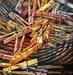
You can see in this photo that the whole photo is dark but their is a light that shines straight across the objects to show, that’s the importance and main focus in the photo.
Line– Any objects in the picture that acts like lines. Straight or curvy, thin or thick.

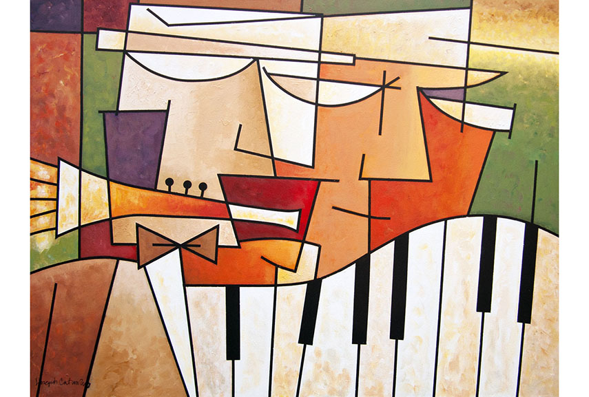
There are multiple lines in this picture, all different sizes. But the thin lines are used to just outline shapes whilst the thick lines are used to stand out.
Repetition/Shape– Any objects, shapes, lines or other subjects that repeat and create a rhythm or pattern. Echoes, reflections that also are in photos.

The repetition of all of the pegs are used to create structure to the photo without layering it and piling the picture too much.
Space– Any geometric (straight edged) or organic, (curvy) shapes? What shapes are they and how they relate to each other.

Texture/Value/Tone– Are there important negative (empty) spaces in addition to positive (solid) space. Ground or background, if you could touch the surface of the photograph how would it feel? How do the objects in the picture look like they would feel, is there a range of tones from dark to light. Where is the darkest part of the image, where is the lightest.

Colour– Where is the darkest part of the image? Where is the lightest? Are the tones in the photograph balanced or does the image tend towards darkness or lightness overall. How does this affect the mood or atmosphere?
What kind of colours can you see e.g. saturated, muted, complementary, primary? Is there a dominant colour? How would this image be different if it was in black and white?

Composition– Does the use of colour help us understand the subject or does it work independently?
How have the various elements in the picture been arranged? Does the image seem balanced or unbalanced? Is it possible to superimpose geometrical shapes on the image to better understand the composition e.g. a pyramid? Has the photographer used the Rule of Thirds?


Try to keep your Formalism post separate from your post about Walker Evans and Darren Harvey-Regan. Include images to go with your description of the formal elements. You can also choose a photograph and try to identity as many different formal elements within the photo, as a way to analyse it.
Try to include a more thorough exploration of Walker Evans. Research more about his work and how / why he produced it. Then, when looking at Darren Harvey-Regan, you should focus on the work he produced in response to Walker Evans (he created some photo montages using Walker Evans’ photos).