Photos consist of formal and visual elements, without these there would be no photo. Its like having a sentence without gramma, it would be impossible. Examples of formal/ visual elements include:
- Light – e.g. areas of brightness?
- Line – do objects in the image act as lines? Lines can guide the viewer through your shot or to a specific focal point. These are known as leading lines. Lines don’t need to be straight either, they can be curved, angular, ext. Angular lines that converge into a central point, commonly known as a vanishing point, are often used to add perspective to an image.
- Repetition – this could be done to create a larger emotion on the viewer
- Shapes – organic/geometric shapes. Circles for example are often used to create a feeling of balance and harmony.
- Space – is there depth to the photo or shallow, is there negative space? A positive space is the part with the subject in.
- texture – how do the objects feel? Texture is often used to bring a feeling of realness. A picture with little texture can often look too flat.
- Value/tone – Is there a range of tones? are they balanced?
- Colour – saturated, black and white, ext. Can heavily effect mood.
- Composition – how have elements in picture been arranged
Photo Literacy:
Its the language of the image. People have an ability to ‘read’ a photograph, to analyse its form and meanings. For example, an image taken with certain camera lenses or angle, ext can portray different time periods of photography. People admire different things in photos so not every photo will impact 2 different people in the same way.
Formalism examples:
Formalist photos are where The Design, Composition and Lighting are dominant over Subject Matter:


Walker Evans
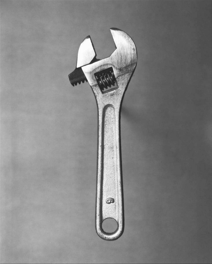
Walker Evans began to photograph in the late 1920s, making snapshots during a European trip and published his first images in NY 1930s. The photographs of Walker Evans told the story of American working-class life with an exacting frankness that was truly revolutionary for its time. His iconic portrait of Allie Mae Burroughs – a farmer’s wife, and mother of four – whose unforgettable eyes seem to stare right through us – is one of the most firmly embedded images in American consciousness. Beauties of the common tool was another famous piece of work that he published in 1955 and tries to capture the good, clear, ‘undesigned’ forms.


This B/W image of a wrench has hard shadows and soft highlights. There is a very basic background elements so your eyes are drawn into the only object in the scene. The roughness on the surface with geometric shapes makes it feel heavy duty and useful.
Darren Harvey-Regan
Darren Harvey-Regan (born in 1974) was greatly influenced by Walker Evans where they paid large amounts of attention to the choice of objects used, how they are arranged, the lighting and exposure values. This allowed both of them to create striking images that portray different feelings. His work often sees a hybridisation of the conventions of photography and sculpture. His works challenge the viewer to distinguish where representation ends and the object begins. Here are some photos from his album Beauties of the Common Tool, Rephrased II, 2013 which is inspired by the origional:

with modern camera and lighting systems this image was able to eliminate all background elements leaving the object on a plain white background. These images also differ as it combines two common tools. Its done in a way to make it seem like the objects belong together.

Good start…but you can improve your blog by adding the following
1. A blog post that explores camera handling skills and lighting techniques that we have used. The Canon camera simulator examples are useful for this too.
2. More description and analysis of images (your own and others) in each blog post that has only images
3. A blog post that clearly shows your initial images in lightroom (like a contact sheet)…this can highlight your selections too (as well as edits)
Good start. Can you make the ‘Formalism’ post separate from the Walker Evans / Darren Harvey- Regan post?
In your formalism post, you can demonstrate a deeper understanding by using the formal elements to analyse one of the photos you have picked as an example.
For your Walker Evans / Darren Harvey-Regan research, you have shown a good understanding of their main objective. Try to show a slightly deeper understanding by using more analysing more and using more technical terminology. E.g. What colours do they both use and why? How are the objects framed in the photo? How do the photographers make use of negative space?