My diamond Cameo final presentation and evaluation.
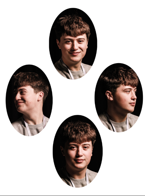
This was my first diamond cameo, I really like the photos and i edited them slightly in Lightroom which added more affect and depth then before, What I don’t like is that its a bit basic and the top and bottom photo are very similar and aren’t different angles its just the facial expression. In some ways I do like that they have different facial expressions as it can tell more of a story of the kind of guy he is, whether he is tough or soft and happy or sad and the viewer has more to interrupt.
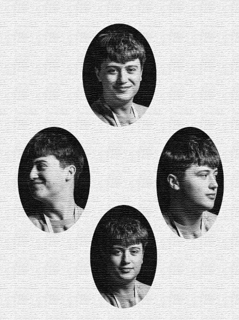
For my second diamond cameo I wanted to try something different but used the same photos, this is because in the first photoshoot I take enough different ones and need to take more next time. I edited them in grey and while to give them an old affect that was inspired by henry mullions. I also think it told more of a story, to continue to add this affect I added texture on photoshop to look like the same vibe from old photos once again. I like this but I also think there is too much of the texture and it is hiding the face more.
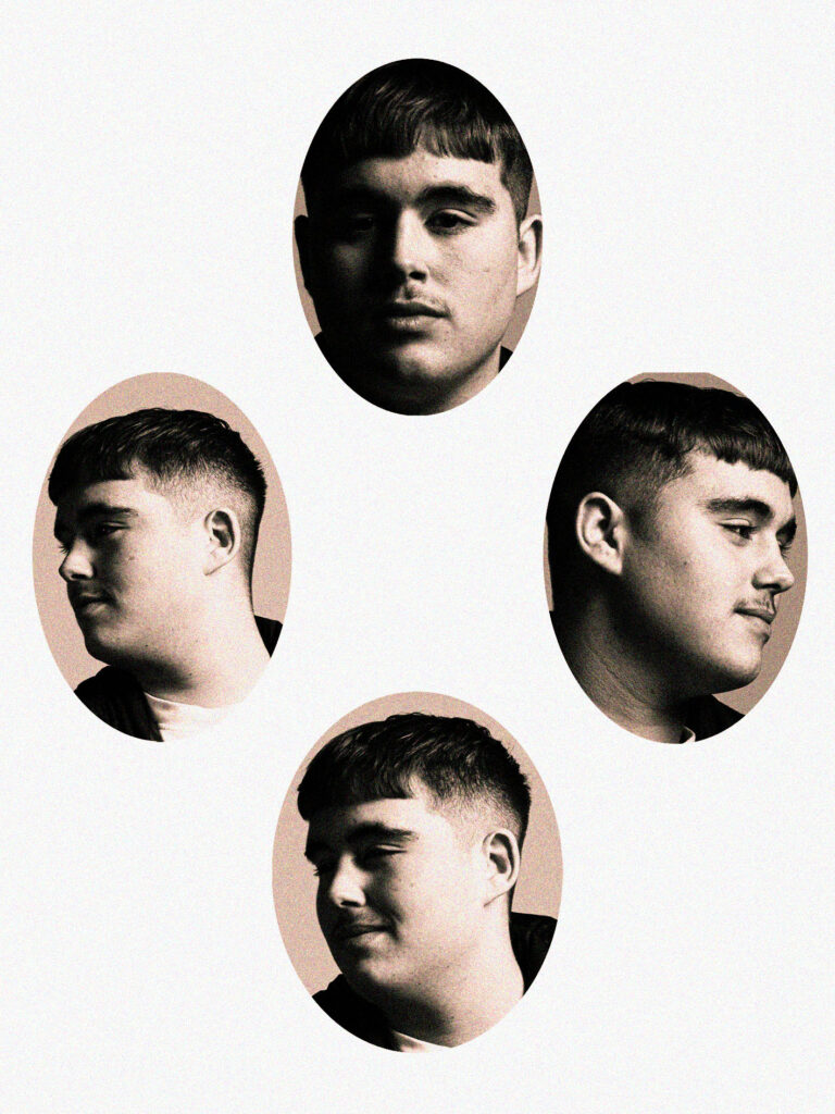
What I love with these photos is I really started to improve and I did the things that I didn’t like and changed it to make these ones better, I like that all the photos are Edgar going in different directions and it has a yellow tint now to give the coffee spilled affect and oldie look, it also has a slight bit of texture that’s fuzzy but not too much so you can still see the face and the texture given so it can tell its story to the viewer.
What I don’t like is that I should have fixed the contrast ad exposure more as there is a lot of dark shadowing on too much of his face.
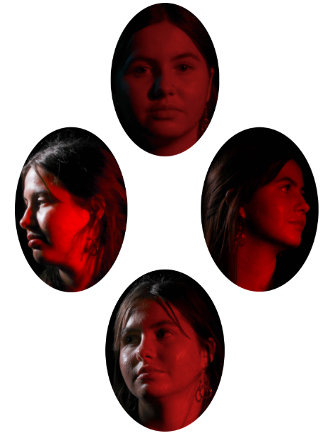
This is my final diamond cameo which I loved with the lighting and the different angles but I think it was still boring with no editing and different texture and the oval was cut too tightly around the heads with not much space of the backgrounds.
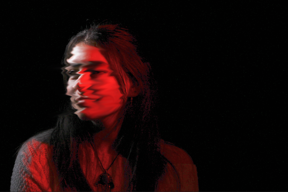
I liked these photos and mainly wanted to experiment with Photoshop editing to create different affects I had seen. I like this blurry affect on the face and was testing if I wanted it on only the eyes or mouth but then tried it on all the face and like that more. It looks cool but still not my favourite way of editing and I don’t like how it blurred.
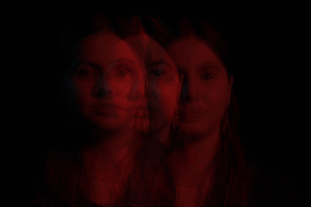
This is one of my favourite edits, I figured out how to bring the image over more times and make it transparent in a glitchy, blurred sense , which I actually preferred then using the smudge or blur tool. I really like it but if I was to change it I would make the first image more prominent then the others so it stands out more.
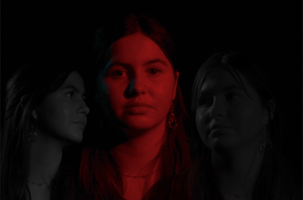
This is some more new editing I was trying that I also really liked and thought looked cool I as trying to add an effect of voices or other people around her to give different meanings to the viewer. I think adding more faces might be cool or having her face in a different facial expression might work better.
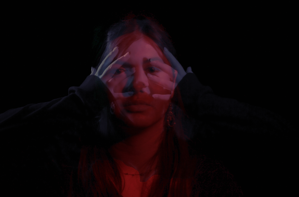
I like how this photo turned out but it still wasn’t quite what I was looking for as it is a photo of Ellen with a straight face layered with a more transparent photo of Ellen screaming in a blue colour to give a cool affect that inside she is screaming but shows no emotion, yet it didn’t look quite how I picture but still gives a cool effect and now I think gives more interpretation to viewers.
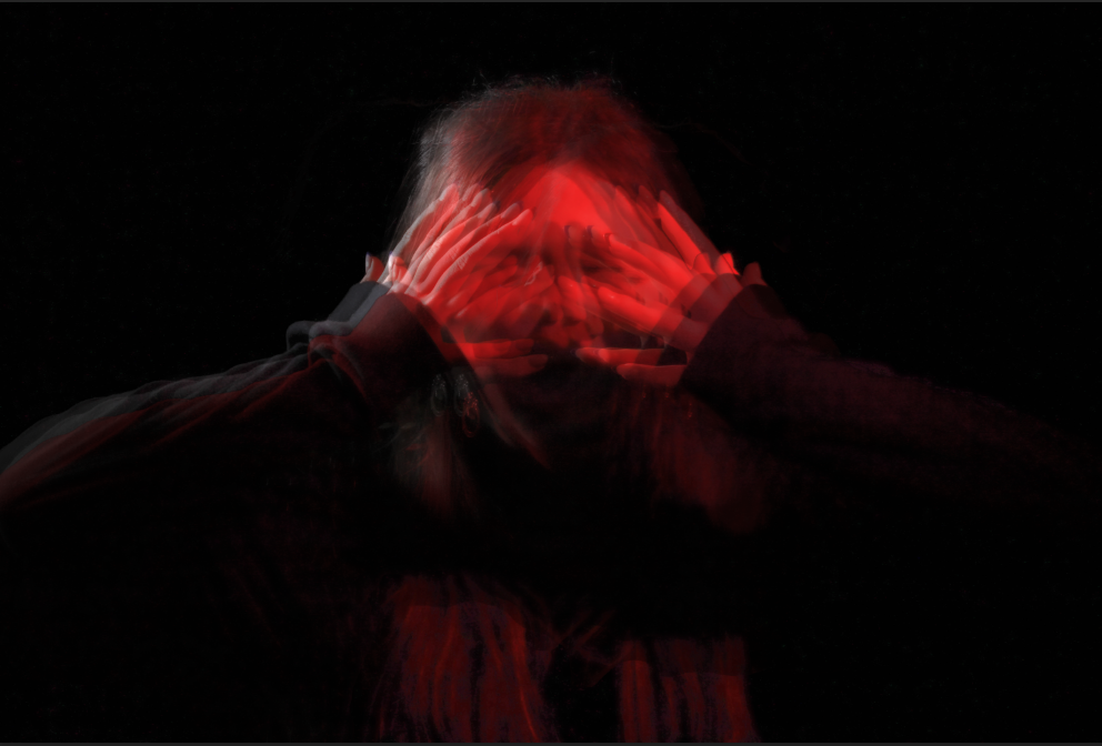
This is more layering technique which I really liked gave a cool affect.
