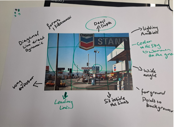
Definition: Formalism means the way a piece of art or something has been made and the works visual aspects.
The Formal Elements
Line
Definition: A straight or curved geometric element that is generated by a moving point and that has extension only along the path of the point.
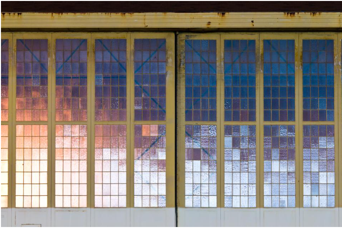
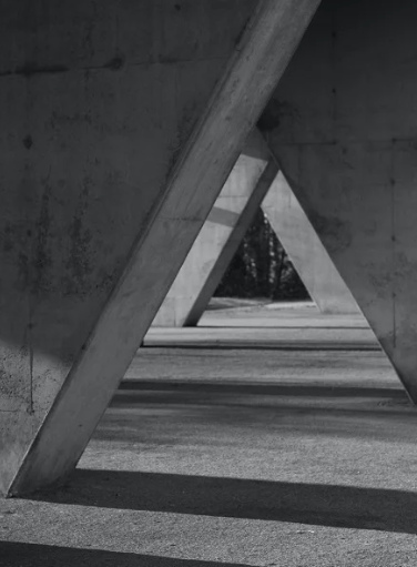
Lines are either straight, curved, or a combination of the two. Lines can be solid, dashed or interrupted, implied, or psychological. They can be vertical, horizontal, or somewhere in-between. They can be mostly seen in man-made but can also be seen in nature too.
Here is an example of a photograph that includes lines:
Shape
Shape has many definitions: The visible makeup characteristic of a particular item or kind of item, spatial form or contour, or a standard or universally recognized spatial form. Shapes are two-dimensional. They can be measured by overall height and width. Shapes can be the outline of an object—familiar or unfamiliar.
There are two types of shapes, Geometric and organic.
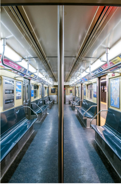
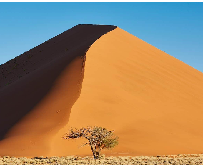
Here is an example of a photograph that includes geometric shapes:

Here is an example of a photograph that includes organic shapes:
Form
Definition: The shape and structure of something as distinguished from its material.
Form has an overall height, width, and depth.
Just like with shapes, there is also two types of form, Organic and Geometric.
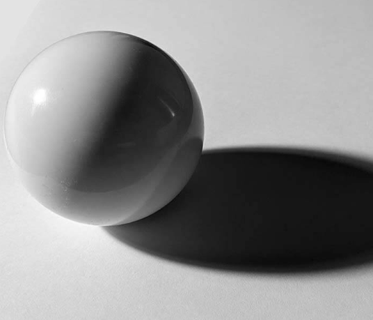
Here is an example of a photograph that includes form:
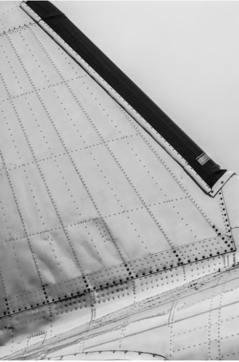
The shadows in this image shows us more of what the actual form of the plane wing looks like.
Texture
Definition: The visual or tactile surface characteristics and appearance of something.
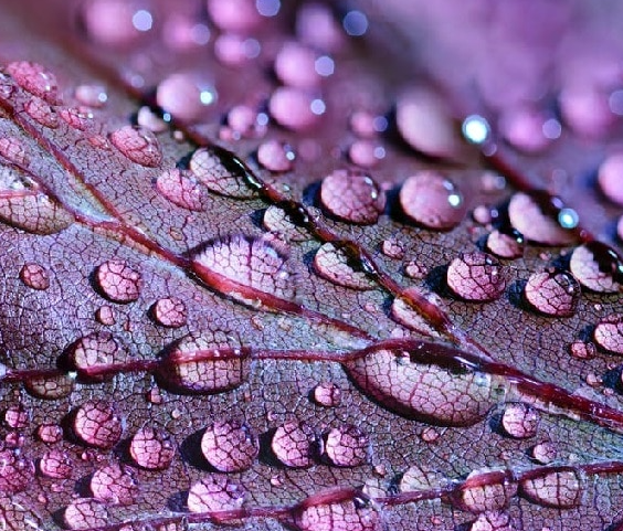
In a photograph, smooth objects might have reflections or specular highlights. Rough objects might have aggressive areas of light and shadow without reflections. Different patterns could indicate/show texture. Different angles of lighting can also show texture and even hide it and whether the camera is quite far or close to their subjects, if the camera is also out of focus.
Here is an example of a photograph that shows texture:

Colour
Definitions: A phenomenon of light (such as red, brown, pink, or gray) or visual perception that enables one to differentiate otherwise identical objects or the aspect of the appearance of objects and light sources that may be described in terms of hue, lightness, and saturation for objects and hue, brightness, and saturation for light.
Light itself has no actual colour. But, sending light through a prism or a drop of water and we can see that it is comprised of a literal rainbow of colours.
Different colours may represent different things, for example red may symbolise danger, and yellow may symbolise happyness.
Colour has three properties:
Hue– It is simply the description of the colour (e.g., blue, red, yellow, etc.).
Value– It is the relative brightness or darkness of a colour.
Saturation– It is the intensity or purity of a colour. The purest colour is a hue with no white, black, or gray added to it.
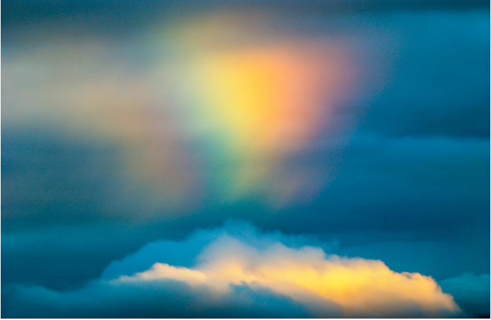
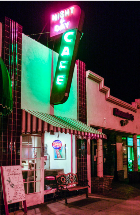
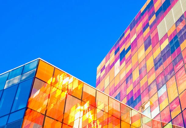
Here is an example of a photograph that shows bright, neon colours:
Size
Definition: A physical magnitude, extent, or bulk : relative or proportionate dimensions.
Size in a photograph is relative and can be an illusion. There can be a variety of sizes, however the most common names for these sizes are: Large, medium, or small.
In the real world, the eye and brain automatically adjust the retinal image in what is known as size constancy. This means the perception of an object as having a fixed size, despite the change in the size of the visual angle that accompanies changes in distance.
Here is an example of a photograph that shows size:

This image shows the size difference between the persona and the ship.
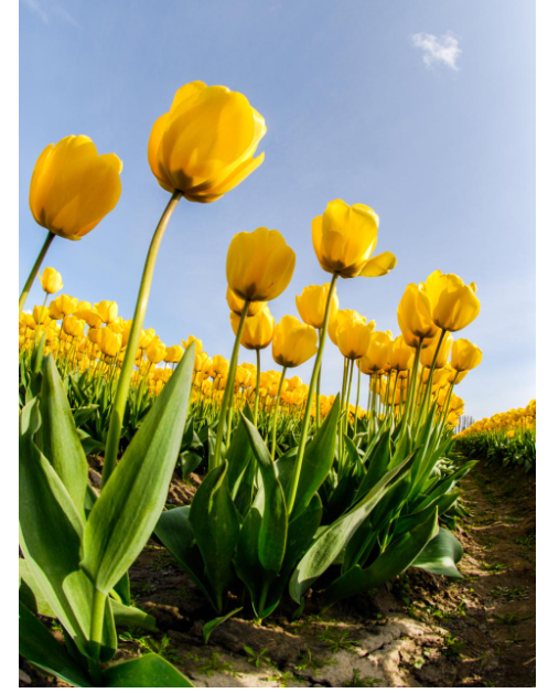
Getting close to an object can emphasize the size/it can make the objects/subjects/things in the image look much bigger or much smaller than they actually are.
Below is an example of this effect:
Overlapping objects/subjects/things is another way to render a scene virtually in three dimensions, and overlap can also give hints to size.
Depth
Definition: It is the direct linear (using converging lines to show the depth in a frame) measurement from front to back.
Depth is rendered on how well the objects in the frame are dependent, composition, and perspective.
Most images have a foreground, middle ground, and background. The stronger the delineation (Any kind of accurate or vivid portrayal of something else) between successive “grounds,” the stronger the sense of depth in your image.
Depending on the quality of the surrounding air or atmosphere, distant objects in a photograph will have less clarity and contrast than objects in the foreground.
Texture can also show depth within an image by using shadows and light.
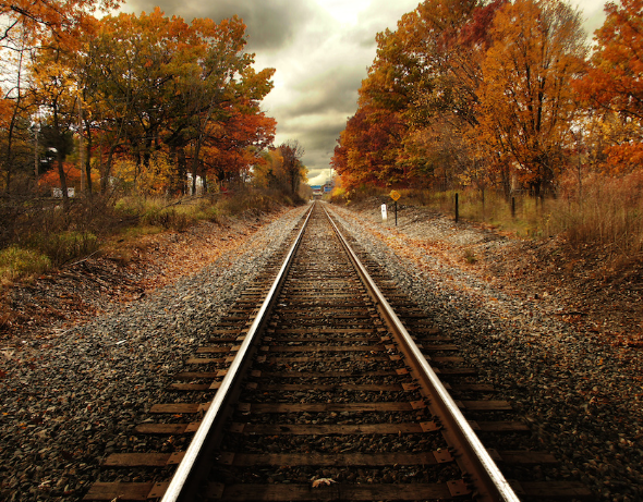
Here is an example of a photograph that shows depth:
All of these formal elements are used to make any pieces of art, they are often being used together and are composed/organised in certain ways, which will determine what the final piece would look like.
Visual Elements
There are seven visual elements, these are:
Line– It is a point that continues; it implies motion.
Shape– It is the two-dimensional appearance of objects as your camera captures them.
Form– It is when shape takes on three dimensions.
Texture– It is the visual quality of the surface of an object, revealed through variances in shape, tone and colour depth.
Colour– It is a component of light that is separated when it is reflected off of an object.
Size- It is the term given to describe the height and width of an image in pixels.
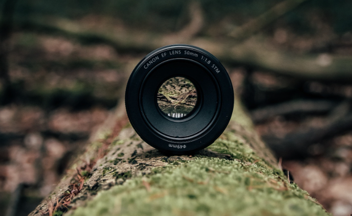
Depth– It is the distance in an image where objects appear “acceptably in focus” or have a level of “acceptable sharpness”.
Formal Analysis Poster
