formalism:
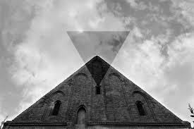
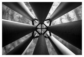
Formalism describes the critical position that the most important aspect of a work of art is its form. The seven basic elements explored in formalism are:
- Line
- Shape
- Form
- Texture
- Colour
- Size
- Depth
Line:
A straight or curved geometric element that is generated by a moving point and that has extension only along the path of the point. Lines can be: straight, curved, solid, dashed, implied, psychological, vertical, horizontal or somewhere in-between.

Vertical or horizontal lines convey a sense of stability or a static feel to an image. Horizontal lines can indicate distance and vertical lines can indicate height, balance, strength. Diagonal lines convey a more dynamic scene.
Shape:
Shapes are two-dimensional. They can be familiar or unfamiliar. A familiar shape can transform into an unfamiliar or unrecognisable shape based on the viewpoint of the photographer.
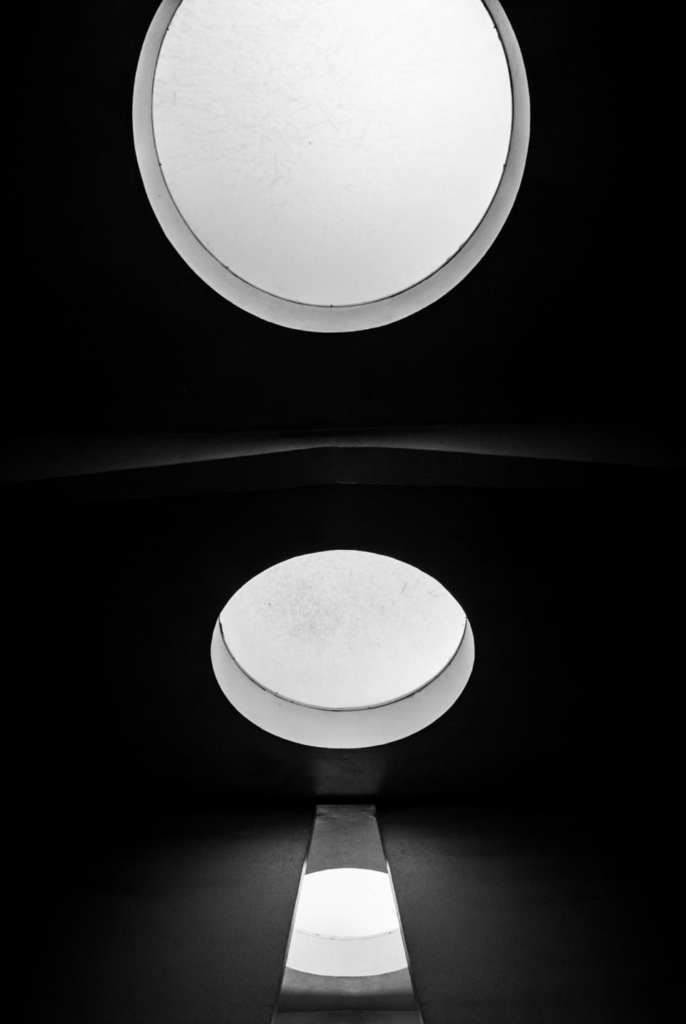
There are two basic types of shapes: geometric (regular) and organic. Geometric shapes include: circles, squares, triangles, dodecahedrons, and more. Organic shapes include: the outline of a bird, an elephant, a flower, a tree, etc. Fluids can create organic shapes that cannot be permanently defined eg. the shape of a cloud or a rain puddle.
Form:
Form is three-dimensional and has an overall height, width and depth. The two types of form are: geometric (eg cylinder, cone, sphere and cube) and organic (eg objects that surround us in our three-dimensional world).
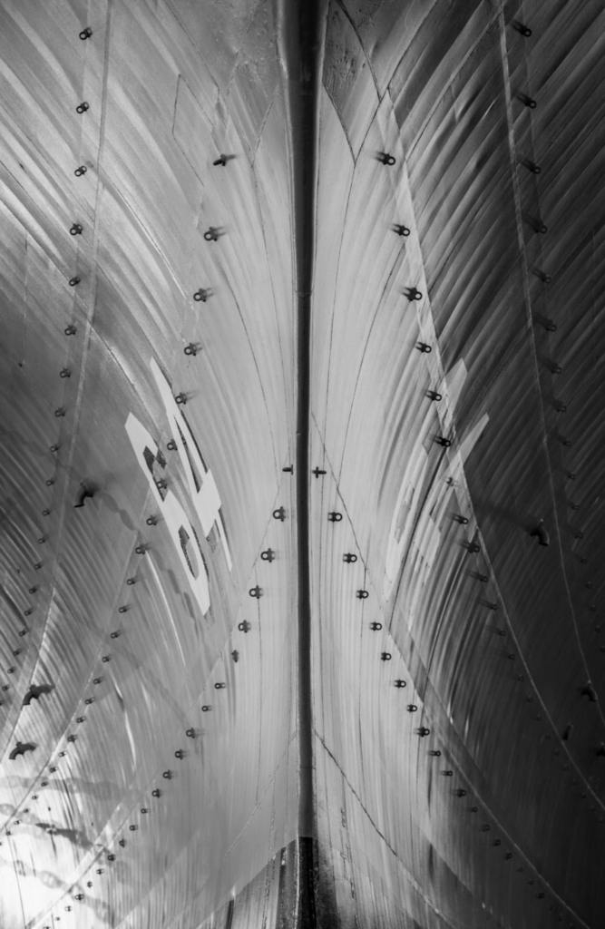
Forms create negative and positive space. In a photograph, positive space is basically that which is occupied by forms and negative space is what remains.
Texture:

Texture is the visual or tactile surface characteristics and appearance of something. It can be felt with both the fingers (the print) and virtually (with the viewer’s eye). Some examples of textures are: rough, smooth, soft, wet, slimy, bumpy and shiny. In a photograph, smooth objects might have reflections or specular highlights. Rough objects might have aggressive areas of light and shadow without reflections.
Colour:
Colour can be defined as:
- A phenomenon of light (such as red, brown, pink, or grey) or visual perception that enables one to differentiate otherwise identical objects
- The aspect of the appearance of objects and light sources that may be described in terms of hue, lightness, and saturation for objects and hue, brightness, and saturation for light.
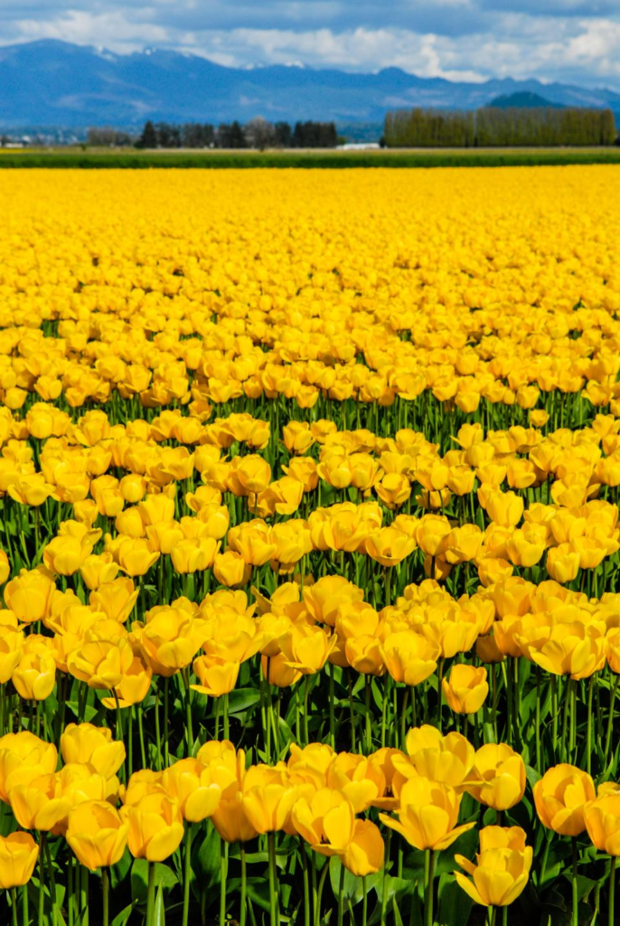
Light itself has no perceived colour. But, send light through a prism or a drop of water and we can see that it is comprised of a literal rainbow of colours.
Colour has three properties: hue (the description of colour), value (the relative brightness/ darkness of a colour), and saturation (the intensity or purity of a colour. Bold/ bright colours tend to capture people’s eyes more which is why commercials often use brighter colours in order to engage the public.
Size:
Size can be defined as: physical magnitude, extent, or bulk : relative or proportionate dimensions.
Size in a photograph is relative and can be an illusion.
When a familiar object appears in the frame of a photograph (car, basketball, streetlamp, etc.) we immediately get a feel for the scope of the entire scene. Without a familiar object in the image, we struggle to determine the scale shown in the photograph.

The size of common objects in the photograph gives the scene a sense of scale. But a single object in space might not accomplish this since there is no means for comparison. There are times when another object, maybe sitting atop our subject, serves to confirm the scale in the image—eliminating the possibility of confusion.
In order to emphasize the size of an object in a photograph in relation to its surroundings, you should get closer to the object.
Depth:
Depth is the direct linear measurement from front to back.
We are given a sense of depth due to various visual cues, to which most people rarely give much thought to. However, by learning what those cues are, photographers can use them to create more compelling images.

Depending on the quality of the surrounding air or atmosphere, distant objects in a photograph will have less clarity and contrast than objects in the foreground. This aerial perspective is indicative of depth in a photograph.
Texture gradient shows depth in a photograph as relatively distinct foreground textures. Whether it’s the surface of a road, sand on the beach, leaves or needles on a tree, crashing waves, and even clouds overhead, texture gradients in a photograph smooth out as they recede into the distance.


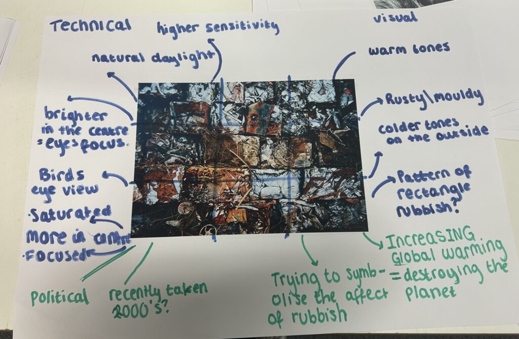


Lauren…you must aim to line your images and text into a column.
If you re-arrange this and then add the analysis poster images it will have a more well-rounded feel to it