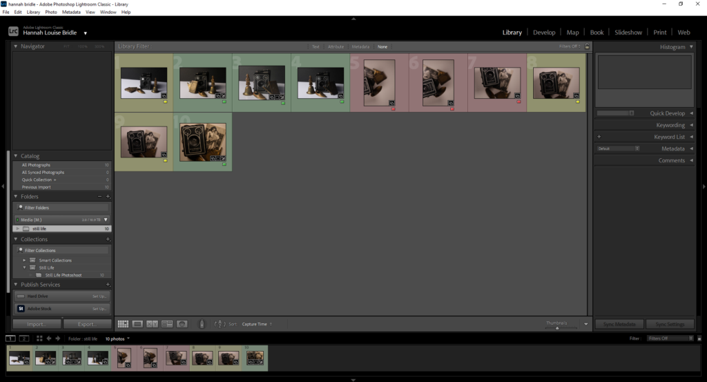
I used colours to label and categorise the photos I used green for the images I really liked and definitely wanted to use and then yellow was for the ones I thought were ok and possibly would use and red for the ones that I definitely wouldn’t use.
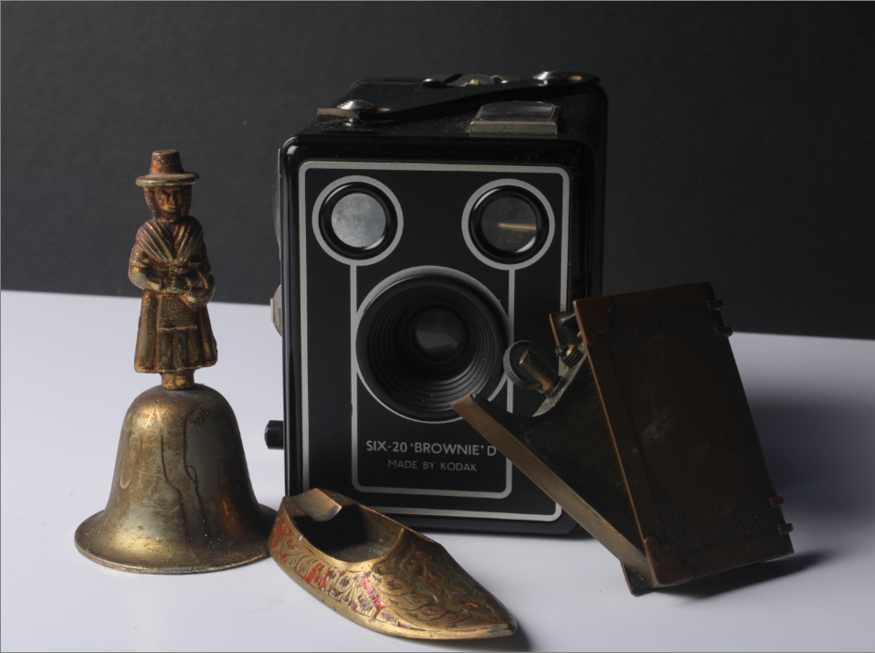
this is the original photo before editing
for this image I did some basic editing so I cropped the image slightly and when changed the temperature of the image slightly because I thought the originally was a little bit too warm. Then I changed exposure and contrast. I also dulled down some of the highlights because they looked too bright making the image look really overly bright.
Overall I do really like the image I think the gold objects really stand out because of the colour contrast as everything in the image is black and white so the gold and even the read on the ashtray really stands out in the image.
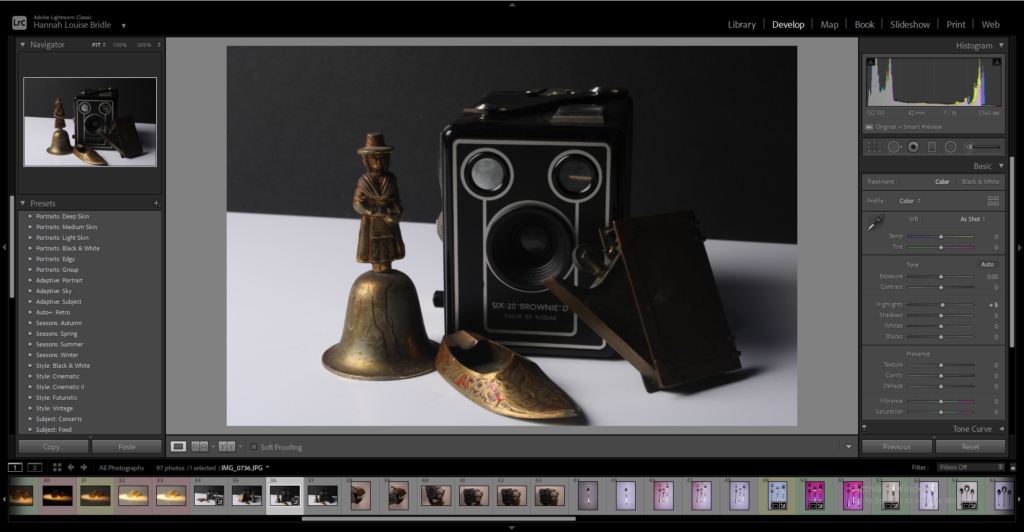
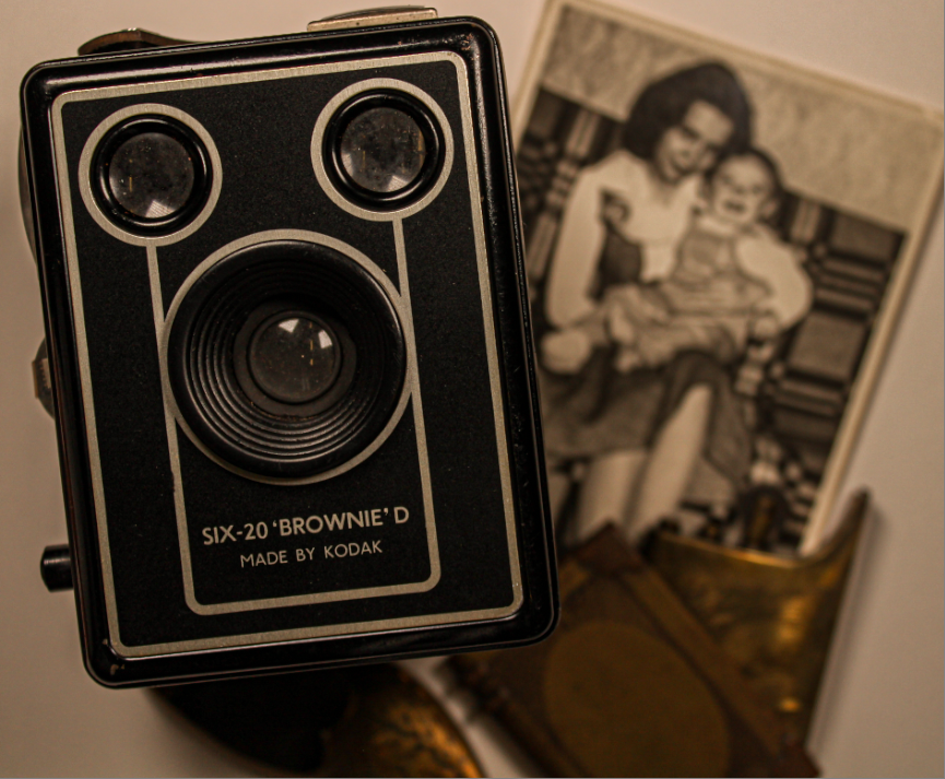
When looking at the image I really like how I have the old fashioned camera in focus and then everything else like the photo and the vintage lighter not in focus. It makes the camera really stand out which I wanted to do originally but you can still see the other objects which corelate to the camera.
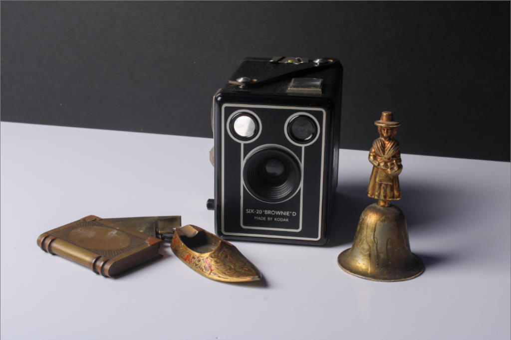
I think the contrast between the black and white works really well compared to the gold objects but also it matches quite well with the vintage camera. I think I maybe could have arranged my objects better I think they look kind of awkward in the way they are positioned at the moment.

These are really nice photos to start this project off – well done.
It would be lovely to see you developing these photos into final images. Remember to include a post that shows the edits for these photos (otherwise I cannot gie you a mark for ‘Still Life Edits’)