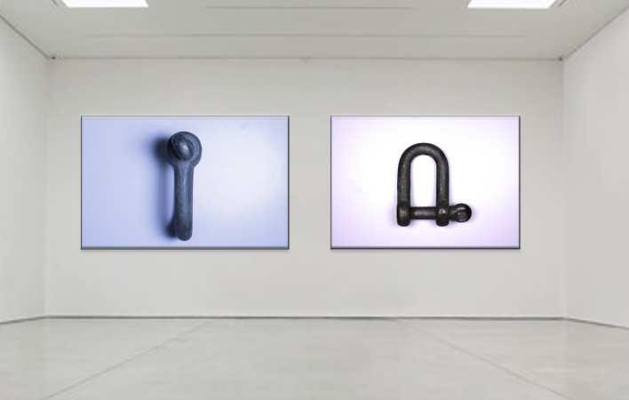
I selected these two photos for my final presentation, I presented them in a gallery form using adobe photo shot. I picked these two because out of all of them I liked them the most, I thought they went well in the topic and was most lie my inspiration of Walker Evans.
This wasn’t my favorite topic as I didn’t find it as exciting taking photos of just single objects and dint show the best of my ability, I also thought while i’m still getting used to the camera and editing on adobe light room it is not the best I can do.
Even when looking at these final images now i see improvements that can be made, with the image on the left although i wanted that cooler temperature it was still too bluey and i think it was because there was something not right with my lighting and when i first took the photo there was a purple background. The image on the right is actually better i think because i increased the contrast so the darker colour really stands out more on the white background. You cant see very well in these photos but there are slight smudges in the background that i also dont like and when improving and learning more about photo shot i can edit those out.
Overall, i do like these images and of course they can improve but this was not my favorite topic.
