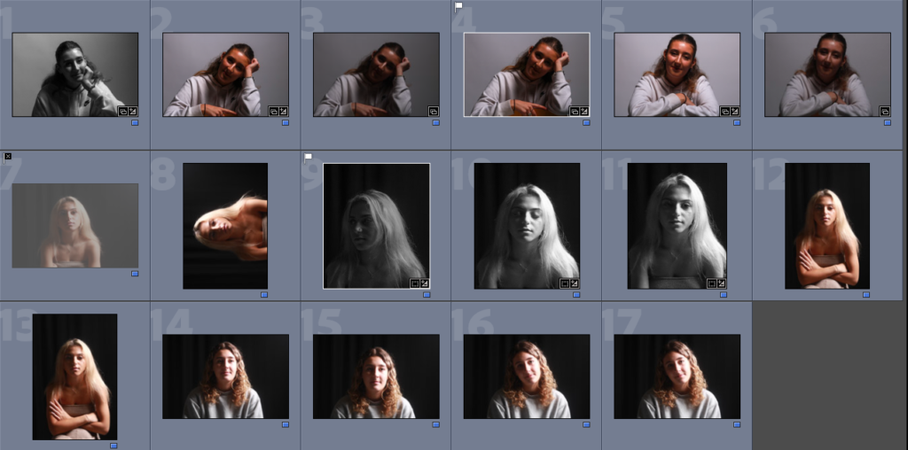
I organised all of my Chiaroscuro images into one colour so I could easily see them all and figure out which ones had the best lighting.
MY FAVOURITE IMAGES:
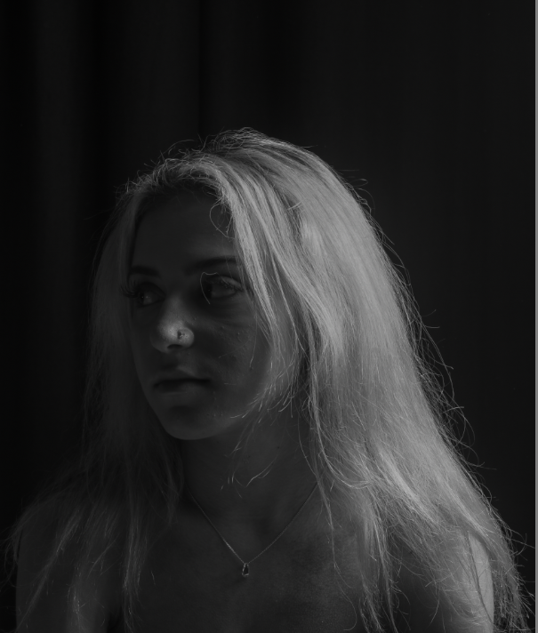
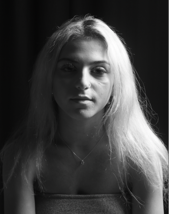
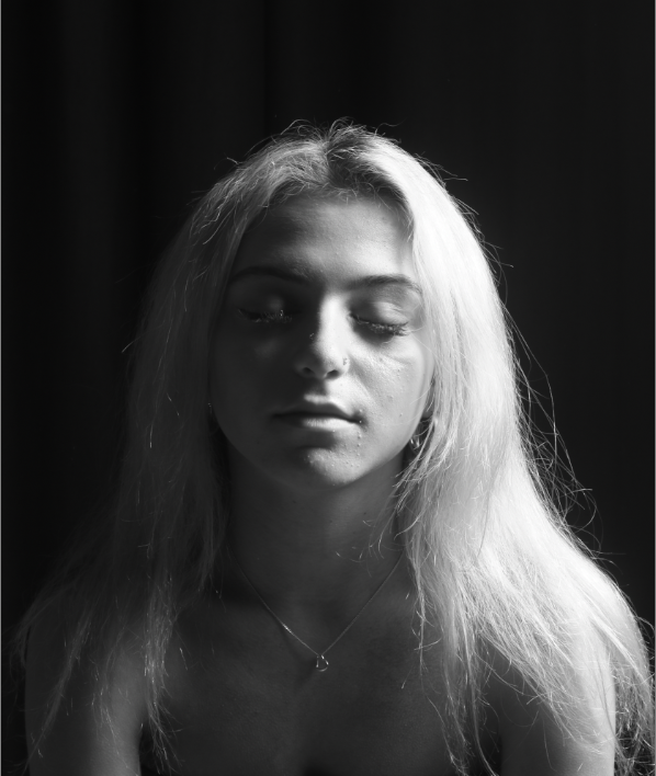
I thought these 3 images were the best out of all the others. Although they are similar in the way that they are the same position and person, however I liked the way they went together. In the first image, as she is blonde this has reflected well off of the light and only lights up part of her face as she is turned away. In the second, the lighting has been completely split down either side of the subject’s face which I really liked. In the last image, I got her to close her eyes as this made the darker part of her face almost disappear which I thought was effective. They didn’t need much editing as the placement of the lighting along with the black curtain behind worked well together.
The original images:
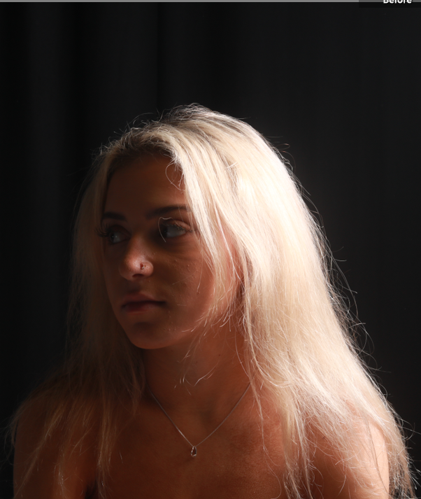
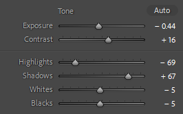
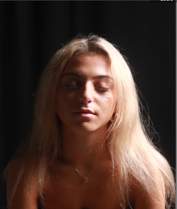
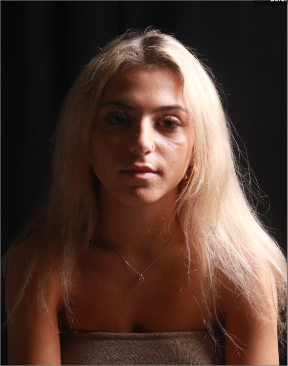
These two images didn’t require any editing.

All the blogposts that you have produced from three main lighting techniques: Rembrandt, Butterfly and Chiaroscuro are excellent with a clear process demonstrating your knowledge and understanding and some great creative responses in in the studio.
Great job! Keep going >