I colour-coded all my images so I could see which ones I preferred over the ones that were the worst and could easily see them.
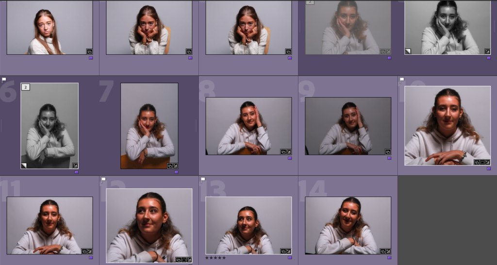
MY FAVORITE IMAGES:

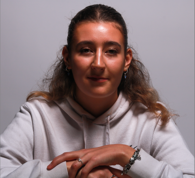
I like the way her hands are included in the image in a relaxed way as I feel it adds more to the image and fills up what would’ve been empty space. I like the way they are curved on top of each other and you can see her jewellery as I feel like this brings more life to her character. She has a very relaxed and neutral expression and is central. I cropped the background so that she was the main focal point of the image. The position she is sat in is quite powerful as she is straight on from the camera looking right into it which I really liked.
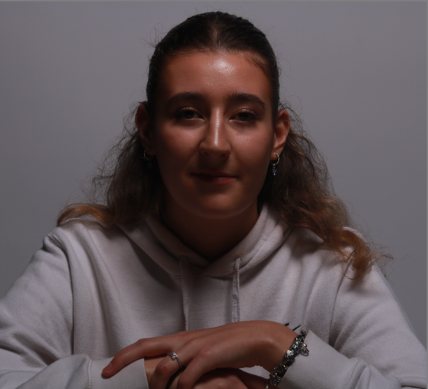
Original image:
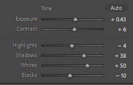
MY SECOND IMAGE:

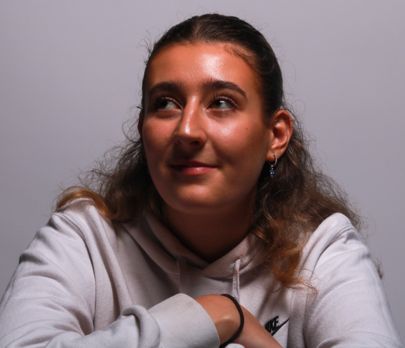
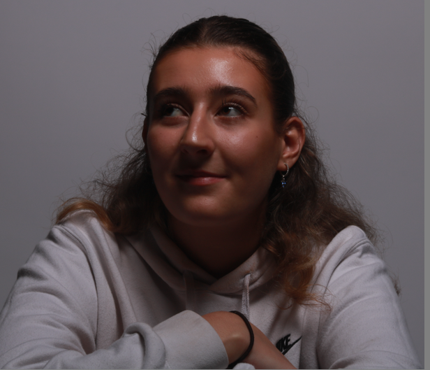
I really like the way she is looking to the left of the camera because a lot of my other images are looking directly forward and the light is bouncing off her face more. Her cheekbones have been darkened alongside the butterfly shape under the nose so I know this technique has been successful. I cropped the background so she would be more central to the image. Instead of a neutral expression she has a slight smile which I also really like as it is more natural instead of being neutral and lifeless.
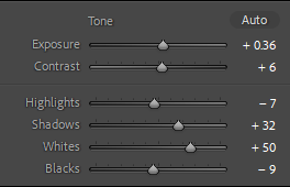
The final images:
