These images are from studio lighting portraits:
My Intention with these shoots was to play around and experiment with the Rembrandt, Butterfly and Chiaroscuro lighting techniques.
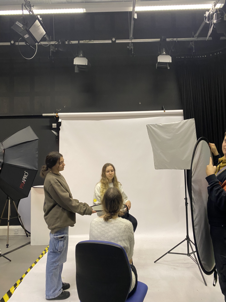
Recreating these, in the studio we used a DSLR camera, with a flash adapter, additionally with a reflector to try out with.
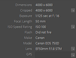
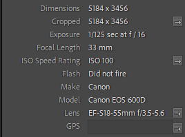
camera settings:


Studio set up:

Rembrandt –
5 – 4 star rated photos:
(These are also white flagged – meaning they consist of photos that are taken clearly and match the Rembrandt light triangle).

These photos, capture the visual elements of Rembrandt, with the light positioned at a 45 degree angle and Rembrandt light triangle present on the cheek.
3 – 2 star rated photos:
(These are also white flagged – meaning they consist of mostly clearly taken photos or just didn’t fit the look I was going for, such as not containing a clear indicator of the light triangle or too poorly exposed).

These could improve, by altering the exposure on the camera or by repositioning the light to create a starker contrast of the triangle.
2 – 1 star rated photos:
(These are black flagged meaning they do not appeal to what I was aiming for during this photoshoot).

These, to me didn’t fit the look I was going for, therefore this is why I have given them a low rating.
Butterfly –
5 – 4 star rated photos:
(These are also white flagged – meaning they consist of photos that are taken clearly and match the Butterfly lighting effect).

These images, best represented the effect of butterfly lighting as shown with the shadow casting on the top lip.
3-2 star rated photos:
(These are also white flagged – meaning they consist of mostly clearly taken photos or just didn’t fit the look I was going for).

These images were clearly taken but did not fit what I had In mind.
Chiaroscuro –
5 – 4 star rated photos:
(These are also white flagged – meaning they consist of photos that are taken clearly and match the tonal contrast of Chiaroscuro lighting).

These are my best of the shoot, the contrast with tones, and balance of colour most represent examples I’ve looked at.
3 – 2 star rated photos:
(These are also white flagged – meaning they consist of mostly clearly taken photos or just didn’t fit the look I was going for).

The poses to me created to much brightness, which isn’t what chiaroscuro is.
2 – 1 star rated photos:
(These are black flagged meaning they do not appeal to what I was aiming for during this photoshoot).

The exposure for this image was too low.
Conclusion –
In conclusion, I think these shoots turned out well, in terms of the visual composition they are inspired from and recreated to fit the techniques to a decent standard. I would improve by experimenting more with the light and try to get better at Rembrandt. as that proved the most difficult to create.
