Rembrandt –
For my Rembrandt shoot, I believe my photos could improve by more experimentation with the positioning of the light.
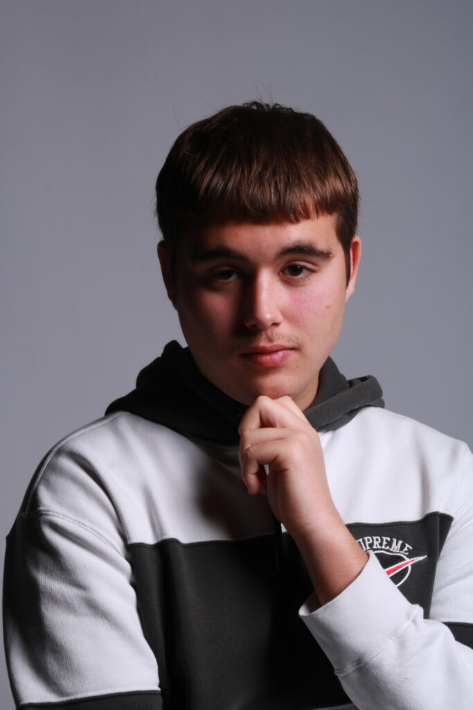
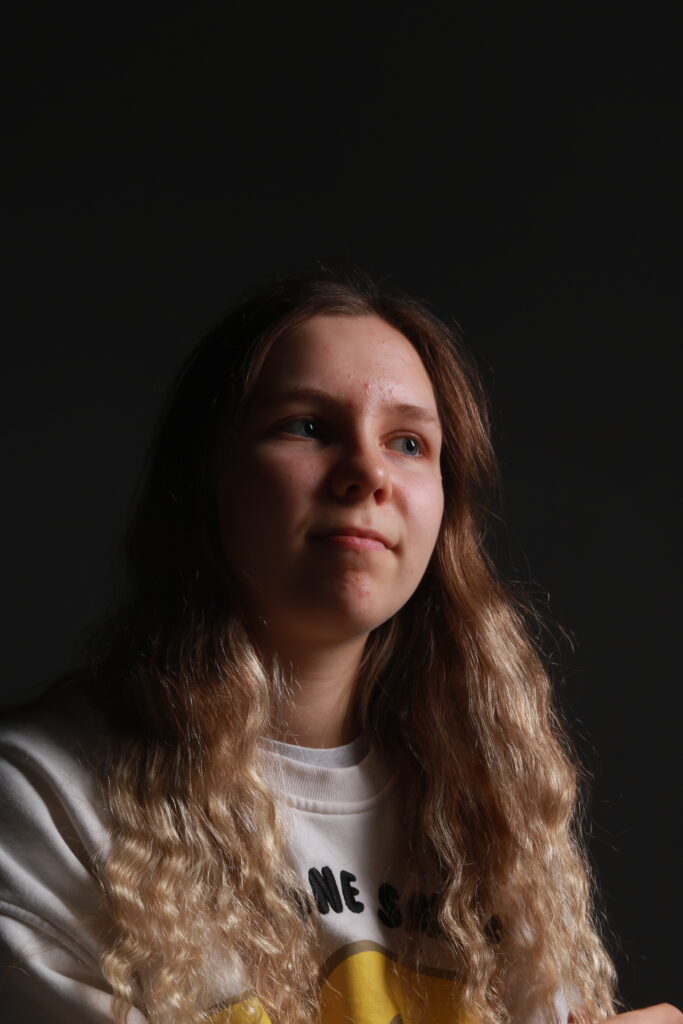
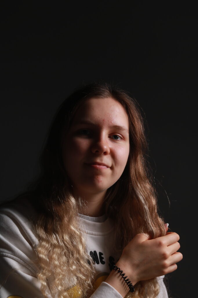
Out of the shoot, these where my best, with the recognisable light triangle on the cheek of the subject being the aim to be captured.
3 Best photos:
Edits:
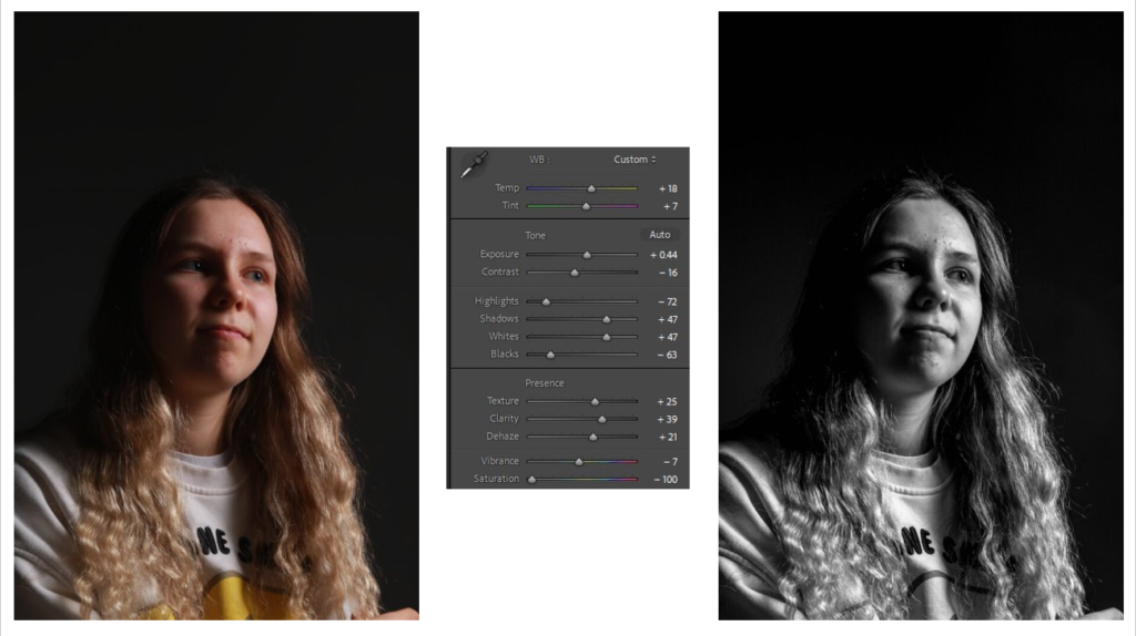
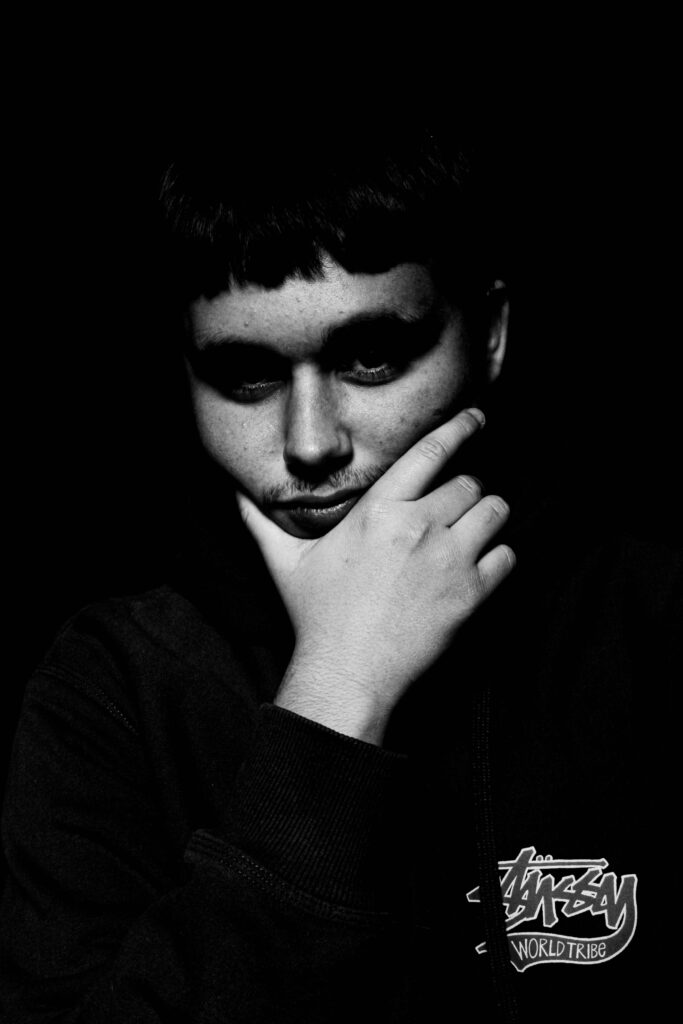
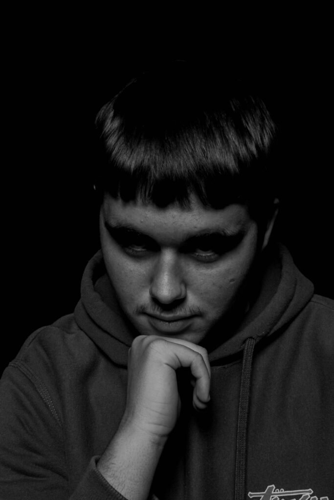
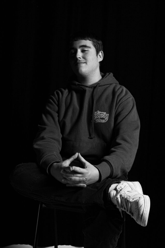
Creating a black and white effect it added more tone and contrast to the image. I liked these edits as by converting into a black and white image, its makes the subjects form look separate from the background, making this interesting 3D effect.
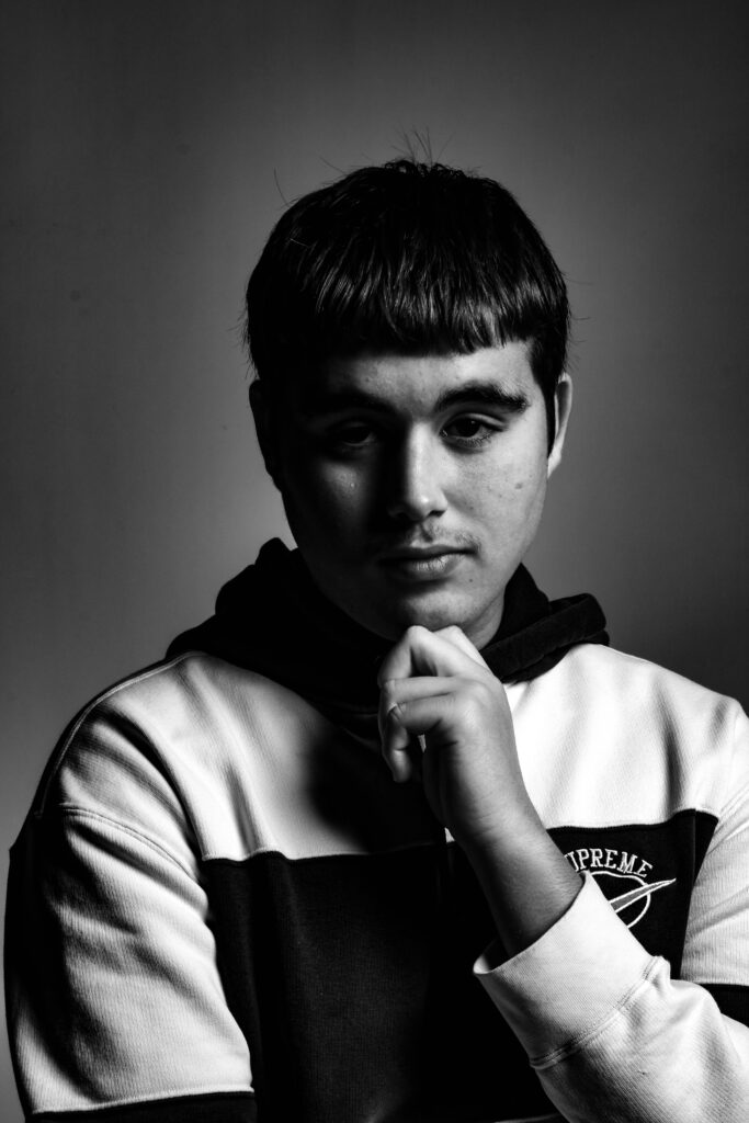
(Such as this one, the grey background separates with the contrast of his white and black hoodie. I Made this effect by altering with the saturation and adjusting different areas with the use of contrast, highlights and temperature).
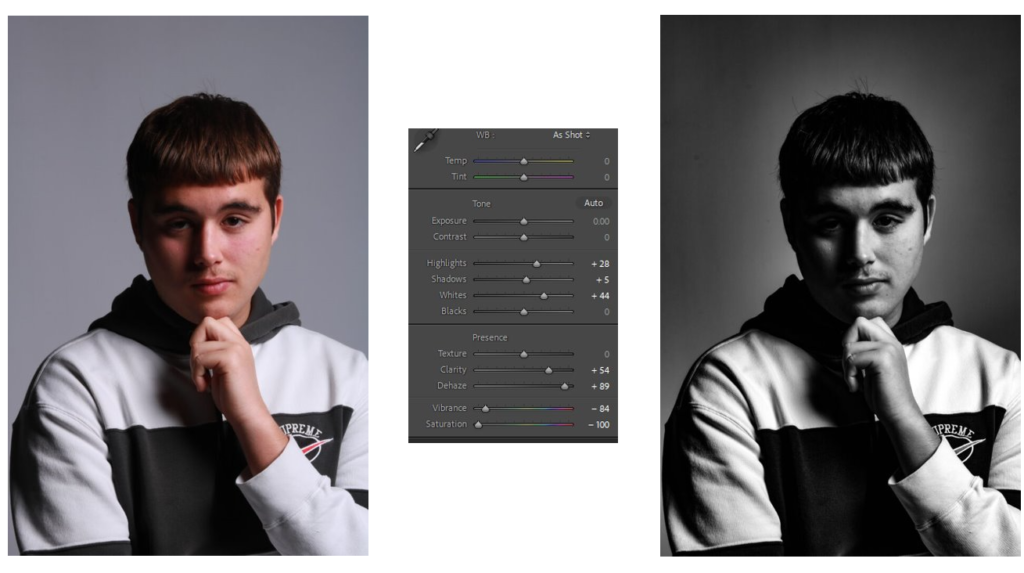
(With this photo, I tried to lessen the highlights to make the light triangle more predominant, this, alongside with the use of some contrast it adds more depth and form to the image. By making the white higher it creates that strong lighting effect, ruminant of Rembrandts early use with portraits in Hollywood).
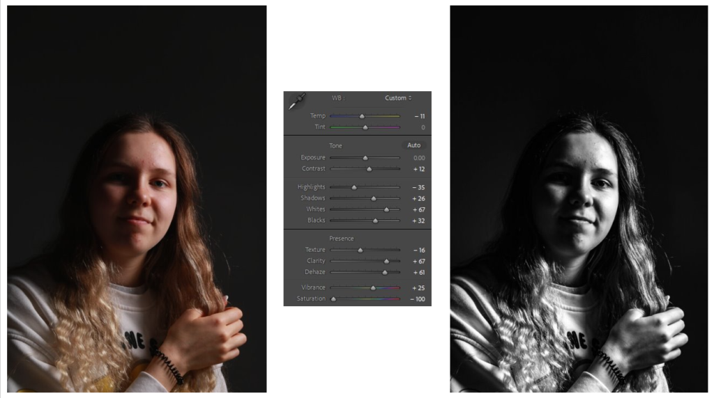
(Although the light triangle is more circular with its lines, I used texture, clarity and de hazing to create a dark toned portrait. Additionally by lowering the highlights and black aspects of the image, it allowed the bright parts of the image to create a tone shift of a different merge of shades).
Butterfly –
3 best photos:
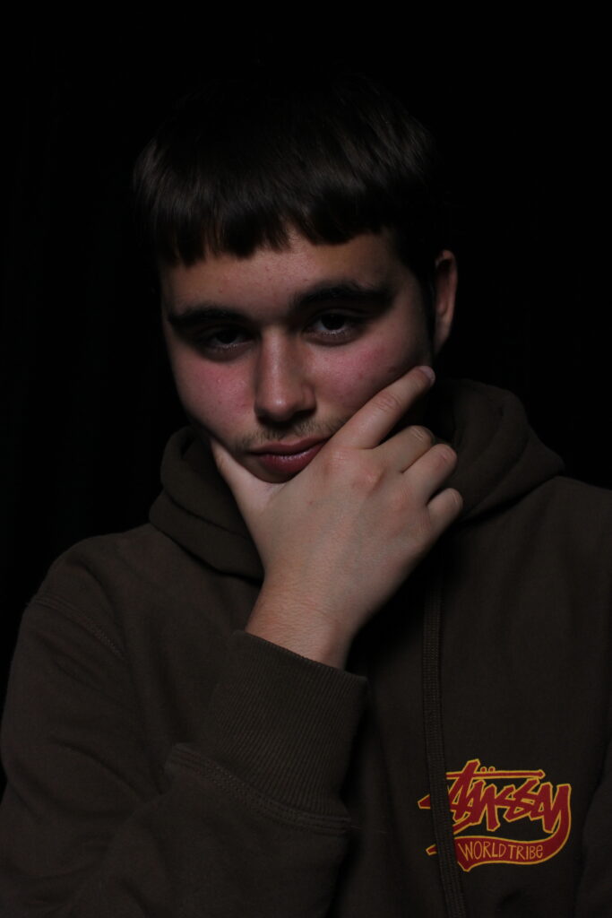
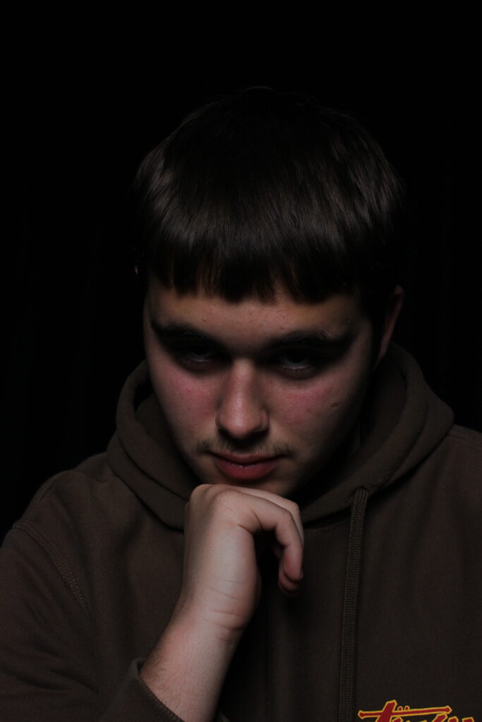
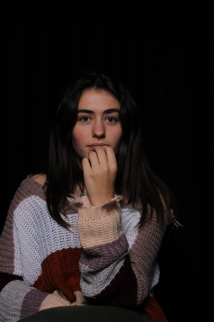
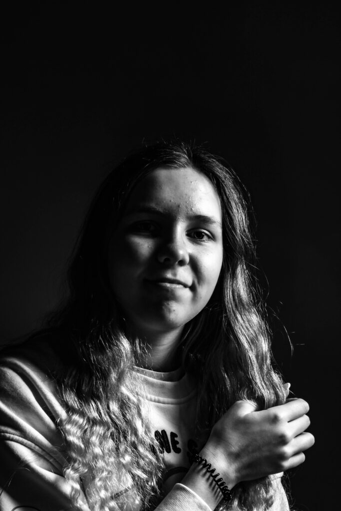
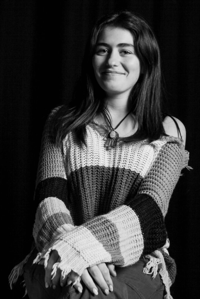
I like how these images created the recognisable ‘butterfly’ below the subjects noses, this alongside the use of shadows surrounding them, it creates an nice composition.
For next time, I will try and create more photos with this effect as I find it, Interesting to play around with.
Edits:
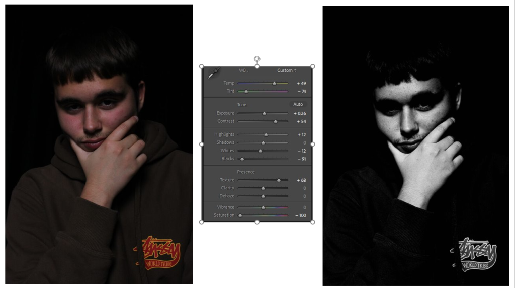
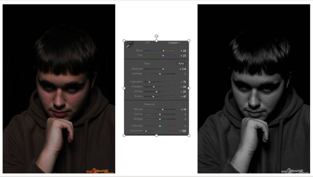
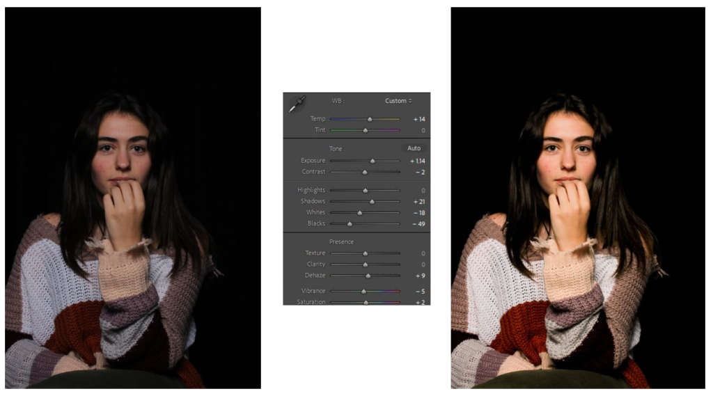
For my Butterfly edits, I altered with texture, shadows and highlights to create a very stark trio of photos.
(For this image, by lowering the saturation, altering the images temperature as-well as the texture it creates a gritty but cool effect on the subject. With a sort of 2D effect, it looks as if they where painted onto a black canvas).
(With some good shadows already present, I edited further by lowering them as-well as some other elements such as highlights and the whites and blacks to generate a more matte effect on the image).
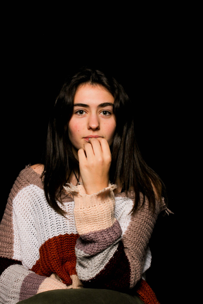
(Going for a different style, away from greyscale, I tried to make the shadows more faded by decreasing the black, and increasing the exposure, this creates a more higher toned lighting effect).
Chiaroscuro –
3 best photos:
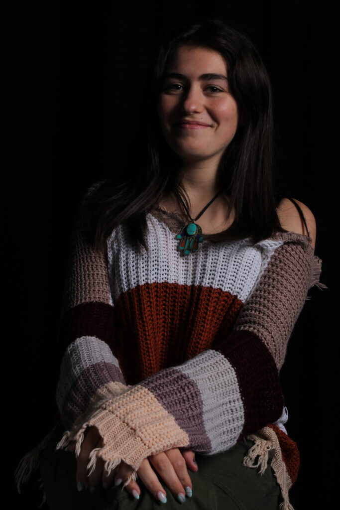
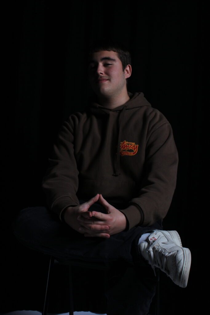
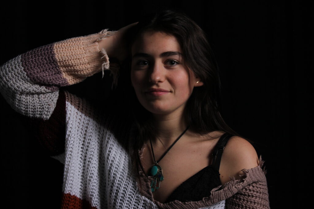
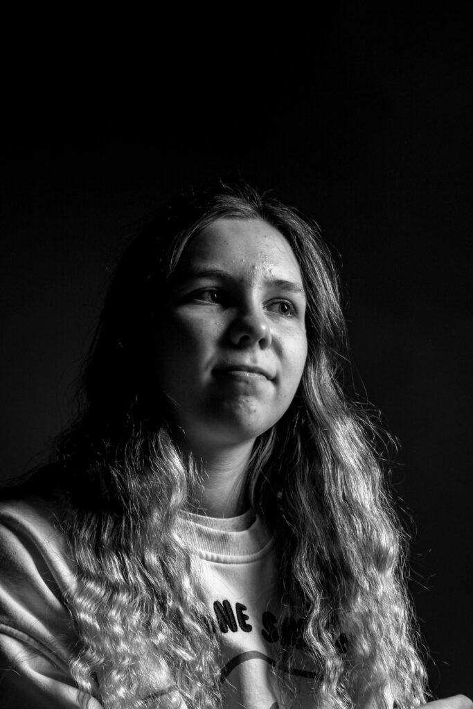
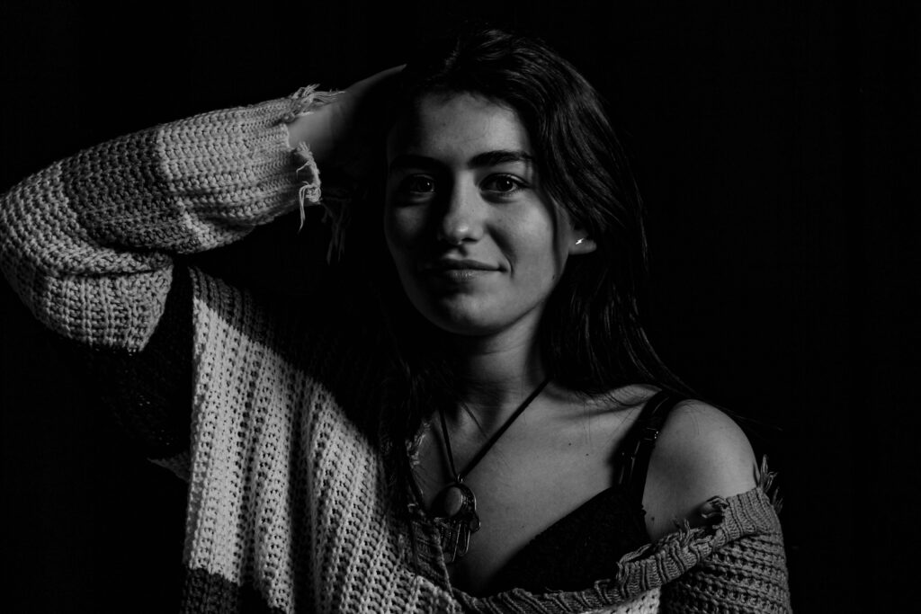
I believe these are my best Chiaroscuro photos, I like how the light creates an interesting 3D effect, with shadows being created through creases in clothes.
For improvement, I will try to improve the brightness of the light.
Edits:
(By increasing the image temperature I was able to increase the lights brightness with this image. To create a more standout effect with the shadows).
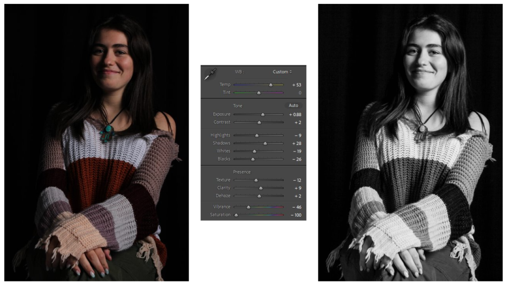
(With the original image I found that it wasn’t bright enough, so by using a low saturation alongside a darker shadow effect the contrast of the white tones to the black makes a distinct composition).
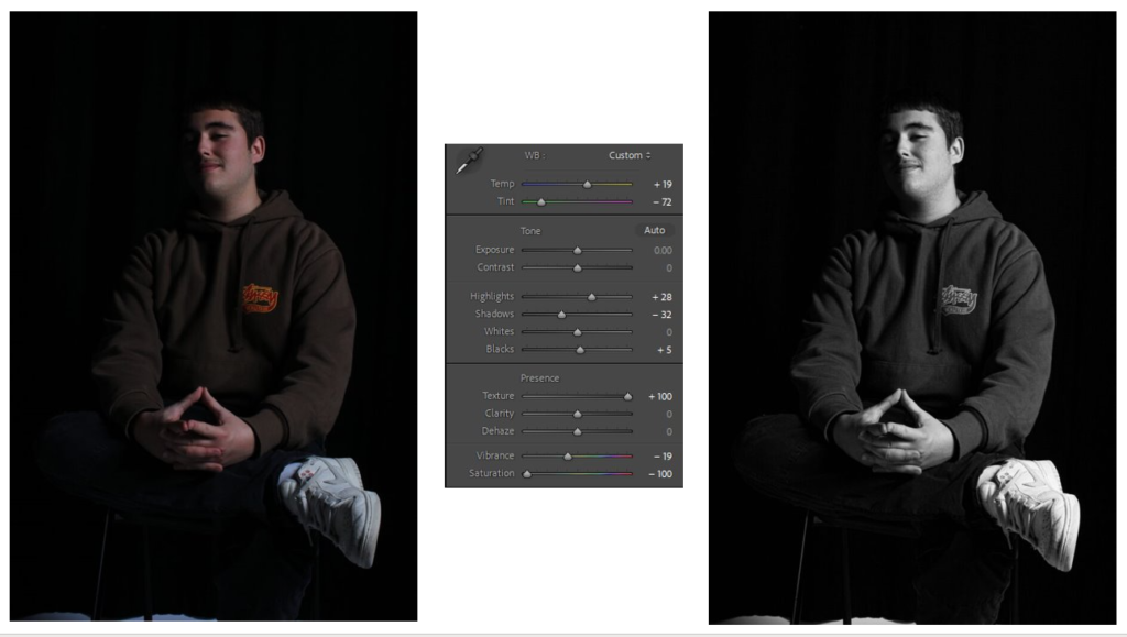
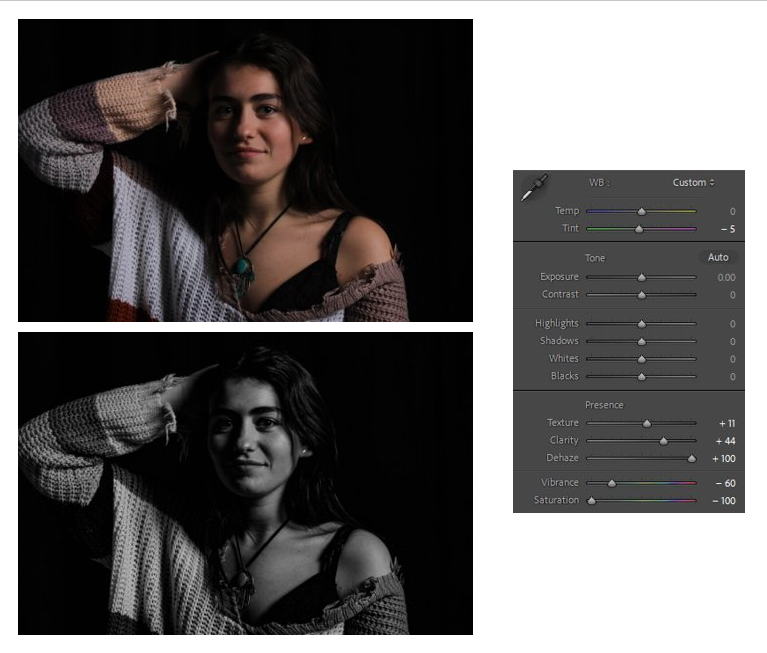
(With the outcome of this it already fitting the aesthetic, I added only little by altering the texture, clarity and dehazing, sticking to the genre of my mainly greyscale images, I lowered the saturation).
Full photos:
Rembrandt
Butterfly
Chiaroscuro
In conclusion, I like these images and believe they are a good first attempt at trying Studio lighting techniques.
