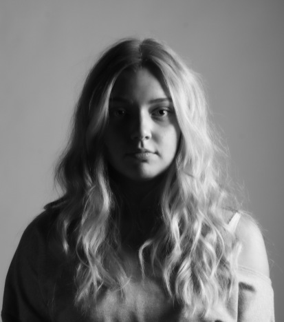
Chiaroscuro editing:
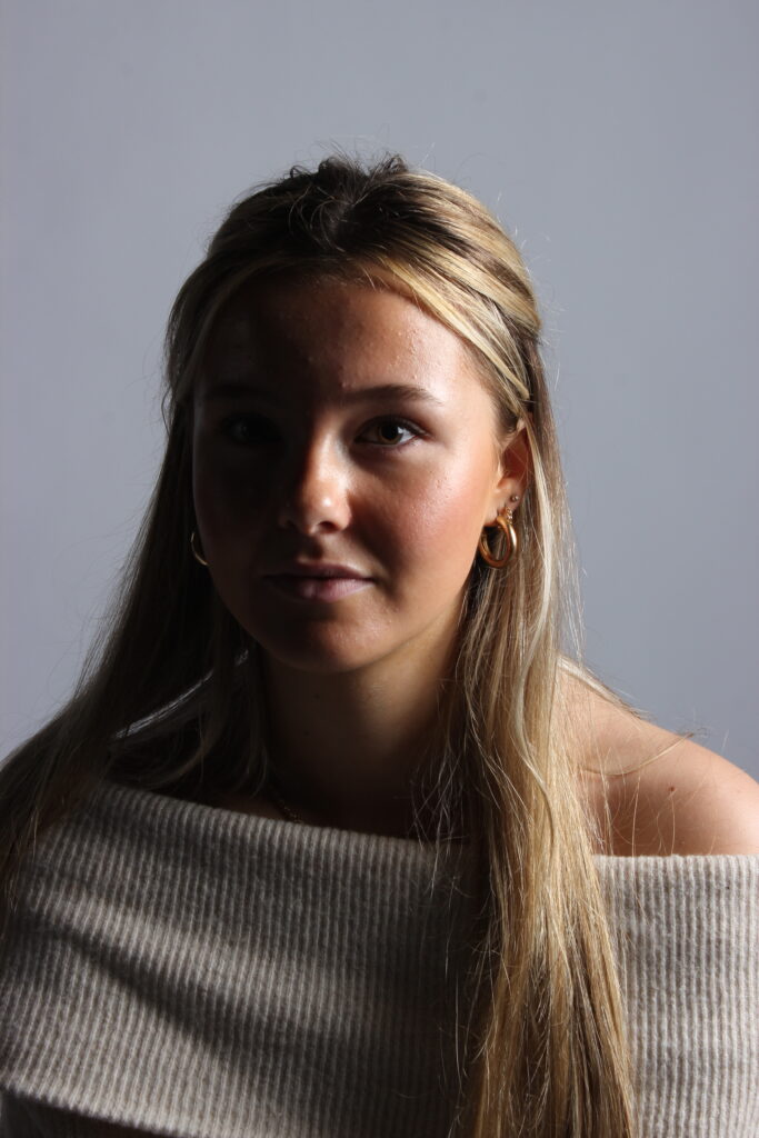
Also known as split lighting, the aim of this photo was to make one side of my face luminous while the other side is dark. This was my portrait before any editing, I think this lighting technique is effective as it gives a mysterious look. We ensured to keep the continuous lights off in order to achieve the dark look on one side of my face. This helped because it added a sense of drama to the photo making the left side very dark, and illuminate the brighter side of my face which created a successful contrast.
History of editing:
Final image:
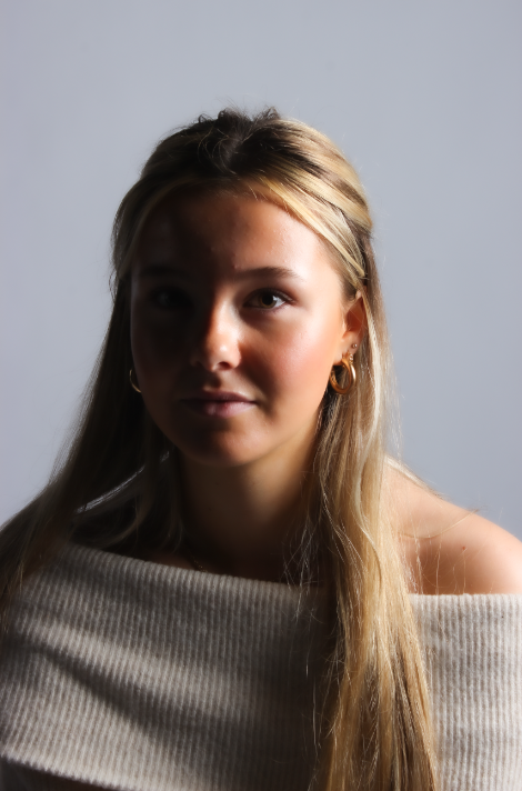
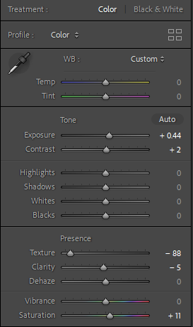
This is my final edited image. I decided to keep the temperate and tint the same as before because my main focus was not to make the image look warmer. If I had adjusted the temperature it would decrease the dramatic effect, which I didn’t want. Instead I decreased the texture to give myself a smooth appearance, which prevents the viewer from being distracted. Additionally, I increased the saturation which helped illuminate the bright side of my face, which also increased the contrast between the light and dark side.
Rembrandt editing:
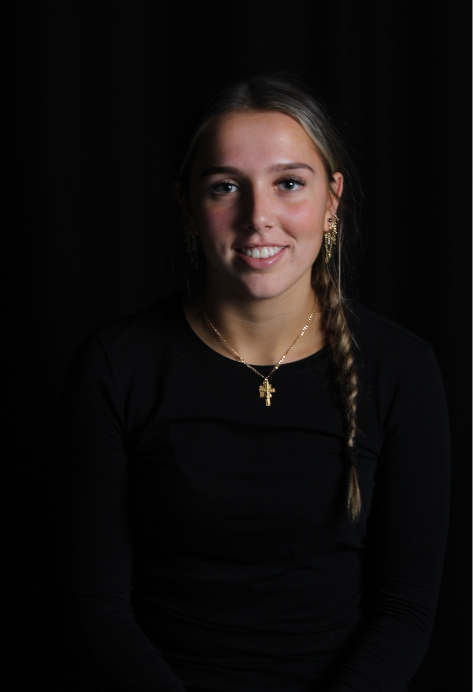
This was my original photo before any editing. We struggled to achieve the idea of a triangle appearing under the models eye, as we decided to make the background black for this photoshoot. We chose to do this because we thought it would enhance the triangle effect, however it did not turn out as successful as we thought it would.
History of editing:
Final image:
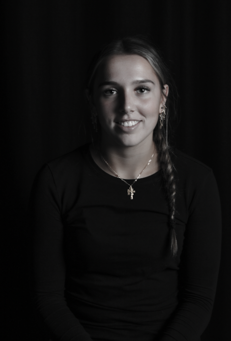
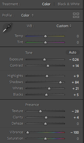
This is my final edited image for Rembrandt lighting, where I tried to highlight underneath the models right eye by increasing the shadows by an immense amount. I also increased the contrast because this would make the image appear brighter on the side where the flashlight hit, yet darker on the side where there was no light. By decreasing the vibrancy, it allowed me to achieve the black and white effect more successfully, as it instantly made the image appear more catastrophic.
Butterfly editing:
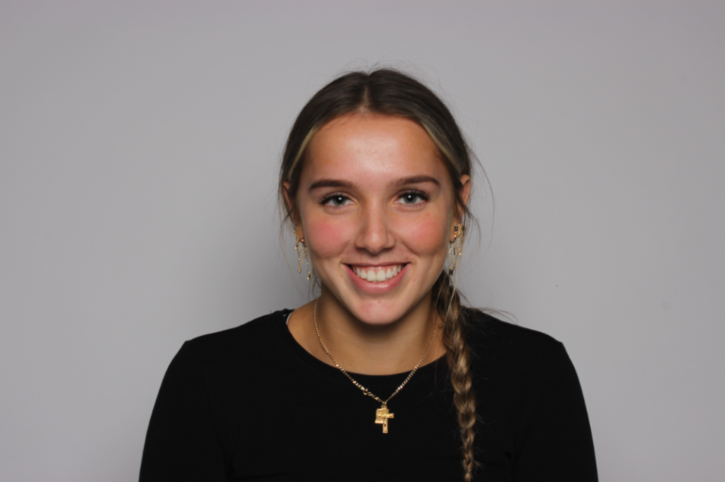
This is my photo before editing. We tried to achieve the butterfly effect by using a flashlight instead of a continuous light, as we thought we would achieve the strong, eye-catching deep shadow under the models nose. However, we used a reflector when taking these photos, which meant that our photos were significantly less effective. We soon realised that this was not as effective as it would have been if we used continuous lighting, because it also meant we were in less control of the outcome. This is because we made the room dark in order to receive the full potential of the flash, meaning we could not see what was working in the photo and what wasn’t.
History of editing:
Final image:
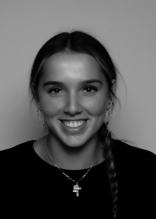
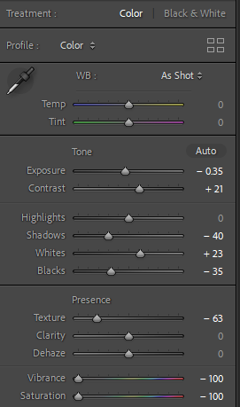
This is my final edit for our butterfly lighting attempt. Although it did not work as successfully as we hoped, I think the use of the editing process significantly helped improve the look of the photo and achieve the butterfly effect to an extent. I decreased the exposure a notable amount as it helps dull the image, which in a way helps increase the dark shadows. In addition to this, by increasing the contrast it helped bring out the shadows against the light, enhancing the butterfly effect. I decreased the vibration and exposure to -100 as it made my final image black and white, which I think is the more successful version for this technique of lighting.
More final edits:
