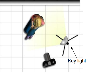
Chiaroscuro is an Italian word that translates to Light and Dark. The effect is created by a light across the subject that goes in one direction and then a lit background positioned so that it is in a reverse direction. Ideally, the subject should go to black on the side that is unlit and it should stay the same for the background. The subject’s outline or shape, is clearly described because of the lit background even though its black on the unlit side. The word chiaroscuro came from painting. It was a job that joined a very strong contrasts of light and dark in an image so that it created a sense of volume and shape.
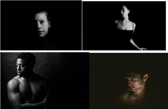
The setup for Chiaroscuro lighting.
Own experiments of Chiaroscuro lighting
Experiment 1:
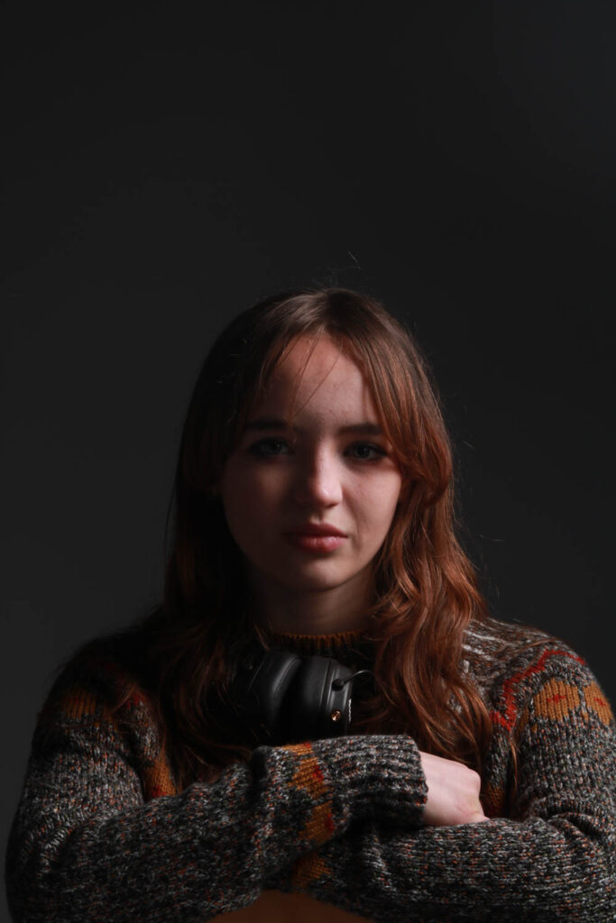
Experiment 2:
Experiment 3:
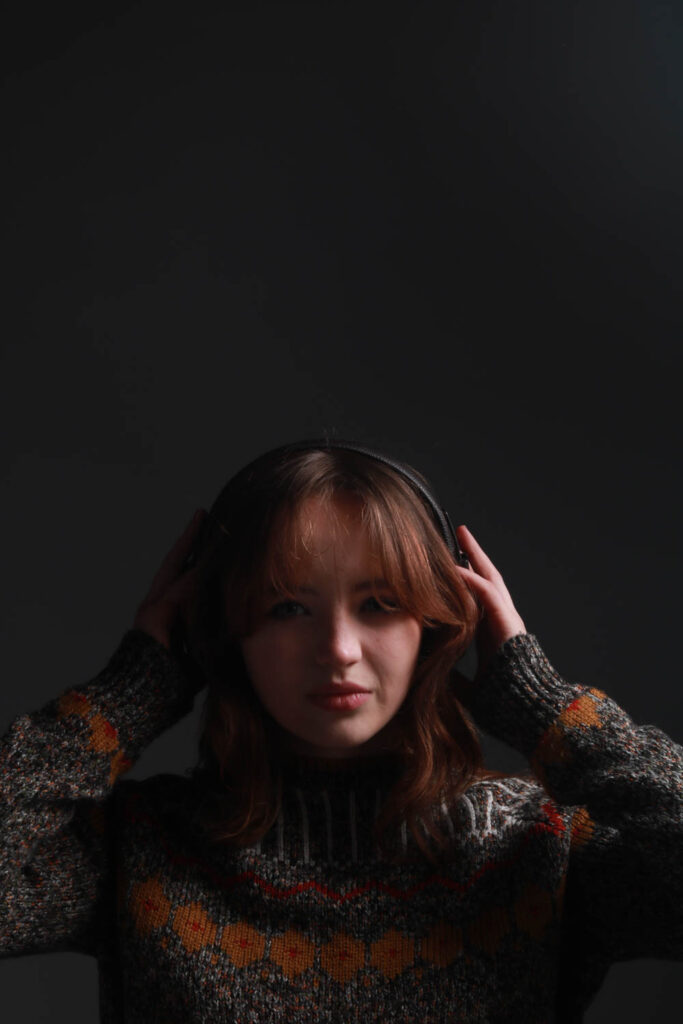
Editing process: For these three pictures I kept them just as they are. I didn’t edit them because I though that it perfectly represented Chiaroscuro lighting as it shows the dark background and the illumination of the subject’s face. Although the background could possibly be darker, editing it would negatively effect the subjects illuminated face. So changing this picture would only do harm to it and strip that Chiaroscuro lighting from it.
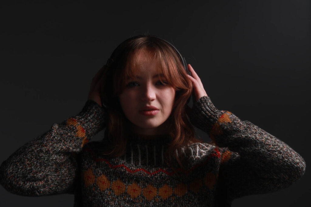
Experiment 4:
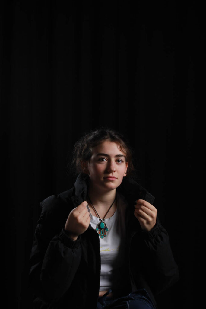
For this picture I kept it just as it was because I think that shows chiaroscuro lighting because of the black background and the illuminated face.
Experiment 5:
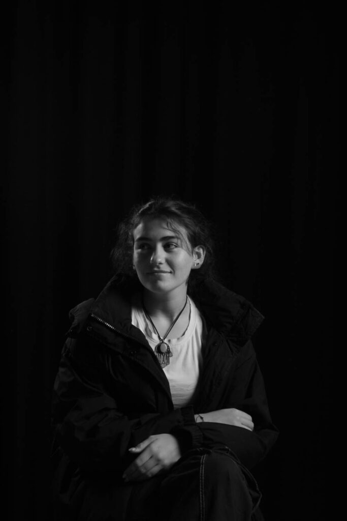
For this picture, I desaturated it (-100) to create diversity within my pictures and because I liked how the picture looked in black and white especially with the illuminated face and the dark background.
Presentation of outcomes
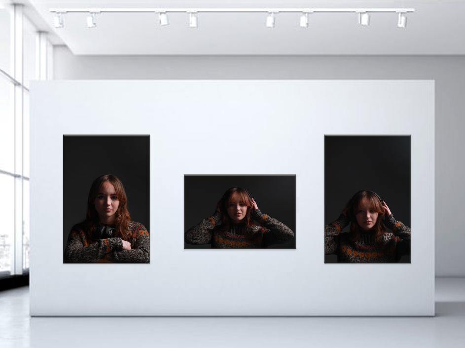
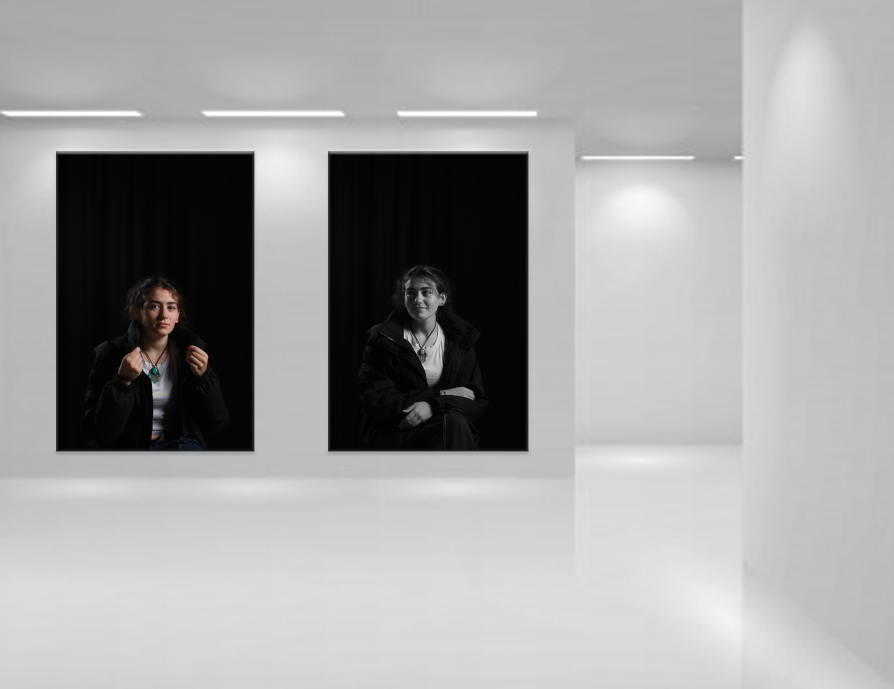
Evaluation and Critique.
Overall, I think my pictures look great. I believe that in most of my pictures I was able to show that chiaroscuro lighting that we we’re meant to show. My pictures have that black background that chiaroscuro is meant to have and that illuminated face.
The quality of my pictures are high. They are focused and have no type of blurry parts showing in the pictures and due to this the quality of my pictures is good.
However in some of my pictures I feel like they could show more of that illuminated part on the face and also have a more evident dark side on the face. For an example on my experiment 4, the left side of the face could have been darker by moving the key light more to the right side of the subjects face and same goes for fifth experiment. Adjustments like this would’ve massively impacted the photo and increased that chiaroscuro lighting slight more.
Another improvement I could’ve done in my 1-3 experiments was the fact that the background could’ve been a little darker. The way I could make the background darker is putting a black curtain in the background to make sure that the background is fully black. I could also bring the key light closer to me from where I was taking the picture and also bring the key light closer to the subjects face and facing it more so that it was closer to the centre of their face but not completely centred to the subjects face.
