For this photoshoot, I was inspired by my previous research on Still Life and so decided to take some pictures of old/ vintage looking objects that I found in a box in the studio. I also used some of my own objects that bought up feelings of nostalgia to me. I chose to use old looking objects as a common theme in the still life images I looked at is that most of the objects looked old and expensive, so I thought I would try and recreate that tone in my photographs too.
Whilst in the studio, I used a variety of the setups such as the infinity curve. I then tested out using different lighting eg a warmer toned light and cooler toned light. There was also a light that I put on underneath the objects in some of the photographs.
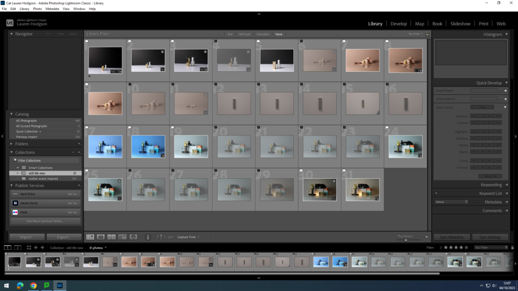
Once I had taken the photographs, I put them into my media folder and imported them into Lightroom. I then gave them either a white flag (if I liked the picture) or a black flag (if I didn’t like it). Once I had decided what pictures I liked I rated them out of 5 and gave them a colour (green=good, yellow=alright and red=bad). By doing this, it allowed me to narrow down my selection and make it easier to see what images I wanted to use as my final images and edit.
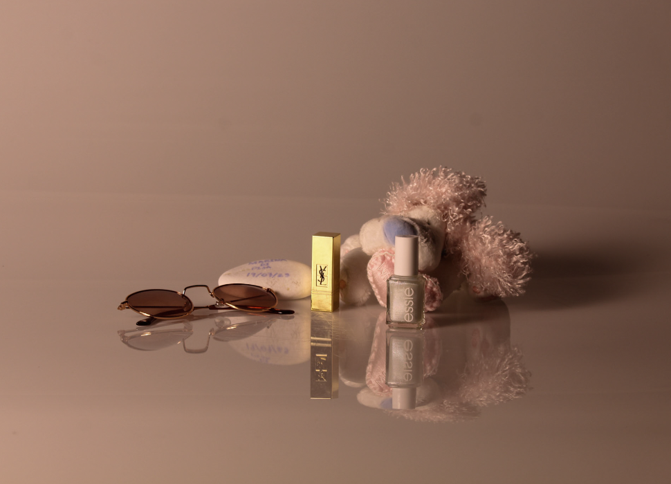
For this photograph, I decided to use more of a warm tone as that is what I associated those objects and memories with. I like the clarity of the photograph and the reflection of the objects on the infinity curve. When editing it on Lightroom, I went onto the develop tab and then experimented with different settings eg bringing the contrast and highlights down and trying different levels or clarity/ texture.
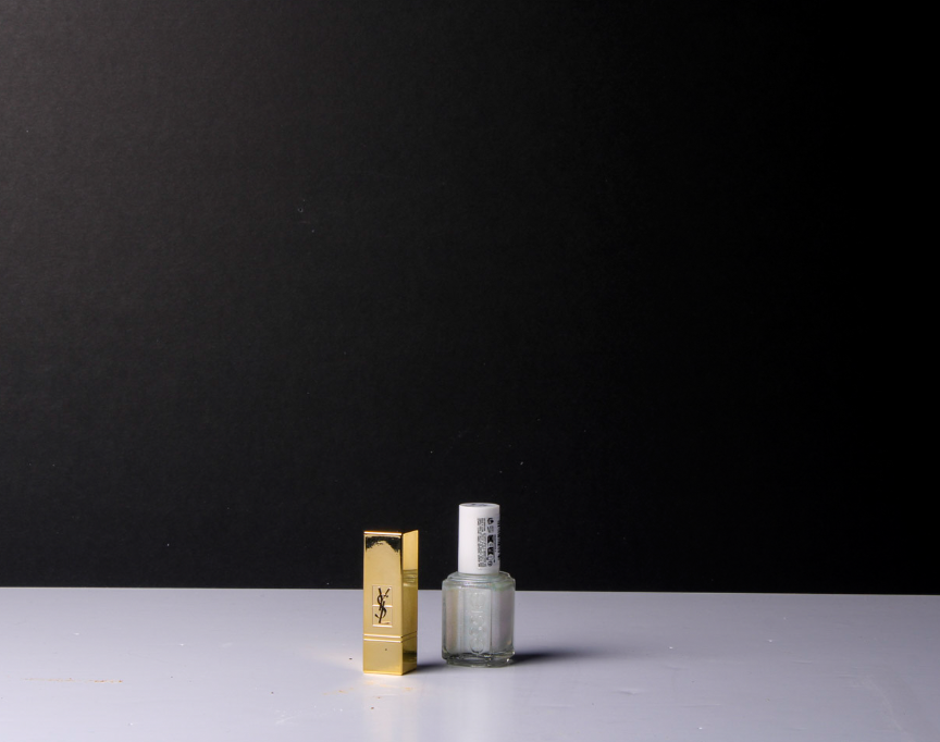
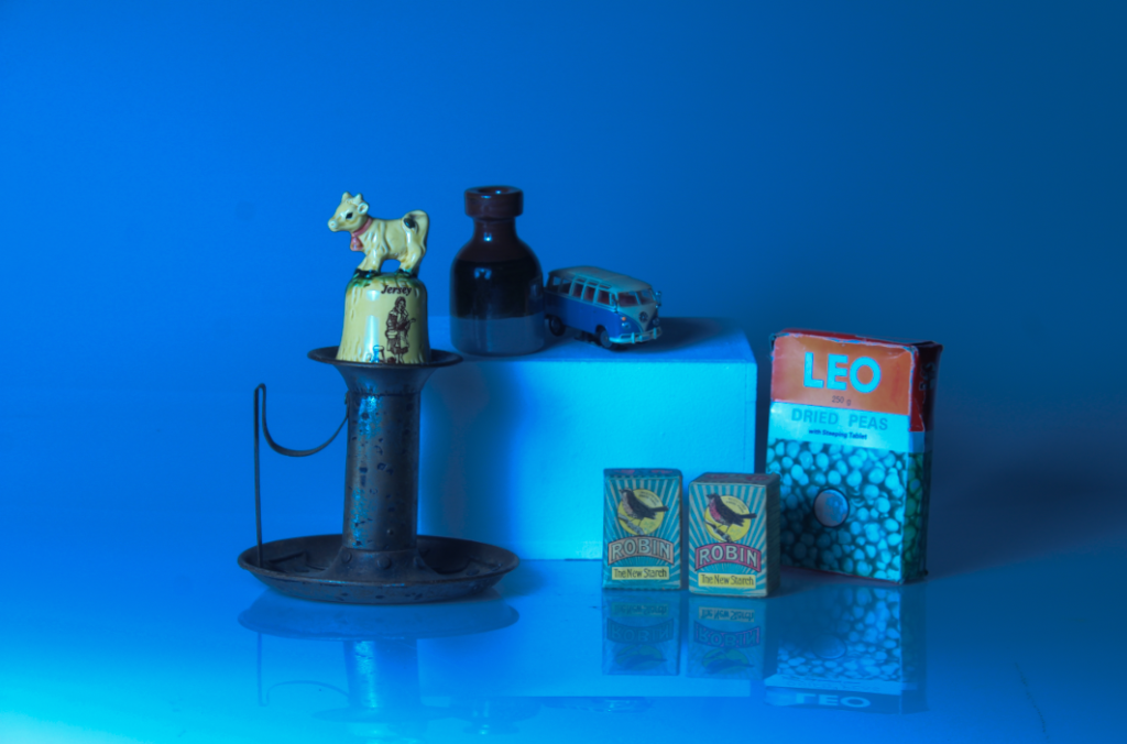
For this image, I decided to attempt to create a cool toned image utilising an abstract approach in the style of Daniel Sigg recreating the monochromatic effect of his photography. I did this by going onto the colour setting and enhancing the blue in the image. I then changed the exposure and contrast of the image too.

Daniel Sigg- The Blue Series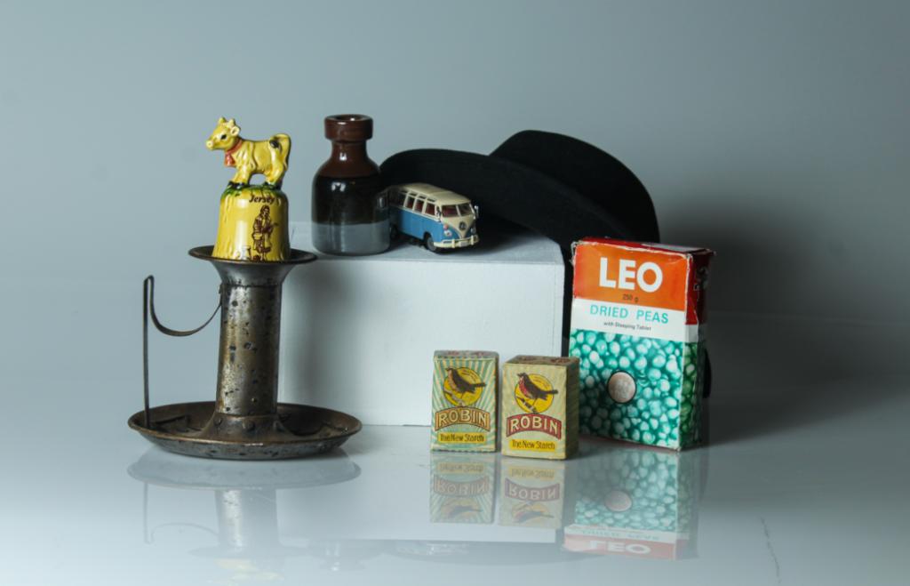
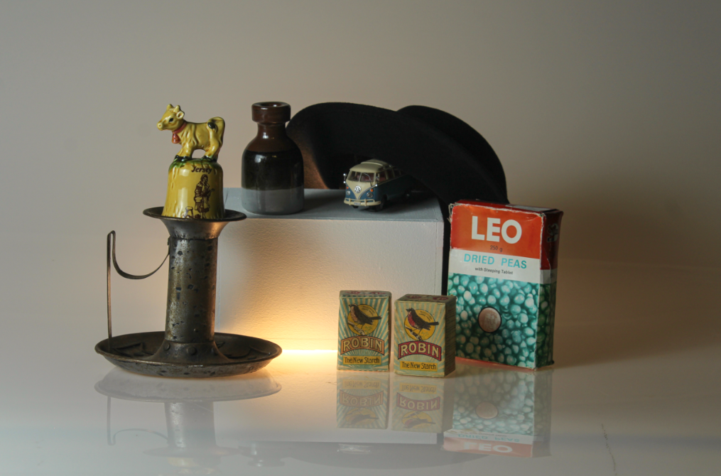
In this picture, I decided to add a light underneath my objects. I think this helped to bring more of a soft, comfy feel to image. However, if I were to edit this again, I would make the clarity of the image more clear as the objects look a bit blurry making it look less professional.
Overall, I like how this photoshoot came out as a first attempt of recreating still life images because I managed to grasp and understand the essence of still life photography as shown in my earlier blog post on still life. I really enjoyed using the infinity curve and will remember that for future projects, as well as beginning to experiment with other setups and attempting to refine my images further.
