Features
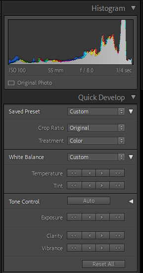
Quick edit which is on the right hand side of adobe lightroom. Has a crop option, white balance and also a black and white section when the drop down is used.
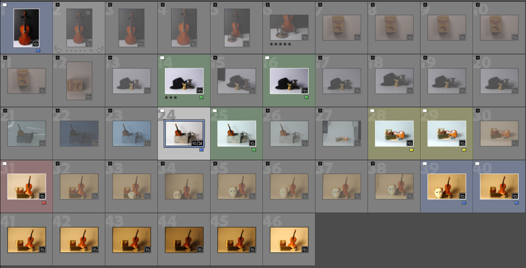
The catalogue shows all the photographs. These can be filtered and saved in Collections.
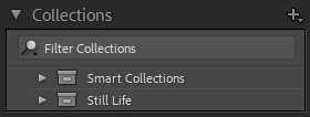
Collections are files within Lightroom. The plus in the corner adds a collection and you drag images into it. If you ‘ctrl’ or ‘shift’ you can select multiple at a time.

This changes how you view the image. The grid shows the whole catalogue at once, the rectangle shows the one selected image in large. The ‘x/y’ shows two selected images back to back for comparison if there are two similar images.
For filtering and rating images there are three options:

- Flags, are a simple yes/no option. If you press p, its a white flag and ‘pass’ or ‘yes’. If you press x, its a black cross flag and a ‘no’. A yes means it is relevant to the project and a no means it is not relevant.

- Stars are a five star system. If you press a number on the keyboard the corresponding number of stars will show up under the image. 5 is 5 stars. 3 is 3 stars. Stars are the quality of the image and the second stage of the process. 5 stars means everything is in focus and in frame. 1 star means the quality is not usable.
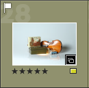
- Colours are a small rectangle to the right corner of the bottom of an image. A drop down will reveal 5 different colours for further filtration and organisation. This is the final step after using stars. This refers to whether it is going to be edited. Red means no it will not be edited. Blue means unsure and depends on the amount needed. Green means that yes it can be edited and yellow means it will definitely be edited.
Edited Images
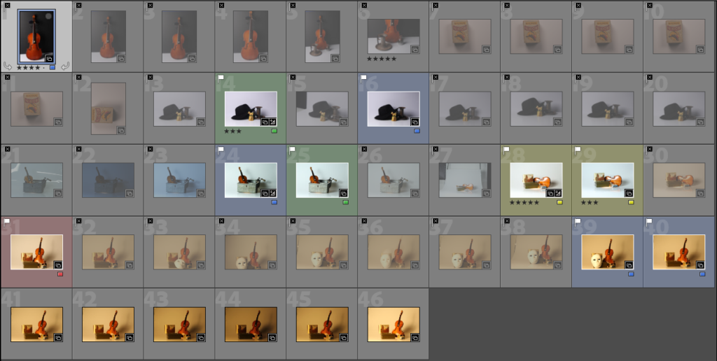
I started with 46 images and narrowed it down with gradually with each filtering option. I finally settled on one yellow and one green photograph which I edited in the quick edit tab.
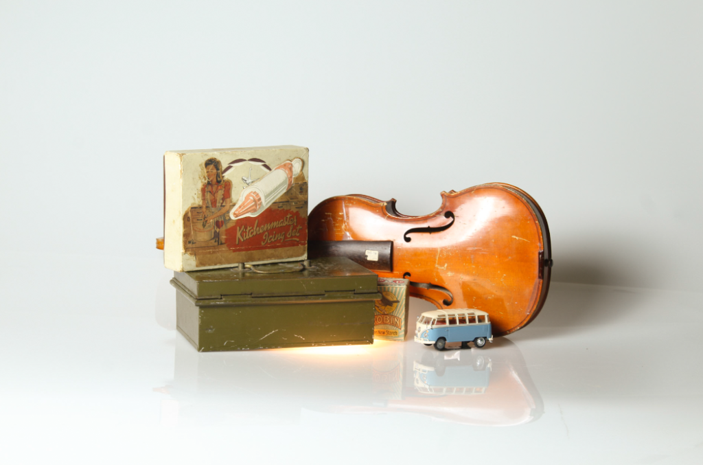
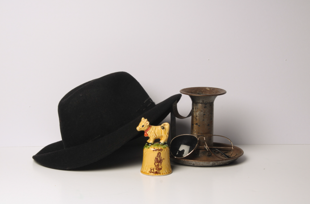
Both the images were brightened using the white balance option however I didn’t know how to crop or rotate them. The first photograph has a shiny background and reflected the light differently to the second which has matt paper as a background so the whites look different.
