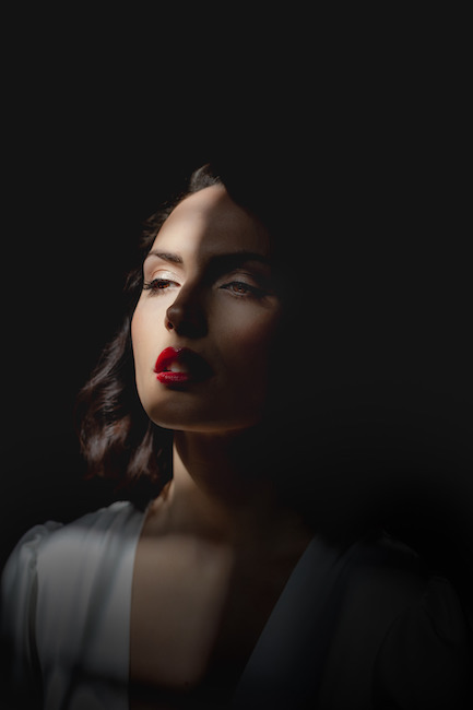
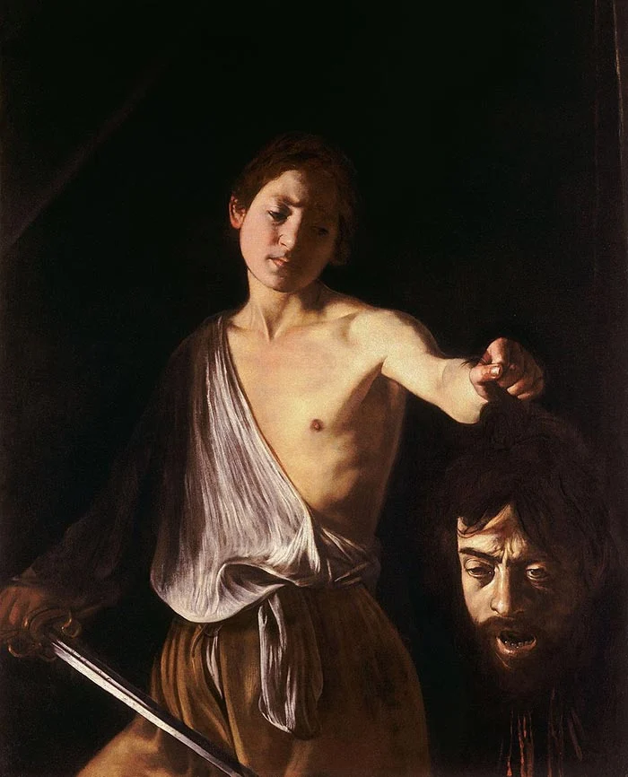
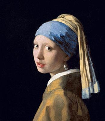
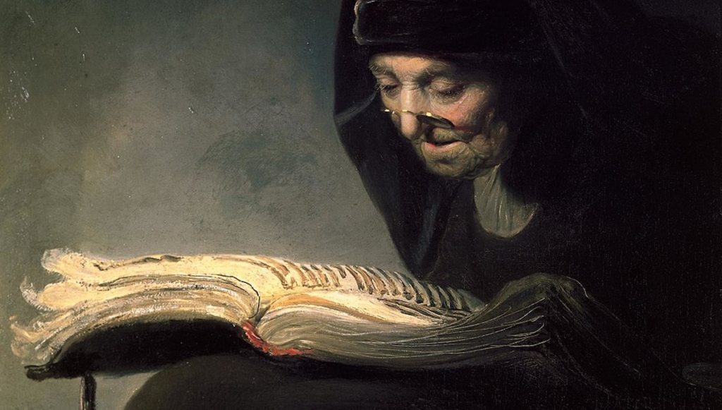
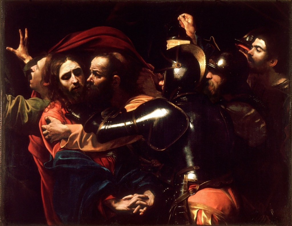
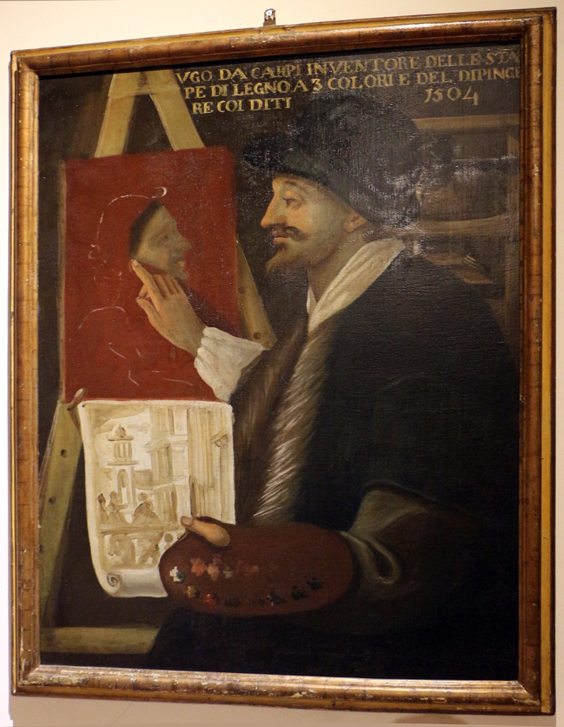
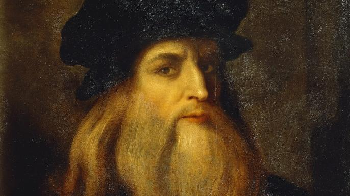
Chiaroscuro was a compositional device developed by Ugo da Carpi, however high renaissance artists Leonardo da Vinci was found out to have also helped to ‘pioneer’ the creation of Chiaroscuro lighting. Chiaroscuro is a renaissance painting technique which means “light-dark” in Italian. The theory of Chiaroscuro is that it is always best achieved by the effect of light falling on the model/ subject however it must also allow the shade to give two-dimensional figures a sense of volume.
How To Do It
Through my research I have found out that the most important elements of chiaroscuro lighting are:
(Definitions obtained from google)
- highlights– Highlights are the lightest elements in an image, whereas shadows are the darkest areas. Dynamic range is the ratio between those vivid highlights and dark shadows, from bright white to pure black. That range is key to an image’s depth and drama.
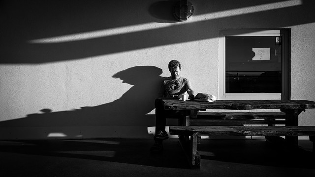
- halftones– Halftone is the reprographic technique that simulates continuous-tone imagery through the use of dots, varying either in size or in spacing, thus generating a gradient-like effect. “Halftone” can also be used to refer specifically to the image that is produced by this process.
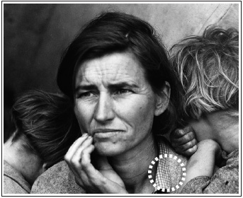
- deep shadows– Shadows are the dark areas where a light source is blocked by an object. Shadows change shape, intensity, and even colour along with the angle, direction, and temperature of light.
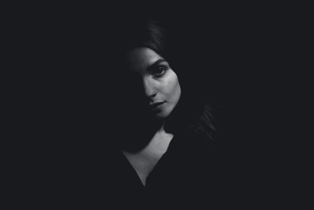
- reflected lights– Reflected light is light that’s reflected off a subject. No matter what direction the light is coming from, it will be affected by what it’s bouncing off. The subject will determine which type of light will be reflected.
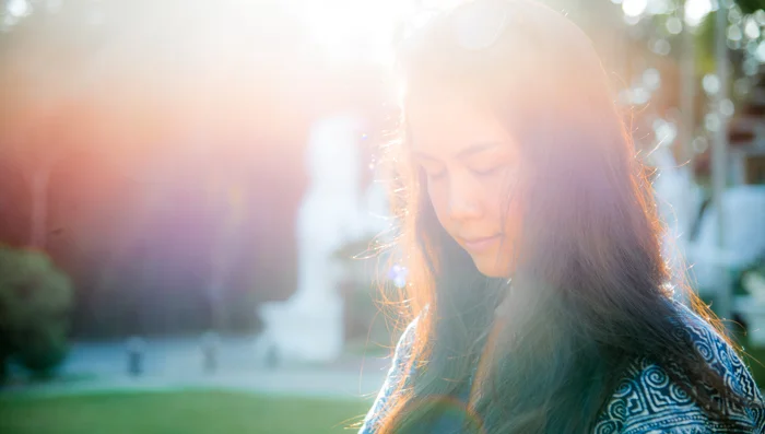
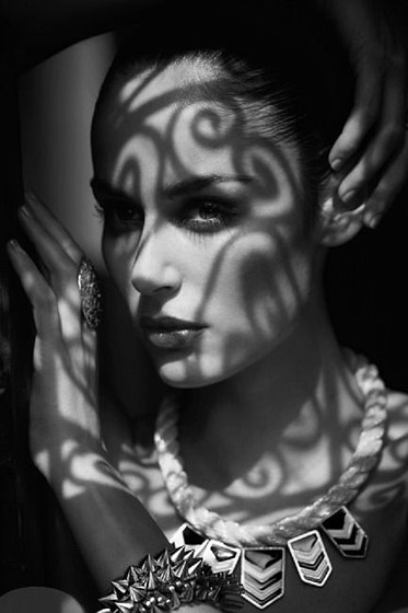
- cast shadows– The difference between core shadows and cast shadows is that core shadows are the darkest part of a shadowed region on a subject, whereas cast shadows are shadows that are cast by one object onto a different object. The silhouette you see of yourself on a sunny day is a cast shadow of yourself.
Creation and Development of Chiaroscuro
Chiaroscuro lighting is known as a ‘high-contrast’ lighting technique that uses a low-key lighting setup which achieves a contrast between the model and a dark background. Chiaroscuro lighting helps to balance its high-contrast light and its shade which gives the appearance of depth, creating an enhanced or more dramatic monochromatic effect.
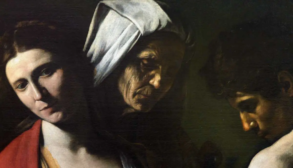
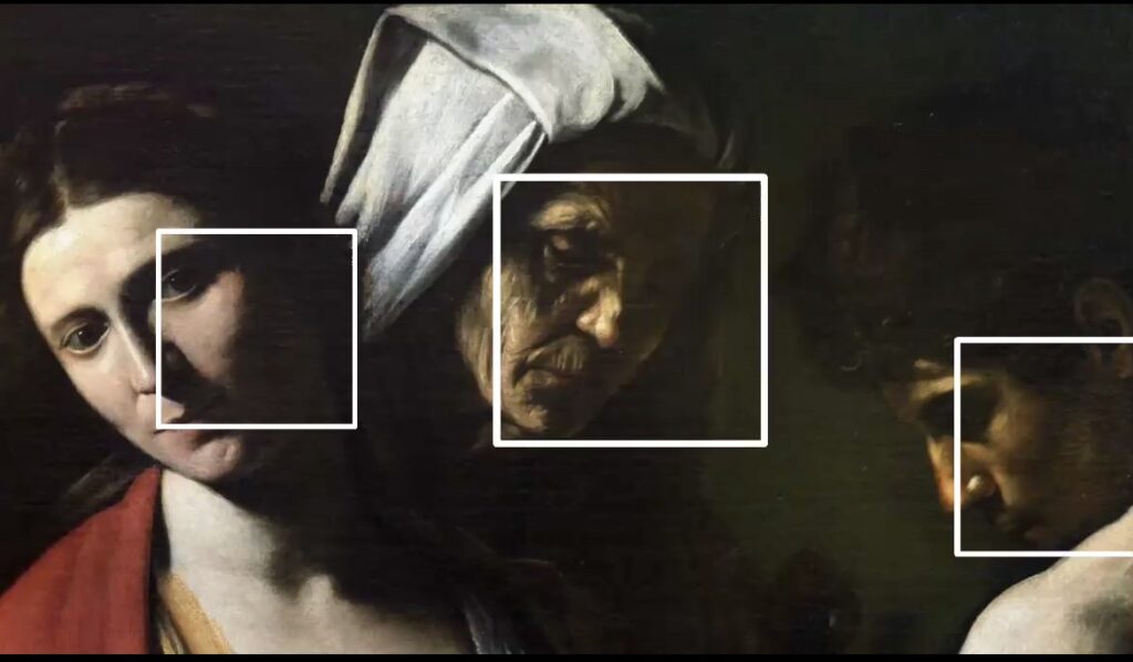
Da Vinci quickly discovered that he could create depth through slow gradations of light and shadow. He then decided to use this in his paintings, this is demonstrated in the painting below. The parts of the painting in the squares are the particular areas that highlight the chiaroscuro lighting technique and how Leonardo Da Vinci used it in his paintings.
Examples of Chiaroscuro Cinematography
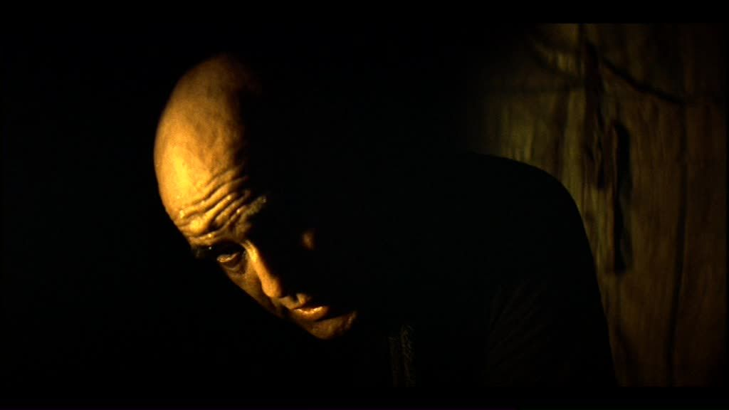
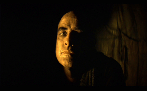
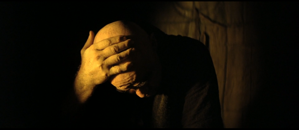
These images I have collected from a movie I have researched called ‘Apocalypse Now’ I chose this movie because I have seen the amazing cinematography throughout. Here are some images that represent the elements of chiaroscuro lighting in this film.
These photos are a perfect example of low-key lighting in cinema. During the ‘Willard’s scenes’ it shows the characters face is darkness apart from a small yellow back light, which lights up the image from behind with only the left half being illuminated. This element of chiaroscuro is shown by some parts of the face being shaded, some slightly exposed to light and some completely exposed to light. The creator made a challenging lighting scenario, however it has positively impacted the images as they create a sense of mystery melancholy and sinister impression . This has inspired me with my photography using the chiaroscuro technique.
My Chiaroscuro Photography
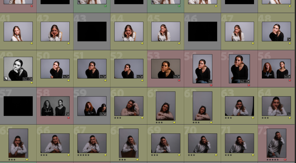
This is a virtual gallery of all the photos I have taken during my photoshoots. I labelled these photos with multiple different colours. I labelled my Rembrandt lighting photos red, my chiaroscuro lighting images green and my butterfly lighting photos in blue. I also then labelled some photos in yellow, this was for photos that include none or multiple of these lighting techniques. This is an easy and simple way to identify images and separate them into different categories. I then categorized them further with stars. This helps me to further categorise my photos and easily pick my highest quality photos. I categorised these by having my best images at 5 stars ‘*****’ and my least favourite, low quality images at 1 star ‘*’.
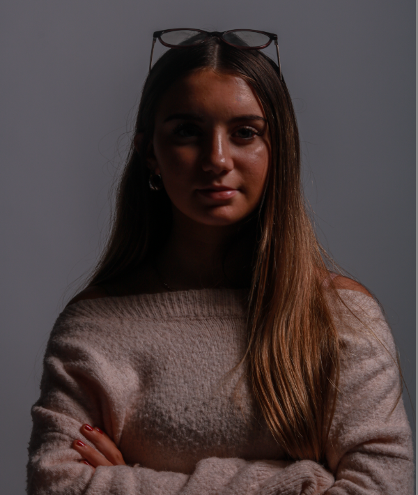
I think this photo is a perfect powerful stance for my model. It is a beautiful 1/4 body shot which demonstrates power through her pose and the chiaroscuro lighting.

I then took these chiaroscuro inspired images and edited them into black and white, this black and white effect has added an extra element of wonder and dramatic impressions. I think the lack of colour has brought out more contrast and has given them more cohesion to the overall look of my images.
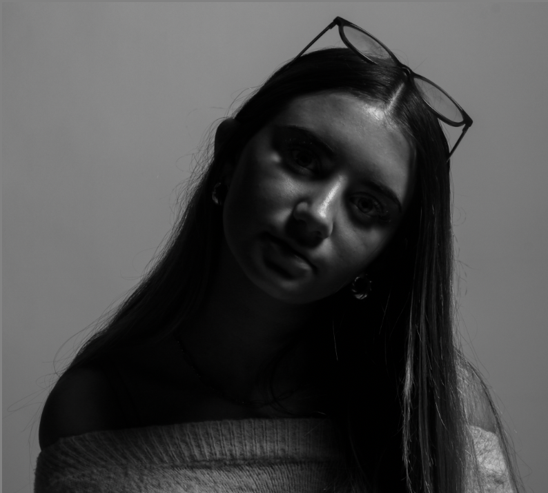
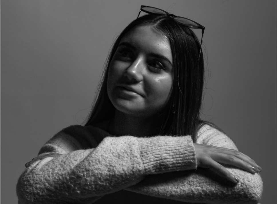
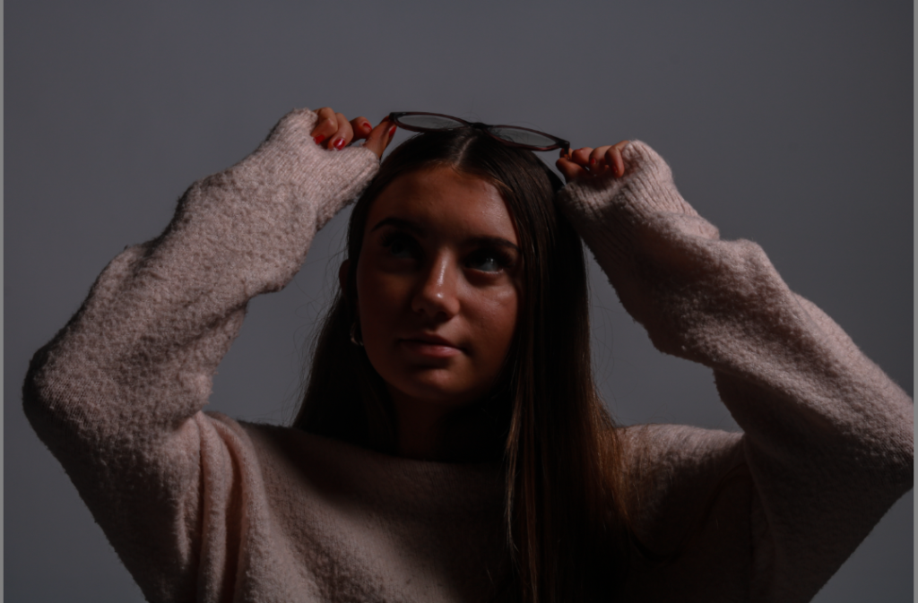
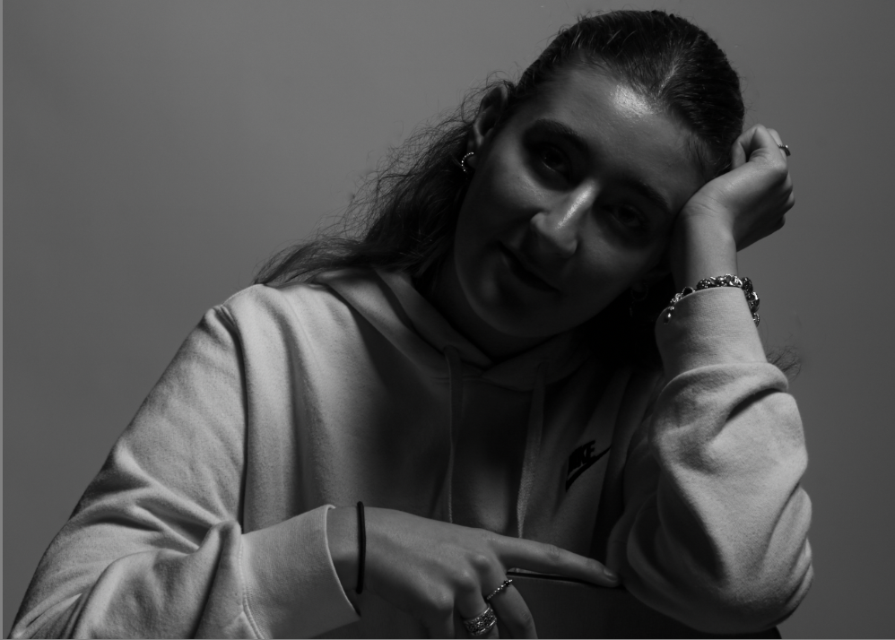
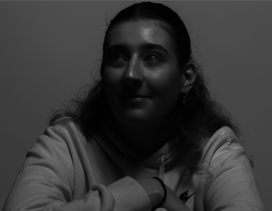
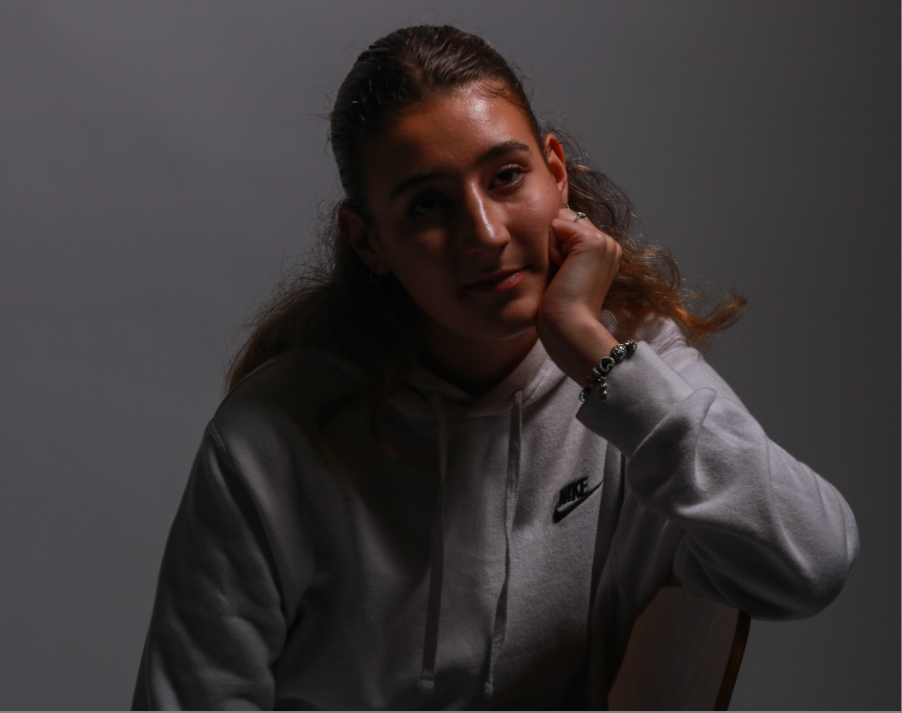

These photos I think perfectly demonstrate chiaroscuro lighting, the way some parts of her face are shaded and some are exposed shows this interesting and mysterious impression about my photos. I think that the lighting technique of chiaroscuro is definitely a great method in accentuating form throughout my photography and editing. Chiaroscuro lighting also will help draw viewers’ eyes to things they might not focus on otherwise in my photos.

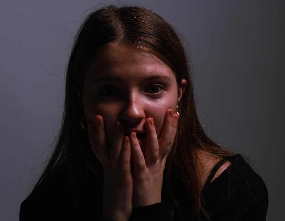
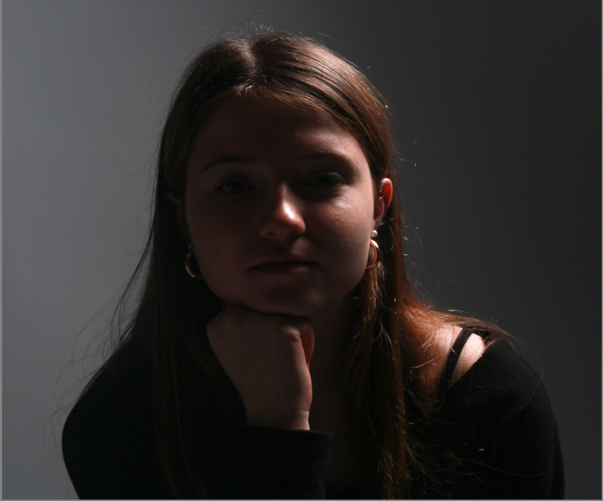
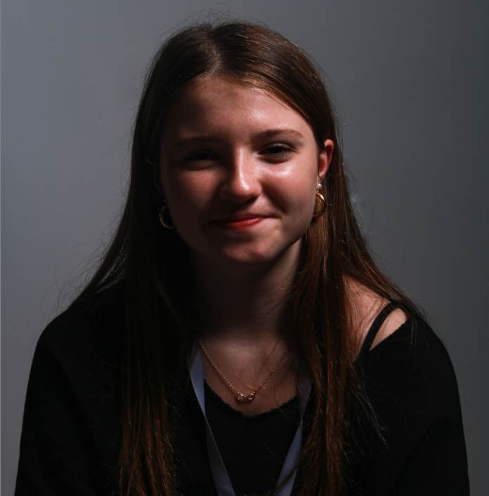
I think in order to take my work to the next level when it comes to Chiaroscuro, Rembrandt and Butterfly, I should use a reflector, this includes another person helping and holding a reflector that looks like this..
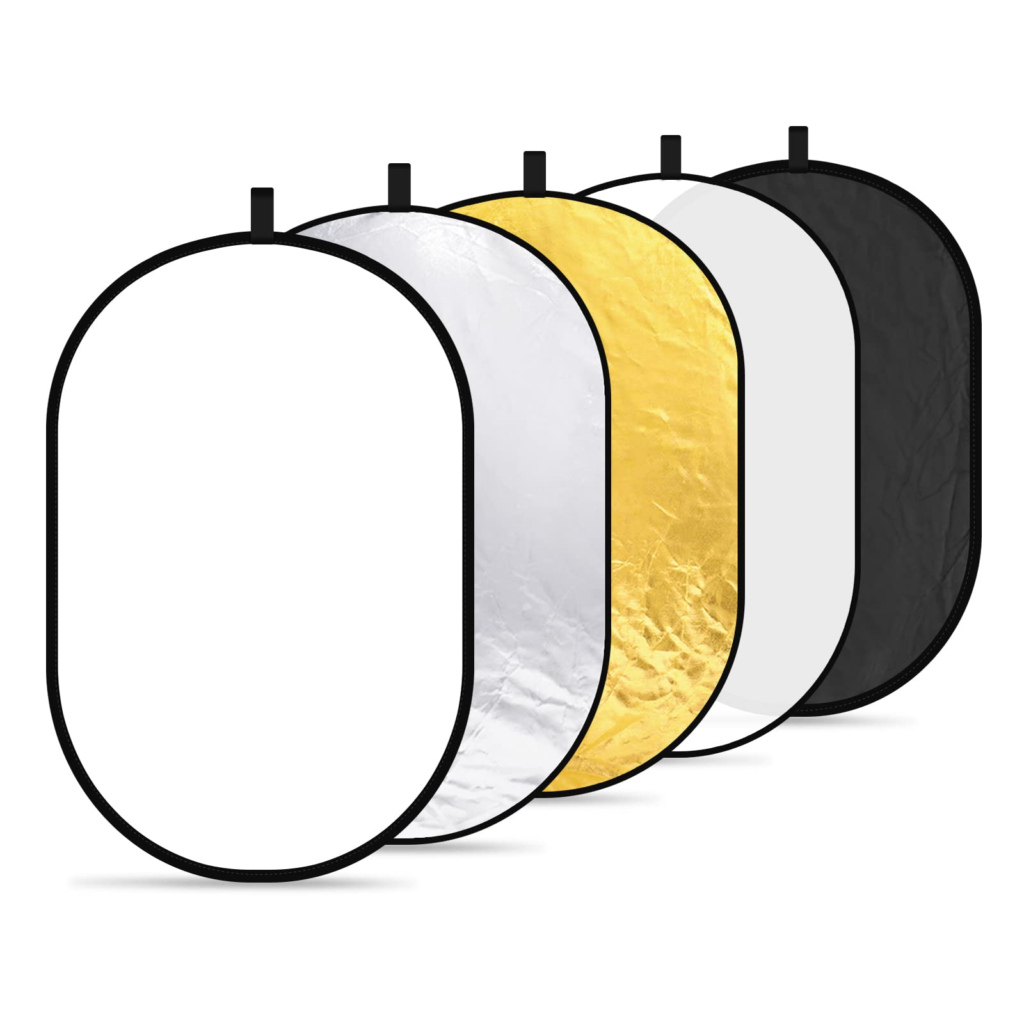
These photography tools called ‘reflectors’ help to redirect light onto my model, I must remember that it does not It doesn’t create any light but it will move and redirect light that is created by a flash head create fill light and lessen shadows.

All the blogposts that you have produced from three main lighting techniques: Rembrandt, Butterfly and Chiaroscuro are excellent with a clear process demonstrating your knowledge and understanding and some great creative responses in in the studio. Well done!
The only thing I would suggest, is that you take a little more care in lighting the eyes/ faces of your models in the studio using a reflector. Also make finer adjustments in Lightroom, by selecting eye/ face using adjustment brush and adjust separately from the rest of the image.
Finally, always make sure you produce different versions of your best examples/ portraits adjusting both in colour and B/W, maybe also try out other monochrome image adjustments, such as sepia tone and blue tone in Lightroom
Keep going >