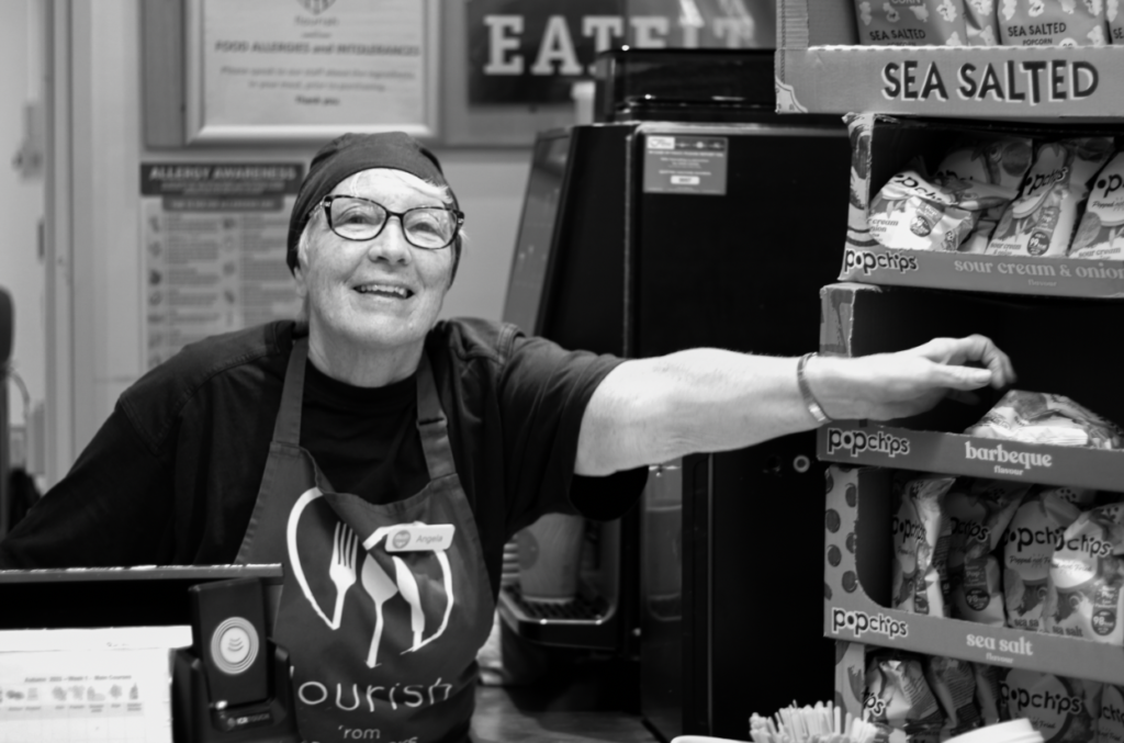
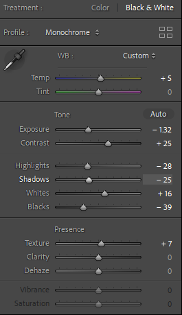
Within this photo, I personally like it as it has a successful background to make environmental portraits by the outfit and props behind her to make her significantly blend in with the background. I did some experimenting and increased the temp however kept the tint the same. The original photo on exposure was too high so I decreased the exposure until it had the correct amount. I then continued to decrease highlights as if I decreased my shadows next it would significantly deepen the depth of shadows which shown successful, however this image originally has natural lighting whereas forced lighting in a certain area would emphasise these shadows. Lastly, I put it in black and white to create an effect of vintage and nostalgia and the original image was too colourful in my opinion.
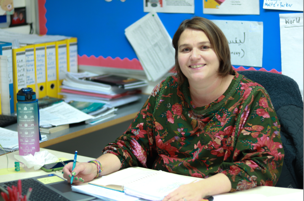
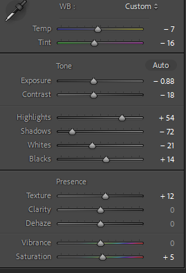
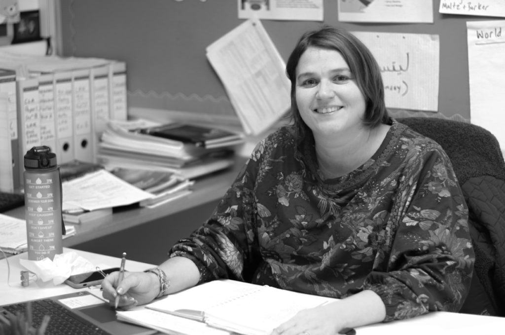
Firstly, I edited the colour one to create a warmer temperature and lowered the exposure ever so slightly so the image wasn’t as exposed and bright. Decreased the shadows to deepen them but contrasted it with increased the highlights to make it not too dark. I then put it in black and white to see if I liked the possibility of it being in that colour however I definitely preferred it in colour as the image itself and surroundings are very bright and colourful and I think that adds to the image and ultimately creates environmental portrait so the viewer has more of an understanding of the environment behind her.
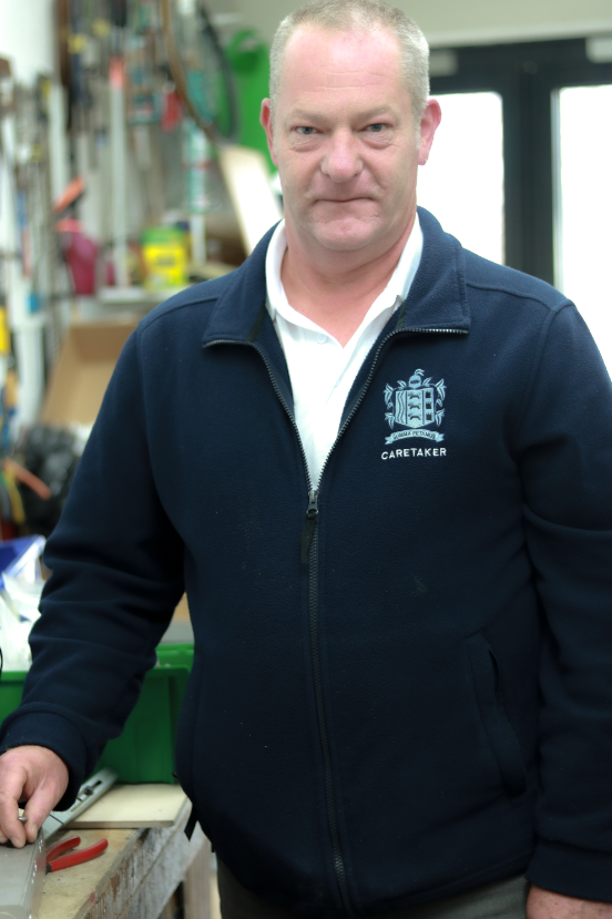
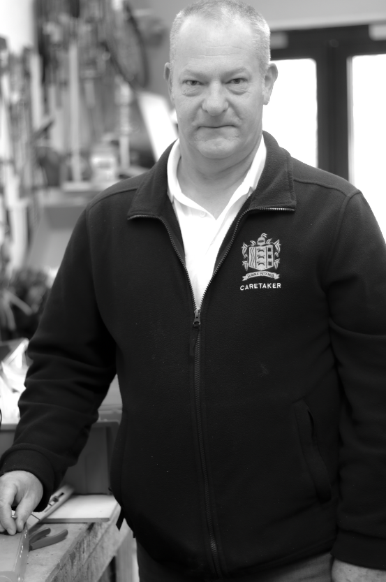
Personally, I couldn’t decide which one I preferred as I think the colourful image is more eye-catching however the black and white reduces all the tones especially the green tone but the colourful image does help the viewer see the props and background to actually understand what environment relates to him as a person.

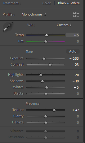
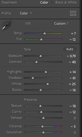
I definitely prefer this image in black and white as he gives off old energy which links to the nostalgic theme and black and white significantly adds a vintage vibe. I decreased the exposure to make it less bright and exposed and contrasted it with increasing the contrast so the image had more definition and decreased the shadows too deepen them as its in black and white and finalised it by adding some texture so the image had more definition and looked more realistic.

I flagged and made my images green to make it easier for me to quickly reach my best images in my environmental portrait collection and therefore be able to see what to do next to improve or do the same for my next project to be able to be more successful.
