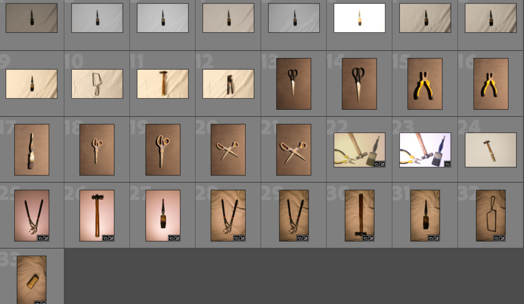
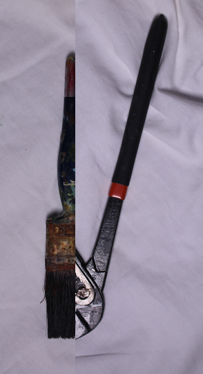
For this photoshoot I tried a few different techniques, for example I used plain backgrounds, textured backgrounds (using a cloth or cardboard), different exposure levels and lighting. However, all these photos where taken using a top down camera setup. I used common basic tools without context behind them because the photos are meant to show only the object, which are designed for functionality, not for form. The concept of ‘form follows function’ can make the object beautiful in a sense as they ae not trying to be anything else. This is why Walker Evans kept the photos very basic just like the tools he was taking photos of.
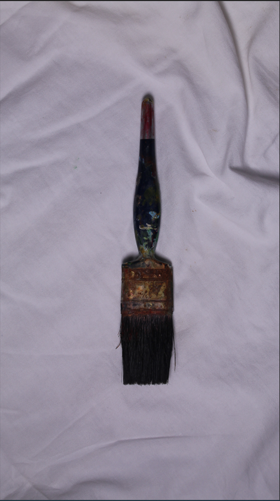
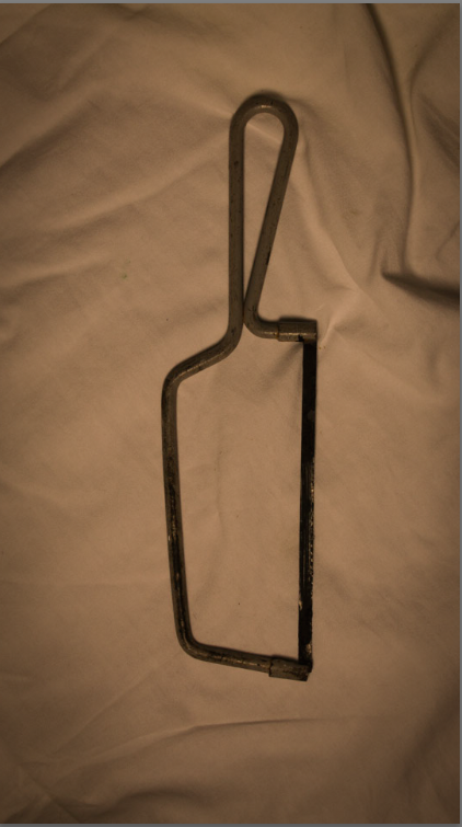
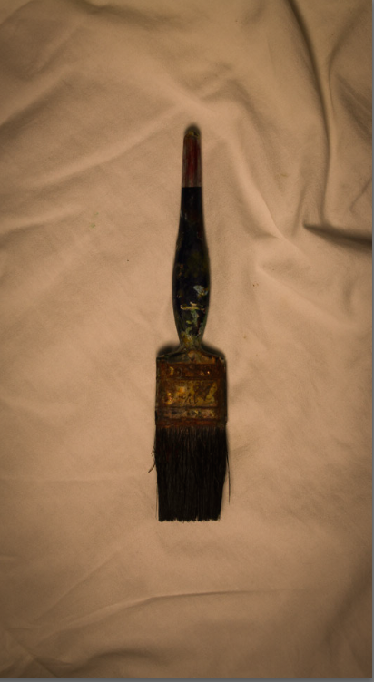

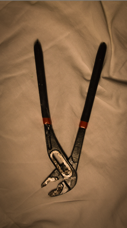
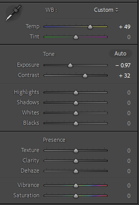
Here, 4 images of common tools are laid out over a sheet (the top image is unedited). The camera settings where all the same (f/10, exposure time 1/40, iso-100). I used a low iso so the images will be more crisp. For the editing process, I created a present and used that for all the images:
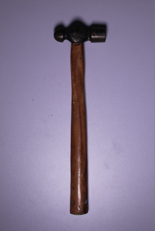
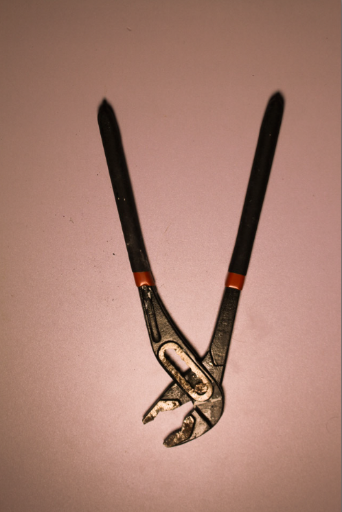
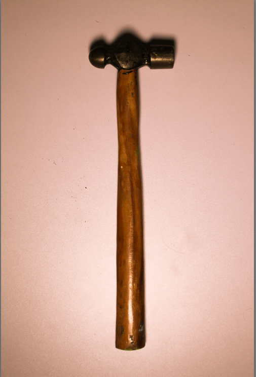
These where taken using the same setup just with a different background. The editing was using the same present as the ones above. The top images is unedited and has a purple hue due to the lighting used. I prefer more yellow and orange hues for images trying to show a nostalgic effect so I just bumped up the temperature.
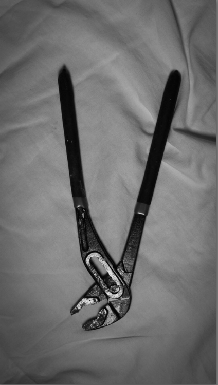
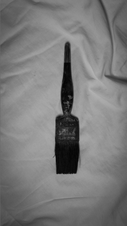
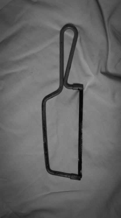
Here are some of the images from the photoshoot in B/W. Walker Evans took his photos in B/W because it was still normal to have B/W photos. B/W photos also means that colour will not almost distract the image for what it is, making it seem raw and pure. It also amplifies negative space (parts of image without subject), giving a more dramatic image.
 )
)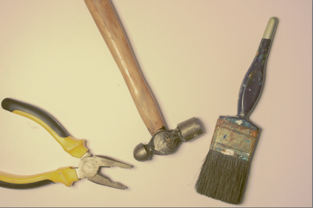
Here is an image of multiple tools placed randomly, for the editing:
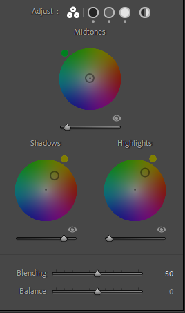
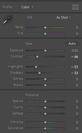

Good start. Try to consider the lighting and exposure of your photos. Could you use the overhead set-up in the studio to achieve better lighting? Can you edit any of your greyscale images to have better exposure / brightness / contrast?