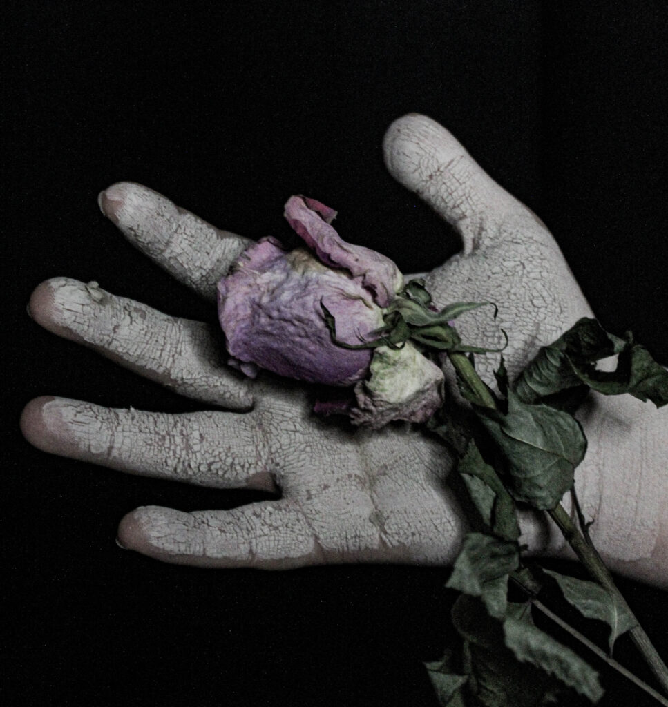
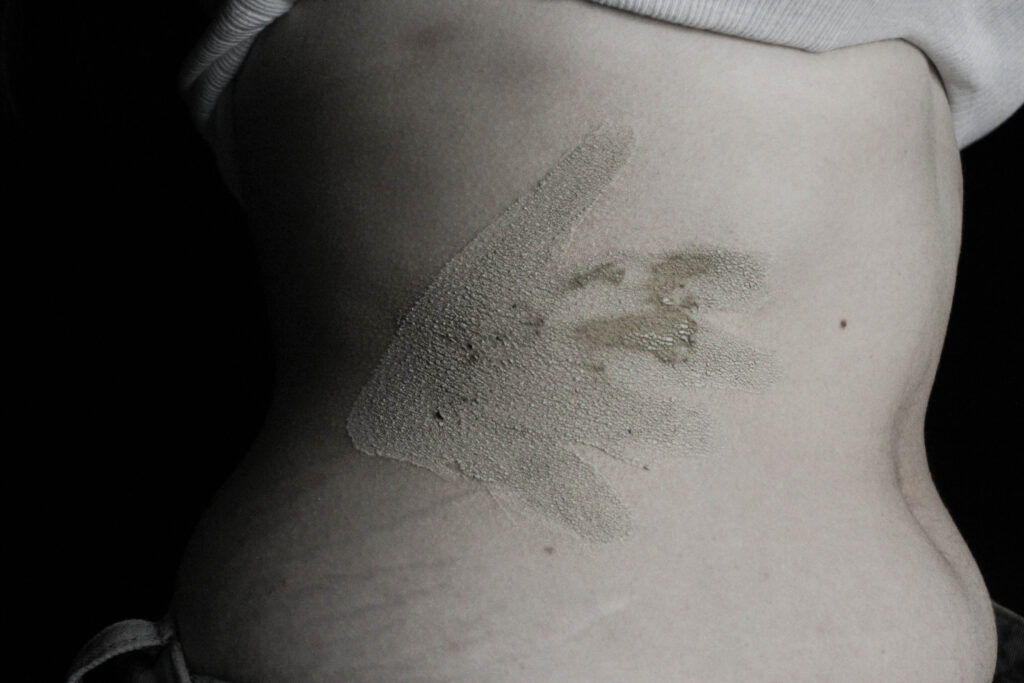
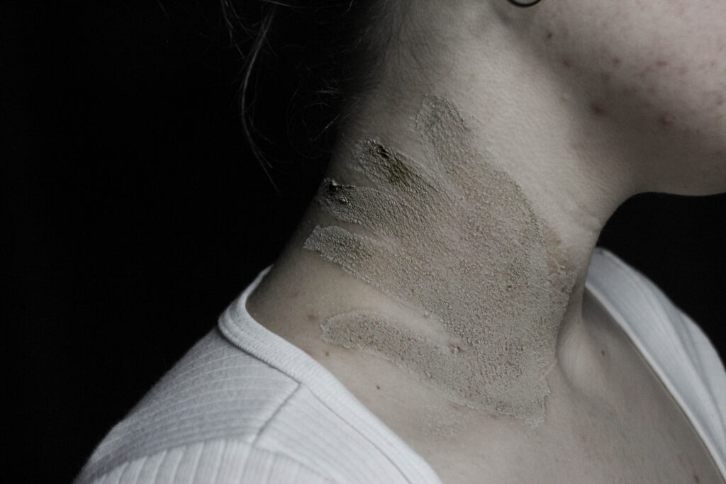
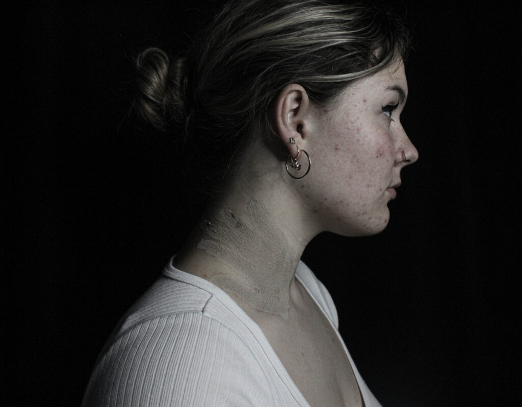
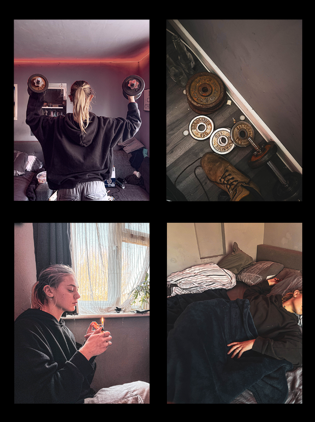
For this photoshoot I wanted to focus specifically on sexual assault and harassment. I did this through creating handprints on the model. This was actually inspired by a movement originating in 2020 where sexual assault victims would paint a red handprint on their body where they were touched without consent and share their story/experience as a part of the hashtag ‘DenimDay’.
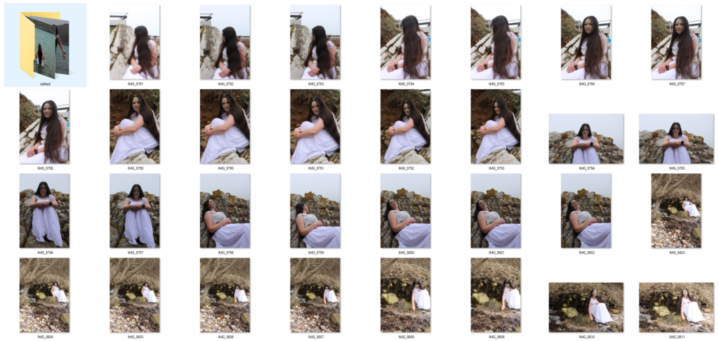
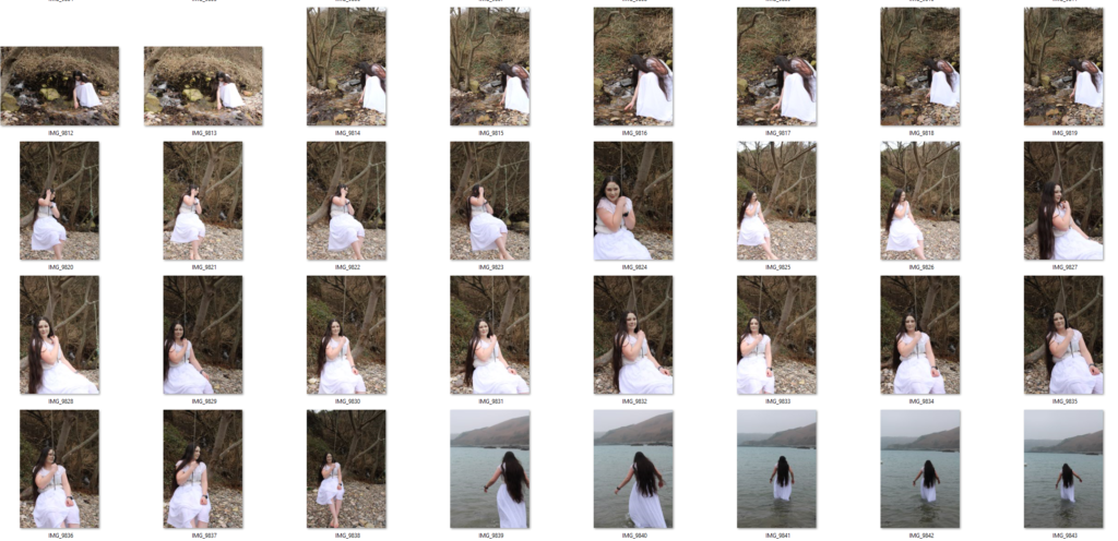
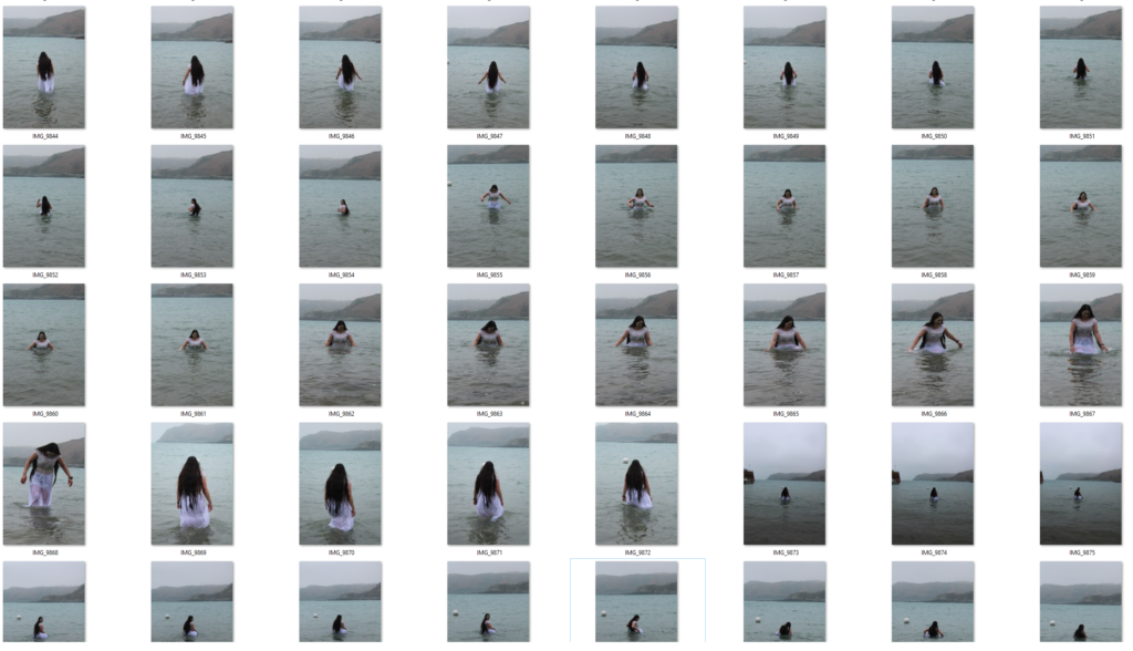
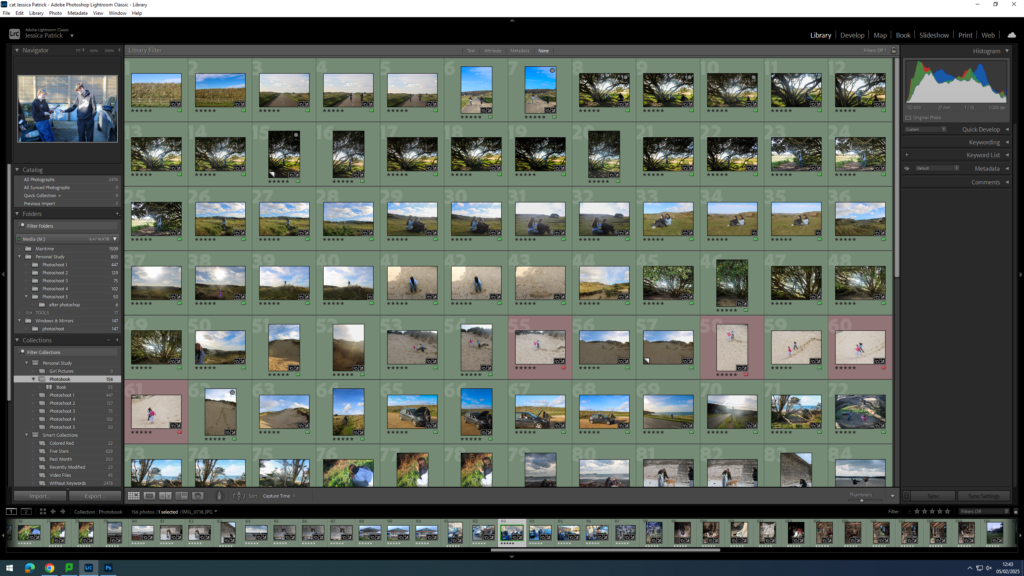
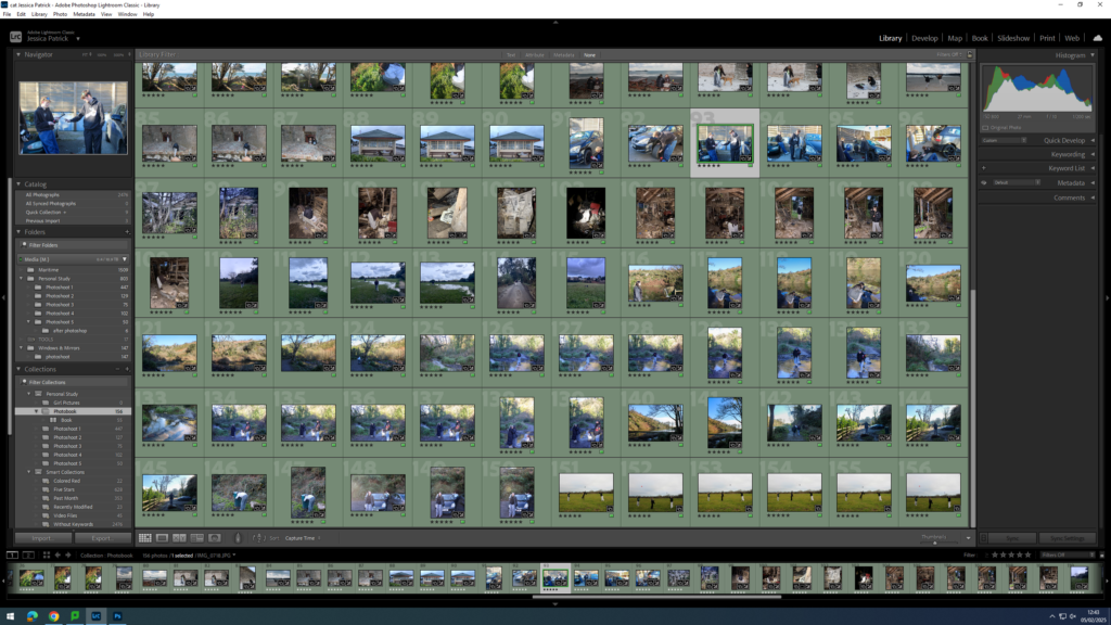
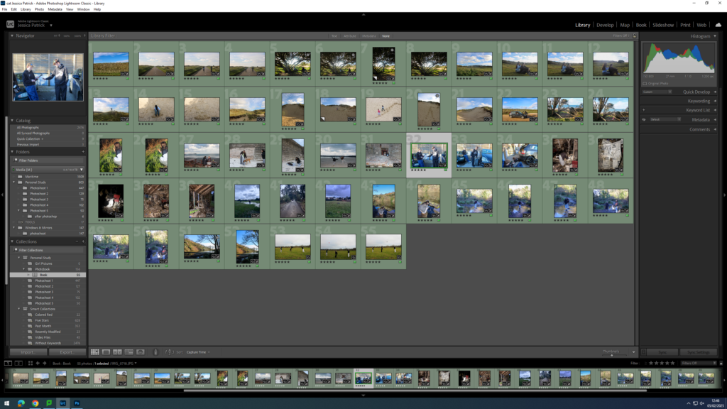
Contact Sheet
Editing
When editing something I wanted to focus on and emphasise was the darkness of the photos. I knew I wanted to place these images towards to back of my book which is where the more dramatically lit and intense photos would be found. This meant that I had to increase contrast, blacks and shadows in the photo however by just doing that it lost a lot of the details so I then increased the high and highlands to help make sharper lines.
Final Images
Evaluation
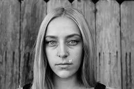
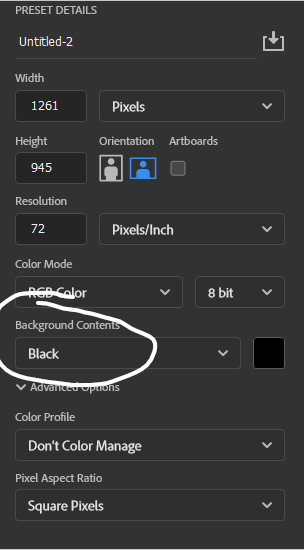
I’m extremely pleased with how this photoshoot came out. From a technical point of view potentially they could have been better by increasing the exposure in order to brighten up the picture. However, by doing that I felt it lost part of the intensity of the photo. The picture of the hand with the aged rose I think is my favorite from this shoot I used the rose to try and symbolise how objectification doesn’t only affect you internally but can start to manifest and affect other aspects of your life in the way you see things or interact with things.
The theme for the final exam in photography is ‘Union’..
What is the simple definition of union?
1. : an act or instance of uniting or joining two or more things into one. especially : the formation of a single political unit from two or more separate and individual units.
I am going to start my project based around feminism and girlhood.
What do the terms mean by feminism and girlhood?
Feminism in Photography focuses on challenging gender stereotypes and how women are portrayed.
It includes:
Reclaiming the female gaze, where women are shown from their own perspective, not just as objects for male viewers/pleasure.
Challenging gender roles and depicting women in complex ways rather than just sexually.
Body politics, exploring themes like body image and how we are depicted compared to men.
Famous feminist photographers’; Cindy Sherman, who focuses on issues like identity and self-representation.
Girlhood refers to the period of a girl’s life, focusing on her experiences, development, and social identity as she grows up. It’s not just about biological growth but also the social expectations, challenges, and roles associated with being a girl in society.
The term often explores themes like:
Social conditioning, where societal norms influence how girls are expected to behave, look, and interact.
Gender identity, examining how girls develop their understanding of themselves and their place in the world.
What’s the history behind this concept?
Historically, girlhood was defined by unspoken societal roles, with girls primarily prepared for domestic life as wives and mothers, often with limited education (cooking and cleaning for their husbands and kids, stay at home mums). In the late 19th and early 20th centuries, feminism and the women’s rights movement began challenging these traditional views, advocating for girls’ education and opportunities outside the home, you could even start to think about the suffragists were by they were the ones who fought for women to have the right to vote, pushing back against old-school ideas about what women could and couldn’t do. They made a huge impact, and their efforts set the stage for today’s movements that focus on empowering girls and women, helping them claim their rights, get an education, and have a voice in the world. Here are some images from the suffragists protest.
Feminism is still a big fight in today’s world, with protests and social media being powerful tools for change. A good example of this is the #MeToo movement, where women can share their stories about sexual harassment or assault online. By speaking out, they not only help others who might relate but also inspire more people to come forward and raise awareness about these issues.
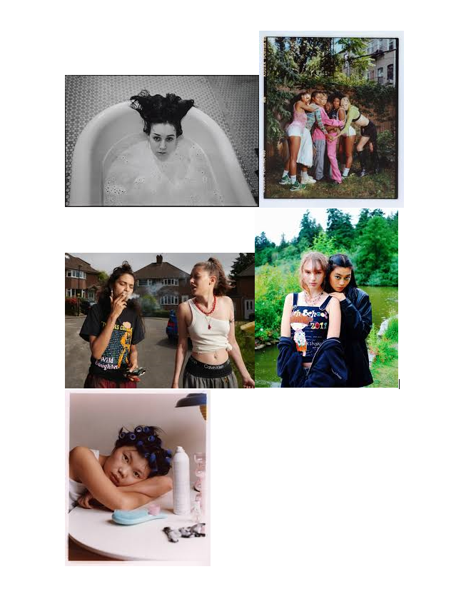
I want to create images like these..
These images all show how girls are portrayed and grown, not just by men but by women too. I want to try and challenge these ideas and try put a stop to this as it shouldn’t be seen as the norm anymore and we should be moving forward as a society. This is why I have chosen to girlhood and fermium for my union project as we can all be seen as a group/union and we all need to stick together as one.
Photoshoots
For my photoshoot plan/idea, I am going to start to have a think about these areas. bathroom/bathtub The bath feels like freedom to me, candles, bubbles and relaxing.
Les Quennevais Park: A simpler, more personal place. I imagine shots of a model sitting on a swing, walking barefoot in the grass. These moments feel real—like when we’re alone with our thoughts, reflecting on who we are.
Woods:
This gives the feel of girlhood back in the day, with there camping and swimming in lakes. I want to capture every element I can for my project
The Look & Models: I want the models to feel like themselves—natural and effortless, something that doesn’t feel too forced. I’d love to include different women of various ages, body types, and backgrounds because femininity looks different on everyone, and that’s the beauty of it.
Vibe & Feel: I want the photos to feel like a conversation—gentle but empowering, vulnerable but strong. I’d play with natural light, capturing both quiet, intimate moments and bold, freeing shots. It’s about showing the different sides of being a girl and a woman.
In the end, this project is about connection. Between women, between ourselves, and between our past and present. The locations, the models, the light—all of it should tell a story of unity, growth, and strength.
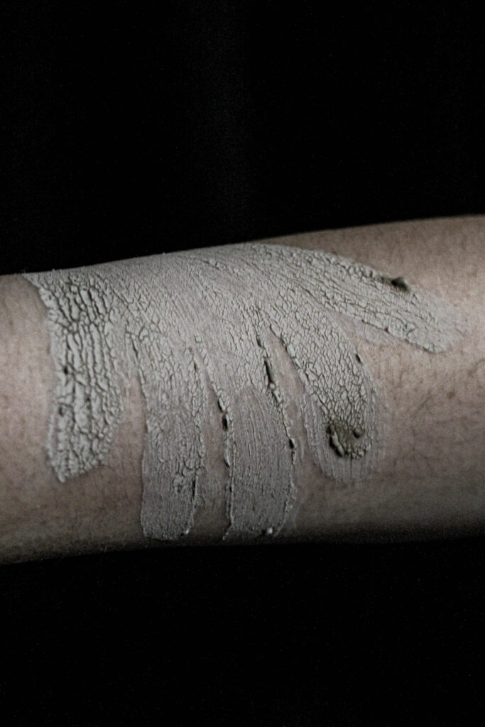
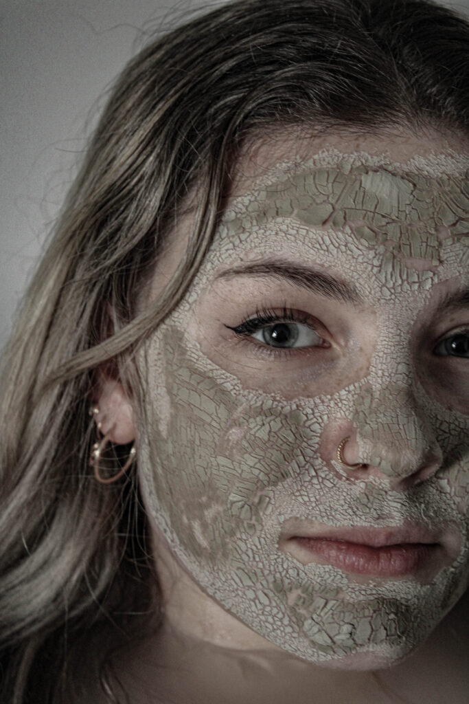
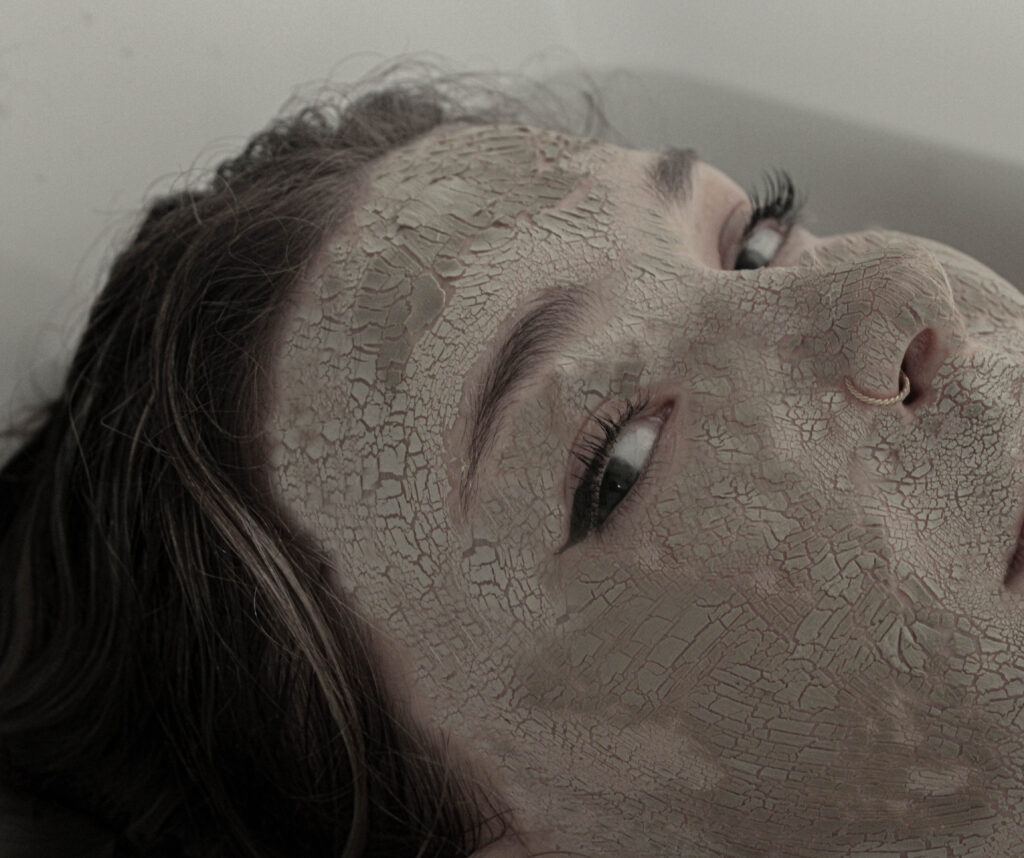
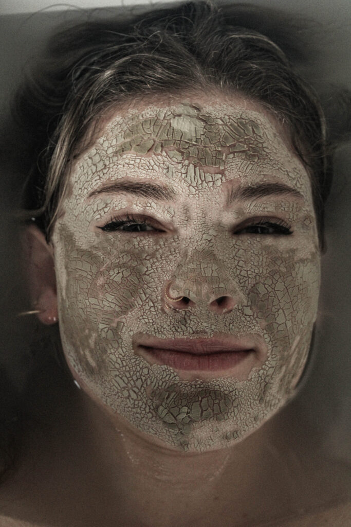
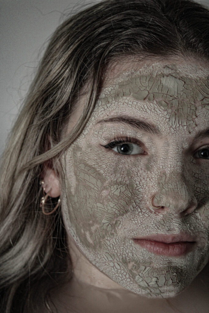
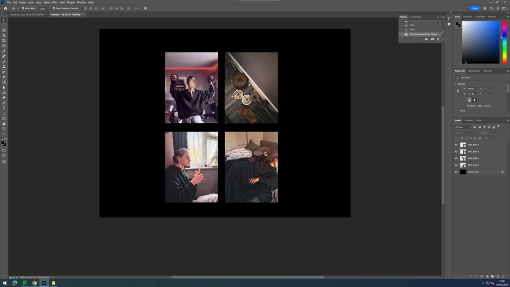
For this photoshoot, I took inspiration from milk baths. I wanted to do this because they often represent purity and tranquillity. I try to create a similar effect in all my photoshoots by having this contrasting meaning of the broken and dispirited. I will use makeup to give texture to the model’s face, and then either the clothes I put the model in or, in this case, the background suggests concepts such as purity. I like adding these calming and dreamy aspects the pictures to emphasise the damage being done.
Contact Sheet
Editing
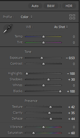
For these images when editing the one thing I do like to pay attention to and focus on would be the texture. For the concept of the story I’m trying to tell the cracking of the model’s face is a key component. Therefore, I like to make sure it’s as effective as possible. To emphaise this the key things I like to do is increase the contrast, shadows, highlights, and texture. I’ve found that increasing the shadows and highlights significantly amplifies both depth and details which is what I want.
Final Images
Evaluation
Overall, I’m not too happy with how the photo shoot came out I think I would have worked better using a bigger bathtub to have more space but I had to work with what I had access to. However, I do like the photo from the side angle where it focuses closer up to the model’s face I think it’s a little bit different compared to my other photos where they were all full face shots. I think what I could have done during the photo shoot to improve would have been to give my model more direction in terms of facial expressions and posing as I do like the photo where the model appears to be slowly submerging into the water facing straight towards to camera however I believe it would have worked much better if she had more of a deadpan facial expression.
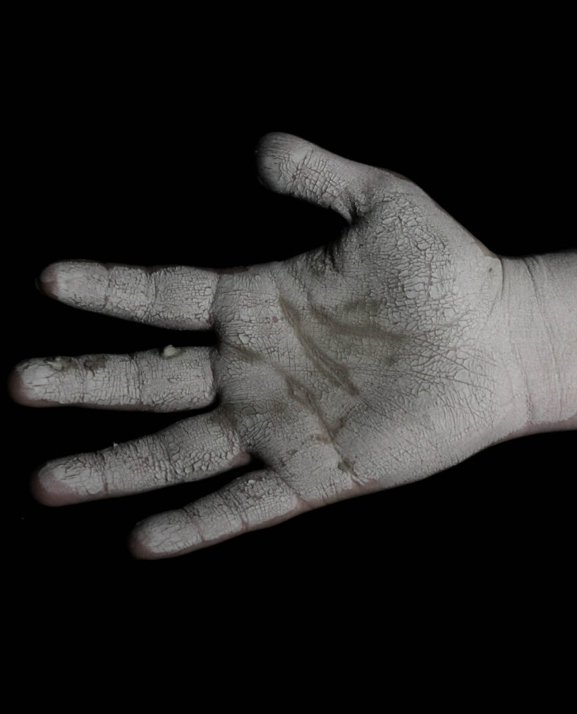
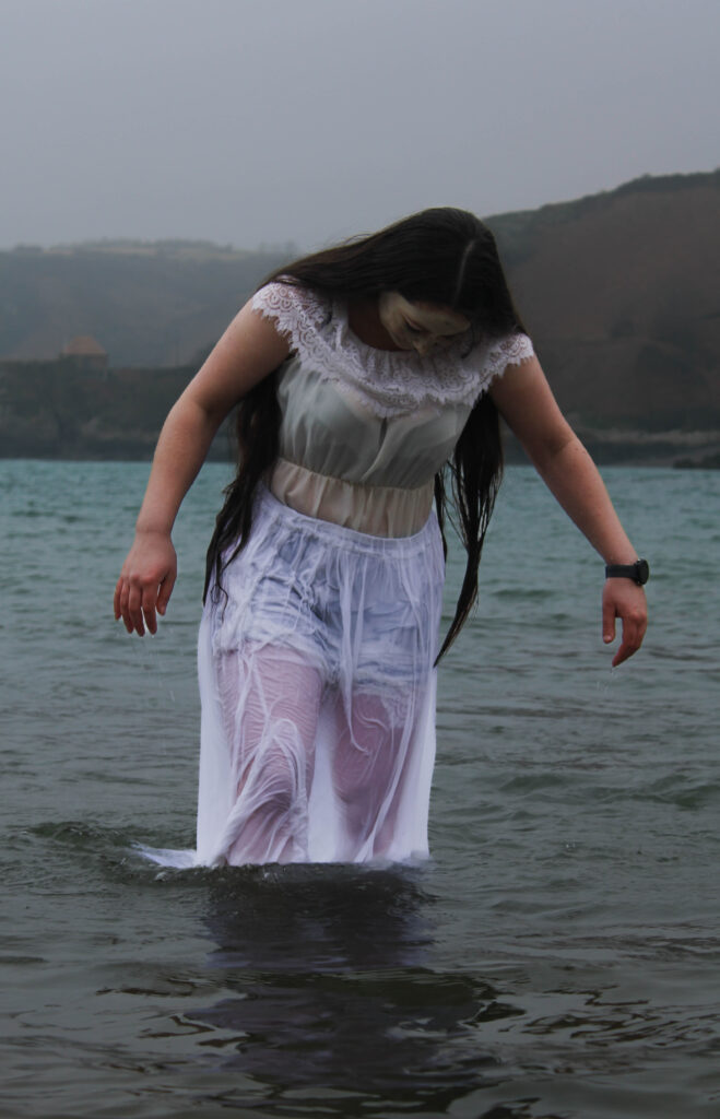
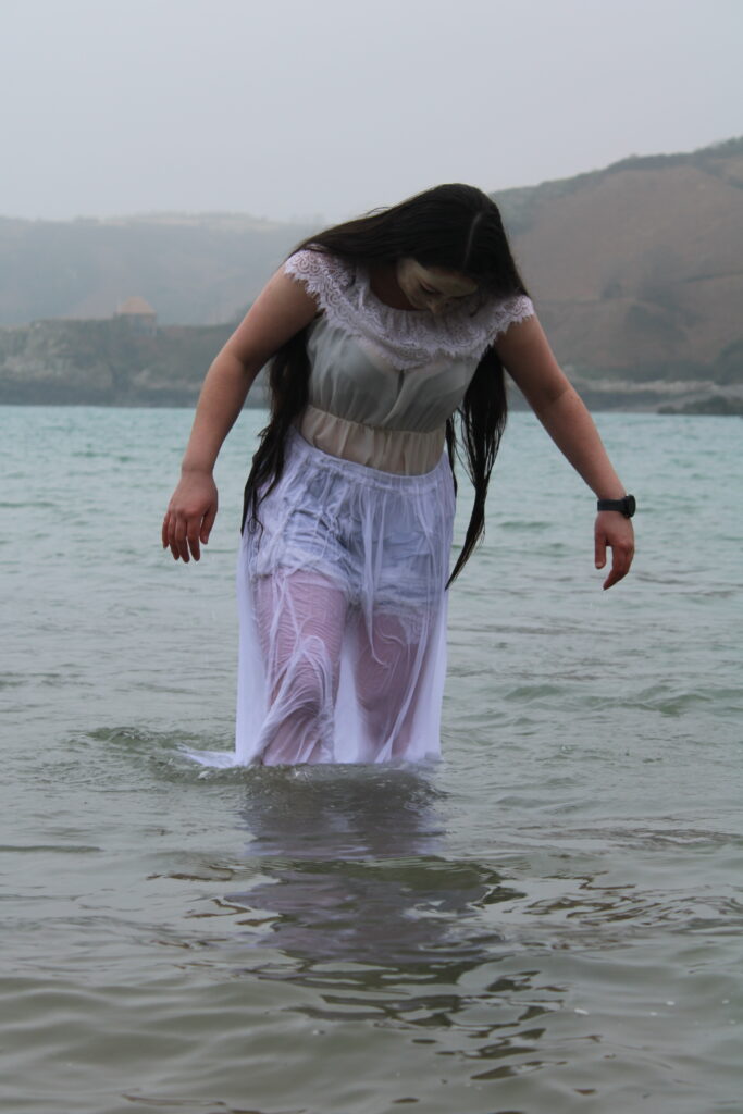
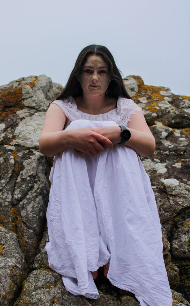
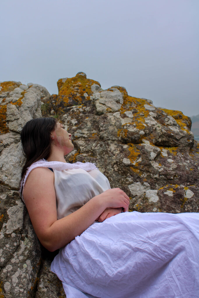
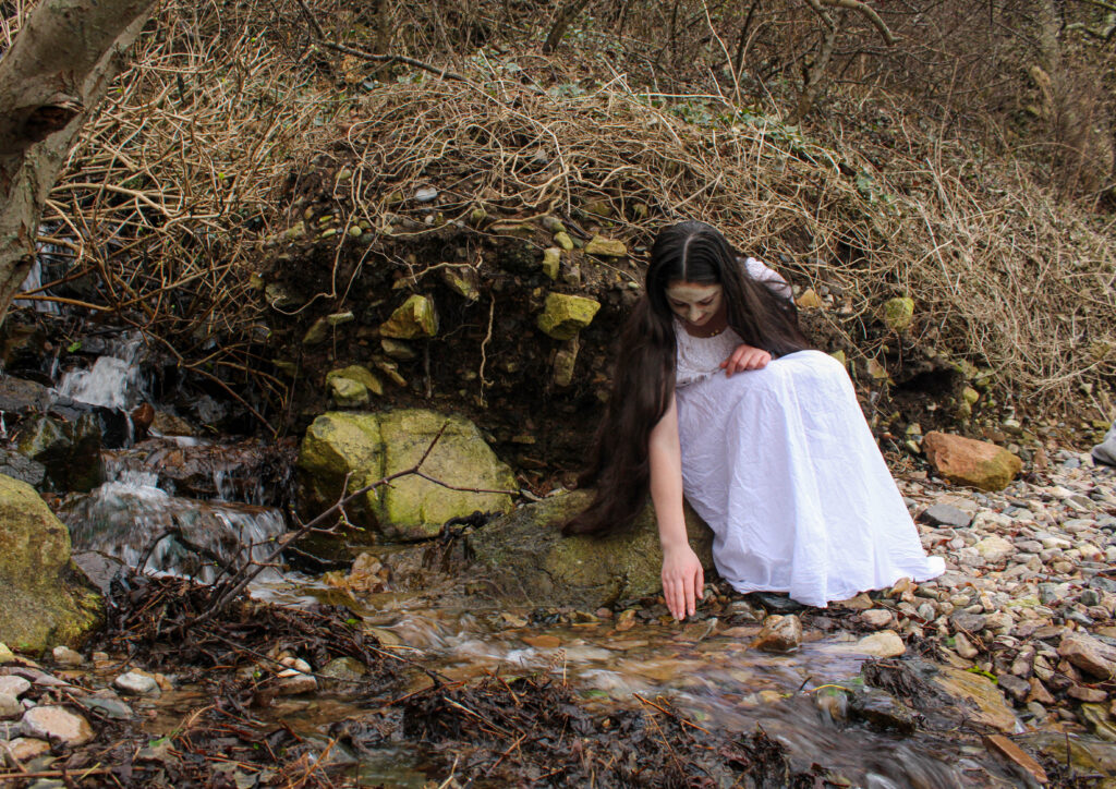
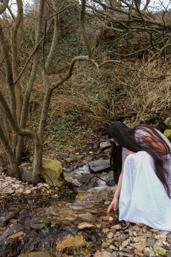
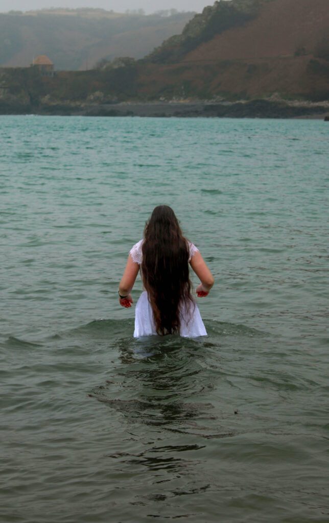
For this photoshoot I went to Bon Qui this is because this location contains many different sections within it. This means I am able to go to the woodland area, rocky area and then the sea and have everything look more cohesive as variables like lighting will be the same due to the fact the photos will be taken within a short time frame. Similarly to my other photoshoots i will be using the Aztec face mask to create the cracking effect on my models face.
Contact sheet
Editing process
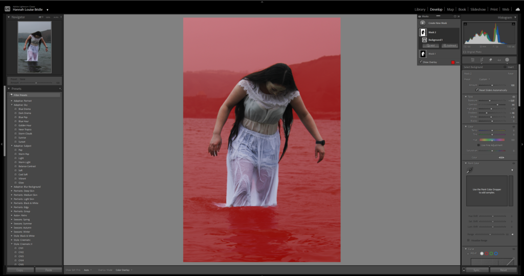
For this photoshoot I wanted to make the picture appear darker and have higher contrast levels. However when trying to achieve that it make the model appear too dark. Therefore, I used the mask tool in order to separate the model and the background so that I could darken the background without effecting her. By doing this i was able to create this eerie effect to the image.
Final images
Evaluation
Overall I’m pleased with how this photoshoot came out. I wish that I had spent a little bit more time in order to properly frame each shot in order to try and achieve more symmetry through the shoot. I think the images of the model on the rocks came out very successful what helped was the models facial expression, she appeared to have quite a serious and sombre look on her face. Similarly, the clothes that I put the model in were appropriate and did an excellent job of helping portray the message of the model representing purity and perfection. I really like the photos of the model emerging out of the water I think efficiently demonstrate the concept of someone being washed away spiritually. Additionally, the image of her walking into the water I wanted to represent her losing her self.
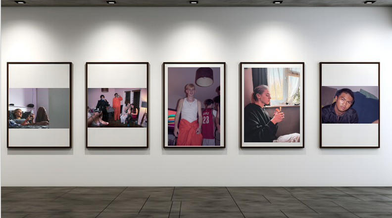
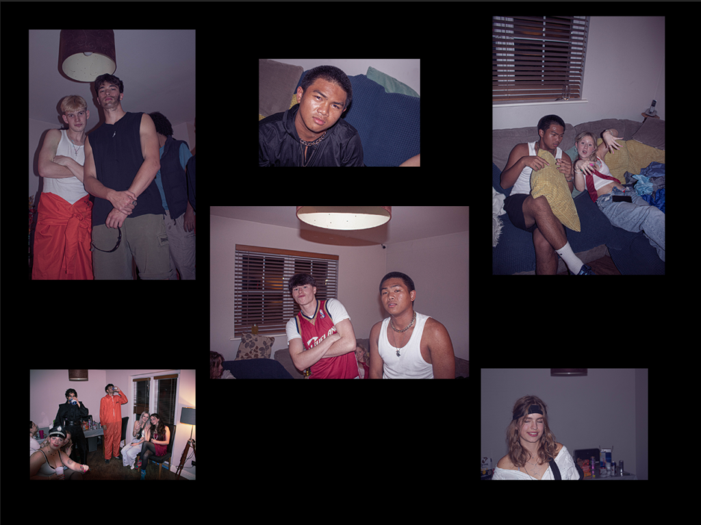
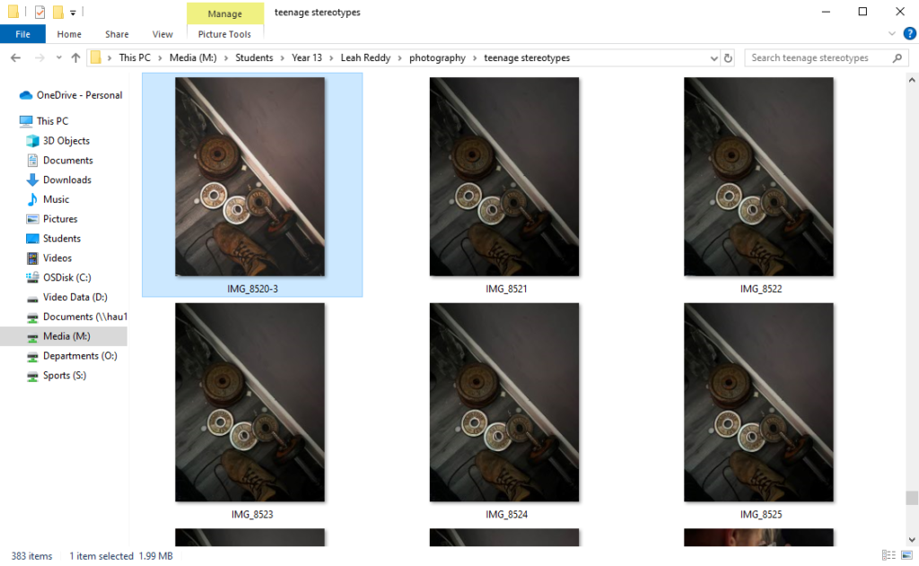
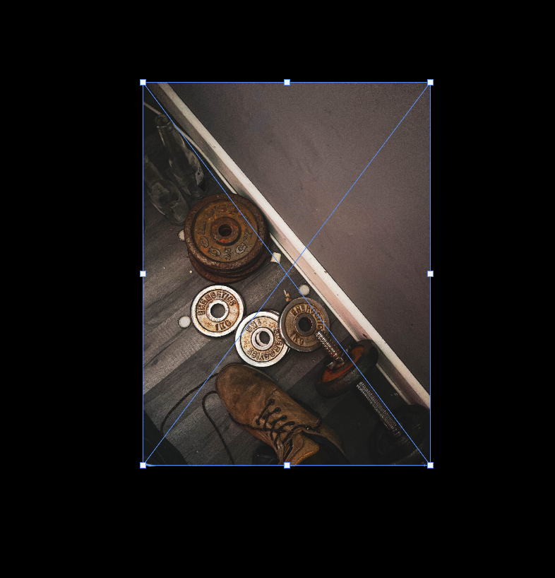
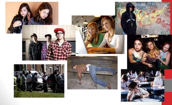
This is my virtual gallery of my teenage stereotypes photoshoot. I selected 5 of my favourite images out of the whole shoot. I picked these images as i believe they have depth and meaning to them, and you can really tell a story through the picture. I wanted to show teenage stereotypes in different light through these pictures, showing positives and negatives. I wanted to share emotion through these images as well.
A story line consisting of current teenage stereotypes.
A paragraph
A look in to teenage lives, thinking about the stereotypes made. Consists of bad habits, partying and normal life, like makeup, sleep and working out.
Design:
Consider the following
How you want your book to look and feel
I want my book too look consistent by using a sequence within my imagery, and I want it to feel shiny.
Format, size and orientation
I want a smaller square book as they are easier to handle, and will keep my pictures in tact.
Title
My title is a short description of my book, giving as much detail as I can.
Structure and architecture
My book will have a structure which goes into the personality and meaning of each photo.
Design and layout
I want to have some smaller images and some images that are full bleed to create attention and effect to my favourite more effective photos.
Editing and sequencing
I have edited my images to contain full texture with a filter over the top of all photos to create a sort of party and fun effect.
Mood Board.
Key words.
Aesthetic
To be concerned with beauty. A set of principles underlying the work of a particular artist or artistic movement.
2. The cubist aesthetic
Cubism was a revolutionary new approach to representing reality invented in around 1907–08 by artists Pablo Picasso and Georges Braque. They brought different views of subjects (usually objects or figures) together in the same picture, resulting in paintings that appear fragmented and abstracted.
3. Indexicality
Guide signs and symbols memory. In photography, indexicality refers to the direct relationship between the photographer, the photograph, and the subject. This concept emphasises that photographs are inherently linked to the physical reality they capture, serving as an imprint of the real world.
4. Formalism
Formalism describes the critical position that the most important aspect of a work of art is its form – the way it is made and its purely visual aspects – rather than its narrative content or its relationship to the visible world. Structure over content ,no emotion or context.
5. Representation
Ideas are depicted. To understand representation in photography is to understand how you are interconnected to the thing in which you photograph. It is to accept the responsibility for how you depict a particular subject. Understanding the deep impact images have in our society is the reason for teaching representation in any capacity.
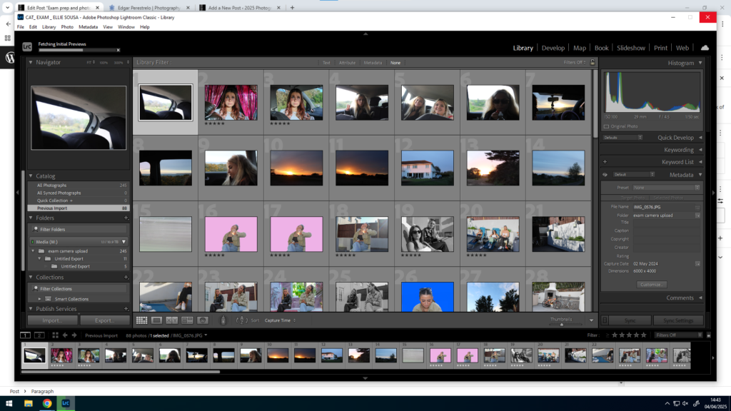
For my photobook, i made it in lightroom classic. To make this, you go to the personal study folder, then select all using ctrl A. Go back into top collections, create collection inside of personal study, in a separate folder. Click book, then create. Drag in new images and create save book. Images are at the bottom can drop and drag them in, use zoom button and favourite different templates. Use right click too add pages.
I then played around wit the sizes of the photos on the book to see what i liked. I did this until i got the layout that suited me.
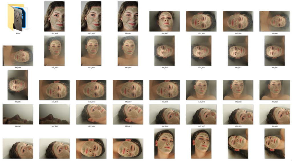
I colour coded all my images so that i could put them all in to one folder where all my best images were. All my green images were the ones i wanted to include in the book.
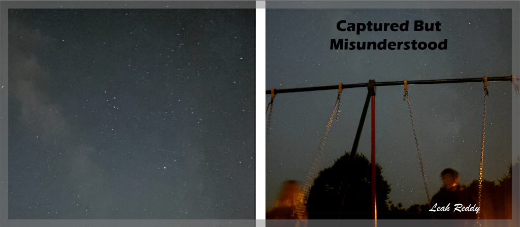
For my title. it took me a while to decide. I picked Captured and Misunderstood, as I wanted to emphasise that teenagers are NOT who they hang around with, nor what they do. I wanted to show how a lot of us are misunderstood all down to stereotypes of the wrong type of teenagers.
Evaluation.
How successful was your final outcomes (book, film, prints etc)?
I like the way my book turned out. The pictures were what i was going for and I like the way they are edited. I also really like my title as I believe it created meaning.
Did you realise your intentions?
At the start no, but as I started gathering pictures it all became clear to me.
What references did you make to artists references?
I have looked at Nick Haymes photographs, and decided I really liked his work. I tried to stick with his style of photography with a lot of texture making it look as realistic as possible.
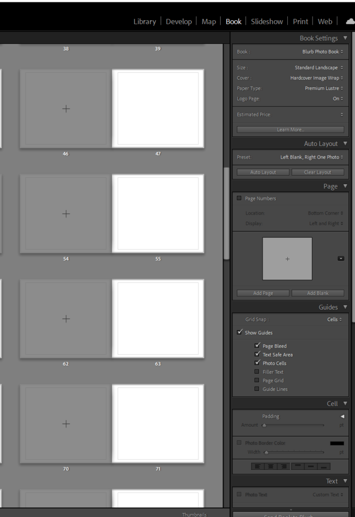
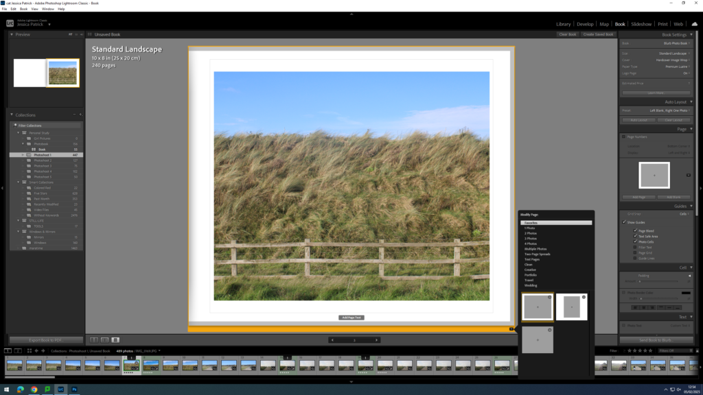
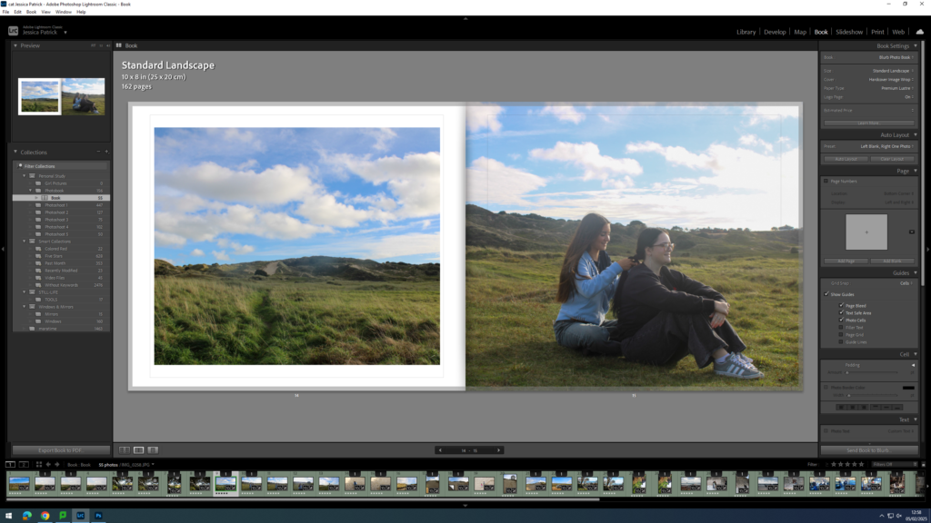
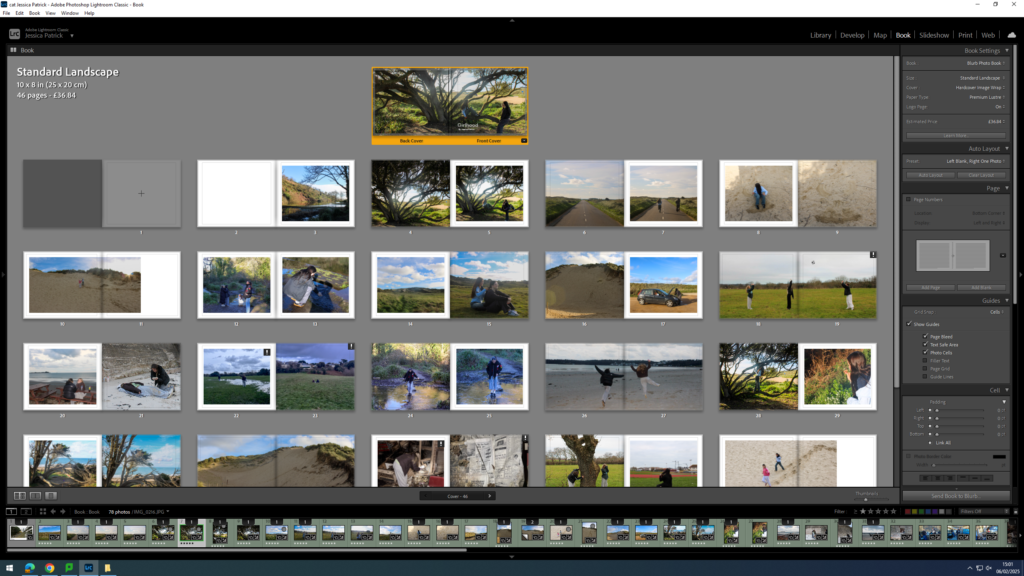
To create my photobook, I used the book mode in Lightroom Classic.
Image Selection
First, I selected all the images, which I have highlighted green and edited in all my photoshoots under this personal study and put them in a new folder called photobook, as they are my best images and the ones I have chosen to use for my book.
Next, I went through my images a removed the images which weren’t in my top 50, as I had selected over 150 images, and this would be way too many pages for my photobook, so instead I aimed for 50 pages.
Setting up my Book
Once I had my finished selection of images, I went into the book setting in Lightroom.
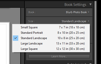
Next, I selected the size and orientation that I wanted my book to be.
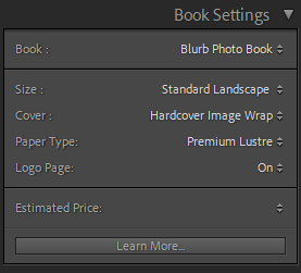
Then, I chose whether I wanted a hard cover or soft cover book, as well as choosing what paper I wanted to use for my book.
I chose a hardcover book, as I feel this would be more aesthetically pleasing for my book. I also chose glossy premium lustre for my paper, which is a glossy paper made for photographs, as I also felt this would be more aesthetically pleasing.
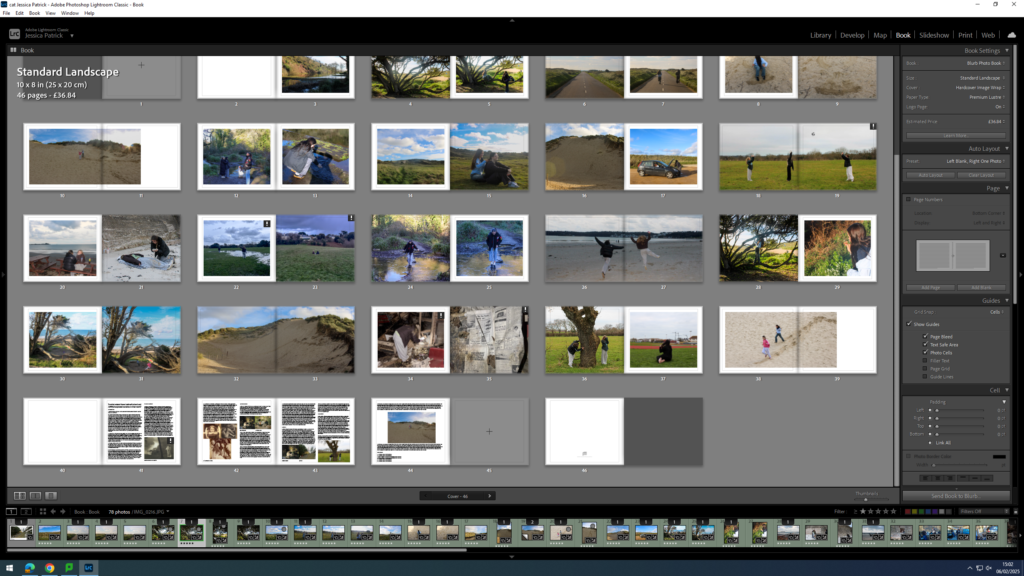
Experimentation
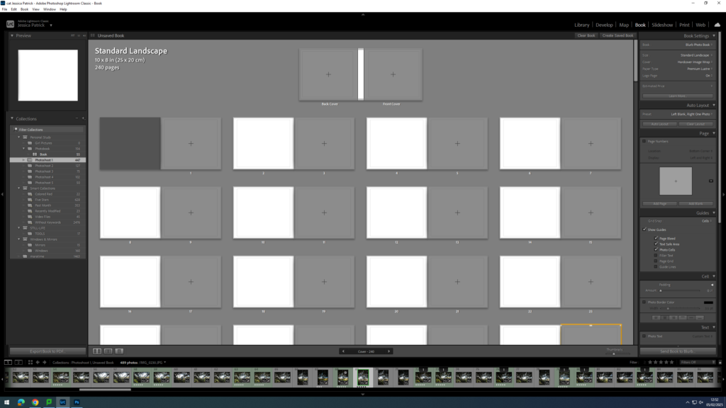
The first thing I did for my photobook, was that I deleted each photo, so that I could start with a blank slate.
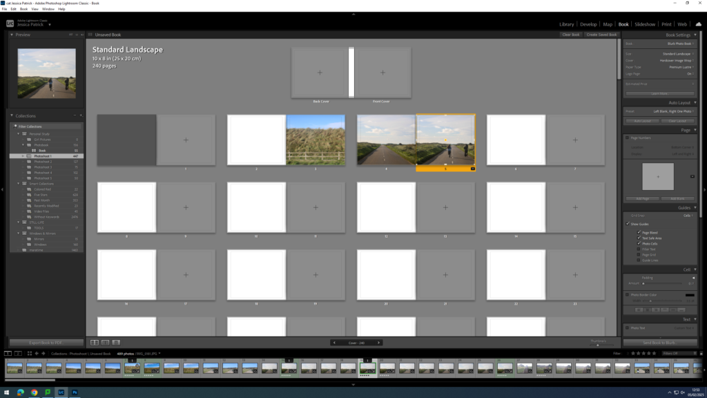
Then, I started experimenting with the layout of my images.
Next, I started experimenting with whether I would like my images to be full bleed, or not.
I also experimented with double page spreads.
I also experimented with having a three quarter page spread for a specific photo, because the main viewpoint in the image, which was the subjects, were sat in the gutter, which is not aesthetically pleasing, or what I wanted.
I also experimented with the differing the layout of some of my images and having some of my images with a similar layout.
At the back of my photobook I am also going to include my essay, which I have written based on this study.
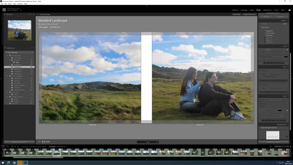
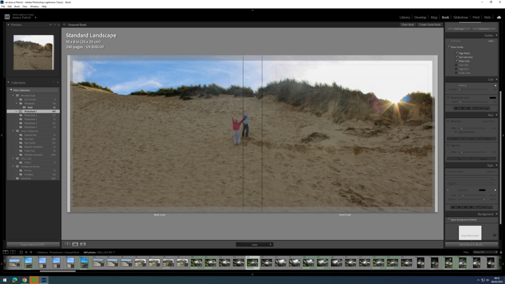
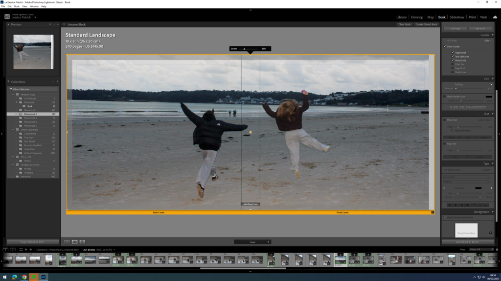
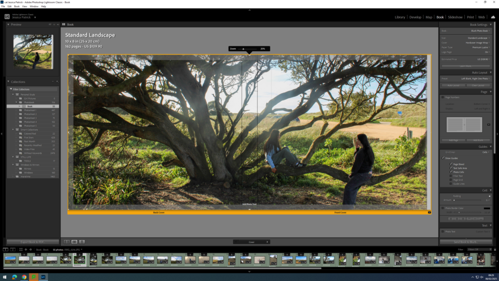
Experimenting with Front Cover, Back Cover and Title
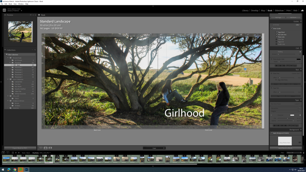
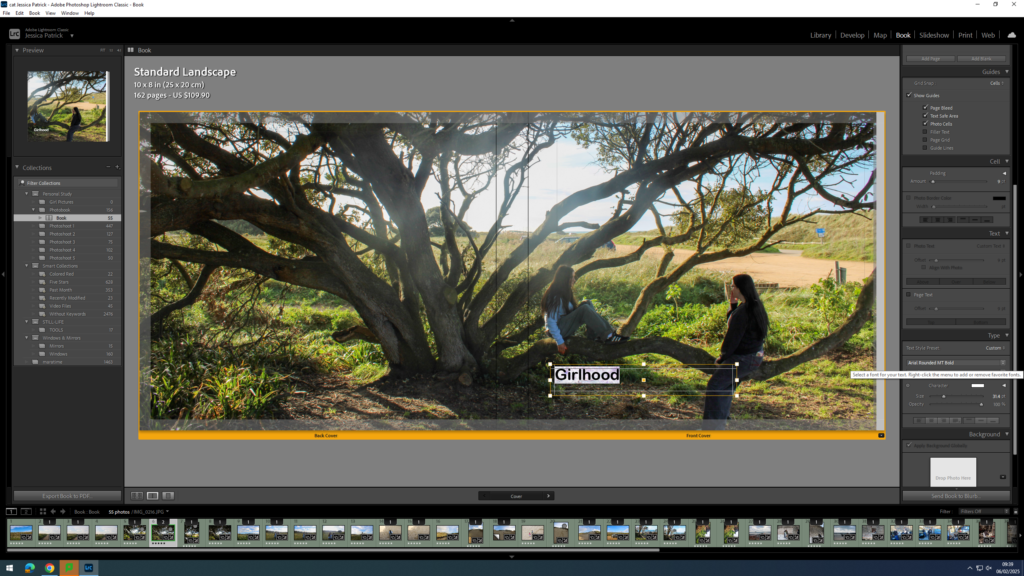
First, I experimented with having a single front cover and a different single back cover.
However, I didn’t really like this and I thought a double page spread for my front and back cover would work a lot better, so I started experimenting with the different images I could use.
I liked this image, but it didn’t work well as a double page spread, because the main viewpoint of the image is on the spine of the book.
I liked this photo as a double page spread, but thought the front cover may be too boring on it’s own.
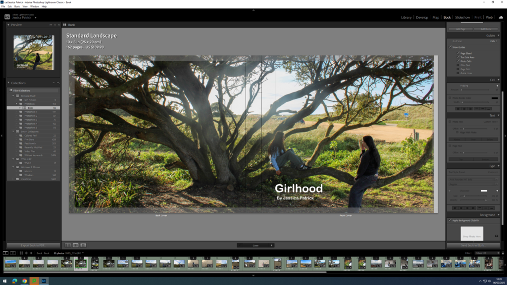
The final image above is the one I have chosen to use, because it works well as a double page spread, and the front cover of the book has the main viewpoint on it, so it isn’t so boring.
Once I was happy with the front and back cover image I could start experimenting with my title.
Some title options:
Girlhood
My Girlhood
Girl
The Girlhood
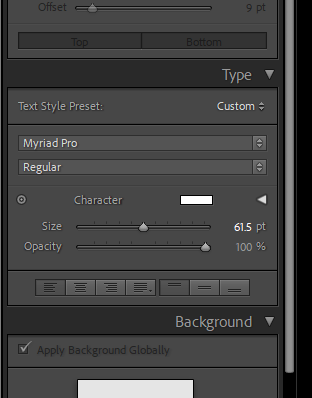
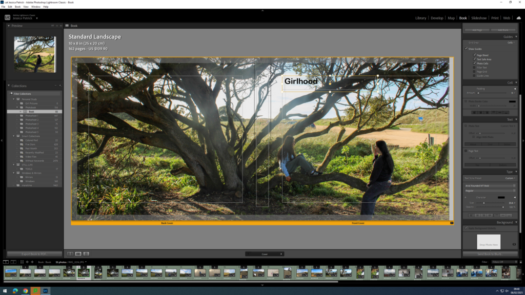
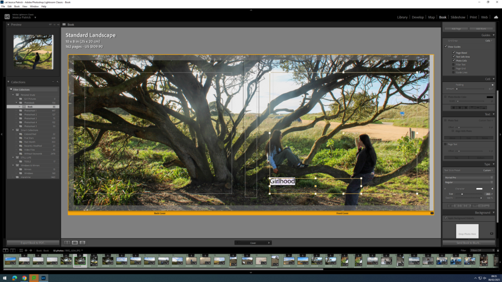
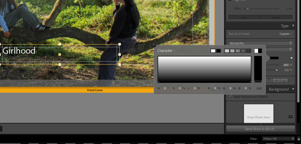
Once I had decided on Girlhood as my title I could start experimenting with the font, size and colour.
The tools were on the right hand side of the screen and the options were to change the size, opacity, colour and font.
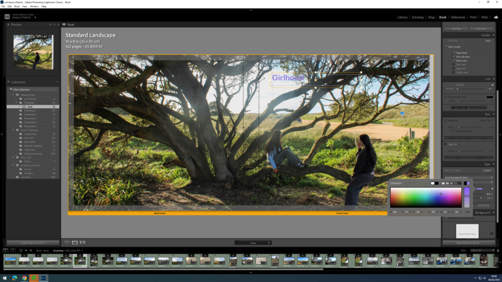
First, I experimented with the placement of my title.
Then, I experimented with the colour of my writing, because depending on my placement the writing couldn’t be seen that well. If my writing was placed at the top of the page black text was better, but if the text was at the bottom of the page the white writing was better.
Next, I started experimenting with coloured writing, but ultimately decided on white text.
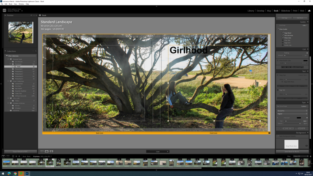
Next, I experimented with the size of the text.
Finally, I experimented with the font and decided on Ariel Rounded MT bold.
Now, I think the title and my name is too bright with the white ink, so I decided to experiment with the opacity. I set all my writing opacity to 70%.
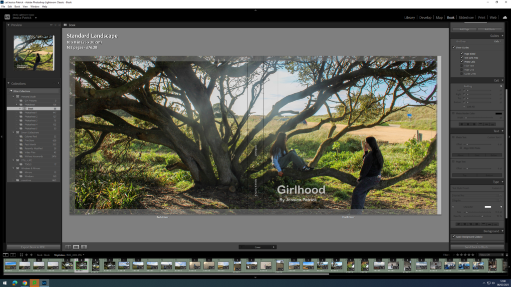
Next, I needed to add my title and name to the spine of my book.
I had to position my title and name where I did on the spine, so that the writing could be seen.
The sky in the centre of my image was too bright, due to shooting facing the sun, so I had to go back into develop mode and select the tool on the very right at the top.
Then, I had to select the sky and lower the highlights and exposure, so the sky was less bright and had some more blue in it.
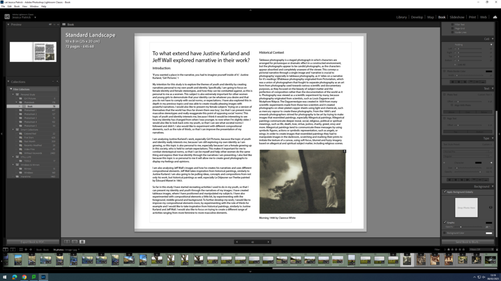
Adding my Essay
Next, I had to copy and paste my essay in. I used the same font as I used for my title and I had the size on 8pt. My subtitles however are on 10pt and my title is on 17pt.
Then, I had to import the photographs I have used in my essay onto my book in the correct place.