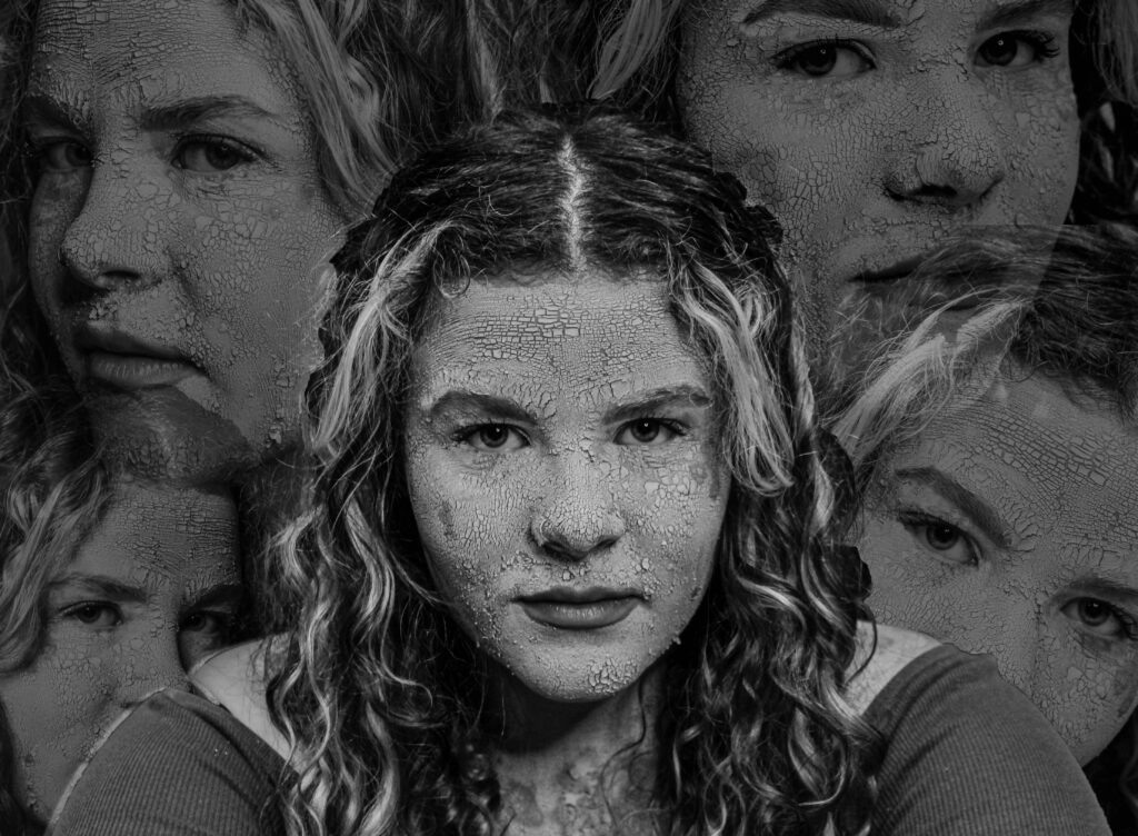
I’ve decided to do more of an experimental edit. I want to try and create a chaotic feeling.
to create this I have used a image of the model where she is looking directly at the camera and in the middle of the shot. Then I’ve taken some of the other photos where she is looking in different directions and cut them out of their photo and added them to this one. I also realised that I would need to do the same to the original photo otherwise it would be covered by all the others surrounding it.
I found that the image looked a lot better with the surrounding photos with lowered capacity as I wanted the main/middle version of the model to be the one that stands out. Then all I needed to do was add the resat of the images and arrange around the image.
Photoshoot 2- experimenting
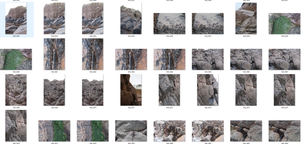
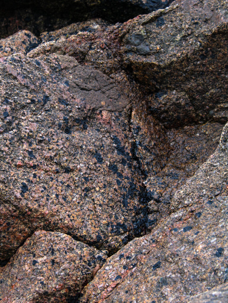
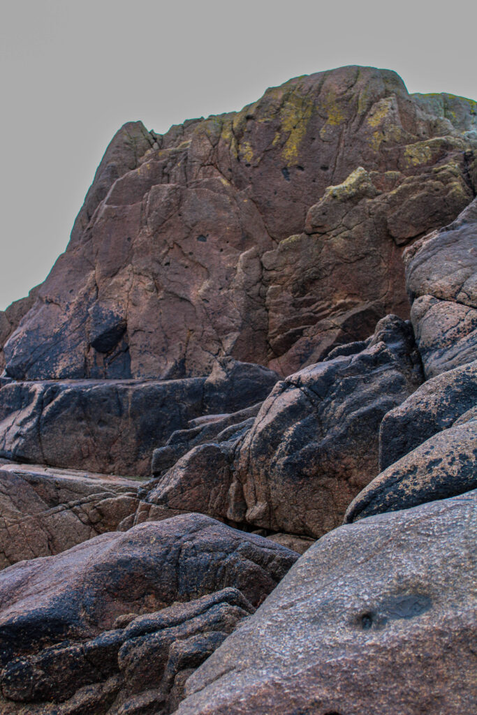
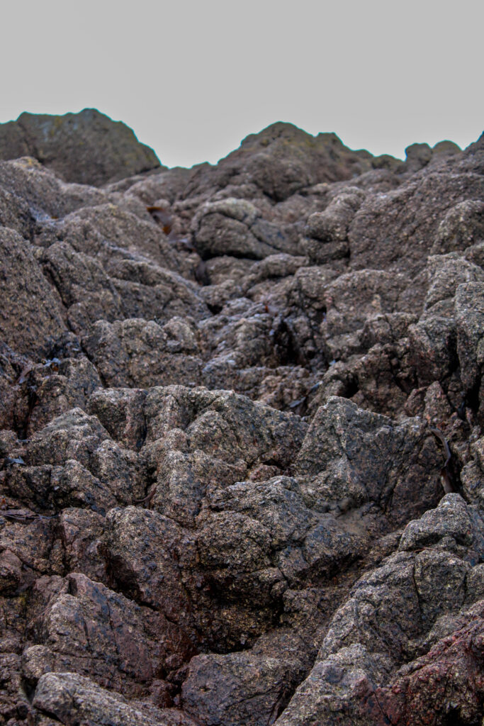
Binary opposites its referring to the idea of having two things that are vastly different and contrasting for example light and dark. So for my work I liked having the beauty from the model but also the natural aspects from the rocks which contrasted the man made structures behind.
I experimented with these photos by using AI. I tried to edit the background and replacing it with something new and more stereotypically pretty the first image I used one of my own photos and placed in behind the rocks whereas for the second two images I used AI.
For this photoshoot I went into the studio, as I felt like my photobook would need some other images to add contrast; this is because most of my photos are portraits so by adding these additional filler images it will make my book appear less repetitive and more engaging.
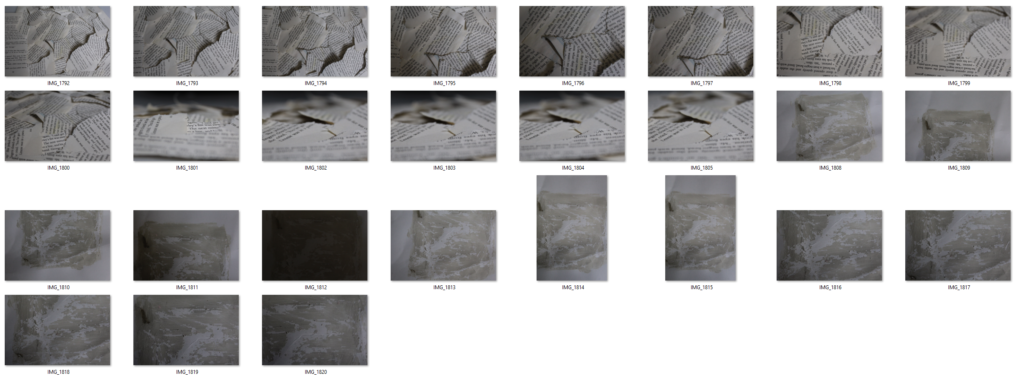
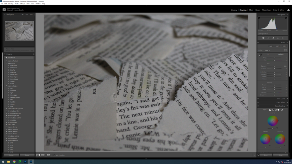
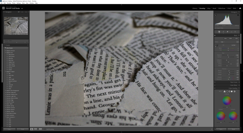
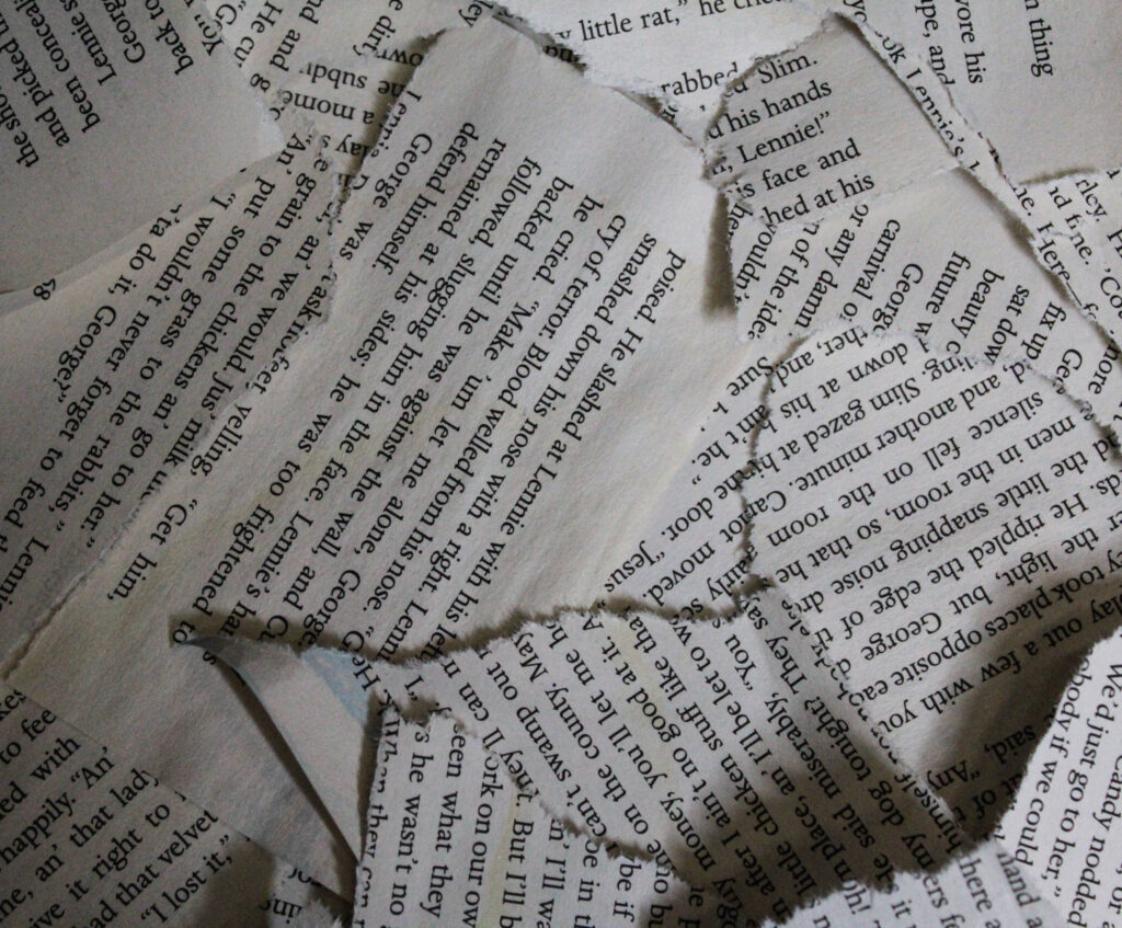
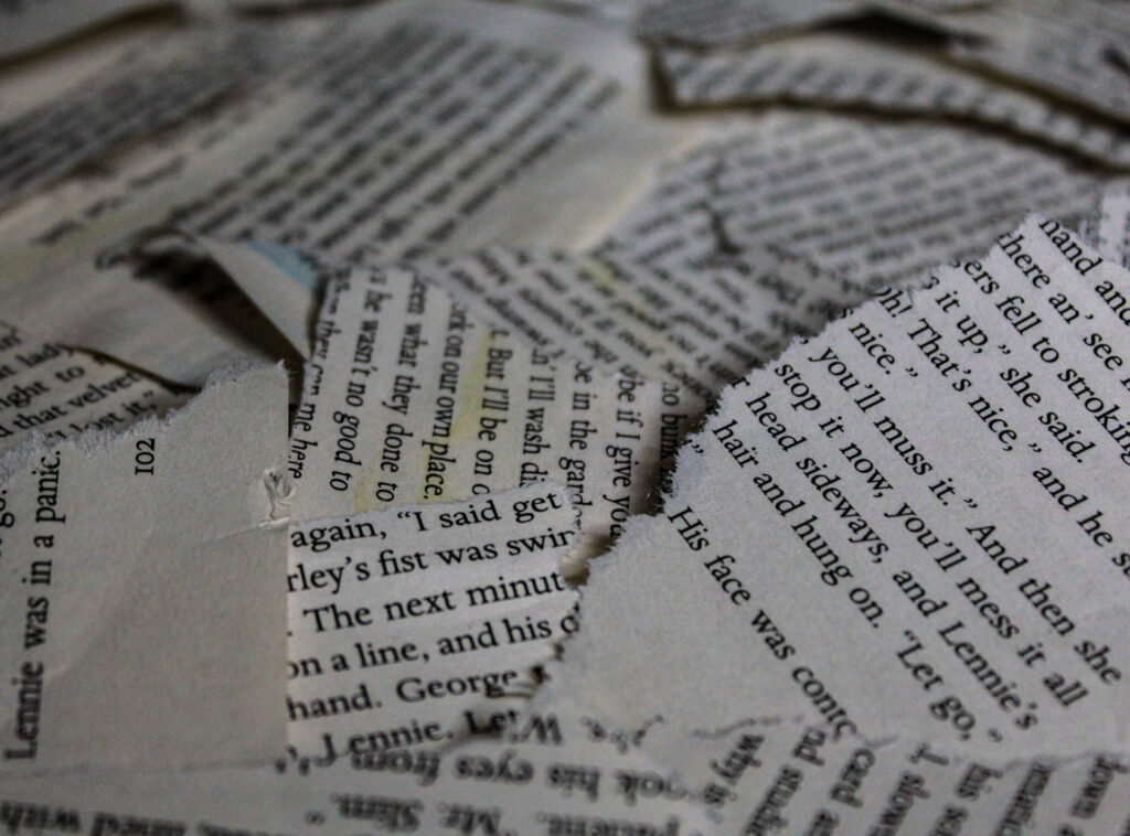
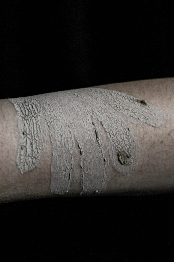
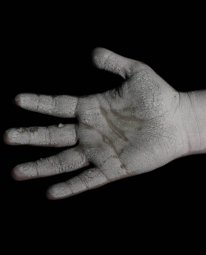
I chose to use some ripped-up book pages and a piece of card with the face mask to create a cracked look on the model’s face. I did this to try and symbolise destruction and loss, just like I did with the models; to amplify and carry on with the ‘narrative’ that I am trying to tell whilst also using an alternative and more abstract way of showing destress, vulnerability etc…
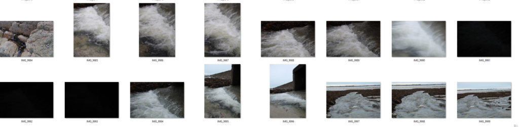
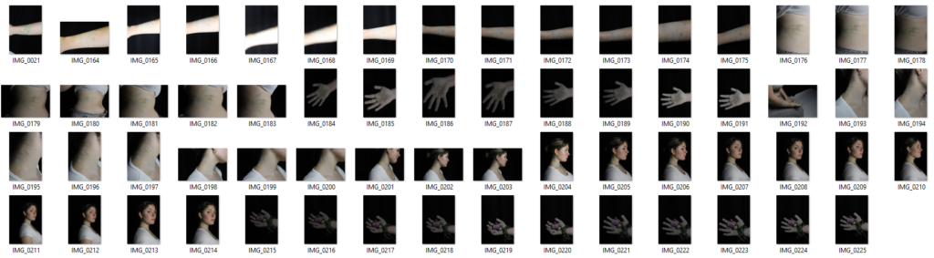
Contact Sheet 1
Contact Sheet 2
Editing
The editing for these photoshoots was rather simple and fairly similar. The main aspects that I wanted to enhance and change was the highlights ,shadows, blacks and whites. I found this works best as it makes the image look sharper, the edges of the paper are a lot more emphasised this way. However, I did decrease the saturation slightly as a key aspect of my book I wanted was the further into the book you got the more desaturated it gets.
Similarly with the other set of photos I adjusted the whites, blacks etc… However, with some of the picture of the rocks you could see the sky and more of the background compared to the other photoshoot. This meant that I had to adjust the brightness for the background using the masking tool.
Final Images
Final Images
Evaluation
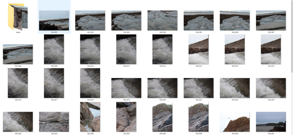
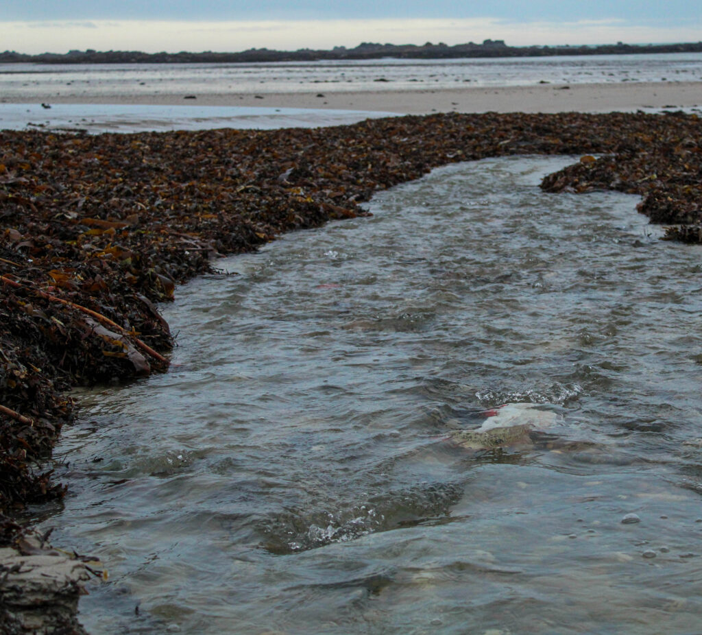
Overall, I’m quite happy with the pictures of the rocks because some of them were close-ups, meaning you can see many details in the different colours and textures. This is going to be very useful in my photobook as it’s adding a lot more variety. I also find that they link and can be related to the cracked ‘skin’ that I used on the models. However, for the picture of the water I wish I had used a faster shutter speed in order to get a clearer image of the water running as the ones I got came out slightly blurry due to the speed of the water and the lower shutter speed which I used.Similarly, I’m happy with how the book pages and the piece of card turned out. I tried to get multiple different angles when photographing the book pages, experimenting to see if I could create more depth within the photos. Which I think I successfully achieved by taking some of the photos from a lower angle additionally by using the lower angle it reveals more layers and textures which you couldn’t see from the higher, birds eye view which I also used.
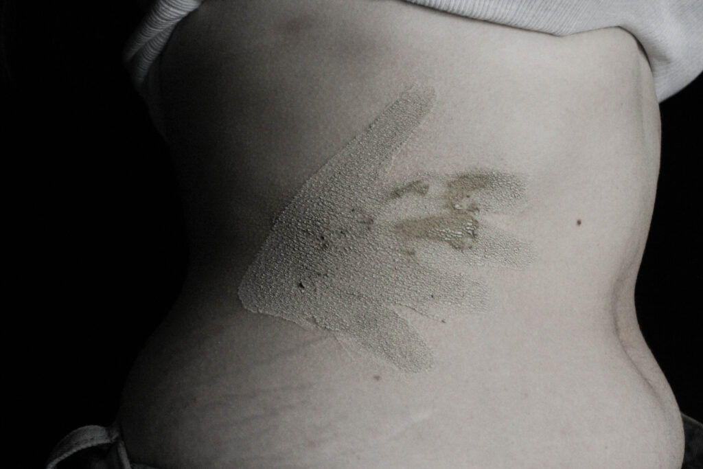
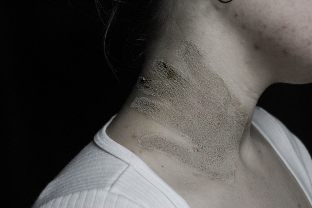
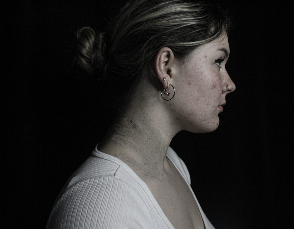
For this photoshoot I wanted to focus specifically on sexual assault and harassment. I did this through creating handprints on the model. This was actually inspired by a movement originating in 2020 where sexual assault victims would paint a red handprint on their body where they were touched without consent and share their story/experience as a part of the hashtag ‘DenimDay’.
Contact Sheet
Editing
When editing something I wanted to focus on and emphasise was the darkness of the photos. I knew I wanted to place these images towards to back of my book which is where the more dramatically lit and intense photos would be found. This meant that I had to increase contrast, blacks and shadows in the photo however by just doing that it lost a lot of the details so I then increased the high and highlands to help make sharper lines.
Final Images
Evaluation
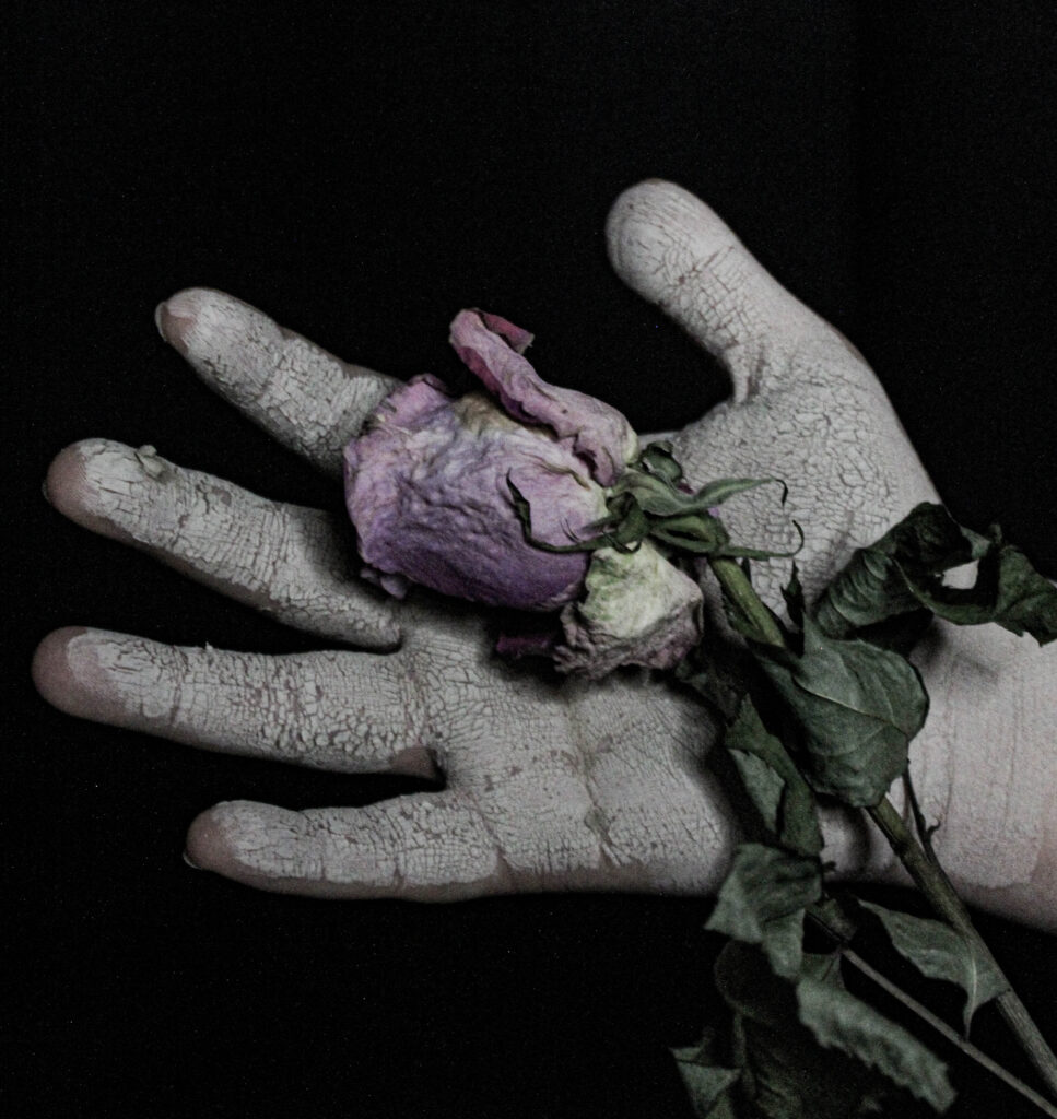
I’m extremely pleased with how this photoshoot came out. From a technical point of view potentially they could have been better by increasing the exposure in order to brighten up the picture. However, by doing that I felt it lost part of the intensity of the photo. The picture of the hand with the aged rose I think is my favorite from this shoot I used the rose to try and symbolise how objectification doesn’t only affect you internally but can start to manifest and affect other aspects of your life in the way you see things or interact with things.
The theme for the final exam in photography is ‘Union’..
What is the simple definition of union?
1. : an act or instance of uniting or joining two or more things into one. especially : the formation of a single political unit from two or more separate and individual units.
I am going to start my project based around feminism and girlhood.
What do the terms mean by feminism and girlhood?
Feminism in Photography focuses on challenging gender stereotypes and how women are portrayed.
It includes:
Reclaiming the female gaze, where women are shown from their own perspective, not just as objects for male viewers/pleasure.
Challenging gender roles and depicting women in complex ways rather than just sexually.
Body politics, exploring themes like body image and how we are depicted compared to men.
Famous feminist photographers’; Cindy Sherman, who focuses on issues like identity and self-representation.
Girlhood refers to the period of a girl’s life, focusing on her experiences, development, and social identity as she grows up. It’s not just about biological growth but also the social expectations, challenges, and roles associated with being a girl in society.
The term often explores themes like:
Social conditioning, where societal norms influence how girls are expected to behave, look, and interact.
Gender identity, examining how girls develop their understanding of themselves and their place in the world.
What’s the history behind this concept?
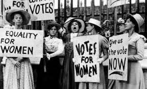
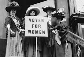
Historically, girlhood was defined by unspoken societal roles, with girls primarily prepared for domestic life as wives and mothers, often with limited education (cooking and cleaning for their husbands and kids, stay at home mums). In the late 19th and early 20th centuries, feminism and the women’s rights movement began challenging these traditional views, advocating for girls’ education and opportunities outside the home, you could even start to think about the suffragists were by they were the ones who fought for women to have the right to vote, pushing back against old-school ideas about what women could and couldn’t do. They made a huge impact, and their efforts set the stage for today’s movements that focus on empowering girls and women, helping them claim their rights, get an education, and have a voice in the world. Here are some images from the suffragists protest.
Feminism is still a big fight in today’s world, with protests and social media being powerful tools for change. A good example of this is the #MeToo movement, where women can share their stories about sexual harassment or assault online. By speaking out, they not only help others who might relate but also inspire more people to come forward and raise awareness about these issues.
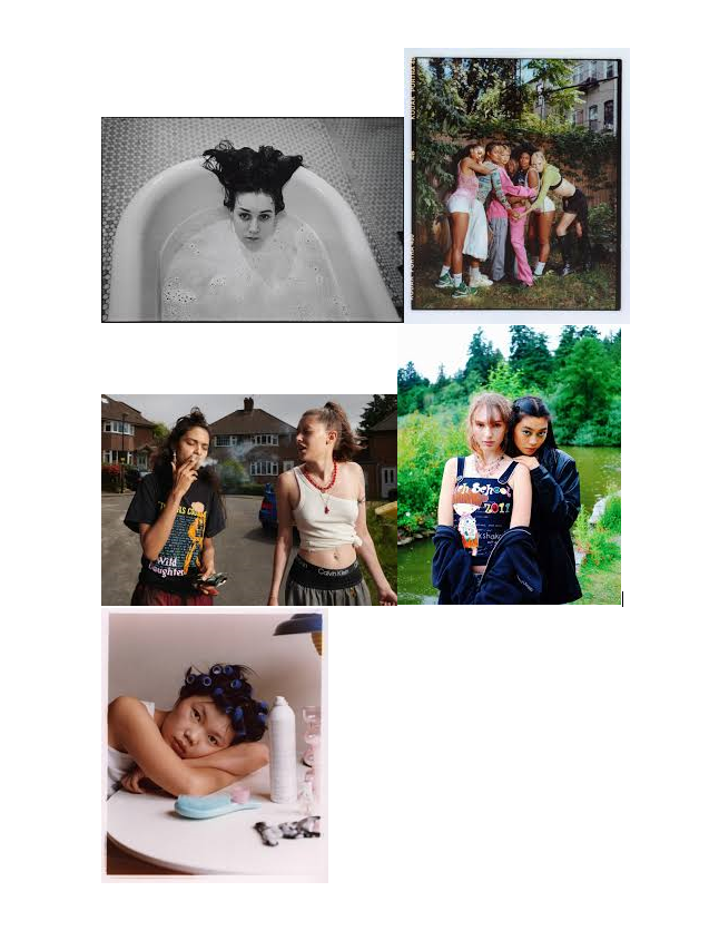
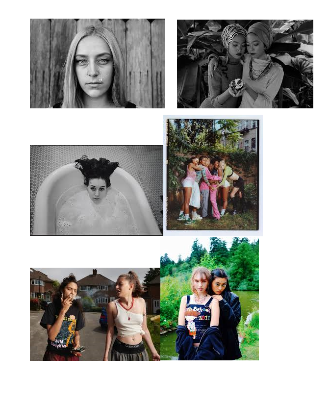
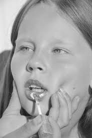
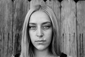
I want to create images like these..
These images all show how girls are portrayed and grown, not just by men but by women too. I want to try and challenge these ideas and try put a stop to this as it shouldn’t be seen as the norm anymore and we should be moving forward as a society. This is why I have chosen to girlhood and fermium for my union project as we can all be seen as a group/union and we all need to stick together as one.
Photoshoots
For my photoshoot plan/idea, I am going to start to have a think about these areas. bathroom/bathtub The bath feels like freedom to me, candles, bubbles and relaxing.
Les Quennevais Park: A simpler, more personal place. I imagine shots of a model sitting on a swing, walking barefoot in the grass. These moments feel real—like when we’re alone with our thoughts, reflecting on who we are.
Woods:
This gives the feel of girlhood back in the day, with there camping and swimming in lakes. I want to capture every element I can for my project
The Look & Models: I want the models to feel like themselves—natural and effortless, something that doesn’t feel too forced. I’d love to include different women of various ages, body types, and backgrounds because femininity looks different on everyone, and that’s the beauty of it.
Vibe & Feel: I want the photos to feel like a conversation—gentle but empowering, vulnerable but strong. I’d play with natural light, capturing both quiet, intimate moments and bold, freeing shots. It’s about showing the different sides of being a girl and a woman.
In the end, this project is about connection. Between women, between ourselves, and between our past and present. The locations, the models, the light—all of it should tell a story of unity, growth, and strength.