Photobook- Girlhood
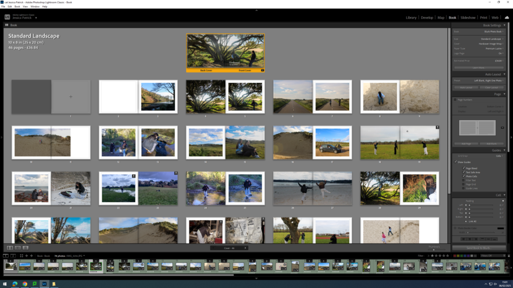
To create my photobook, I used the book mode in Lightroom Classic.
Image Selection
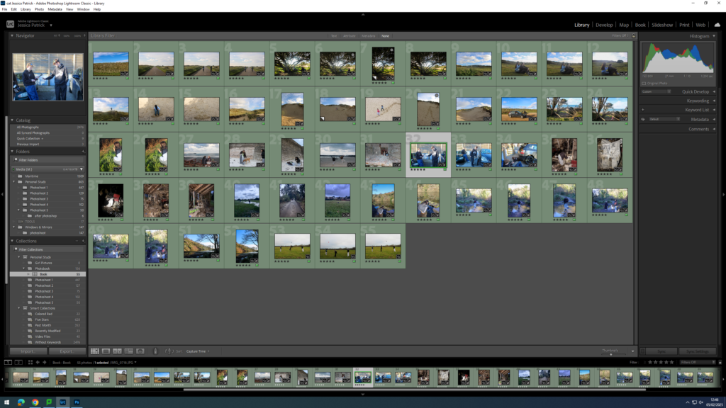
First, I selected all the images, which I have highlighted green and edited in all my photoshoots under this personal study and put them in a new folder called photobook, as they are my best images and the ones I have chosen to use for my book.
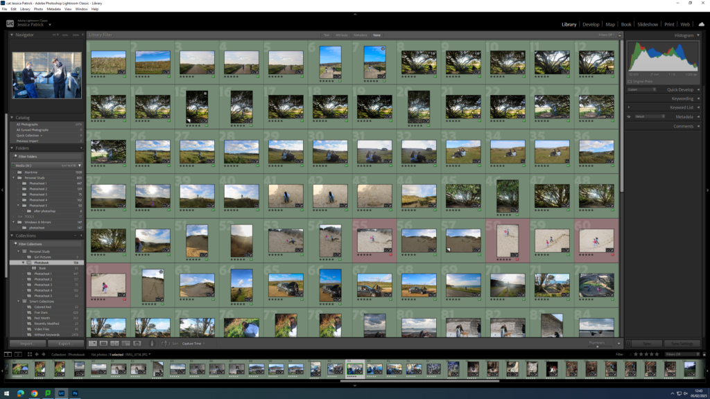
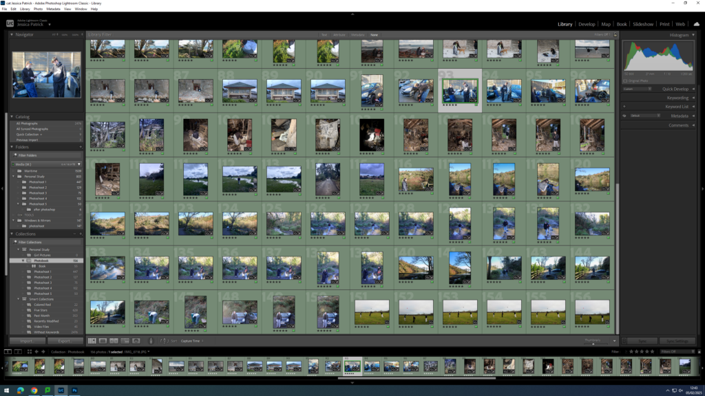
Next, I went through my images a removed the images which weren’t in my top 50, as I had selected over 150 images, and this would be way too many pages for my photobook, so instead I aimed for 50 pages.
Setting up my Book
Once I had my finished selection of images, I went into the book setting in Lightroom.
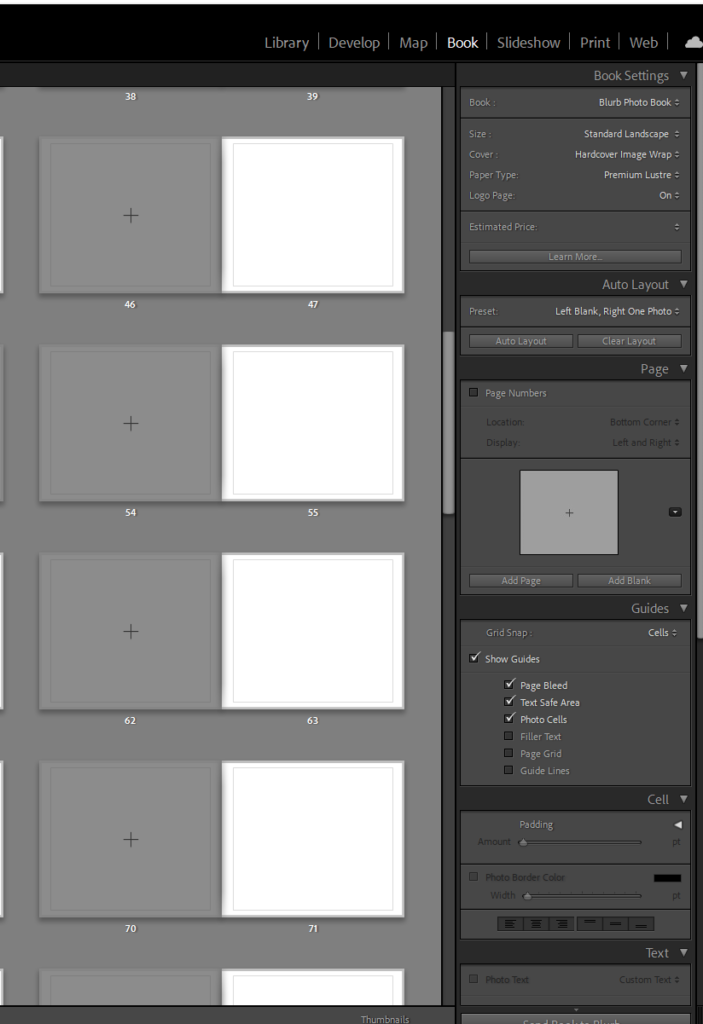
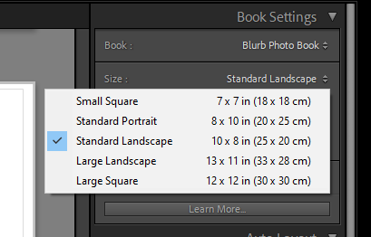
Next, I selected the size and orientation that I wanted my book to be.
Then, I chose whether I wanted a hard cover or soft cover book, as well as choosing what paper I wanted to use for my book.
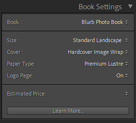
I chose a hardcover book, as I feel this would be more aesthetically pleasing for my book. I also chose glossy premium lustre for my paper, which is a glossy paper made for photographs, as I also felt this would be more aesthetically pleasing.
Experimentation
The first thing I did for my photobook, was that I deleted each photo, so that I could start with a blank slate.
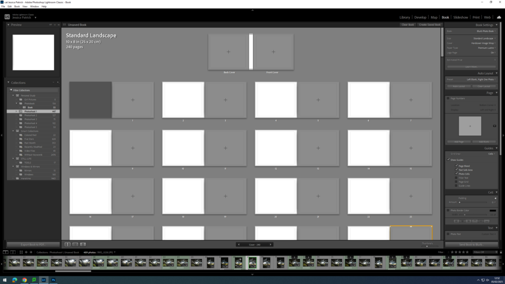
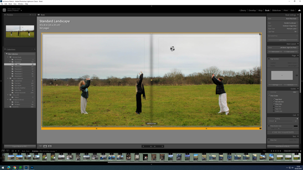
Then, I started experimenting with the layout of my images.
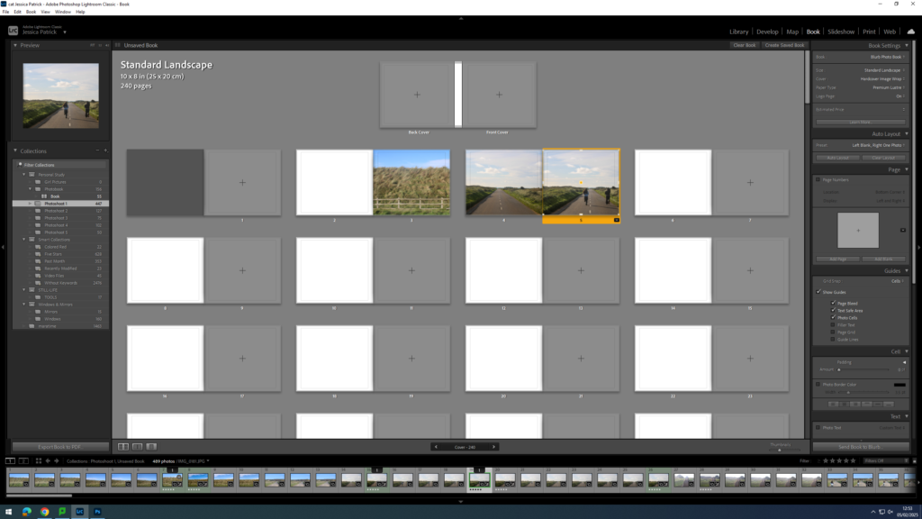
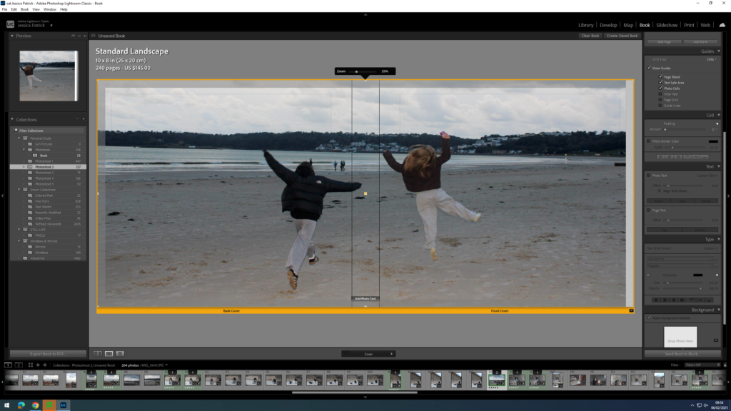
Next, I started experimenting with whether I would like my images to be full bleed, or not.
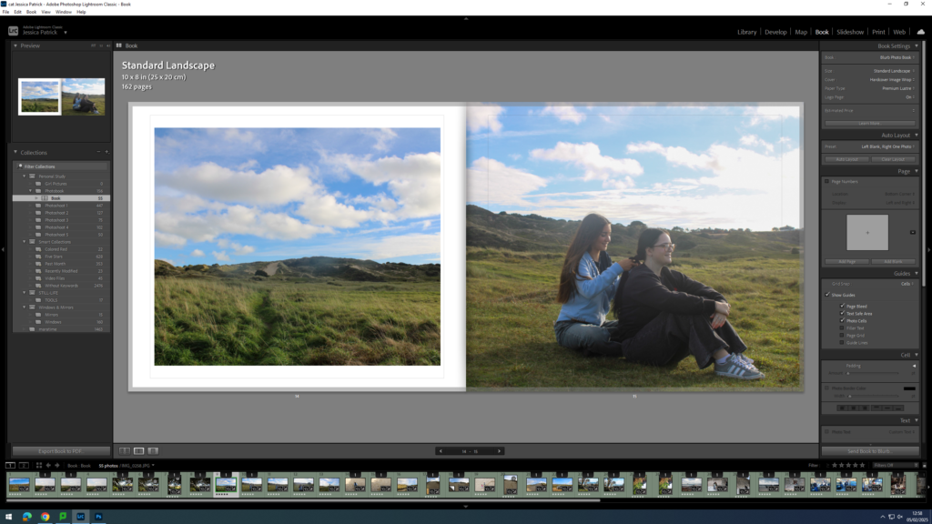
I also experimented with double page spreads.
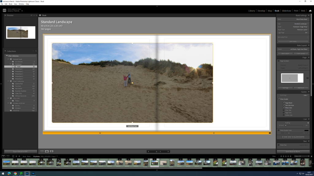
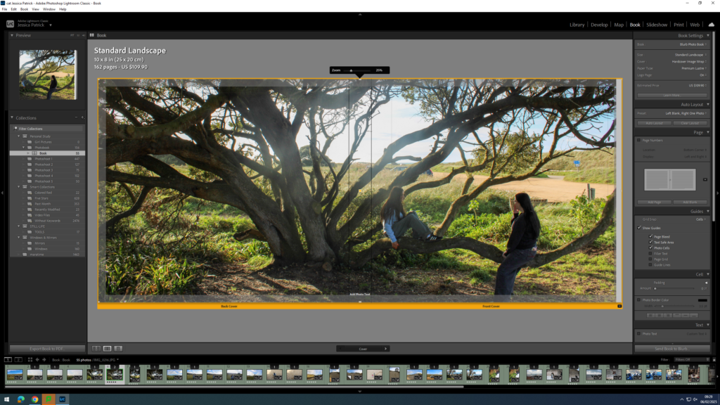
I also experimented with having a three quarter page spread for a specific photo, because the main viewpoint in the image, which was the subjects, were sat in the gutter, which is not aesthetically pleasing, or what I wanted.
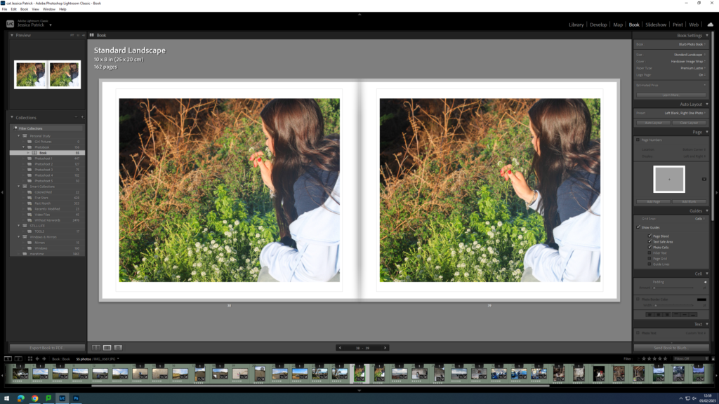
I also experimented with the differing the layout of some of my images and having some of my images with a similar layout.
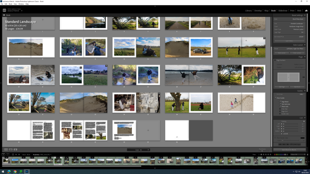
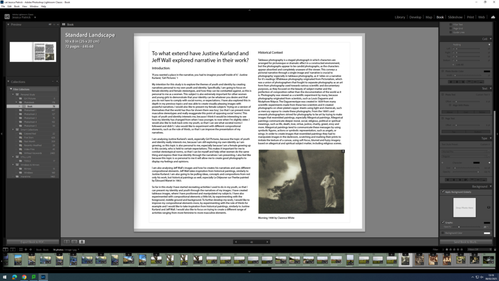
At the back of my photobook I am also going to include my essay, which I have written based on this study.
Experimenting with Front Cover, Back Cover and Title
First, I experimented with having a single front cover and a different single back cover.
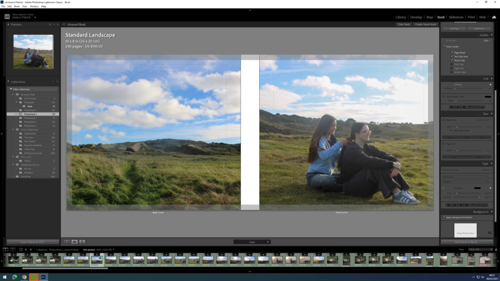
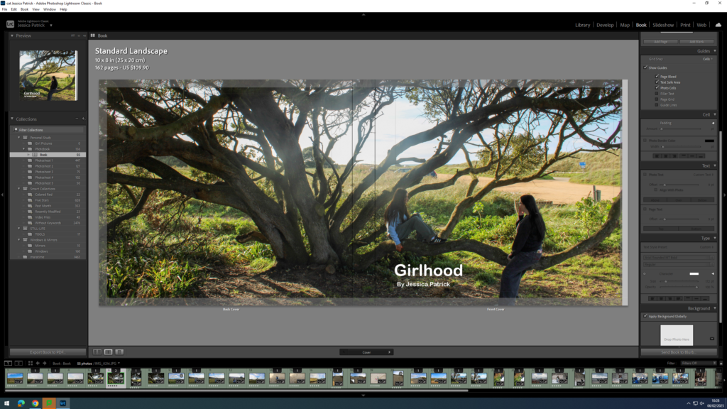
However, I didn’t really like this and I thought a double page spread for my front and back cover would work a lot better, so I started experimenting with the different images I could use.
I liked this image, but it didn’t work well as a double page spread, because the main viewpoint of the image is on the spine of the book.
I liked this photo as a double page spread, but thought the front cover may be too boring on it’s own.
The final image above is the one I have chosen to use, because it works well as a double page spread, and the front cover of the book has the main viewpoint on it, so it isn’t so boring.
Once I was happy with the front and back cover image I could start experimenting with my title.
Some title options:
- Girlhood
- My Girlhood
- Girl
- The Girlhood
Once I had decided on Girlhood as my title I could start experimenting with the font, size and colour.
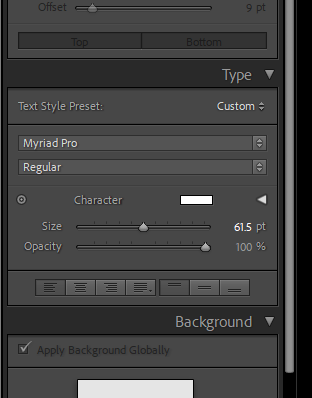
The tools were on the right hand side of the screen and the options were to change the size, opacity, colour and font.
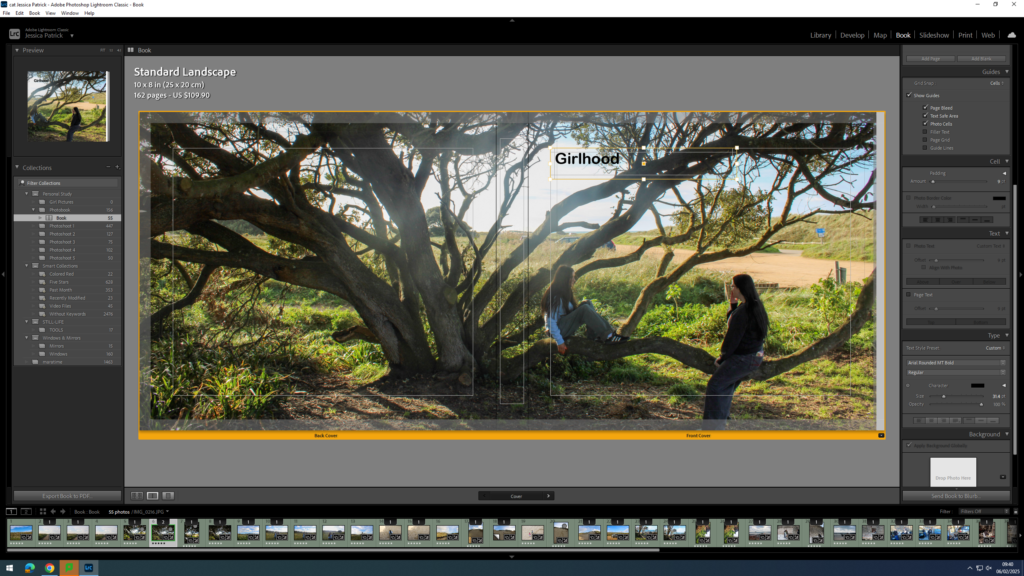
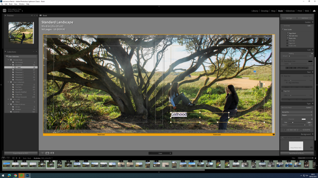
First, I experimented with the placement of my title.
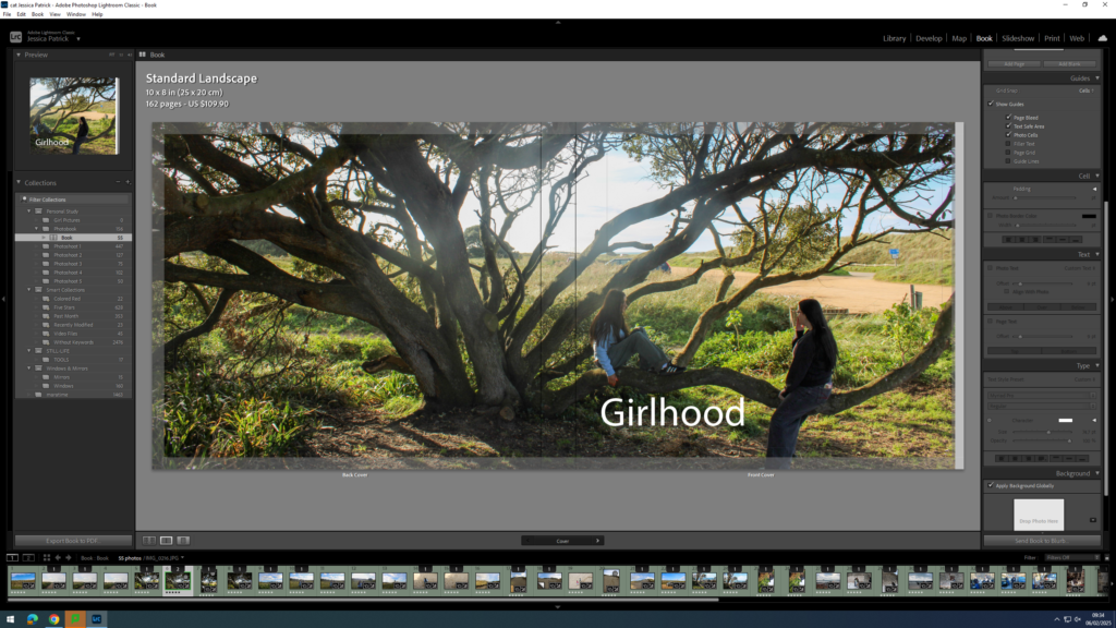
Then, I experimented with the colour of my writing, because depending on my placement the writing couldn’t be seen that well. If my writing was placed at the top of the page black text was better, but if the text was at the bottom of the page the white writing was better.
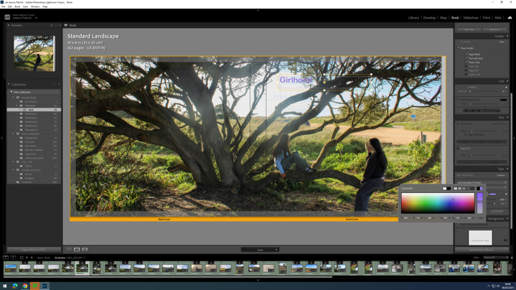
Next, I started experimenting with coloured writing, but ultimately decided on white text.
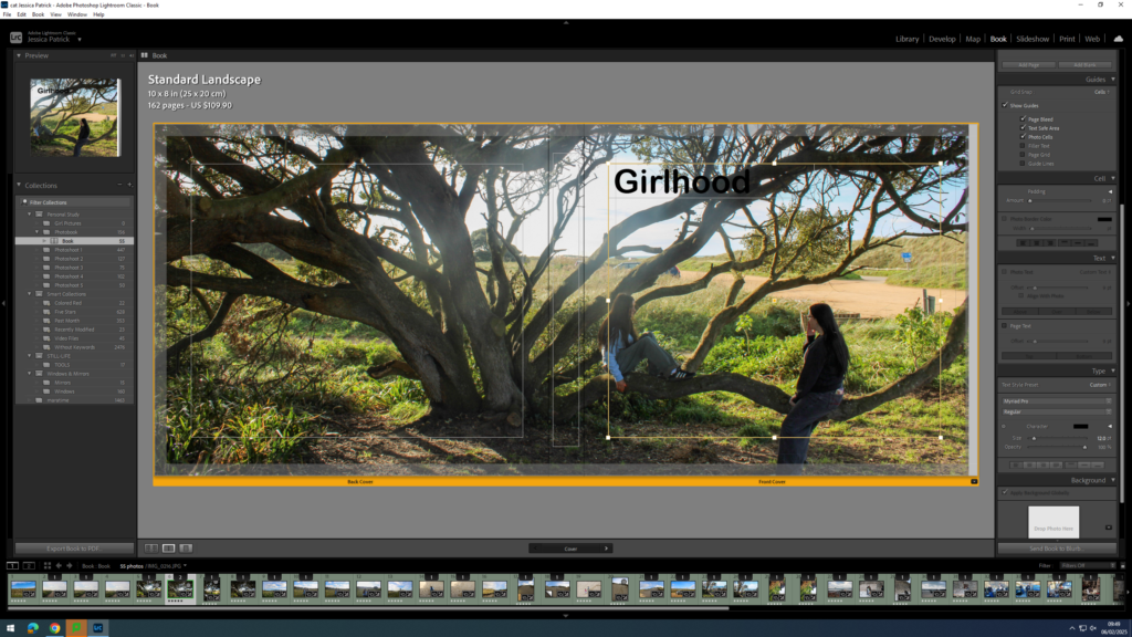
Next, I experimented with the size of the text.

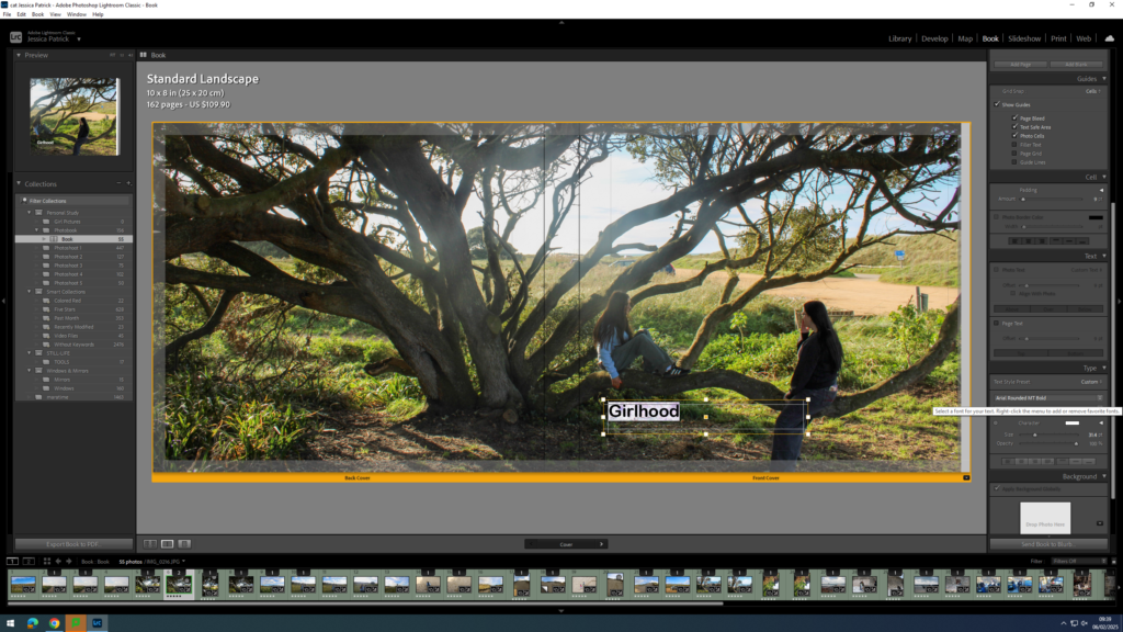
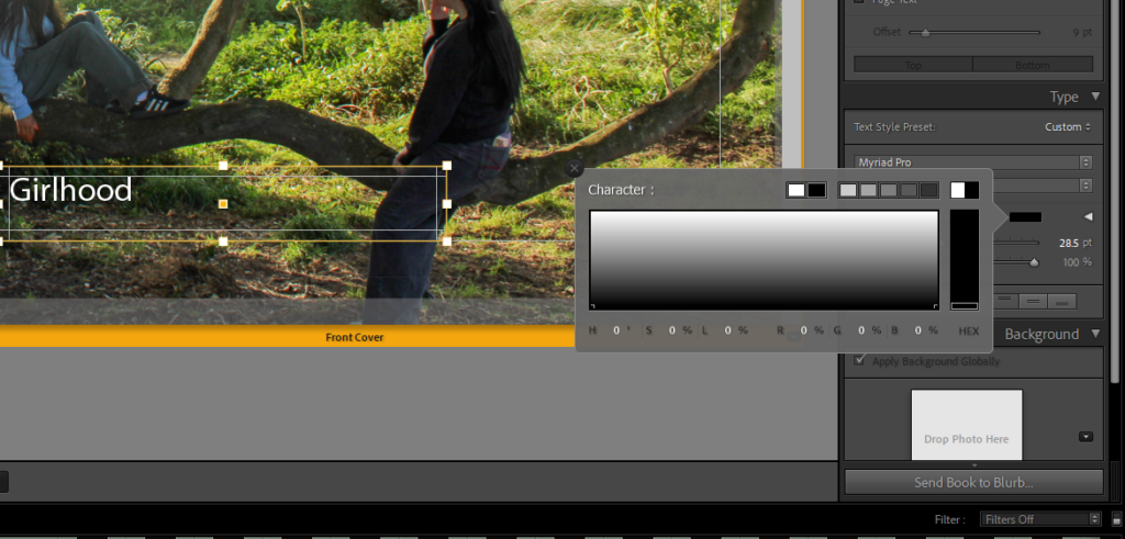
Finally, I experimented with the font and decided on Ariel Rounded MT bold.
Now, I think the title and my name is too bright with the white ink, so I decided to experiment with the opacity. I set all my writing opacity to 70%.
Next, I needed to add my title and name to the spine of my book.
I had to position my title and name where I did on the spine, so that the writing could be seen.
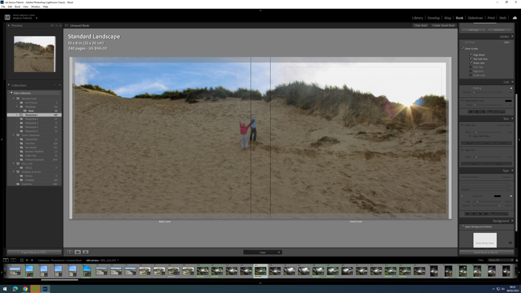
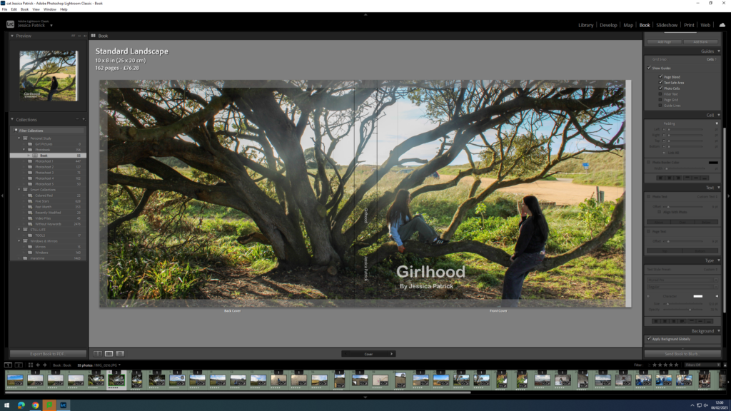
The sky in the centre of my image was too bright, due to shooting facing the sun, so I had to go back into develop mode and select the tool on the very right at the top.

Then, I had to select the sky and lower the highlights and exposure, so the sky was less bright and had some more blue in it.

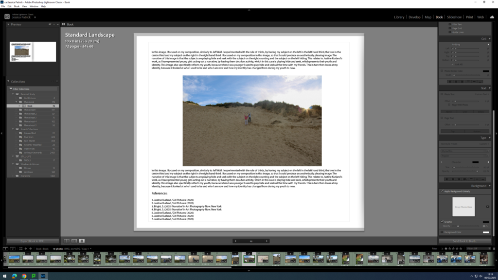
Adding my Essay
Next, I had to copy and paste my essay in. I used the same font as I used for my title and I had the size on 8pt. My subtitles however are on 10pt and my title is on 17pt.
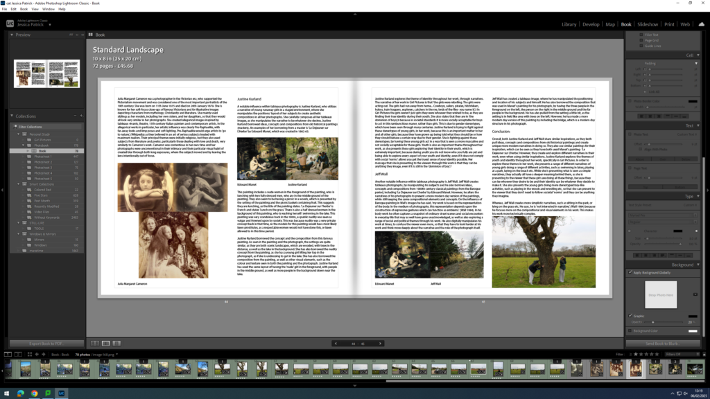
Then, I had to import the photographs I have used in my essay onto my book in the correct place.
Final Layout