“Exploring the relationship between a car and its driver”

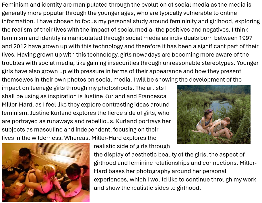
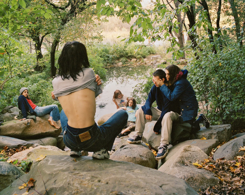
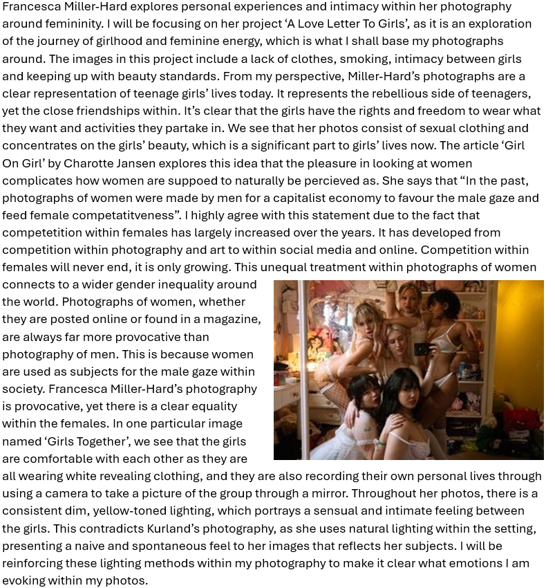
The connection between man and car is far more special than what the eye can see, the whole is greater than the sum of the parts. When one is in control of a car, there exists a greater bond between the two, where the car’s built purpose is in action, and the driver instinctively manoeuvres the car, sometimes perfectly balancing the thin line of the car’s limitations. This connection is not just a physical connection, but an innate response to the forces that the car’s mechanical functions impose. Whether you are a regular driver on the road, or a rally driver with a performance-optimised car, it is this innate response that ultimately determines every movement the car makes. This is arguably one of the most important aspects of the relationship that a driver develops with their car, and it is from here that the relationship cultivates. It is here, where the car becomes animate and feels alive, where a driver becomes enwrapped and connected with a car, that the car’s soul is found. This is something that people who are not interested in cars do not understand. A quote by Jeremy Clarkson sums this up perfectly, “It’s what non-car people don’t get. They see all cars as just a ton and a half, two tons of wires, glass, metal, and rubber, and that’s all they see. People like you or I know we have an unshakable belief that cars are living entities… You can develop a relationship with a car and that’s what non-car people don’t get…”. In this essay, I want to explore the many ways one can develop a relationship with a car, and how this relationship, from extreme to simple, is directly reflected in the car’s soul. To demonstrate this photographically, I will first analyse the infamous rally photographer Maurice Selden, and show how his photographs visibly express the souls of the rally cars he captured.

Ari Vatanen in the 1976 Granite City Rally in Scotland, photo by Maurice Selden

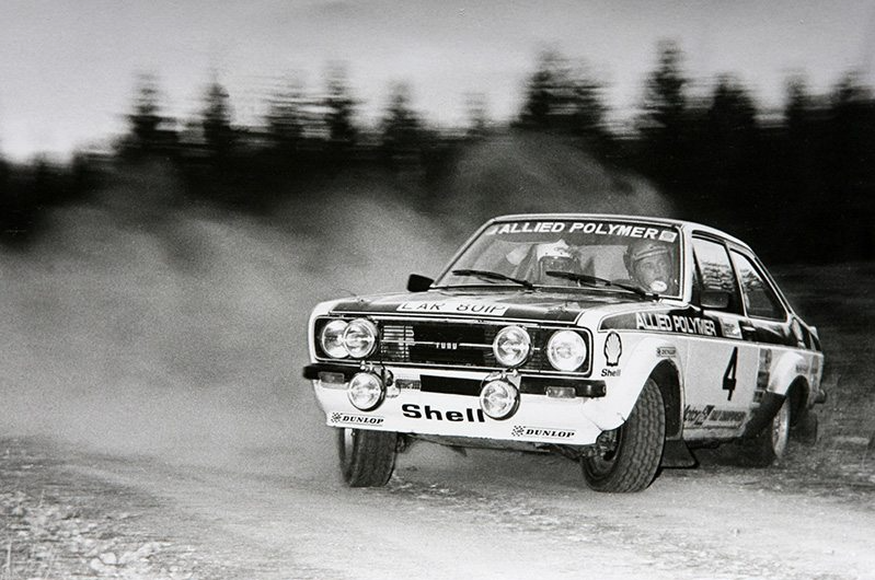
This is a perfect example of how Maurice Selden was able to capture the true essence of the velocity and intensity of rallying in a single photo. This photo is actually one of his personal favourites, as stated in an interview with RallySport Magazine, and it evidently expresses the trust that Ari Vatanen had in his car. In 1976, Maurice Selden was just starting out his long and prolific career as a rally photographer, and was luckily sent to the Granite City Rally where he captured this photo of Ari Vatanen in his brand new Mk2 Ford Escort. “It was a standard joke among photographers that if Ari was the next car we should take a couple of steps back, as he always appeared faster and used more of the road than other drivers. Just from the sound of his engine, I could tell that he was much faster than the previous cars”. Ari entered the right-hand turn much faster than expected, and had to turn in quickly and swing the rear out, then steer in the opposite direction and use the power of the rear wheels to push through the corner, battling with the steering and throttle to stay on the dirt track using whatever finite amount of grip he could find with the front wheels. During this intense bout of focus, Maurice Selden was stood on the inside of the corner a couple steps away from the road, and had set up his camera flash to compensate for the lack of daylight. Once Ari Vatanen instantly barrelled through the corner, Selden followed him with his camera and took a number of burst photos in rapid succession. This specific photo truly captures the raw essence of rallying; the motion blur combined with the scattering dust captures the driver’s dedication to speed, and his calm and focused facial expression combined with the wheel angle shows he has a massive amount of trust in his car. It clearly demonstrates the instinctive connection that rally drivers have with their cars: he simply looks at where he needs to go and subconsciously understands exactly what inputs the car needs in order to get there. And fundamentally, in rallying it is this level of understanding, trust and dedication from the driver that ultimately determines how much soul the car has. In this photo, the soul of the car is outstandingly striking; the face of the Ford Escort shines gleamingly in focus, illuminated by the quick flash of the camera, and the car looks so balanced and controlled even while being pushed so close to its limits. It is so clearly evident to me that, in this photo, Maurice Selden captures not only the car at its most extreme point, but also the relationship between the car and its driver that enables this ability to balance on the car’s thin line of limitation.

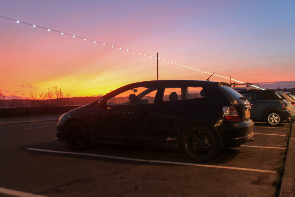
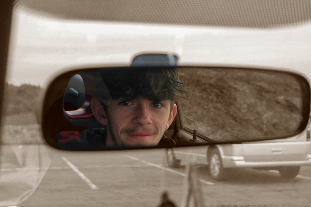
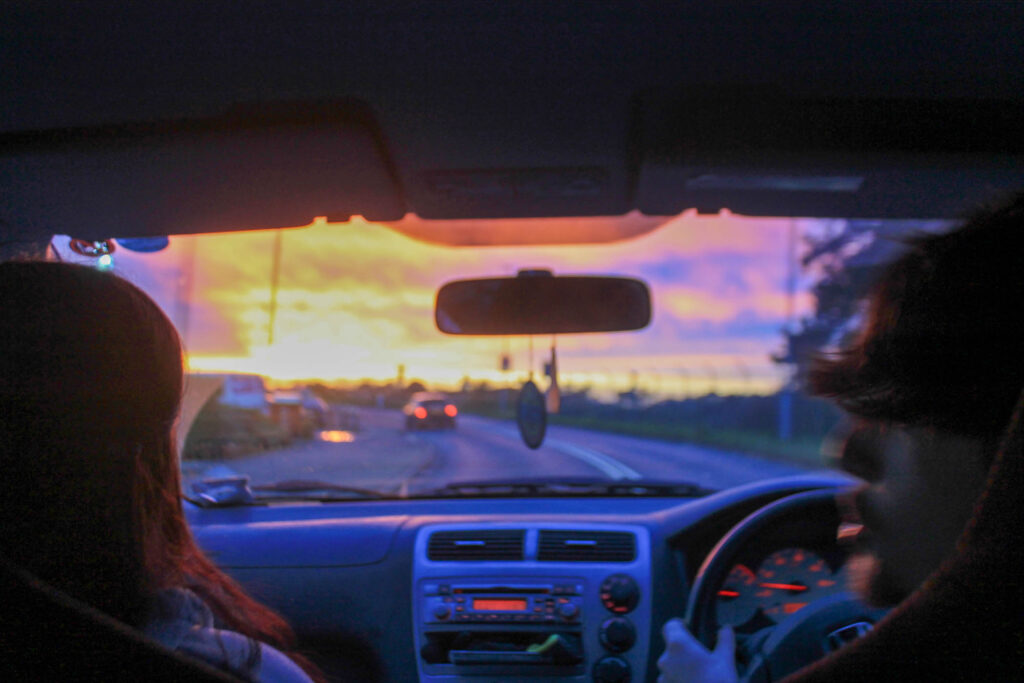
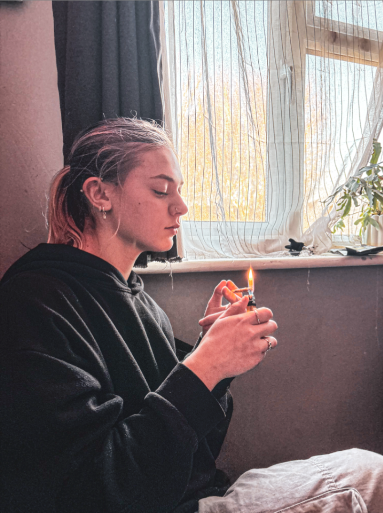
However, this relationship is very different to the majority of car owners who just use their cars for safe transport. These cars are not built to maximise speed or agility, rather they have been built for functionality and practicality. This is where these relationships evidently differ, a daily driver simply doesn’t have to drive on the edge of the car’s capability, and therefore these drivers will build a more personal relationship with their cars, one that involves more emotional connections (memories, family, places the car has been, etc.). It is these connections that ultimately create this relationship, I’m sure you can nostalgically remember a family car or a classic rust bucket that your father never quite finished working on. But there are so many ways that a person can develop a relationship with a car that I simply cannot express every view. A car can go through so many owners throughout its life, it is immeasurable how many memories the car has created. However, there is one way I can truly express my perspective, and that is to present to you my own car, the Ferrariesta.

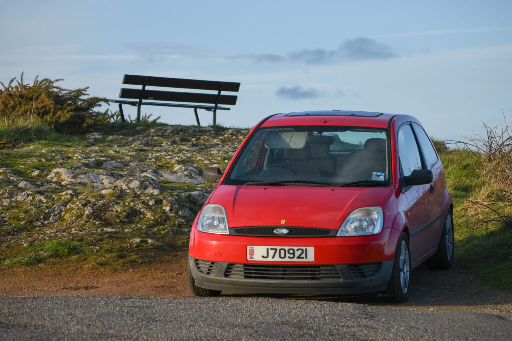
The Ferrariesta is a 2004 2-door Mk6 Ford Fiesta ‘Finesse’. It has a 1.25L Duratec which makes no power at all, and a leaky sunroof which drips water onto the passenger seat every time it rains. The name ‘Ferrariesta’ originated from when my brother owned it before me, simply because of its formula red paint job, although we have no idea who actually came up with the name. However, since then the Ferrariesta has become somewhat of an icon to me; it is my first car, my first access to the freedom of the open road, and the perfect car to fit coilovers and wheel spacers onto. Since my ownership, this car has transformed into a timeless hatchback that will probably break down and be scrapped within the next 20 years. But through all of its imperfections, to me, the Ferrariesta is perfect; the value of this car is immeasurable.

Overall, the point is this; every driver develops a different relationship with their car. Some are much less considerate about damaging their car, others develop a very personal relationship with their car, but in general, every driver has the appreciation for the freedom that their car provides them. Every driver appreciates these beauties of mechanical defiance that will take them anywhere in the world, without complaining, and there is no better way to portray this than to show you Helge Skodvin’s study of urban Volvo 240s, a car that will never back down, in the harsh environment of Norway that it was designed to thrive in.

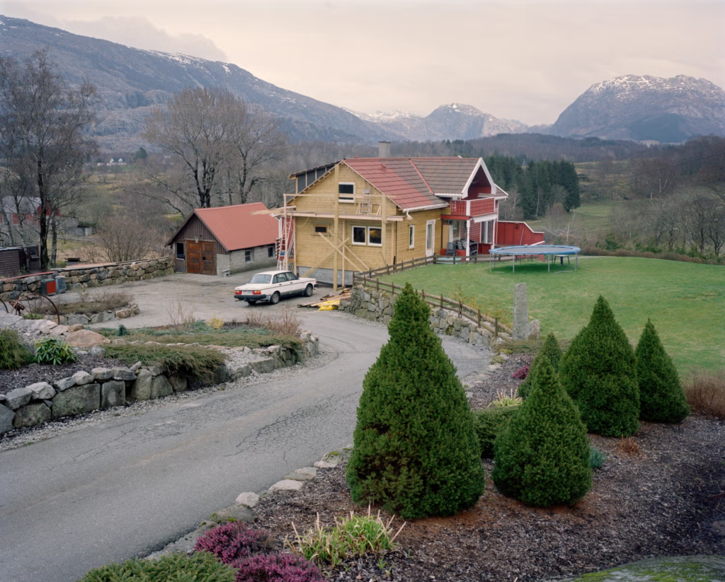
240 Landscapes is a simple photobook created by Helge Skodvin, which is made up of Volvo 240s in various different landscapes in Norway. In each image, a different 240 is presented, and the viewer is left to question what each 240 represents when its environment is factored in. In this photo, the 240 is meant to represent a family car, it brings a sense of nostalgia and memory, something I’m sure you can relate to when recalling a family car and the roadtrips you may have taken in it. The souls of these 240s become so clearly evident when put in conjunction with their environments; some live in harsh, mountainous conditions, others live in peaceful cities or multi-story car parks.

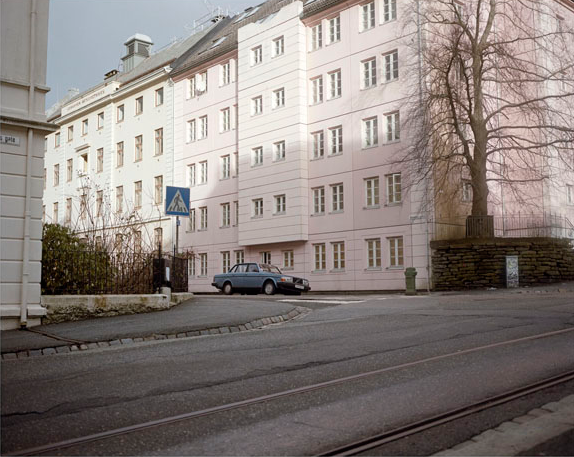
But the point of the book is understanding this: the Volvo 240 was designed to be the safest and most reliable car in the market, every Volvo was designed to suit the needs of the driver. And subsequently, since every 240 was designed to live forever, a lot of 240s are still driving today nearly 40 years after they were manufactured, including all of the Volvo 240s in 240 Landscapes. Each of these Volvos has lived long lives, each with their own imperfections and modifications, and the lives they’ve lived is ultimately dependent on the environment that both the 240 and its owner live in.

CONCLUSION

Bibliography

Jeremy Clarkson (2009). – Interview from “Love the Beast” (released March 12, 2009), a documentary made by Eric Bana and Pickup Truck Pictures (production)

Peter Whitten (2018). – Interview for RallySport Magazine – https://rallysportmag.com/maurice-seldens-top-10-rally-photographs190318/

Helge Skodvin (2015). – 240 Landscapes (photobook) – https://helgeskodvin.no/240-landscapes

Personal Study: Photobook Design and Layout

Process

I started off my photobook layout by adding all my best images in so that I could see them all in order to start sorting their positions.

After that, I had started to arrange images where I would like them and what I would like them near. These are the arrangements for my older building images. This arrangement does not include the layout of each individual page.

I have then added some images between which present both old and new styles of Architecture to create a link between the two.

I then paired images of modern buildings which I think go well together. During this process, I eliminated a lot of photographs.

After sorting through the images, I made a start with the layout of each individual page.

I then added the front and back covers. I showed step by step how I created the front cover on my further experimentation blog post. Furthermore, I chose this specific photo as the back cover as I think it sums up the book quite well due to the combination of new and old architectural styles.

These are the first two pages of images when you open the book. I started with these because I like how they have both been taken at the same angle and they are commercial buildings with a historical architectural style.

These are my next pages. I wanted to show more commercial buildings in the same are.

I then moved on to residential buildings, focusing in on the details for the next 4 pages.

For these two images, I wanted to show two different old architectural styles.

For these two pages, I presented the same building but from different perspectives and different parts of the building.

These two images are both of buildings split into two. The first one is two buildings which are connected and the second is two houses which have different shape doors.

I presented these images together as they are both zooming in on the details.

I wanted to then transition to modern buildings by presenting images of old and new buildings together.

These are my the first images of modern buildings. I showed them together as I think they are quite similar images.

These next images I have put together as they are both of balconies.

I presented these next two images together as I was able to connect them with the lines of the buildings.

These images are similar because they both are of shapes, the first is circular and the second is triangular.

I really like these pages as the images both contain curves.

For these pages, I presented these images together as they both have square windows and are similar to my artist reference.

For these images, I presented them together as they both have similar perspective.

These images I put together as I think they look similar and both were taken at similar angles.

For this next page, I presented these images together as they both have the same triangular points.

This is my last page. I made it a double page spread of this photo because it is

Final Prints

FINAL PRINTS: 

Select a set of 5-6 photographs as final outcomes and evaluate

A3

The reason I have chosen this image is because of its technical composition, I like how I have used the flash for my lighting which create a glare on their eyes and adds more depth to there outfits, creating brighter blues and darker blacks etc. This creates a exposed glare, adding a sense of realism to my image. By using a zoomed in lens I have focused on my subjects, the camera that I was using was actually broken and didn’t have automatic focus hence the aspect of unfocusedness, but I think that this adds to the image creating a sense of mystery. I think my image is a bit over exposed allowing my subjects to have brighter skin, which I think looks good with the blue background I have created using photoshop. This image has a clear tonal range of dimmer colours, deep blues and blacks. Creating a dark colour temperature. My image is textured through the use of the ruffled jacket and the gloss on there hair. I think that I have created a 3D form and repetition with both the boys smoking, by both doing the same thing they work well together in the image.Creating a smooth composition. Using the rule of thirds by centering my image, having the main subjects in the middle and the outer parts of them on the two outsides. The eye contact within this image can create a deeper conceptual meaning. By creating eye contact while smoking and drinking we can read through there eyes that they are not doing this in a negative way to escape their emotions but more socially to have fun. This creates a contextual meaning that the two are friends, so I overall think that this image can be easily read.

A4

I have chosen this image as I wanted to progress the storyline of my final prints, focusing on this boys life and what he does to make it enjoyable. I have used daylight and the flash of the camera but the shine of the torch creates a sort of glare spot which adds to the imagery contrasting the bright whiteness against the darker colours. I didn’t have much control over the levels of the lighting but I think that I have clearly manipulated it through the use of editing. My image has a cooler tonal range, portraying how what he is doing is more clean and sterile as he needs to focus. I have used visual elements by having him in the background and the tools that he is using in the foreground, to create the ideology that he is not the main focus in this image but it is more what he is doing. What he is doing really adds context to his story line and this can also be read through how dirty his hands are and by the struggle in his face. The conceptual thought behind this can be read in two ways, wondering if he is actually enjoying this or it is a task that he needs to do, my other images around this one will provide the evidence needed to conclude that he is actually enjoying himself.

A4

This image is going to be one of my breakthrough images. Using the lighting as bright creating a positive connotation around my other images. I have used a wide landscape lense to add to the foreground and background, having the reflection of the sun in the water may add a conceptual analysis and texture. This will make people think more about how we miss the beautiful things because we are so obsessed with ourselves. This image is very 3 dimensional, the texture of the clouds and the stillness of the water creates a sense of calm, adding context to my image to provide the evidence that I want to create a positive board.

A4

This is going to be another one of my break through images but with a cooler tone. I wanted to add something with a darker composition and more focus on the background rather than the foreground to allow the viewer too breath. By adding something that is easier on the brain it will make them think more conceptually about this image and more contextually about the others, trying to use the other to build up a storyline but using this one to build up a conceptuality, creating an essence.

A4

I have added this image to add onto the contextual meaning of my board. This image is up close and personal, using texture on his face and 3d elements to feel that connection. By adding a up close image it breaks up all the other story lines, delving deeper into him. I have used background light to reflect on his face and bold colours around him to make his skin tone pop. All my images will cross over onto each other, but I wanted this one to stand out a bit more, allowing for a more waved pattern rather than simple repetition.

A5

I have used this image to break up from the drinking and smoking. By adding something more childlike and nostalgic it will add context and a conceptual meaning about how there are always multiple sides to people. The motion in the image allows for texture and the use of two people allows for action. I have used photoshop to edit the background to make it a bit cooler rather than fully grey as I wanted this image to have the golden connotations of nostalgia. My image is a bit grainy but that adds to the old-style I was trying to replicate. Using harmony between the shades of the wall and the golden shades of the sky but contrasting with the bolder colours of their clothes.

A5

I wanted this image to stick with the golden style but be a bit brighter. I have still kept this landscape as a breakthrough but I wanted to add the car to the image to create a harmony between all of the elements. To explain the conceptual meaning that we can still have fun while observing the world around us, we don’t always need to just focus on ourselves and what we are doing and we can always branch out and take in other things as well. This bring deeper value to my imagery, adding a key narrative. This creates a depth of background, with the borght colours of the natural sky even coming through the car windows it show how everything can actually flow together.

A5

This image will add a deeper personal connection through all of my images, I wanted to keep the use of eye contact but add a smile to show how when he is in his car he is happy. Providing proof that working on the car does make him happy. I have used Photoshop to edit this background to keep to the golden colours of all my images allowing a simple harmony between all of them. I took this photo in daylight to not have a glare on the mirror through the use of the flash.

A5

I have used this image to add to the conceptual analysis of how the car is a safe space. By the use of natural lighting I think it goes well with the happy aesthetic of my images. Using a zoomed in lens to tell a story about the two characters. The fluorescent lighting manipulates the car’s interior lights creating a very apparent contrast between the two.

A5

This black and white portrait captures a teenage boy who’s face may carry a look of determination, confidence, or introspection, depending on the moment captured. The skate park behind him , becomes an extension of his identity adding further context, subtly reinforcing themes of freedom, rebellion, or solitude. Compositionally, the use of leading lines, shallow depth of field, or high contrast lighting can enhance the impact of the portrait. The softer, diffused light of the flash creates a more introspective mood. The black and white format intensifies the rawness of the image, making every detail—from facial expressions to textures—more pronounced.

Personal Study- Photobook/ Evaluative Analysis – George Blake

Photobook – Kanelsoldaten:

https://www.blurb.co.uk/bookstore/invited/10557723/b507883124ef15ccdaa8bea8ffe4dac42a548b5c

Overall I think my personal study was successful in creating my plan to portray the truths of reality and war through photography. By being able to show links to my influence from both my artists I find my images appeal to both aesthetics. Due to the difficult process of image taking such as with the props, locations, weather and timing in addition to the editing process of detail correction in Lightroom and the positioning and creating the images through photoshop I found it was hard to create all the images I wanted in the time that I had. Another issue was the lack of equipment to portray the soldiers as accurately as I wanted.

Despite these set backs however I believe I was able to create a diverse array of images and locational settings that fitted around my target location of La Corbiere. With accuracy as my focus I aimed to include cross-comparing elements such as referencing through my images to the text I included. With the text being a poem, written by a German Soldier stationed at La Corbiere, it mentions the seas surrounding Corbiere, through some of my images I aimed to include photographs of the sea to make reference to this.

With the Images I produced including archival photographs, I positioned these together with my recreations/interpretations to create the narrative of their relation. With Landscape shots as separator’s, this was to tie in the location of the narrative and bring emphasise to the images local setting. With the photographs including cloned versions of myself, in interoperated scenarios, the aim of these images by themselves was to create the immersion into their own stories

Using a variety of designs within my photobook layout, the aim was to create a well balanced composition where images used together would work well together or contrast in an aesthetically pleasing way.

With archive images being an important tool to show my influence in the recreated photographs, it was important to me to position them together.

With the design, I also positioned the images to merge in colour or create contrasts through various appearances, this can be seen where images lower in saturation or are placed on separate pages of black and white to then coloured photographs.

(Lowering of saturation)

(Colour contrasts)

Photo book Layout

For my final photo book, I am using Lightroom Classic to design it.

This was my first original layout, where I had initially placed around 50 images into it to start off my photo book. Although, I quickly realised that 50 images was too many as they were taking up 100 pages of a book. I wanted my book to only be around 30-40 pages long, so it stays consistent throughout but with a variety of interesting images from each shoot. Therefore I removed many of my images that were perhaps too similar to another one or just didn’t stand out to me as much, and I was left with 35 pages. This was a rough plan for which images I wanted to include, however I soon decided that I wanted to make my layout more unique, and have specific images standing out from the rest of the book.

I also switched my book layout from standard landscape to standard portrait, as I felt that it fits my images better due to them mostly being portraits. This way, my big landscape images would also be emphasised too.

When choosing displays, my main choice was the one with two photos, I chose this because if I included any more then the images may clash with each other, and it would be too distracting from the other pages. I wanted each and every image to stand out individually to be able to tell my story, and I did not want any images discarding another one.

I then began experimenting with different layouts for each double page of my book, choosing a range of displays and also choosing which images work best on a page together. During this experimentation, I also chose my best landscape images to include on a double page spread individually. This way, my photo book will look more appealing and have unique elements within it to draw the viewers attention to specific images without subtracting from another.

My front and back cover:

I chose these two images for my front and back cover because I feel they represent my subject matter best. The front cover image on the left clearly takes inspiration from Justine Kurland, and as she was my main artist focus, I wanted to incorporate her ideas and apply my own approaches. By looking at the front cover, the viewer immediately gathers a sense of freedom and escape, which is what I wanted to achieve as this links to the femininity and youth themes of my project. The back cover image was inspired by Ramona Wang, another artist I looked at in depth and wanted to focus on for this project. The image displays traditional expectations of women, and this will work effectively with the title of my book as I am wanting to challenge the ideology of women objectification.

I put these two images together on the first page for the viewer to immediately see as they reflect Kurland’s series of exploring escaping the expectations on female behaviour. I like how the scenery is similar in both images, so I decided to include them both on the same page so the similarities and differences can be seen clearly.

For my second page I chose a similar approach to the first page, reinforcing my ideas on females in natural landscapes. These images were from different shoots, but they compliment each other well due to the factor of nature and the vibrant clothing on the subjects. I made the image on the right full bleed because it is a portrait, and therefore the image on the left can have its own border around it, allowing the tones to stand out.

The two images on the right are on a two photo display, as neither of them include elements of nature yet they still link to my themes. Both images include darker tones and a higher contrast, so I put them together to create a more dramatic effect and slowly tie in a more realistic side to my project. The image on the left is by itself due to the cooler tones and the building in the frame.

These two images are also from different shoots, I like how they differ from each other completely as it allows for the viewer to interpret them however they like. I placed the portrait on the right as full bleed due to the immense amount of black in the image and I like how it adds tension. I placed my front cover image on the left page with a border as I didn’t want to attract too much attention to it due to it already being used.

This image is on a double page spread, due to the excessive amount of nature, which I believe works well because the previous few pages do not include much greenery. I like the editing in this image and therefore wanted it to be on its own so the viewer can take in the different colours and shades within it.

These two images compliment each other as they were taken in the same shoot, they share similar colours within them as well as both having quite low exposure. I placed them together to reflect the importance of community within young females. The image on the right reflects loneliness, so I gave it a border to emphasise this. Whereas, the image on the right shows bonds and friendships, so I made it full bleed to emphasise the significance of it to my project.

This image is on its own double page due to the fact it has many elements in it and is already quite a busy image. I did not want to repeat a similar approach to the previous page, so I placed a border around it and left the right page blank. This allows the viewer to focus on the activities the subjects are exhibiting, which is what Kurland photographed so I wanted to recreate that effect.

These two images portray more of a darker mood, due to the pitch black sky and limited background because of this, so I think they compliment each other effectively. I placed them next to each other to bring out the theme of loneliness again. However, the white clothing on the subject in the left image helps brighten the overall mood due to the heavy contrast of colours, also allowing her to stand out. As she is also further away from the camera in the left image, I made it full bleed so the viewers eye wouldn’t move straight to the image on the right.

I liked the setting in which this photo was taken, it has a lot more colour in it than the previous images. Therefore I brought this image in by itself to bring back some life to my photo book as I do not want it to appear dull or repetitive. The image shows me executing Kurland’s ideas of bravery and also brings in rural landscapes. I added a white border surrounding it to contrast with the dark greenery and trees taking up the majority of the frame.

These two images portray the theme of escape, as they show subjects outdoors in the dark which hints to the viewer that they are runaways. I placed them together because they have similar colour schemes and reflect the same idea, which helps give my book a sense of organisation as the rest of my images are mixed together. The image on the right has a border because I think if I put them both big they would look too similar.

These two images directly link to Ramona Wang through the subject composition. This is because they are both self portraits reflecting typical expectations of women, such as putting in effort to look feminine. I placed them together on this page as they have dark tones with hints of red clothing, also linking to femininity. However, the image on the right is significantly smaller than the one on the left as it is as landscape image, so I added a border to add some definition.

This image is one of my favourites from all five of my shoots, so I wanted to give it its own double page because I feel that it is unique to every other photo I took and I wanted to emphasise it in my photo book. I like the natural lighting as it links directly links to Justine Kurland and her use of natural lighting in all of her images. I also like the angle of it as it is typically lower than any of my others, as well as including moving subjects, making it appear less staged.

I wanted this image to be presented on its own as it is a busy image with lots of different colours within it. It also has quite a high exposure due to the flash being used for extra lighting, so I chose not to contrast this with another image on the other page as I feel it may defeat the intriguing elements in it tat I want the viewer to focus on, such as the makeup and clothing. This image is inspired by Ramona Wang and exploring the exploitations of women in art and photography, and I wanted this statement to be quite clear, so placing it by itself I am allowing it to be emphasised.

This was another layout where I decided to include three images on a double page, due to the fact they all have a black background and a high contrast. I placed the two on the left together as they were both inspired by Ramona Wang, challenging traditional female stereotypes as we are not professionally posed, giving the two photos a candid effect. They compliment the image on the right page because they all look underexposed, which creates a sense of nostalgia and makes them feel like they were captured in the same story.

These two images were taken in different shoots, and the differences between them is what made me put them next to each other. The image on the left has a darker feel to it, contrasting the right image which shows the sunset beaming through the trees. However, the colour palette in both of them is similar because of the nature, and it portrays adventure and freedom which parallels to Kurland’s Girl Pictures. The left image is a portrait so I made it full bleed, and the image on the right has lighter shades throughout because of the lighting, so adding a white border will effectively compliment it.

I wanted my last page to correlate with both my artist inspirations but in a way they could work together and share similar ideas. They both highlight youth, femininity and community which is significant to end my photo book with to ensure my aim has been portrayed successfully. Despite the similarities they share, there is a clear divide between them creating a juxtaposition. The top image has a dream-like aesthetic because the setting is in bed, giving the image a warm, friendly sense to it. Whereas the image on the bottom delves into reality, as it shows exploration and being in the wild. A contextual reference to this could be that Kurland focuses on a more idealised world, whereas Wang takes a more realistic and raw approach, and these two force the viewer to question if we, as a society, should accept the world as it is, or perhaps suggest change to the expectations of beauty and ideas surrounding feminism.

Evaluation of photobook:

Overall, I am pleased with the outcome of my photo book and my careful selection of final images used. The front and back cover of the photo book set the tone for what’s inside as they reflect my different artist inspirations but also correlate with each other. I think there is a clear theme and message which can be seen immediately, and I think I have successfully displayed some of my personal ideas and opinions in my images throughout the book, yet it also leaves room for interpretation from the viewer, as only some pages are cohesive. There isn’t really a consistent flow throughout the book, which may be a drawback as it could be argued that the message is not clear due to the random order of the images. However, I think each page is engaging as there are clear connections between images and they are well composed and thoughtfully framed. The lighting and colour varies through the book, as I took my photoshoots in different locations and at different times of the day. The images inspired by Justine Kurland often have bright, natural lighting which enhances the mood and helps the viewer engage as they can see the adventure in the outdoors. This contrasts with other images from different shoots, particularly my second photoshoot where me and my subjects were outdoors in the dark. These images have lower exposure, less vibrancy and overall a more tense effect to them, which reflects the theme of youth through being rebellious, as well as reflecting bonds and community. I think all of my images have an emotional and intellectual impact on the viewer as they display my personal experiences with being a youthful female, which can help with engagement. I am also happy with the overall design of the book as there is a variety of different placements and spacing to create a rhythm, even though the arrangement of the images is random. Another drawback of my book is that I did not consider adding in any text to any of the pages, which may take away some value due to the fact it may be harder for the viewer to interpret my message. In conclusion, my personal study photo book reflects historical contexts of the Male Gaze, as well as traditional stereotypes of females and the behaviour we are expected to carry out. My images execute my ideas and beliefs on these contexts, and I have thoughtfully framed each image on every page to display my themes of femininity and youth through my own personal experiences.

Final Essay:

Introduction:

Paragraph 1:

Paragraph 2:

Le Déjeuner sur l’herbe- Édouard Manet
Boy Torture, Love: 1999- Justine Kurland

Paragraph 3:

Conclusion:

Bibliography:

Final Photobook + narrative analysis

white space left for illustration post printing

silhouetted picture of the fairy to peak interest and speculation

more clear image of the fairy but still dimly lit

the fairy is being slowly revealed as its approached, here we get our first glimpse of our nervous figure

clear presentation of the fairy in the wild, indicated to be the size of small trees

image above provided to atmosphere as our protagonist of revealed more and more and appears very tense

protagonist is pictured falling

clear, detailed and intimidating pictures of the fairy – he is close

the fairy becomes more and more obscured through a series of three images – the fairy leaves

change of stories + brief informational page about witches seats ( bellow and above )

atmosphere setting

first view of the protagonist – establishing setting

we can see more and more of her but not quite

witch is revealed but the face is still obscured with shaddow and hair

witch looks to be running

religious and occult influence

protagonist is seeming upset with unknown hand on her face

hands and face are bound and eyes bore into the viewer

back cover

spine with author + title

MOCK PLANNING.

Mock Day 1-

Finish essay and make sure bibliography is correct. Also check that references are correct, essay plan is also clear and added to. Then PUBLISH essay+ essay plan.

EDIT images that are being included and in the book and make sure they are all the same type of lighting and vibe as the others. X3.

1ST PHOTOSHOOT, Front Cover! All similar sizes and orientation, also select the amount of photographs I would like to include and make sure they are not all too similar. ALL BLACK AND WHITE IMAGES

2ND PHOTOSHOOT, Front Cover! Make sure the images have a brand label at the beginning and then how some similar images, then include the next brand, show some similar images, brand 3 then show some similar images. ALL COLOUR IMAGES.

3RD PHOTOSHOOT, Front Cover! Make sure all images are edited and be mindful of lots of different orientations, choose images with the best quality and a mixture of black and white, best way forward. MIX OF COLOUR AND BLACK AND WHITE IMAGES.

WHILST CHOOSING, EDITING AND EXPERIMENTING, TAKE PHOTOS FOR BLOG AND ANALYSE ALONG THE WAY.

WHAT WENT WELL+ WHAT TO IMPROVE ON ANALYSIS.

Mock Day 2-

Complete photobook design and post pictures on the blog. Showing process and evaluate it. WHY have I chosen this layout, Why in this specific order. WHAT am I trying do demonstrate.

ADD ESSAY AT THE END OF THE BOOK+ SMALL INTRO TO THE BOOK AT THE BEGINNING.

Select my final prints, produce blog post on why chosen, layout ideas for images and SAVE TO PRINT FOLDER.

THEN, Finish any missing blog posts.

ADD TO BLURB AND PRINT.