Developing & Experimenting – Nightlife

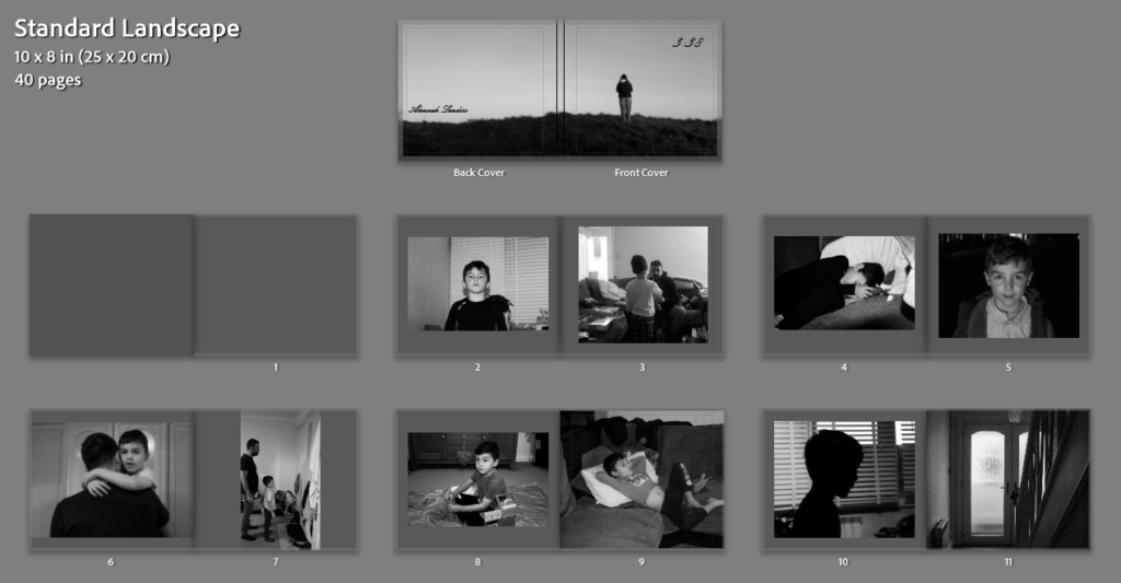
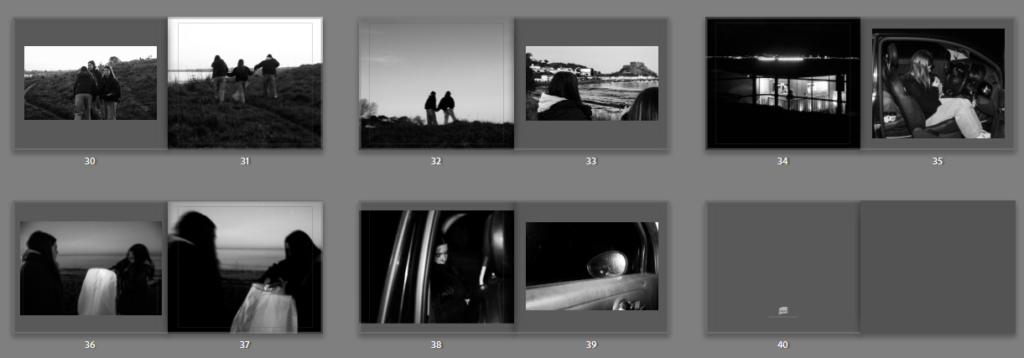
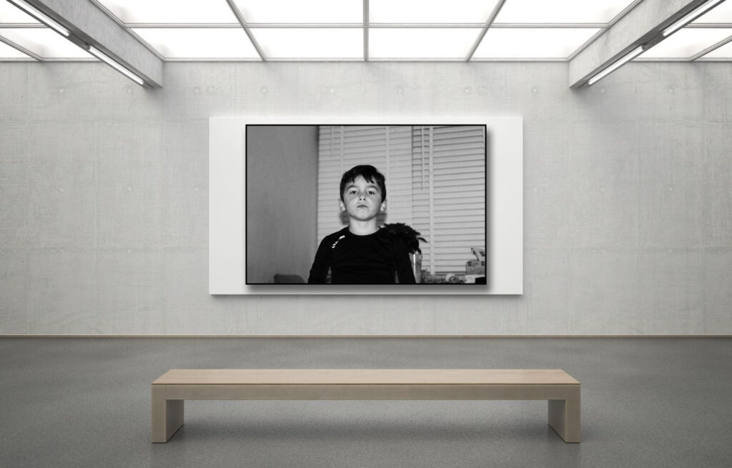
For my personal study I have chosen my theme to be youth culture and identity expressed through nightlife. I have chosen this theme as I think it is a fun thing to be taking pictures of and a good way to take fun photos and experiment with them. Firstly I did a photoshoot with my friends of us at one of our houses and got my friend to act drunk in the shower

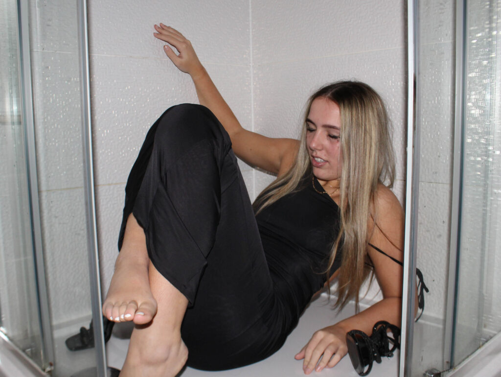
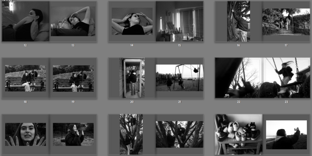
For this image I got my friend to act drunk in the shower, I had her put makeup and a nice dress on because this matched with one of the parties that I took pictures at so I thought it would be a good filler image to use. I edited this with high contrast and increased highlights and whites to make it look brighter. I wanted this effect because It’s very in your face and in contrast to the images of one of the parties that I went to it has the opposite lighting effect which looks cool.

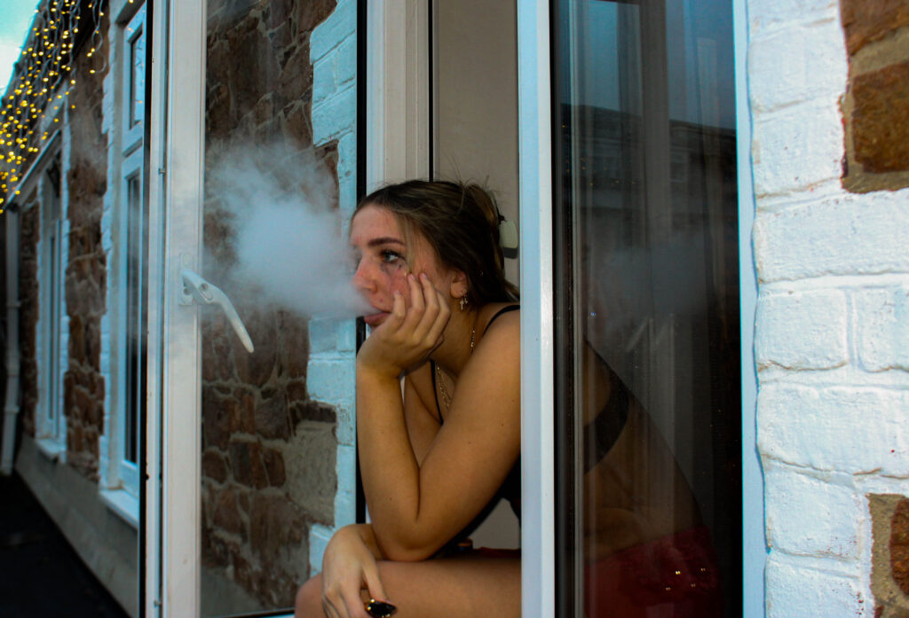
This image is also set up where I had my friend smoke out of a window to represent someone who is hungover after a night out. I turned the exposure down to replicate the early hours of the morning. I increased the contrast to make the image seem a bit more rough and turned up the saturation for this yellow tone which matches with the final images in my photobook.

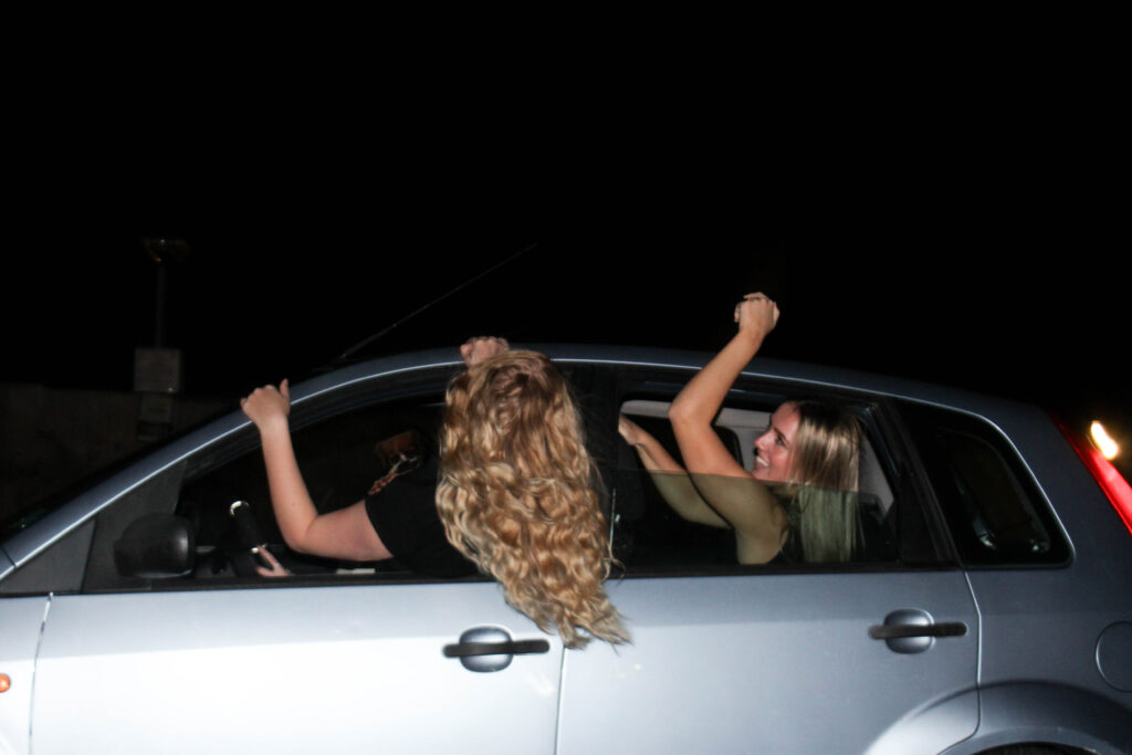
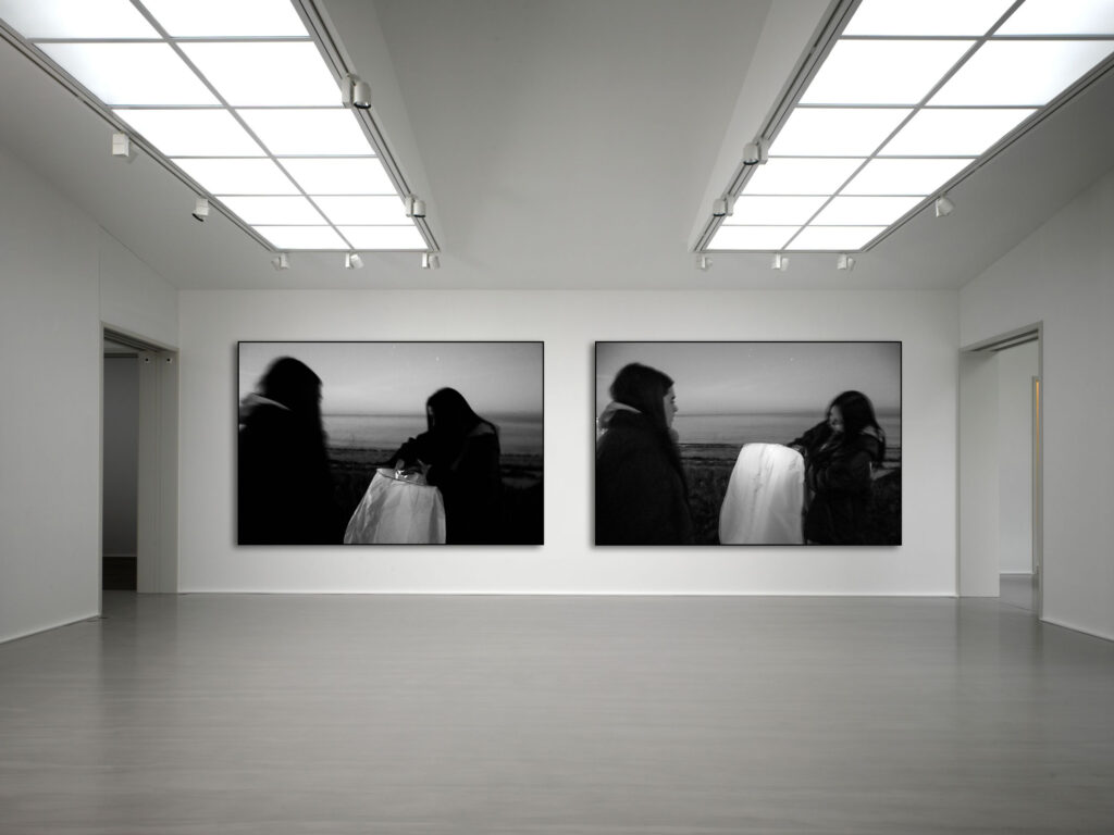
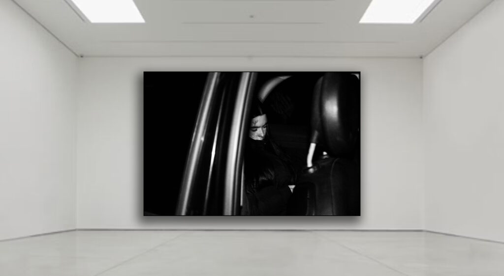
This image of two girls hanging out of a car is a filler image for my photobook, as it will be used to separate one night from another. I decided to use this photo because it still fits my theme of youth culture and identity in nightlife as its night time and its two girls having fun but without going to a party which is a break from all my other images of partying. I increased the exposure the overall image brighter but also for the car to look brighter because it contrasts better with the hair coming out of the car window.

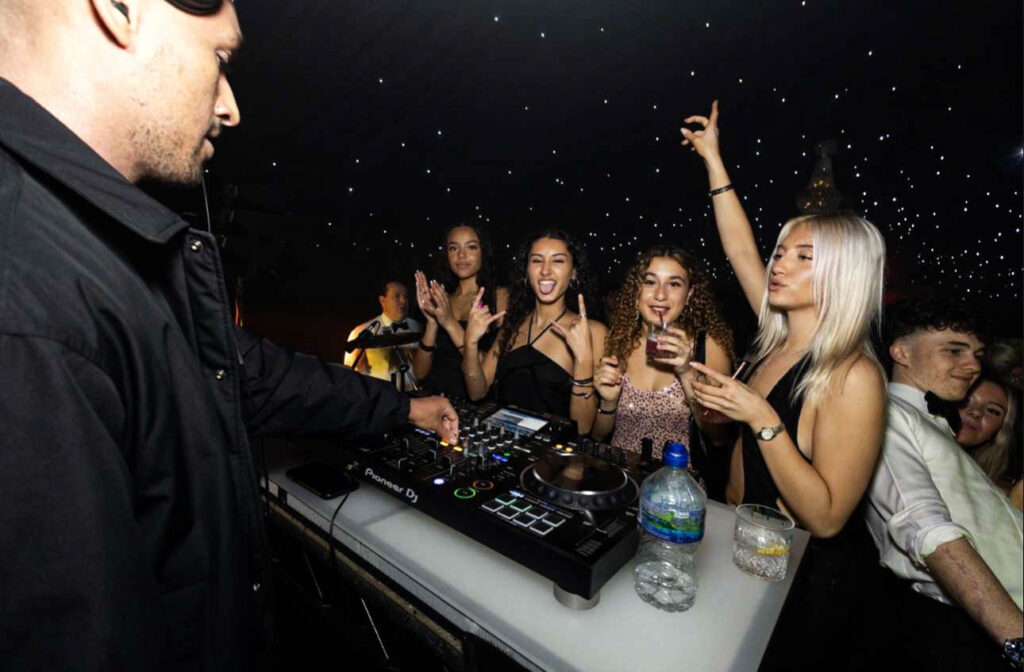
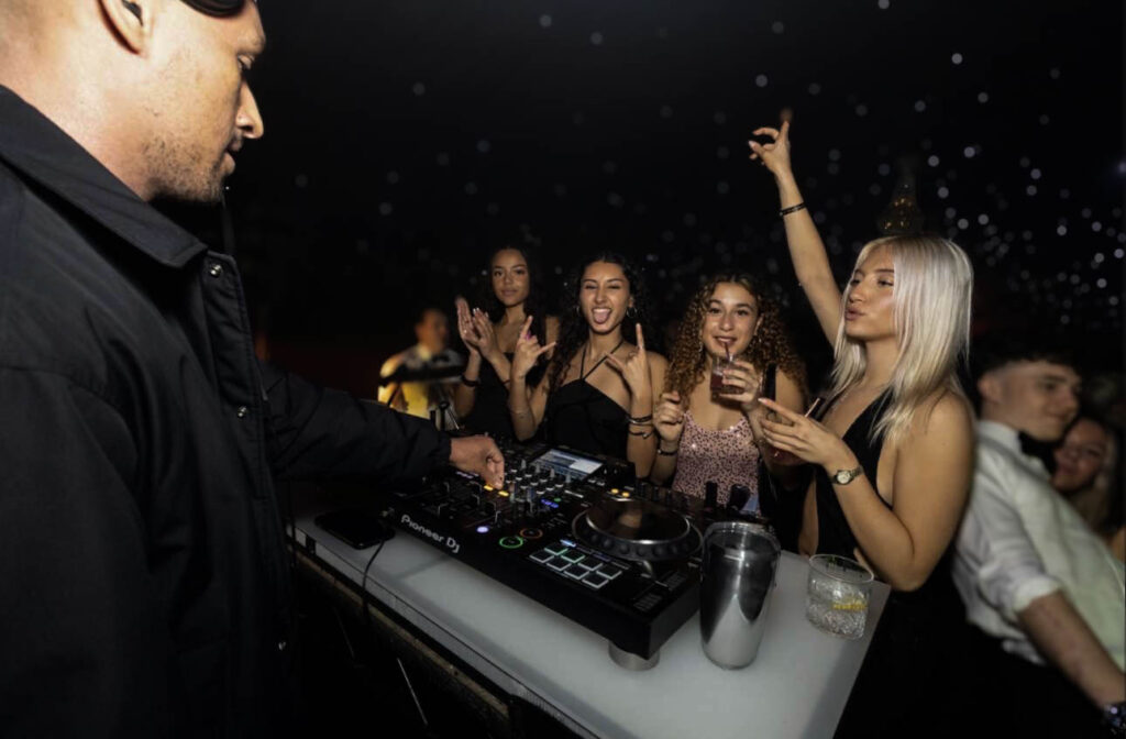
For this image I used AI to remove a water bottle and replace it with a metal cup because the water bottle looked out of place and to me ruined the picture, I couldn’t remove it fully without it looking weird, so I replaced it with the cup, which looked better overall and matched with the other things on the desk better. I also used a blurring filter for this photo so you could focus fully at the DJ and the 4 girls at the front. It also looked nice with the blurred background with the little star lights in the background.

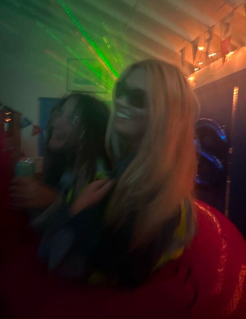
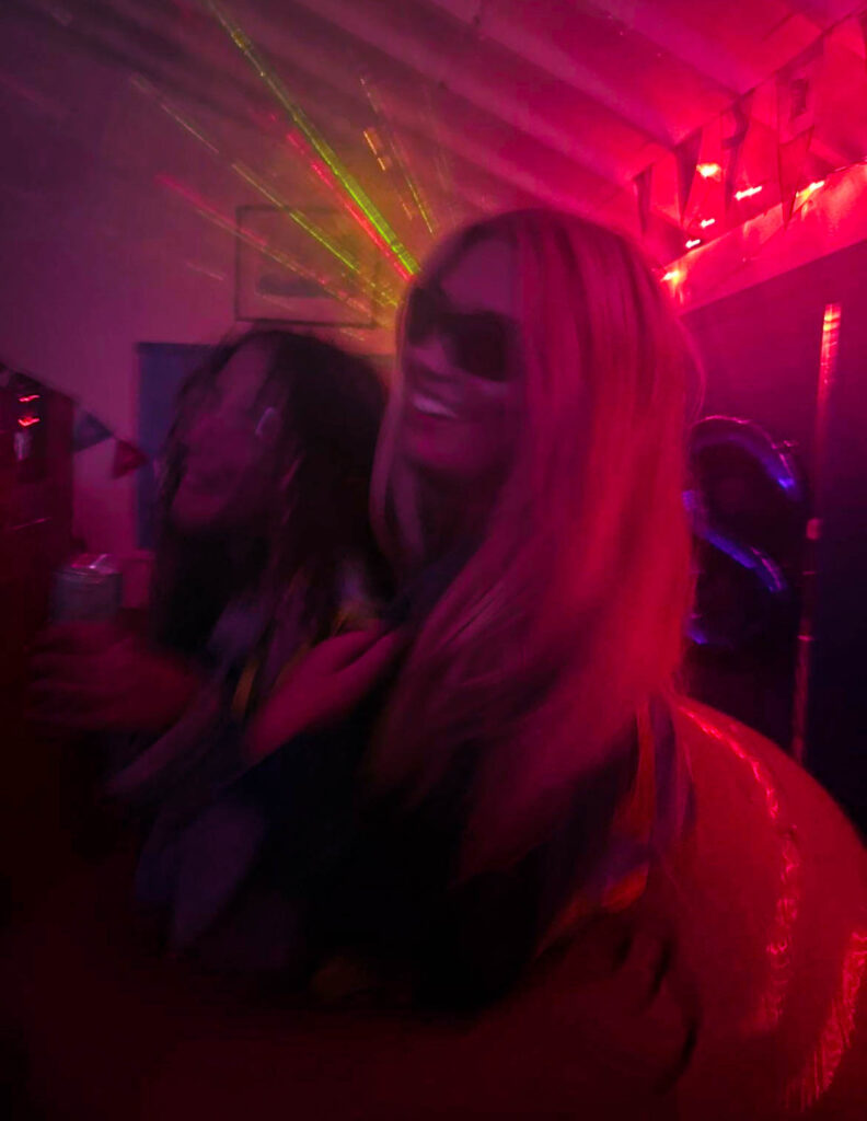
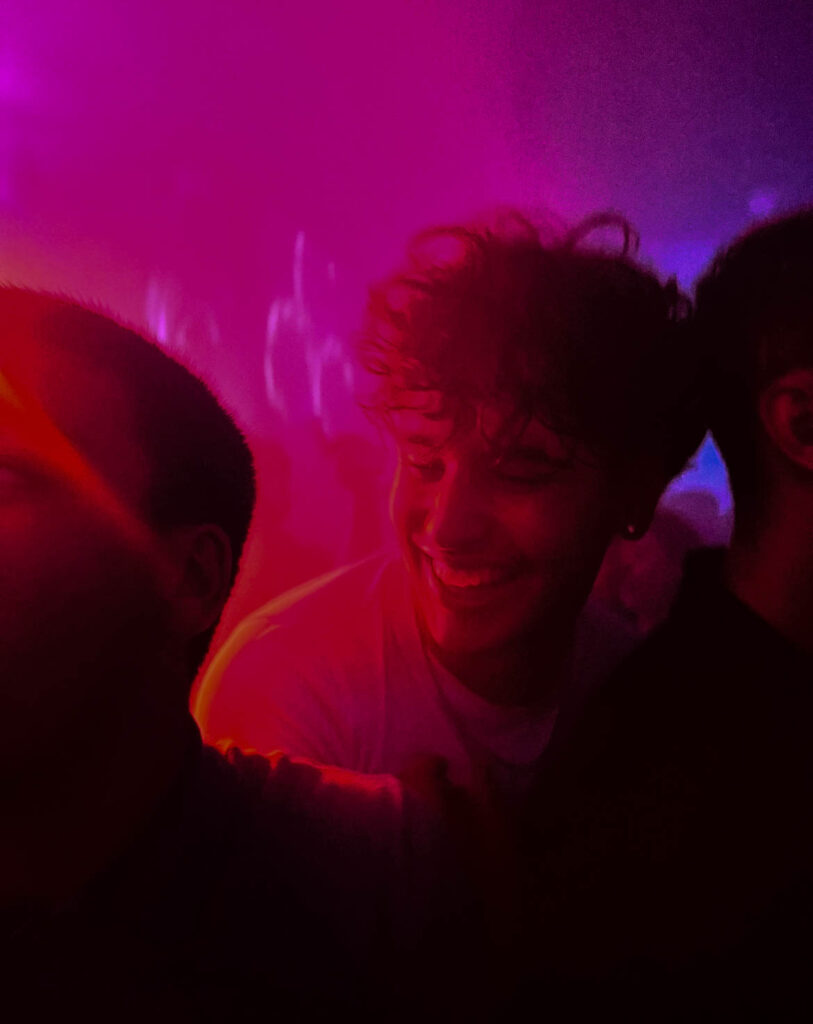
For this the picture it originally had green lighting but I changed it to pink to match another image that I was using in my book with the same posing and movement, which is originally a pink/purple colour but I made it brighter and the colour stand out more.

How its used in the photobook:

How I edited this image:

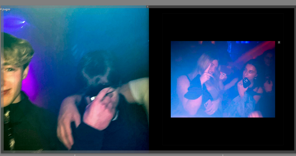
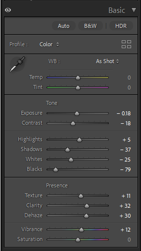
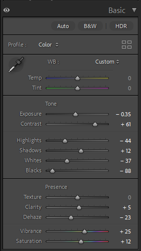
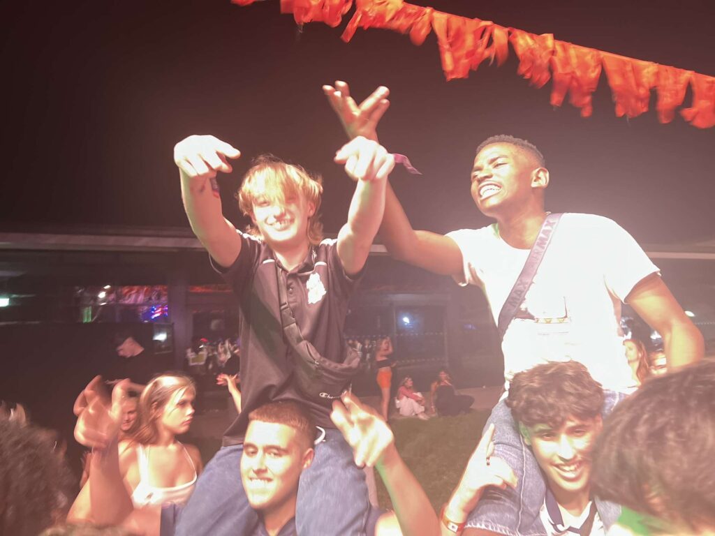
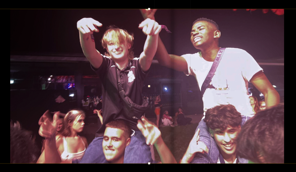
The first image already had bright lighting but I turned up the dehaze and clarity to make the lighting pop out more while also turning down the exposure and contrast to make it darker in general with the bright colourful lighting in the background. For the second image I turned up contrast so it wasn’t too blurry and then turned up vibrance and saturation to make the colours stand out more. I made the overall tone much darker than the original because the picture looked well lit with blue tones but looked too bright compared with the other.

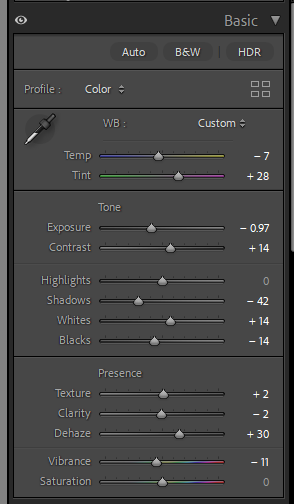
For this image it originally was more orangey and bright but but I turned down exposure so that you could see things more clearly without it being so bright and then turning down vibrance and increasing the pink tint for a neutral tone because it is placed in my photobook next to images with brown and neutral tones.

Personal Study: Evaluation of project

Initial Idea Reflection

The main focus of my project was to show how the “normal becomes abnormal”, referring to how recognizable areas or locations change under different lighting and weather, specifically at night. When I commenced the project, I was going to explore both day and night photography but as the project went along, I found myself more interested to the low light / night photography as it brought the mystery, emotion and thought-provoking feel. Me being more interested by the nighttime photography, led me to have more photoshoots during the night and better outcomes at night whilst still getting multiple daytime shoots in.

Photoshoots Reflection

The biggest realization I had throughout my project was that the images taken during the night turned out a lot more effectively in comparison to the daytime ones. The night time photographs had more of an emotional effect to them, evoking senses of mystery, isolation, solitude and interest which fit in perfectly with the theme I was intending on. The nighttime photographs, inspired by Todd Hido and Pierre Putman had a surreal, cinematic look to them which was created through the blend of lighting and the mist, the shadows and the contrast of highlights. Alternatively, the photos taken during the day, although they were strong in terms of composition and framing, I thought that they were quite basic in comparison. They were missing the same feel and intensity which the nighttime images had, meaning that they look more simplistic. Even though they may have been quite ordinary, they still played a huge role in the sequencing of my final photobook, they allowed to show the dramatic changes between the day and night effectively.

Essay process

Another key aspect of my project was the essay, writing the essay was challenging but there were many positives in completing the essay to a high standard. To construct this essay, I had to do lots of detailed research into the photographers, Todd Hido and William Eggleston. I also researched the progression and history of colour photography. Although it was difficult, it helped me understand different photography techniques, lighting techniques and etc. In conclusion the essay improved my confidence in analyzing the meaning behind work which helps me analyze the meaning behind my own work, benefiting me in future projects.

Final Book Reflection

The final photobook successfully shows the theme I had intended on exploring. The minimalistic cover attracts people to look at the inner pages of the photobook as it is mysterious and is an extremely thought-provoking scenery, the yellow title was a perfect addition to the cover as it gave a contrast without being too bold. If I could change or improve anything about this project, I would make the amount of images of day and night more equal and get them to similar quality. I would try out different ways to make the daytime photographs more interesting, engaging by maybe focusing on different angles, lighting conditions, lenses or different camera techniques.

As a whole, this project has made me think precisely about sequencing, planning and presentation. It has also helped me have a stronger understanding on how images can have deeper meanings behind the framing of it. In the future, I will be taking skills I have improved and learnt with me as well as any improvements or mistakes as a lesson which I can avoid in future work.

Final Prints – Virtual Gallery + Evaluation

final Prints:

Above are the seven photos that I precisely chose to be my final prints. When selecting the images for final prints, I chose only one that was taken during the day because my nighttime photographs are more powerful in conveying the mood and atmosphere that my project aims to express. The artificial lights mixed with darkness create mystery and depth that is suited to the main theme of my personal study. In the future, I will frame these prints to evolve the presentation and impact that these photos can have on the viewer.

Virtual Galleries:

Virtual Gallery #1
Virtual Gallery #2
Virtual Gallery #3

To see how my end prints would be shown in an art gallery space, I created a virtual gallery using a website called: ArtSteps. Artsteps allowed me to investigate how to put the photos together and which layout looked best in the gallery space. The layout was done carefully to put night photos next to other night images, making a more organized and clearer layout. I included the one day-time photograph on its own in the middle of the exhibition in order to make it a statement piece and make it stand out even more. Seeing the photos in this gallery setting allowed me to be more specific with my selection of my final prints and it also showed how the photos would be successful together in a professional gallery space, giving me inspiration on how to lay my final prints out when framing them.

Evaluation Of Final Prints

For the recent images I shot, I think they perfectly capture the mood and ideas I was going for with this project. The seven images summarise the entire book by displaying the contrast between the light and the dark as well as how everyday places change based on the lighting and time of day. However, the contrast between the two would be apparent and easier to compare if I had chosen an equal number of daytime and nighttime photographs for my final prints. The choice of mainly nighttime photos was intentional, the nighttime scenes produce a stronger mood, mystery, and emotion, where the one photo taken during the day provides a glimpse of clarity to lead the viewer into the darker scenes. Each photo was chosen specifically based on composition, light, and the effect that it provides to the series. Seeing these images in the virtual gallery made me more comfortable and confident that these 7 images were the most appropriate to use. Soon, the photos will be framed and mounted to be presented professionally and in person.

Photobook Creation

I chose these two images as my front cover image and back cover image. The reason I chose the front cover image, was because it explains my whole theme with the struggles my subject has to deal with through injuries in basketball and the still photograph in the dark, sat underneath the hoop with a spotlight shined down onto him, is very powerful for emotion.

I chose the back cover image to be that multiple photograph of my subject shooting and playing basketball on the court because as the storybook starts, he has the injuries, but as you progress through the storybook, you see he slowly heals and can then play back to normal again in the end. Hence the ‘Rise to Recovery’ title, but with the back cover image, it just shows how he is back to playing and can run and shoot around the whole court again.

I chose black pages as most of my photographs are in black and white, or involve it in the images. Also, black pages helps the photographs show isolation, loneliness and separation from playing basketball with friends.

I added my title ‘Rise to Recovery’ with my second main image after the front cover image, because this photograph is similar to the front cover but instead he is holding a basketball, looking down at it, instead of covering his face with his wrist. Also, it is in black and white to help showcase the physical, mental and emotional struggles that viewers may not be able to see.

I used this image of when he was in a boot from breaking his ankle, but I made it in black and white too, and selected it to go over the top of two pages.

For these photograph’s, I really wanted to keep the theme of black and white, but with the basketballs, shoes and even the graffiti in the background of the first image. I decided to do a colour-popping edit for both of them, only allowing the red and orange in each photographs to be let through resulting in these dark meaningful images.

This title, really expresses how his dreams of playing basketball everyday and night have now been shattered as he has to take onboard all these injuries preventing him from playing and excluding him from friend activities.

I then added these photographs with them all having a similar theme of how my subject ‘Bruce’ is excluded from playing with the rest and has to just sit down and watch from afar. I chose to have one photograph on each side that involves black and white to equal out the balance between the four photographs.

These photograph just involve my full photograph in the first image, with my subject sat down hiding behind his cast on his wrist, holding the basketball, sat under the hoop. But then, the image on the right is after I edited it and drew over his cast with a red, to show the frustration through his cast and injury and also it links to my reference of the girls coat in Schindler’s List.

These images just involve a picture of a basketball hoop against the wall, and a long exposure photograph of the court with all of its lines, on the right, which together is what resembles a basketball court. I made the hoop image in black and white to resemble forgotten/fade. This is because it is not being used anymore as my subject is injured, so it is being forgotten and fading.

I then chose to add this image which I created by making two cut outs of my subject layered on top of one another, with the ‘hue’ tool, which makes him kind of transparent, over the image of a basketball hoop against a wall. I used the title ‘Isolation’ because he is isolated away from everyone and is sat by himself in the dark.

I then changed the background of the paper to a light grey to match my inverted theme of this white inverted photograph of my subject in the same position centre of the hoop sat on a bench, with his jersey and ball darker compared to the rest of the image.

Then I created the title ‘Inverted’ on the next page, with two of the same photographs but in opposite inverts, with one in white and one in black next to each other.

The inverted photograph’s is from this overall image with this one in full colour next to a singular photograph of the hoop at millennium park, with the title on the left ‘Hoops, Ascend’ which resembles how he is ascending back to the top again and back out of injury to full playing.

Finally, I used this image I edited with multiple photographs in one big one, spreading across two pages, but keeping the black and white theme, which shows the overall story, of him having injuries but then after recovering he is rising back to playing again including dunking the basketball.

These are all of the images I have used in my photobook and including my reference images.

This was my idea for my layout with all of my final images but I will change it around.

This is my final layout including my final essay at the back.

For my text throughout the photobook, I used ‘High Tower Text’ font, with size 12pt, for paragraphs and size 24pt for titles. I used size 24pt for leading which spaced out my lines helping my essay look more professional and it was the idea I had in mind. I also used centre lining for all my text because I felt the layout looks better overall and looks better next to my images.

Evaluation

For my evaluation, I chose my final images which are specific to my theme for a lonely, isolated basketball player who has to deal with injuries. But, what my photographs show and tell are the thoughts and feelings not everyone sees, but he has to deal with everyday whilst being unable to play. I used a lot of black and white photographs, or photographs in colour but involve black and white, like when I made just my subject in black and white to showcase how he is left out and/or how he is the one struggling whilst all his friends are playing.

I used black paper for most of my photobook, but for my inverted images, I chose to use a mid-grey colour for the paper, so my images blend nicer against the background.

Also, for my essay at the end, I started the introduction in black paper with white text, but as I got to the historical and theoretical context, I decided to switch the paper and text colour to opposite, so now the paper is white with the text in black and I carried on switching between the shades after each section of my essay.

Virtual Gallery

I created a virtual gallery in Photoshop, transforming my final images to fit in-between the frames against the walls, creating this.

Photobook Design and Layout

I have 4 main focuses while designing my photobook;

  • Simplicity – 1 photo on each page; the photos I have taken are very good standalone, therefore each photo will be presented on the right page, with a blank page on the left throughout the book, creating a simple sequence that visually appeals to the viewer, while also directly disconnecting each photo from each other.
  • Create a narrative – my photo taking was very spontaneous, and no photo is the same really, however if I describe to the viewer what the Ferrariesta means to meat the start of the book, the viewer is more inclined to view the photobook as a journal, or a documentation of the Ferrariesta, similar to how 240 Landscapes by Helge Skodvin is presented.
  • Start with the best photos – if my best photos are scattered around near the front of the book, the first impressions of my photography will be much better, and since this book only has a loose narrative, I am able to do this.
  • Create connections between photos – there are some elements of my photos that are similar, and therefore it is best to put these photos together in the book so that the viewer recognises these similarities also.

When building my sequence, I knew to start with my best images and move through the book trying to loosely connect each photo with each other. The majority of photos do not link, which made this slightly challenging, however I did find that these two photos would be perfect when put next to each other in the sequence.

Final Photobook

To start with my photobook, I moved around the images, placing them next to others or alone to figure out where they would best be presented. While doing this, I also evaluated each image, deciding whether or not it would make the final cut, removing some images or replacing them with better versions, as well as adding in completely new photographs that I hadn’t been sure on.

I also moved them around and experimented with different orders to present the photographs. This was the harder part as the images are from photoshoots with different scenarios. However, once I figured how to arrange them synonymously, I was able to position the images well within the book. I believe that the final way the photographs are ordered works well with the narrative and aesthetics of the entire book.

Finally, I went back through the images, changing the placement of how they were displayed on the page. I used a variety of positionings such as in the middle with a border, across the whole page, or a double page spread. This allows for a change in the book, avoiding too much repetition too often.

Final Layout:

Overall, I think my photobook turned out well. I was able to present my photographs as I had hoped to, with the images in such an order that the narrative is portrayed effectively. I believe the final images that I chose to use in the photobook work really well together and I think that they are good photographs. I also really like how the black and white theme turned out, I think that all of the photographs being black and white makes the aesthetics better than if I had a mix. If I were to do this project again, I would take photographs of other friends and family close to me, allowing myself to illustrate different lives and aspects of life to what is already shown.

Some final images:

Photobook Specification

Narrative: What is your story?

In 3 words:

Life, memories, moments

In a sentence:

This photobook is a glimpse inside the life of another.

In a paragraph:

The narrative of this photobook, is to show a small segment of the lives of the people close to me. My aim is to portray the differences in the way every person lives their life uniquely from one another. Although this photobook only reflects particular moments, when observing the images, you are looking into a part of my life, and more specifically my friends and family’s who are in the images. This could be considered as ‘mirror’ images as they are reflecting myself and that is the main idea.

Design:

My photobook will use matte photopaper to make my images look classy and for a more subdued feel. I will be making a standard landscape photobook (25 x 20cm). I am going to use a hardcover image wrap for my book.

The title of my book is ‘3:38’, I have decided on this title as there are no words to describe what is inside of the book and I think it makes it more intriguing.

When designing this book, I carefully picked which images would sit well next to one another. I decided on whether the photographs fit well into the story together, whether they shared some similarities, if the people in the photographs differentiated etc. to come to the final sequence of images.

Once I had the order of my photographs in place, I then altered the presentation of each image. I have displayed some images across the whole singular page, some in the middle with the page bordering them, and some across a whole double page spread. I used a variety of ways to show my images to avoid repetition, and to reflect on how each page was a different part of the story.

Personal Study: Photobook Construction

Selection of images

Firstly, before I even began opening the book I selected the 41 final images which could possibly be used in my book and put them into a collection of its own. This collection consists of images from Both night and day, ready to be put into my photobook to show the contrast between the day and the night. Before even opening up the book tab I had another quick review of the images and most of them will be incorporated in the book however some might not. The collection of the 41 photos are displayed below.

Book Specification

These are the settings I have originally chose for my Photobook, I have gone for a Standard Landscape Book with a Hardcover Image Wrap and on the inside I have chosen to have Premium Matte paper. I chose the standard landscape sized book because most of my final selected images are landscape orientated and in my personal opinion I prefer the landscape over the portrait book. Premium Matte paper was chosen because matte paper works better with darker photographs, it allows the ink to sink in efficiently.

Initial Book Construction

Front Cover:

Front Cover Original Image

Firstly, this is the image I have decided to put as the cover I chose this image to be the cover of my book because this photograph is extremely thought provoking and displays a part of my projects theme clearly. To make this landscape image the front cover I had to zoom the image in 11%, meaning that I lost some parts of the image. Even though some areas of the image are not shown in the front cover, I do not think this is a big deal as I framed the image perfectly where the Interesting part of the image was shown, and the parts cut were little details which do not add too much to the image. The combination of the fog and the bright glow coming from the lampposts creates brings out the feeling of mystery. The emptiness shown in the photograph links back to the solitude which the night brings. This cover fits perfectly with the purpose of my photobook of how a normal setting can become abnormal, the focus of my project. This image stands out and therefore invites the viewer to pick up and look through my book. 

Title Of Photobook:

My Title for my project has always been “Normal Becomes Abnormal”. I chose this title at the very beginning of the project, this title was chosen due to the way it blends with the intention behind the images and the images themselves. My projects theme is to show the contrast between the day and night showing the elements presented during the day, under the sunlight and showing the contrary elements which are presented in the night, under low light.

This above is the chosen front cover of my photobook and the next step to finalize, or proceed with the photobook is to add the title of my project: “Normal Becomes Abnormal”. I already had an idea in mind on what font I was going to use for this title, The font is called Playfair Display. This font stood out to me out of any other font because it has both thick and thin strokes which creates a dramatic look and matches the look of the book.

Once I decided what font I was going to use for the title of my front cover, the next step was to choose a colour for the title. I started off with experimenting with most colours seeing which ones I thought worked with the book and which ones did not, I narrowed my choices down to two colours Muted Yellow and Cool Grey. I first experimented with the muted yellow, finding the perfect shade of yellow on google then using the muted yellow hex to apply it to my title. I found that muted yellow worked well with the front cover because my cover displays a dark misty night setting and the muted yellow gives me enough contrast to make the title stand out. I chose muted yellow over any other yellow because this Muted yellow stood out in front of the dark tones of my image without being too bright or clashing with my cover. Below is What my title looks with the Playfair Display font and the muted yellow colour.

Once I had experimented with using the muted yellow colour on my title, I then tested out a cool grey on the title, however this colour did not work well on my front cover. The grey did not stand out when placed on top of my cover, because the photo on the cover is mainly dark toned and the grey on the cover just blended in with the rest of the image, making the title not stand out. Below shows what my title looks like in cool grey, in the screenshot it looks good however when put together with the whole image, it just does not work.

Title Placement Experimentation:

As you can see in the screenshots above, I experimented with the placement of the title. I tried placing the title of my book on various different areas of the cover. After having tried every area I could, I found that when the title is located in the corners of the cover, where there is some empty space, it looks more minimalistic and professional. Above show the four title locations I narrowed it down to, My favourite two out of these four are the two displayed below.

I find that these two covers work the best out of the four, the title being placed on the right side of the cover works nicely as the bottom and top corners of the right hand side are quite empty and do not show any detail, making these the perfect places for my title to be so I lose as little important content as possible. These two are also very minimalistic which I like and was one of my targets for this photobook.

Final Front Cover Chosen:

This above is my final front cover I have chosen for my photobook. I have decided to include the muted yellow title “Normal Becomes Abnormal” placed in the bottom right corner of the cover image and the font used is Playfair Display. I chose this design as my final one as it looks professional, tells a story, minimalistic and is eye catching, making it a strong front cover for my book. The muted yellow colour on the font works perfectly with the cover image, duplicating the same tones as the streetlights and it gives a slight contrast making the title stand out, drawing attention to my photobook.

Inner Pages Of Photobook

Sequence Experimentation 1:

To start off the internal pages of my book, I started off with a quick draft putting the night time images at the front of my book and the daytime photos towards the end of the book, contrasting the sequence of the ordinary day. I do not think that this sequence is good enough to be my final sequence as it just does not make sense and is quite confusing. Below is a screenshot of my first experimentation with structuring and sequencing the inner pages.

Sequence Experimentation 2:

Below is my second experimentation with sequencing, differently to my first sequence I started off the book with photos during the day and then the end of the book consisting of the night time / low light images. I think this sequence works better than the first one, following the cycle or the day, this structure allows the viewer to experience the shift from day to night, going from familiarity and clarity to mystery and isolation.

Sequence Experimentation 3:

Below is my third experimentation with the sequencing, this is my favourite format of sequencing out of the three drafts. This structure shows a photo taken during the day, then a photo taken during the night showcasing each one side by side, making the difference between the day and night easier to understand and view. This sequencing also works very well because I have a handful of images which are taken in the same location at different times, by placing two photos taken in the same location next to each other, I can really display how the day and night contrast with each other. This will be the sequencing I use for my final photobook.

Image Framing:

As you can see in the screenshot above, I have decided to make each of the photos have a border around them, I did this on every page to create a sense of balance and keep my photobook consistent.

Page Colour:

I did not like the white background on all the inner pages because I think that the white pages do not work well with the overall mood of the images, therefore I changed it to a darker tone, a dark grey. This slight change in the book makes a big difference, making the book more appealing to look at and the paper blends with the night time / low light photographs. This small change helps put the whole book together, making the presentation of my book more detailed and efficient.

Back Cover:

For the back cover I have decided to keep it simple and leave it blank, apart from my name. I have done this to keep the minimalistic approach I have kept throughout my entire photobook. By not adding a photo on the back cover, it allows the viewer to only focus on the front cover and the photography itself. The minimalist approach also adds to the sense of mystery which I portray through my photographs taken during the night, reinsuring the aspect of mysteriousness, making my book look more professional and neat.

Final Evaluation Of My Photobook

My photobook, “Normal Becomes Abnormal”, focuses on different areas and settings change between day and night, highlighting how the time of day and atmosphere can create a difference in emotions. My main aim was to capture how normal environments that we live and see every day become mysterious under different times of day and light. The book was mainly inspired by William Eggleston and Todd Hido however i also took inspiration from a belgian photographer who goes by the name of Pierre Putman. Overall I am happy with how the photobook turned out in the end. I think the book successfully showcases the beauty of locations changing depending on their atmosphere and the emotional impact that it can create. This whole process has been great to do and helps me see what it is like to develop and create a photobook, this experience can be reflected on and any mistakes or errors done in this book can be used to improve any future project I do. Personally, I believe that this photobook could possibly be seen as quite random and confusing. The book could be viewed like this because of the use of the same locations next to each other and others being two completely different locations placed next to each other.

Final Photobook: