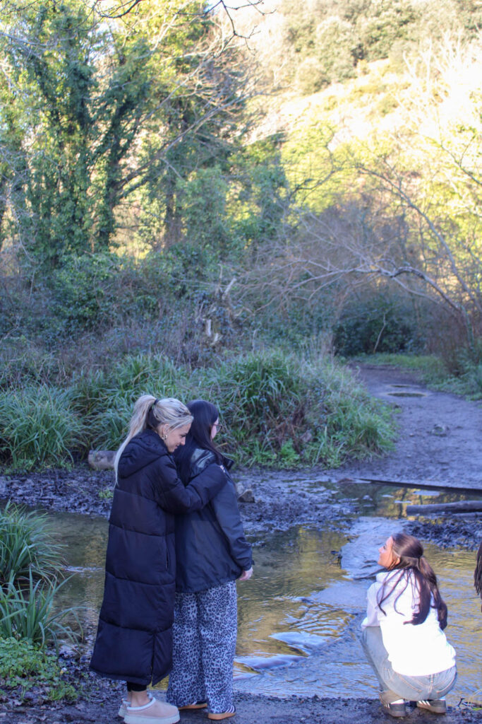
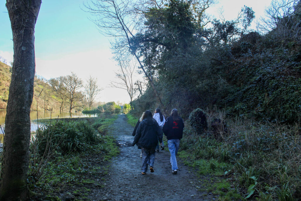
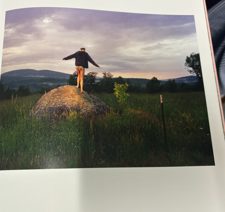
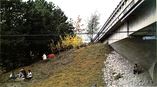
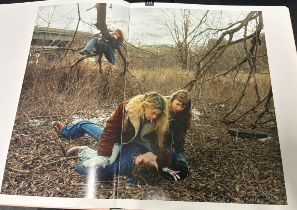
For this photoshoot I visited the field next to Jersey Dairy, where weekender used to be. The setting of this photoshoot doesn’t particularly relate to the themes of youth and identity, as this isn’t somewhere I used to visit except when I went to weekender, but it was a good setting to display the narratives I had in mind. The setting also correlated well with the settings used in Justine Kurland’s book. The narratives I wanted to display here was playing catch/ piggy in the middle, hula hooping and playing hide and seek.
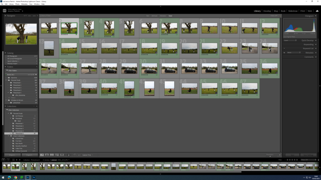
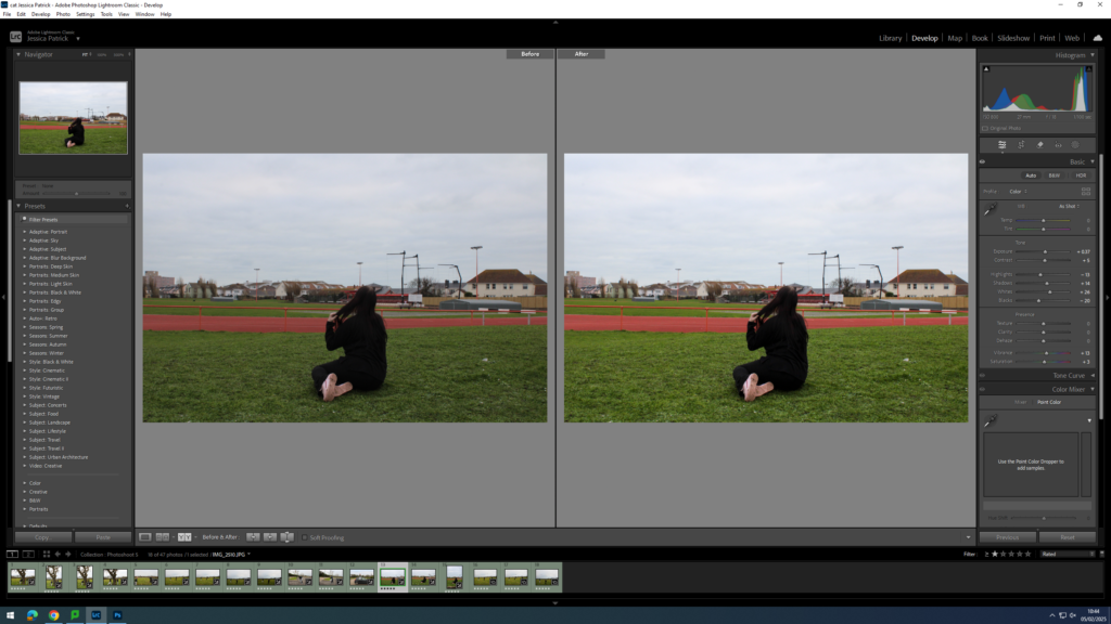
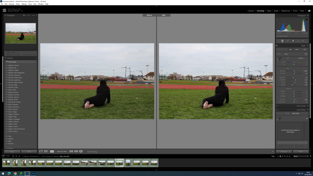
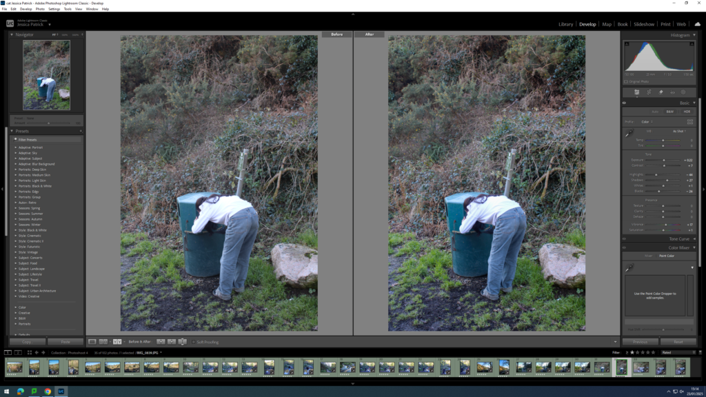
Contact Sheet
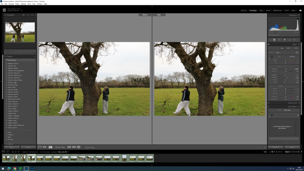
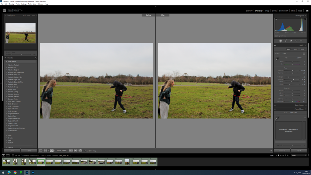
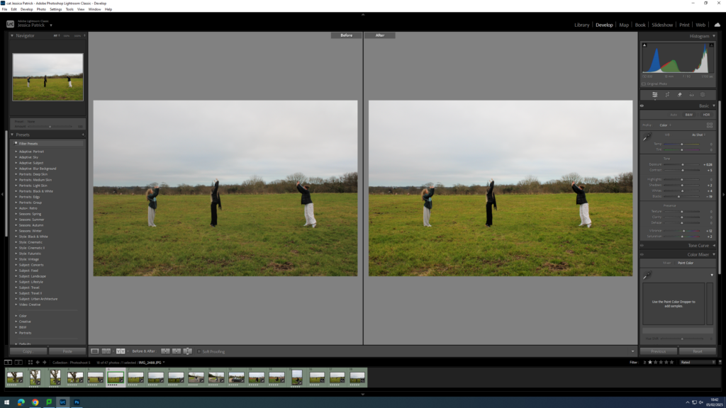
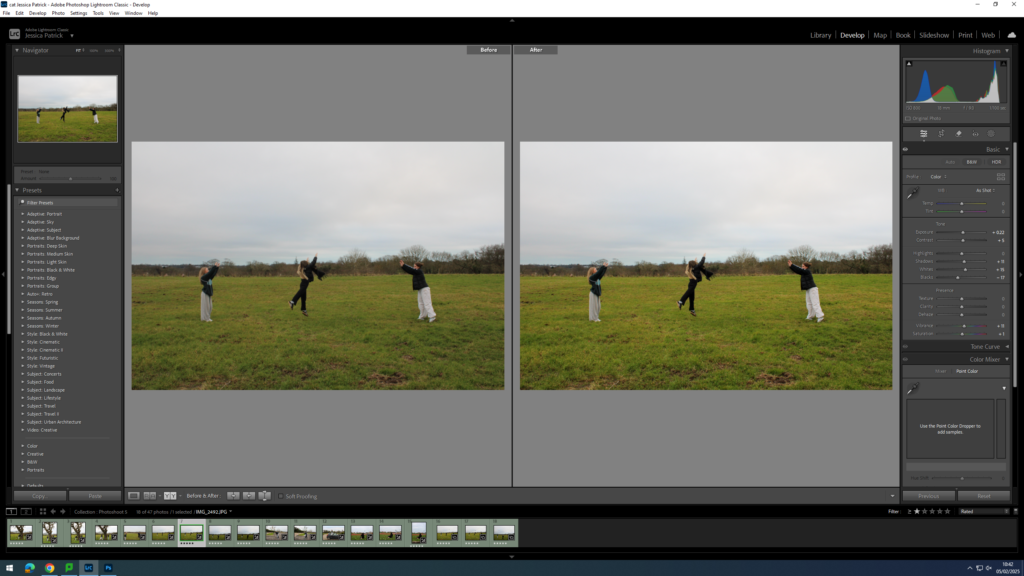
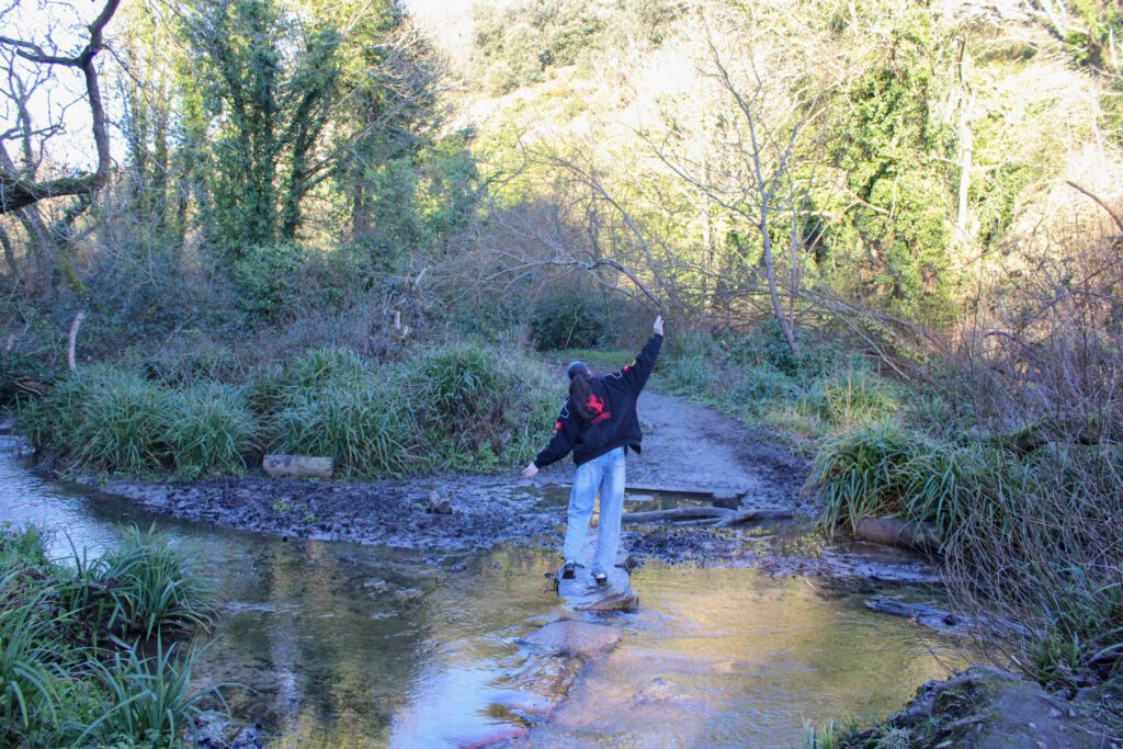
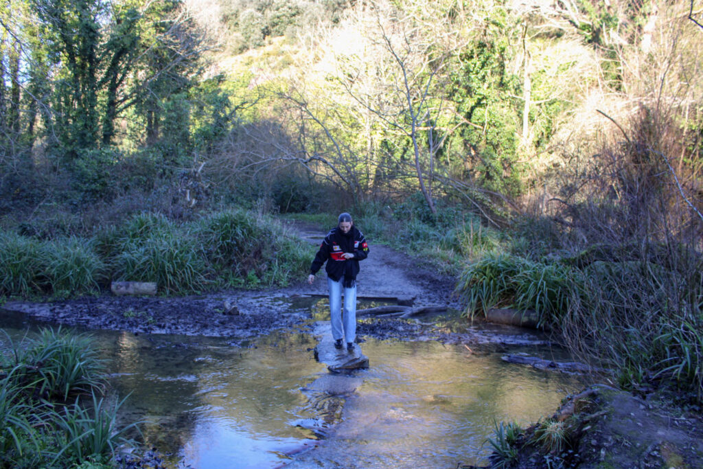
The images which are highlighted green are the images I have chosen to edit, because they are my best images with the best composition that fits my themes of youth and identity the best.
Edits
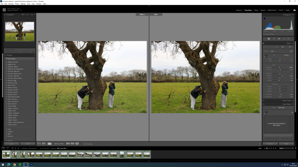
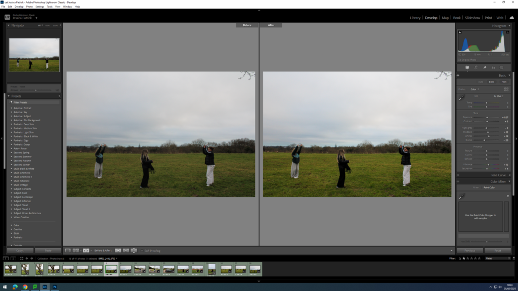
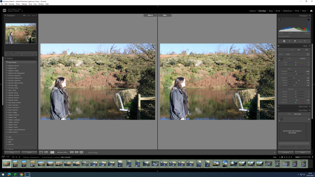
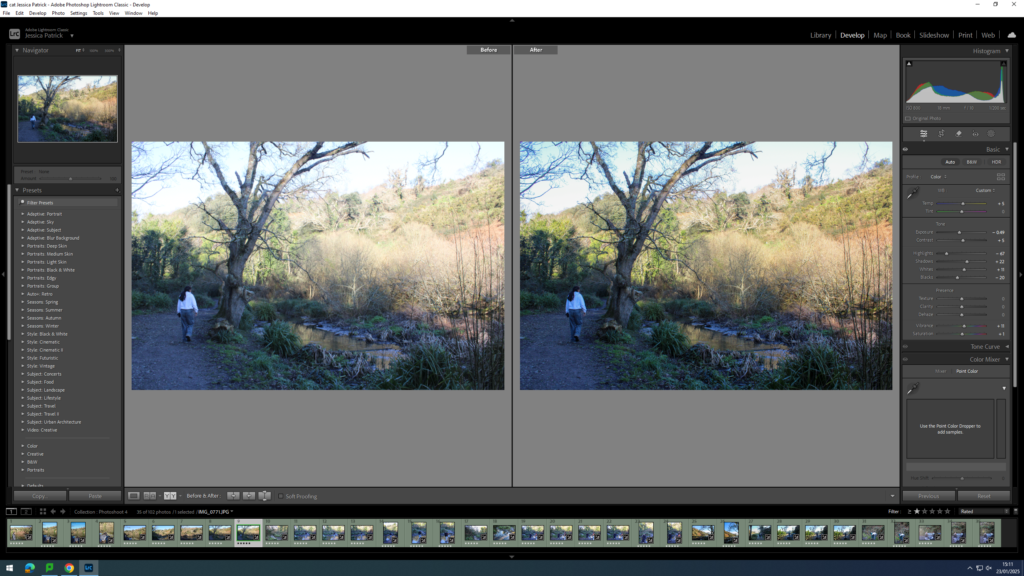
I edited this image by increasing the contrast, shadows, vibrancy and saturation, while decreasing the exposure, whites and blacks. I did this so that the image would be more vibrant and saturated, specifically the green grass.
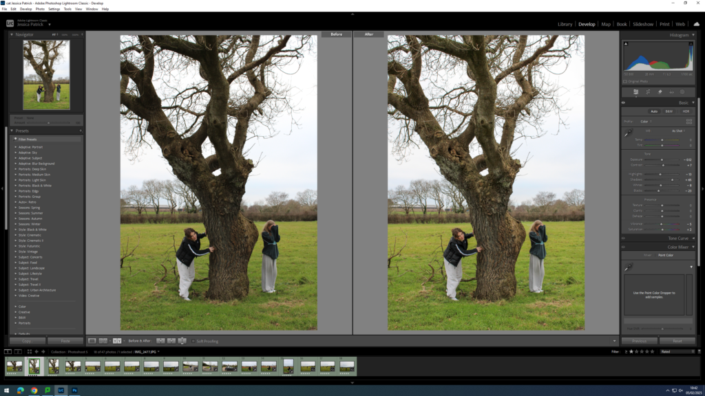
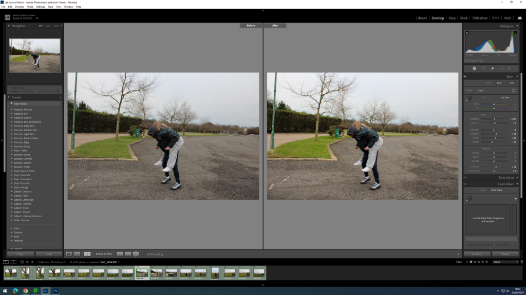
I edited this image by increasing the contrast, shadows and saturation, while decreasing the exposure, highlights, whites, blacks and vibrancy. I did this, so that the image had better lighting and was more saturated.
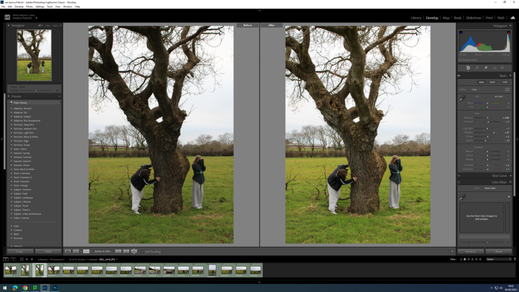
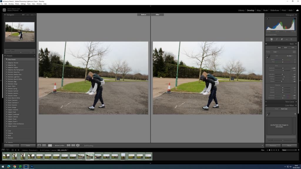
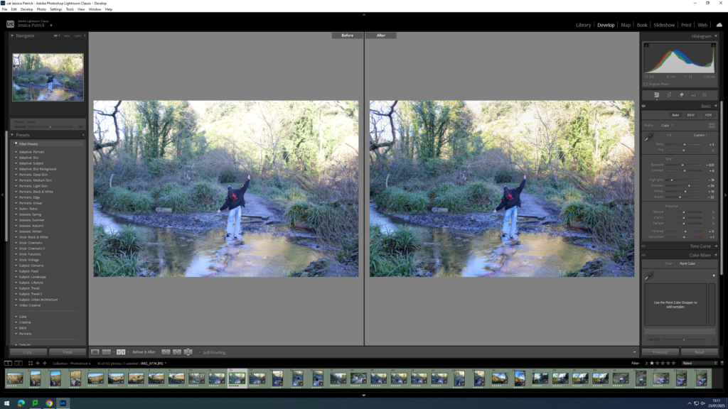
I edited this image by increasing the exposure, contrast, shadows, whites, vibrancy and saturation, while decreasing the highlights and blacks. I did this, so that the image would have better lighting and be more vibrant.
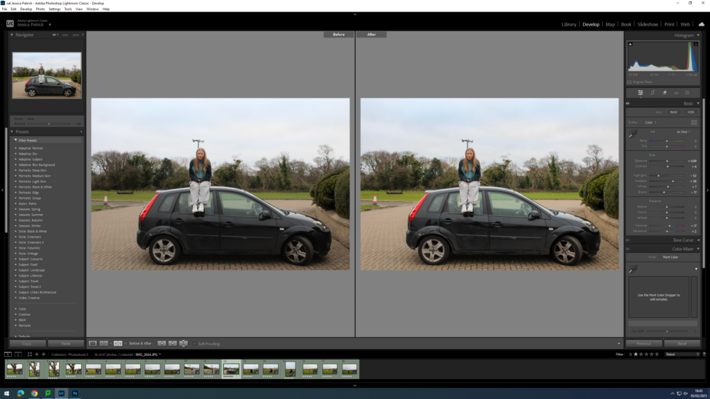
I edited this image by increasing the exposure, contrast, shadows and saturation, while decreasing the highlights, whites, blacks and vibrancy. I did this, so that the image has better lighting and is slightly more saturated.
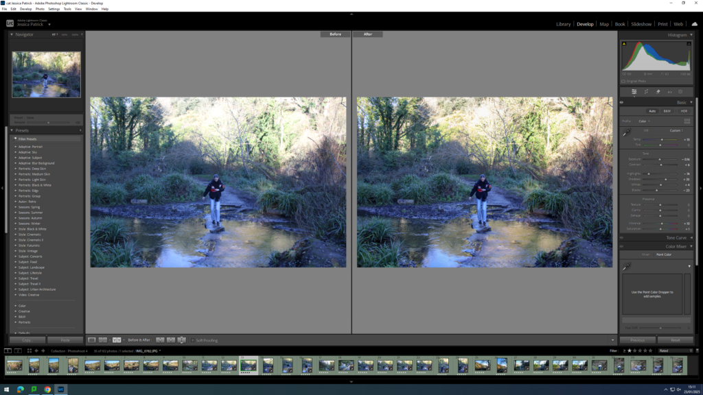
I edited this image by increasing the exposure, contrast, shadows, vibrancy and saturation, while decreasing the highlights, whites and blacks. I did this, so the image would be slightly more vibrant.
I edited this image by increasing the exposure, contrast, shadows, whites, vibrancy and saturation, while decreasing the blacks. I did this so the image would be more vibrant.
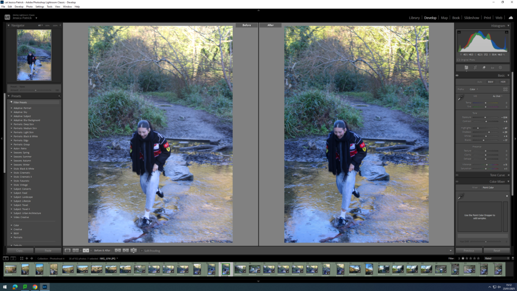
I edited this image by increasing the exposure, contrast, shadows, whites, vibrancy and saturation, while decreasing the blacks. I did this, so the image would be slightly more exposed and more vibrant.
I edited this image by increasing the exposure, contrast, shadows, whites, vibrancy and saturation, while decreasing the highlights and blacks. I did this to improve the lighting.
I edited this image by increasing the exposure, contrast, shadows, whites, vibrancy and saturation, while decreasing the highlights and blacks. I did this, so that the image would be slightly more exposed and more vibrant.
I edited this image by increasing the exposure, contrast, shadows, whites, vibrancy and saturation, while decreasing the highlights and blacks. I did this, so that the image would be slightly more exposed and more vibrant.
I edited this image by increasing the exposure, contrast, shadows, whites, vibrancy and saturation, while decreasing the highlights and blacks. I did this, so that the image would be slightly more exposed and therefore have better lighting.
I edited this image by increasing the exposure, contrast, shadows, whites, vibrancy and saturation, while decreasing the highlights and blacks. I did this, so that the lighting was better and the image was more vibrant.
I edited this image by increasing the exposure, contrast, shadows, whites, vibrancy and saturation, while decreasing the highlights and blacks. I did this, so that the image was slightly more exposed, so the lighting was better and so it was more vibrant.
How is sexuality and gender identity explored and represented in photography?
‘This binarism, which is but one of a series that underpins much photography theory and criticism, characterizes – in a manner that appears virtually self-evident – two possible positions for the photographer. The insider position – in this particular context, the “good” position – is thus understood to imply a position of engagement, participation, and privileged knowledge, whereas the second, the outsider’s position is taken to produce an alienated and voyeuristic relationship that heightens the distance between subject and object.’ (Abigail Solomon-Godeau, Inside/Out, 1995)
Introduction
Exploring sexuality and gender identity within photographs are usually captured and addressed from an outsider perspective, a viewpoint that is commonly objectifying and misleading. Instead, this intimate proximity, seen through Nan Goldin’s insider delineation of her close community, enables her to portray an extremely personal, and at times, voyeuristic perspective of her lived experiences. This narrative showcases a tableaux and uncompromising representation of Goldin’s and her found family’s feelings and familiarity within the queer community. Being in the same artistic circle as other photographers who predominantly photographed on film New York’s queer subculture, Goldin dedicated these portraits to preserving and capturing the essence of relationships, sexuality, gender exploration, and addiction during the 1970s and 1980s. As photography serves as an archive, there are many photographs exploring sexuality and gender identity which are immortalised, especially within the 19th and 20th century as photography began to become a popular and accessible medium of art and documentation. Situated within the fluidity and ambiguous notion of sexuality during these important and representative eras, these relaxed and fluid forms of identity captured within art and photography avoids distinct labelling, imposing a flexible identity of the individual.
Historical and theoretical context
Representation within art, photography and visual culture is to accept responsibility for the portrayal of the subject, and to deepen the understanding of the shared adjacent bond between the subject and the artist or photographer. The dichotomy between a subject’s essence being captured by someone outside their own community compared to inside their community showcases the epitome of “good” and “bad” representation of that person or group.
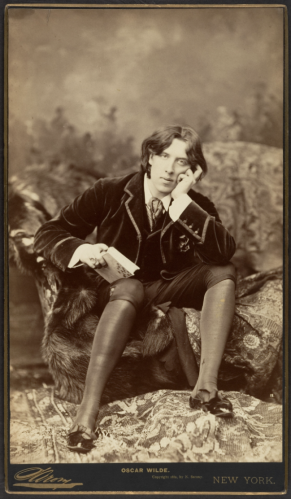
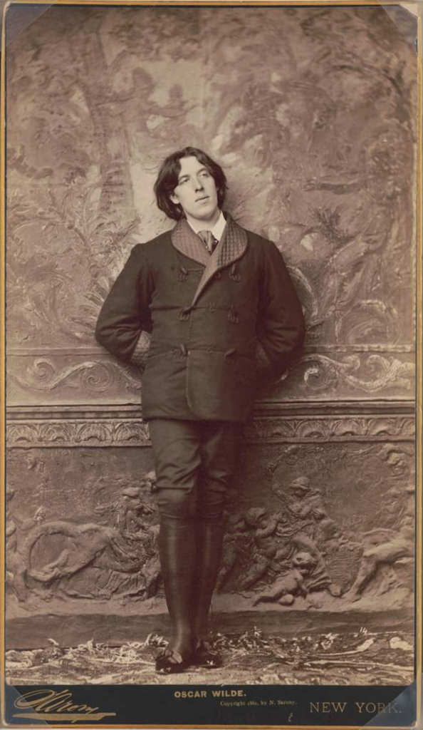
In circa 1882, the photographer Napoleon Sarony photographed portraits of Oscar Wilde, a poet and playwright in Victorian London, which positioned Wilde in the frame with his usual flamboyant and dandy personality, characteristics of the art movement of aestheticism which valued appearance of art over functions. The society of this time explicitly expressed disdain against sexual debauchery, which included the outlawing of all homosexual acts for ‘gross indecency’ under the 1885 Criminal Law Amendment Act, which Wilde was one of the first and highest importance figures prosecuted and put on trial for. This opens the discussion whether photography not only serves as an art form, but also archival material and an account of history.
Fig. 1Fig. 2
Fig. 1 – Napoleon Sarony, Oscar Wilde, 1882
Fig. 2 – Napoleon Sarony, Oscar Wilde, 1882
In Abigail Solomon-Godeau’s ‘Inside/Out’, she highlights and contrasts whether a photograph appears as an insider or outsider perspective. She states, ‘Are the terms of reception- or, for that matter, presentation- in any way determined by the position- inside or out- of the photographer making the exposure? … for not only are the photographs themselves exterior views, but they model themselves directly on the impersonality, anonymity, and banality of the purely instrumental image.’ (Solomon-Godeau, Inside/Out, 1995) This solidifies Napoleon Sarony’s portraits of Oscar Wilde as solely photographed originating from an outsider’s perspective.
Nan Goldin
The photographer beholding a position of intimate proximity is vastly evident throughout Nan Goldin’s wide photography portfolio. Goldin was born 12th September, 1953 in Washington, D.C. and has relished in photography since she was fifteen, and in downtown Boston until she was nineteen. Ultimately driven by her need to remember herself and those she loves, Goldin solidified her innate passion of documenting scenes of her subcultural communities she made a home within for herself once moving from Boston to New York in 1978.
‘[Journalists] talk about the work I did on drag queens and prostitution, on “marginalised” people. We were never marginalised. We were the world. We were our own world, and we could have cared less about what “straight” people thought of us.’ (Goldin, 1986)
Utilising a narrative within photographs which conveys a deeply personal bond between Goldin and her subjects, she is often notably recognised for this inner representation of the communities and subcultures she shares space with. In her book The Ballad of Sexual Dependency, she initially shared the photographs within with those photographed in frequently visited clubs and venues, and an immediate reaction from these peers contributed to its growth and ultimately its final presentation. ‘I look at Ballad and see the dynamics of both love and hate, tenderness and violence, as well as all kinds of ambivalence in relationships.’ (Goldin, 2012) Whether her subjects were portrayed in these harshly juxtaposing settings; an extremely domestic house or party setting, or at the funeral of her close friend, in a deadpan approach, Goldin addressed her subjects by their first name and most commonly added context on what was happening within the photograph, allowing the viewer to look inside the scene and realise much more of the situation and the lives of these people. Goldin personally engages her subjects with the creation of her art, and although this could have swayed the reception, especially the involvement of queer people from the 1970s, 80s and 90s, she does not leave this up for discussion. Her subjects are presented as the artwork, identifying visceral and ambivalent reactions towards her work and deepening the sense of these photographs being deemed as a voyeuristic gaze.
Fig. 3Fig. 4
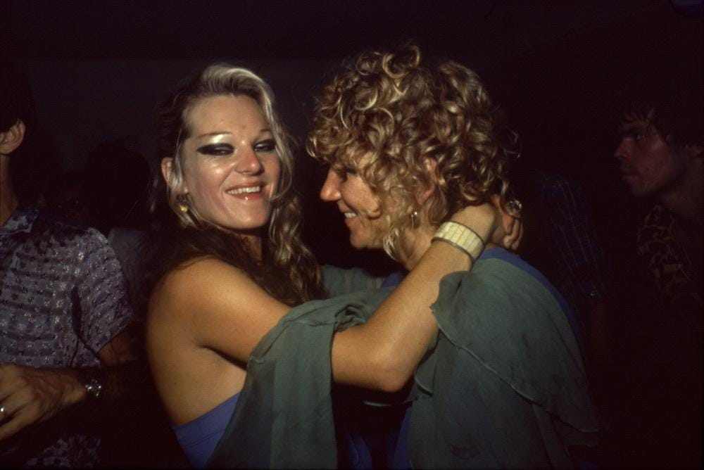
Fig. 3 – Nan Goldin, Cookie and Sharon Dancing at the Back Room, 1976
Fig. 4 – Nan Goldin, Warren and Jerry fighting, 1978
‘People in the pictures say my camera is as much a part of being with me as any other aspect of knowing me. It’s as if my hand were a camera. If it were possible, I’d want no mechanism between me and the moment of photographing. The camera is as much a part of my everyday life as talking or eating or sex. The instant of photographing, instead of creating distance, is a moment of clarity and emotional connection for me. There is a popular notion that the photographer is by nature a voyeur; the last one invited to the party. But I’m not crashing; this is my party. This is my family, my history’ (Goldin, 1986)
In Abigail Solomon-Godeau’s ‘Inside/Out’, she highlights and contrasts the representation of a photograph and how it shifts from being an insider or outsider portrayal of an individual, group, or community. She states, ‘The Ballad of Sexual Dependency can be considered as exemplary of the insider position … by way of examining the terms by which insiderness comes into play, the viewer can readily assume from the content of the images that the photographer is in a position of intimate proximity with her subjects. This is suggested by the depiction of the conventionally private activities of dressing and undressing, bathing, putting on makeup, the apparent physical closeness of the camera itself to its subjects in many of the pictures, and lastly, toward the end of the book, three images of one of the transvestites and a lover in bed together.’ (Solomon-Godeau, Inside/Out, 1995) This interpretation of Goldin’s work highlights the shared bond between herself and the subject of each individual photograph presented, and furthermore how these photographs involving vastly personal and intimate moments within the subject’s life would not have been documented without Goldin and her innate passion to document her community. This identifies how important an insider perspective is to accurately portray the life of an individual, and how aspects can be missed, hidden, or left out; whether purposely or not.
Fig. 5Fig. 6
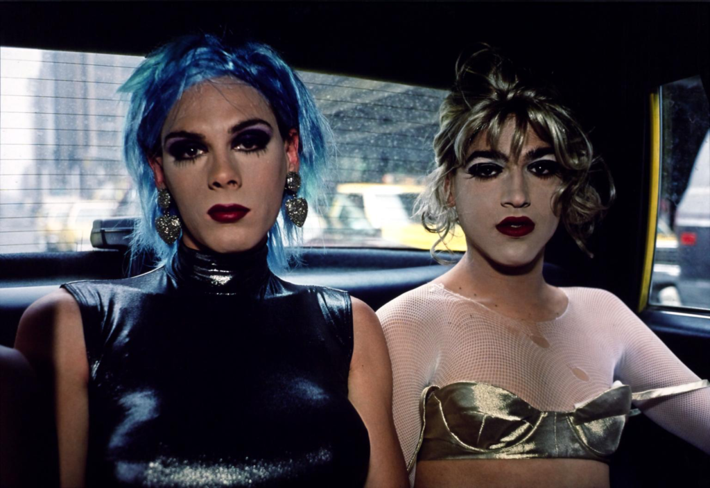
Fig. 5 – Nan Goldin, Misty and Jimmy Paulette in a taxi, 1991
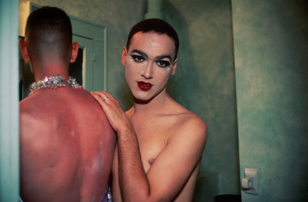
Fig. 6 – Nan Goldin, Jimmy Paulette and Taboo! in the bathroom, 1991
Nan Goldin’s The Ballad of Sexual Dependency features a wide plethora of subjects she acknowledges holding an emotional and romantic investment for, and the photographs within this reflect this insider perspective of the queer community captured in a passionately close way by Goldin. As Nan Goldin has stated, ‘As children, we’re programmed into the limitations of gender distinction … But as we grow older, there’s a self-awareness that sees gender as a decision, as something malleable … Rather than accept gender distinction, the point is to redefine it … there is the decision to live out the alternatives, even to change one’s sex, which to me is the ultimate act of autonomy.’ (Goldin, 1986) In figures 5 and 6, Goldin has provided an insider representation of the queer community, a recurring subject in these two photos is Jimmy Paulette, who is depicted in a taxi with Misty, and then confidingly sharing the space in a bathroom with Taboo. Goldin’s photographs are usually personally close to the subjects and properly engage with the scene at hand, displaying the deeply held connection between the subject and photographer.
Conclusion
In conclusion, the representation of sexuality and gender identity within photography and visual culture ultimately depends on who is photographing the subjects, and how that individual personally wishes to portray a group or community. An insider delineation of people inside of a community, which is captured throughout Nan Goldin’s work opens up the possibility of an extremely intimate and personal perspective of her and her found family’s lived experiences and familiarity within the queer community. The essence of these connections and relationships inside communities throughout history are intricately preserved through photographers and artists like Nan Goldin, and the many photographs exploring sexuality and gender identity have been immortalised since the 19th century with the popularisation of photography not only as an art medium, but also a documentation of history.
Bibliography
Sontag, S. (1977) ‘In Plato’s cave’ in On Photography. London: Penguin Books.
Goldin, Nan (1985) ‘The Ballad of Sexual Dependency’
Solomon-Godeau, A. (1994), ‘Inside/ Out’in Photography At The Dock: Essays on Photographic History, Institutions, and Practices. Minnesota: University of Minnesota Press.
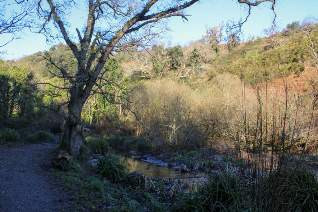
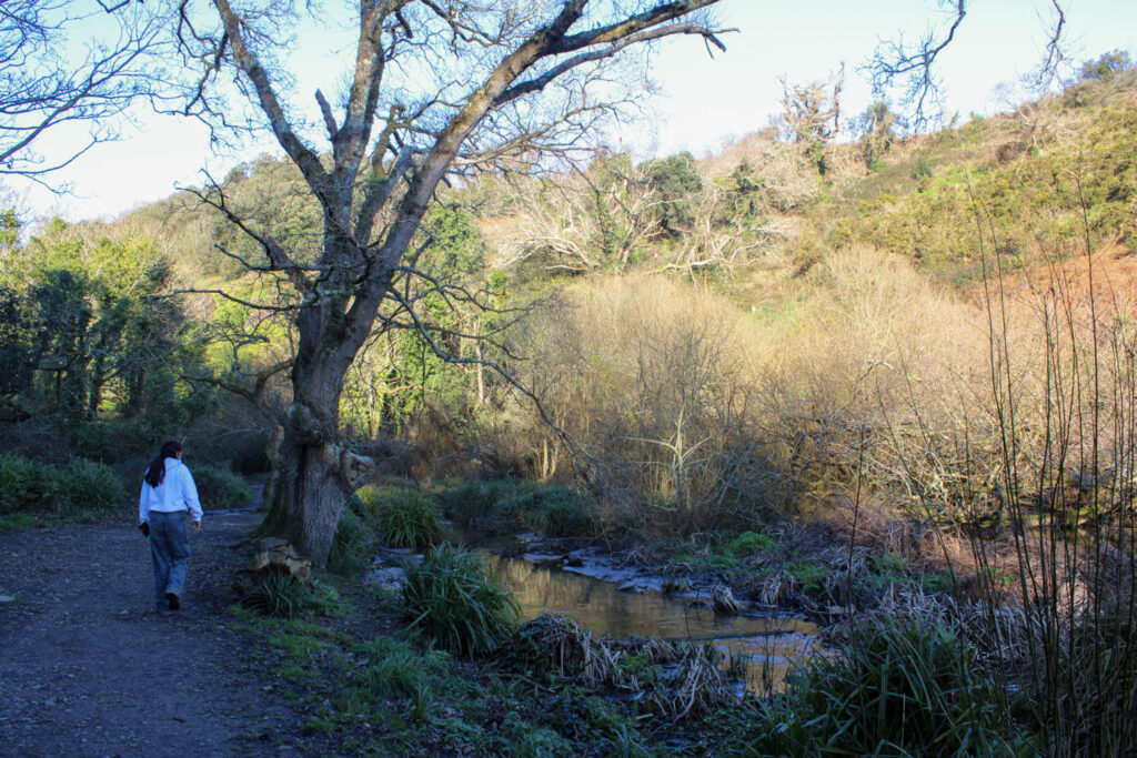
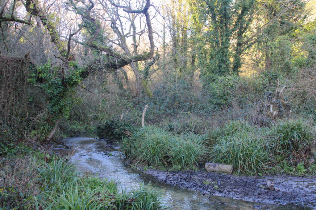
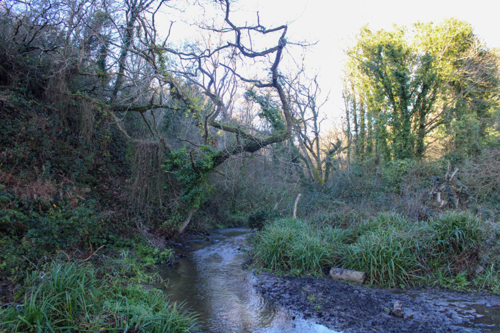
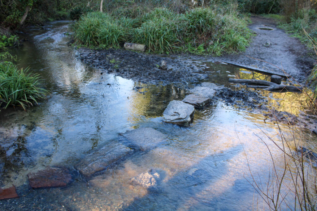
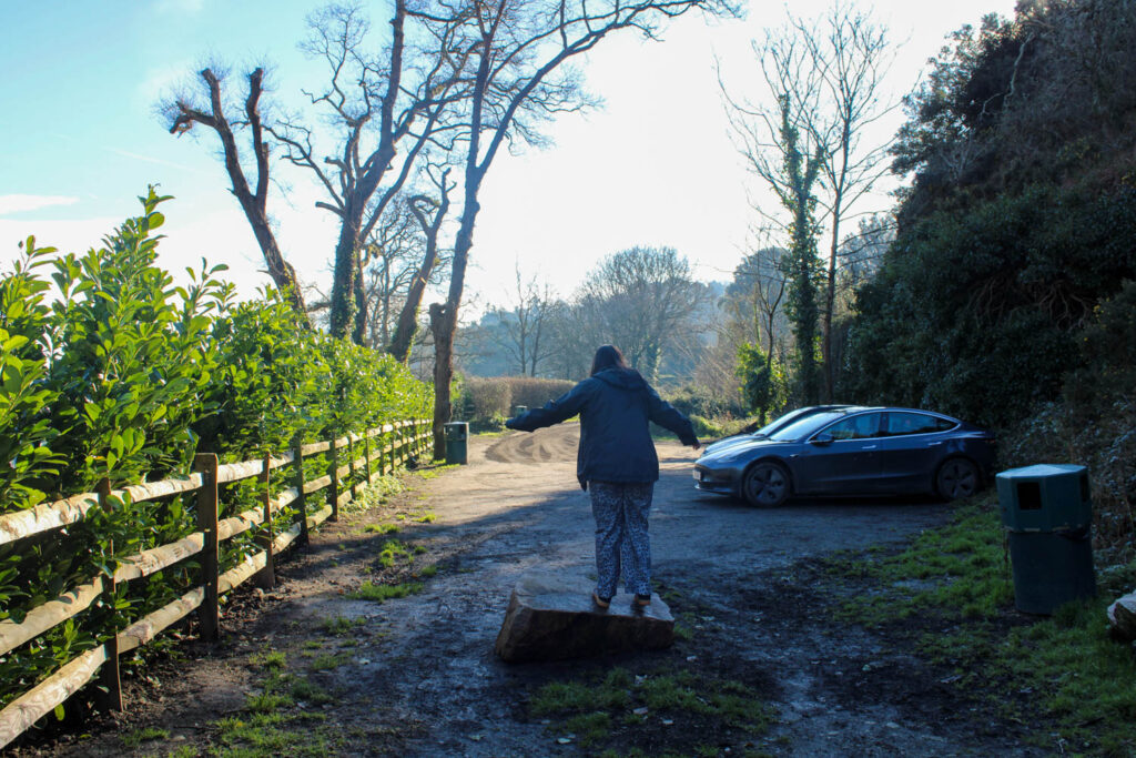
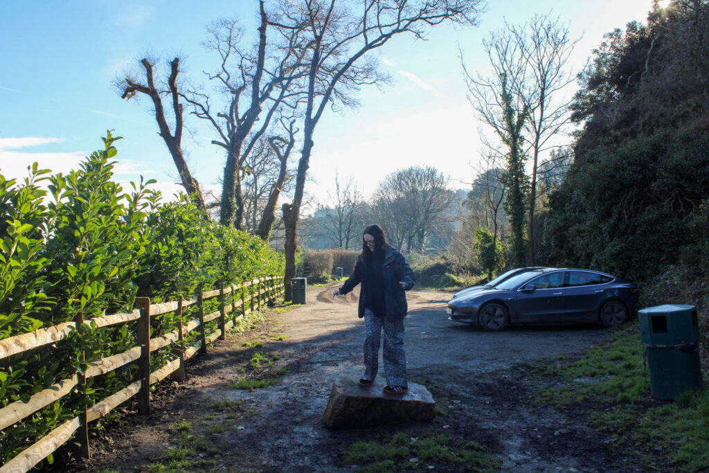
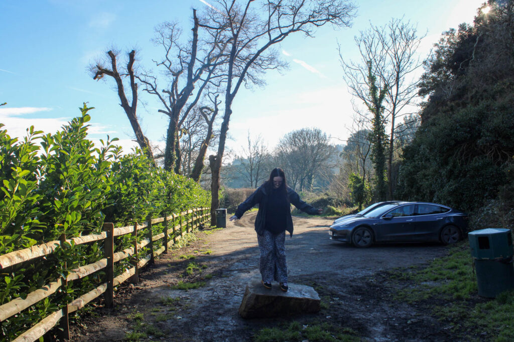
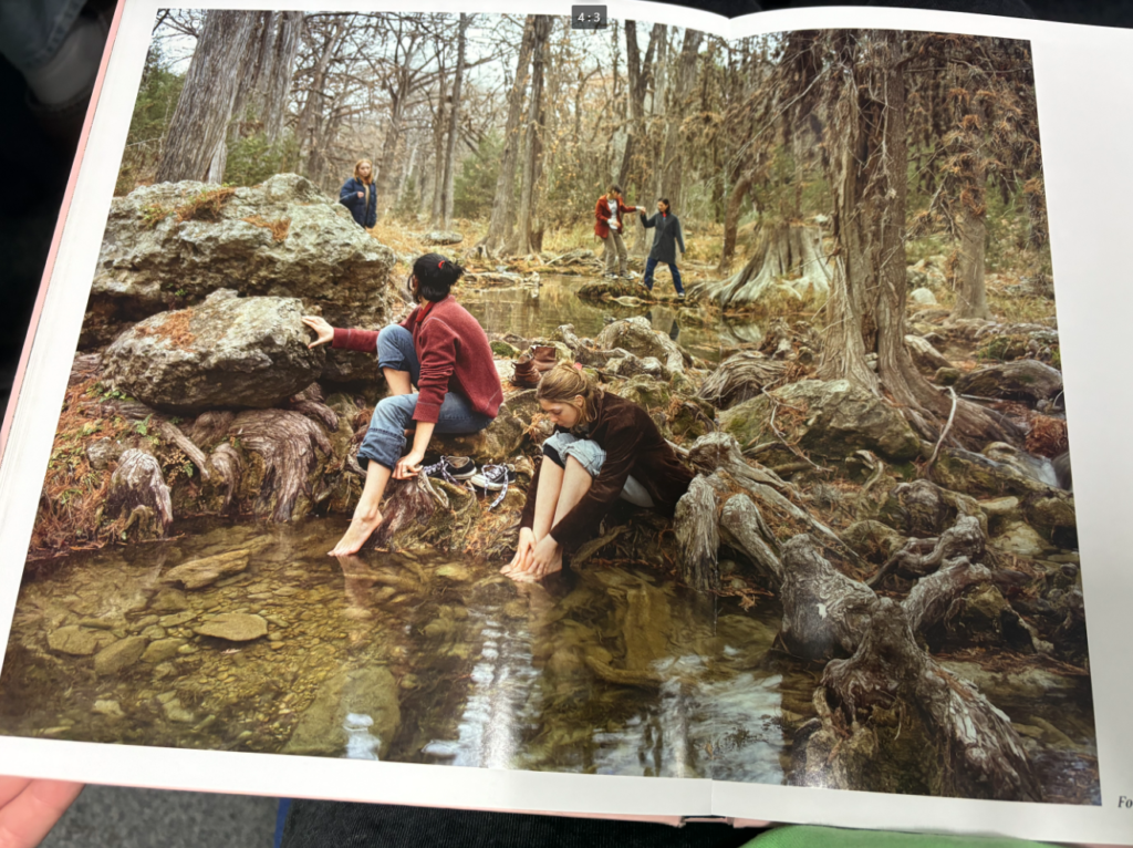
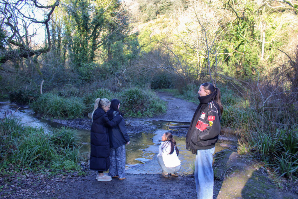
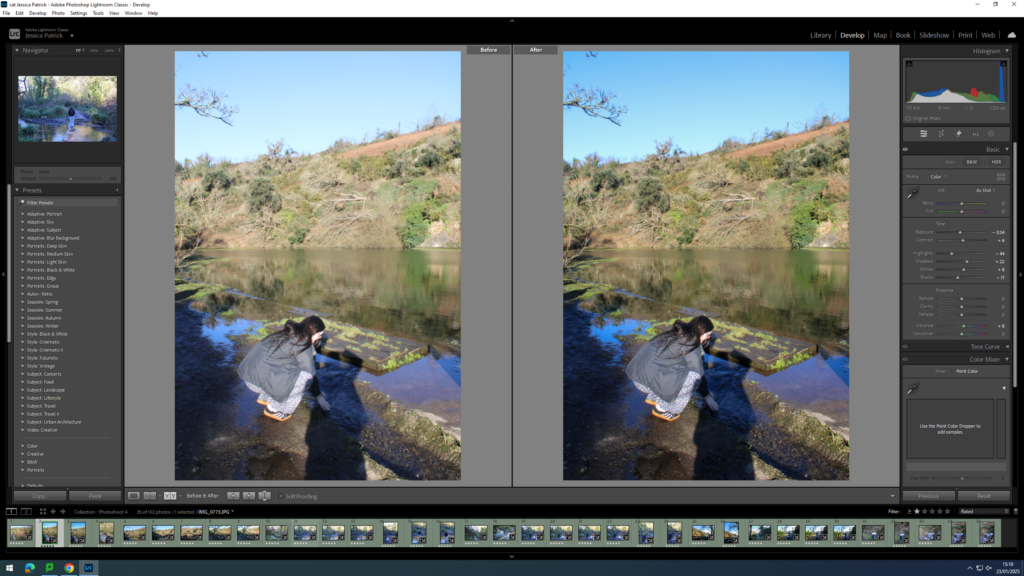
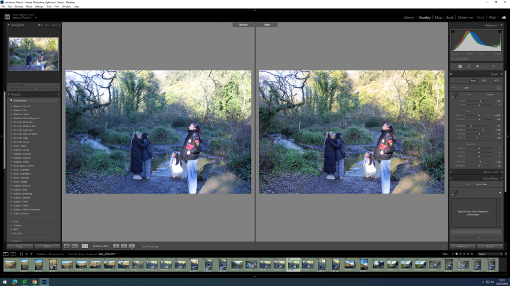
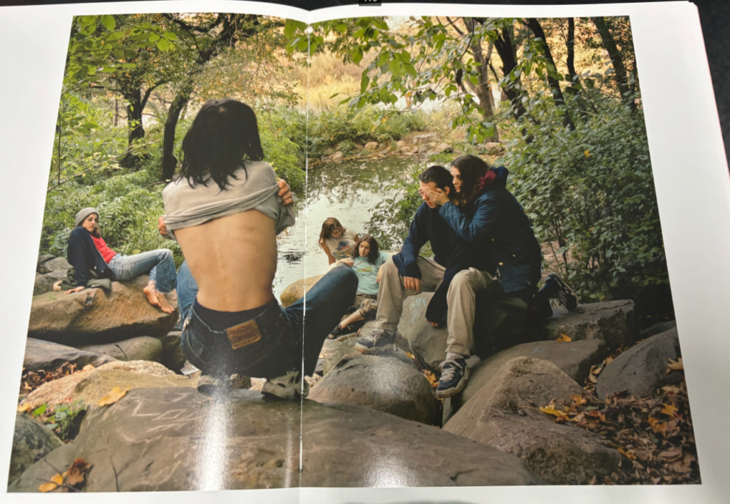
This photoshoot relates to Justine Kurland’s images, because they have a similar wooded setting and are at a similar time of day, so the lighting is very similar. I have also made some similar photographs to the ones that Justine Kurland have made.
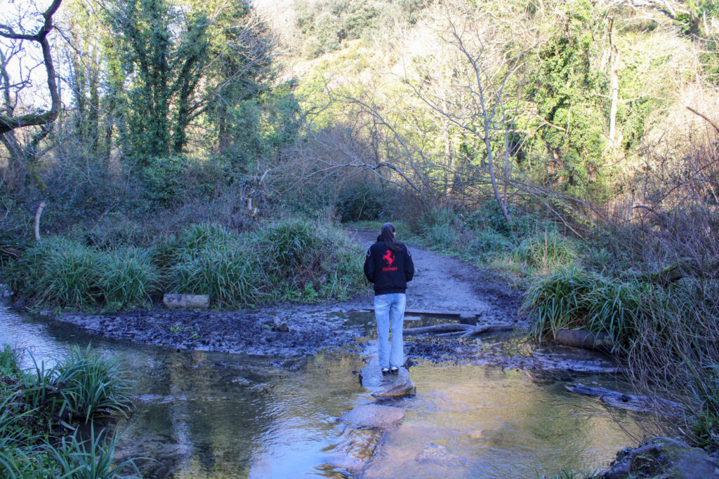
Both Kurland’s subject and my subject are stood up on a rock.
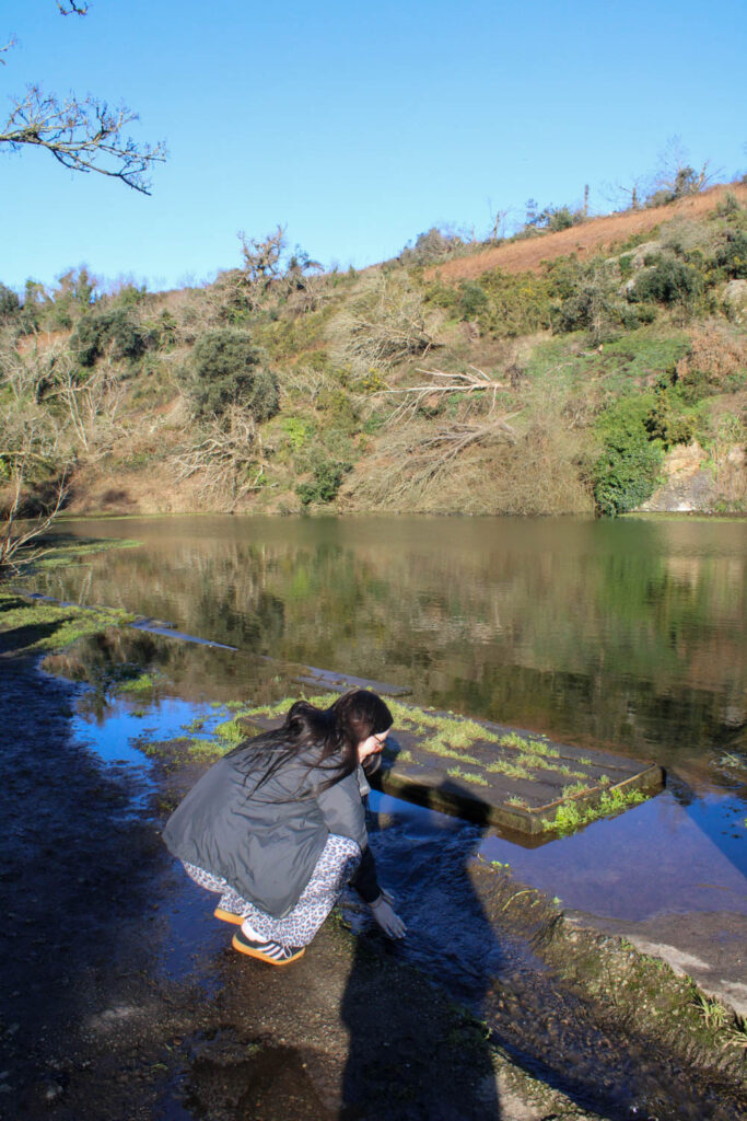
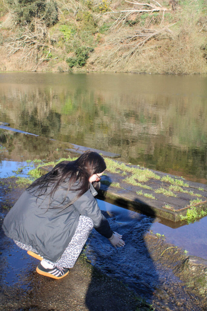
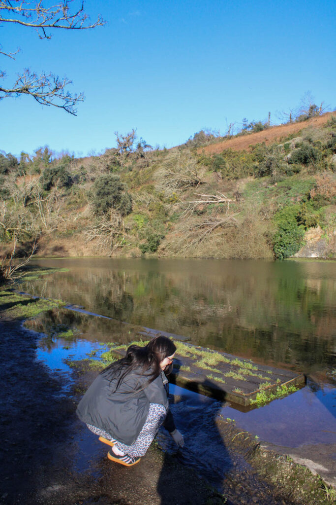
In Justine Kurland’s image she had her subjects wash their feet in the lake. However, in my image the subject was washing her hands.
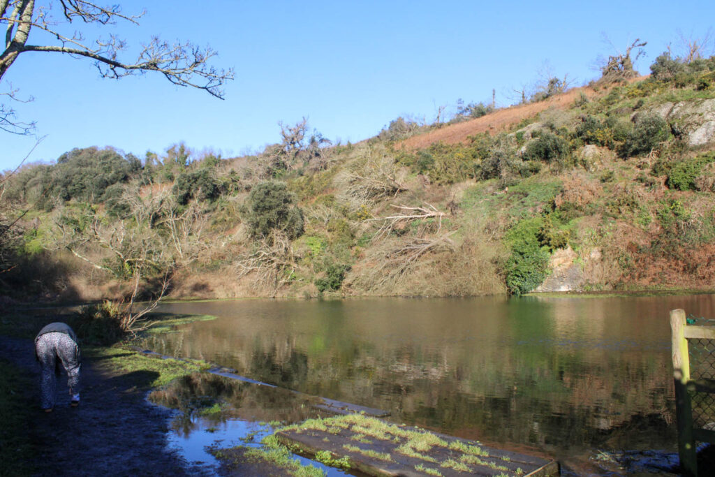
In this image, I have pulled from the composition, by having a subject in the foreground, middle ground and background. I have also pulled from the setting, with the wooded area with the trees and the lake in the background.
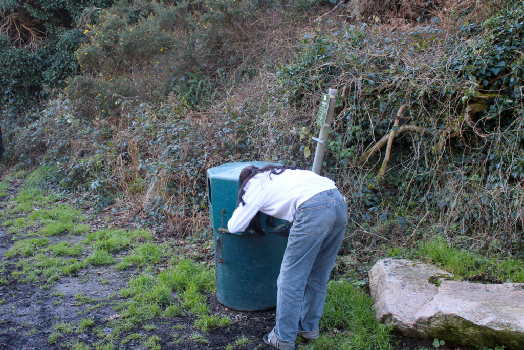
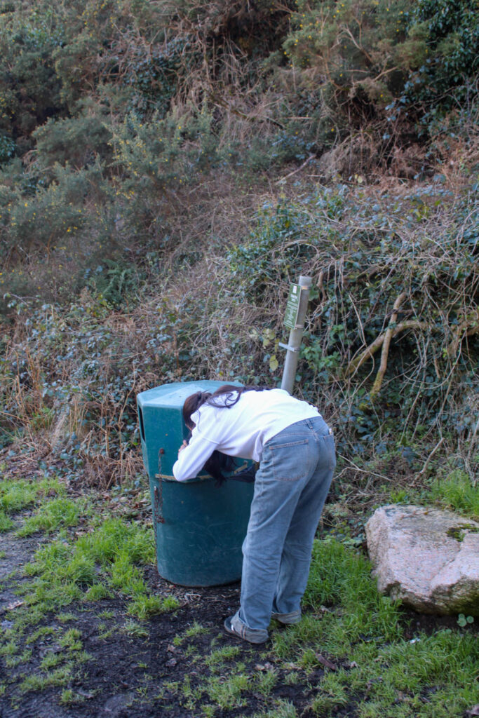
Justine Kurland also displays the subjects in her work as runaways, so I experimented with the concept of runaways in my work, by having a subject scavenge through a bin for food.
However, I do not think this narrative of the runaway girls suits my themes of youth and identity and what I am trying to portray.
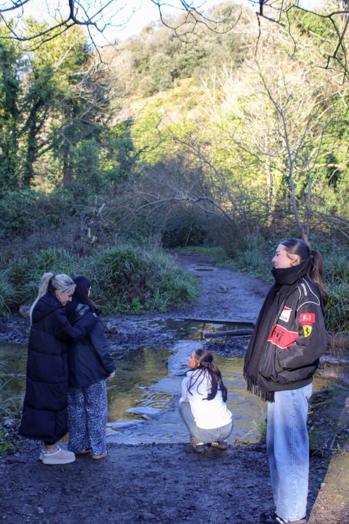
In Comparison to Jeff Wall
In this photoshoot I focussed on composition for one specific photo. I have used the composition of having a subject in the background, middle ground and foreground. This relates to Jeff Wall, because he also focusses on composition and has used this compositional technique before.
How does this relate to the themes of youth and identity?
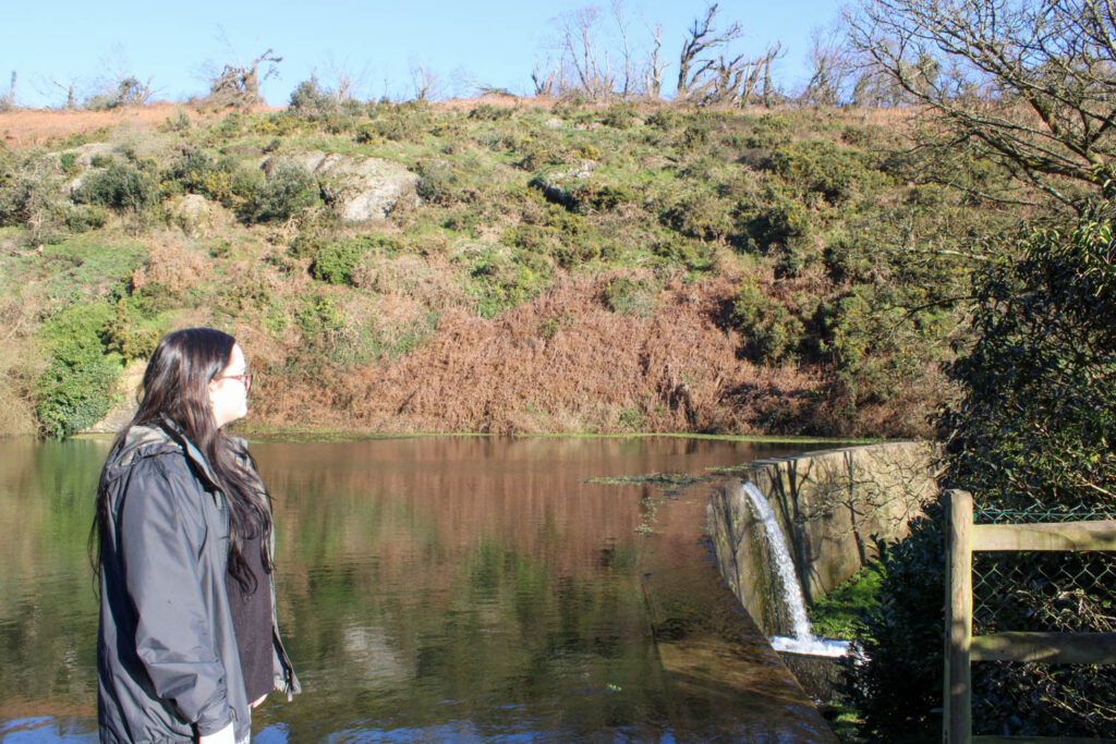
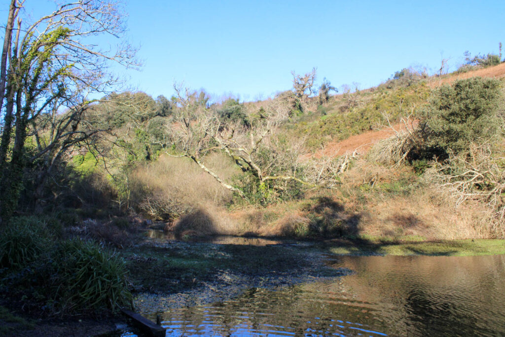
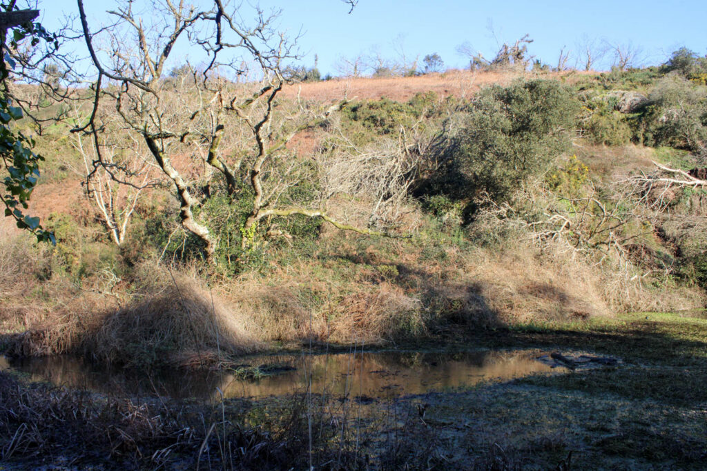
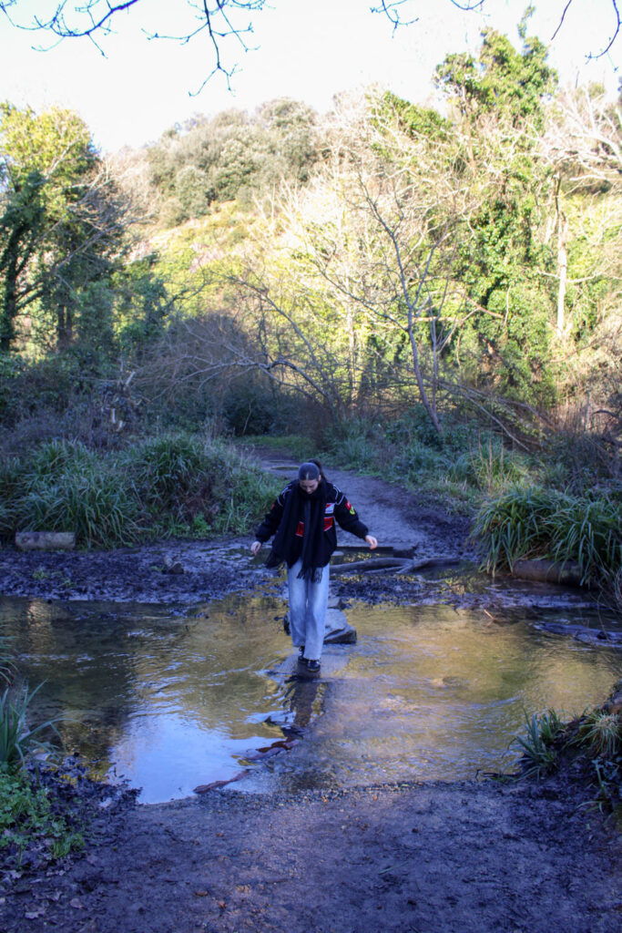
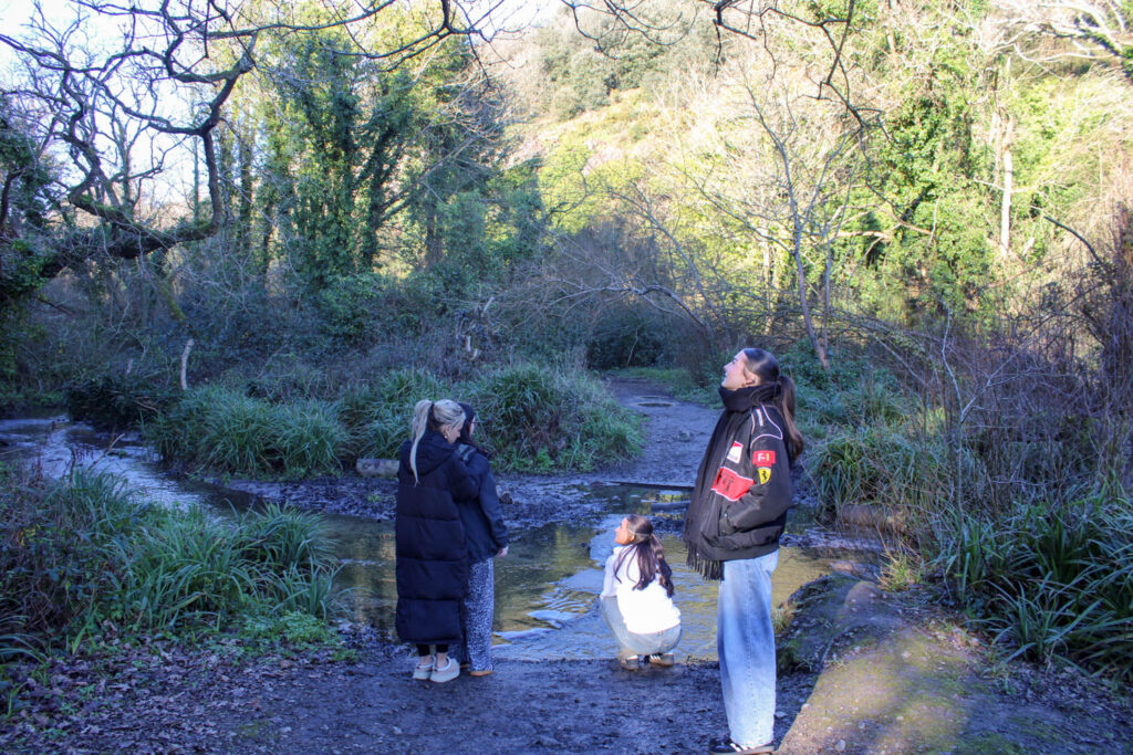
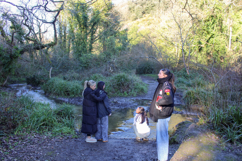
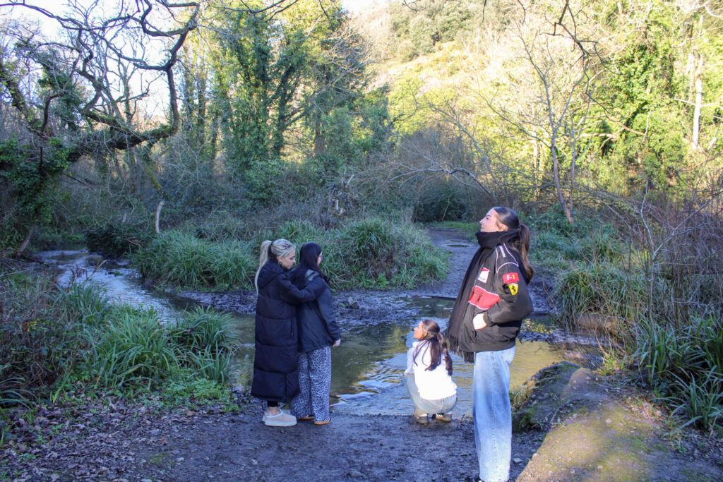
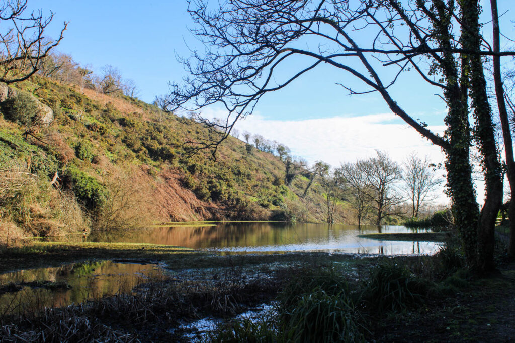
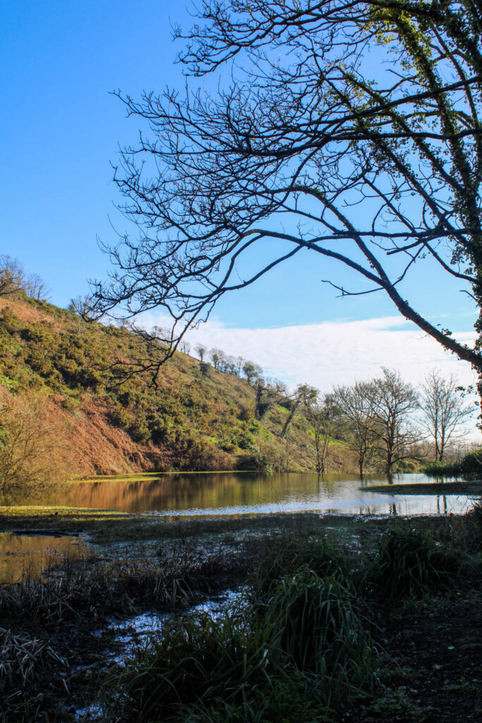
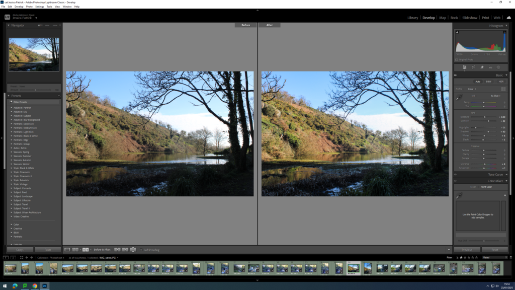
This photoshoot relates to the theme of youth, specifically my youth, as I used to visit St Catherine’s woods a lot when I was younger, especially in lockdown during Covid. I would visit the woods a lot with my family, as we would always take my dog for walks here. This represents my identity during my youth, as this photoshoot represents an activity I enjoyed doing and still enjoyed doing during this photoshoot. It also represents a part of my identity, because it represents the people I enjoy going here with and the people I surround myself with represent who I am as a person.
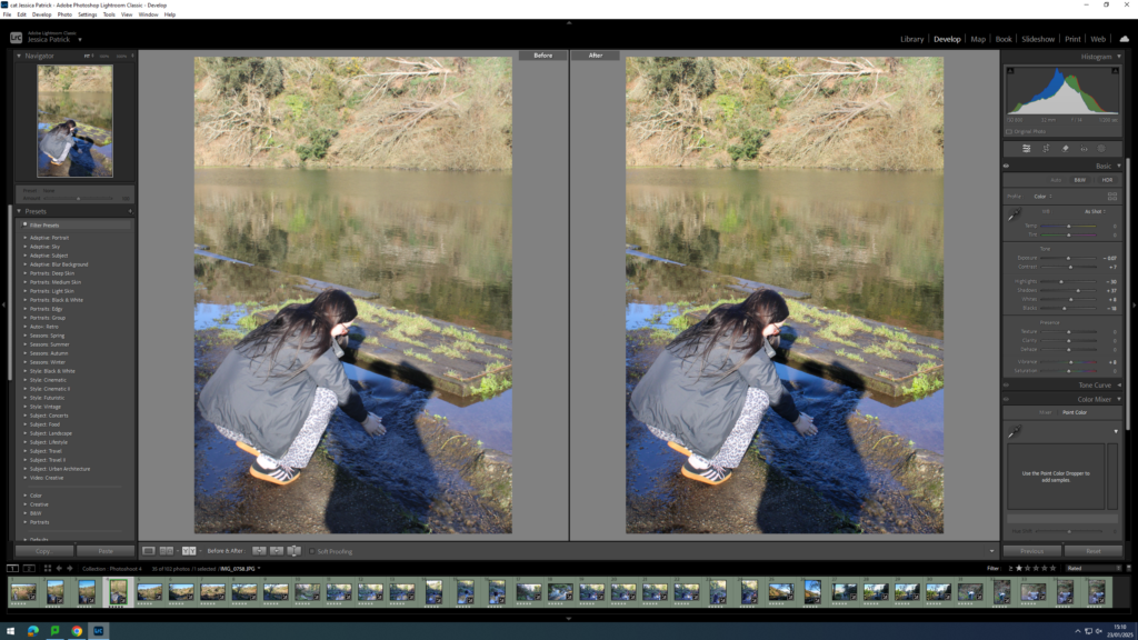
Analysis of 1 Image
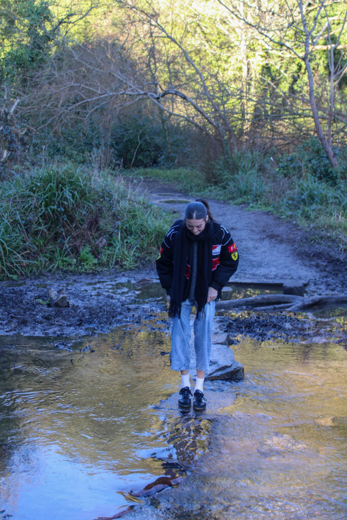
This photo has high levels of control, because I was able to manipulate the position and distance of not only my subjects, but myself as well. However, there was little control over the lighting, as natural daylight was used, rather than the lighting that can be found in a studio.
F Stop: f/ 4.5
Exposure time: 1/60 sec
ISO: ISO- 125
The colours in this image are not very bright, as the lighting in this image was quite dark. There are quite natural colours, such as the browns, green and blues, but the red and the yellow in the subjects jacket make the image pop slightly more, as they are quite a bit brighter and more vibrant. There is quite a lot of light tones in the top section of the frame, due to the sun, but throughout the rest of the image there is lots of dark tones, due to the shade caused by the trees. There is also a lot of texture in this photo, due to the ripples and current of the water, as well as the trees and muddy ground in the background. There is also a lot of line work in this image, which can be seen from the line of rocks in the lake and the path behind.
The composition of this subject is quite simple, as the main viewpoint is centre of the frame, and there is only one subject. However, the setting of this image makes it more interest due to the background and textures.
This image relates to my youth, because I used to visit St Catherine’s woods a lot when I was younger, especially in lockdown during Covid. I would visit the woods a lot with my family, as we would always take my dog for walks here. This represents my identity during my youth, as this photoshoot represents an activity I enjoyed doing and still enjoyed doing during this photoshoot. It also represents a part of my identity, because it represents the people I enjoy going here with and the people I surround myself with represent who I am as a person.
Photoshoot Conclusion
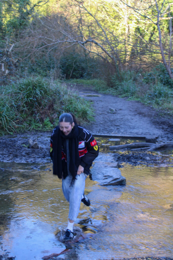
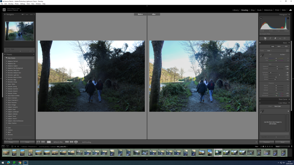
Overall, I think this photoshoot went well, as I was able to have a look at different compositional elements, such as the foreground, middle ground and background, like both Justine Kurland and Jeff Wall. I was also able to create a similar setting to the ones used in Justine Kurland’s work, with lots of similar visual elements, such as the texture.
However, some of the images were quite dark and had quite a blue tone, so next time I would adjust the exposure on my camera more to resolve this.
This photoshoot also presents the themes of youth and identity, in particular my youth and identity, as walking through these woods is an activity I used to love during my youth. This represents my identity, because it presents what I enjoy, which is part of what makes me who I am.
For this photoshoot, we visited St Catherine’s woods, because when I was younger, especially during covid, my family and I would go on walks here with our dog very regularly, so this setting relates to my youth and identity in particular.
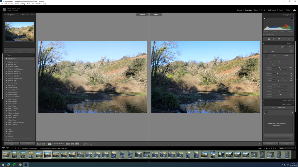
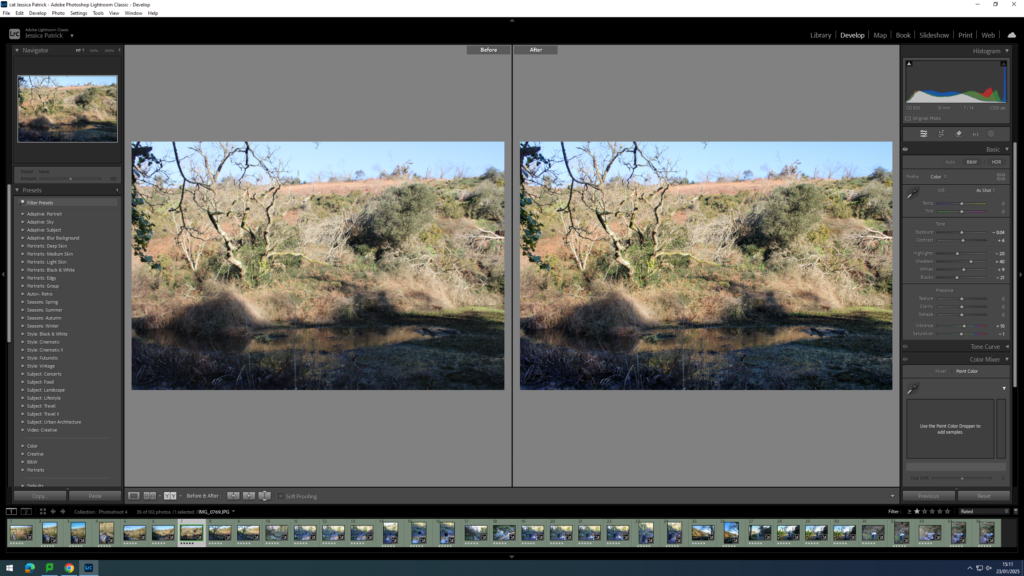
Contact Sheet
The images which are highlighted green are the images I have chosen to edit, because they are my best images, with the best composition and layout. They also represent my themes of youth and identity the best.
Edits
I edited this image by increasing the contrast, shadows, whites and vibrancy, while decreasing the exposure, highlights, blacks and saturation. I did this, so that the image was slightly less exposed and had better lighting.
I edited this image by increasing the contrast, shadows, whites and vibrancy, while decreasing the exposure, highlights and blacks, so that the image had better lighting and was slightly more vibrant.
I edited this image by increasing the contrast, shadows, whites and vibrancy, while decreasing the exposure, highlights, blacks and saturation. I did this, so that the image had better lighting, due to less exposure and so it was more vibrant.
I edited this image by increasing the contrast, shadows, whites, vibrancy and saturation, while decreasing the exposure, highlights and blacks. I did this, so that the image had better lighting.
I edited this image by increasing the contrast, shadows, whites and vibrancy, while decreasing the exposure, highlights, blacks and saturation. I did this, so that the lighting was better.
I edited this image by increasing contrast, shadows, whites, vibrancy and saturation, while decreasing the exposure, highlights and blacks. I did this so the lighting was better. I also added a yellow tint to the image, because the image had a blue tint originally, due to the lighting and camera settings, so I wanted to cancel that out.
I edited this image by increasing the contrast, shadows, whites, vibrancy and saturation, while decreasing the exposure, highlights and blacks. I did this, so that the image was more vibrant and had better lighting. I also added a yellow tint to this image, to cancel out the original blue tint that the image had.
I edited this image by increasing the contrast, shadows, whites, vibrancy and saturation, while decreasing the highlights and blacks. I did this, so that the image has better lighting and was more vibrant. I also added a yellow tint to this image in order to cancel out the blue tint it originally had.
I edited this image by increasing the contrast, shadows, whites, vibrancy and saturation, while decreasing the highlights and blacks. I also added a yellow tint to this image, to remove the blue tint and improve the lighting and make the image more vibrant.
I edited this image by increasing the contrast, shadows, whites, vibrancy and saturation, while decreasing the exposure, highlights and blacks. I did this, so the image would have better lighting. I also added a yellow tint to this image, so I could remove the blue tint the original image has.
I edited this image by increasing the contrast, shadows, whites, vibrancy and saturation, while decreasing the exposure, highlights and blacks. I did this to improve the lighting and make the image more vibrant. I also added a yellow tint to this image, so I could cancel out the slightly blue tint the original image had.
I edited this image by increasing the exposure, contrast, shadows, whites, vibrancy and saturation, while decreasing the highlights and blacks. I did this to improve the lighting and make the image more vibrant.
I edited this image by increasing the exposure, contrast, shadows, vibrancy and saturation while decreasing the highlights, whites and blacks. I did this to improve the lighting of this image.
I edited this image by increasing the exposure, contrast, shadows, whites, vibrancy and saturation, while decreasing the highlights and blacks. I did this, so that the lighting was better and the image was more vibrant.
I edited this image by increasing the exposure, contrast, shadows, vibrancy and saturation, while decreasing the highlights and blacks. I did this, so that the image was more vibrant.
I edited this image by increasing the exposure, contrast, shadows, whites and vibrancy, while decreasing the highlights and blacks. I did this, so that the lighting was better.
In what way have Sally Mann and Nan Goldin explored subject of family as our extensions of memory and identity?
Family photographs are special to many people because they help us remember important moments and even show who we are. They can capture every little special moment that might not feel like it is special but when looking back you realize it is, special moments like birthday parties, holidays, playing in the park, sitting together for dinner, everyday moments. People don’t realize how special a family photograph can be, it’s not just a random photo from the past but also a reminder of how good the moments were. In this essay. I’m going to explore in what way family photographs extensions of our memories as well as our identities with Sally Mann and Nan Goldin as my references. When looking at family images, we often have a feeling of warmth and sentimentality and remind us of happy moments with the people we love. Every little moment counts, for example, a photo of a family trip to the beach might make us remember the fun we had building sandcastles and chasing the waves. Taking photos from these little moments fills you up with great joy when looking back at them with your parents. Family images help us remember the small details we might have forgotten.
In the early days of photography, photography was carefully staged studio photographs that were recorded in high-resolution on large-format film. This type of photography was common up through the World War II years. Families would save up money, and go to a photo studio to have portraits made that would be cherished as precious family possessions. Family photography is the most popular category of photography. The family album has only just been included in survey histories of photography, despite the fact that the majority of individuals in the Western world have produced albums in one way or another, at least since the early 1900s until the early 2000s, when digital archiving took over.
Bull explores the relaxing potential of photography, specifically focusing on the role of family albums in personal and collective memory. Bull examines how photographs, particularly those passed down through generations, serve as powerful tools for emotional expression and healing, helping individuals navigate identity, grief, and trauma. Chalfen and Musello, among others, write about “regular” family albums. The 1965 book Un art moyen, written by French sociologist Pierre Bourdieu, was one of the first significant studies on family photography.
Sally Mann, a American photographer, known for taking lovely emotional photos of her own family. She made a book called Immediate Family showing images of her children growing up both in their playful, bright times and even serious, thoughtful times. When looking back at childhood pictures from your family is like reconnecting with the feelings and memories of those times. Just like Sally Mann photos reminds her of who she was and what herself and her family have experiences. Family images also represent our identities. They show where we come from and who we are connected with but also who were influences by such as our parents, siblings ad grandparents which tells us a story of our family’s history. Looking at photographs of family reunions with generations of family members can make you feel proud of our family’s traditions ad how everything has been passed down, which also might make you understand where you fit in the bigger picture of all generations. Looking back at baby pictures makes you realize how much you have grown and changed over time but still have that special family connection. Sally began opening boxes of photographs, letters, diaries, newspaper clippings and other papers that had been gathering dust in her attic, uncovering, as it were, family secrets. People were concerned about Sally Mann images of childhood injuries and naked baby photos which led some critics to challenge her right to record such scenes of distress.
S, Mann: Immediate Family, “Sorry Game”, 1989
Family photographs don’t only capture certain moments but also emotions, when you look at old photos you often remember how you felt at that time. Even though as you get older you don’t feel as exited to take images as when you were younger you always look back at them not regretting anything at all and just thinking about the fun you had while take them which then might make you start to appreciate the importance of these moments. Another American photographer, Nan Goldin, who took images of her own relationships in a personal way, showing strong emotions with her friends and family, capturing happy and difficult moments. She once said ‘I want to show people who they are, and I want to show them how they relate to other people, how they relate to their families, how they relate to their friends, how they relate to themselves.’ (Goldin) Our family pictures carry important lessons and emotion that help shape who we are and how we remember life.
N, Goldin: Self-portrait in the mirror, Hotel Baur Zurich, 1998
Sally Mann and Nan Goldin both explore themes of identity, and the human condition, often drawing from their personal lives and relationship. While Mann’s work often centres on her children and family life, capturing memory’s, decay and Goldin’s focus is on adult relationships, sexuality and trauma. Regardless the differences, Both photographers explore sexuality and relationships. In conclusion, photographs are an important aspect of family and our identity that capture special meaningful moments, just like Sally Mann and Nan Goldin photography.
Bibliography:
Bull, S. (2009). Phototherapy: The Family Album and Beyond
S. Mann (1992). The disturbing photography of Sally Mann
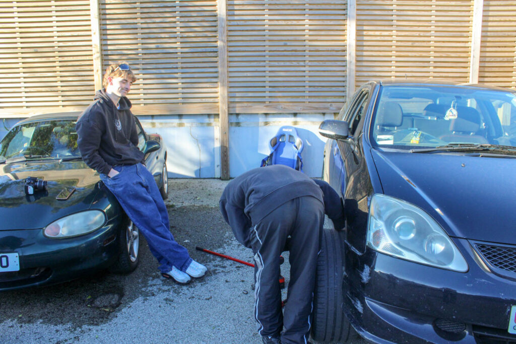
Justine Kurland used some male subjects in her images, so I wanted to do a photoshoot where I also used male subjects, so that I would have a range in my work. I also wanted to present a more masculine activity, as Justine Kurland presented quite stereotypical masculine activities and I have so far only presented feminine ones in my work.
In Comparison to Jeff Wall
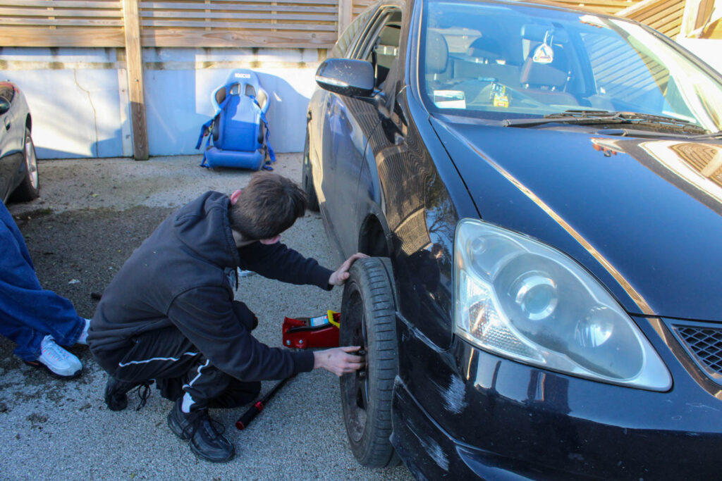
In this photoshoot I presented the same narrative, but I focused on changing my composition throughout this whole photoshoot. This relates to Jeff Wall, as he always focuses on his compositional elements, rather the narrative of his work itself.
I also focussed on other visual elements during my editing on Lightroom.
How does this Relate to the Themes of Youth and Identity?
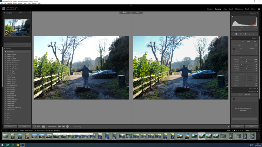
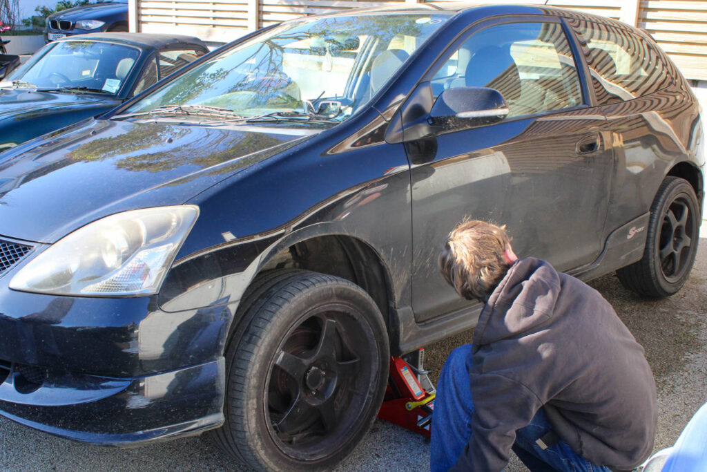
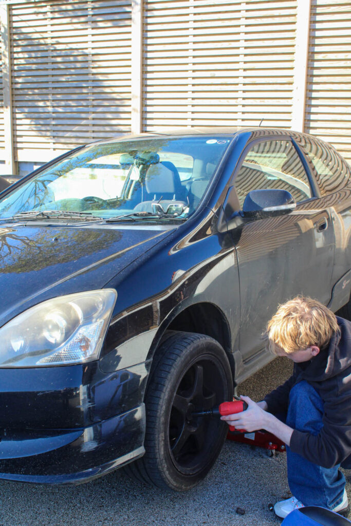
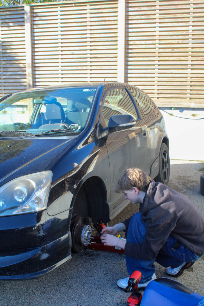
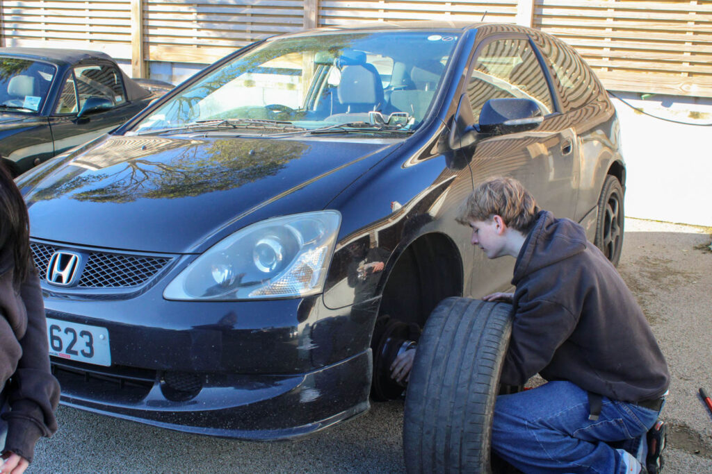
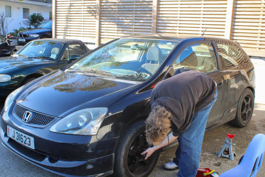
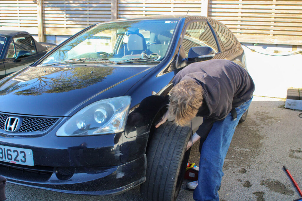
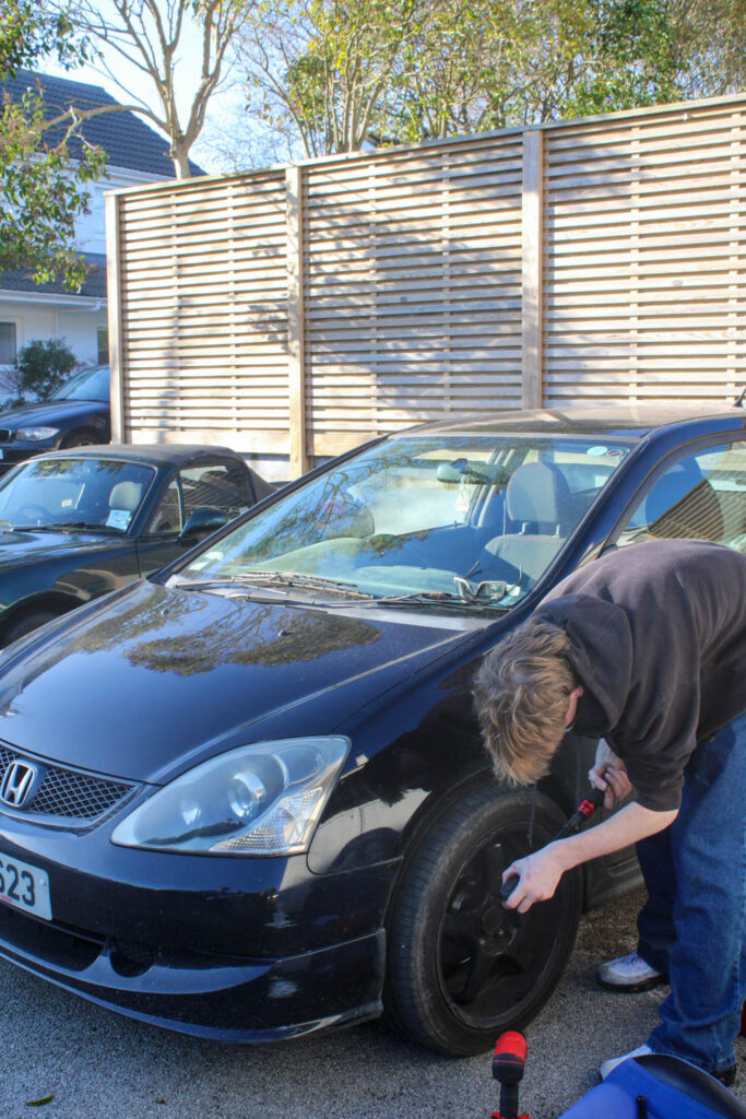
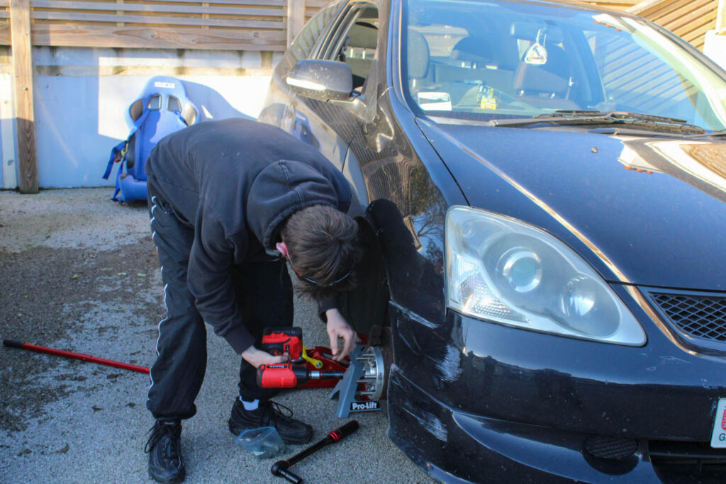
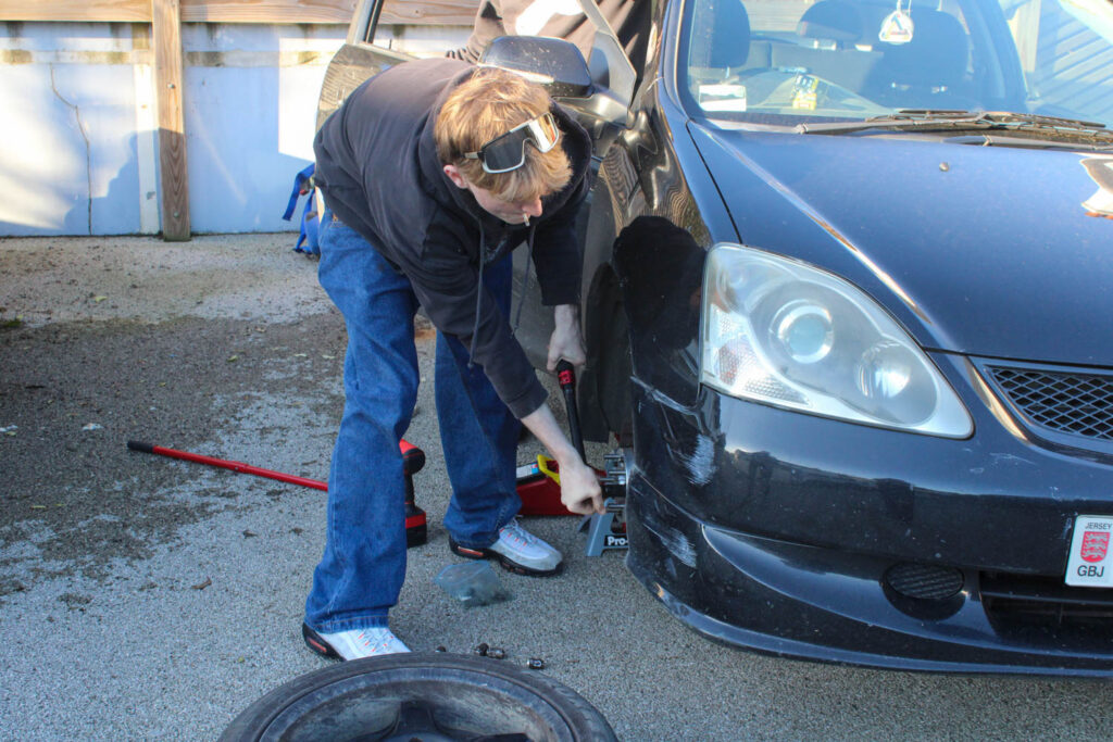
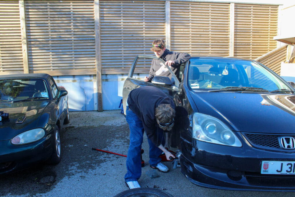
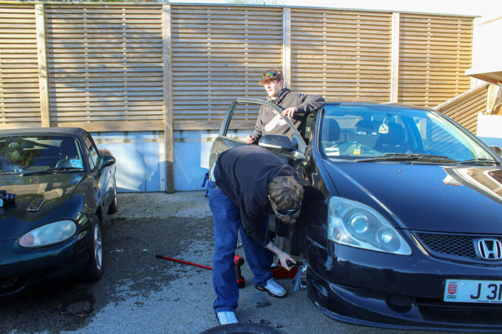
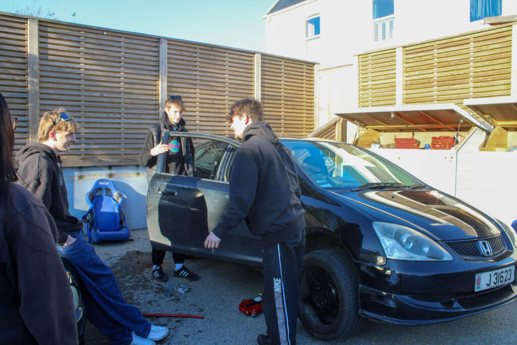
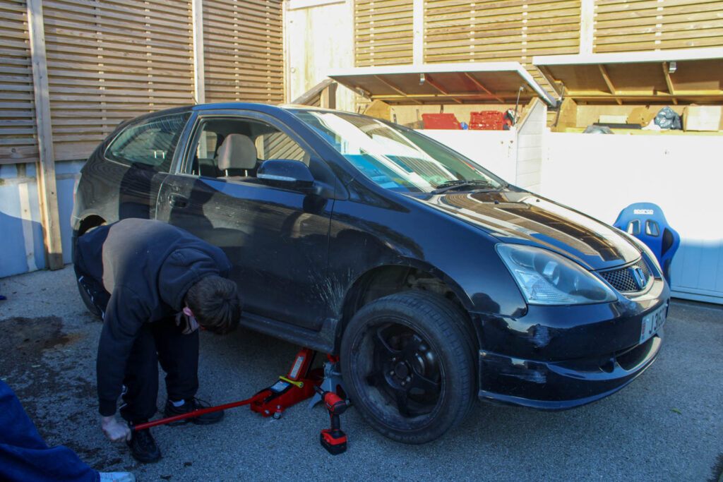
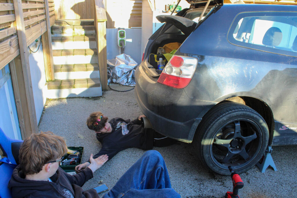
These photos relate to the themes of youth and identity, specifically my youth and identity, because when I was younger I used to watch my uncle add things onto/ fix his cars. I also still now watch my friends do the same thing all these years later, so this presents that my identity hasn’t altered as much as I would have thought now that I am more grown up.
Analysis of 1 Image
There was a high level of control in this image, as I was able to manipulate the position and distance of not only my subjects, but myself as well. However, there was little control over the lighting, as natural daylight was used, rather than the lighting that can be found in a studio.
F stop- f/7.1
Exposure time- 1/200 sec
ISO Speed- ISO-800
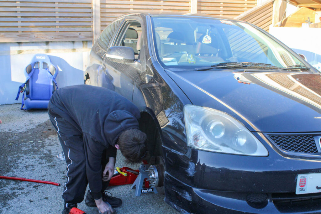
The colours in this image are not very bright colours, but instead there is lots of neutral colours, blacks and dark blues. There is also lots of different dark and light tones throughout the image, due to the sun and the shade caused by the fence. There isn’t tons of texture throughout the image, but you can see a slight texture on the ground. There is lots of different shapes throughout this image, due to the tools and wheels etc.
The layout of this image causes the main viewpoint of this image to be the subject in the centre of the frame under the car. In this image the composition has a subject in the foreground on the left, the car in the middle ground and the subject under the car slightly further back in the background.
This image represents my youth, because I used to watch my uncle fix/ add things to his car when I was younger. This also represents my identity, because it presents how little my identity has changed from my youth, as this is still something I like to watch and now take photos of. This presents that my identity is still very similar to when I was younger, but now instead of watching my uncle, I watch my friends.
Photoshoot Conclusion
Overall, I don’t think this photoshoot is one of my strongest photoshoots, because I did not display a range of different narratives, but instead only presented one narrative. However, I was able to experiment with my compositional elements, as I was only focussed on my composition, rather than displaying different narratives. I was also able to present a more masculine activity/ narrative, just like how Justine Kurland presents more stereotypical masculine narratives. I was also able to experiment with male subjects in this photoshoot, rather than just using female subjects and activities, like in my other photoshoots.
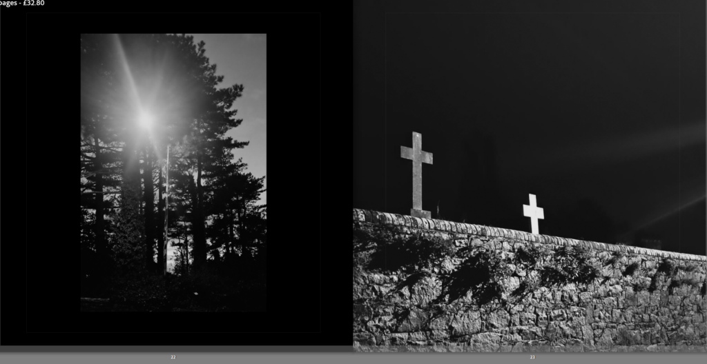
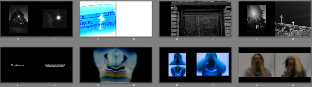
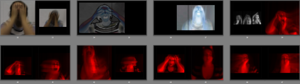
Overall the photobook has gone very well, my idea for it was to follow a narrative sequence of a person’s journey through mental deterioration, it starts with the protagonist going through mental health and personal problems, they then attempt to find a resolution to their pain through the supernatural and religion, they feel a calling, in the end their mental health becomes more severe as if they’ve been possessed by their obsession with the unknown.
The reason I made this photobook and the images within was to visually interpret hidden feelings and portray how they can feel. My intention was to make my images look chaotic and dramatic to try and capture strong emotions such as dread, anger and frustration which are common feelings associated with mental health problems like depression. The subject of depression in particular was my main inspiration when making this project.
1. Write a book specification and describe in detail what your book will be about in terms of narrative, concept and design with reference to the same elements of bookmaking as above.
Narrative:What is your story? Describe in:
3 words
Struggles, Athlete, Recovery.
A sentence
It will show the physical, mental and emotional struggles an athlete has to deal with, due to injuries.
A paragraph
My story will give another view on my subject’s life and how the struggles he has to deal with are a lot harder than the viewers would see. I go in-depth with different angles of him to showcase the loneliness, separation and isolation he has to deal with whilst being injured.
Design: Consider the following
How you want your book to look and feel
Hard, stiff, clean, smooth with good clear images and text across all the pages.
Paper and ink
Premium Lustre
Format, size and orientation I used A3 for my landscape photographs and A4 for my portrait photographs.
Binding and cover Standard Landscape Hardcover Image wrap
Title Rise to Recovery
Structure and architecture I have text across a few pages before my images to structure my idea for loneliness and isolation across the storybook.
Design and layout I used some single page photographs for my portrait ones, but for my landscape images, I used a two-page spread layout, with black paper to match the theme of my images, but the paper and text colour changes throughout the essay.
Editing and sequencing I edited my photographs mainly in black and white, but for some images I used colour-popping to show the red and orange throughout basketball. I also, made the images that were still in colour, to all match the other images in colour by having a similar tint on the top of them.
Images and text My images are mainly in black and white but some are in colour with a same tint across all the in-colour images. For my text I used the font ‘High Tower Text’ with size 24pt for titles, 14pt for paragraphs and with a 24pt leading, spacing out my lines.
2. Produce a mood-board of design ideas for inspiration. Look atBLURB online book making website, photo books from photographers or see previous books produced by Hautlieu students on the table in class.
I have chosen to pick two strong images from my photoshoots to use as the front and back cover of my photobook, this is to immediately get the viewers attention of what is expected inside the book. I like this image because it displays the high quality images that are going to be inside the book. This gives the viewer a clear indicator of what images are going to be inside and what the intention of the book may be about.
PARAGRAPH OF INTRODUCTION:
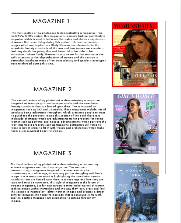
I would first like to begin with a small introduction to my book and explain the contents and basically why there is three different magazines inside and WHY there is 3 different viewpoints throughout time, of women. By having this introduction, the viewer will be able to understand the intent of the book, before they read it, by understanding the contents before they read it, a more straightforward flow of reading and viewing images, is able to take place. This contents page includes a small picture of each magazine cover and a small paragraph explaining which artist the section is inspired by, and what style of photography is included. The paragraph also includes
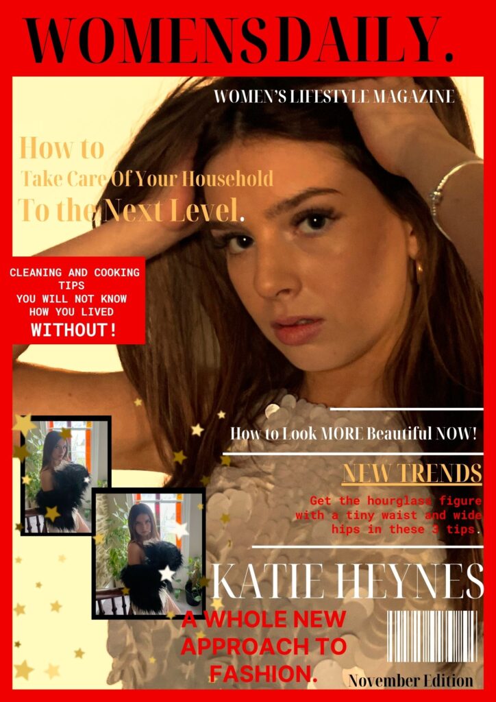
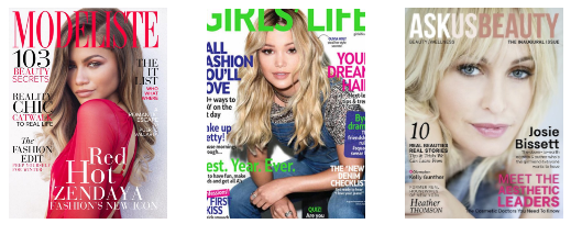
MAGAZINE COVER 1- 1970s Style Magazine.
This is the beginning image for my photobook. This image consists of a front cover of a 1960’s/1970’s women’s fashion and lifestyle magazine which is used to influence the styles and choices day-to-day, of women that were living during this period. Whilst analysing magazines from this period in order to create the best product possible, I took ideas on which colours, layout designs and which key headings were used to draw in the attention of this target audience.
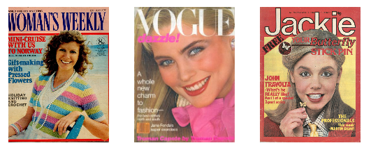
HERE ARE MY TOP 3 IDEAS THAT I USED FOR INSPIRATION.
I chose to have a red border in order to incorporate an eye-catching bold colour surrounding my chosen image with a semi border of black to help it to stand out. I feel this black border also ties with the black title and this automatically displays that this is a women’s magazine aimed at this specific demographic of audience. I then chose to create phrases such as “Get the hourglass figure with a tiny waist and wide hips in these 3 tips.” and “CLEANING AND COOKING TIPS YOU WILL NOT KNOWHOW YOU LIVEDWITHOUT” these are some quotes from this cover which demonstrate the target beauty standard for this era and what the traditional beauty standards were for women in order for them to be beautiful and attractive. I chose these specific ones as the ‘hourglass figure and wide hips’ was the most idealistic body type for women. I wanted these phrases to be short and demanding in order to demonstrate that these magazines and media products chose to push these standards on to women and make them feel as if they are pressured to look this way, and that the way for females to look like this, was my purchasing their products and in taking the advice from’ their favourite stars’ and how they look in order to get male attention.
IMAGES INCLUDED FOR INSIDE THIS SECTION.
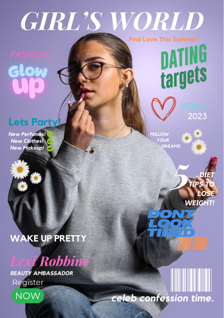
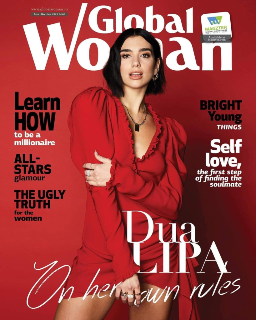
MAGAZINE COVER 2- Modern Style Magazine.
This is the front cover for my modern day girls magazine section of my magazine. This section is demonstrating a magazine targeted at teenage girls and younger adults and the unrealistic beauty standards that are forced upon them. Whilst analysing magazines in this style in order to create the best product possible, I took ideas on which colours, layout designs and which key headings were used to draw in the attention of this target audience.
HERE ARE MY TOP 3 IDEAS THAT I USED FOR INSPIRATION.
This is inspired by magazines such as OK! and US weekly. These magazines include lots of products being advertised throughout, which pressures people to want to purchase the products. I have chosen for my magazine cover to include lots of pastel colours and bright colours which would catch the eye of a young adult and have a large picture of a beautiful girl on the cover which a girl may aspire to look like and therefore want to read. I also used phrases such as “Wake up pretty” and “5 Diet tips to lose weight” which may appeal to girls which want to in- fact be pretty and lose weight. Whereas in reality, these are derogatory and toxic phrases which may pressure girls into wanting to fit in, I chose to have such harsh things said on a seemingly wholesome and girly front cover to show how easy it is for these things to be covered up and ignored when people who actually read them are affected by their content. I also used flowers, pinks, purples and bright short quotes such as “Don’t look tired, look good” and “Glow Up” which are all small things girls have reported that they feel are pressures they feel in their teenage and young adult years. The idea of having words such as “glow up” on my cover, insinuate that inside there will be products that people can buy in order to glow up and ‘become pretty’. Then, inside my book there is a multitude of images which have been made into perfume and makeup advertisements which will force young girls to want to buy in order to fit in with trends and preferences which make them a stereotypical beautiful woman.
IMAGES INCLUDED FOR INSIDE THIS SECTION.
MAGAZINE COVER 3- Modern Style Women’s Empowerment Magazine.
This is the front cover for my modern day women’s magazine section of my magazine. This section is demonstrating a magazine targeted at women who may be transitioning into older age, or who may just be struggling with body image. It is a magazine which is highlighting the unrealistic beauty standards that are forced upon them in today’s age and how they are toxic and must be overcome. Whilst analysing magazines in this style in order to create the best product possible, I took ideas on which colours, layout designs and which key headings were used to draw in the attention of this target audience.
HERE ARE MY TOP 3 IDEAS THAT I USED FOR INSPIRATION.
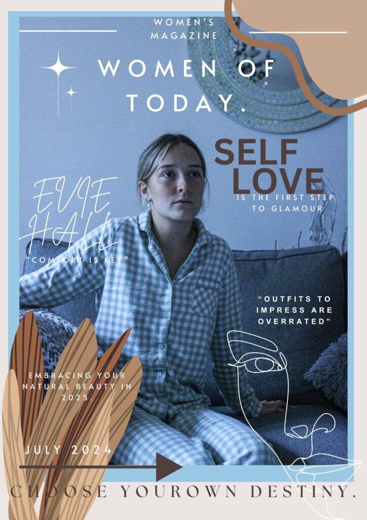
I chose for this magazine cover to have a more homely, welcoming feel to it which is able to let the reader know it is a safe space within the magazine and that they will not be pressured or encouraged to purchase products that are meant to make them look thin or beautiful or always well dressed, but instead to promote comfort over look and natural over glam. This style of magazine is the future of women’s magazine, but for now targets a more niche market of women seeking peace within themselves and the way they look, dress and feel. I chose to have colours such as browns, whites and very beige colours for this cover as it is less eye-catching and popping with colour like the other magazines, as these magazines use these colours and bold writing to mask the underlying message of “if you do not purchase these products, then you will not become beautiful” whereas, in this magazine, the message is ‘Natural beauty is key, to finding yourself and your inner peace. The photograph on the front cover also displays a girl in her pyjamas and wearing no makeup, this is to automatically stick out from other products as viewers will notice that there is no, over the top, dramatized image with bold colours and makeup, and instead appreciate the unconventional front cover of a popular magazine, where a model is seen in her pyjamas and with no makeup on.
EssayLayout.
IMAGES INCLUDED FOR INSIDE THIS SECTION.
Inside Back Page Contents.
This page includes a final overview of the book through photos. I chose to include the section of the book and a small section of pictures included in the back to display a different perspective of the women included in my book and how they are displayed as positive and happy in their natural state, clothing and comfortable in their own skin. I believe that this was necessary to include in my book to shine a positive light on this project and subject that I have explored and display a natural and positive end to my book after exploring such complex and negative stereotypes of women and highlighting many errors in society.