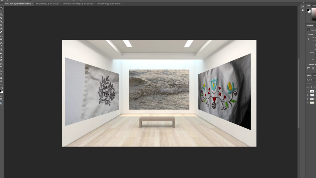
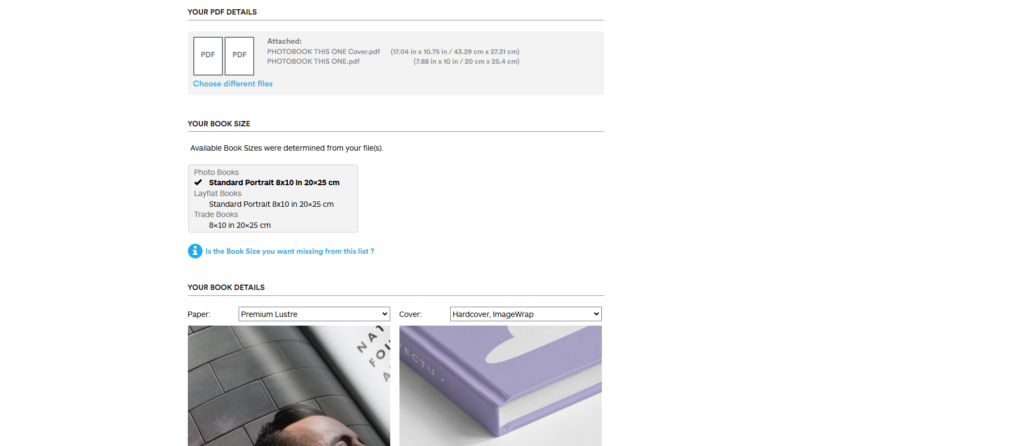
When creating my photobook on Lightroom classic I made sue when exporting it to the final destination Blub that all the measurments and images wee in the place I wanted them in.
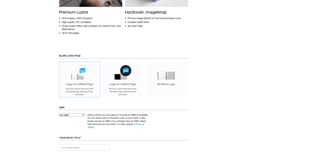
The platform includes a variation of design tools, quality printing and distribution options. It also offers a range of high quality printing options which includes professional-grade paper types which is an essential option for photobooks. The quality of the paper and the print is crucial for preserving the integrity of the photos. The website also includes features of glossy or matte paper with options for lay-flat binding. It ensures that your photographs will be showcased in the best way.
If a persons work involves fine details, high printing prints are neccessary to bring out the true colour, texture, and lighting in each photograph.
It also provides an integrated online platform, where you can sell your photography book directly to the public through their website. Additionally, the platform allows you to distribute your book to other online retailers like Amazon that makes it easier for a wider audience to discover and purchase your work. This could significantly expand the reach of a photographers book without needing a traditional publisher or intermediary.
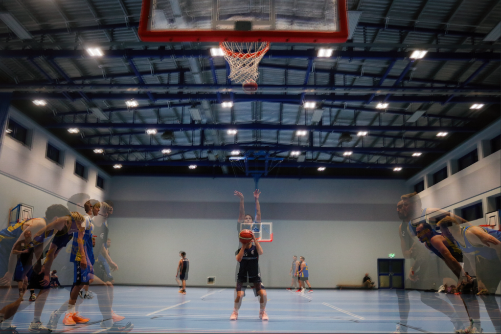
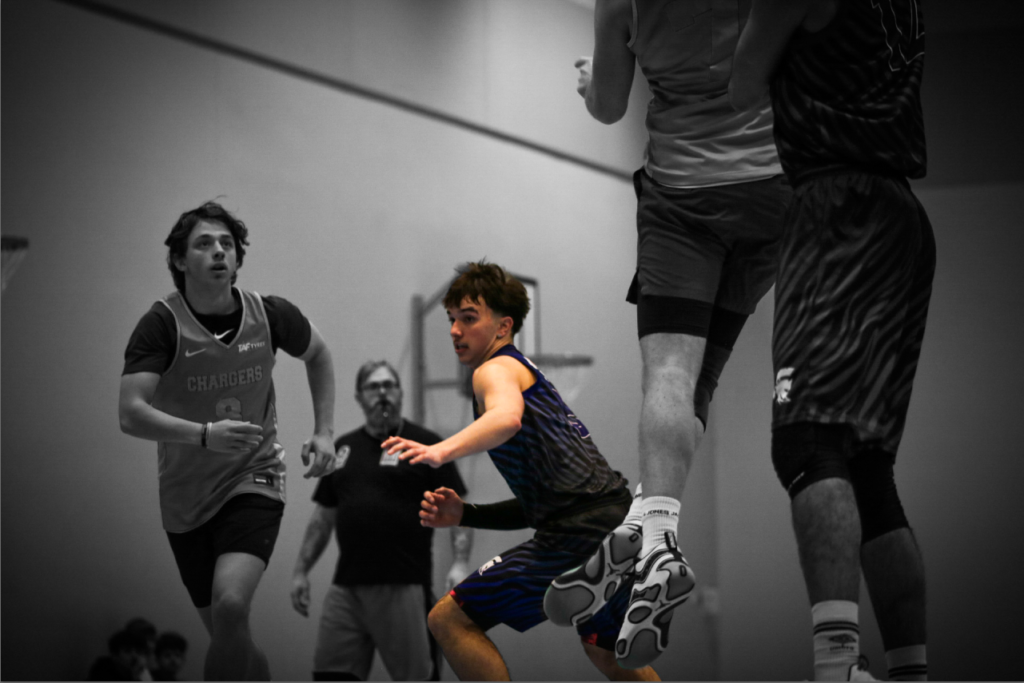
Here I used multi-exposure technique to overlay 3 images of this player performing a free throw. You can see the player start from a normal position, then the next photo shows them beginning to run towards the hoop to catch the rebound. Using this technique, I’m also able to show time in a photo, making this photo more interesting to view. Here I used Lightroom to select the subject in the middle, I then pressed invert and brought the saturation down to -100. This meant the whole photo, apart from the middle subject, was in black and white. This makes the centre player seem important, as the colour draws the attention towards him. I added a vignette around his as well to keep the eyes away from the outside and and more towards the centre of the image. The composition it well formulated, as the negative space is evenly spread out thought the image. Here I added a linear gradient layer mask to the top of the image since there isn’t much up there, it better if it isn’t bright and noticeable. But I do like the composition with all the players taking up the lower half of the image, so I didn’t crop it.
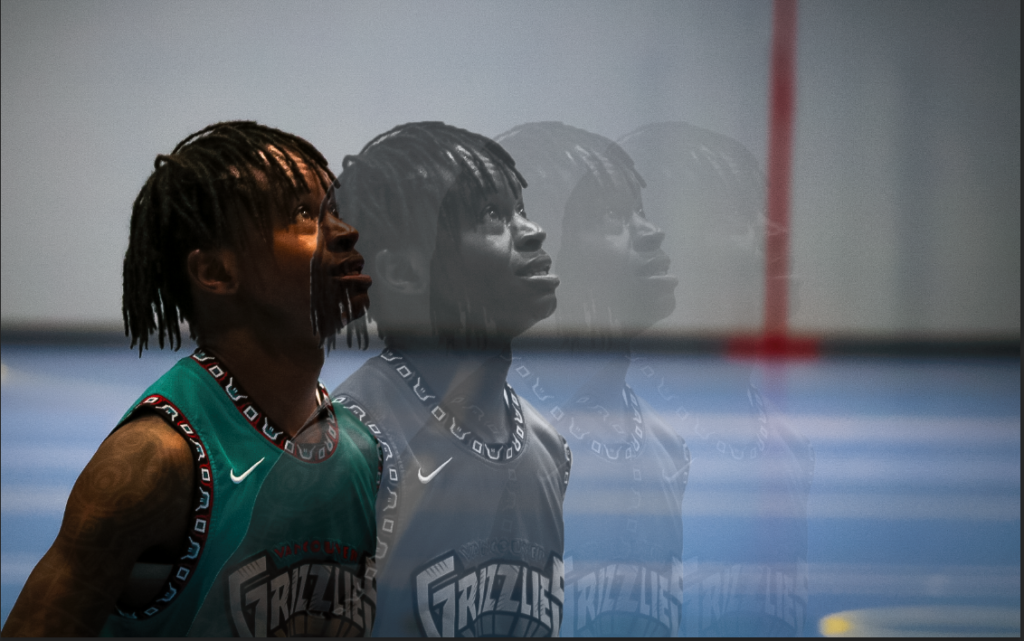
Here I used the multi-exposure technique again by cropping out the subject using photoshop, with a mixture of quick select and manual cut out. Then I duplicated the subject, creating 3 new layers, as offsetting them equally. Then with each layer I decreased the saturation to make it B&W and decreased the opacity, becoming more and more opaque as the layer gets further away from the original subject. I think this allows a lot more of the image to be filled up, while also creating more emotion since the subject is duplicated multiple times.