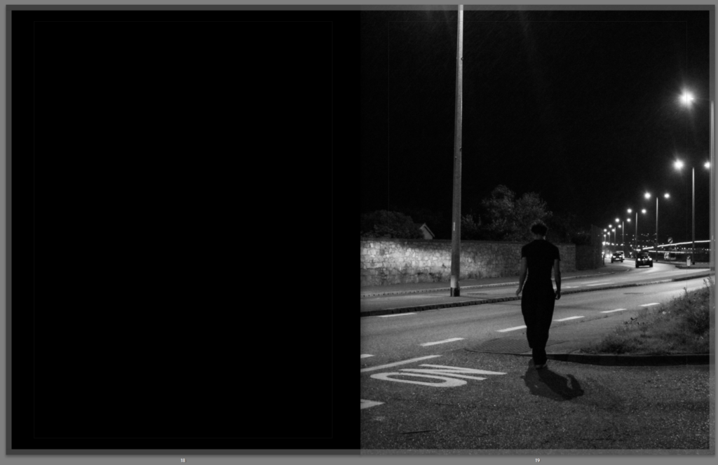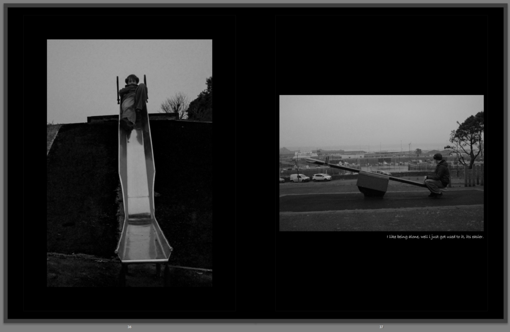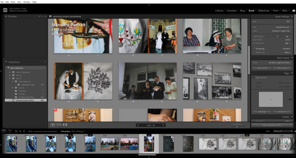
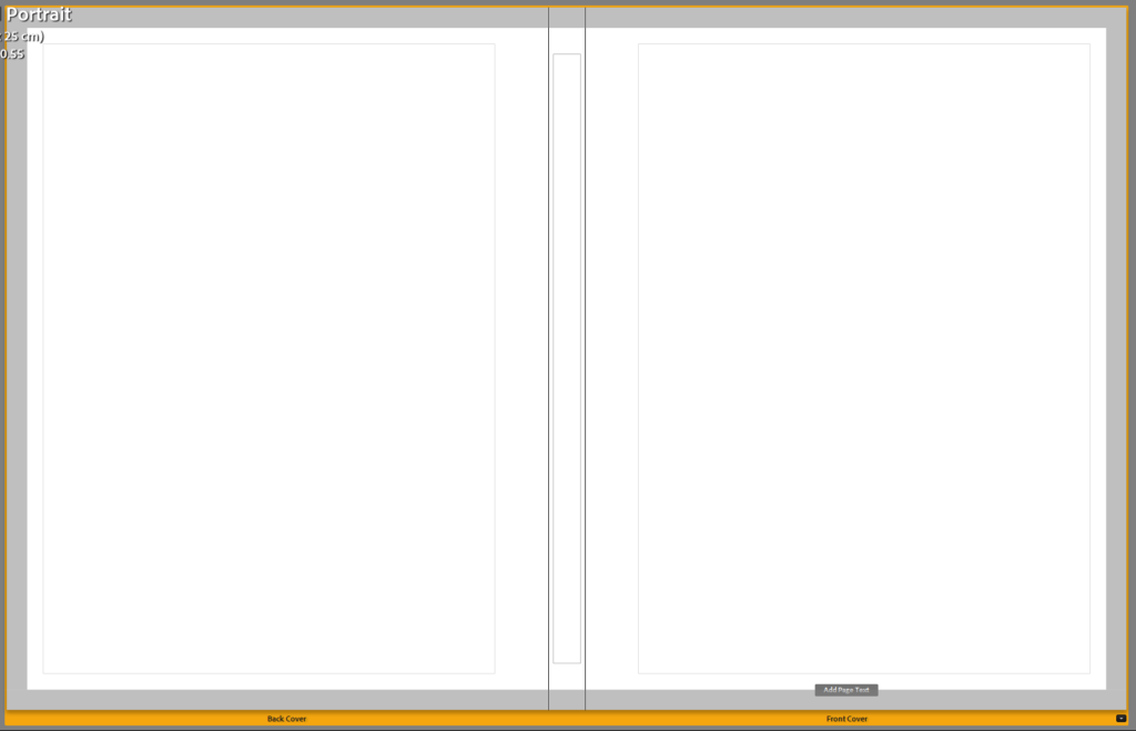
I wanted to create a double page spread for this photo because I feel like it deserves a whole page and it wouldn’t have as much emphasis on only one page.
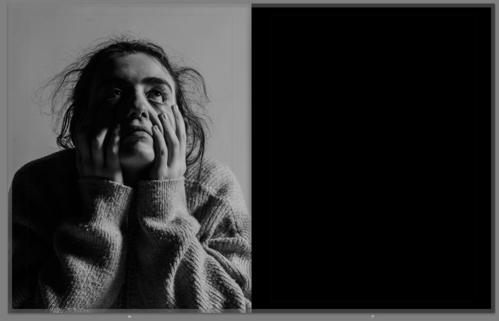
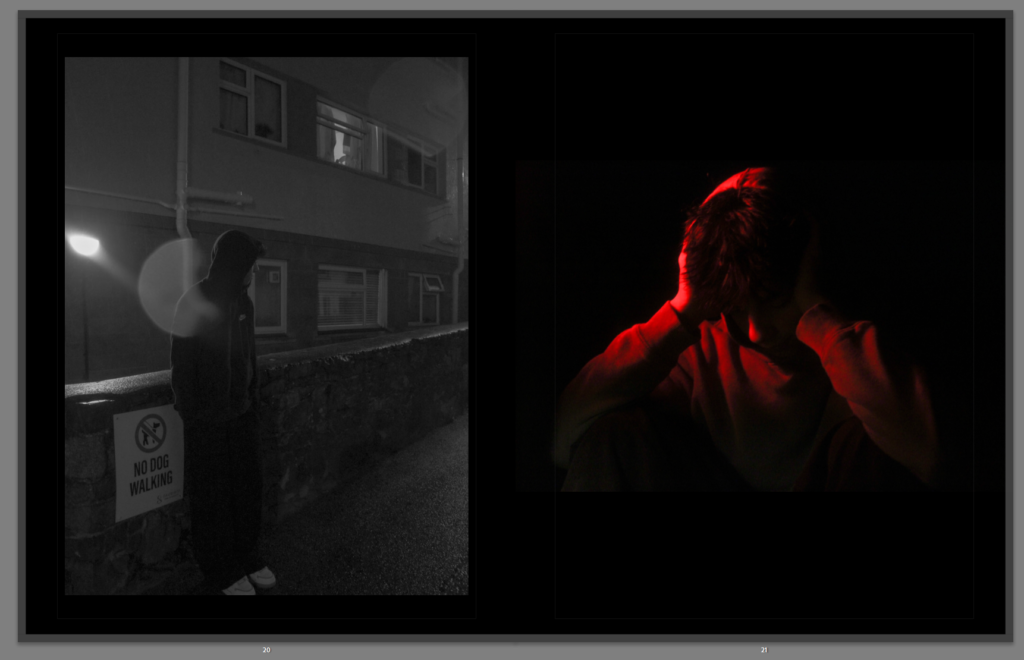
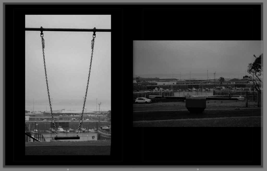
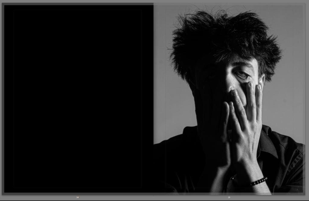
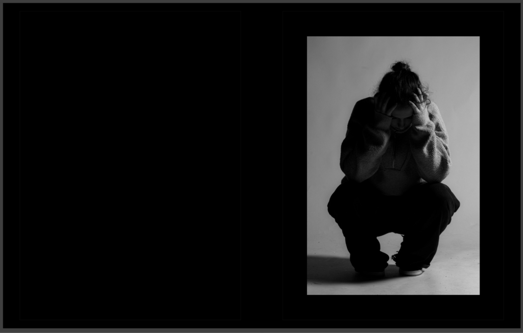
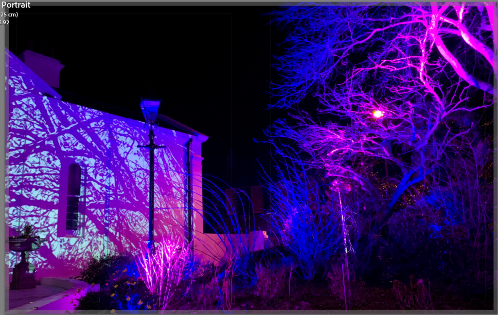
I like the way this portrait image has a whole page to itself as the image feels lonely and isolated so it works well on its own page.
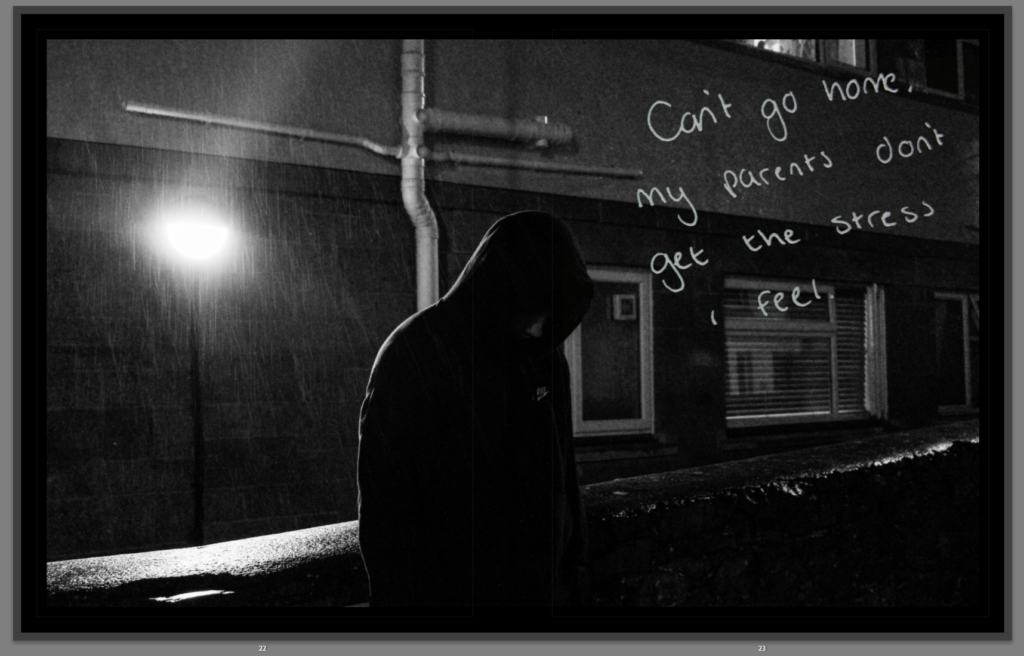
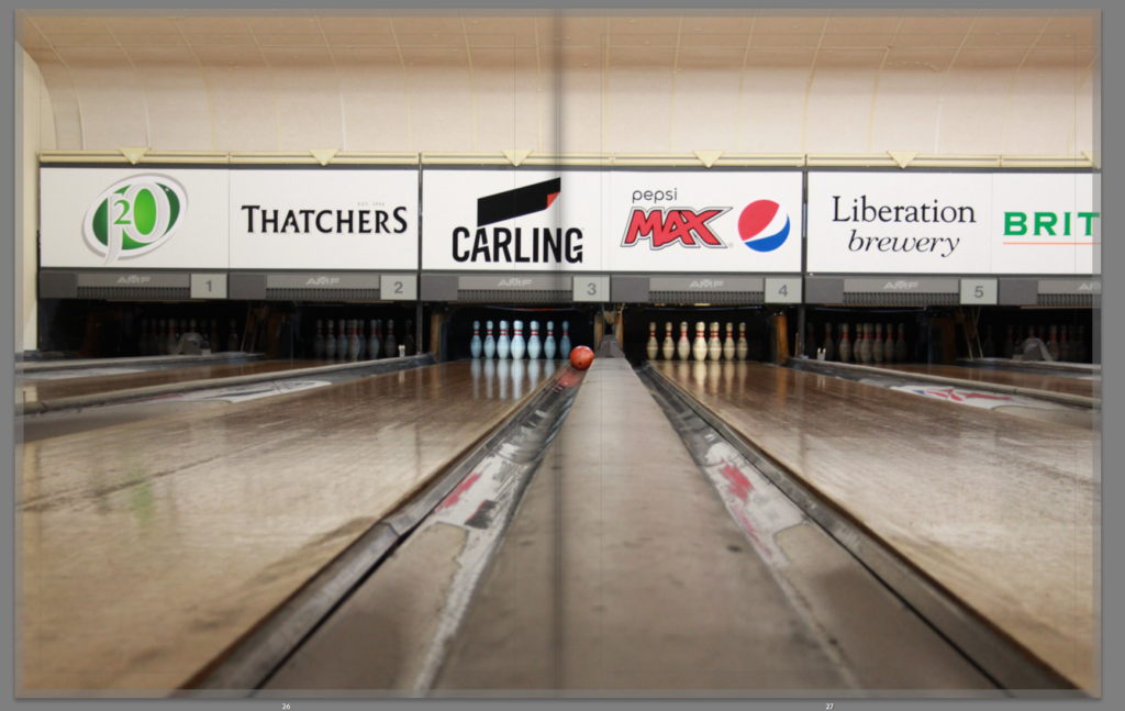
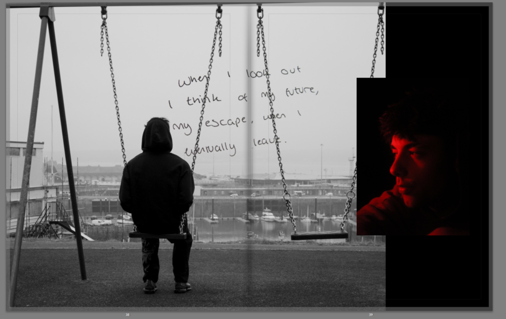
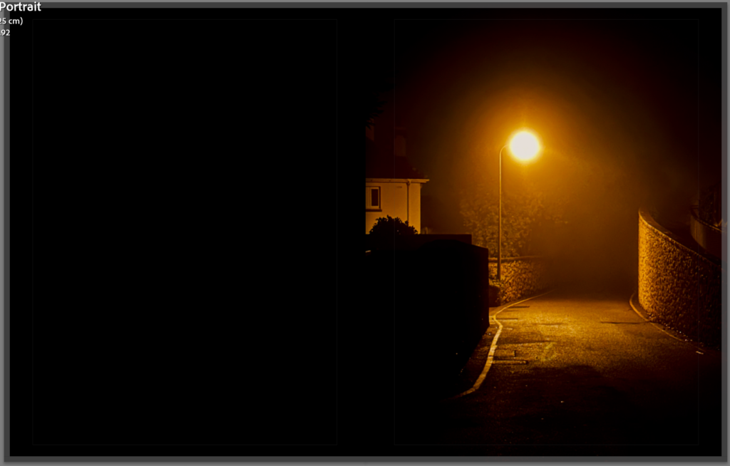
This image here was originally a full page spread, however there was a bit cropped out which affected its composition so I slightly narrowed it so there is a bit of black on the left and the composition isn’t affected now
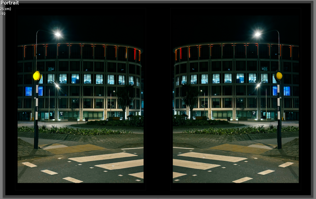
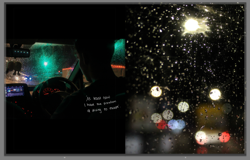
I didn’t know what photo to put on the left but i felt it needed a photo there so I realised I had the same photo of the building but with the beacon light on so I applied the exact same edits I did to the original photo and put it on the left and I think the photos work well together. I tried experimenting by flipping the photo on the left , however I did not like it as much so left it how it was.
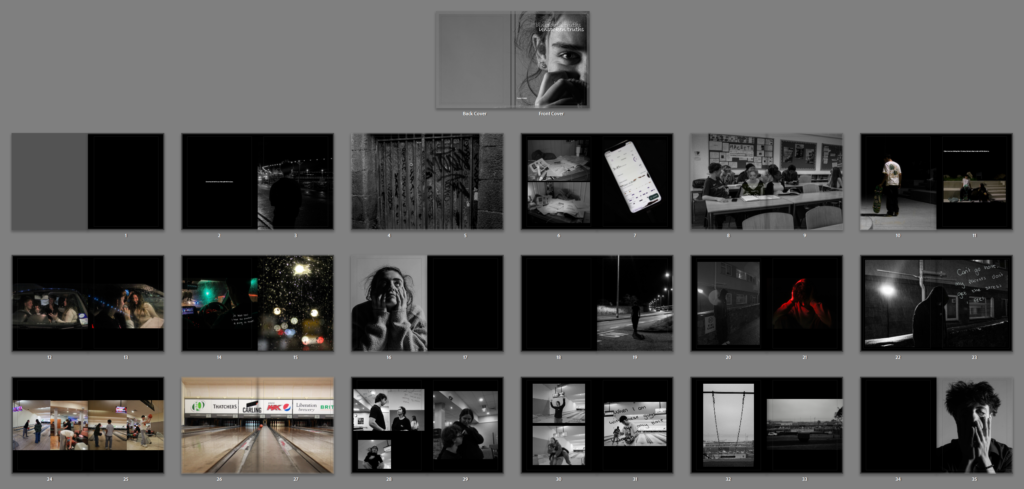
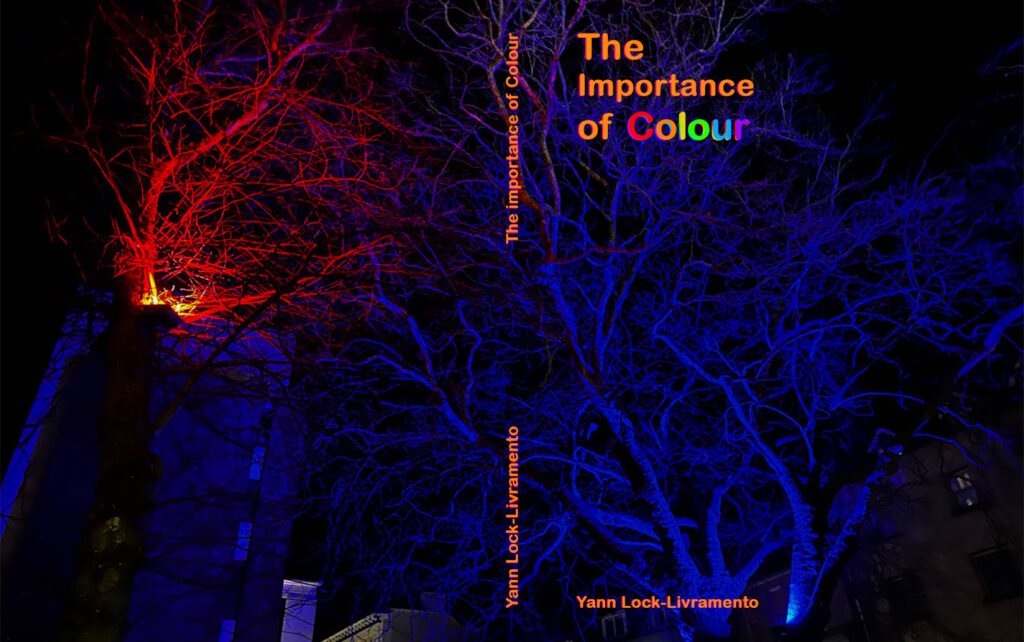
Designing the front and back cover
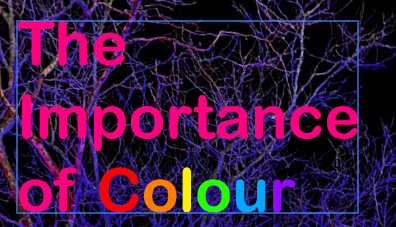
I went into photoshop to design the text for the front cover, I was originally going to make all the text rainbow but I really like this pink and think it contrast well with the blue trees on the front cover and having just the word ‘colour’ in rainbow works so much better and provides meaning/emphasis to the word colour. I chose Arial rounded MT Bold as it is my favourite font and it is really smooth and simple as I don’t feel my photography book needs a really over the top serif font

I tried positioning the text on the right but I wasn’t really a fan of it and think the front cover composition would look way better with the text on the left
I was going to add a glow but whilst I was experimenting with It and the composition I made a copy of the text, then I thought what would the text look like if I made it the colour #F80 (#FF8800)? as I really like using this colour and I use it a lot on my website and other personal projects. It would also contrast really well with the blue on the trees, so I placed it on top of the original pink text and it made this really nice drop shadow effect which I really love. Now I just need to come up with something for the text ‘Colour’ but I have this idea to do the drop shadow effect but with the colours reversed.
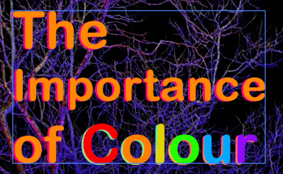

After a lot of attempts of adding a drop shadow to the front cover I experimented by adding a gradient one and I eventually settled on a rainbow one (seen below) as the other ones didn’t work as well.
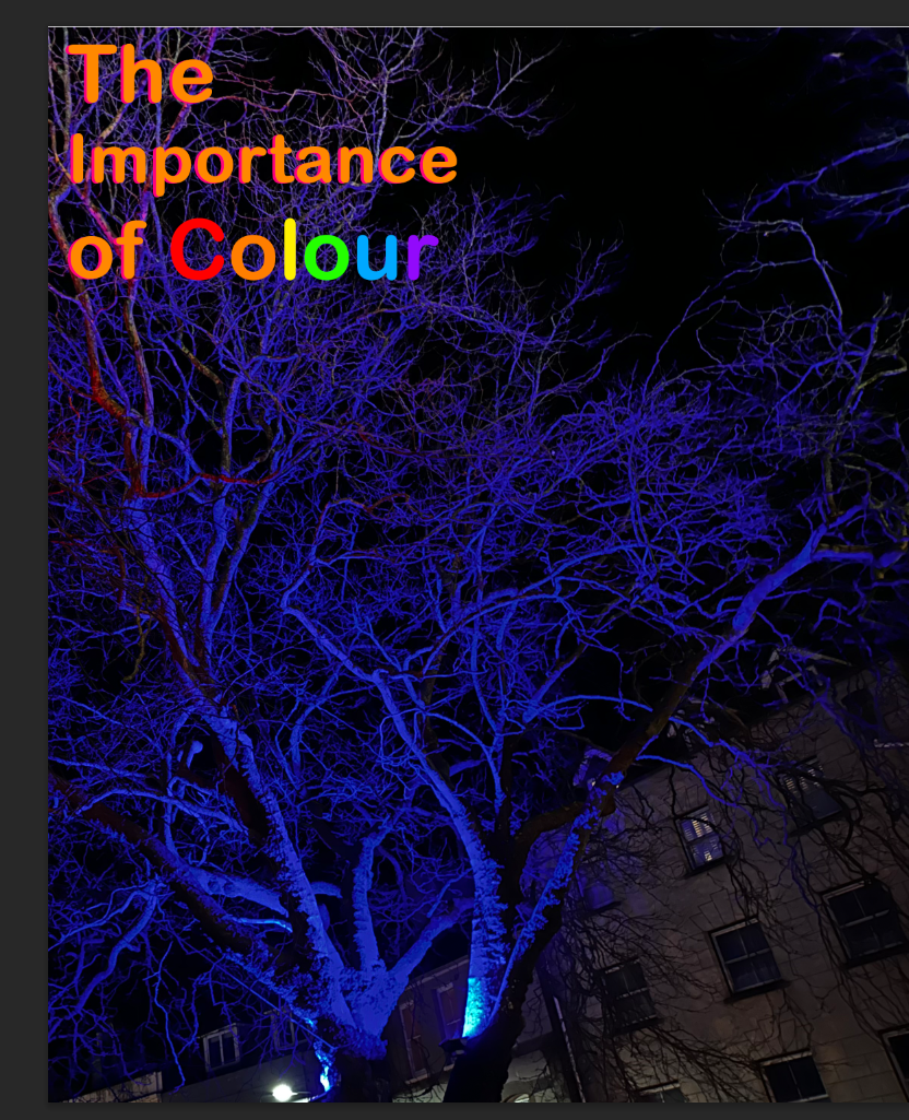
This is the end result of the front cover and I am very pleased with how it turned out.
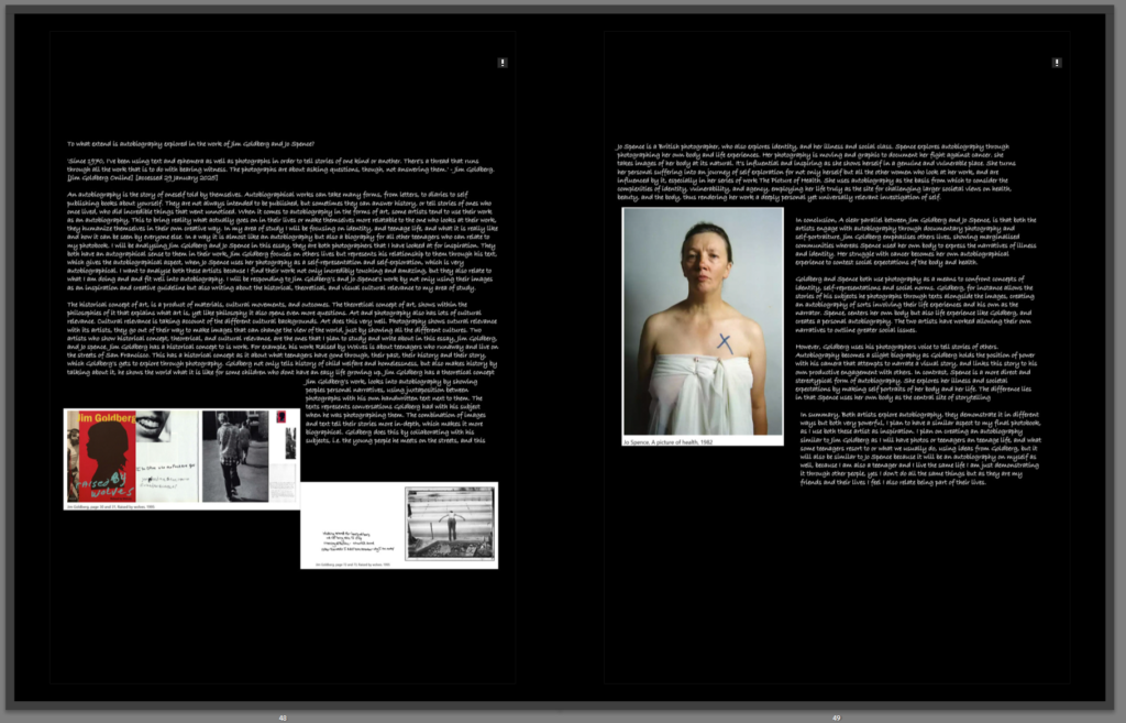
The essay at the end of the book
I began transferring the essay into the book and I think it looks good with the white text on black paper, I also changed the colour of some words which mention colours as it fits the theme of colour, it also looks good and makes the essay more engaging to read.