

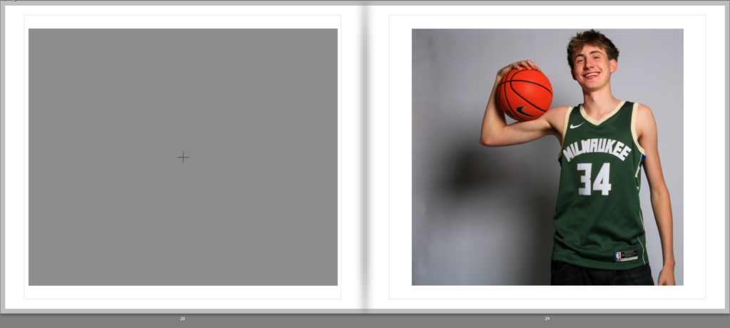
Here are the images I will be using for my photobook. I chose my best images as well as images that included the main subject, tony. I colour coded them to help me organise the layout in the photobook. Purple means its documentary photos of a basketball game. blue are photos of tony in his room. Green are photos of the team mates. yellow are only portrait photos of the team mates faces. and red are photos that don’t fit the rest of the images. The star rating is not important here.
Below is my first try at laying out these images:

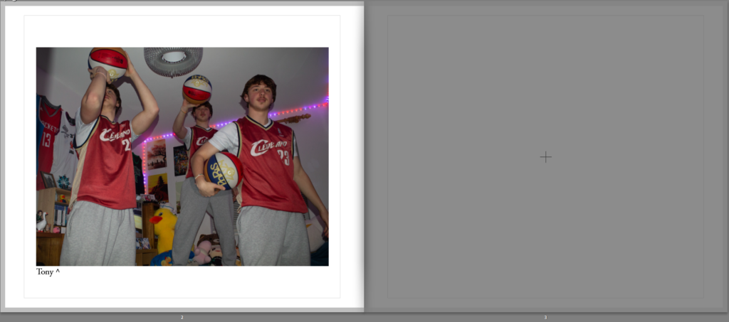

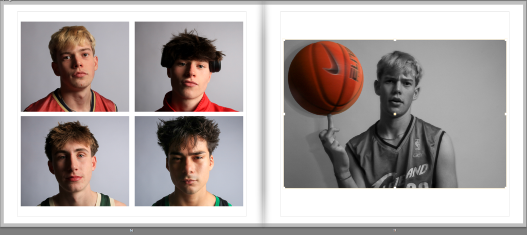
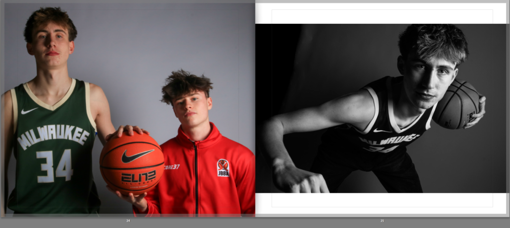
Here I have another montage right after the page with Tony in it. This increases the isolation that tony has as pages before and after it are full of people. I also added Tommy on the right and I think It complements the headshots on the left quite well, almost like a ‘zoom in’ into Tommy’s headshot.
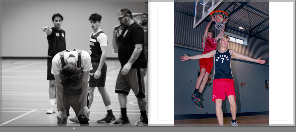
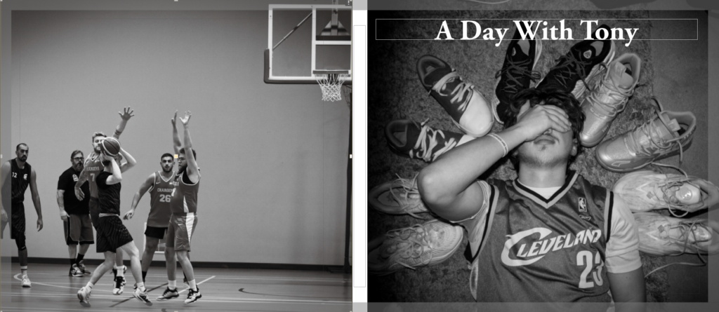
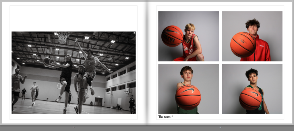
I think these two images contrast each other nicely, one is almost sad with the subjects face looking down, likely tired. The other image seems exciting with its vibrant colours, as well as a nice slam dunk in the background.

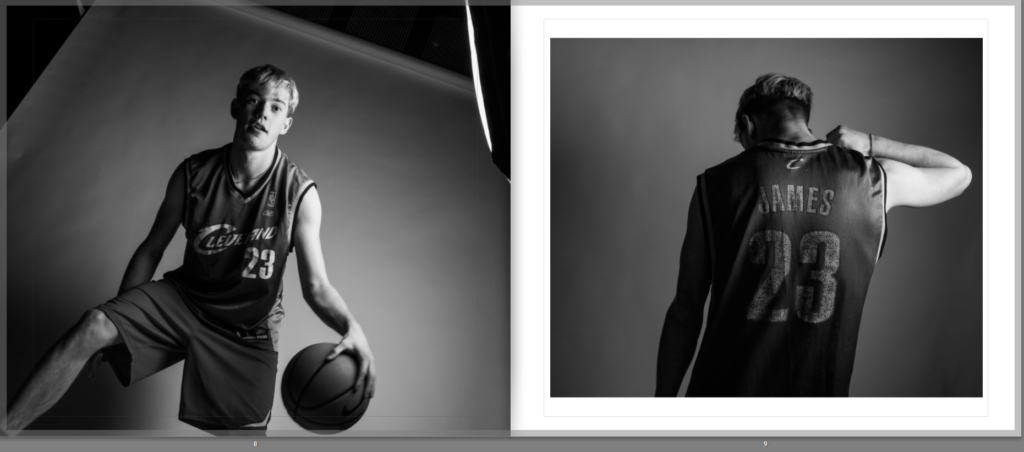
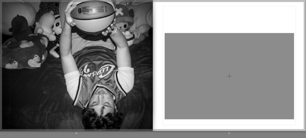
Here I added to Images that contrast each other again, to add more to this book, making it more interesting. From this part of the book you stop seeing tony, showing that his obsession to be the best has stopped him completely from having fun playing the sport that he loves.
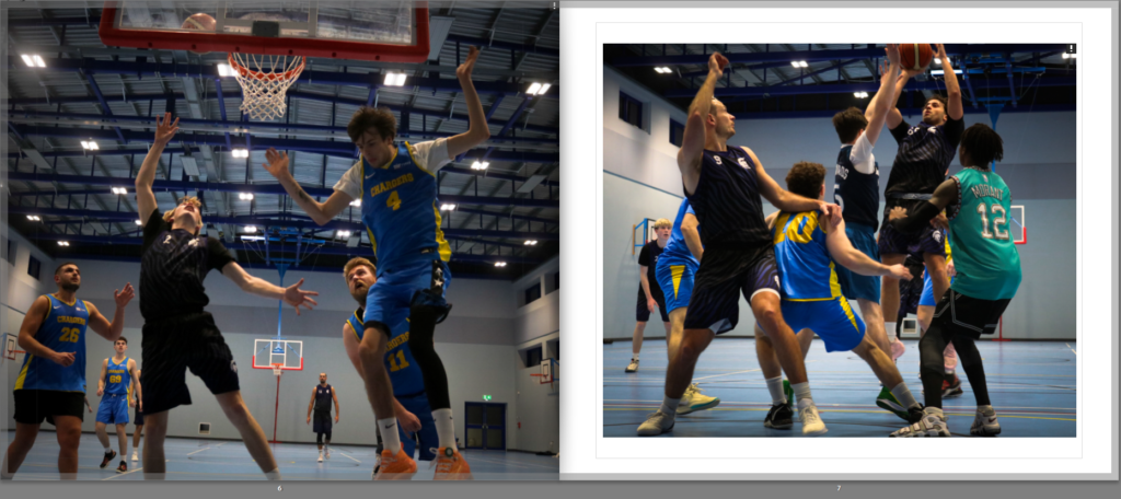
These two images are nicely contrast, with the left image replicating the famous photo of the largest and shortest players, Gheorghe Muresan and Muggsy Bogues:

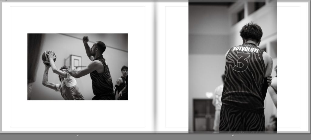
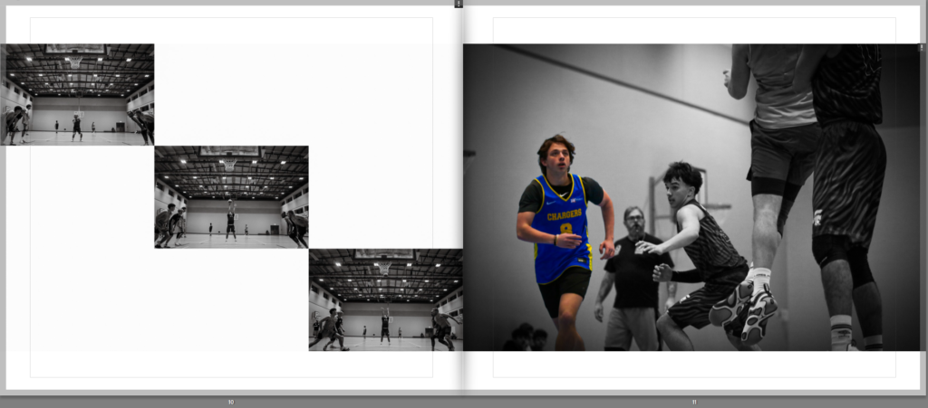
Here I added more documentary photos of the basketball game, once again not including tony to show his participation in the team is dwindling.
For the final image I decided to use this image of Jesper looking very excited to be there, showing a lot of positive emotion. I think this image finishes of this book quite nicely since it shows that sport is meant to be played for fun, and trying to hard where you stop finding the sport fun is not worth it. I also used this image of Jesper specifically since he is shown a lot more towards the end of the book, making him the centre of attention. The book is divided into 2 parts I think, Tommy’s section at the start and Jespers section at the end, as well as having Tony presented thought the book. This allows me to show 3 different story’s at once, with each subject showing how different there personality is.
I decided to change the front cover to:
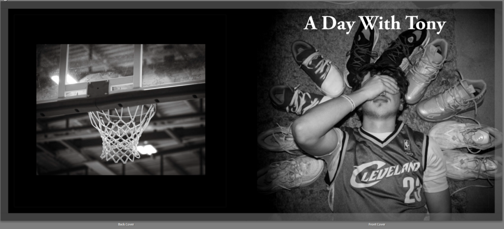
This is because I took my documentary photos using a very compressed format so when I scale up my images they become very blurry, so I changed it to a basketball hoop photo too keep with the theme and stop pixilated images from being an issue.
I then added the essay about tableaux vs documentary to the photo book:

As you can see I added the title to its own page spread to lead the reader into the essay.
Evaluation
I think I did a good job at creating a story of a player using photos from 3 different photoshoots. The things I did well in was having a variety of different types of images (including documentary and tableaux, portrait and landscape). I also made use of Juxtaposition with the images, paring coloured and B&W images in an aesthetic way. I used Adobe Garamond Pro for the font, keeping it consistent throughout the book. I also like the minimalist text I added below some of the images to give context to the viewer.
However, I think I didn’t add enough text to the photobook overall, making it less exciting to read. I also think I lacked in the amount of photos I took, especially with the main figure in this book, tony. The image quality was also a problem meaning I cant scale up a lot of my images, making it difficult to lay out the photos in the way I want. I also think the editing is too inconsistent, with some images being slightly darker, some being too colourful, ext.