For this photoshoot, we visited St Catherine’s woods, because when I was younger, especially during covid, my family and I would go on walks here with our dog very regularly, so this setting relates to my youth and identity in particular.
Contact Sheet
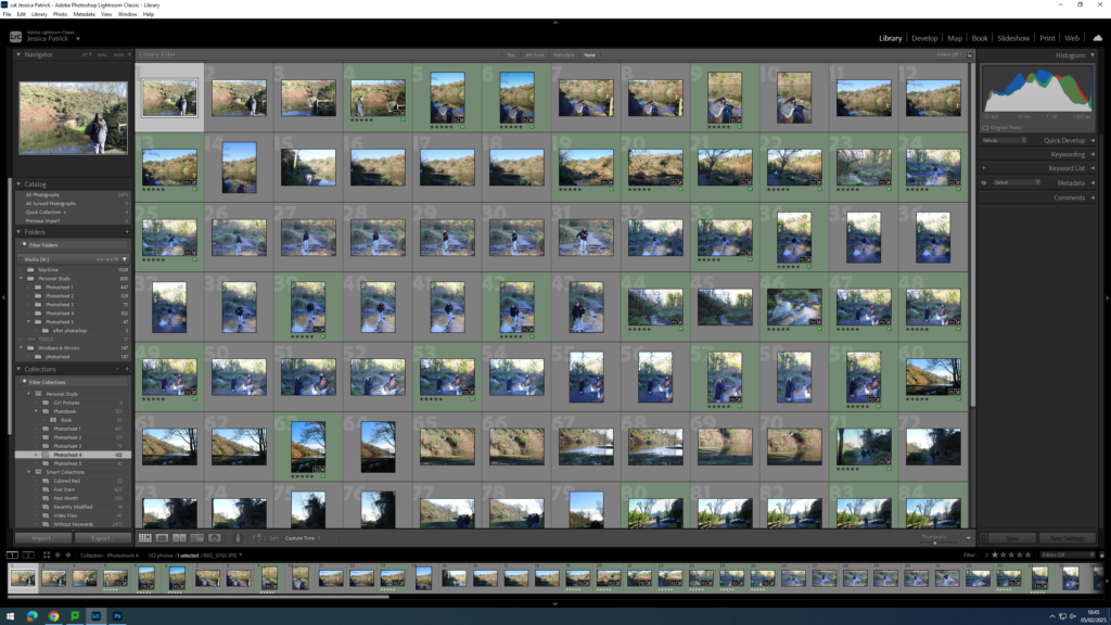
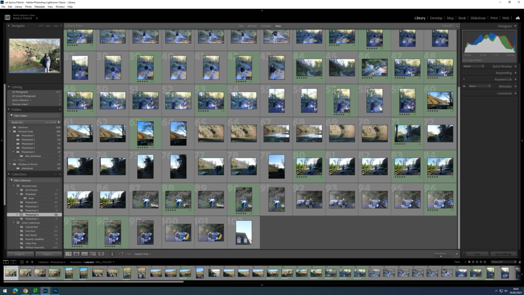
The images which are highlighted green are the images I have chosen to edit, because they are my best images, with the best composition and layout. They also represent my themes of youth and identity the best.
Edits
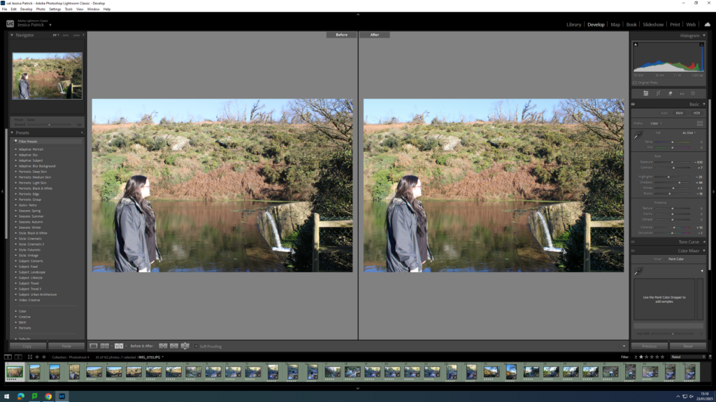
I edited this image by increasing the contrast, shadows, whites and vibrancy, while decreasing the exposure, highlights, blacks and saturation. I did this, so that the image was slightly less exposed and had better lighting.
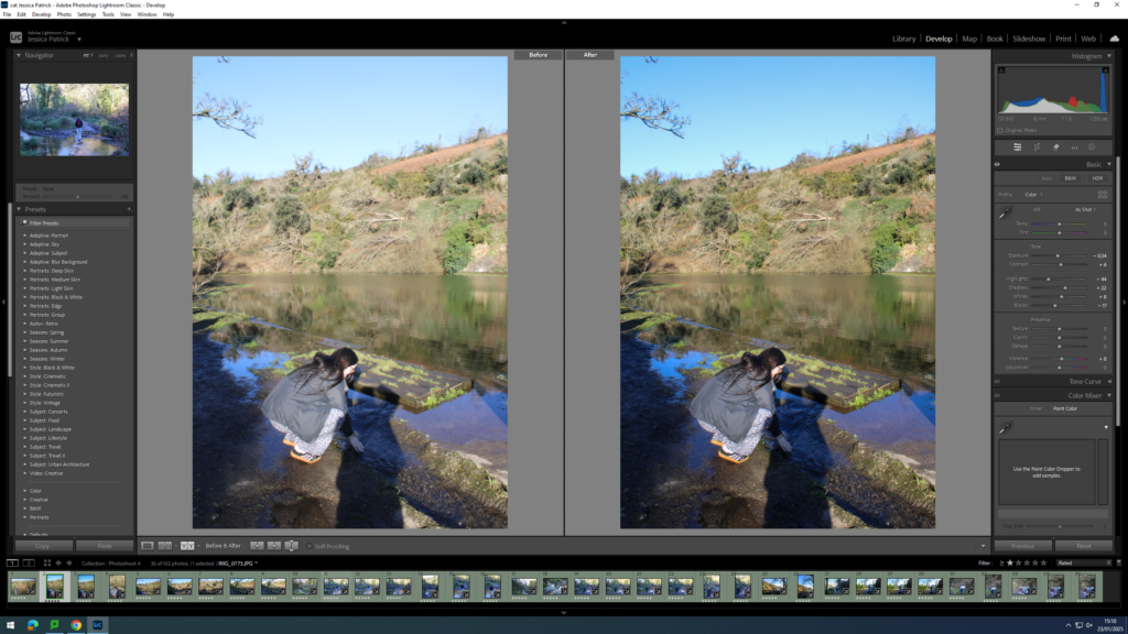
I edited this image by increasing the contrast, shadows, whites and vibrancy, while decreasing the exposure, highlights and blacks, so that the image had better lighting and was slightly more vibrant.
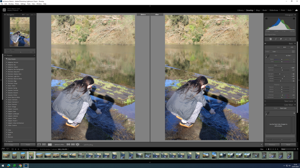
I edited this image by increasing the contrast, shadows, whites and vibrancy, while decreasing the exposure, highlights, blacks and saturation. I did this, so that the image had better lighting, due to less exposure and so it was more vibrant.
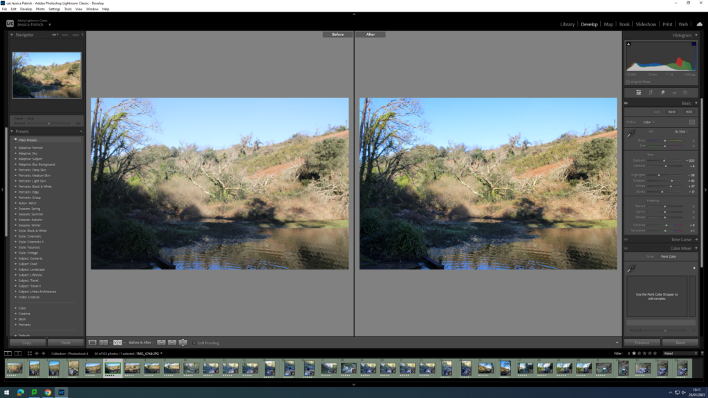
I edited this image by increasing the contrast, shadows, whites, vibrancy and saturation, while decreasing the exposure, highlights and blacks. I did this, so that the image had better lighting.
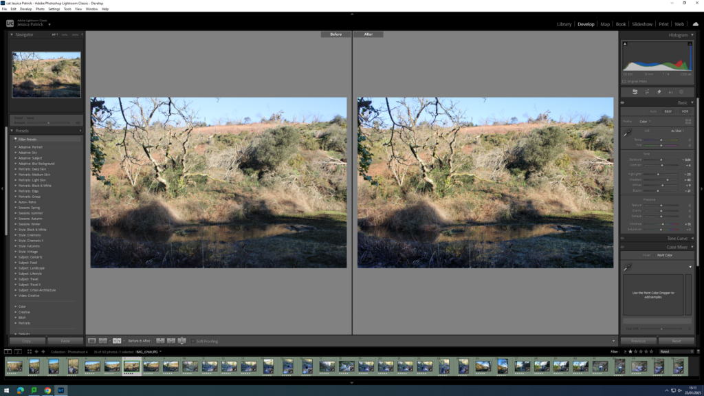
I edited this image by increasing the contrast, shadows, whites and vibrancy, while decreasing the exposure, highlights, blacks and saturation. I did this, so that the lighting was better.
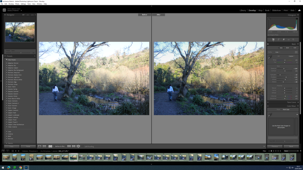
I edited this image by increasing contrast, shadows, whites, vibrancy and saturation, while decreasing the exposure, highlights and blacks. I did this so the lighting was better. I also added a yellow tint to the image, because the image had a blue tint originally, due to the lighting and camera settings, so I wanted to cancel that out.
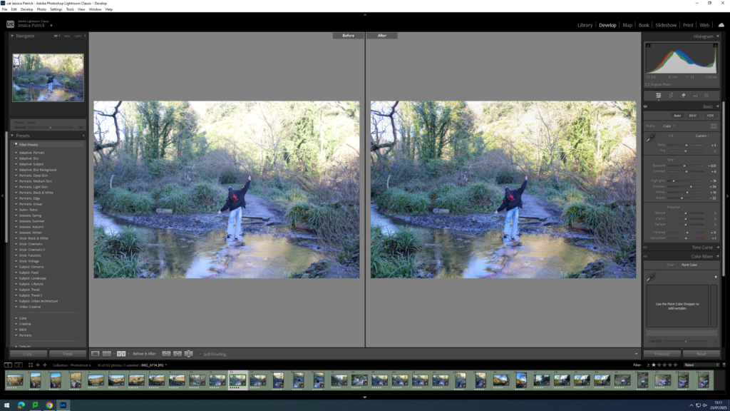
I edited this image by increasing the contrast, shadows, whites, vibrancy and saturation, while decreasing the exposure, highlights and blacks. I did this, so that the image was more vibrant and had better lighting. I also added a yellow tint to this image, to cancel out the original blue tint that the image had.
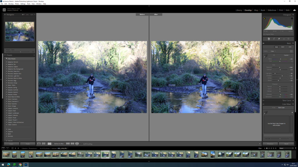
I edited this image by increasing the contrast, shadows, whites, vibrancy and saturation, while decreasing the highlights and blacks. I did this, so that the image has better lighting and was more vibrant. I also added a yellow tint to this image in order to cancel out the blue tint it originally had.

I edited this image by increasing the contrast, shadows, whites, vibrancy and saturation, while decreasing the highlights and blacks. I also added a yellow tint to this image, to remove the blue tint and improve the lighting and make the image more vibrant.
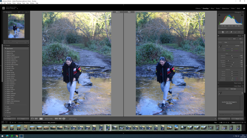
I edited this image by increasing the contrast, shadows, whites, vibrancy and saturation, while decreasing the exposure, highlights and blacks. I did this, so the image would have better lighting. I also added a yellow tint to this image, so I could remove the blue tint the original image has.
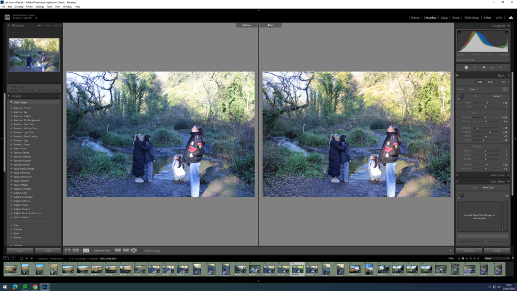
I edited this image by increasing the contrast, shadows, whites, vibrancy and saturation, while decreasing the exposure, highlights and blacks. I did this to improve the lighting and make the image more vibrant. I also added a yellow tint to this image, so I could cancel out the slightly blue tint the original image had.
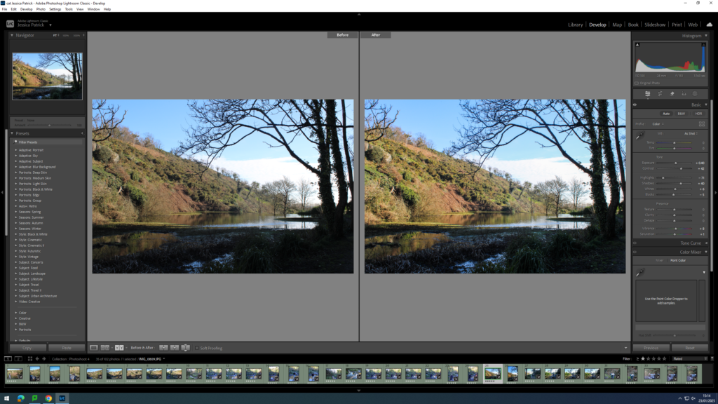
I edited this image by increasing the exposure, contrast, shadows, whites, vibrancy and saturation, while decreasing the highlights and blacks. I did this to improve the lighting and make the image more vibrant.
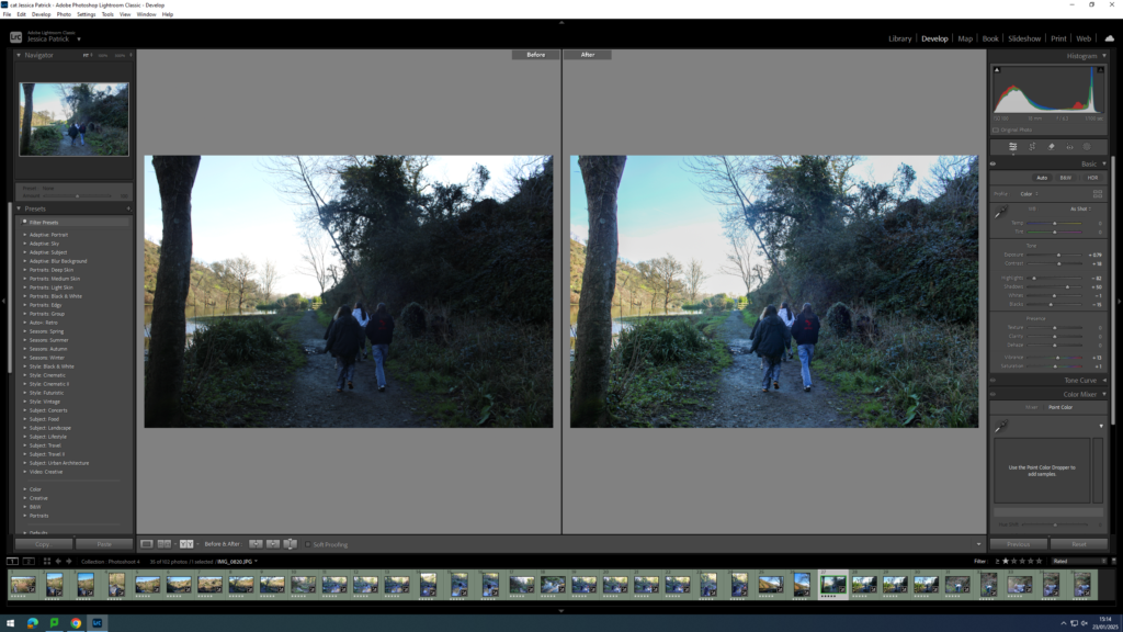
I edited this image by increasing the exposure, contrast, shadows, vibrancy and saturation while decreasing the highlights, whites and blacks. I did this to improve the lighting of this image.
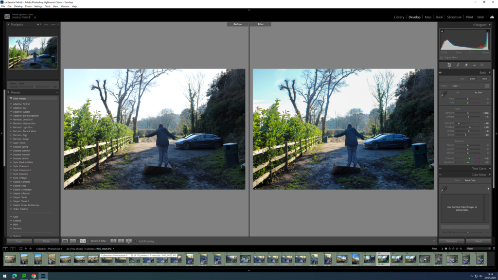
I edited this image by increasing the exposure, contrast, shadows, whites, vibrancy and saturation, while decreasing the highlights and blacks. I did this, so that the lighting was better and the image was more vibrant.
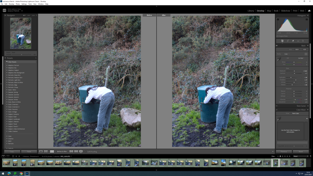
I edited this image by increasing the exposure, contrast, shadows, vibrancy and saturation, while decreasing the highlights and blacks. I did this, so that the image was more vibrant.

I edited this image by increasing the exposure, contrast, shadows, whites and vibrancy, while decreasing the highlights and blacks. I did this, so that the lighting was better.
