
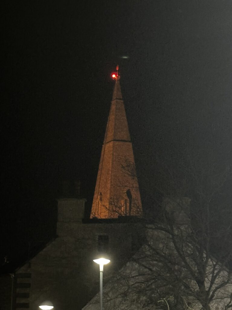
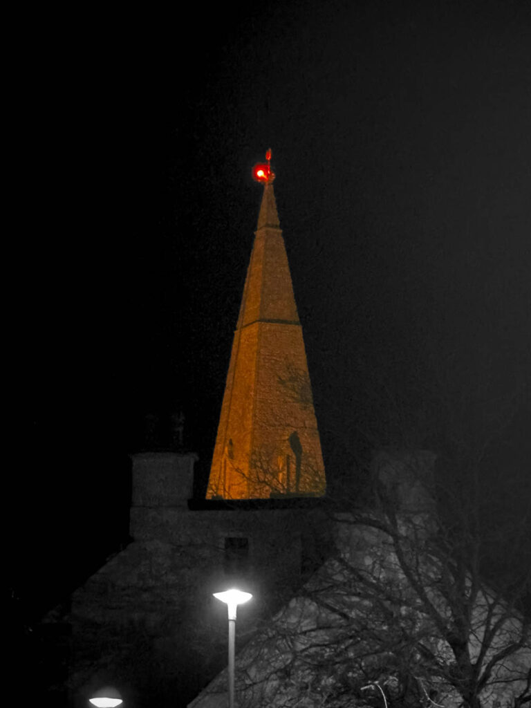
For this image of the church I really wanted to have the orange pop out so I did selective colour to make everything except the church and the red light on the top black and white. I think the image looks alot cleaner like this and it really highlights the orange church better.
To edit this photo I rotated it and cropped it so it was more level and aligned. I also slightly adjusted the colour and the contrast to visually improve the image. I really like this photo as it looks like a strange photo as there is not much context about it I also really like the orange light as it makes the photo look beautiful.
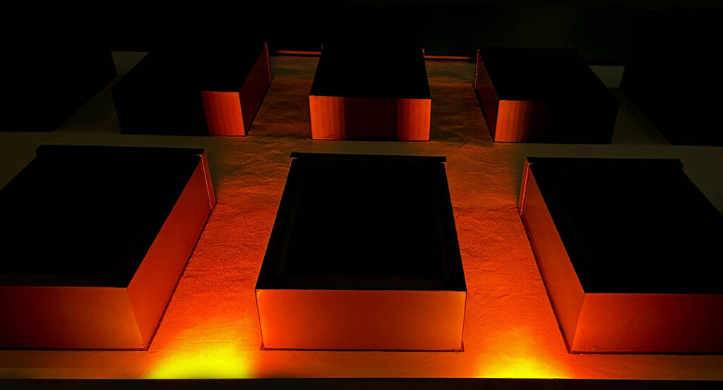
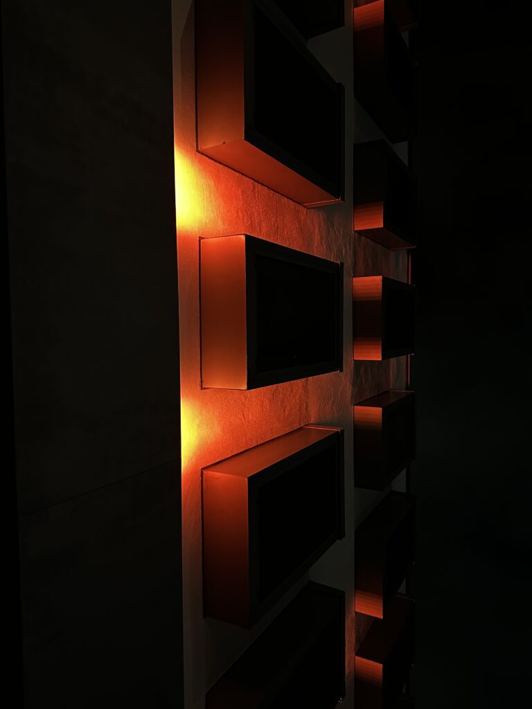
I wasn’t really sure the way I wanted this image to turn out so I decided to experiment by adjusted the contrast, shadows and colour until I turned out with this edit which I think looks so much better than the original photo
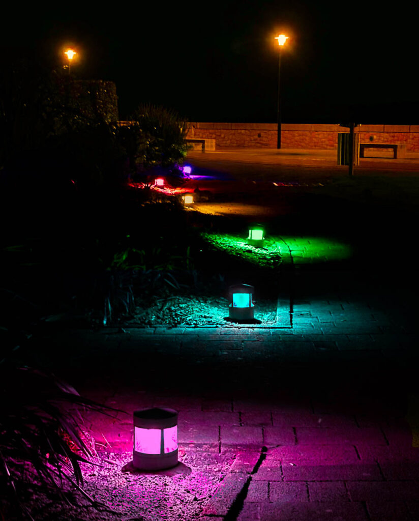
I took this image of some lights by the waterfront and I got this cool idea to make the lights different colours, so I basically divided the image into layers for each light and recoloured them using the camera raw filter which contains a wide range of useful tools. To achieve the different colours for the light I colour graded them and adjusted the hue, saturation and luminance of the specific colours. I also removed the light at the end as it wasn’t needed and was causing problems due to the other lights. I really like how it turned out and how colourful the image now is.
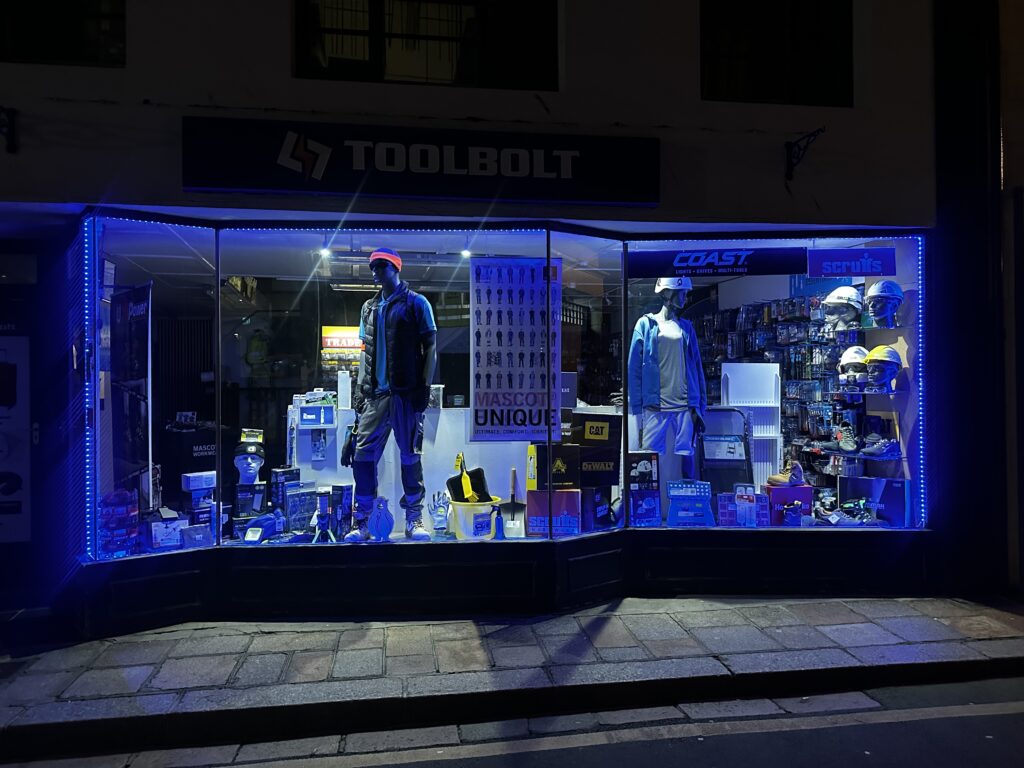
For this image I made slight adjustments to the lighting and enhanced the blue light to make it stand out more. I also added a green colour grade to the shadows and highlights which creates this nice green and blue effect in the reflection of the shop window which I think works well and looks really good.
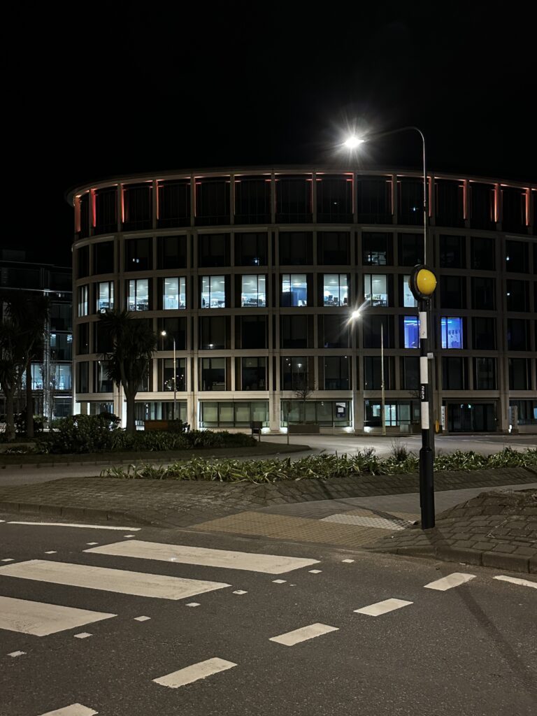
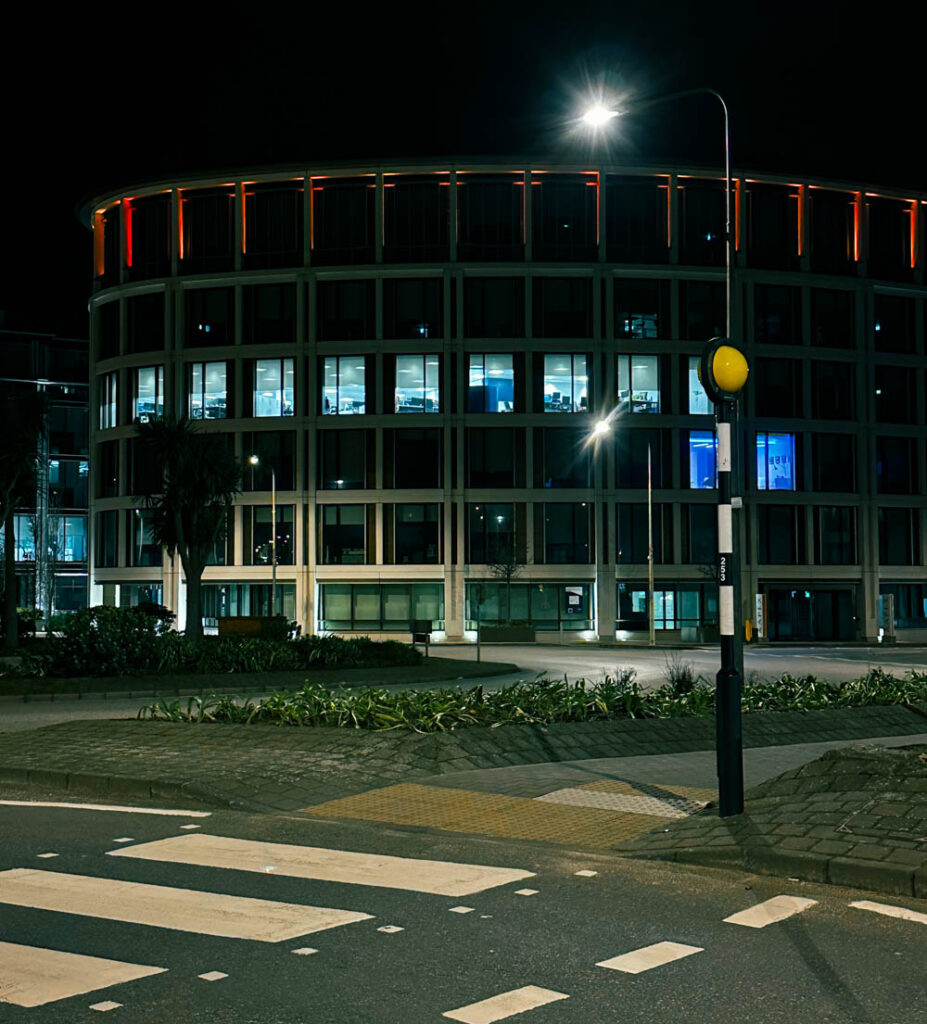
In this photo I slightly cropped it so the building is more centred and inview, I also slightly enhanced the orange/red on the building as I am trying to show colour and its importance so I need it to stand out. I also added this greenish colour filter which give the image a cool/coldish feel and looks quite good.
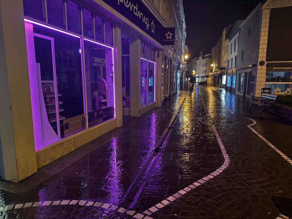

In this photo I increased the Vibrance and Saturation to really make the colours pop and look even more beautiful. I also slightly adjusted the lighting to make the blacks and shadows more stronger. Overall I really like this photo because the reflections on the wet pavement are really nice and the photo really shows why colour is important in our lives as colour helps to create a vibrant and less dull world.
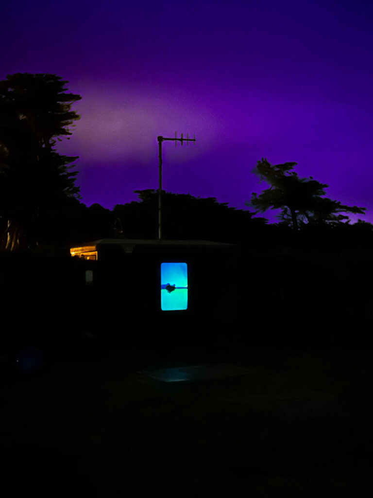
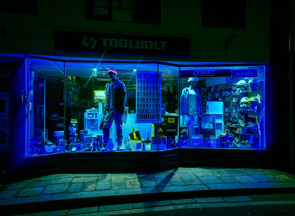
I really like this image I took as it looks mysterious and like a photograph Will Lakeman would take, however the sky could be a lot nicer, so I selected the sky with the masking tool and adjusted the Temperature, Tint and Hue shift to give it this deep purple color which makes the image look more beautiful and goes well with the light in the window.