
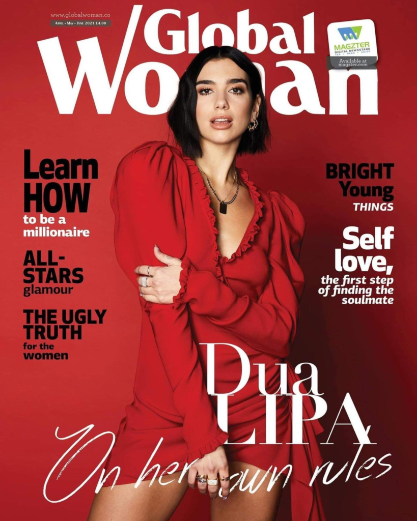
FRONT COVER:
I have chosen to pick two strong images from my photoshoots to use as the front and back cover of my photobook, this is to immediately get the viewers attention of what is expected inside the book. I like this image because it displays the high quality images that are going to be inside the book. This gives the viewer a clear indicator of what images are going to be inside and what the intention of the book may be about.
PARAGRAPH OF INTRODUCTION:
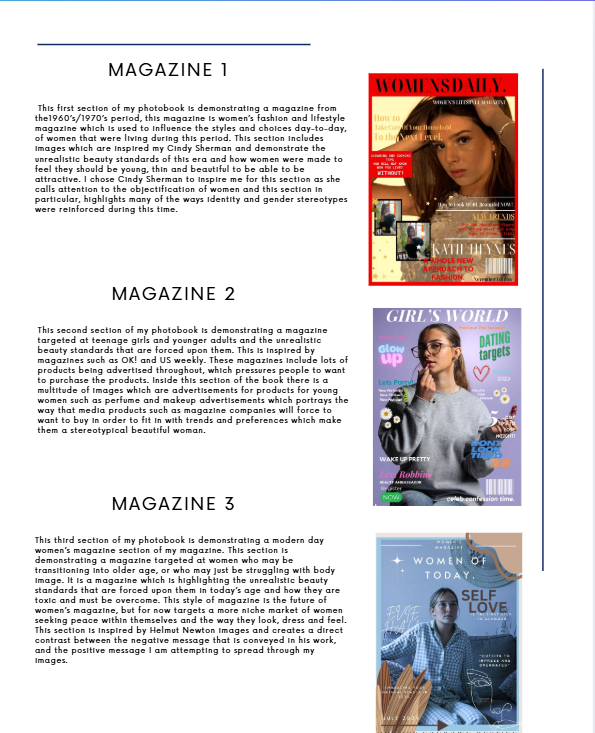
I would first like to begin with a small introduction to my book and explain the contents and basically why there is three different magazines inside and WHY there is 3 different viewpoints throughout time, of women. By having this introduction, the viewer will be able to understand the intent of the book, before they read it, by understanding the contents before they read it, a more straightforward flow of reading and viewing images, is able to take place. This contents page includes a small picture of each magazine cover and a small paragraph explaining which artist the section is inspired by, and what style of photography is included. The paragraph also includes
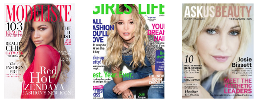
MAGAZINE COVER 1- 1970s Style Magazine.
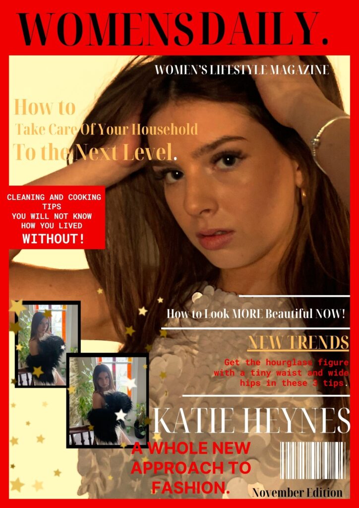
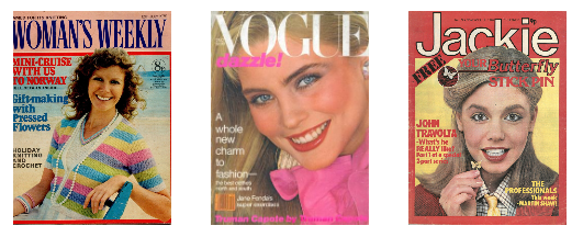
This is the beginning image for my photobook. This image consists of a front cover of a 1960’s/1970’s women’s fashion and lifestyle magazine which is used to influence the styles and choices day-to-day, of women that were living during this period. Whilst analysing magazines from this period in order to create the best product possible, I took ideas on which colours, layout designs and which key headings were used to draw in the attention of this target audience.
HERE ARE MY TOP 3 IDEAS THAT I USED FOR INSPIRATION.
I chose to have a red border in order to incorporate an eye-catching bold colour surrounding my chosen image with a semi border of black to help it to stand out. I feel this black border also ties with the black title and this automatically displays that this is a women’s magazine aimed at this specific demographic of audience. I then chose to create phrases such as “Get the hourglass figure with a tiny waist and wide hips in these 3 tips.” and “CLEANING AND COOKING TIPS YOU WILL NOT KNOW HOW YOU LIVED WITHOUT” these are some quotes from this cover which demonstrate the target beauty standard for this era and what the traditional beauty standards were for women in order for them to be beautiful and attractive. I chose these specific ones as the ‘hourglass figure and wide hips’ was the most idealistic body type for women. I wanted these phrases to be short and demanding in order to demonstrate that these magazines and media products chose to push these standards on to women and make them feel as if they are pressured to look this way, and that the way for females to look like this, was my purchasing their products and in taking the advice from’ their favourite stars’ and how they look in order to get male attention.
IMAGES INCLUDED FOR INSIDE THIS SECTION.
MAGAZINE COVER 2- Modern Style Magazine.
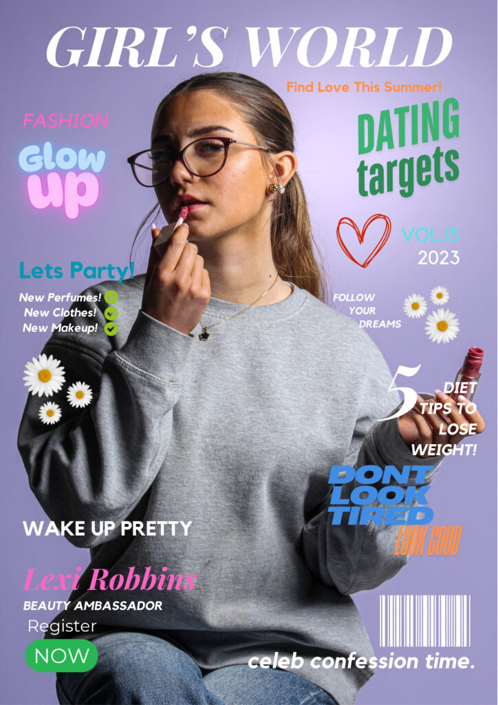
This is the front cover for my modern day girls magazine section of my magazine. This section is demonstrating a magazine targeted at teenage girls and younger adults and the unrealistic beauty standards that are forced upon them. Whilst analysing magazines in this style in order to create the best product possible, I took ideas on which colours, layout designs and which key headings were used to draw in the attention of this target audience.
HERE ARE MY TOP 3 IDEAS THAT I USED FOR INSPIRATION.
This is inspired by magazines such as OK! and US weekly. These magazines include lots of products being advertised throughout, which pressures people to want to purchase the products. I have chosen for my magazine cover to include lots of pastel colours and bright colours which would catch the eye of a young adult and have a large picture of a beautiful girl on the cover which a girl may aspire to look like and therefore want to read. I also used phrases such as “Wake up pretty” and “5 Diet tips to lose weight” which may appeal to girls which want to in- fact be pretty and lose weight. Whereas in reality, these are derogatory and toxic phrases which may pressure girls into wanting to fit in, I chose to have such harsh things said on a seemingly wholesome and girly front cover to show how easy it is for these things to be covered up and ignored when people who actually read them are affected by their content. I also used flowers, pinks, purples and bright short quotes such as “Don’t look tired, look good” and “Glow Up” which are all small things girls have reported that they feel are pressures they feel in their teenage and young adult years. The idea of having words such as “glow up” on my cover, insinuate that inside there will be products that people can buy in order to glow up and ‘become pretty’. Then, inside my book there is a multitude of images which have been made into perfume and makeup advertisements which will force young girls to want to buy in order to fit in with trends and preferences which make them a stereotypical beautiful woman.
IMAGES INCLUDED FOR INSIDE THIS SECTION.
MAGAZINE COVER 3- Modern Style Women’s Empowerment Magazine.
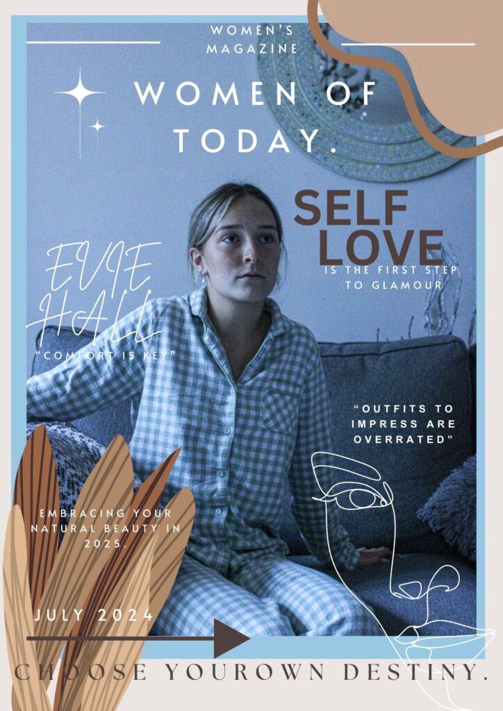
This is the front cover for my modern day women’s magazine section of my magazine. This section is demonstrating a magazine targeted at women who may be transitioning into older age, or who may just be struggling with body image. It is a magazine which is highlighting the unrealistic beauty standards that are forced upon them in today’s age and how they are toxic and must be overcome. Whilst analysing magazines in this style in order to create the best product possible, I took ideas on which colours, layout designs and which key headings were used to draw in the attention of this target audience.
HERE ARE MY TOP 3 IDEAS THAT I USED FOR INSPIRATION.
I chose for this magazine cover to have a more homely, welcoming feel to it which is able to let the reader know it is a safe space within the magazine and that they will not be pressured or encouraged to purchase products that are meant to make them look thin or beautiful or always well dressed, but instead to promote comfort over look and natural over glam. This style of magazine is the future of women’s magazine, but for now targets a more niche market of women seeking peace within themselves and the way they look, dress and feel. I chose to have colours such as browns, whites and very beige colours for this cover as it is less eye-catching and popping with colour like the other magazines, as these magazines use these colours and bold writing to mask the underlying message of “if you do not purchase these products, then you will not become beautiful” whereas, in this magazine, the message is ‘Natural beauty is key, to finding yourself and your inner peace. The photograph on the front cover also displays a girl in her pyjamas and wearing no makeup, this is to automatically stick out from other products as viewers will notice that there is no, over the top, dramatized image with bold colours and makeup, and instead appreciate the unconventional front cover of a popular magazine, where a model is seen in her pyjamas and with no makeup on.
Essay Layout.
IMAGES INCLUDED FOR INSIDE THIS SECTION.
Inside Back Page Contents.
This page includes a final overview of the book through photos. I chose to include the section of the book and a small section of pictures included in the back to display a different perspective of the women included in my book and how they are displayed as positive and happy in their natural state, clothing and comfortable in their own skin. I believe that this was necessary to include in my book to shine a positive light on this project and subject that I have explored and display a natural and positive end to my book after exploring such complex and negative stereotypes of women and highlighting many errors in society.