Virtual gallery

Essay question
Family photographs are special to many people because they help us remember important moments and even show who we are. They can capture every little special moment that might not feel like it is special but when looking back you realize it is, special moments like birthday parties, holidays, playing in the park, sitting together for dinner, everyday moments. People don’t realize how special a family photograph can be, it’s not just a random photo from the past but also a reminder of how good the moments were. In this essay. I’m going to explore in what way family photographs extensions of our memories as well as our identities with Sally Mann and Nan Goldin as my references. When looking at family images, we often have a feeling of warmth and sentimentality and remind us of happy moments with the people we love. Every little moment counts, for example, a photo of a family trip to the beach might make us remember the fun we had building sandcastles and chasing the waves. Taking photos from these little moments fills you up with great joy when looking back at them with your parents. Family images help us remember the small details we might have forgotten.
In the early days of photography, photography was carefully staged studio photographs that were recorded in high-resolution on large-format film. This type of photography was common up through the World War II years. Families would save up money, and go to a photo studio to have portraits made that would be cherished as precious family possessions. Family photography is the most popular category of photography. The family album has only just been included in survey histories of photography, despite the fact that the majority of individuals in the Western world have produced albums in one way or another, at least since the early 1900s until the early 2000s, when digital archiving took over.
Bull explores the relaxing potential of photography, specifically focusing on the role of family albums in personal and collective memory. Bull examines how photographs, particularly those passed down through generations, serve as powerful tools for emotional expression and healing, helping individuals navigate identity, grief, and trauma. Chalfen and Musello, among others, write about “regular” family albums. The 1965 book Un art moyen, written by French sociologist Pierre Bourdieu, was one of the first significant studies on family photography.
Sally Mann, a American photographer, known for taking lovely emotional photos of her own family. She made a book called Immediate Family showing images of her children growing up both in their playful, bright times and even serious, thoughtful times. When looking back at childhood pictures from your family is like reconnecting with the feelings and memories of those times. Just like Sally Mann photos reminds her of who she was and what herself and her family have experiences. Family images also represent our identities. They show where we come from and who we are connected with but also who were influences by such as our parents, siblings ad grandparents which tells us a story of our family’s history. Looking at photographs of family reunions with generations of family members can make you feel proud of our family’s traditions ad how everything has been passed down, which also might make you understand where you fit in the bigger picture of all generations. Looking back at baby pictures makes you realize how much you have grown and changed over time but still have that special family connection. Sally began opening boxes of photographs, letters, diaries, newspaper clippings and other papers that had been gathering dust in her attic, uncovering, as it were, family secrets. People were concerned about Sally Mann images of childhood injuries and naked baby photos which led some critics to challenge her right to record such scenes of distress.
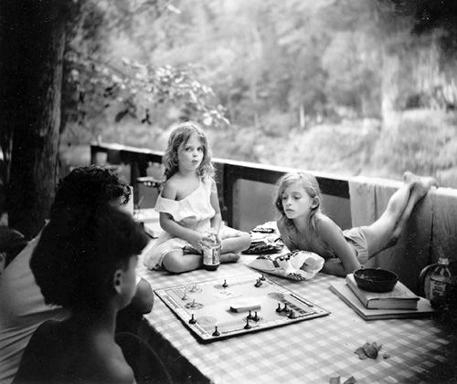
S, Mann: Immediate Family, “Sorry Game”, 1989
Family photographs don’t only capture certain moments but also emotions, when you look at old photos you often remember how you felt at that time. Even though as you get older you don’t feel as exited to take images as when you were younger you always look back at them not regretting anything at all and just thinking about the fun you had while take them which then might make you start to appreciate the importance of these moments. Another American photographer, Nan Goldin, who took images of her own relationships in a personal way, showing strong emotions with her friends and family, capturing happy and difficult moments. She once said ‘I want to show people who they are, and I want to show them how they relate to other people, how they relate to their families, how they relate to their friends, how they relate to themselves.’ (Goldin) Our family pictures carry important lessons and emotion that help shape who we are and how we remember life.

N, Goldin: Self-portrait in the mirror, Hotel Baur Zurich, 1998
Sally Mann and Nan Goldin both explore themes of identity, and the human condition, often drawing from their personal lives and relationship. While Mann’s work often centres on her children and family life, capturing memory’s, decay and Goldin’s focus is on adult relationships, sexuality and trauma. Regardless the differences, Both photographers explore sexuality and relationships. In conclusion, photographs are an important aspect of family and our identity that capture special meaningful moments, just like Sally Mann and Nan Goldin photography.
Bibliography:
Bull, S. (2009). Phototherapy: The Family Album and Beyond
S. Mann (1992). The disturbing photography of Sally Mann
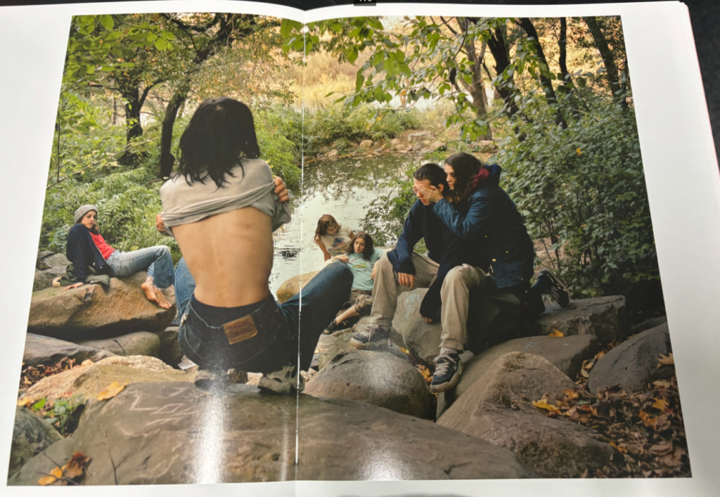
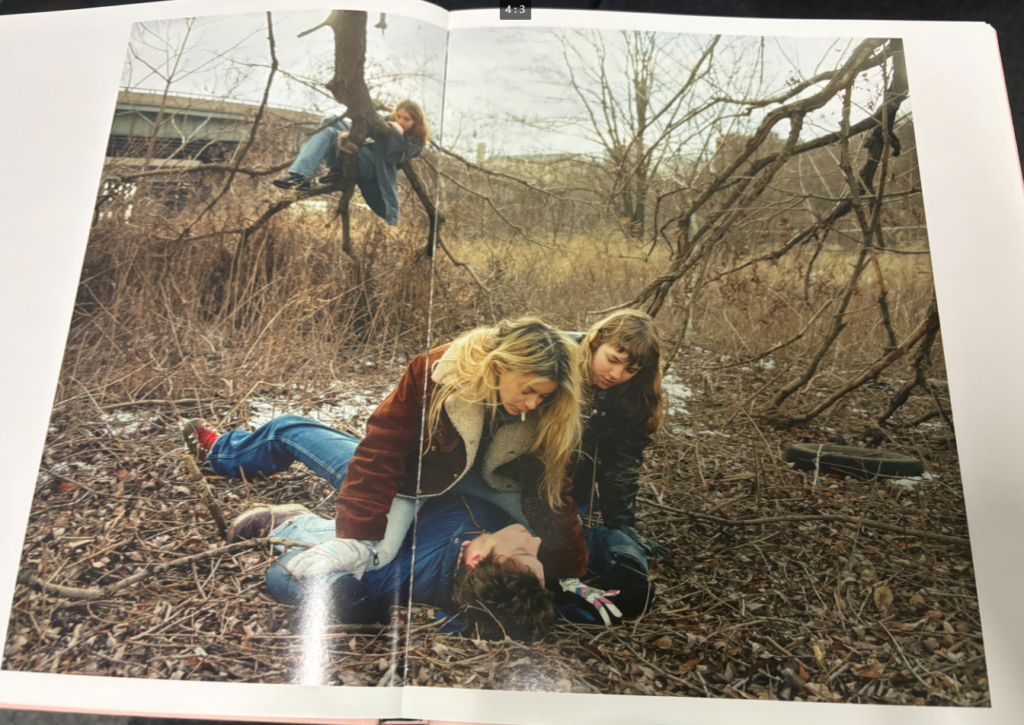
Final Images


In Comparison to Justine Kurland
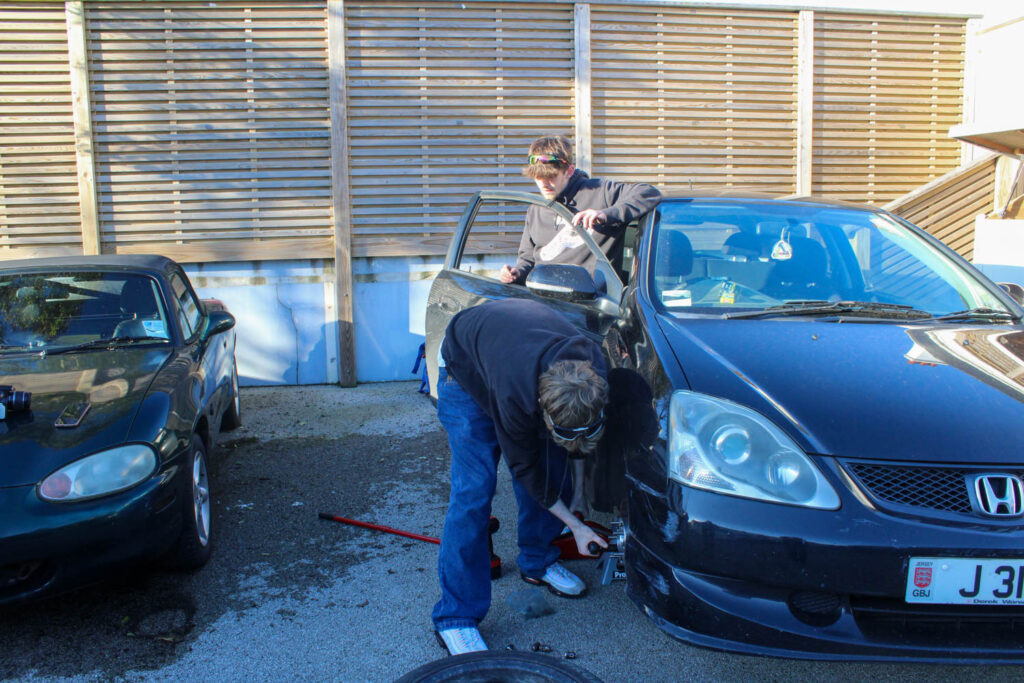
Justine Kurland used some male subjects in her images, so I wanted to do a photoshoot where I also used male subjects, so that I would have a range in my work. I also wanted to present a more masculine activity, as Justine Kurland presented quite stereotypical masculine activities and I have so far only presented feminine ones in my work.
In Comparison to Jeff Wall
In this photoshoot I presented the same narrative, but I focused on changing my composition throughout this whole photoshoot. This relates to Jeff Wall, as he always focuses on his compositional elements, rather the narrative of his work itself.
I also focussed on other visual elements during my editing on Lightroom.
How does this Relate to the Themes of Youth and Identity?
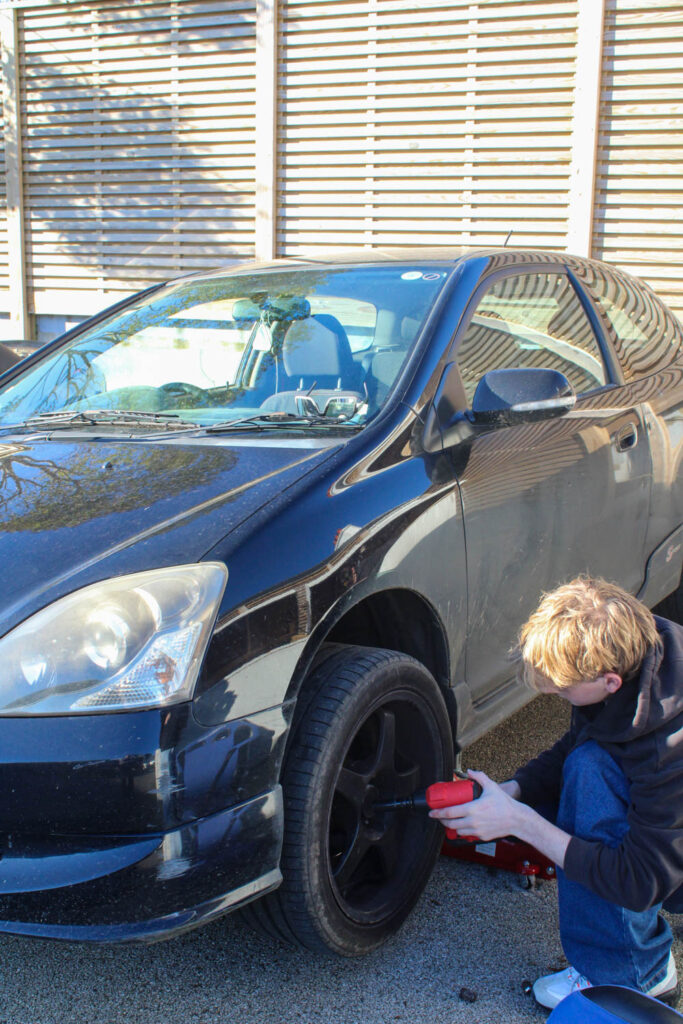
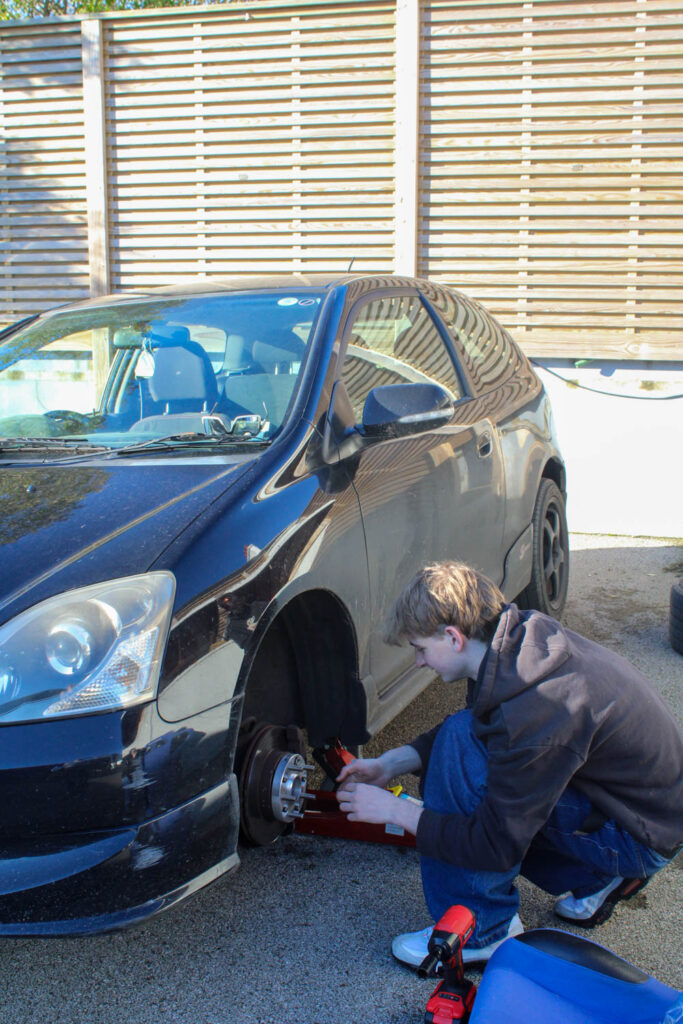
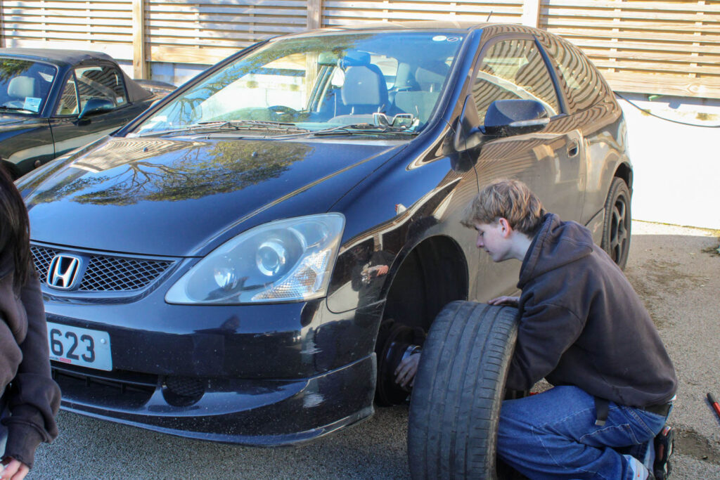
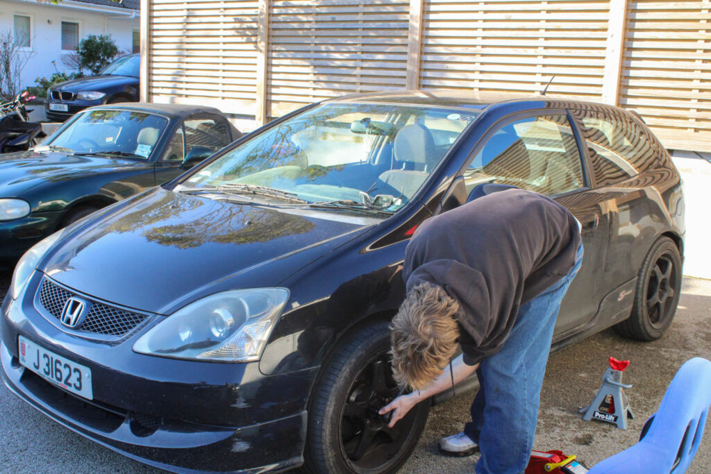
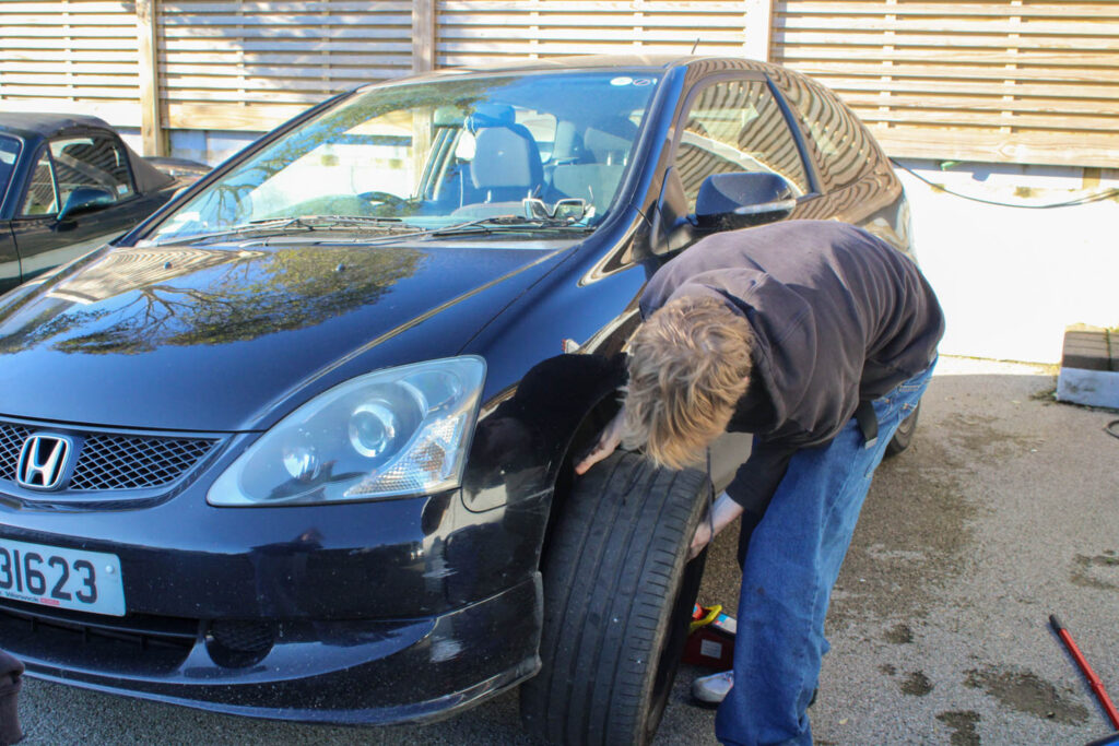
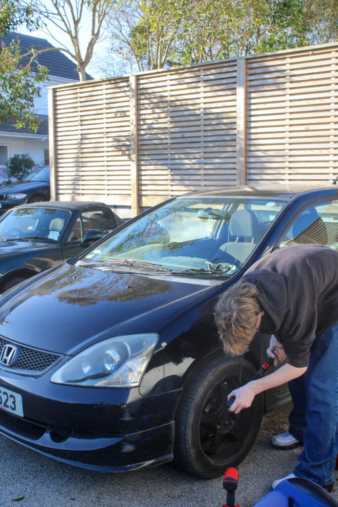
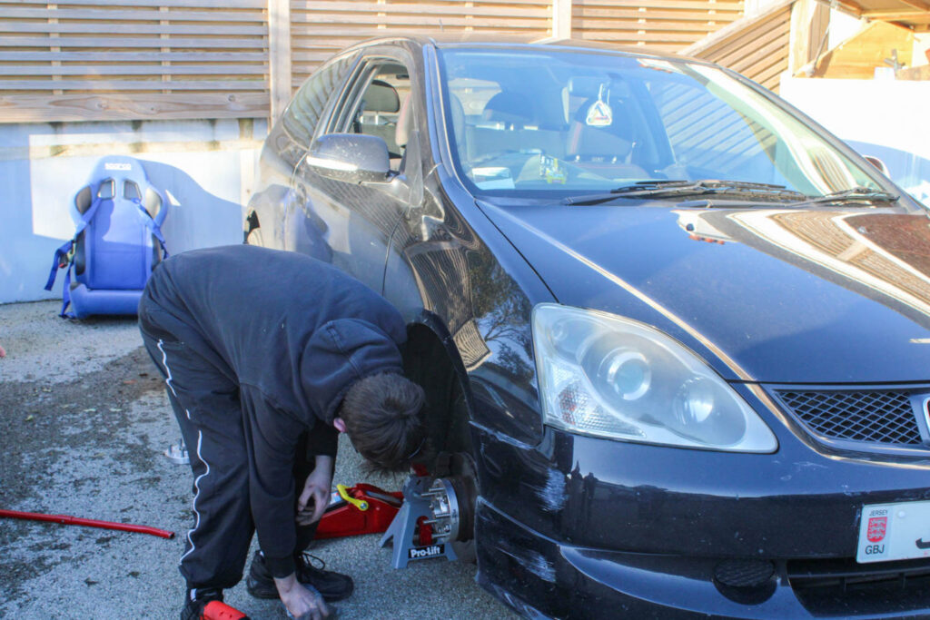
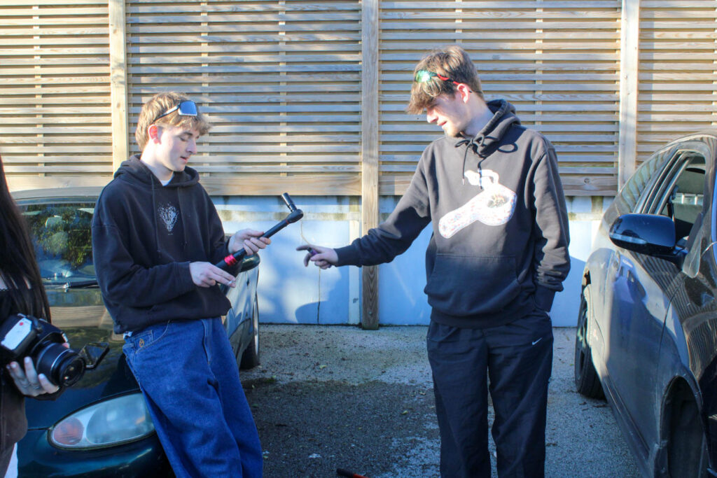
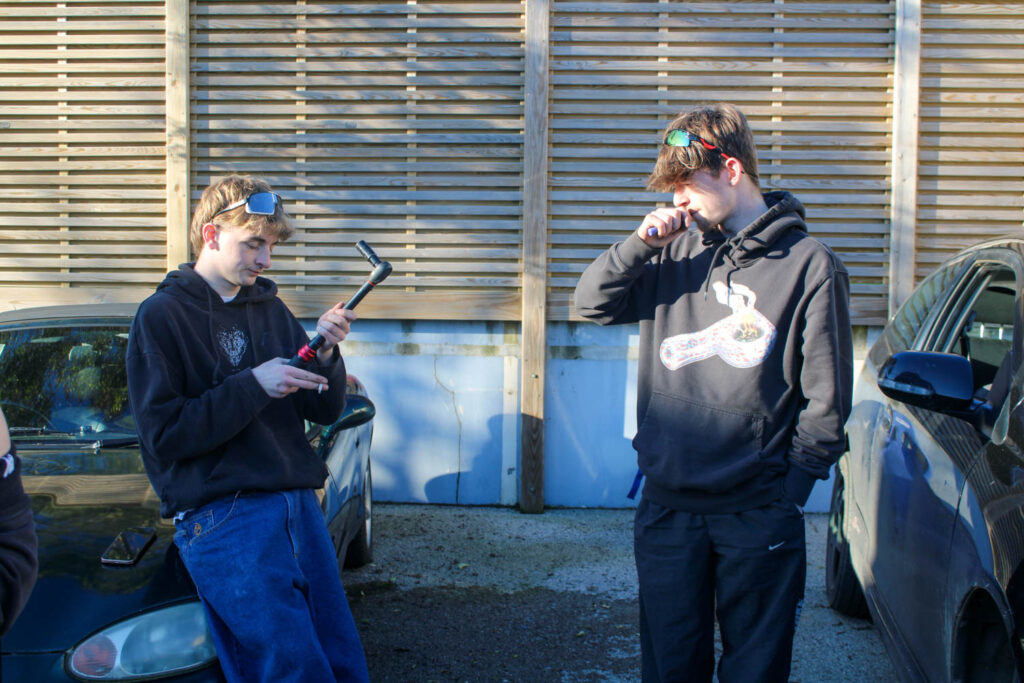
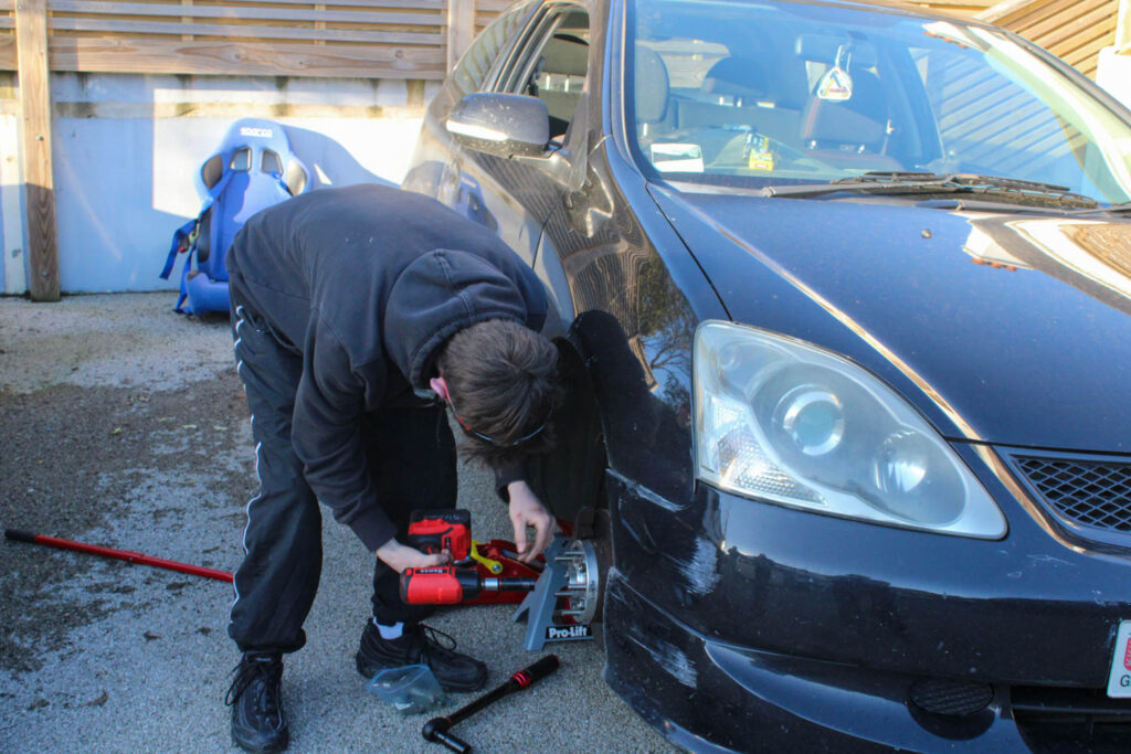
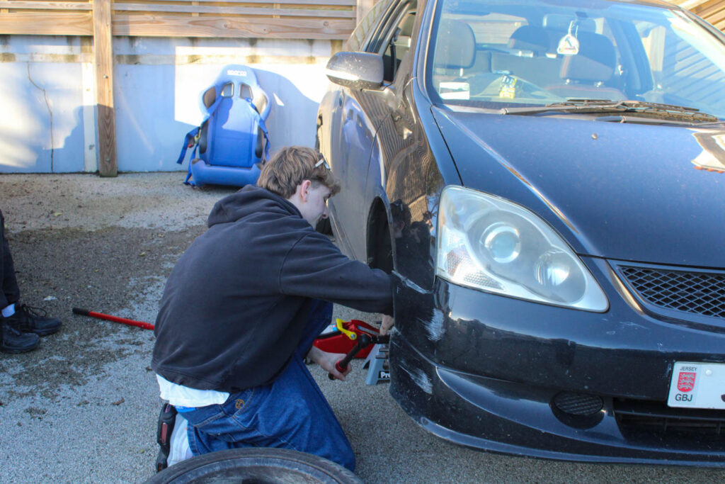
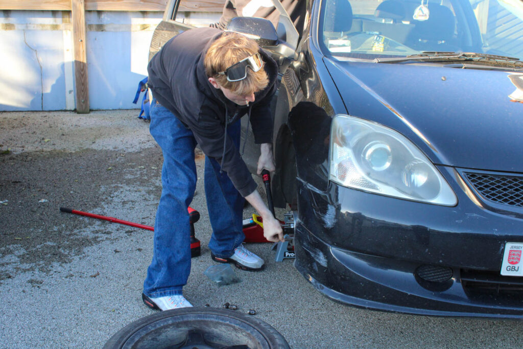
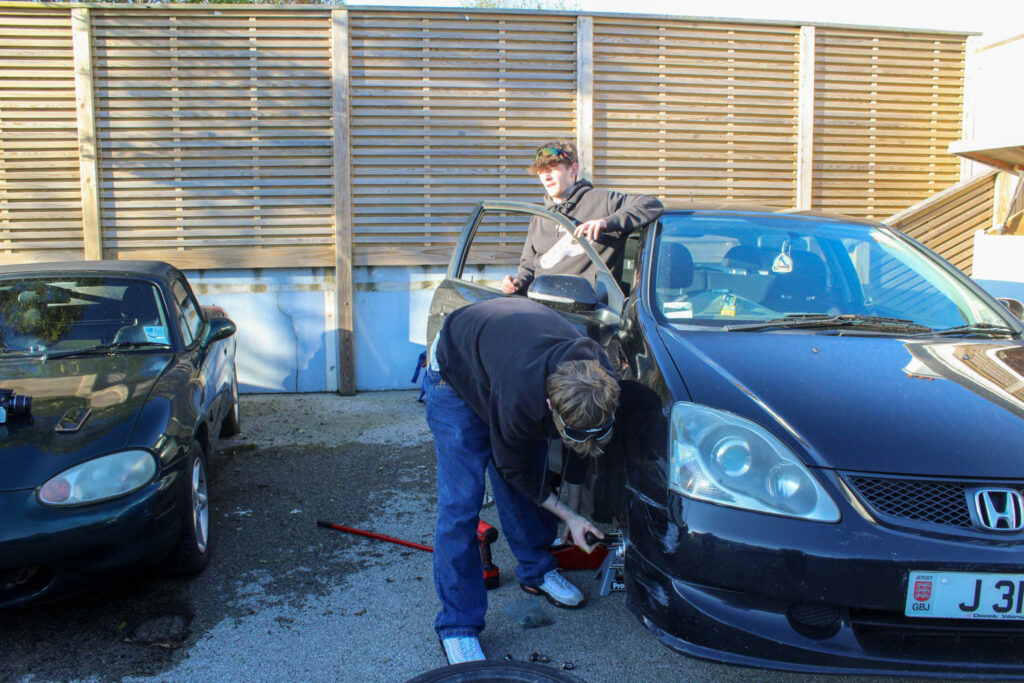
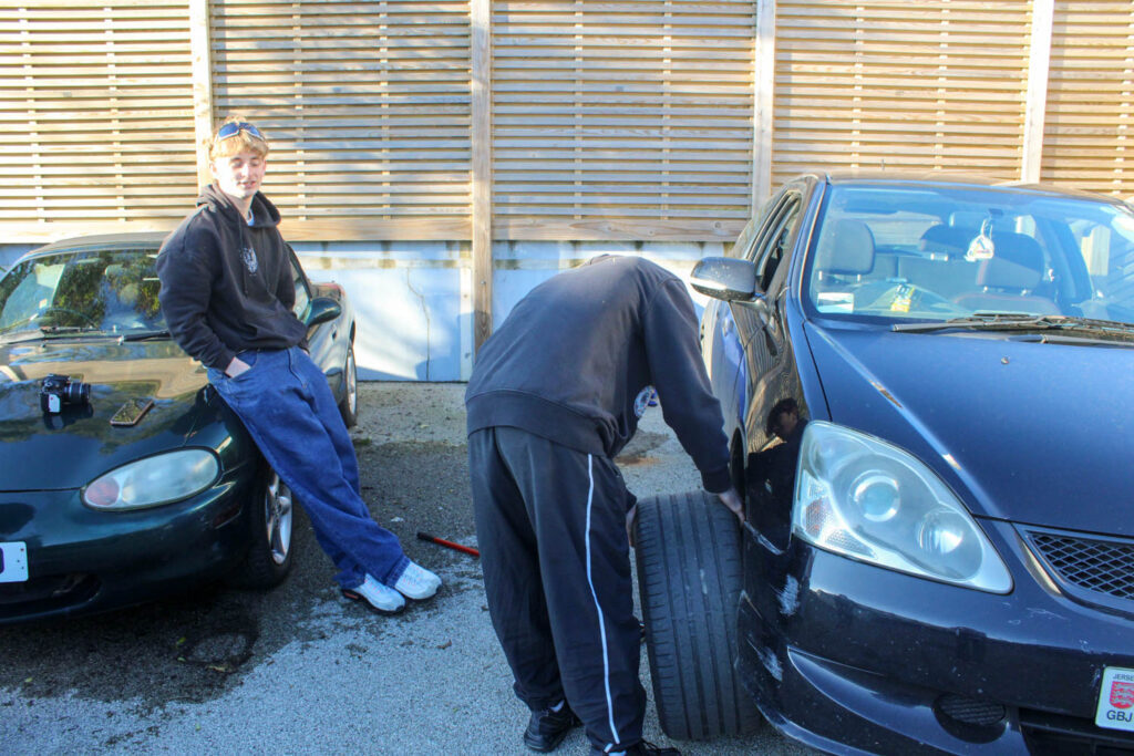
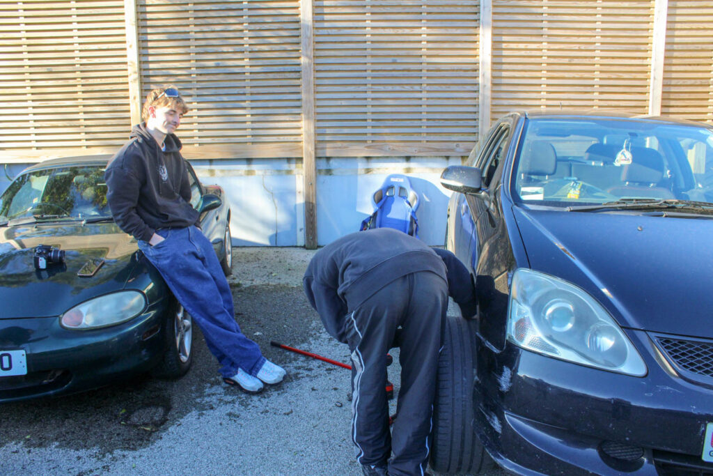
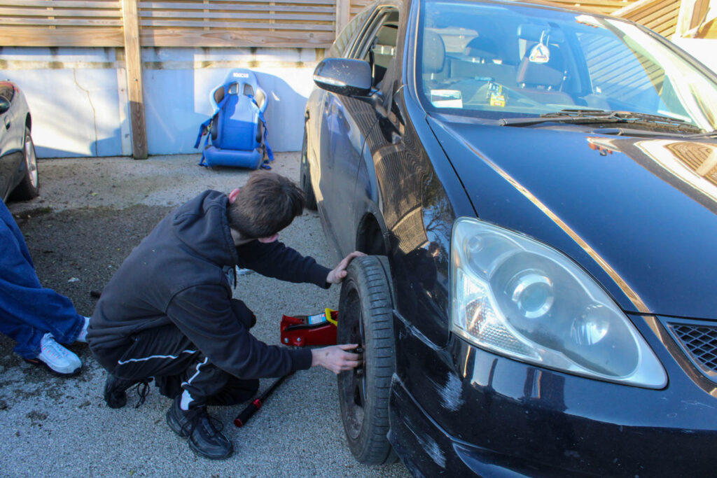
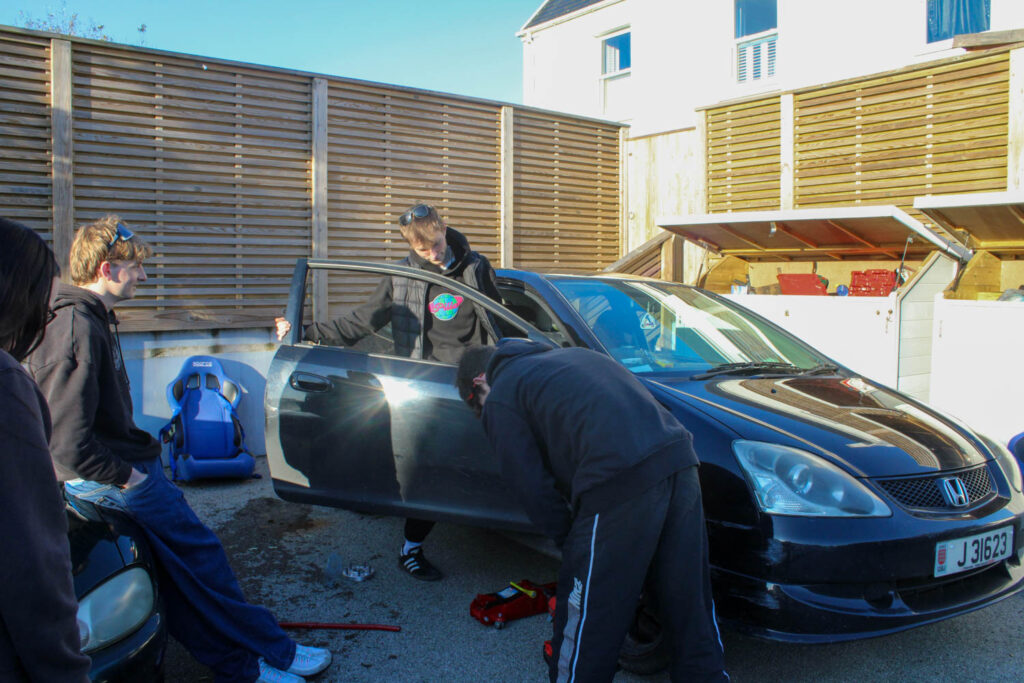
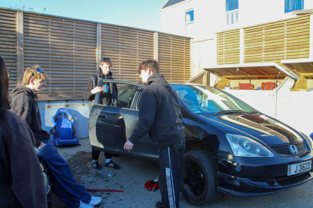
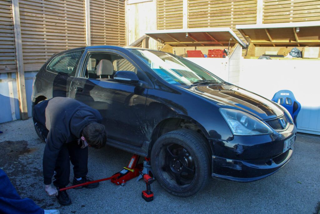
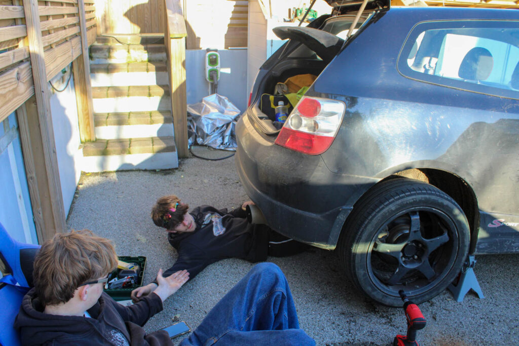
These photos relate to the themes of youth and identity, specifically my youth and identity, because when I was younger I used to watch my uncle add things onto/ fix his cars. I also still now watch my friends do the same thing all these years later, so this presents that my identity hasn’t altered as much as I would have thought now that I am more grown up.
Analysis of 1 Image

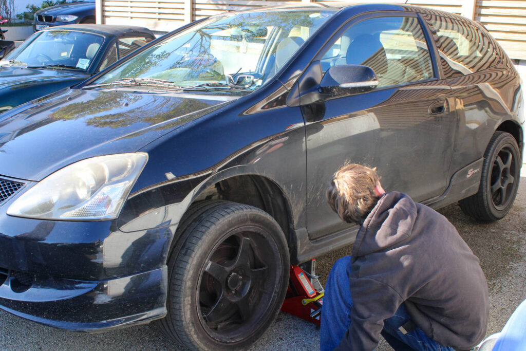
There was a high level of control in this image, as I was able to manipulate the position and distance of not only my subjects, but myself as well. However, there was little control over the lighting, as natural daylight was used, rather than the lighting that can be found in a studio.
F stop- f/7.1
Exposure time- 1/200 sec
ISO Speed- ISO-800
The colours in this image are not very bright colours, but instead there is lots of neutral colours, blacks and dark blues. There is also lots of different dark and light tones throughout the image, due to the sun and the shade caused by the fence. There isn’t tons of texture throughout the image, but you can see a slight texture on the ground. There is lots of different shapes throughout this image, due to the tools and wheels etc.
The layout of this image causes the main viewpoint of this image to be the subject in the centre of the frame under the car. In this image the composition has a subject in the foreground on the left, the car in the middle ground and the subject under the car slightly further back in the background.
This image represents my youth, because I used to watch my uncle fix/ add things to his car when I was younger. This also represents my identity, because it presents how little my identity has changed from my youth, as this is still something I like to watch and now take photos of. This presents that my identity is still very similar to when I was younger, but now instead of watching my uncle, I watch my friends.
Photoshoot Conclusion
Overall, I don’t think this photoshoot is one of my strongest photoshoots, because I did not display a range of different narratives, but instead only presented one narrative. However, I was able to experiment with my compositional elements, as I was only focussed on my composition, rather than displaying different narratives. I was also able to present a more masculine activity/ narrative, just like how Justine Kurland presents more stereotypical masculine narratives. I was also able to experiment with male subjects in this photoshoot, rather than just using female subjects and activities, like in my other photoshoots.
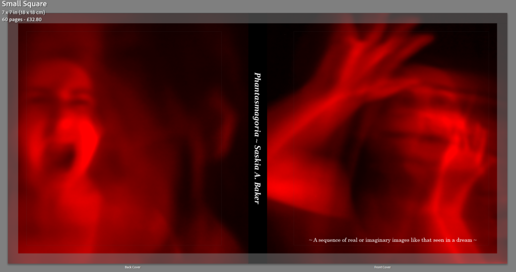
Saskia A. Baker: https://www.blurb.co.uk/b/12320018-phantasmagoria
Evaluation
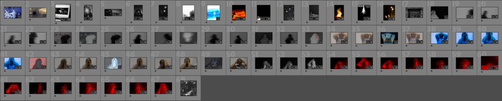
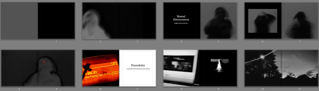
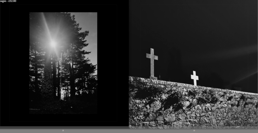
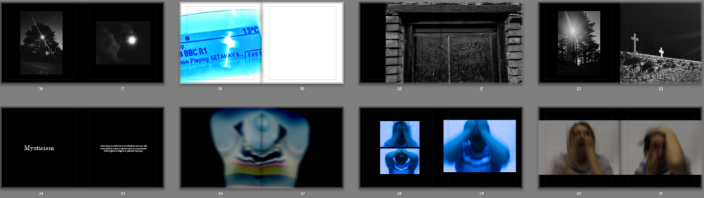
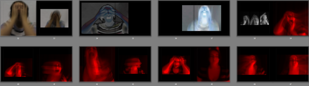
Overall the photobook has gone very well, my idea for it was to follow a narrative sequence of a person’s journey through mental deterioration, it starts with the protagonist going through mental health and personal problems, they then attempt to find a resolution to their pain through the supernatural and religion, they feel a calling, in the end their mental health becomes more severe as if they’ve been possessed by their obsession with the unknown.
The reason I made this photobook and the images within was to visually interpret hidden feelings and portray how they can feel. My intention was to make my images look chaotic and dramatic to try and capture strong emotions such as dread, anger and frustration which are common feelings associated with mental health problems like depression. The subject of depression in particular was my main inspiration when making this project.
1. Write a book specification and describe in detail what your book will be about in terms of narrative, concept and design with reference to the same elements of bookmaking as above.
Narrative: What is your story?
Describe in: The unseen story of a basketball player who strides for success, but is met with severe injuries disallowing him to compete in trainings and games.
Struggles, Athlete, Recovery.
It will show the physical, mental and emotional struggles an athlete has to deal with that many others wouldn’t see from the naked eye.
My story will give another view on my subject’s life and how the struggles he has to deal with are a lot harder than the viewers would see. I go in-depth with different angles of him to showcase the loneliness, separation and isolation he has to deal with whilst being injured.
Design: Consider the following
Hard, stiff, clean, smooth with good clear images and text across all the pages.
Premium Lustre
2. Produce a mood-board of design ideas for inspiration. Look at BLURB online book making website, photo books from photographers or see previous books produced by Hautlieu students on the table in class.
My Mood-board

FRONT COVER:
I have chosen to pick two strong images from my photoshoots to use as the front and back cover of my photobook, this is to immediately get the viewers attention of what is expected inside the book. I like this image because it displays the high quality images that are going to be inside the book. This gives the viewer a clear indicator of what images are going to be inside and what the intention of the book may be about.
PARAGRAPH OF INTRODUCTION:
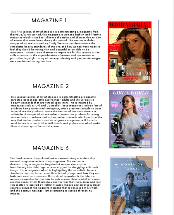
I would first like to begin with a small introduction to my book and explain the contents and basically why there is three different magazines inside and WHY there is 3 different viewpoints throughout time, of women. By having this introduction, the viewer will be able to understand the intent of the book, before they read it, by understanding the contents before they read it, a more straightforward flow of reading and viewing images, is able to take place. This contents page includes a small picture of each magazine cover and a small paragraph explaining which artist the section is inspired by, and what style of photography is included. The paragraph also includes
MAGAZINE COVER 1- 1970s Style Magazine.
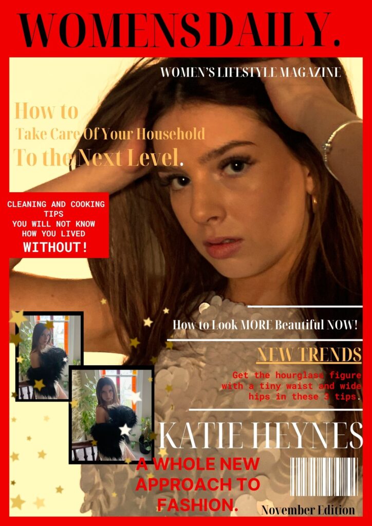
This is the beginning image for my photobook. This image consists of a front cover of a 1960’s/1970’s women’s fashion and lifestyle magazine which is used to influence the styles and choices day-to-day, of women that were living during this period. Whilst analysing magazines from this period in order to create the best product possible, I took ideas on which colours, layout designs and which key headings were used to draw in the attention of this target audience.
HERE ARE MY TOP 3 IDEAS THAT I USED FOR INSPIRATION.
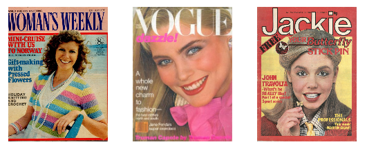
I chose to have a red border in order to incorporate an eye-catching bold colour surrounding my chosen image with a semi border of black to help it to stand out. I feel this black border also ties with the black title and this automatically displays that this is a women’s magazine aimed at this specific demographic of audience. I then chose to create phrases such as “Get the hourglass figure with a tiny waist and wide hips in these 3 tips.” and “CLEANING AND COOKING TIPS YOU WILL NOT KNOW HOW YOU LIVED WITHOUT” these are some quotes from this cover which demonstrate the target beauty standard for this era and what the traditional beauty standards were for women in order for them to be beautiful and attractive. I chose these specific ones as the ‘hourglass figure and wide hips’ was the most idealistic body type for women. I wanted these phrases to be short and demanding in order to demonstrate that these magazines and media products chose to push these standards on to women and make them feel as if they are pressured to look this way, and that the way for females to look like this, was my purchasing their products and in taking the advice from’ their favourite stars’ and how they look in order to get male attention.
IMAGES INCLUDED FOR INSIDE THIS SECTION.
MAGAZINE COVER 2- Modern Style Magazine.
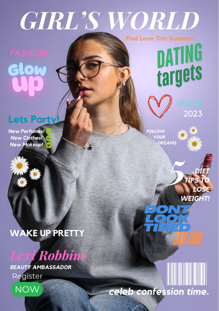
This is the front cover for my modern day girls magazine section of my magazine. This section is demonstrating a magazine targeted at teenage girls and younger adults and the unrealistic beauty standards that are forced upon them. Whilst analysing magazines in this style in order to create the best product possible, I took ideas on which colours, layout designs and which key headings were used to draw in the attention of this target audience.
HERE ARE MY TOP 3 IDEAS THAT I USED FOR INSPIRATION.
This is inspired by magazines such as OK! and US weekly. These magazines include lots of products being advertised throughout, which pressures people to want to purchase the products. I have chosen for my magazine cover to include lots of pastel colours and bright colours which would catch the eye of a young adult and have a large picture of a beautiful girl on the cover which a girl may aspire to look like and therefore want to read. I also used phrases such as “Wake up pretty” and “5 Diet tips to lose weight” which may appeal to girls which want to in- fact be pretty and lose weight. Whereas in reality, these are derogatory and toxic phrases which may pressure girls into wanting to fit in, I chose to have such harsh things said on a seemingly wholesome and girly front cover to show how easy it is for these things to be covered up and ignored when people who actually read them are affected by their content. I also used flowers, pinks, purples and bright short quotes such as “Don’t look tired, look good” and “Glow Up” which are all small things girls have reported that they feel are pressures they feel in their teenage and young adult years. The idea of having words such as “glow up” on my cover, insinuate that inside there will be products that people can buy in order to glow up and ‘become pretty’. Then, inside my book there is a multitude of images which have been made into perfume and makeup advertisements which will force young girls to want to buy in order to fit in with trends and preferences which make them a stereotypical beautiful woman.
IMAGES INCLUDED FOR INSIDE THIS SECTION.
MAGAZINE COVER 3- Modern Style Women’s Empowerment Magazine.
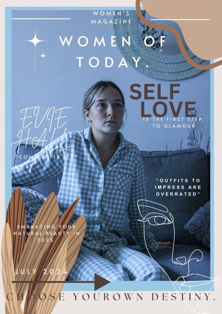
This is the front cover for my modern day women’s magazine section of my magazine. This section is demonstrating a magazine targeted at women who may be transitioning into older age, or who may just be struggling with body image. It is a magazine which is highlighting the unrealistic beauty standards that are forced upon them in today’s age and how they are toxic and must be overcome. Whilst analysing magazines in this style in order to create the best product possible, I took ideas on which colours, layout designs and which key headings were used to draw in the attention of this target audience.
HERE ARE MY TOP 3 IDEAS THAT I USED FOR INSPIRATION.
I chose for this magazine cover to have a more homely, welcoming feel to it which is able to let the reader know it is a safe space within the magazine and that they will not be pressured or encouraged to purchase products that are meant to make them look thin or beautiful or always well dressed, but instead to promote comfort over look and natural over glam. This style of magazine is the future of women’s magazine, but for now targets a more niche market of women seeking peace within themselves and the way they look, dress and feel. I chose to have colours such as browns, whites and very beige colours for this cover as it is less eye-catching and popping with colour like the other magazines, as these magazines use these colours and bold writing to mask the underlying message of “if you do not purchase these products, then you will not become beautiful” whereas, in this magazine, the message is ‘Natural beauty is key, to finding yourself and your inner peace. The photograph on the front cover also displays a girl in her pyjamas and wearing no makeup, this is to automatically stick out from other products as viewers will notice that there is no, over the top, dramatized image with bold colours and makeup, and instead appreciate the unconventional front cover of a popular magazine, where a model is seen in her pyjamas and with no makeup on.
Essay Layout.
IMAGES INCLUDED FOR INSIDE THIS SECTION.
Inside Back Page Contents.
This page includes a final overview of the book through photos. I chose to include the section of the book and a small section of pictures included in the back to display a different perspective of the women included in my book and how they are displayed as positive and happy in their natural state, clothing and comfortable in their own skin. I believe that this was necessary to include in my book to shine a positive light on this project and subject that I have explored and display a natural and positive end to my book after exploring such complex and negative stereotypes of women and highlighting many errors in society.
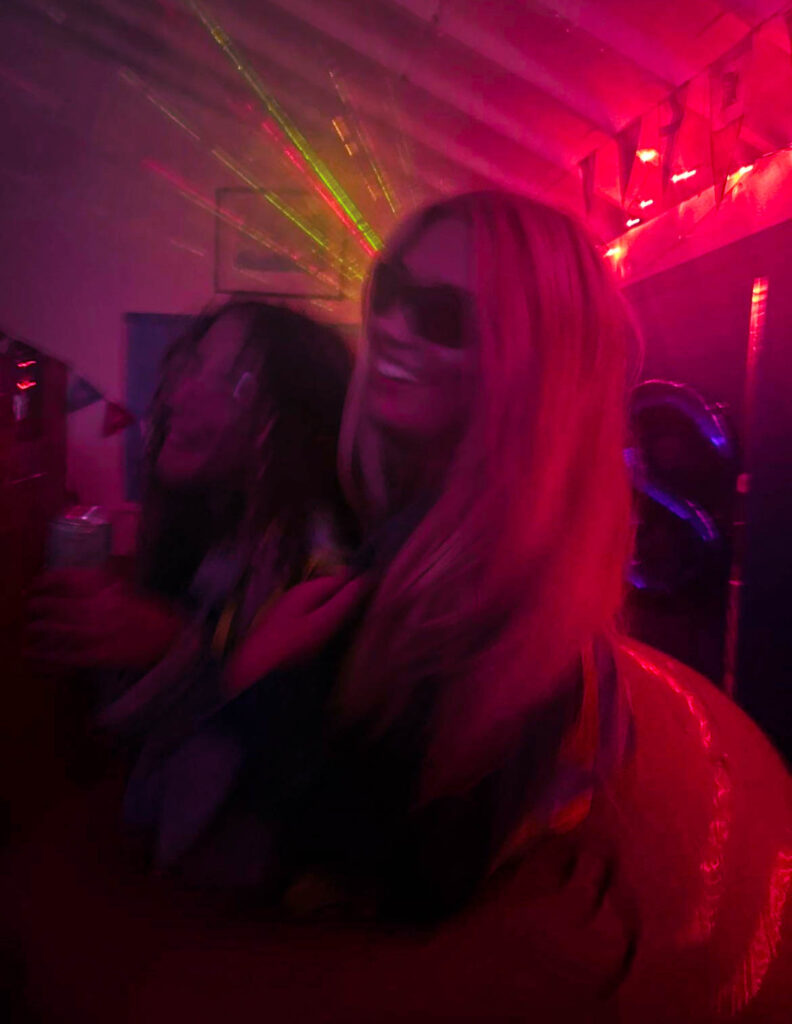
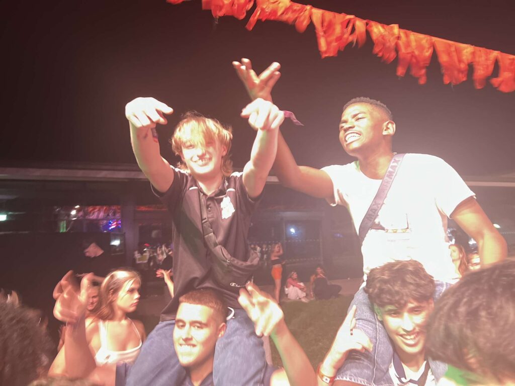
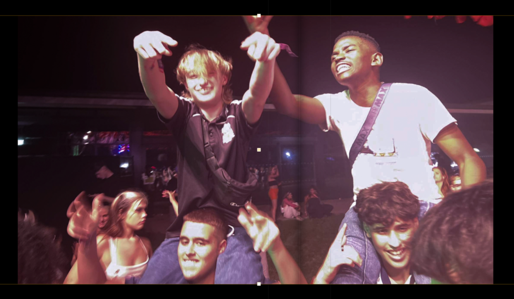
For my personal study I have chosen my theme to be youth culture and identity expressed through nightlife. I have chosen this theme as I think it is a fun thing to be taking pictures of and a good way to take fun photos and experiment with them. Firstly I did a photoshoot with my friends of us at one of our houses and got my friend to act drunk in the shower
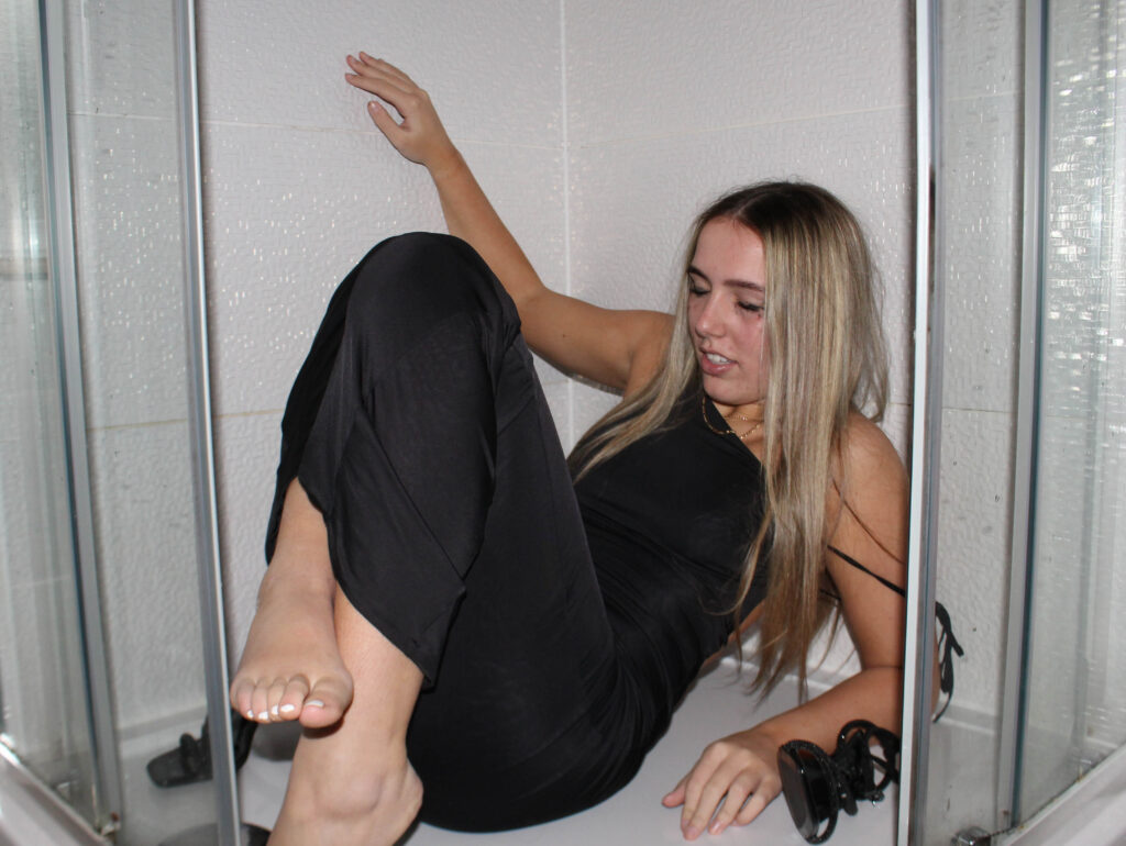
For this image I got my friend to act drunk in the shower, I had her put makeup and a nice dress on because this matched with one of the parties that I took pictures at so I thought it would be a good filler image to use. I edited this with high contrast and increased highlights and whites to make it look brighter. I wanted this effect because It’s very in your face and in contrast to the images of one of the parties that I went to it has the opposite lighting effect which looks cool.
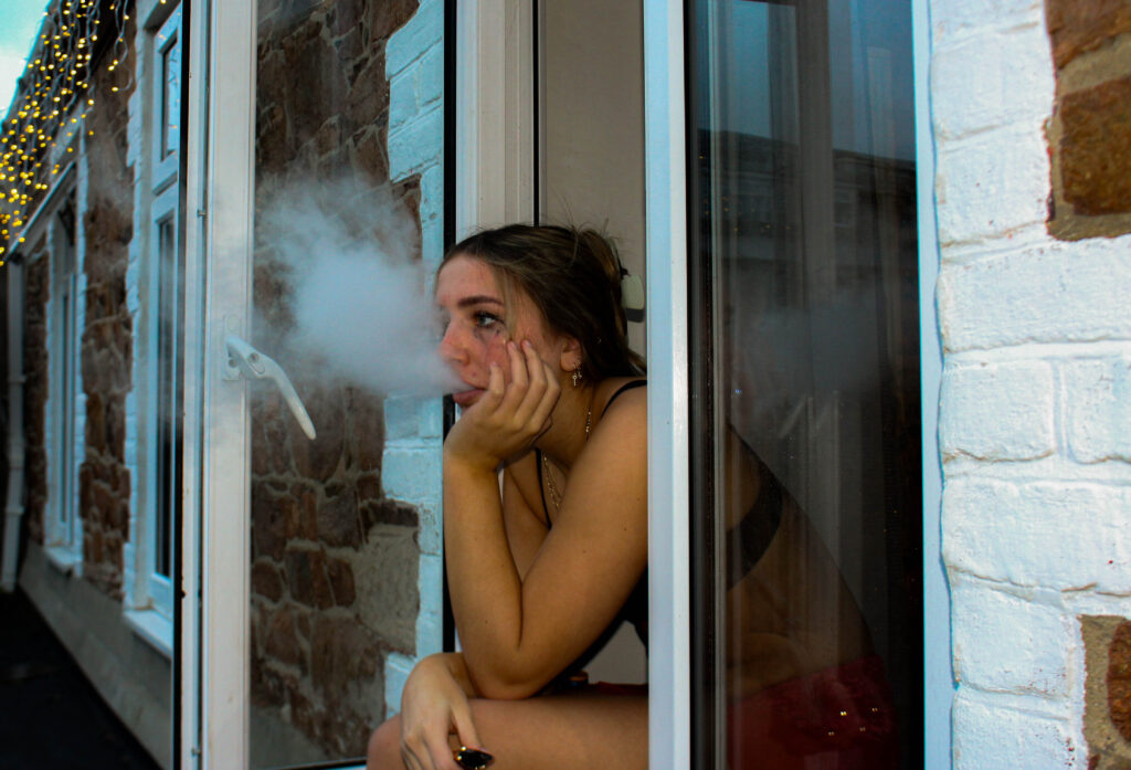
This image is also set up where I had my friend smoke out of a window to represent someone who is hungover after a night out. I turned the exposure down to replicate the early hours of the morning. I increased the contrast to make the image seem a bit more rough and turned up the saturation for this yellow tone which matches with the final images in my photobook.
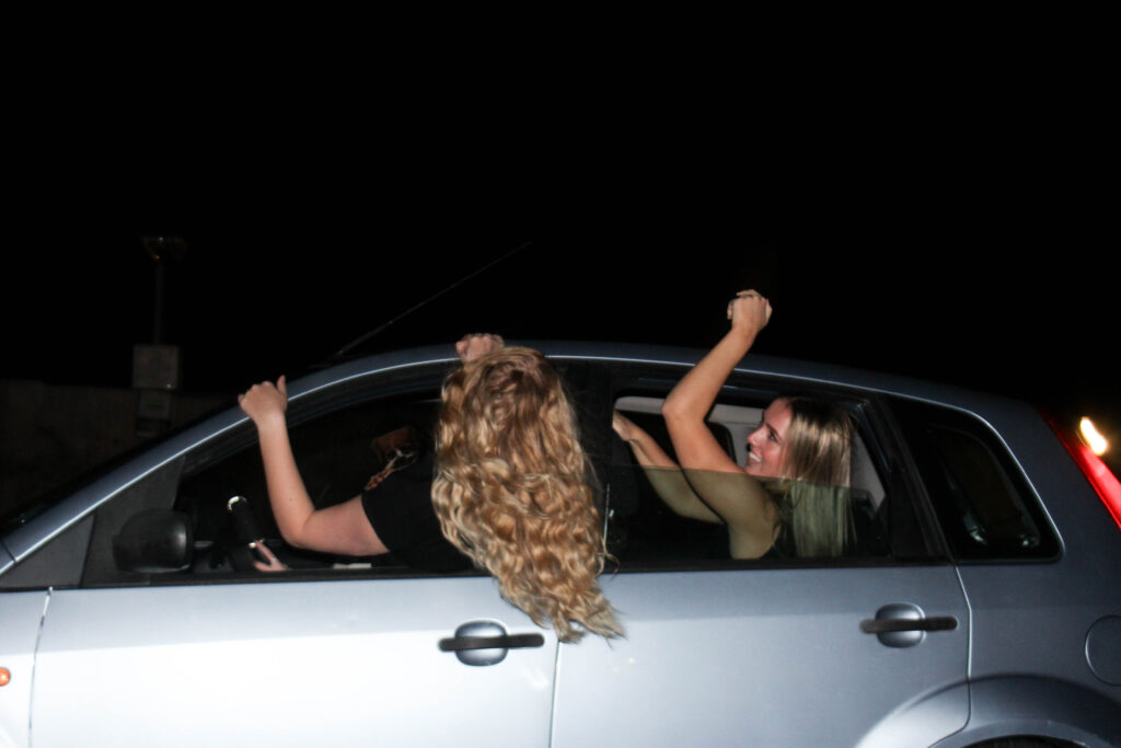
This image of two girls hanging out of a car is a filler image for my photobook, as it will be used to separate one night from another. I decided to use this photo because it still fits my theme of youth culture and identity in nightlife as its night time and its two girls having fun but without going to a party which is a break from all my other images of partying. I increased the exposure the overall image brighter but also for the car to look brighter because it contrasts better with the hair coming out of the car window.
AI
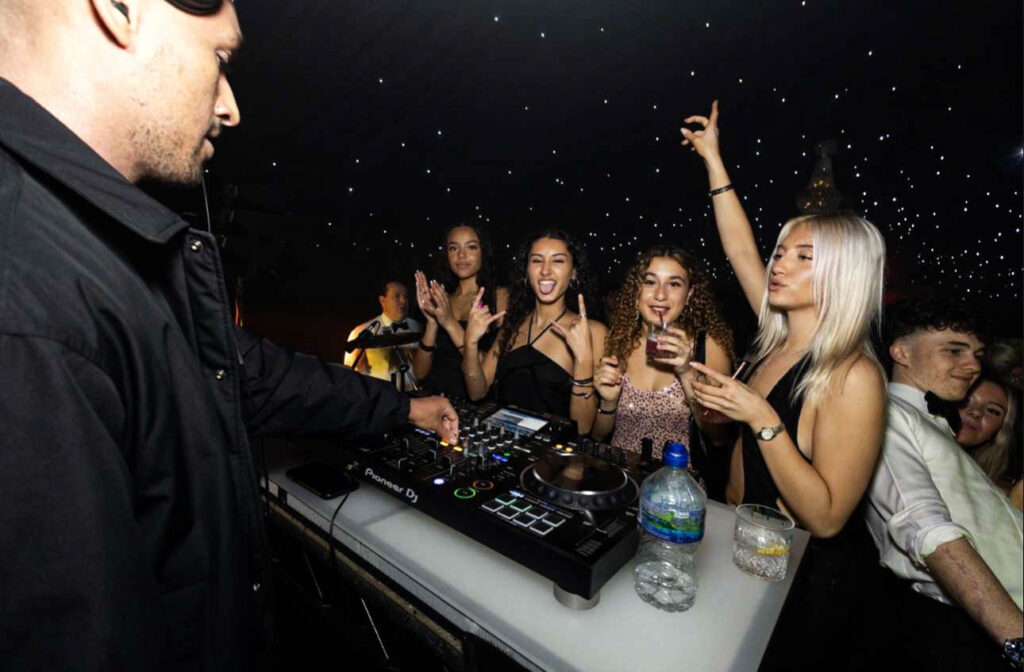
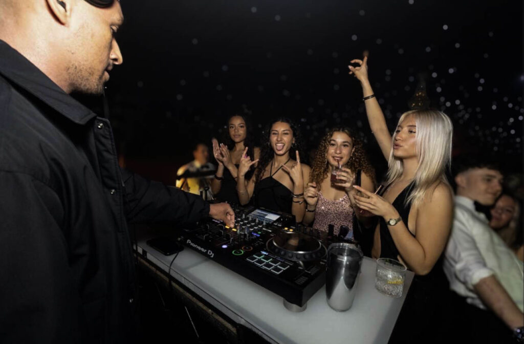
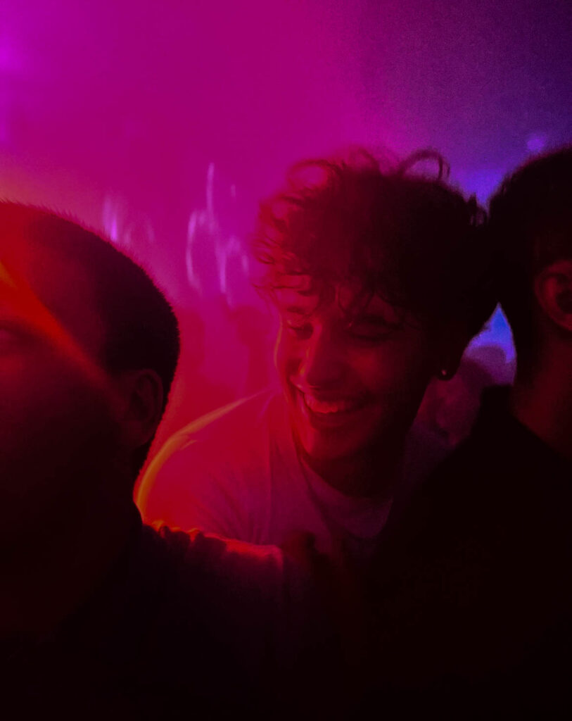
For this image I used AI to remove a water bottle and replace it with a metal cup because the water bottle looked out of place and to me ruined the picture, I couldn’t remove it fully without it looking weird, so I replaced it with the cup, which looked better overall and matched with the other things on the desk better. I also used a blurring filter for this photo so you could focus fully at the DJ and the 4 girls at the front. It also looked nice with the blurred background with the little star lights in the background.
Colours
For this the picture it originally had green lighting but I changed it to pink to match another image that I was using in my book with the same posing and movement, which is originally a pink/purple colour but I made it brighter and the colour stand out more.
How its used in the photobook:
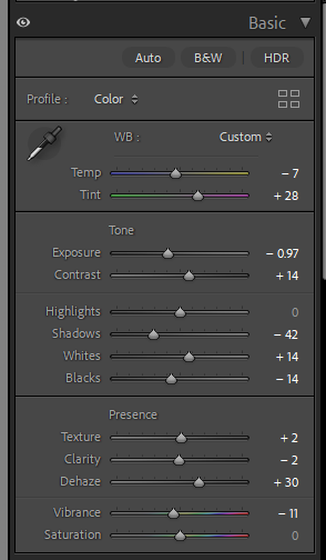
How I edited this image:
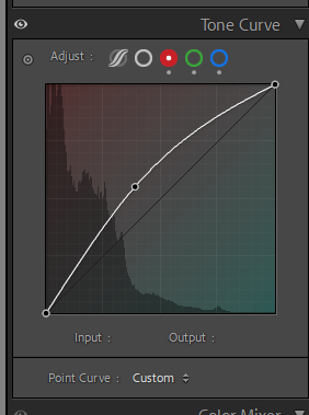
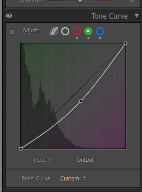
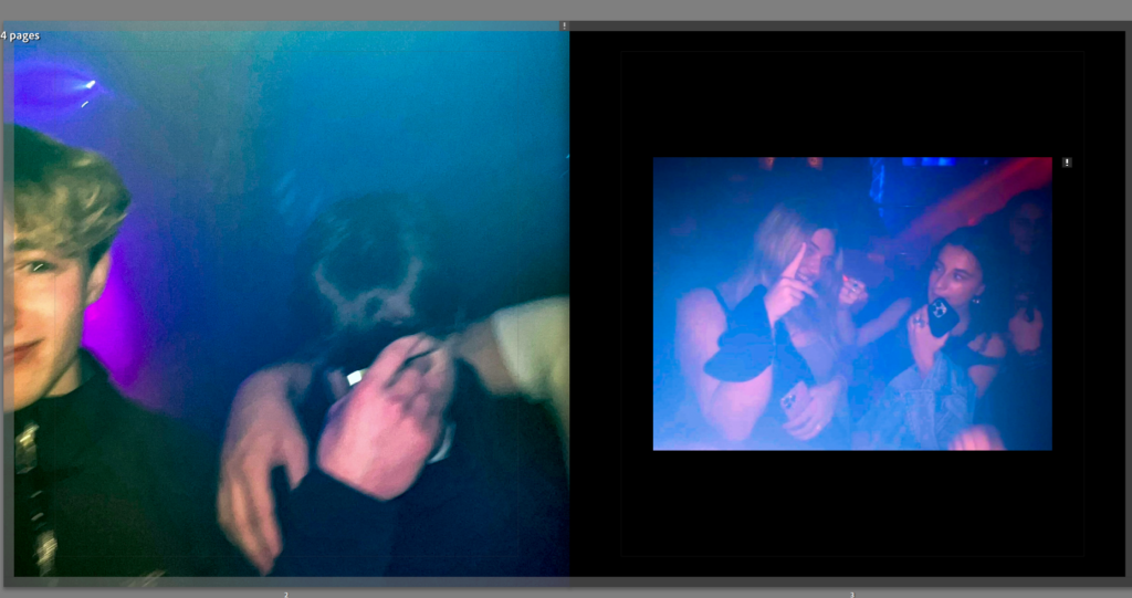
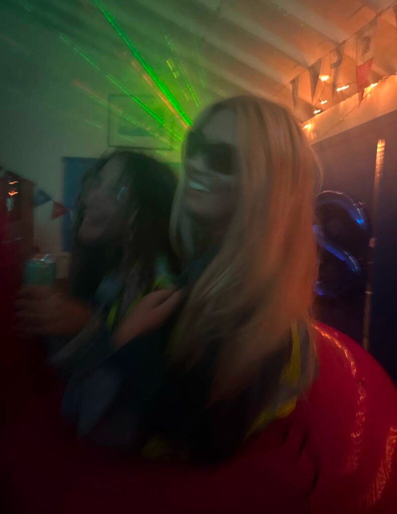
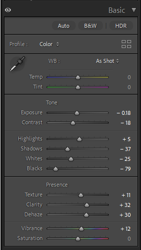
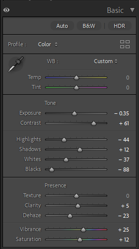
The first image already had bright lighting but I turned up the dehaze and clarity to make the lighting pop out more while also turning down the exposure and contrast to make it darker in general with the bright colourful lighting in the background. For the second image I turned up contrast so it wasn’t too blurry and then turned up vibrance and saturation to make the colours stand out more. I made the overall tone much darker than the original because the picture looked well lit with blue tones but looked too bright compared with the other.
For this image it originally was more orangey and bright but but I turned down exposure so that you could see things more clearly without it being so bright and then turning down vibrance and increasing the pink tint for a neutral tone because it is placed in my photobook next to images with brown and neutral tones.