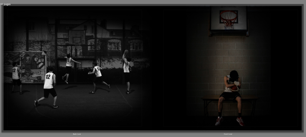
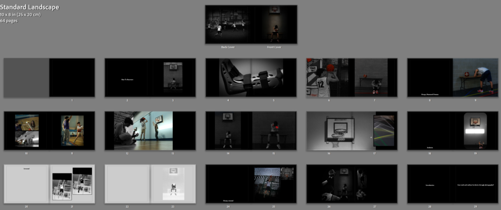
I chose these two images as my front cover image and back cover image. The reason I chose the front cover image, was because it explains my whole theme with the struggles my subject has to deal with through injuries in basketball and the still photograph in the dark, sat underneath the hoop with a spotlight shined down onto him, is very powerful for emotion.
I chose the back cover image to be that multiple photograph of my subject shooting and playing basketball on the court because as the storybook starts, he has the injuries, but as you progress through the storybook, you see he slowly heals and can then play back to normal again in the end. Hence the ‘Rise to Recovery’ title, but with the back cover image, it just shows how he is back to playing and can run and shoot around the whole court again.
I chose black pages as most of my photographs are in black and white, or involve it in the images. Also, black pages helps the photographs show isolation, loneliness and separation from playing basketball with friends.
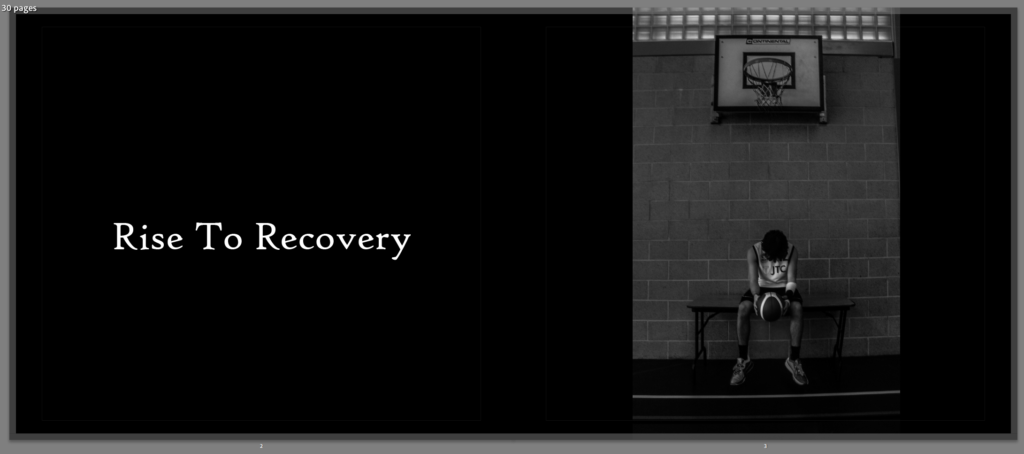
I added my title ‘Rise to Recovery’ with my second main image after the front cover image, because this photograph is similar to the front cover but instead he is holding a basketball, looking down at it, instead of covering his face with his wrist. Also, it is in black and white to help showcase the physical, mental and emotional struggles that viewers may not be able to see.
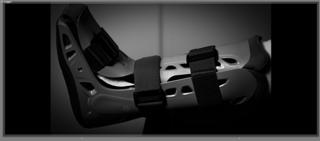
I used this image of when he was in a boot from breaking his ankle, but I made it in black and white too, and selected it to go over the top of two pages.
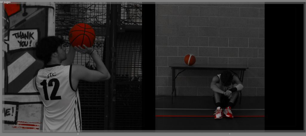
For these photograph’s, I really wanted to keep the theme of black and white, but with the basketballs, shoes and even the graffiti in the background of the first image. I decided to do a colour-popping edit for both of them, only allowing the red and orange in each photographs to be let through resulting in these dark meaningful images.

This title, really expresses how his dreams of playing basketball everyday and night have now been shattered as he has to take onboard all these injuries preventing him from playing and excluding him from friend activities.
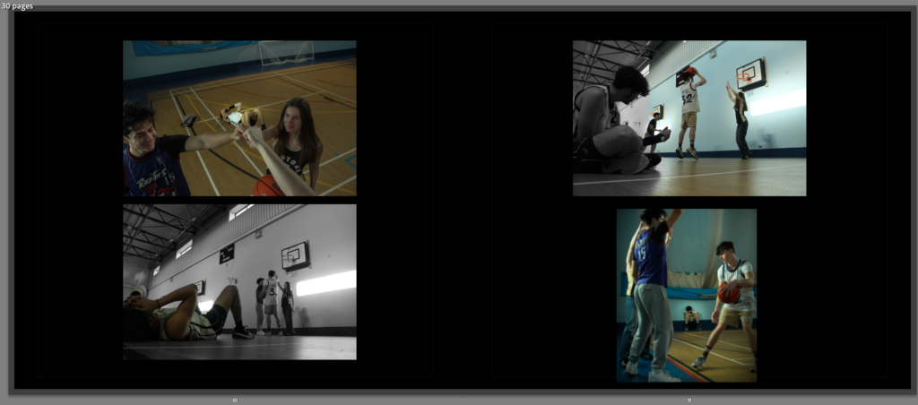
I then added these photographs with them all having a similar theme of how my subject ‘Bruce’ is excluded from playing with the rest and has to just sit down and watch from afar. I chose to have one photograph on each side that involves black and white to equal out the balance between the four photographs.
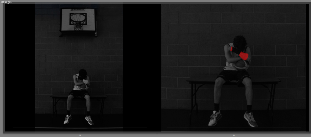
These photograph just involve my full photograph in the first image, with my subject sat down hiding behind his cast on his wrist, holding the basketball, sat under the hoop. But then, the image on the right is after I edited it and drew over his cast with a red, to show the frustration through his cast and injury and also it links to my reference of the girls coat in Schindler’s List.
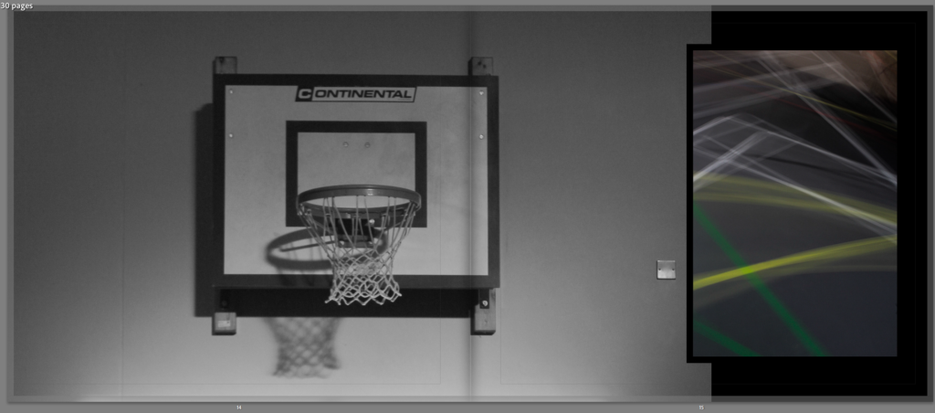
These images just involve a picture of a basketball hoop against the wall, and a long exposure photograph of the court with all of its lines, on the right, which together is what resembles a basketball court. I made the hoop image in black and white to resemble forgotten/fade. This is because it is not being used anymore as my subject is injured, so it is being forgotten and fading.
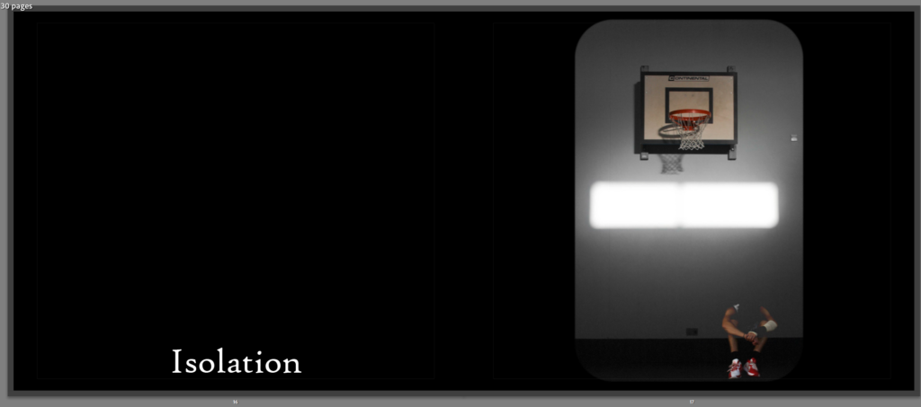
I then chose to add this image which I created by making two cut outs of my subject layered on top of one another, with the ‘hue’ tool, which makes him kind of transparent, over the image of a basketball hoop against a wall. I used the title ‘Isolation’ because he is isolated away from everyone and is sat by himself in the dark.
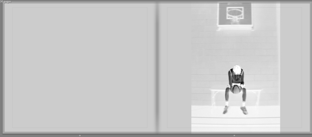
I then changed the background of the paper to a light grey to match my inverted theme of this white inverted photograph of my subject in the same position centre of the hoop sat on a bench, with his jersey and ball darker compared to the rest of the image.
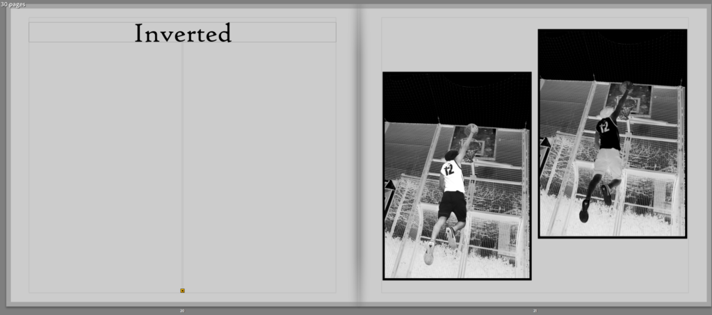
Then I created the title ‘Inverted’ on the next page, with two of the same photographs but in opposite inverts, with one in white and one in black next to each other.
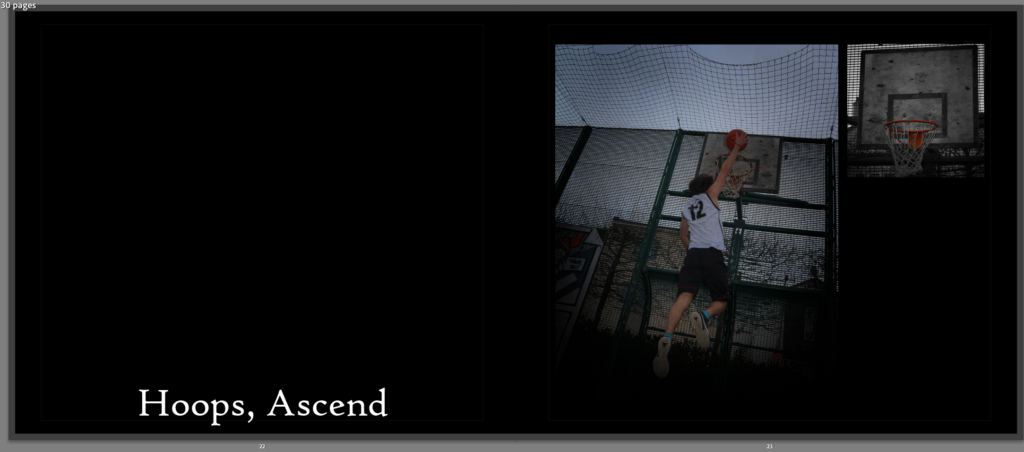
The inverted photograph’s is from this overall image with this one in full colour next to a singular photograph of the hoop at millennium park, with the title on the left ‘Hoops, Ascend’ which resembles how he is ascending back to the top again and back out of injury to full playing.
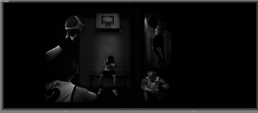
Finally, I used this image I edited with multiple photographs in one big one, spreading across two pages, but keeping the black and white theme, which shows the overall story, of him having injuries but then after recovering he is rising back to playing again including dunking the basketball.
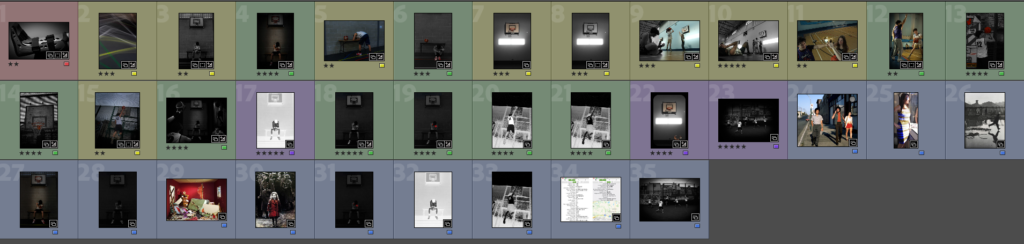
These are all of the images I have used in my photobook and including my reference images.
This was my idea for my layout with all of my final images but I will change it around.
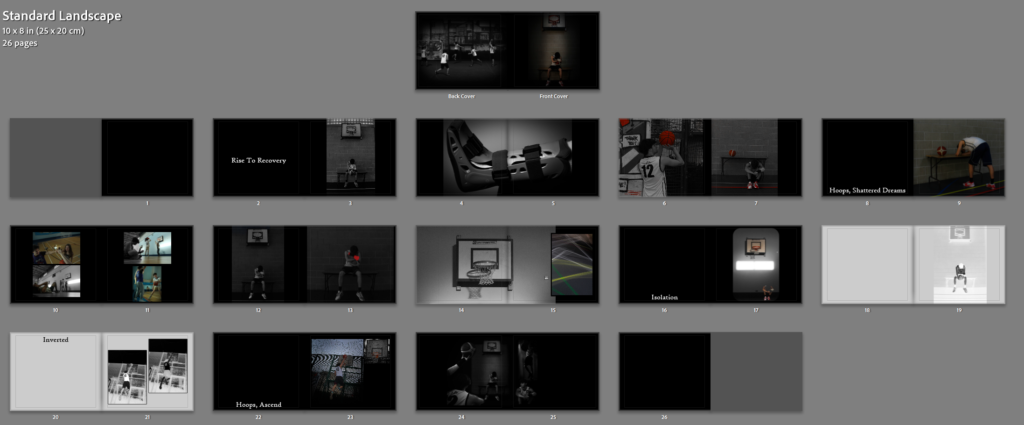
This is my final layout including my final essay at the back.


For my text throughout the photobook, I used ‘High Tower Text’ font, with size 12pt, for paragraphs and size 24pt for titles. I used size 24pt for leading which spaced out my lines helping my essay look more professional and it was the idea I had in mind. I also used centre lining for all my text because I felt the layout looks better overall and looks better next to my images.
Evaluation
For my evaluation, I chose my final images which are specific to my theme for a lonely, isolated basketball player who has to deal with injuries. But, what my photographs show and tell are the thoughts and feelings not everyone sees, but he has to deal with everyday whilst being unable to play. I used a lot of black and white photographs, or photographs in colour but involve black and white, like when I made just my subject in black and white to showcase how he is left out and/or how he is the one struggling whilst all his friends are playing.
I used black paper for most of my photobook, but for my inverted images, I chose to use a mid-grey colour for the paper, so my images blend nicer against the background.
Also, for my essay at the end, I started the introduction in black paper with white text, but as I got to the historical and theoretical context, I decided to switch the paper and text colour to opposite, so now the paper is white with the text in black and I carried on switching between the shades after each section of my essay.
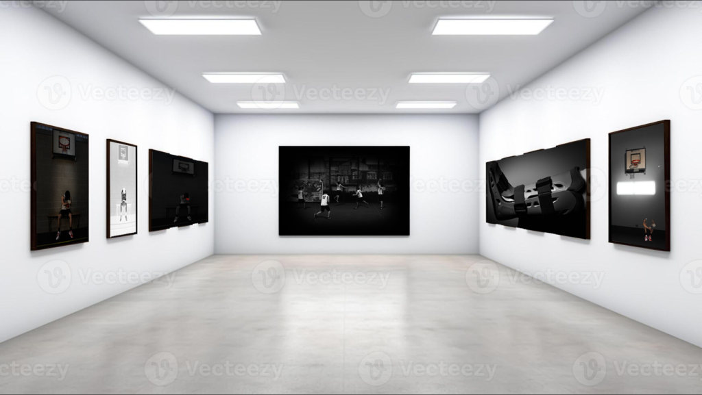
Virtual Gallery
I created a virtual gallery in Photoshop, transforming my final images to fit in-between the frames against the walls, creating this.