For my final photo book, I am using Lightroom Classic to design it.
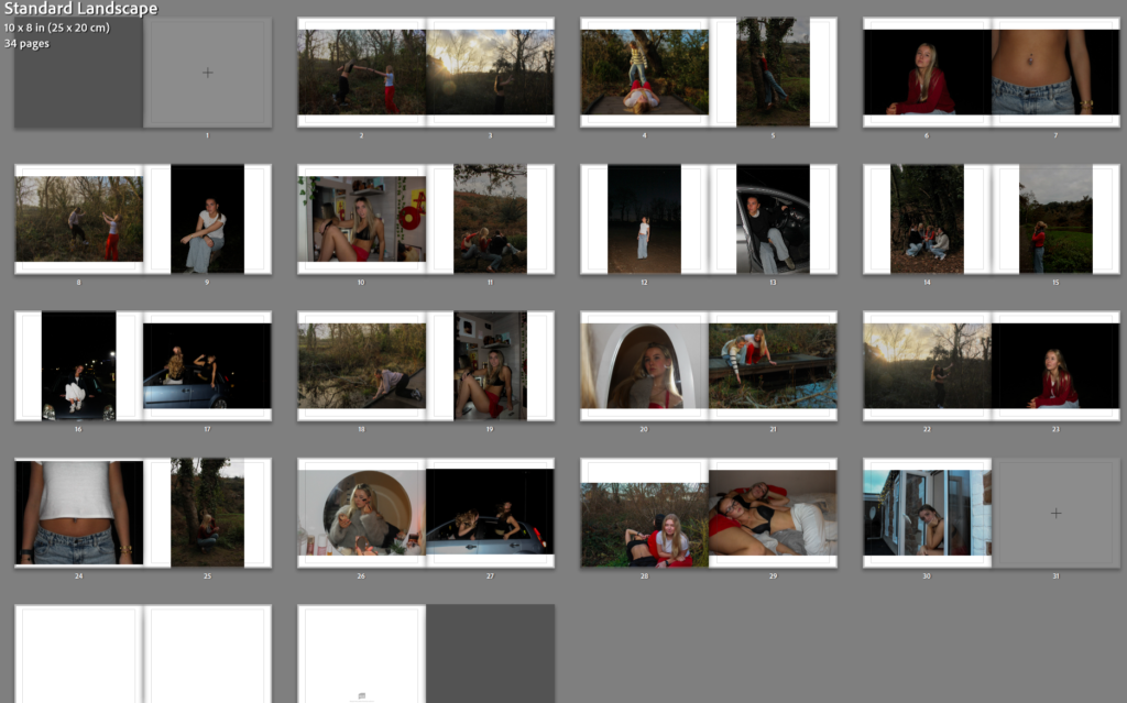
This was my first original layout, where I had initially placed around 50 images into it to start off my photo book. Although, I quickly realised that 50 images was too many as they were taking up 100 pages of a book. I wanted my book to only be around 30-40 pages long, so it stays consistent throughout but with a variety of interesting images from each shoot. Therefore I removed many of my images that were perhaps too similar to another one or just didn’t stand out to me as much, and I was left with 35 pages. This was a rough plan for which images I wanted to include, however I soon decided that I wanted to make my layout more unique, and have specific images standing out from the rest of the book.
I also switched my book layout from standard landscape to standard portrait, as I felt that it fits my images better due to them mostly being portraits. This way, my big landscape images would also be emphasised too.
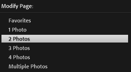
When choosing displays, my main choice was the one with two photos, I chose this because if I included any more then the images may clash with each other, and it would be too distracting from the other pages. I wanted each and every image to stand out individually to be able to tell my story, and I did not want any images discarding another one.
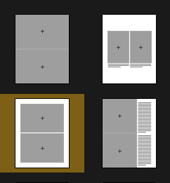
I then began experimenting with different layouts for each double page of my book, choosing a range of displays and also choosing which images work best on a page together. During this experimentation, I also chose my best landscape images to include on a double page spread individually. This way, my photo book will look more appealing and have unique elements within it to draw the viewers attention to specific images without subtracting from another.
My front and back cover:
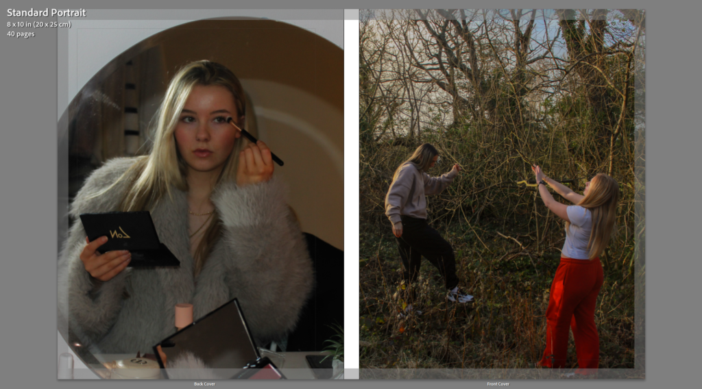
I chose these two images for my front and back cover because I feel they represent my subject matter best. The front cover image on the left clearly takes inspiration from Justine Kurland, and as she was my main artist focus, I wanted to incorporate her ideas and apply my own approaches. By looking at the front cover, the viewer immediately gathers a sense of freedom and escape, which is what I wanted to achieve as this links to the femininity and youth themes of my project. The back cover image was inspired by Ramona Wang, another artist I looked at in depth and wanted to focus on for this project. The image displays traditional expectations of women, and this will work effectively with the title of my book as I am wanting to challenge the ideology of women objectification.
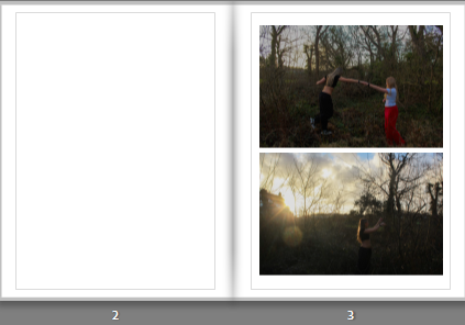
I put these two images together on the first page for the viewer to immediately see as they reflect Kurland’s series of exploring escaping the expectations on female behaviour. I like how the scenery is similar in both images, so I decided to include them both on the same page so the similarities and differences can be seen clearly.
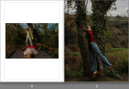
For my second page I chose a similar approach to the first page, reinforcing my ideas on females in natural landscapes. These images were from different shoots, but they compliment each other well due to the factor of nature and the vibrant clothing on the subjects. I made the image on the right full bleed because it is a portrait, and therefore the image on the left can have its own border around it, allowing the tones to stand out.
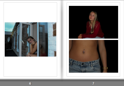
The two images on the right are on a two photo display, as neither of them include elements of nature yet they still link to my themes. Both images include darker tones and a higher contrast, so I put them together to create a more dramatic effect and slowly tie in a more realistic side to my project. The image on the left is by itself due to the cooler tones and the building in the frame.
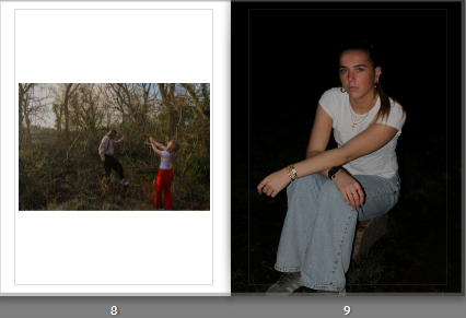
These two images are also from different shoots, I like how they differ from each other completely as it allows for the viewer to interpret them however they like. I placed the portrait on the right as full bleed due to the immense amount of black in the image and I like how it adds tension. I placed my front cover image on the left page with a border as I didn’t want to attract too much attention to it due to it already being used.
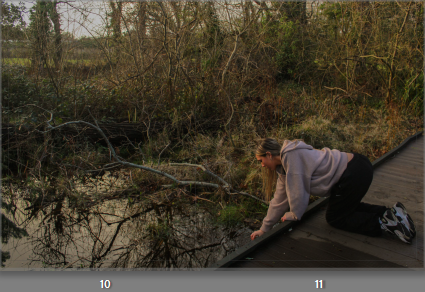
This image is on a double page spread, due to the excessive amount of nature, which I believe works well because the previous few pages do not include much greenery. I like the editing in this image and therefore wanted it to be on its own so the viewer can take in the different colours and shades within it.
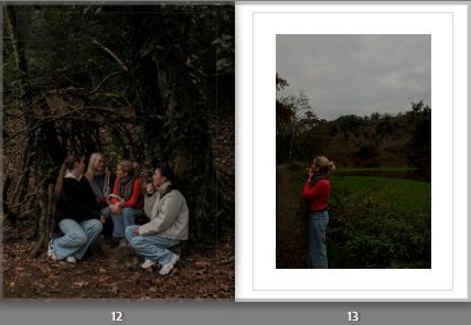
These two images compliment each other as they were taken in the same shoot, they share similar colours within them as well as both having quite low exposure. I placed them together to reflect the importance of community within young females. The image on the right reflects loneliness, so I gave it a border to emphasise this. Whereas, the image on the right shows bonds and friendships, so I made it full bleed to emphasise the significance of it to my project.
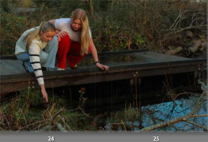
This image is on its own double page due to the fact it has many elements in it and is already quite a busy image. I did not want to repeat a similar approach to the previous page, so I placed a border around it and left the right page blank. This allows the viewer to focus on the activities the subjects are exhibiting, which is what Kurland photographed so I wanted to recreate that effect.
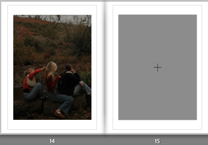
These two images portray more of a darker mood, due to the pitch black sky and limited background because of this, so I think they compliment each other effectively. I placed them next to each other to bring out the theme of loneliness again. However, the white clothing on the subject in the left image helps brighten the overall mood due to the heavy contrast of colours, also allowing her to stand out. As she is also further away from the camera in the left image, I made it full bleed so the viewers eye wouldn’t move straight to the image on the right.
I liked the setting in which this photo was taken, it has a lot more colour in it than the previous images. Therefore I brought this image in by itself to bring back some life to my photo book as I do not want it to appear dull or repetitive. The image shows me executing Kurland’s ideas of bravery and also brings in rural landscapes. I added a white border surrounding it to contrast with the dark greenery and trees taking up the majority of the frame.
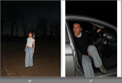
These two images portray the theme of escape, as they show subjects outdoors in the dark which hints to the viewer that they are runaways. I placed them together because they have similar colour schemes and reflect the same idea, which helps give my book a sense of organisation as the rest of my images are mixed together. The image on the right has a border because I think if I put them both big they would look too similar.
These two images directly link to Ramona Wang through the subject composition. This is because they are both self portraits reflecting typical expectations of women, such as putting in effort to look feminine. I placed them together on this page as they have dark tones with hints of red clothing, also linking to femininity. However, the image on the right is significantly smaller than the one on the left as it is as landscape image, so I added a border to add some definition.
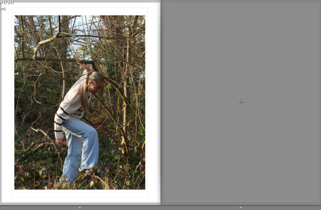
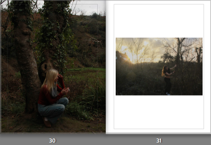
This image is one of my favourites from all five of my shoots, so I wanted to give it its own double page because I feel that it is unique to every other photo I took and I wanted to emphasise it in my photo book. I like the natural lighting as it links directly links to Justine Kurland and her use of natural lighting in all of her images. I also like the angle of it as it is typically lower than any of my others, as well as including moving subjects, making it appear less staged.
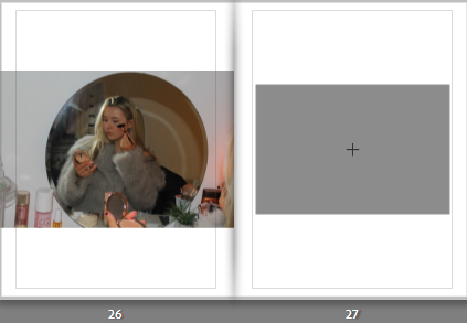
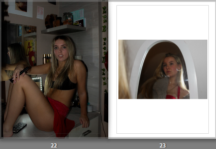
I wanted this image to be presented on its own as it is a busy image with lots of different colours within it. It also has quite a high exposure due to the flash being used for extra lighting, so I chose not to contrast this with another image on the other page as I feel it may defeat the intriguing elements in it tat I want the viewer to focus on, such as the makeup and clothing. This image is inspired by Ramona Wang and exploring the exploitations of women in art and photography, and I wanted this statement to be quite clear, so placing it by itself I am allowing it to be emphasised.

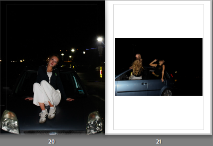
This was another layout where I decided to include three images on a double page, due to the fact they all have a black background and a high contrast. I placed the two on the left together as they were both inspired by Ramona Wang, challenging traditional female stereotypes as we are not professionally posed, giving the two photos a candid effect. They compliment the image on the right page because they all look underexposed, which creates a sense of nostalgia and makes them feel like they were captured in the same story.
These two images were taken in different shoots, and the differences between them is what made me put them next to each other. The image on the left has a darker feel to it, contrasting the right image which shows the sunset beaming through the trees. However, the colour palette in both of them is similar because of the nature, and it portrays adventure and freedom which parallels to Kurland’s Girl Pictures. The left image is a portrait so I made it full bleed, and the image on the right has lighter shades throughout because of the lighting, so adding a white border will effectively compliment it.
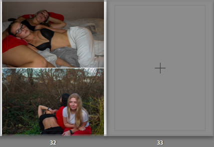
I wanted my last page to correlate with both my artist inspirations but in a way they could work together and share similar ideas. They both highlight youth, femininity and community which is significant to end my photo book with to ensure my aim has been portrayed successfully. Despite the similarities they share, there is a clear divide between them creating a juxtaposition. The top image has a dream-like aesthetic because the setting is in bed, giving the image a warm, friendly sense to it. Whereas the image on the bottom delves into reality, as it shows exploration and being in the wild. A contextual reference to this could be that Kurland focuses on a more idealised world, whereas Wang takes a more realistic and raw approach, and these two force the viewer to question if we, as a society, should accept the world as it is, or perhaps suggest change to the expectations of beauty and ideas surrounding feminism.