Selection of images
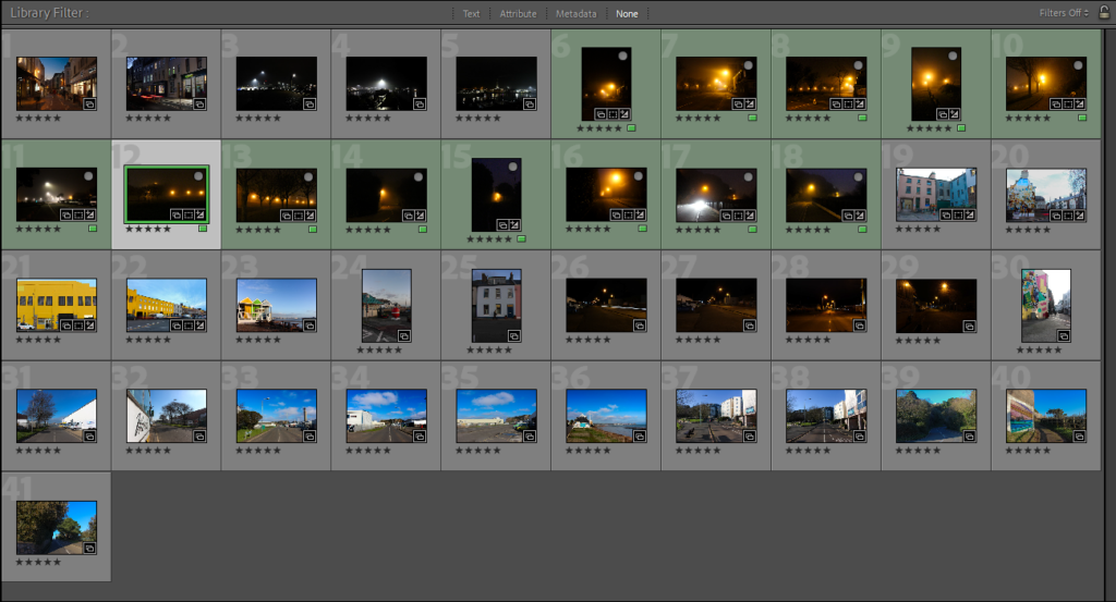
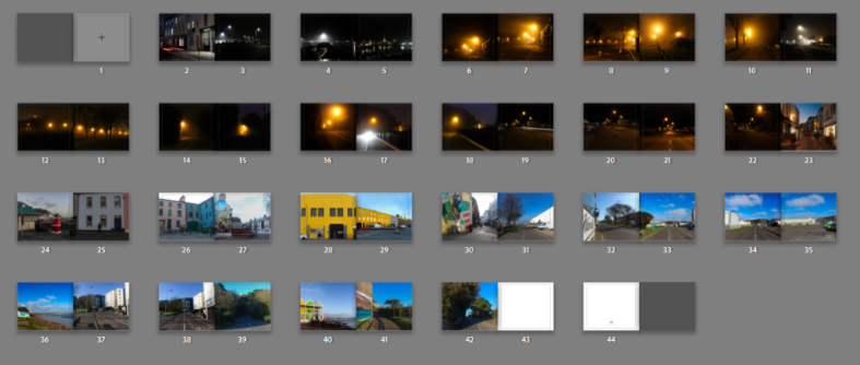
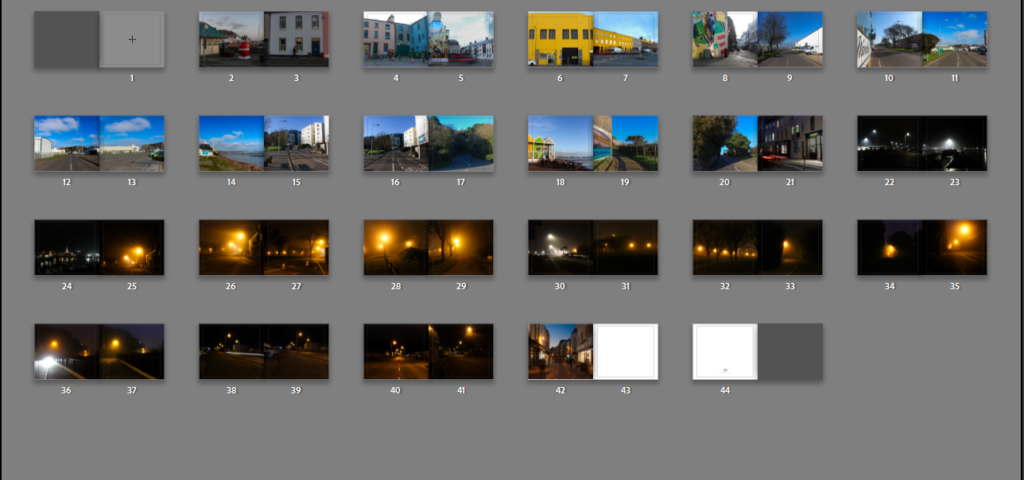
Firstly, before I even began opening the book I selected the 41 final images which could possibly be used in my book and put them into a collection of its own. This collection consists of images from Both night and day, ready to be put into my photobook to show the contrast between the day and the night. Before even opening up the book tab I had another quick review of the images and most of them will be incorporated in the book however some might not. The collection of the 41 photos are displayed below.
Book Specification
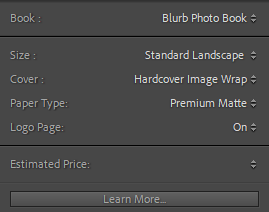
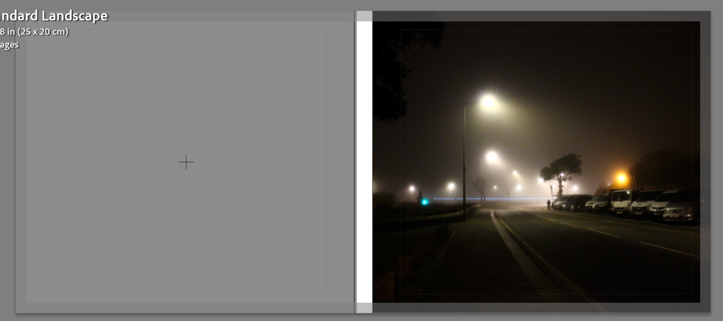
These are the settings I have originally chose for my Photobook, I have gone for a Standard Landscape Book with a Hardcover Image Wrap and on the inside I have chosen to have Premium Matte paper. I chose the standard landscape sized book because most of my final selected images are landscape orientated and in my personal opinion I prefer the landscape over the portrait book. Premium Matte paper was chosen because matte paper works better with darker photographs, it allows the ink to sink in efficiently.
Initial Book Construction
Front Cover:
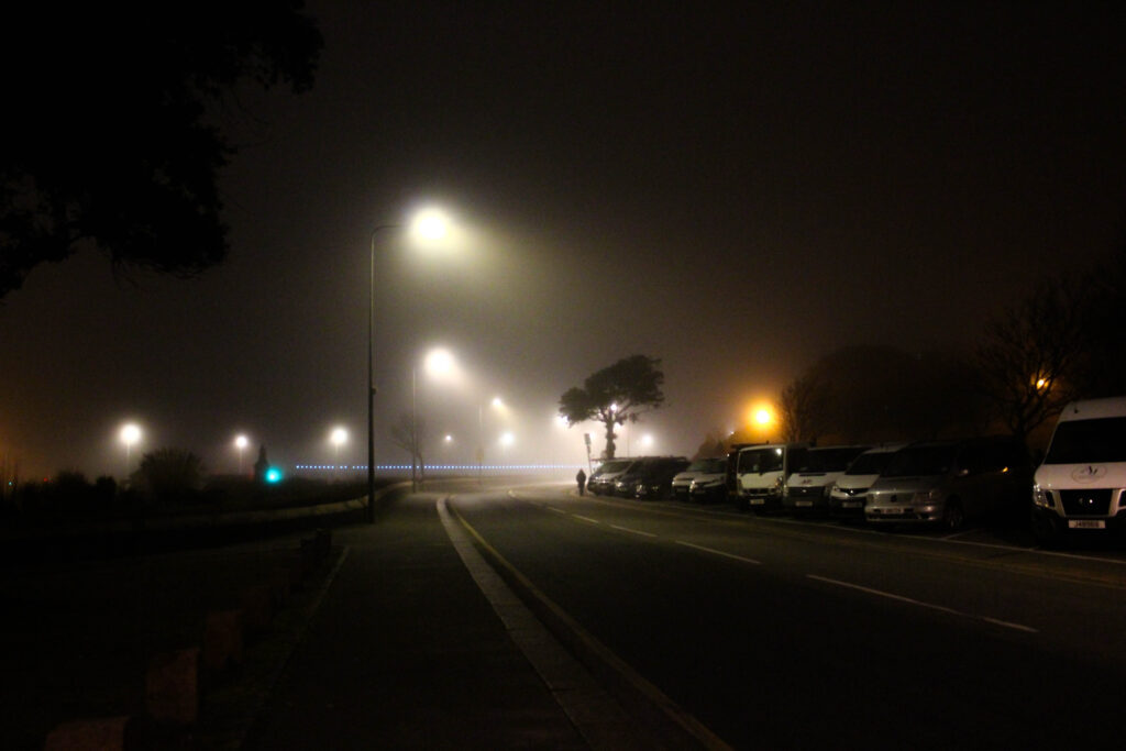
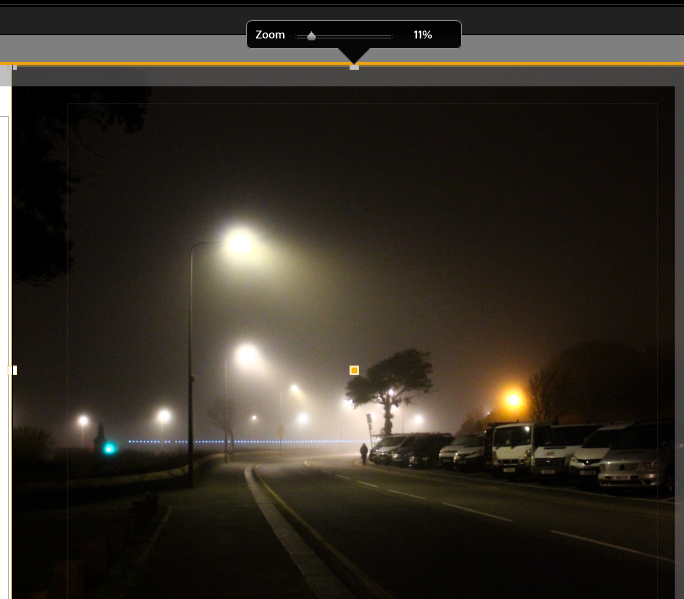
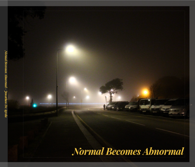
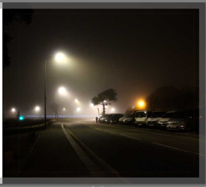
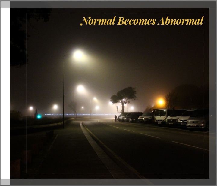
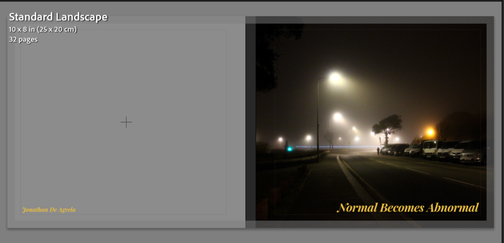
Firstly, this is the image I have decided to put as the cover I chose this image to be the cover of my book because this photograph is extremely thought provoking and displays a part of my projects theme clearly. To make this landscape image the front cover I had to zoom the image in 11%, meaning that I lost some parts of the image. Even though some areas of the image are not shown in the front cover, I do not think this is a big deal as I framed the image perfectly where the Interesting part of the image was shown, and the parts cut were little details which do not add too much to the image. The combination of the fog and the bright glow coming from the lampposts creates brings out the feeling of mystery. The emptiness shown in the photograph links back to the solitude which the night brings. This cover fits perfectly with the purpose of my photobook of how a normal setting can become abnormal, the focus of my project. This image stands out and therefore invites the viewer to pick up and look through my book.
Title Of Photobook:
My Title for my project has always been “Normal Becomes Abnormal”. I chose this title at the very beginning of the project, this title was chosen due to the way it blends with the intention behind the images and the images themselves. My projects theme is to show the contrast between the day and night showing the elements presented during the day, under the sunlight and showing the contrary elements which are presented in the night, under low light.
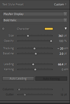
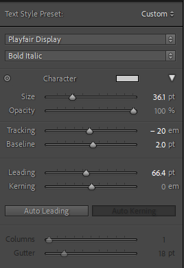
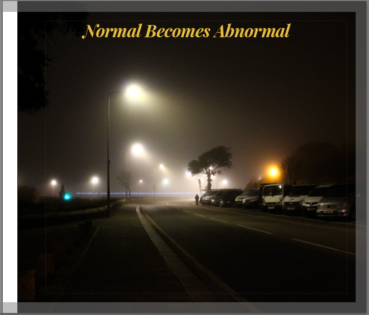
This above is the chosen front cover of my photobook and the next step to finalize, or proceed with the photobook is to add the title of my project: “Normal Becomes Abnormal”. I already had an idea in mind on what font I was going to use for this title, The font is called Playfair Display. This font stood out to me out of any other font because it has both thick and thin strokes which creates a dramatic look and matches the look of the book.
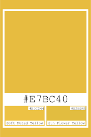
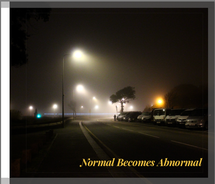
Once I decided what font I was going to use for the title of my front cover, the next step was to choose a colour for the title. I started off with experimenting with most colours seeing which ones I thought worked with the book and which ones did not, I narrowed my choices down to two colours Muted Yellow and Cool Grey. I first experimented with the muted yellow, finding the perfect shade of yellow on google then using the muted yellow hex to apply it to my title. I found that muted yellow worked well with the front cover because my cover displays a dark misty night setting and the muted yellow gives me enough contrast to make the title stand out. I chose muted yellow over any other yellow because this Muted yellow stood out in front of the dark tones of my image without being too bright or clashing with my cover. Below is What my title looks with the Playfair Display font and the muted yellow colour.

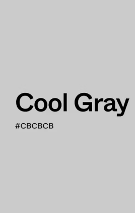
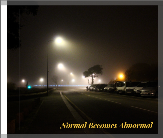
Once I had experimented with using the muted yellow colour on my title, I then tested out a cool grey on the title, however this colour did not work well on my front cover. The grey did not stand out when placed on top of my cover, because the photo on the cover is mainly dark toned and the grey on the cover just blended in with the rest of the image, making the title not stand out. Below shows what my title looks like in cool grey, in the screenshot it looks good however when put together with the whole image, it just does not work.

Title Placement Experimentation:
As you can see in the screenshots above, I experimented with the placement of the title. I tried placing the title of my book on various different areas of the cover. After having tried every area I could, I found that when the title is located in the corners of the cover, where there is some empty space, it looks more minimalistic and professional. Above show the four title locations I narrowed it down to, My favourite two out of these four are the two displayed below.
I find that these two covers work the best out of the four, the title being placed on the right side of the cover works nicely as the bottom and top corners of the right hand side are quite empty and do not show any detail, making these the perfect places for my title to be so I lose as little important content as possible. These two are also very minimalistic which I like and was one of my targets for this photobook.
Final Front Cover Chosen:
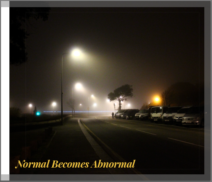
This above is my final front cover I have chosen for my photobook. I have decided to include the muted yellow title “Normal Becomes Abnormal” placed in the bottom right corner of the cover image and the font used is Playfair Display. I chose this design as my final one as it looks professional, tells a story, minimalistic and is eye catching, making it a strong front cover for my book. The muted yellow colour on the font works perfectly with the cover image, duplicating the same tones as the streetlights and it gives a slight contrast making the title stand out, drawing attention to my photobook.
Inner Pages Of Photobook
Sequence Experimentation 1:
To start off the internal pages of my book, I started off with a quick draft putting the night time images at the front of my book and the daytime photos towards the end of the book, contrasting the sequence of the ordinary day. I do not think that this sequence is good enough to be my final sequence as it just does not make sense and is quite confusing. Below is a screenshot of my first experimentation with structuring and sequencing the inner pages.
Sequence Experimentation 2:
Below is my second experimentation with sequencing, differently to my first sequence I started off the book with photos during the day and then the end of the book consisting of the night time / low light images. I think this sequence works better than the first one, following the cycle or the day, this structure allows the viewer to experience the shift from day to night, going from familiarity and clarity to mystery and isolation.
Sequence Experimentation 3:
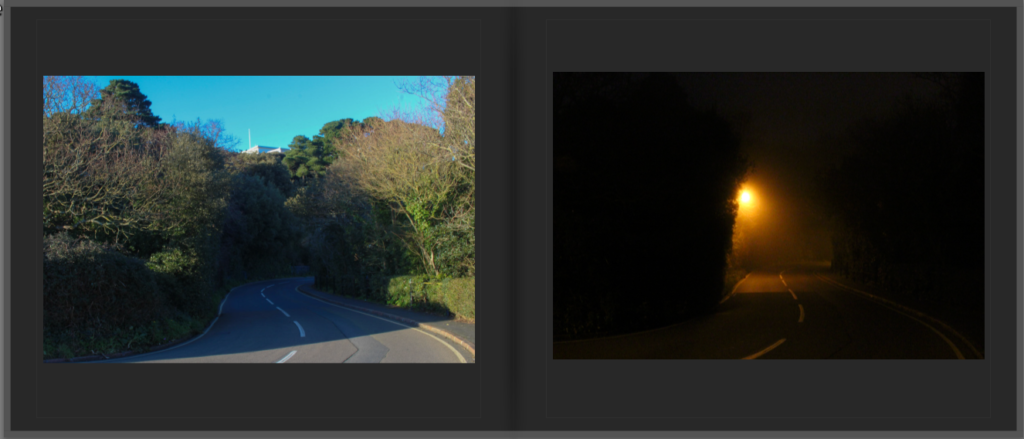
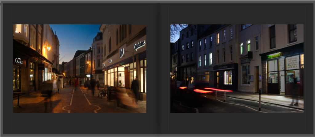
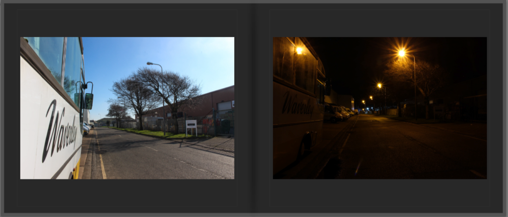
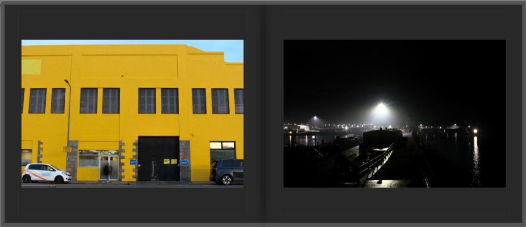
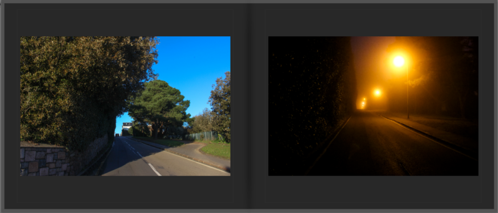
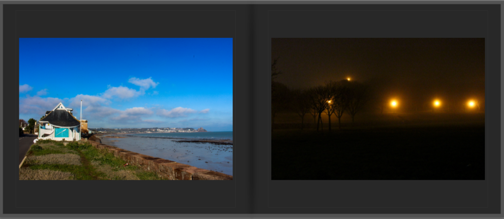
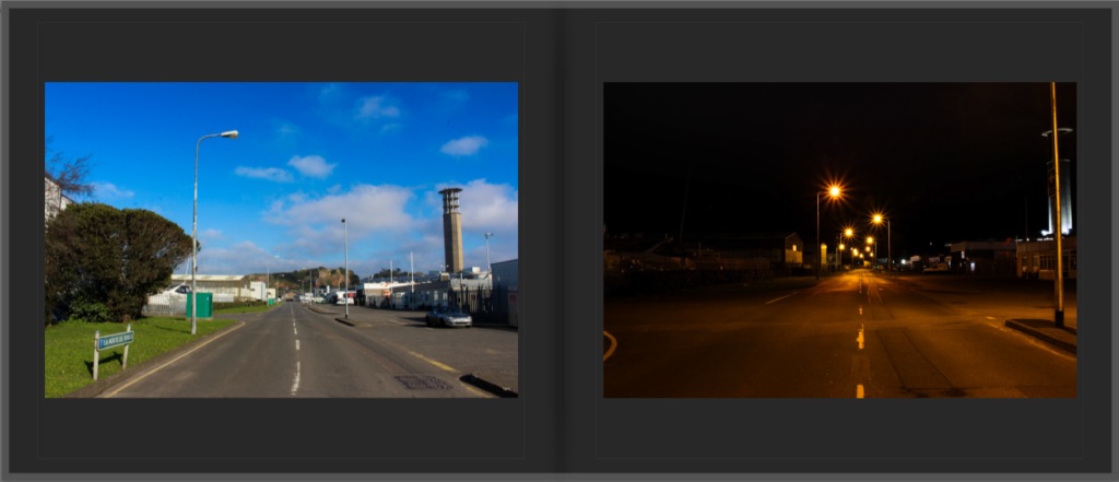
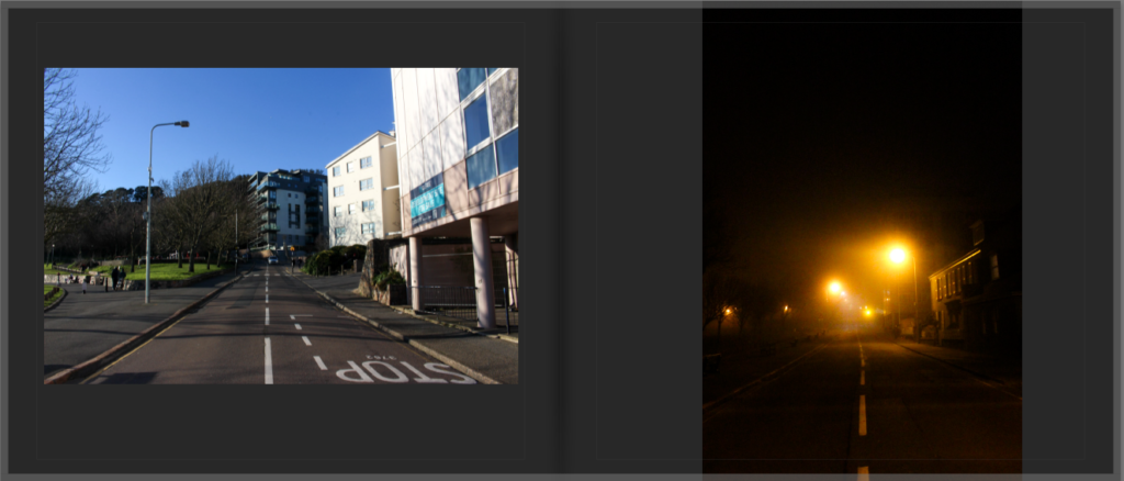
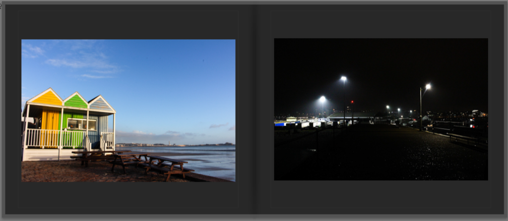
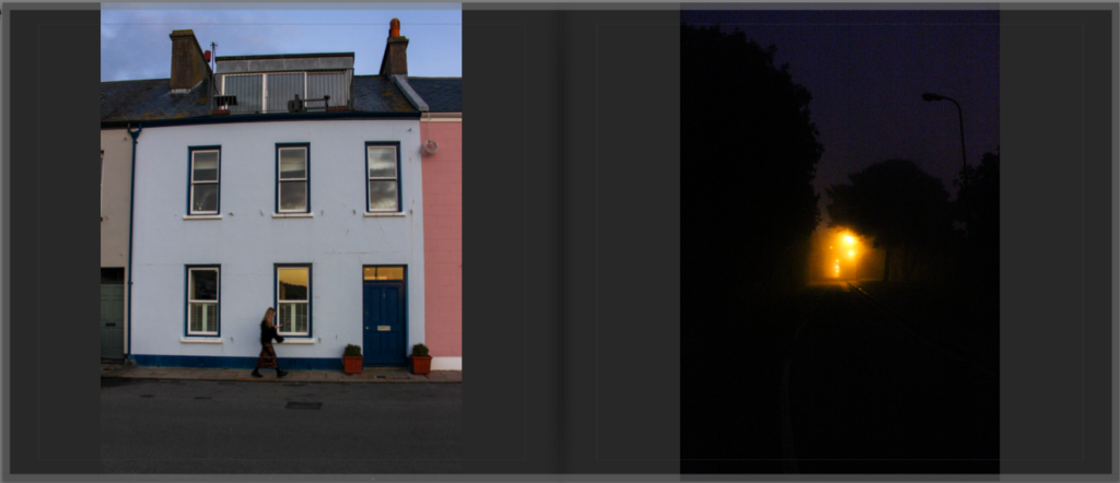
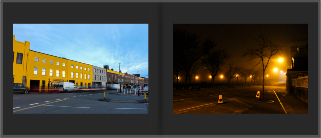
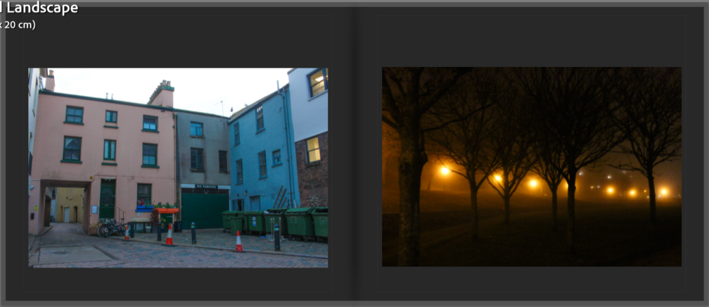
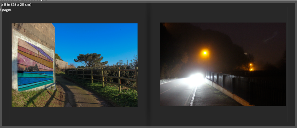
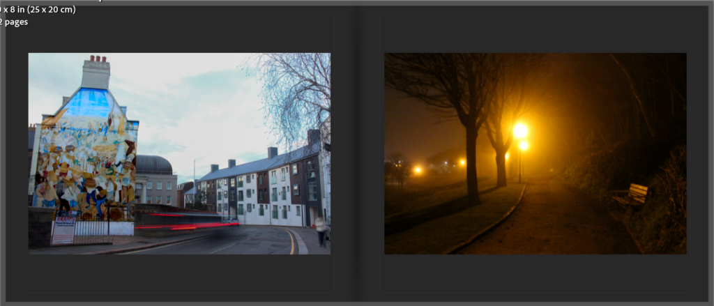
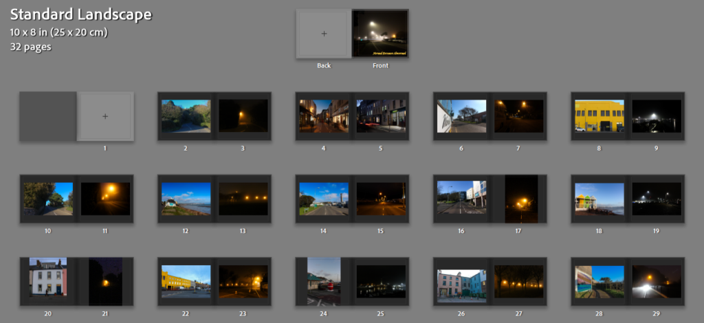
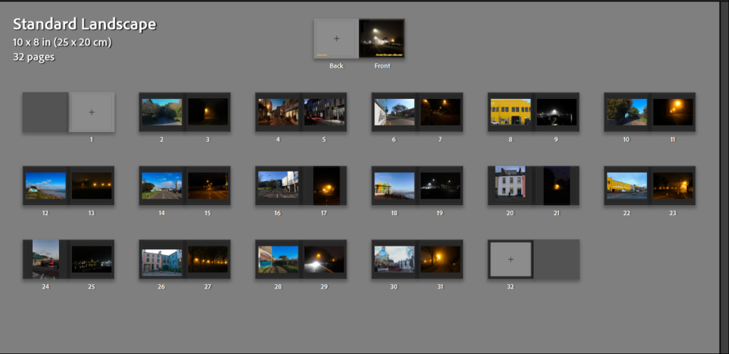
Below is my third experimentation with the sequencing, this is my favourite format of sequencing out of the three drafts. This structure shows a photo taken during the day, then a photo taken during the night showcasing each one side by side, making the difference between the day and night easier to understand and view. This sequencing also works very well because I have a handful of images which are taken in the same location at different times, by placing two photos taken in the same location next to each other, I can really display how the day and night contrast with each other. This will be the sequencing I use for my final photobook.
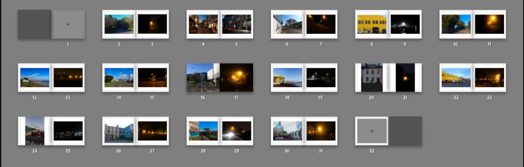
Image Framing:
As you can see in the screenshot above, I have decided to make each of the photos have a border around them, I did this on every page to create a sense of balance and keep my photobook consistent.
Page Colour:
I did not like the white background on all the inner pages because I think that the white pages do not work well with the overall mood of the images, therefore I changed it to a darker tone, a dark grey. This slight change in the book makes a big difference, making the book more appealing to look at and the paper blends with the night time / low light photographs. This small change helps put the whole book together, making the presentation of my book more detailed and efficient.
Back Cover:
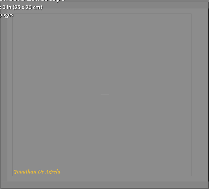
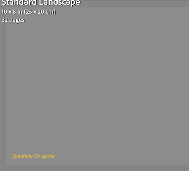
For the back cover I have decided to keep it simple and leave it blank, apart from my name. I have done this to keep the minimalistic approach I have kept throughout my entire photobook. By not adding a photo on the back cover, it allows the viewer to only focus on the front cover and the photography itself. The minimalist approach also adds to the sense of mystery which I portray through my photographs taken during the night, reinsuring the aspect of mysteriousness, making my book look more professional and neat.
Final Evaluation Of My Photobook
My photobook, “Normal Becomes Abnormal”, focuses on different areas and settings change between day and night, highlighting how the time of day and atmosphere can create a difference in emotions. My main aim was to capture how normal environments that we live and see every day become mysterious under different times of day and light. The book was mainly inspired by William Eggleston and Todd Hido however i also took inspiration from a belgian photographer who goes by the name of Pierre Putman. Overall I am happy with how the photobook turned out in the end. I think the book successfully showcases the beauty of locations changing depending on their atmosphere and the emotional impact that it can create. This whole process has been great to do and helps me see what it is like to develop and create a photobook, this experience can be reflected on and any mistakes or errors done in this book can be used to improve any future project I do. Personally, I believe that this photobook could possibly be seen as quite random and confusing. The book could be viewed like this because of the use of the same locations next to each other and others being two completely different locations placed next to each other.
Final Photobook: