Final Photo-book + Evaluation

To start with my photobook, I moved around the images, placing them next to others or alone to figure out where they would best be presented. While doing this, I also evaluated each image, deciding whether or not it would make the final cut, removing some images or replacing them with better versions, as well as adding in completely new photographs that I hadn’t been sure on.

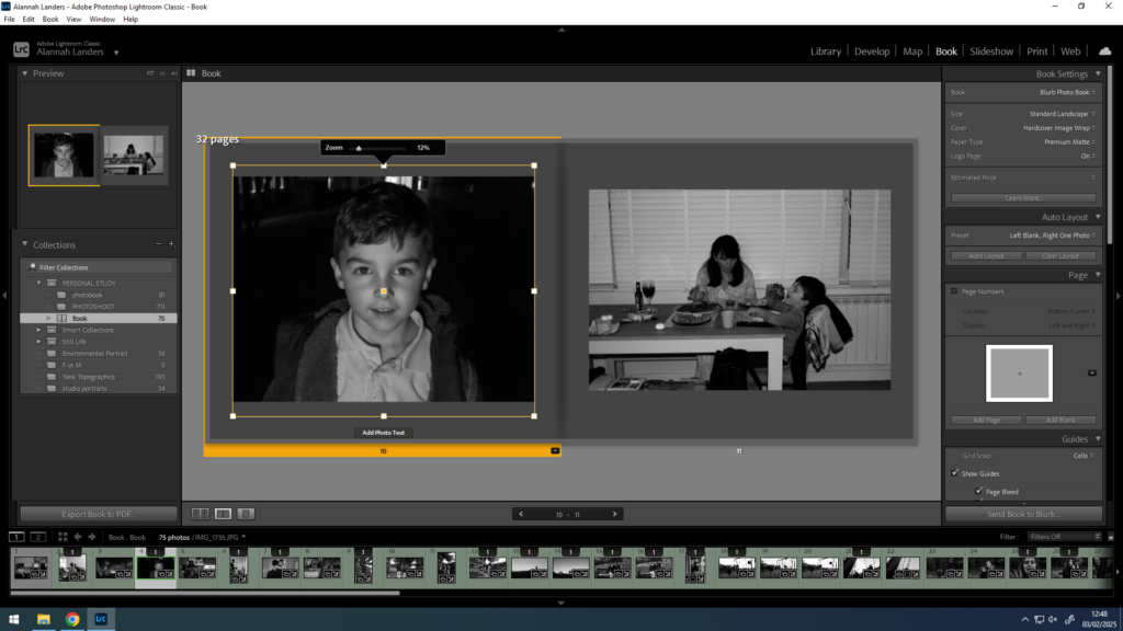
I also moved them around and experimented with different orders to present the photographs. This was the harder part as the images are from photoshoots with different scenarios. However, once I figured how to arrange them synonymously, I was able to position the images well within the book. I believe that the final way the photographs are ordered works well with the narrative and aesthetics of the entire book.

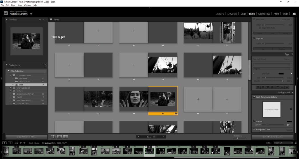
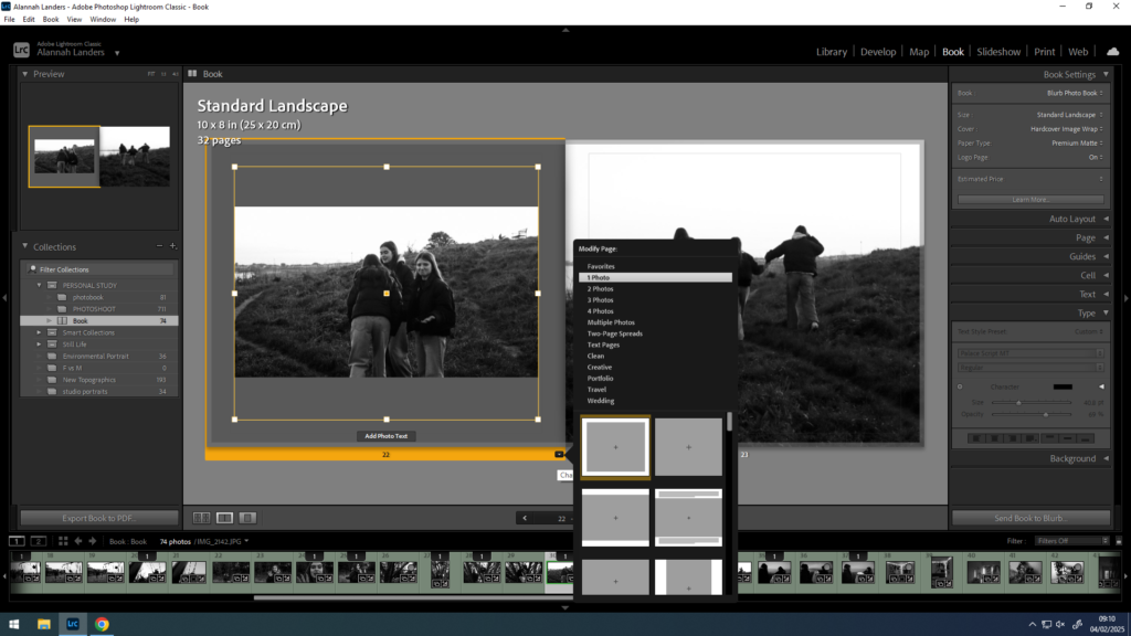
Finally, I went back through the images, changing the placement of how they were displayed on the page. I used a variety of positionings such as in the middle with a border, across the whole page, or a double page spread. This allows for a change in the book, avoiding too much repetition too often.
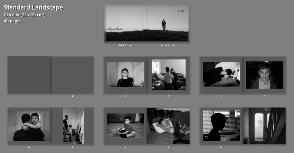
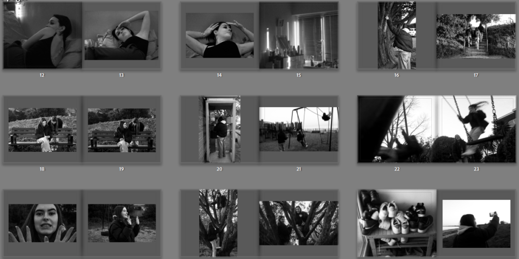
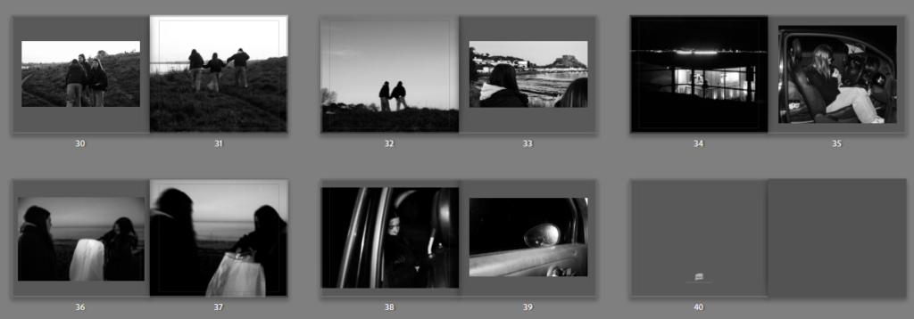
Final Layout:

Overall, I think my photobook turned out well. I was able to present my photographs as I had hoped to, with the images in such an order that the narrative is portrayed effectively. I believe the final images that I chose to use in the photobook work really well together and I think that they are good photographs. I also really like how the black and white theme turned out, I think that all of the photographs being black and white makes the aesthetics better than if I had a mix. If I were to do this project again, I would take photographs of other friends and family close to me, allowing myself to illustrate different lives and aspects of life to what is already shown.

Some final images:

Overall, I think this project turned out successful. The images I produced were high quality images of intriguing scenes. When placed in a photo book, the images come together well, supporting the narrative I had aimed – to portray different ages and lifestyles, and capture moments of bliss from different peoples lives. Throughout my photo book and images, there are similarities to both artists I has researched and taken inspiration from, Tom Wood, Andrew Kung and Andriana Nativio. My original inspiration for my project was Tom Wood’s projects and his style of street photography. This is similar to the work of Andrew Kung, I wanted my project to share alikeness in how the photographs are perceived. Additionally, Andriana Nativio inspired me with her style of documentary photography, as well as the images being presented in black and white which is what I found worked best with my images leading me to make the whole project black and white. When taking my photographs, I used a range of lighting techniques depending on how the environment was lit at the time to keep the authentic feel. When editing the images, I used the same black and white filter across all images so that, although some images are brighter whereas some are darker, they all have consistency in some form. I think that within this project, some photographs are better than others in terms of the scene being shot or the technical camera skills not being up to the same standards. However, overall I believe the images are still successful and flow well in the photo book.

Leave a Reply

Your email address will not be published. Required fields are marked *