1. Write a book specification and describe in detail what your book will be about in terms of narrative, concept and design with reference to the same elements of bookmaking as above.
Narrative: What is your story?
Describe in:
- 3 words: exploration of fears
- A sentence: I want to explore my own fears and how they can be presented in different ways.
- A paragraph: Fear isn’t limited to one particular set of imagery. I want to explore the different ways to present the same few fears with both natural and urban backdrops.
Design: Consider the following
- How you want your book to look and feel: I want my book to look like an old library book with a plain/basic hardcover.
- Paper and ink: I will use plain white paper instead of black for the colour images.
- Format, size and orientation: To create a library book I would have wanted an A5 portrait. Portrait would let me create full bleeds with any landscape images while also keeping some smaller images for variety.
- Binding and cover: I want a plain cover either with a basic pattern and title or like the slip has been removed without much going on at all.
- Title: I decided on ‘Guillemot’ like the bird black guillemot. I choose this because not only do I find large birds freaky but also because birds fly and rise above any difficulties. The black guillemot is a black and white bird which matches my black and white images too.
- Design and layout: I will have two different sequences going at once so I will need to differentiate between the two by size or where they’re laid out on the page.
- Editing and sequencing: The images will be arranged quite sporadically. I was contemplating arranging each image by photoshoot or if they’re all black and white in a gradient however I didn’t want to make a comforting sequence. I will either arrange each image in a random order or start mostly in some sequence and change it every few pages. Additionally most images are in black and white however I will make sure to place a few coloured ones in between.
- Images and text: I don’t plan on having many bodies of text except for the essay at the end which will be arranged in columns with uniform text type and size.
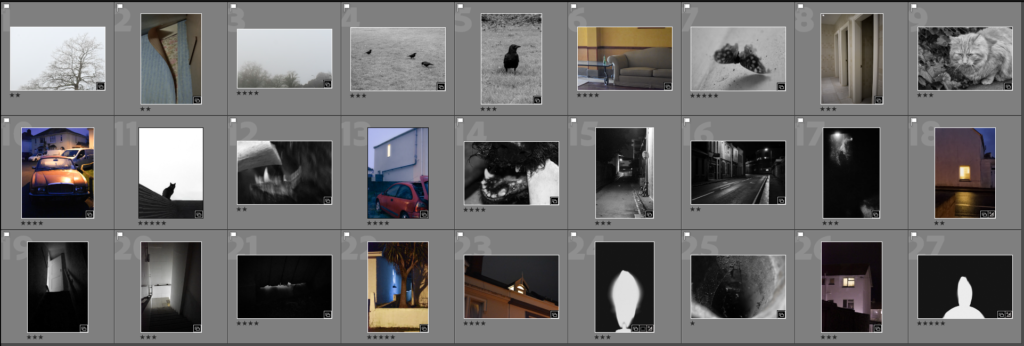
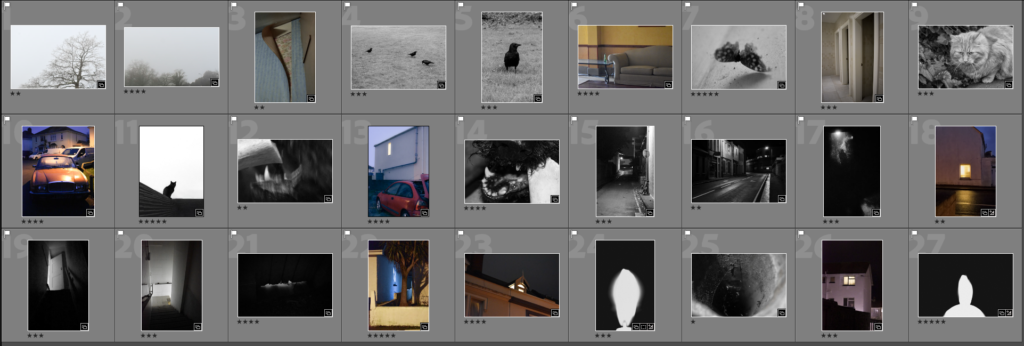
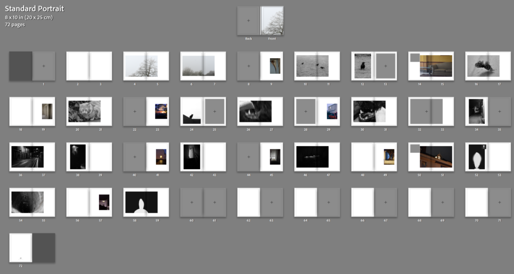
In terms of sequencing I sequenced all my black and white images and coloured ones separately before interspacing them. The black and white ones I tried matching with the one before going from a park outside through a street and into a dark room like walls gradually closing in on the viewer.


The coloured ones I did the opposite. I started closer and worked outwards from wallpaper and being inside to being isolated and left outside.
Then I interspaced the two different sequences.

I tried two different sequences. The first where I used the coloured images to split between images when they changed for instance birds > moth. While this made more sense I didn’t want to create any sense of comfort in predictability and tried one when the images are more sporadically spaced out:
I liked how in particular the dog looks as though its trying to eat the cat since I find it quite funny. The beginning of the first one and the ending of the second one and decided to combine the two.
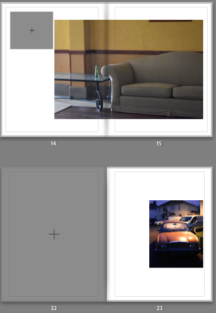
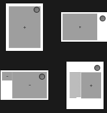
All the coloured images were laid out on the right side as its what’s seen second in either of these templates:
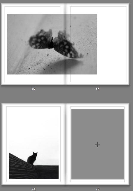
The black and white images were aligned on the left side as its what’s seen first in these 2 templates:
My initial layout looked like the following:
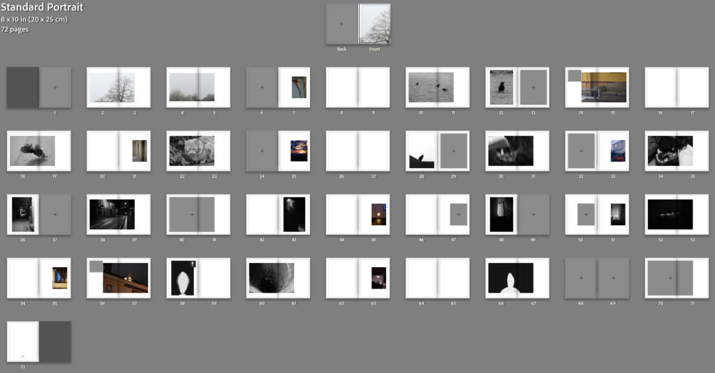
I knew I wanted the essay to fit in separate as a newspaper clipping attached separately to the back so I didn’t need the blank pages at the end. I wanted to add some blank pages throuhg out also which would be a good way to loose all the pages at the end.
In terms of the cover I was unsure wether to put an image on the back or not.
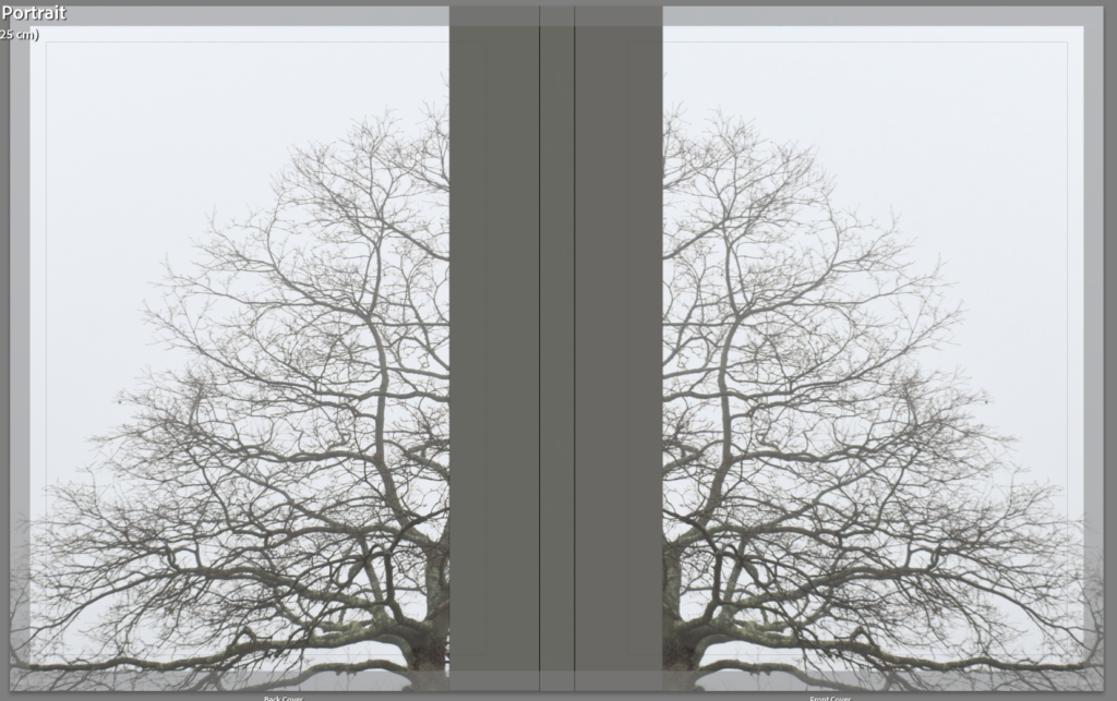
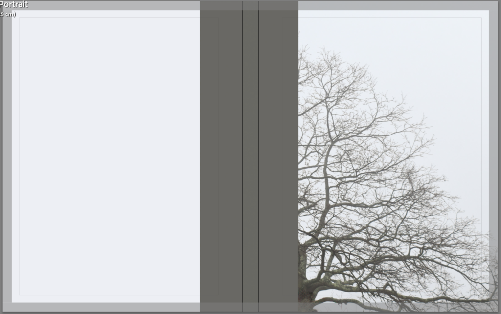
I think that the double looks better so I compared two different images on the cover. Since the book has a sequence going in both directions the same cover inverted like a mirror makes sense.

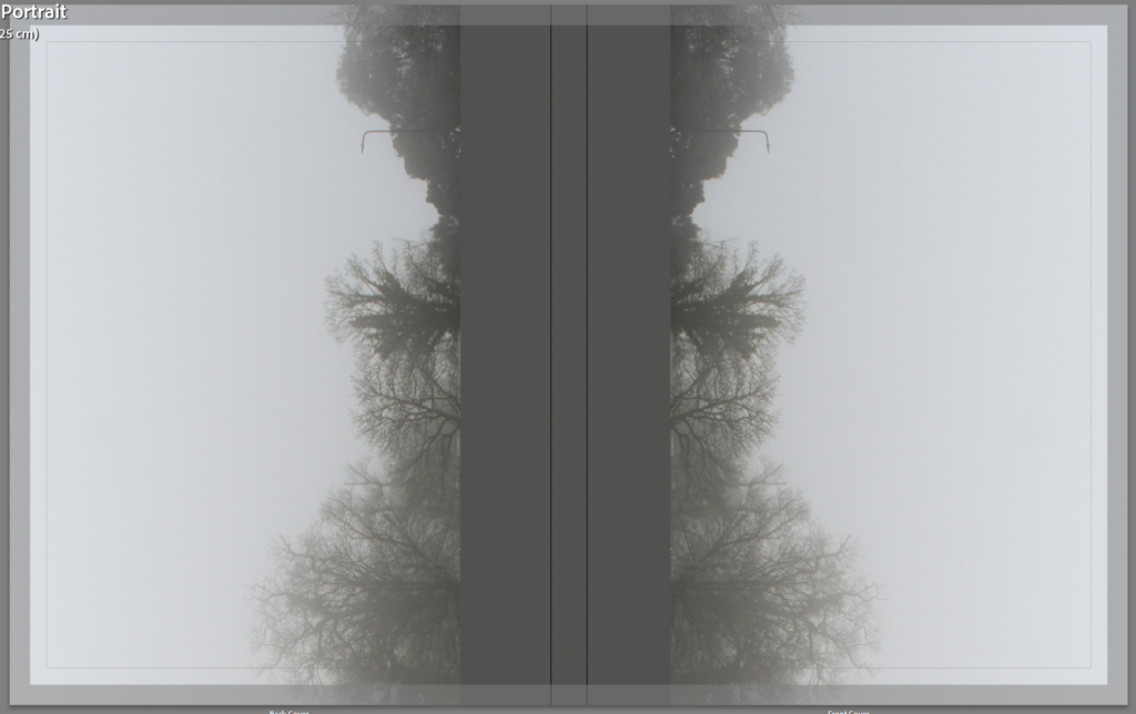
The single tree works best as portrait while the landscape looks better landscape or open. I decided on the landscape image instead.
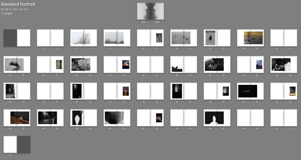
I will insert my essay as a newspaper clipping between pages 68/69.
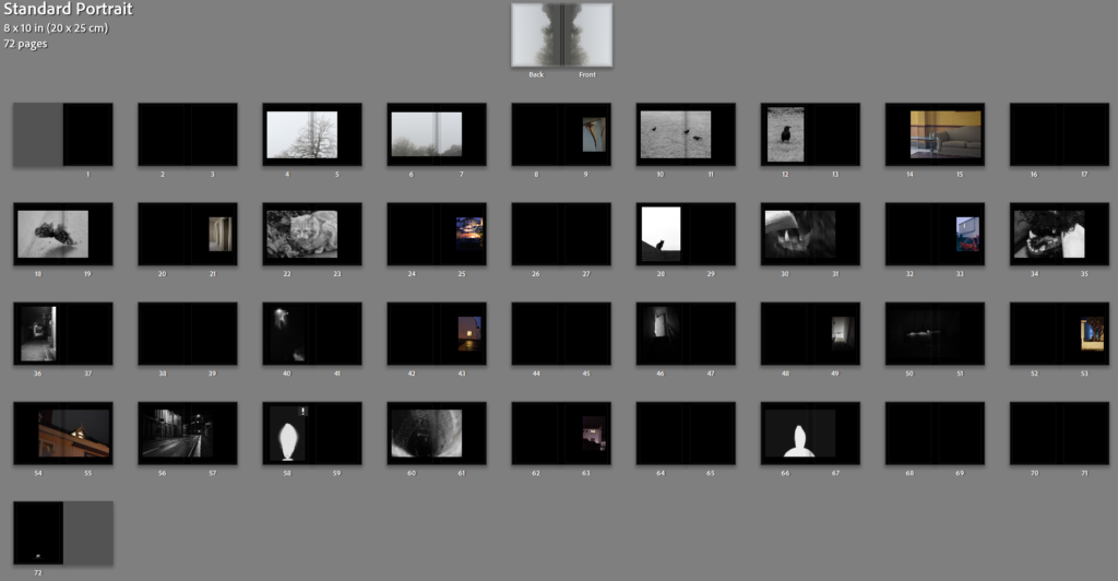
I tried with black pages and grey pages too.
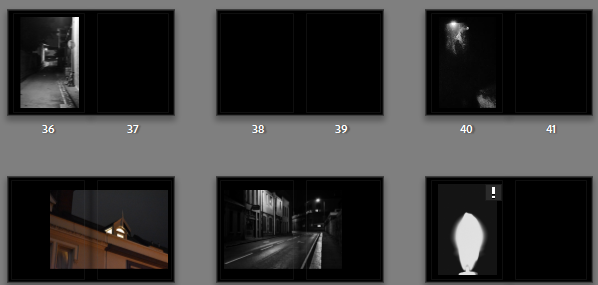
Black pages create a much darker overall appearance. I like how this looks for the darker pictures like these^ however for lighter images like these I’m not so sure on the black pages:

Additionally i tried multiple shades of grey:
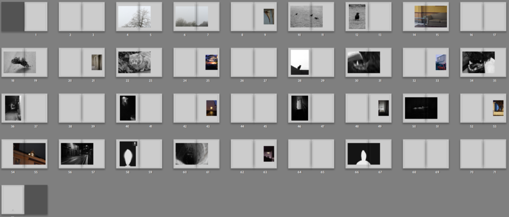
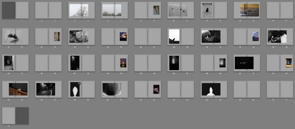
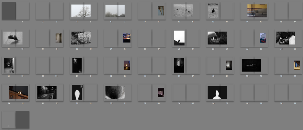
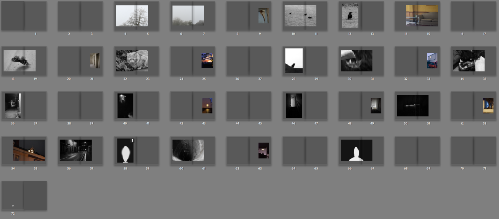
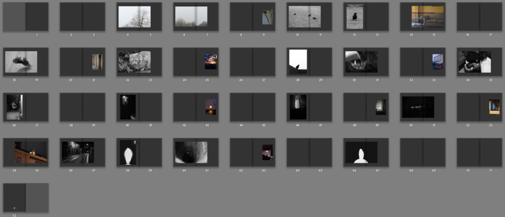
I think that the lighter grey works best because it matches with he cover as well as being darker than bright white for the dark images and light enough for the lighter images. I added the essay at the end in columns and added the title and name to the cover.
