Here is an online link to my photobook- Age of Innocence
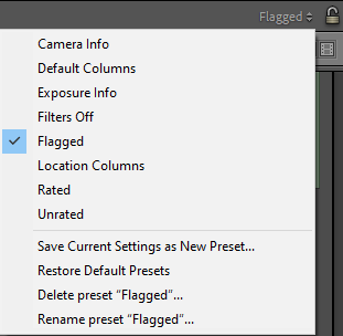
To start with this process, I carefully selected around 20-25 images I was sure I wanted to include in my photobook. To do this, I used the flagging system in Lightroom so it was clear which ones I would be using. I then transferred these images from my ‘Photobook’ folder to my ‘FINAL’ folder. To create my photobook I am using Adobe Lightroom Classic.
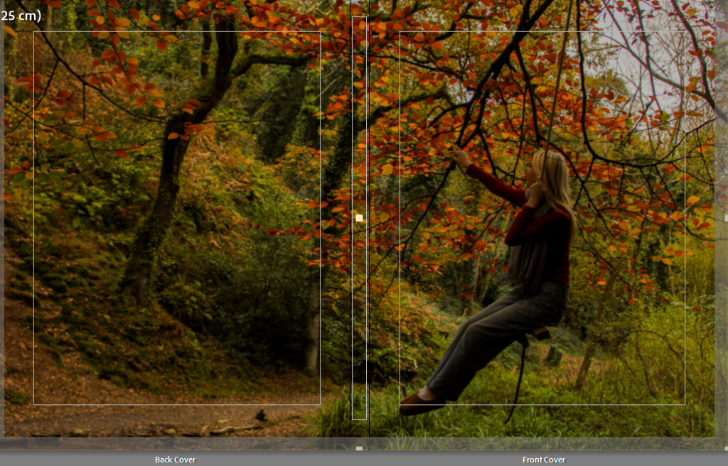
Front and back cover:
From these 26 final images, I chose which image I would like to use as my front and back cover. I picked an image which stood out to me as there is an array of vibrant colours and it can be stretched over the entire book cover.
Initial cover:
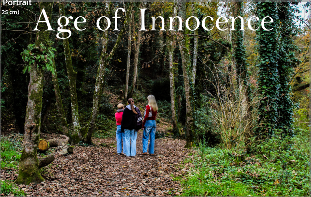
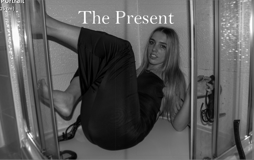
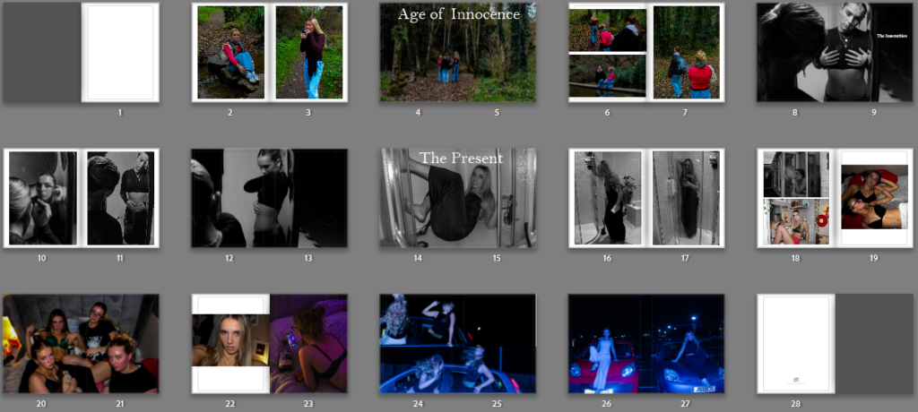
From this, I sorted my images into three sections. One as the beginning of my book under the title ‘Age of Innocence’. Second is the middle part of my book, which is completely black and white, under the title ‘The Insecurities’. Finally, the ending of my book which is under the title ‘The Present’. These sections represent the different narratives I am trying to present, which could be seen as a reflection of a teenage girls’ life. Viewers are able to create their own versions of the narrative, although I am aiming to create the main messages.
First draft of the three section’s front covers:

These are my initial ideas for the first photo in each section.
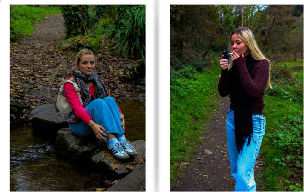
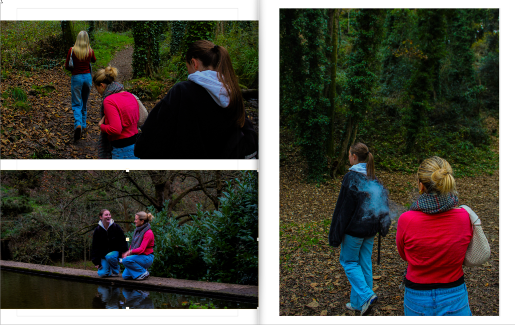
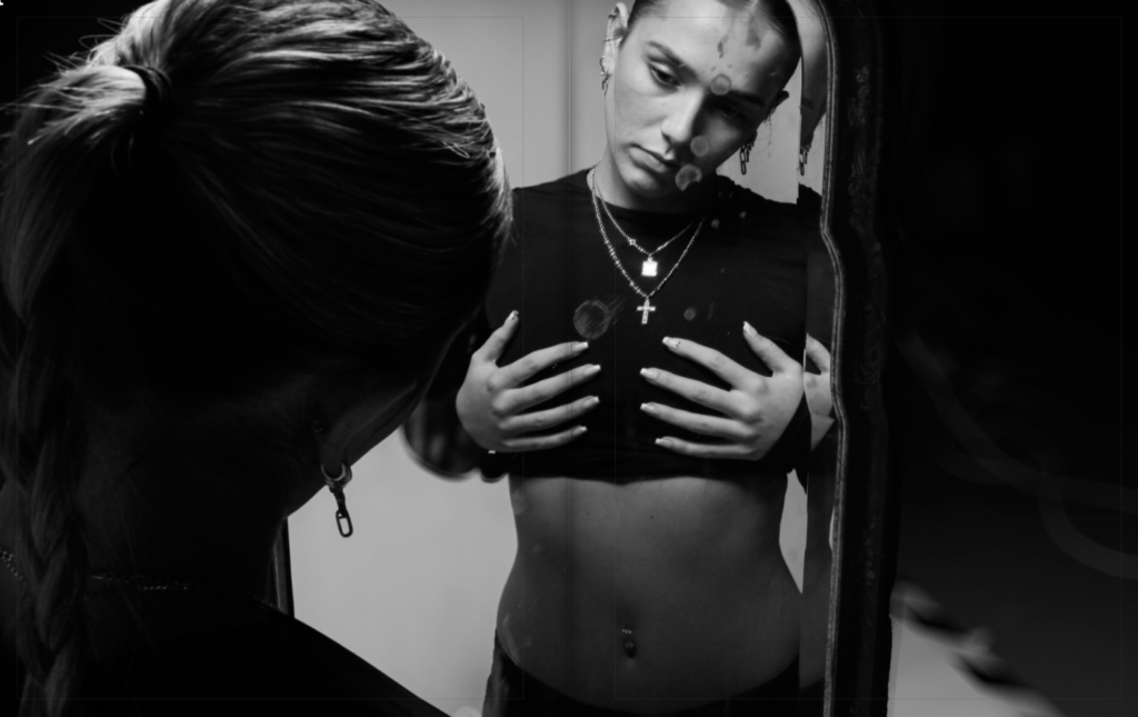
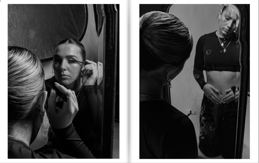
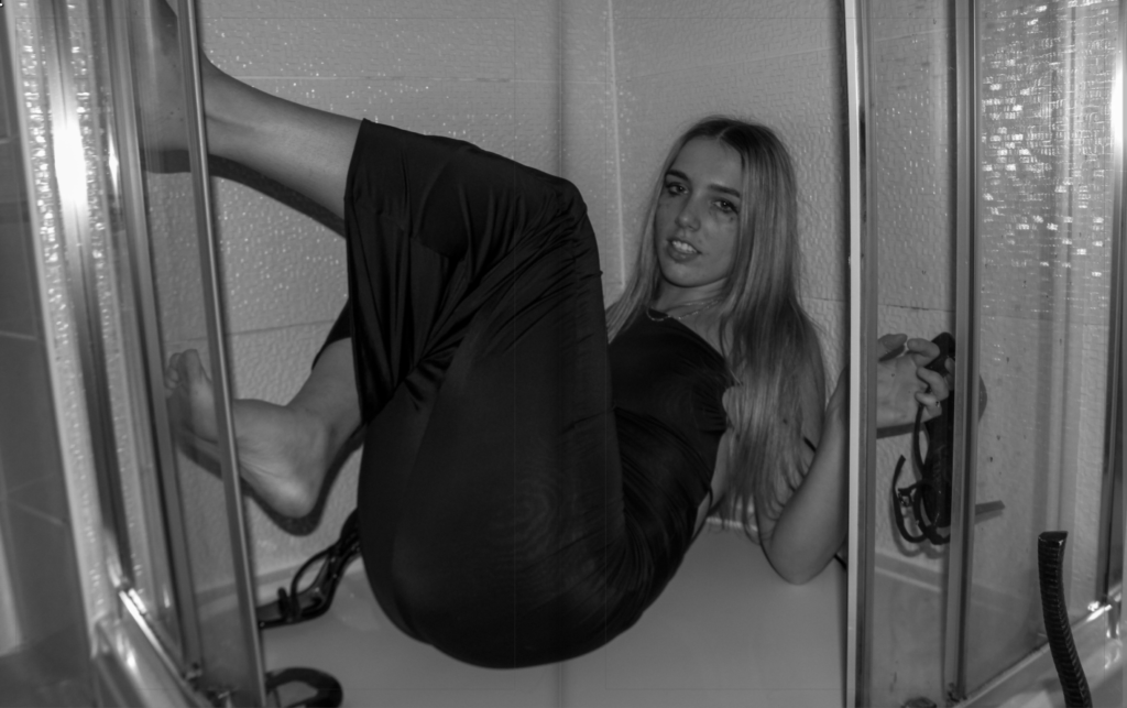
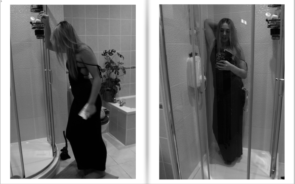
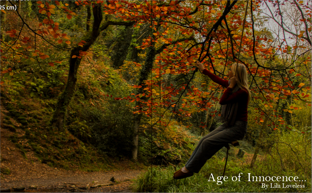
Throughout the photobook, I am hoping to present feelings connected to colours and tones of my images. For example, the entire ‘Age of Innocence’ section is beautifully colourful and bright, reflecting nature and happiness within the girls. This section metaphorically represents ‘time before social media’ for girls and how everyone was so carefree in society. The middle section, ‘The Insecurities’, is entirely black and white, to show how depressing and low girls feel when they gain insecurities, which could be from scrolling through social media and seeing numerous photos of other women who they may feel threatened by. Finally, the last section ‘The Present’ is an attempt to show the lives of girls that have gone a little bit off the rails with their friends, due to the effects of social media and it’s impact on how girls react to it.
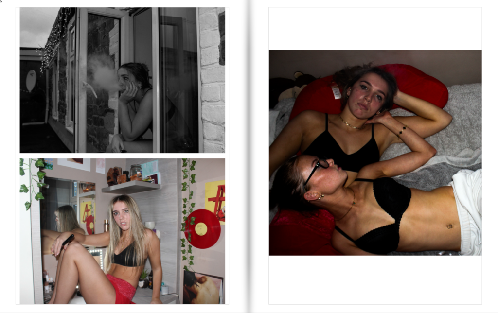
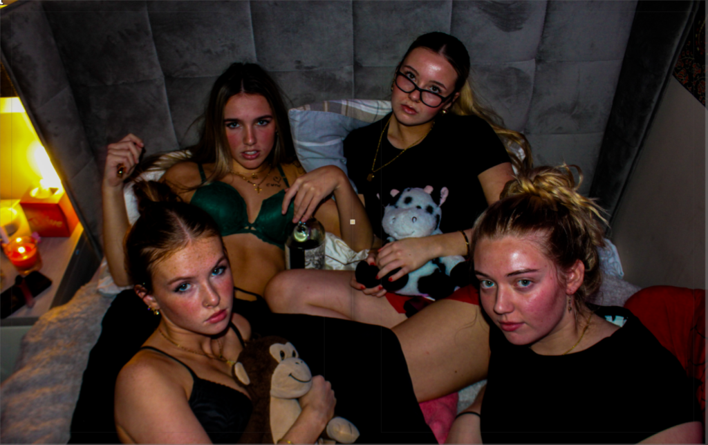
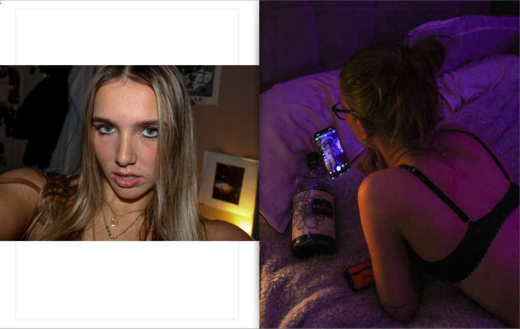
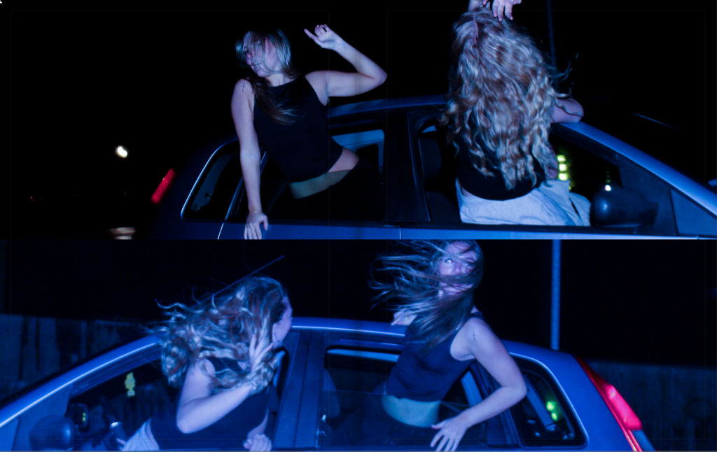
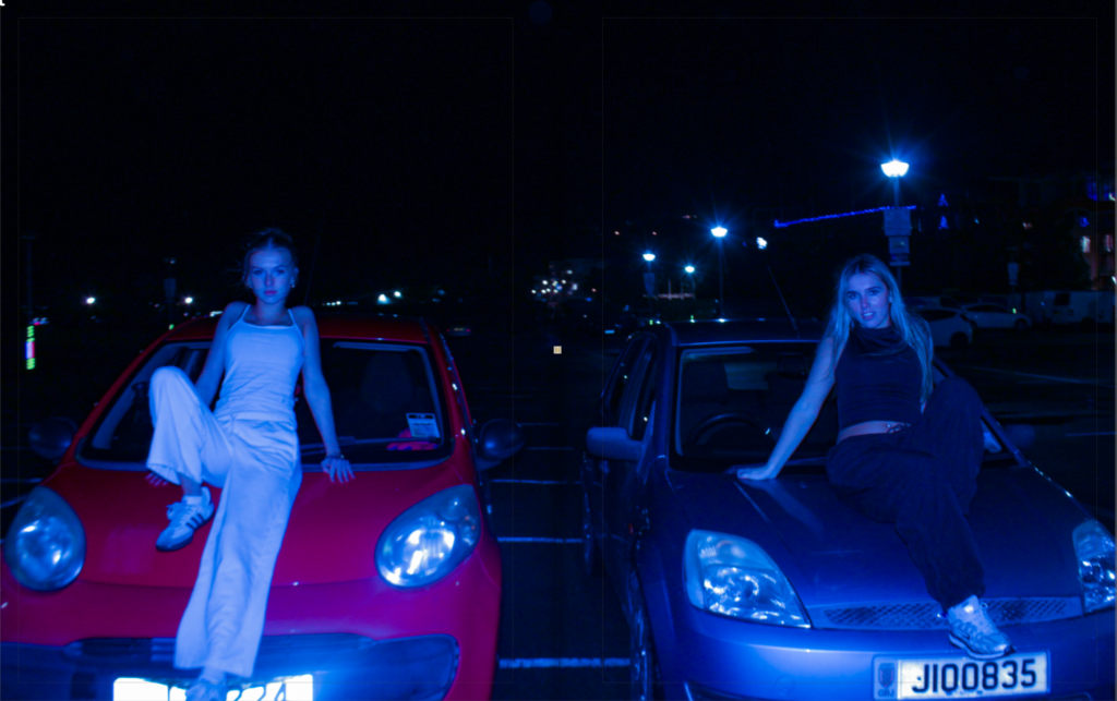
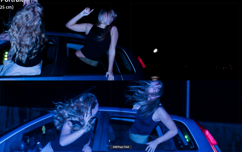
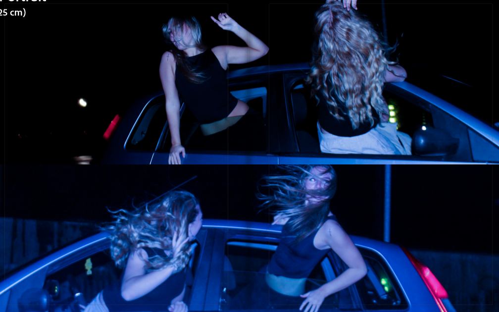
In the last section, I used a range of colours and tones to convey different moods of the photograph. For example, the black and white photos are representing a drunk, lonely girl, who is seen invested on her phone. The coloured images represent sensuality and an intimate feminine connection. Lastly, the bluey toned images convey freedom and rebellion, as we see the subjects hanging out of a moving car at night time.
Final front cover:
Final edits:
Initial:
Final:
Initially, I had both of these images their original way. I started experimenting and thought about flipping one of these images horizontally to make it inverted. I definitely preferred the inverted image as it made the whole photo look more central.
Initial layout:
Final Layout:
I decided to remove the subheadings for the start of each photoshoot as I felt it was more powerful without them and can leave viewers questioning on the narrative behind the images.