Photobook Specification
Narrative
Narrative: What is your story?
Describe in:
- 3 words – Everchanging Built Environment
- A sentence – The contrast between old and new architectural styles.
- A paragraph – My photo book will display the difference between old and new architectural styles, particularly the fine details in older buildings in comparison to the geometric shapes and harsh edges in newer buildings. I would like to display this polarity as I want to show how both styles, in their own way, have beauty. There is beauty which can be seen within the time and effort put in to the design and creation of old, striking buildings with lots of detail but there is also lots of beauty in the abstract style of modern buildings and the technicality of their design. Ultimately, the narrative of my photo book will be the journey through time from old to new architectural styles and how they both can be seen as remarkable.
Design
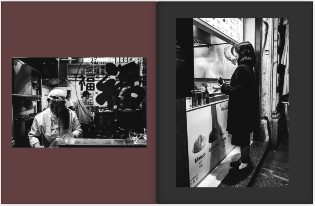
I would like for my book to be Standard Portrait with a hard cover. I would like a Matte finish for the paper as I think that it is the best option for my black and white images. This is because I feel like it’ll make them look more ‘clean’ and make the ink ‘pop’. Furthermore, for the title I think that I will be straightforward and name it ‘ARCHITECTURE’ as it sums up what the whole book is about. In terms of design and layout, there will be a theme of black and white images throughout the book, with none in colour. These images will each be displayed/laid out to what best suits their proportions. By this, I am referring to if I had a portrait image I would not lay it out to be landscape as it would cut off parts of the image or distort it. I would like to create a link within my book between old and new architectural styles by using images which display both styles adjacent to each other or images of buildings which have been retrofitted/refurbished.
Inspiration for Design and Layout
Here are some photo books which I am inspired by in terms of their design and layout:
Introspective – Marco De Waal
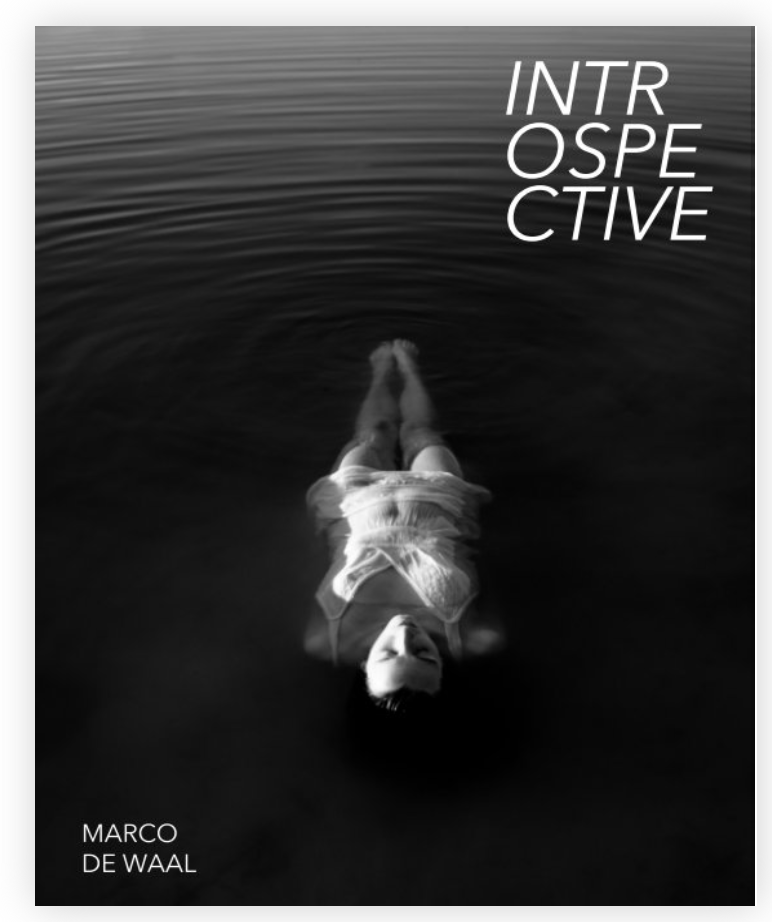
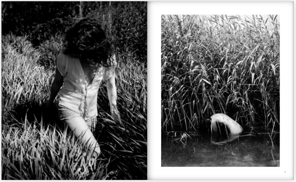
I like how this photo book has a theme of black and white, alike what I am wanting to do, and I like how he lays out his images in different ways. For example, some of his page have one larger and one smaller frame but others may have two of the same sized frames or a double page spread. This is what I would like to do for my photo book as it makes it more interesting and efficacious. He has carefully made sure that there is balance between the pages in the book and that there are no two double spreads with the same layout one after the other.
Poco Tempo – Rikamosan
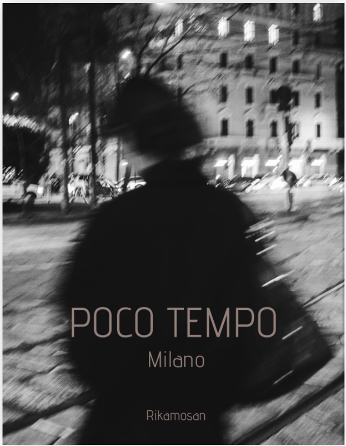
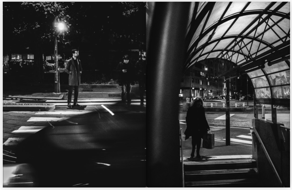
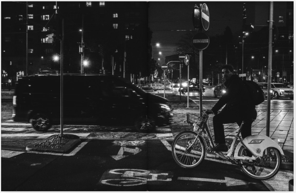
I like this photo book for the same reasons as the previous. I also like the use of colour to diminish the boldness/darkness of the images as they have harsh contrast. I also like how with some of the double page spreads you can’t tell whether it is one image or two separate images.
I found the above books on the BLURB website, the website in which I will be purchasing my own completed photo book.
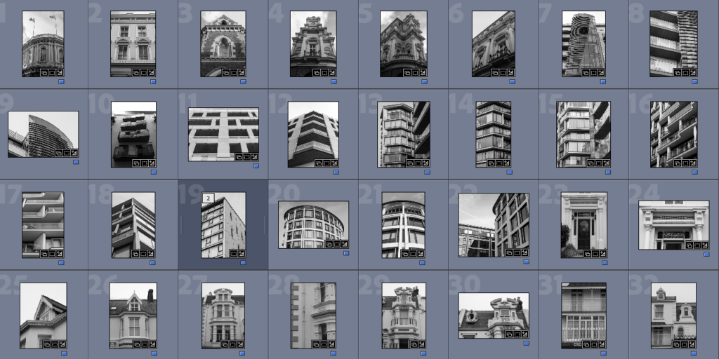
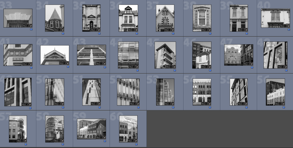
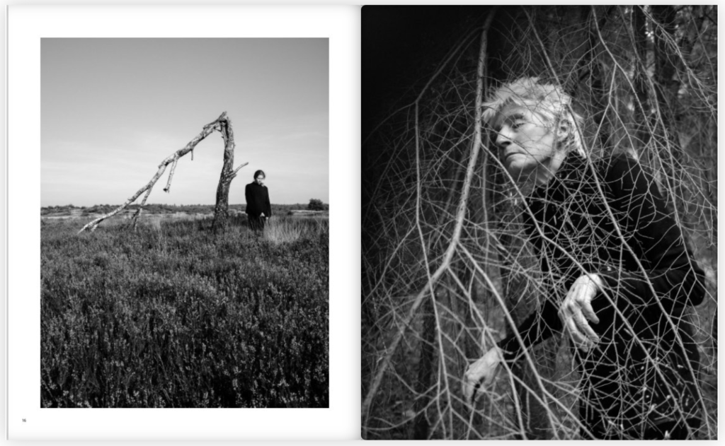
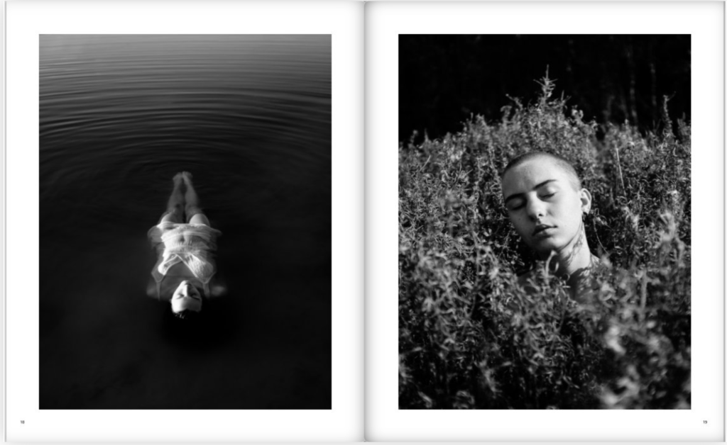
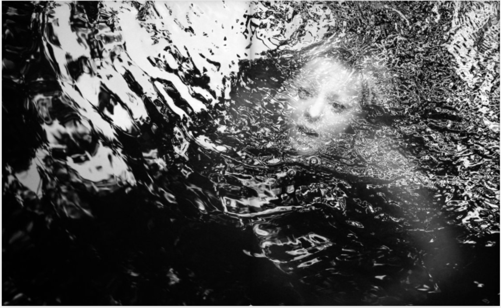
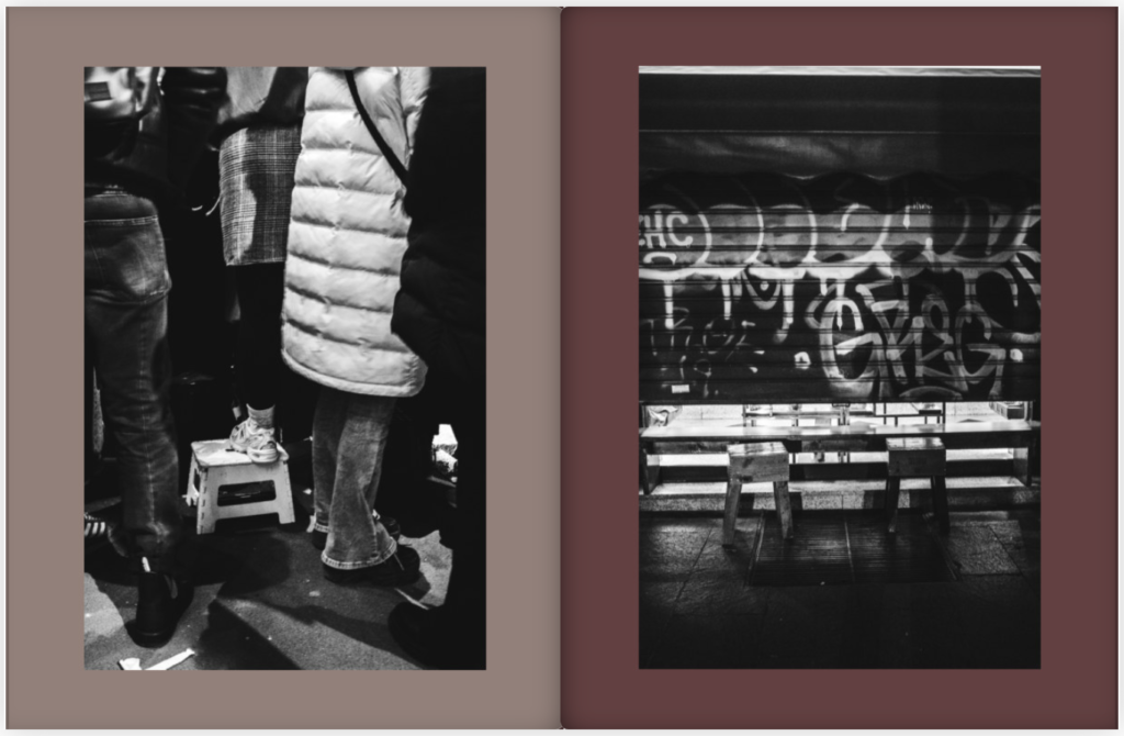
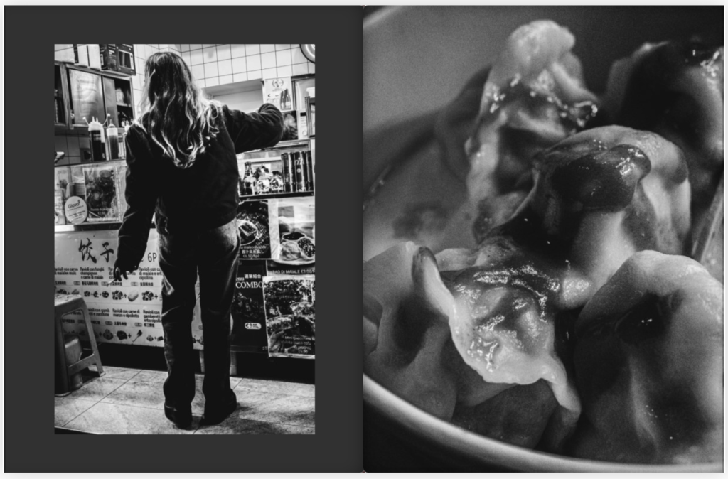
Best Images
These are my best images which I will be using in my Photobook: