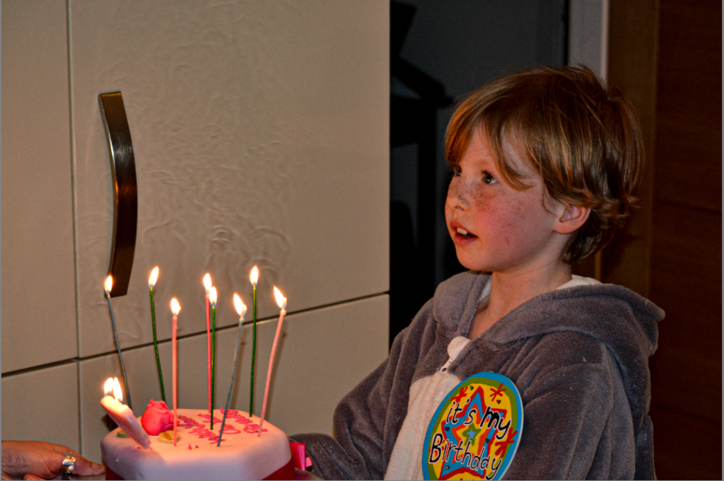
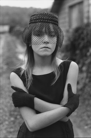
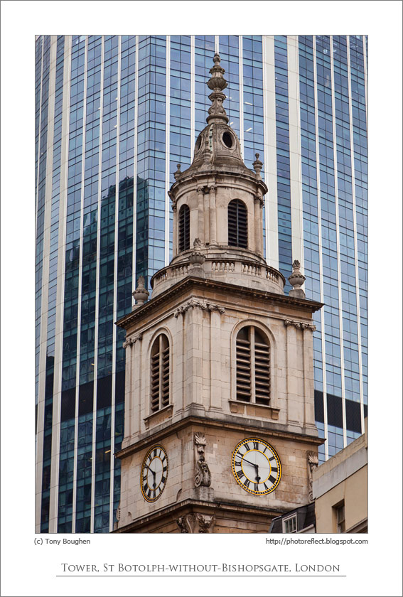
Photobook

My online photobook: https://www.blurb.co.uk/bookstore/invited/10551639/9effd457a602a0ec97cc56155316cb6cb1c6ecd7

To make my photobook, I commenced by adding all of the photographs I wanted to use into a folder on Lightroom. I then selected the book option at the top which then put them all into a book format. I decided to not put an image on the first page of my book and add a poem about identity instead. I did this to set the tone for the book and enable the viewer to understand what the concept behind my book is. I then chose to add my images from the photoshoot ‘who am I?’ at the start as I think it was a good reflection of what I wanted the beginning message of my story to be (someone struggling with their identity). Upon reflection, I decided to make these images black and white instead of in colour to symbolise a loss of identity.

Next, I incorporated my images inspired by Manny Robertson whom creates masks on top of people’s face, showing how everyone hides who they really are in order to avoid being judged. To follow up, I added my Brno Del Zou/ David Hockney inspired images. I slowly began to include colour into my book here as I included two versions of the image: the first all in black and white and the second with some boxes of colour. I then added images from my smaller project I did alongside this about AI. I thought this would fit into my book as I wanted to explore how these AI technologies we have enable people to create completely false versions of themselves online (essentially disguise their true selves).

For my last pages, I used my photographs from my Aneta Ivanova photoshoot and Marcelo Monreal photoshoot. I chose to use these as in my replication of Ivanova’s work, I added pictures of places and people who had a personal connection to the model inside of her, which is ultimately a part of her identity. This was the beginning to her slowly embracing her identity. Lastly, I used the Marcelo Monreal images last as the flowers blooming from inside her shows how freeing and beautiful it is to finally accept and embrace yourself for how you are. As I looked over my photobook again, I decided to add some pages which included a singular full sized image of a model to create some more variety in my work and make it flow smoother between my different artist inspired work. To finalise my book, I added an image of a girl with her head in her hands on the cover page and added the title ‘Beneath The Surface’. I then kept the back cover empty with a black background.

Overall, I like how my photobook regarding the theme of identity turned out. Throughout my project, I got to explore the different ways in which identity is expressed in different artist’s work. The wide range of perspectives surrounding the topic sparked my curiosity and was what ultimately inspired me to create my book around the idea of the journey of identity, which is often complex and chaotic. My photobook commenced with photographs inspired by the artist David Hockney, whom highlights the concept of identity being fragmented and often difficult to understand in his series called the ‘joiners’. In response to his work, I decided to take my own studio portraits of one of my peers from multiple viewpoints. I then collated these images together to create a distorted yet cohesive image, reflecting the state of her mind which is evidently a mess as she is unsure of who she really is. I decided to finish my photobook with images inspired by Marcelo Monreal, who delves into the idea of embracing identity and yourself for who you are. I think my photobook successfully conveyed the concept of the journey of identity as it begins by exploring identity from a negative perspective and then leads into a more positive viewpoint. Additionally, I like how I made the images at the start of my book black and white then slowly introduced more colour into my images as the book continued. I did this to symbolise the idea that the models are slowly regaining their sense of identity. However, one improvement I would make to my photobook is adding a few more pages of just singular, full page images as a lot of my photobook is filled with multiple images put together and writing, which makes it slightly cluttered.

Experimentation with images

For this image I’m increasing the contrast and the exposure to make the brick wall and the rocks stand out and look a lot clearer against the sea.

With this image I increased the shadows to make the rock shadows darker and look more ominous and I also increased the whites so the sun in the corner of the image is a lot brighter.

I decreased the exposure in this image to get the photo darker and then I clicked the masking tool to edit the subject of the photo and the background of the photo separately. Then I increased the white stairs to contrast against the brick wall that I made darker.

I used the masking tool for this image and made the subject darker to create contrast against the white bars of the background. I then also increased the shadows so the lobster pots contrast against the darkened sky and the darkened wooden bridge.

Best Images

These are my best edited images that I’m going to put into my photobook. I have gone through all my images and rated all of my best photos 5 stars and made them green to show that they are my best images.

Final images for photobook:

Firstly, to start with my selection process of images, I moved all of my green rated images and some of my favourite yellow rated images into one folder on Lightroom named ‘Best Images’. From this, I then carefully selected my few favourite images from this folder and moved them into a different folder named ‘Photobook’. This allowed me to significantly reduce the amount of final images I had to chose from. The folder ‘Photobook’ also includes the edited images I could use.

Here is my selection rage of my favourite images, in which I am going to pick a final few to use in my photobook.

What went well?

I think that these three photoshoots were hugely successful as I achieved to create a narrative within my photos, similarly to Justine Kurland. I hope that viewers are able to create their own narratives for these photos, depending on how they want to view them.

Finally, I am going to create another folder named ‘FINAL’, in which I will transfer a few of my favourite images that I will be using in my photobook.

To do this, I will use the flagging system on Lightroom Classic to make it clear which photos I need to transfer to my ‘FINAL’ folder.

Final Photos for Photobook:

Archived photoshoot edits –

I really don’t want to change these photos significantly. I want them to obtain their authenticity, and I believe that altering them too much will take away from that. I have sifted through almost 2000 photos and narrowed it down to 15 photos that I believe will fit my project the best and tell a story individually as well as together.

Photo 1 –

Final edit –

Photo 2 –

Final edit –

Photo 3 –

Final edit –

Photo 4 –

Final edit –

Photo 5 –

Final edit –

Photo 6 –

Final edit –

Photo 7 –

Final edit –

Photo 8 –

Final edit –

Photo 9 –

Final edit –

Photo 10 –

Final edit –

Photo 11 –

Final edit –

Photo 12 –

Final edit –

Photo 13 –

Final edit –

Photo 14 –

Final edit –

Photo 15 –

Final edit –

Virtual gallery –

Photoshoot 2

selected images

I wanted this shoot to kind of represent both, by showing teenagers do go out and enjoy themselves, as well as showing teenagers can be lazy, go on their phones a lot and the self obsession in the way they look.

Possible images

However, after looking at these images with the rest of my images, i decided i didn’t like them together. They didn’t correspond with the story i was trying to make. So, i didn’t use them.

Final Images

These images are inspired by Justine Kurland. I went to a woodland area where there were loads of trees and bushes and also a pond. I used the tableaux photography technique to create these images. This meant that all of these images were staged to look like real life. The people in these images were staged to look like they were having fun in the woods and I wanted to portray a sense of freedom through the photographs. I was inspired by Justine Kurland’s images in her project “Girl Pictures” :

In “Girl Pictures” they are all taken in suburban areas where the girls in the pictures were rebelling in nature. In most of my images, there are 2 or more girls, this is because I wanted to shoe the interaction between girls and the female gaze. The images were staged to create a sense of protection between them and how they interact with each other in nature instead of isolated in a bedroom. For these images, I ensured that the sun was behind the camera so that the natural lighting was on the models instead of in the back of the images. Once I got all of my images, I transferred them onto Lightroom where I started editing them. I really like how these images turned out because of the way that the sun reflects onto the models to create a natural lighting. I also like how the models in the pictures are wearing white, this could show a sense of purity and how the girls are innocently playing together and instinctively protecting each other as a society of females.

These images are inspired by Mary Ellen Mark. I chose to take portrait photos to show emotion through facial expressions. In these images the girls look solemn. My aim in these photographs was for female viewers to relate to the images just like Mark did with her photos. I chose to put these images into black and white to add to the emotions of sadness and loneliness that some females experience through life and to connect with the idea of girlhood. In Mary Ellen Marks photos, she aimed to create a narrative of vulnerability within females and also how the females view the world that they live in. Therefore, this inspired me to create my own images to show the emotions of sadness that females go through in their lives. I was inspired by these images taken by Mark :

I used both of these photoshoots in my photobook because I like the contrast between the two emotions shown in the images. For the images inspired by Justine Kurland the girls are having fun in the woods and protecting each other through the connection of their friendship. It also shows the empowerment that the girls have on their on to make their own lives in a world full of stereotypes and and gender roles. It shows the girls rebelling against these two misconceptions of how girls are perceived. I really like how the images show that the girls look out for each other, especially in the image where the girl is leading the other girl through the woods as it shows trust within each other. In contrast to this, my images in which were inspired by Mary Ellen Mark are taken to show the vulnerability of girls. I chose to take these images with the girls on their own to show the loneliness that some girls experience through their lives. The images also have a black background which could foreshadow that females often feel like they’re in the dark or that they feel empty.

My First Virtual Gallery

For my first virtual gallery, I used my images inspired by Justine Kurland. I transferred all my images from my documents onto the gallery and positioned them in a way that was clear to see them all from one position. I used the best photos out of my photoshoot, the ones that I thought best portrayed the connection of the girls with each other and nature. I put a brown border on my images to match with the brown colour of the woodland and I like how it turned out.

My Second Virtual Gallery

For my second virtual gallery, I used only my images inspired by Mary Ellen Mark. I displayed them in a way that all images could be seen fully. I didn’t add any border because I didn’t want the focus to be drawn away from the image.

Personal Study: Further Experimentation

Experimentation 1

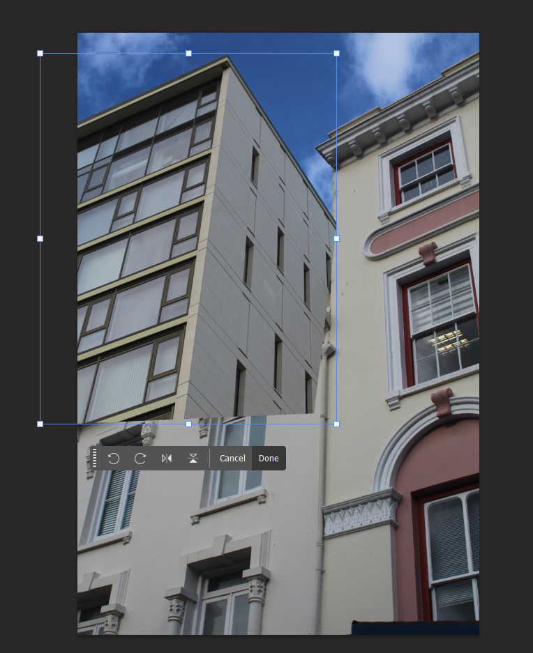
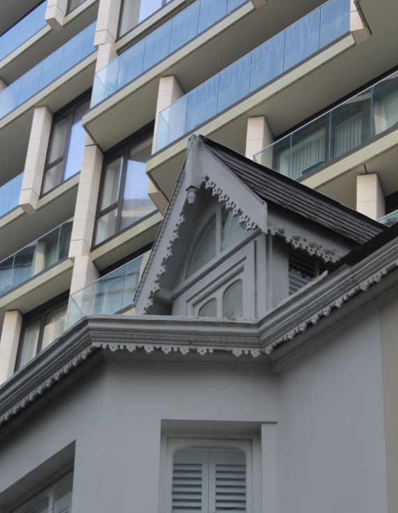
For this edit, I wanted to try and make it look like there was a modern building towering behind a historic one. Firstly, I started by cropping the image and copying it to then paste it on top of the other in Photoshop. I then used Ctrl T > Distort to move the image and change the perspective to make it more realistic.

Once I had the building in place, I used the eraser tool to erase the edges that were overlapping the other building. To make this a bit easier, I lowered the opacity of the layer so that I could see the layer below.

Finally, I flattened the layers and put the image in B&W and adjusted the brightness and contrast. This was my final result. It didn’t turn out quite as good as I expected as it makes me question whether it actually looks real.
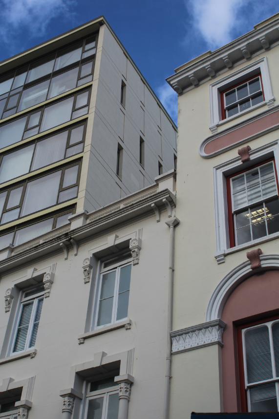
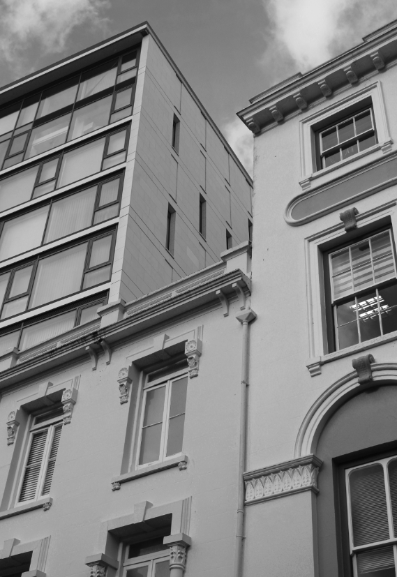
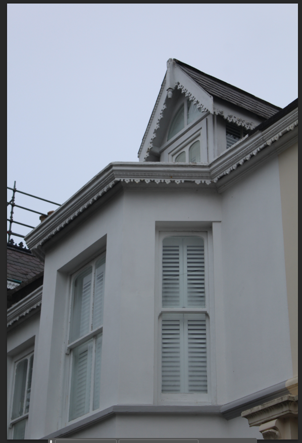
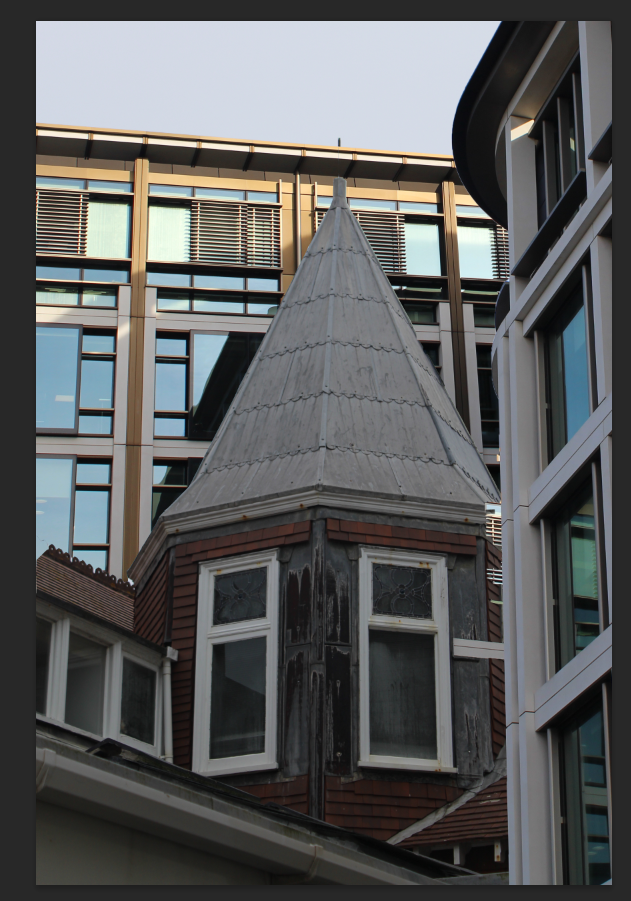
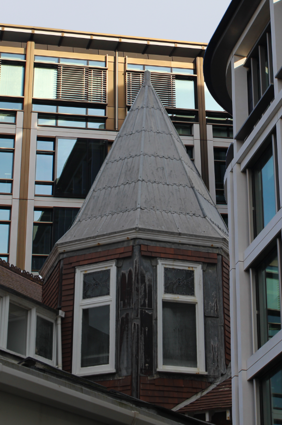
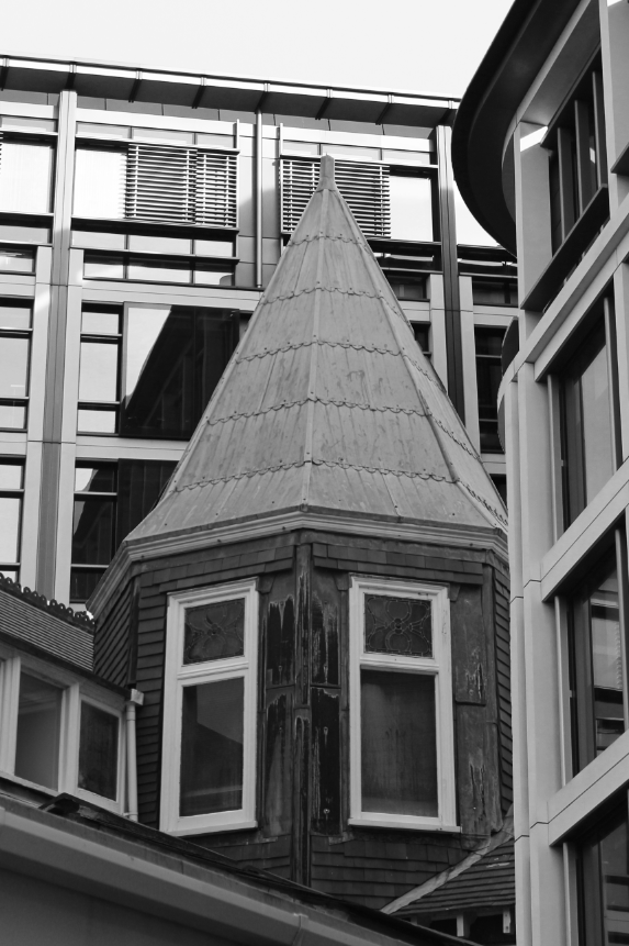
Experimentation 2

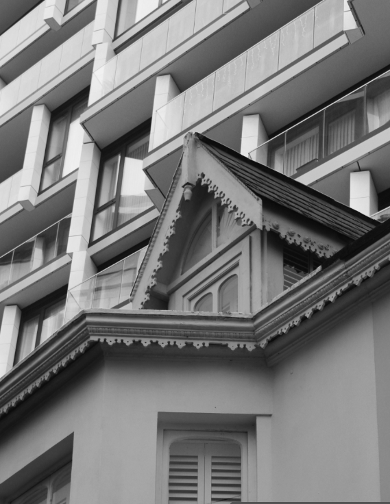
For this edit, I wanted to use an image of part of a historical building and create a background behind it using a modern building. I started off by using the quick selection tool to select the building and paste it onto the other.

Here is the building on top of the other I played around for a bit, adjusting the positioning of the layer.

I then cropped the full image and made some further adjustments.

I then erased a little part of the older building which looked out of place.

This is my final result in B&W, after increasing the brightness and contrast. I think that this image looks better than the previous but still not very realistic.

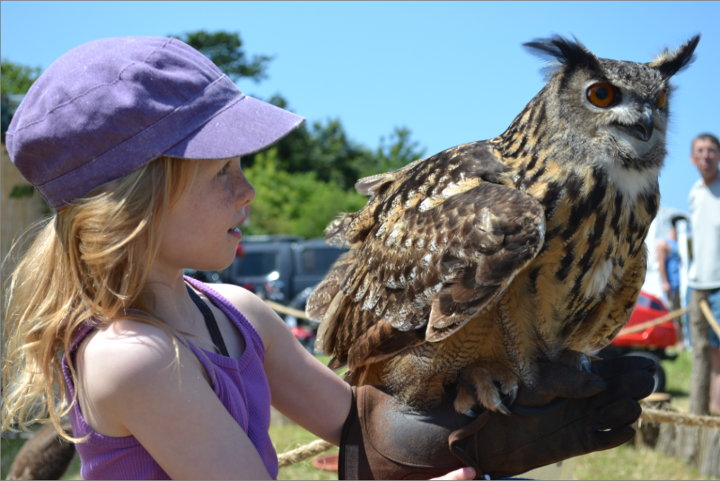
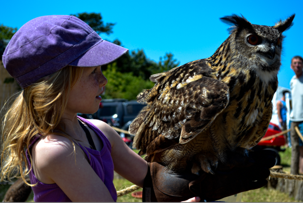
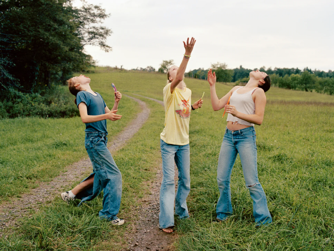
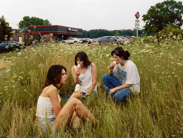
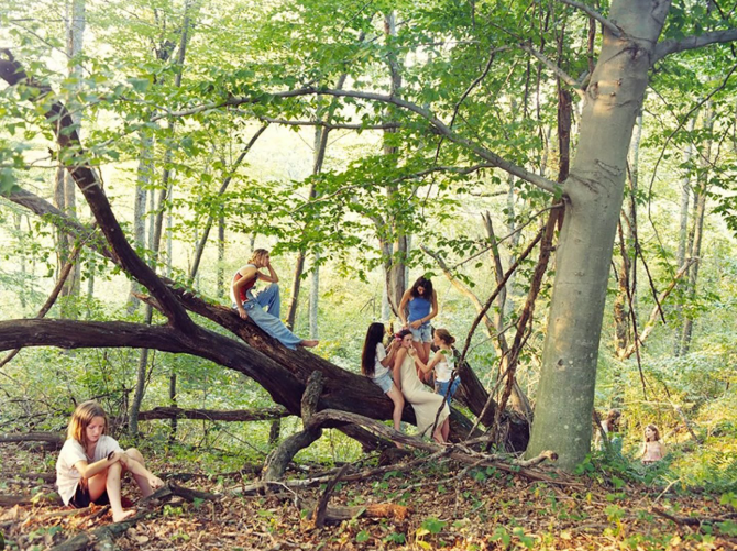
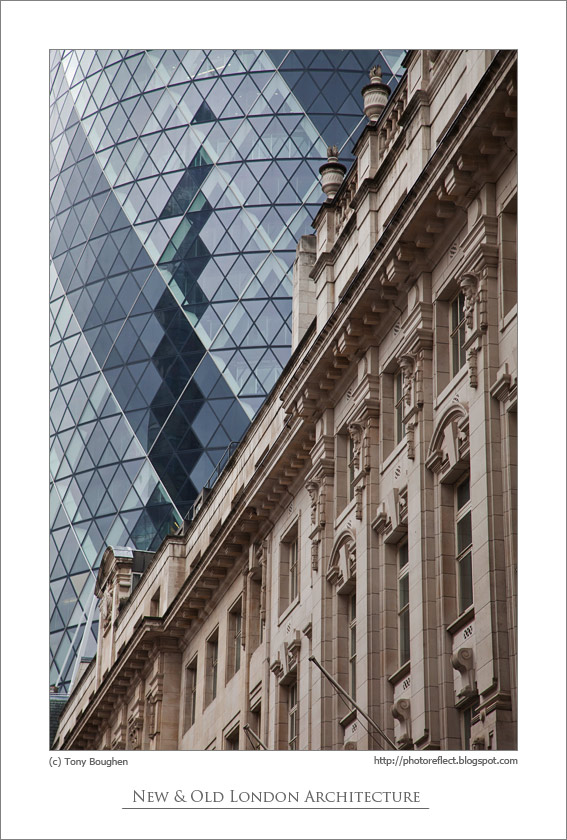
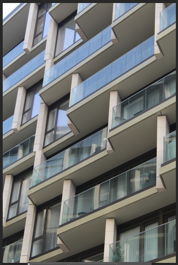
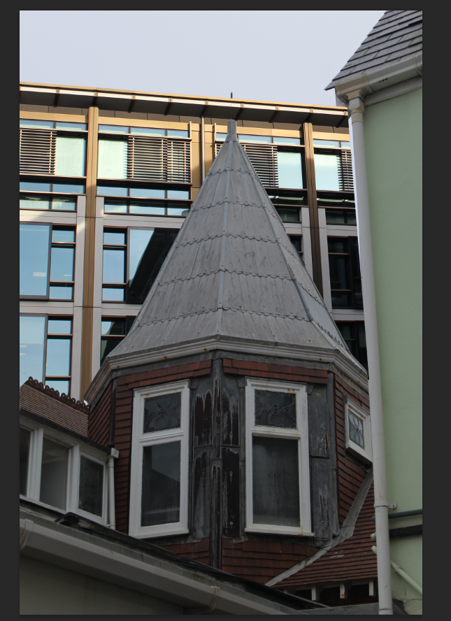
These are the images which inspire me, however they’re not edited and they are in fact real which is why mine doesn’t look great compared. I also don’t have access to settings like the ones photographed in Jersey as there aren’t many high-rise, especially ones adjacent to old buildings as the high-rises are mostly on the Waterfront which is a new/modern area.
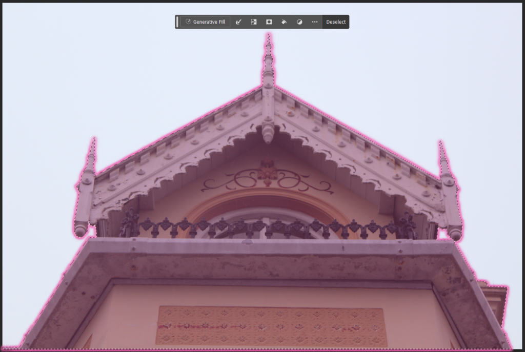
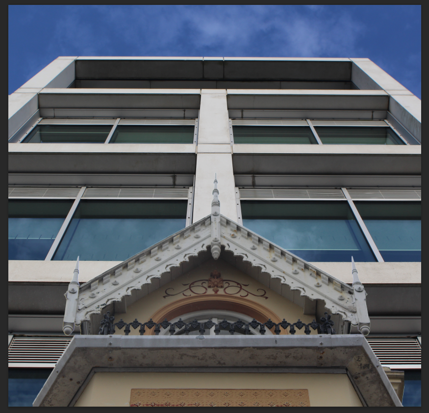
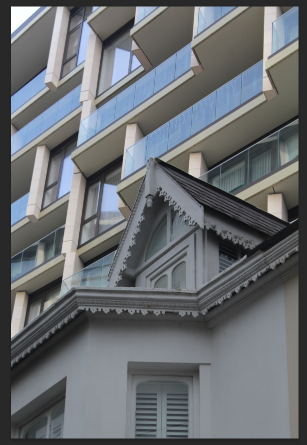
Experimentation 3

I tried to do the same thing again for other images. I started off my opening them both in photoshop.

I then used the object selection tool to paste the layer on top then adjusted it.

I cropped the image at top and moved the layer slightly down.

Finally, I put the image in B&W and increased the brightness and contrast for my final result. I think that this looks more realistic to the previous edit of mine as it looks like it could have been taken in a built up residential area.
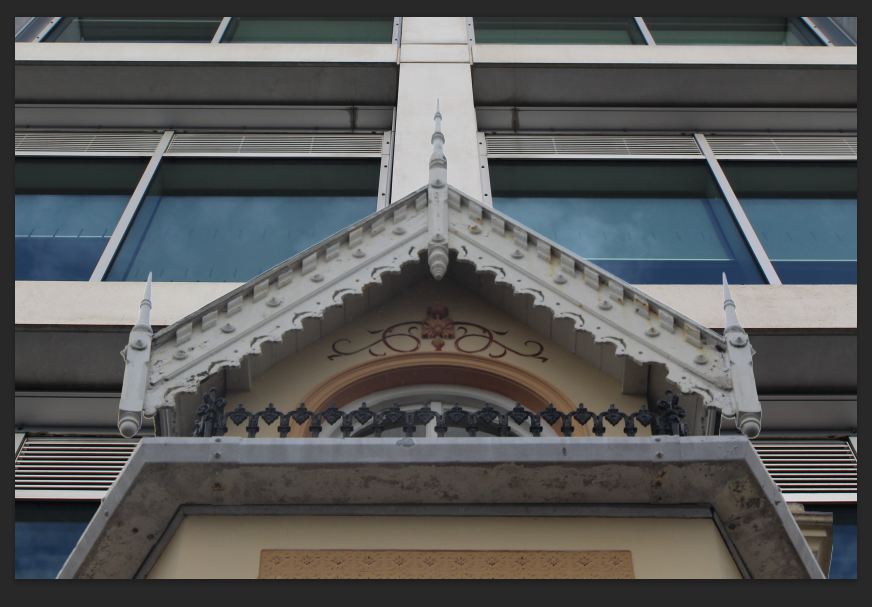
Experimentation 4

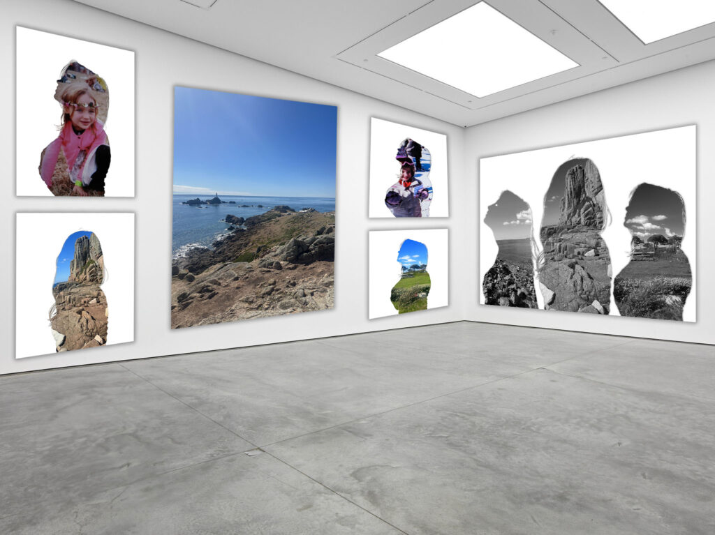
For this edit, I wanted to make it more interesting and have a combination of 3 buildings. I started off by selected the older building and creating another layer with just the parts I wanted. I then pasted one of the buildings in and made sure that it was the layer below so it didn’t overlap the other building.

Then, I added in another layer to the side of the image which was of another building, this building being on top of the older one.

I then erased the edges of the previous layer I had added.

Finally, I flattened the image and put it in B&W then increased the brightness and contrast to get my completed result. I personally think that this is the best experimentation edit yet as it looks the most realistic.

For this image and the previous two, I wanted to represent the difference in styles between old and modern buildings and how modern/high-rise buildings dominate and tower over old ones.
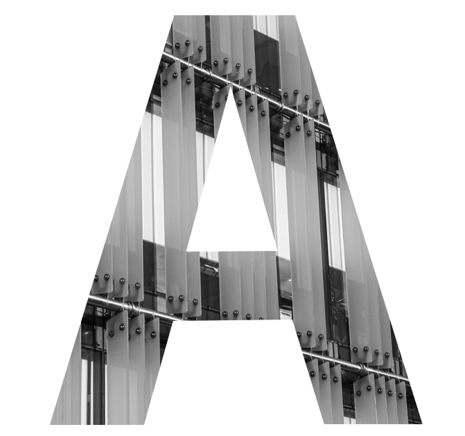
Experimentation 5

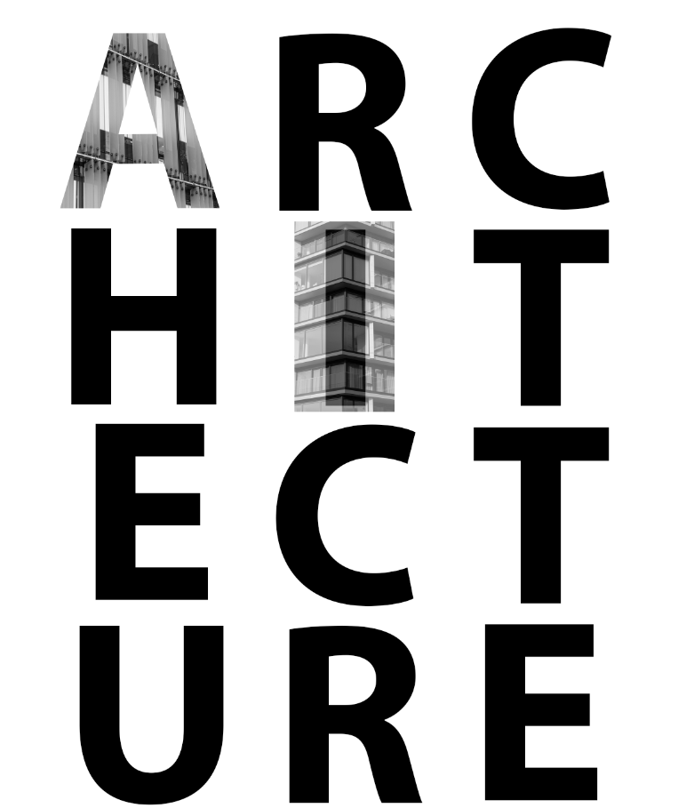
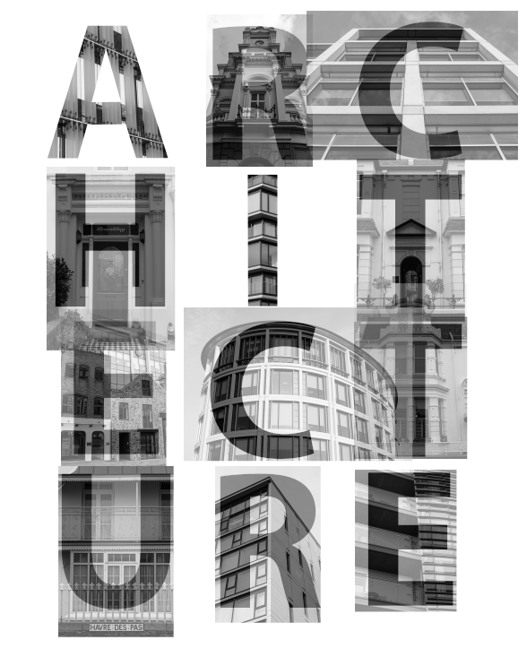
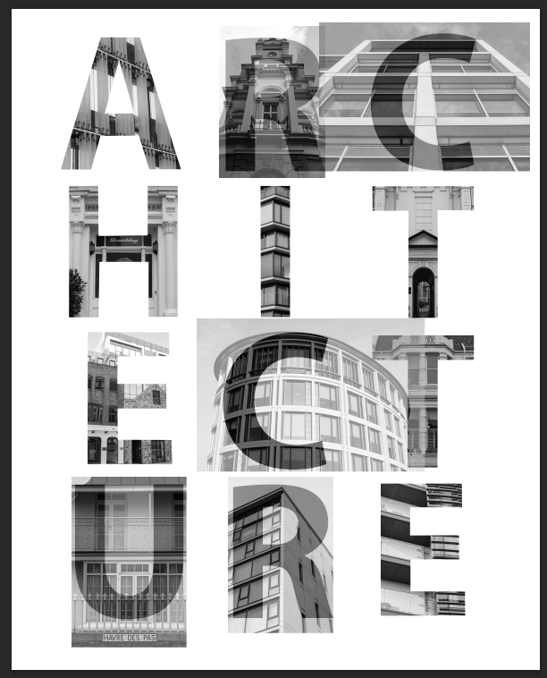
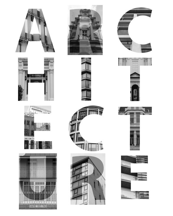
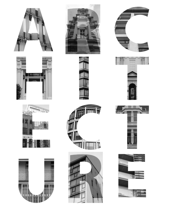
For the cover of my photobook, I wanted to have the word ‘ARCHITECTURE’ with each individual letter being and image. This is how I did it:

Here is the first A. Below I will show how I did this with another letter.

Firstly, I opened the image I wanted to use and created a background copy.

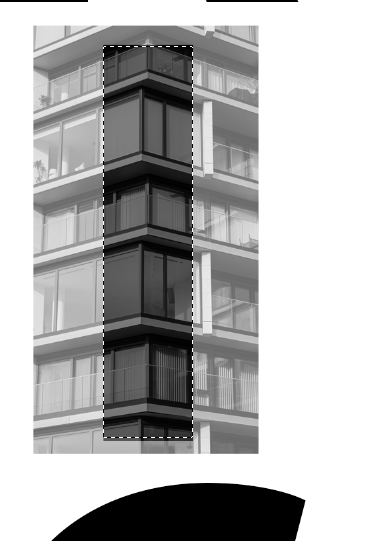
Then, I pasted the image onto the document with text and lowered its opacity so that I could see the letter below.

After that, I used the Polygonal Lasso Tool to select the image in the shape of the letter then select its inverse to delete the outside.

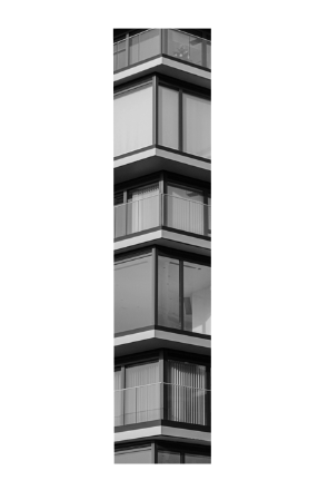
This was the result.

I then added in all my images on top of the letters I would like them to be. I repeated the previous process for all of the letters with straight lines.

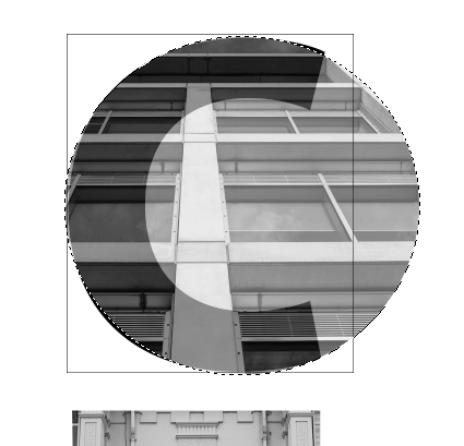
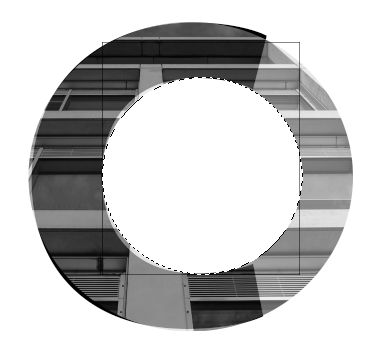
As for letters with a curve, I had a bit of a different process.

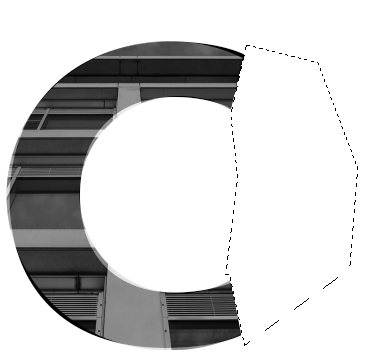
for the C, I used a square as a guide for the edges then the eliptical marquee tool to select the outline. I then selected the inverse and deleted the extrenal area. I then did the same for the middle of the C.

I then used the Polygonal Lasso Tool to get rid of the rest.

I repeated this for the other C.

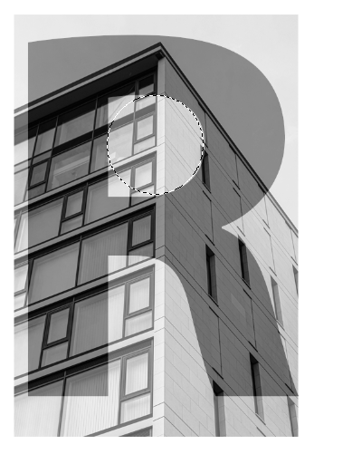
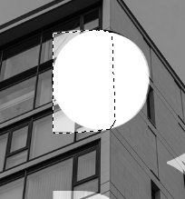
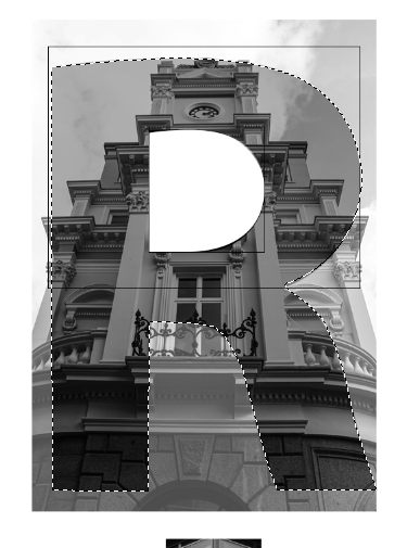
I then started the R’s by getting rid of the middle. I did this by, firstly, cutting out a circle. Then, using the polygonal lasso tool to delete the rest.

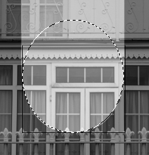
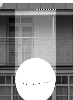
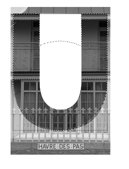
I then moved on to the middle of the U. I, once again, used a combination of the eclipse with a square and the polygonal tool.

I then finished the R’s by using both the eclipse and polygonal tools again. I used shift and alt to add and remove parts of my selection until I was satisfied with it.

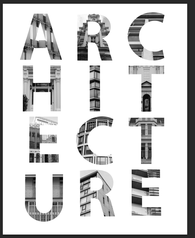
These are my finished letters:

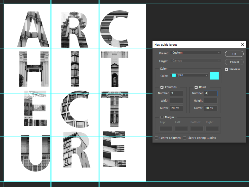
I then created a Guide Layout for the letter placement.

This is the finished product:

Final Images

The final 27 images I choose for the photobook were:

Overall I like interspacing black and white with colour and I feel as though my images create a general sense of discomfort. My favourite images were the figure and moth because of their simplicity. I included a total of 10 coloured images with 5 of them houses. I was worried that maybe there were too many coloured but I didn’t want to remove the colour from any of them either. If I arrange about one colour between every 3 black and white images then I feel as though they might be spread enough.

I decided to use one of the following images on my cover But I wasn’t sure which one.

They were all black and white which I liked for the cover and had different effects. The misty trees were more muted and mysterious while the birds and butterfly were more symbolic. I liked the crows because they have certain superstitious qualities but I also like the moth because its wing was broken and it was left essentially paralysed. I felt as though they were both potentially too busy for the cover though and decided to flip and use the tree.

The final images I choose for prints were the following 6:

I want a variety of sizes with 4 A4 and 2 A5. The Lift and the sofa will be A5. The figure, moth, salt and house will be A4.

Virtual Gallery

Overall I think some of these images are much stronger than others. I think I needed more images to buff up the photobook and create a clearer narrative. I think I had enough coloured images but I should have more black and white images in comparison. I think I’ve created a strong set of images covering multiple bases of fears from superstitions to more specific scenarios such as broken lifts and aggressive dogs with additional images between to keep it constantly changing.