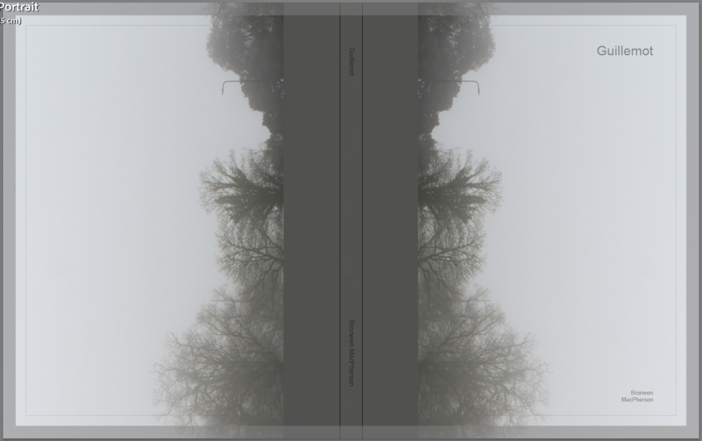
I wanted the cover to make sense from both sides to follow both narratives. I choose this image because it is hazy and soft and somewhat dream like.
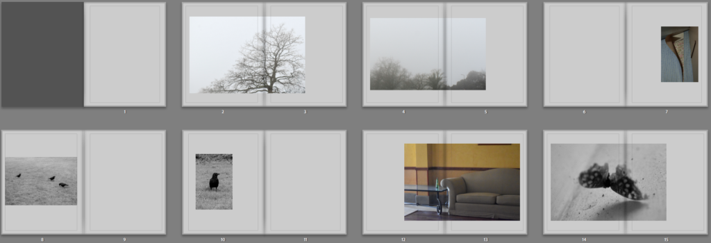
I put both mist images together so that the narrative would start light and outside while still being somewhat mysterious. I then interspaced with peeling wallpaper because its like peeling back a brave face. I put both images of birds together, starting with the further and honing inwards. I interspaced with another coloured one this time the sofa because its still peaceful and quite close. Following birds that can fly I choose the moth to contrast as its flightless.
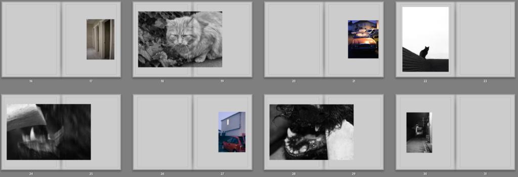
I wanted to interrupt the cats and dog because the images have shifted from peaceful to somewhat aggressive with the dog, broken car and higher contrast. The cats I made sure to start with the more peaceful one and put the second more mysterious one next.
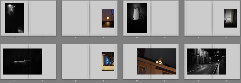
Following the more aggressive images I put together the more eerie images which continued the high contrast sequence.
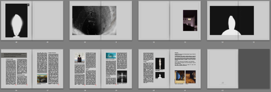
To round off I choose the most abstract dark ones.
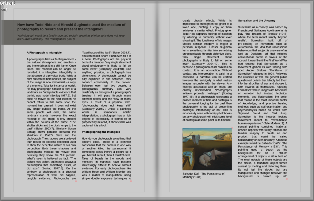
For the final layout I shrunk down all the blurry images so that they would print best and made sure that the black and white images were arranged differently to the coloured ones. I liked how the contrast between the human coloured images and natural black and white images looked when separated within the book. I put the essay at the back of the book instead of the front so that I could start right away with images which I thought was the most effective layout. I also had most of the lighter images at the front, staring off with soft and light images and gradually becoming much darker with harsher lines compared to the effect of mist.
