A sentence – The contrast between old and new architectural styles.
A paragraph – My photo book will display the difference between old and new architectural styles, particularly the fine details in older buildings in comparison to the geometric shapes and harsh edges in newer buildings. I would like to display this polarity as I want to show how both styles, in their own way, have beauty. There is beauty which can be seen within the time and effort put in to the design and creation of old, striking buildings with lots of detail but there is also lots of beauty in the abstract style of modern buildings and the technicality of their design. Ultimately, the narrative of my photo book will be the journey through time from old to new architectural styles and how they both can be seen as remarkable.
Design
I would like for my book to be Standard Portrait with a hard cover. I would like a Matte finish for the paper as I think that it is the best option for my black and white images. This is because I feel like it’ll make them look more ‘clean’ and make the ink ‘pop’. Furthermore, for the title I think that I will be straightforward and name it ‘ARCHITECTURE’ as it sums up what the whole book is about. In terms of design and layout, there will be a theme of black and white images throughout the book, with none in colour. These images will each be displayed/laid out to what best suits their proportions. By this, I am referring to if I had a portrait image I would not lay it out to be landscape as it would cut off parts of the image or distort it. I would like to create a link within my book between old and new architectural styles by using images which display both styles adjacent to each other or images of buildings which have been retrofitted/refurbished.
Inspiration for Design and Layout
Here are some photo books which I am inspired by in terms of their design and layout:
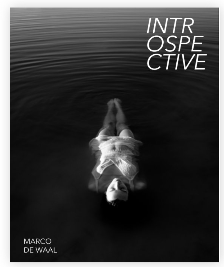
Introspective – Marco De Waal
I like how this photo book has a theme of black and white, alike what I am wanting to do, and I like how he lays out his images in different ways. For example, some of his page have one larger and one smaller frame but others may have two of the same sized frames or a double page spread. This is what I would like to do for my photo book as it makes it more interesting and efficacious. He has carefully made sure that there is balance between the pages in the book and that there are no two double spreads with the same layout one after the other.
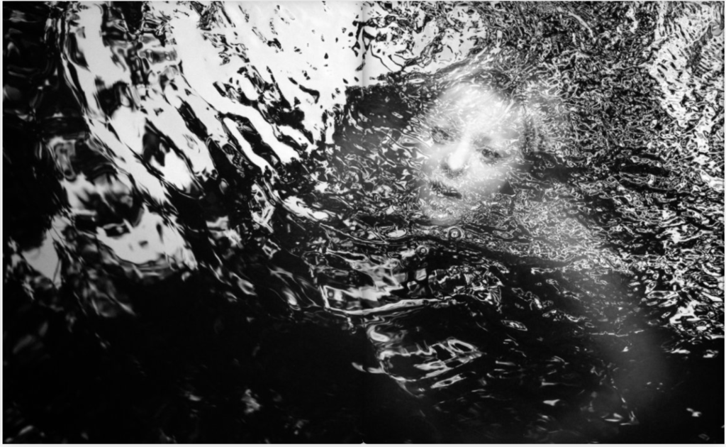
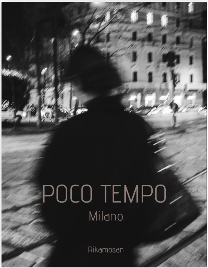
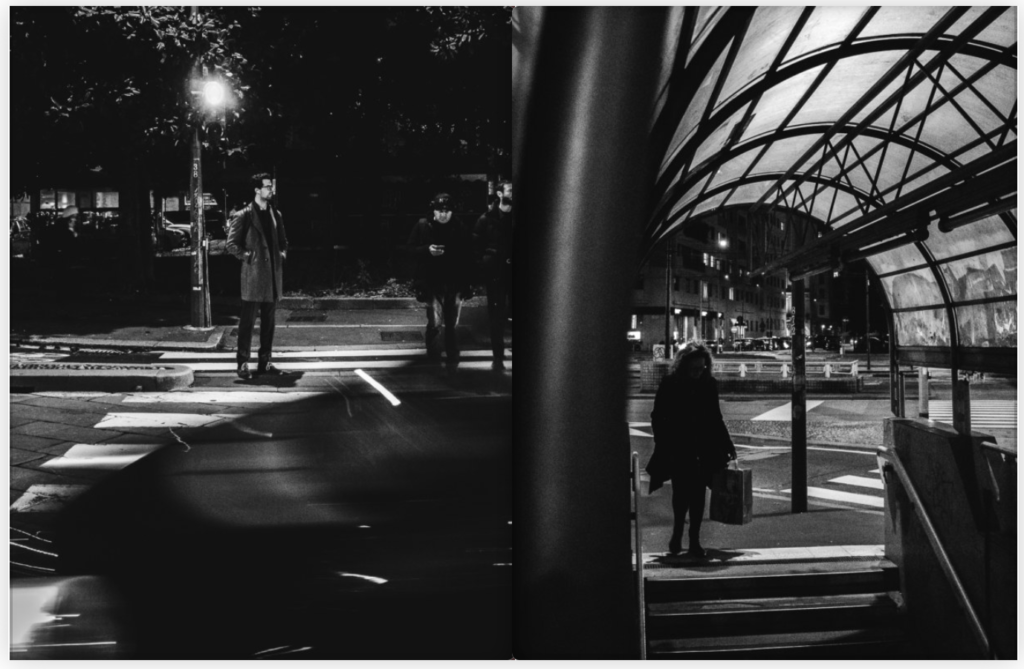
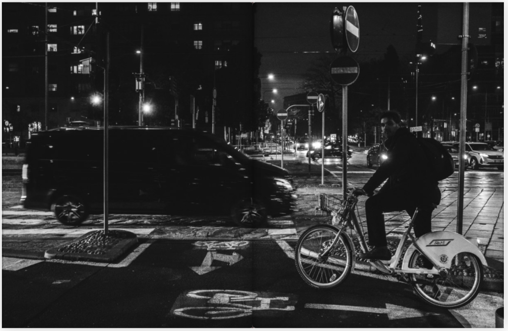
Poco Tempo – Rikamosan
I like this photo book for the same reasons as the previous. I also like the use of colour to diminish the boldness/darkness of the images as they have harsh contrast. I also like how with some of the double page spreads you can’t tell whether it is one image or two separate images.
I found the above books on the BLURB website, the website in which I will be purchasing my own completed photo book.
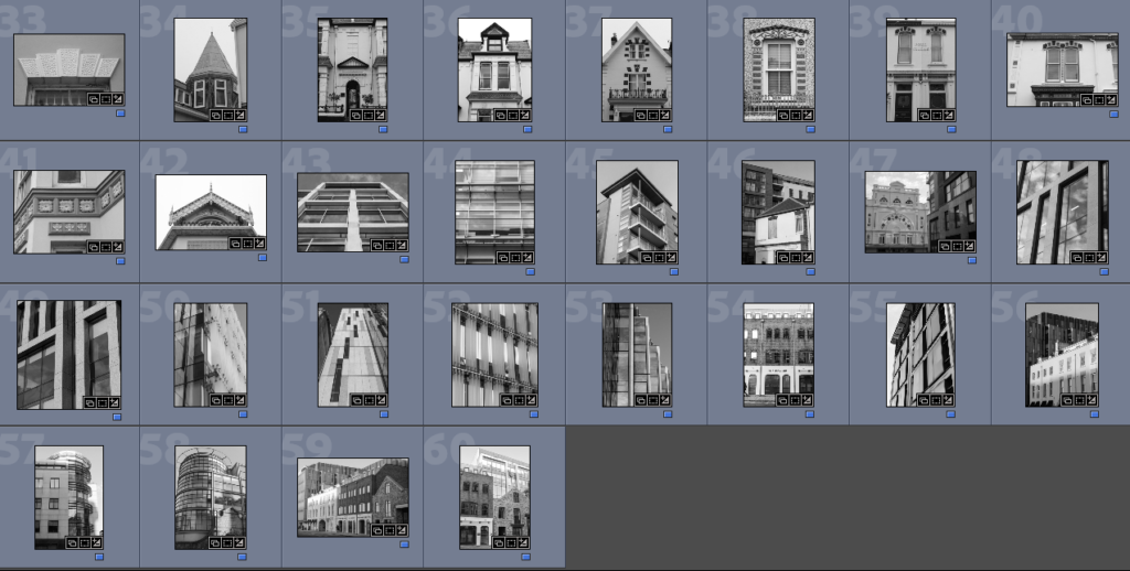
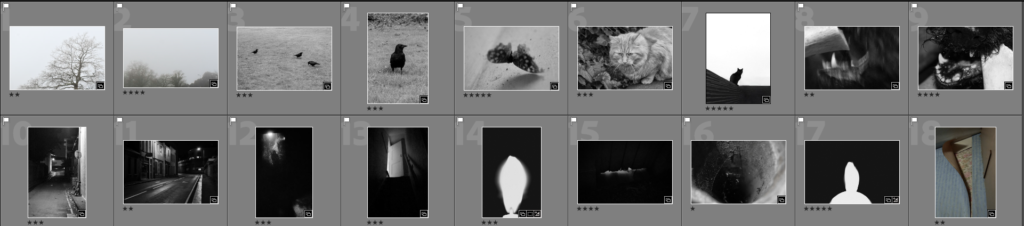
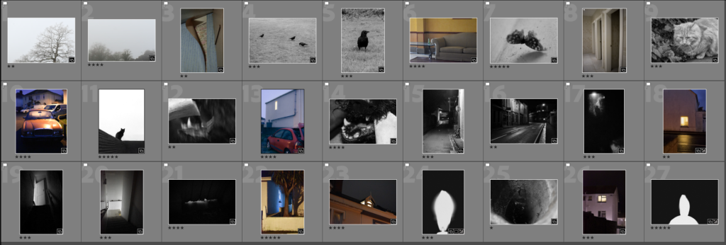
Best Images
These are my best images which I will be using in my Photobook:
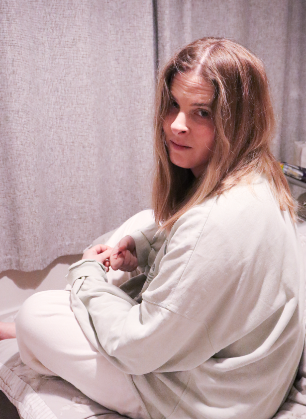
I wanted the cover to make sense from both sides to follow both narratives. I choose this image because it is hazy and soft and somewhat dream like.
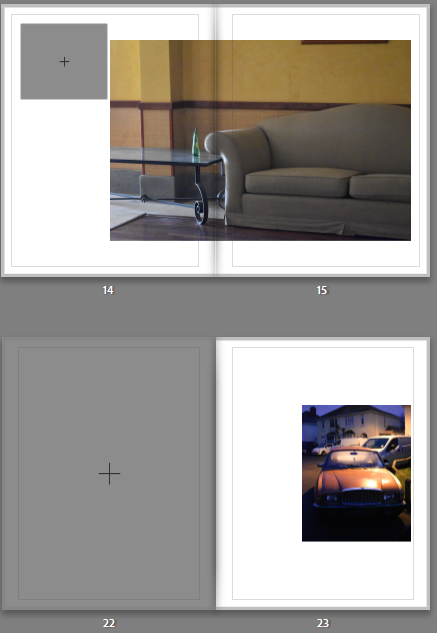
I put both mist images together so that the narrative would start light and outside while still being somewhat mysterious. I then interspaced with peeling wallpaper because its like peeling back a brave face. I put both images of birds together, starting with the further and honing inwards. I interspaced with another coloured one this time the sofa because its still peaceful and quite close. Following birds that can fly I choose the moth to contrast as its flightless.
I wanted to interrupt the cats and dog because the images have shifted from peaceful to somewhat aggressive with the dog, broken car and higher contrast. The cats I made sure to start with the more peaceful one and put the second more mysterious one next.
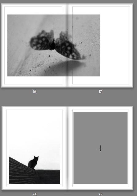
Following the more aggressive images I put together the more eerie images which continued the high contrast sequence.
To round off I choose the most abstract dark ones.
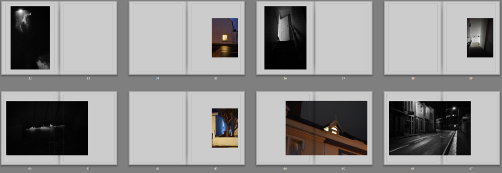
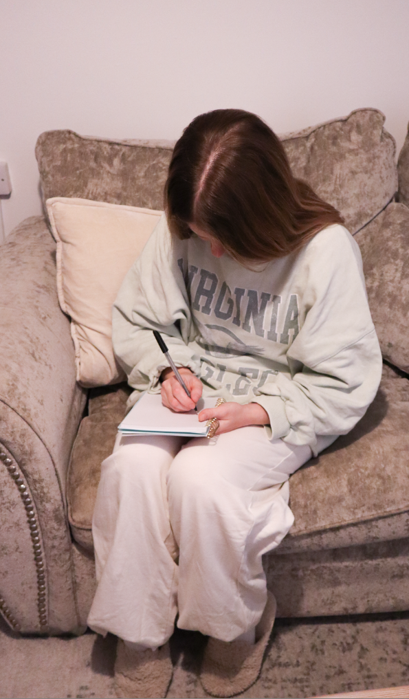
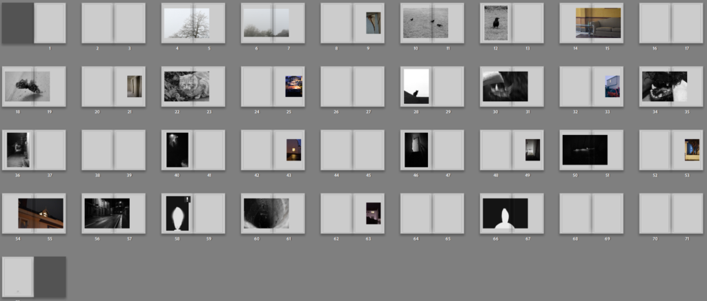
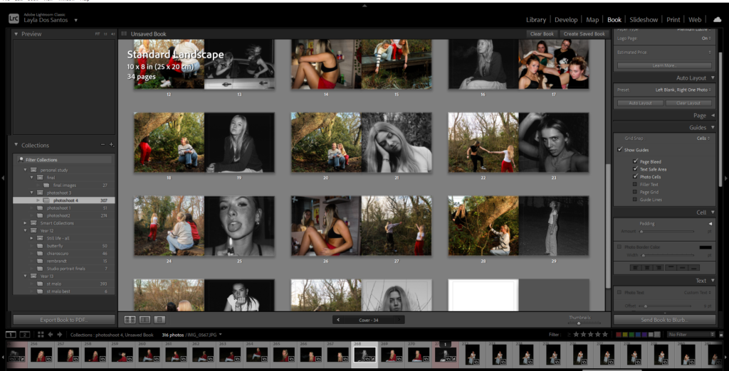
For the final layout I shrunk down all the blurry images so that they would print best and made sure that the black and white images were arranged differently to the coloured ones. I liked how the contrast between the human coloured images and natural black and white images looked when separated within the book. I put the essay at the back of the book instead of the front so that I could start right away with images which I thought was the most effective layout. I also had most of the lighter images at the front, staring off with soft and light images and gradually becoming much darker with harsher lines compared to the effect of mist.
1. Write a book specification and describe in detail what your book will be about in terms of narrative, concept and design with reference to the same elements of bookmaking as above.
Narrative:What is your story? Describe in:
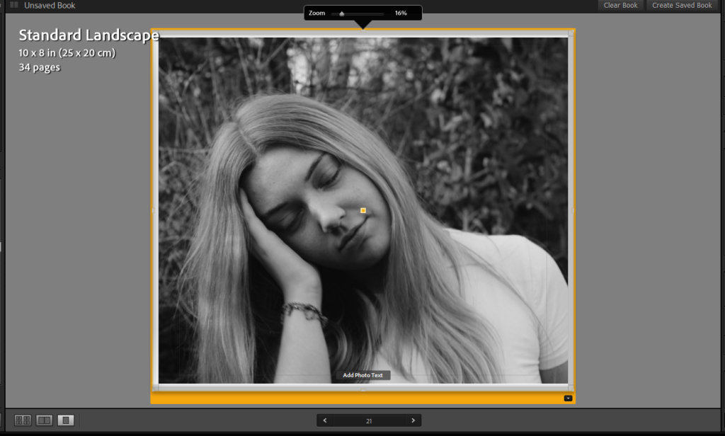
3 words
Athlete, Difficulties, Passion
A sentence
It will be about a passionate basketball player who strives to be the best.
A paragraph
This story is about a player called tony who is a passionate basketball player. His room is filled with basketball items, and he’s always trying to be better than his teammates. He doesn’t participate in activities with his teammates as he’s worried he wont live up to them.
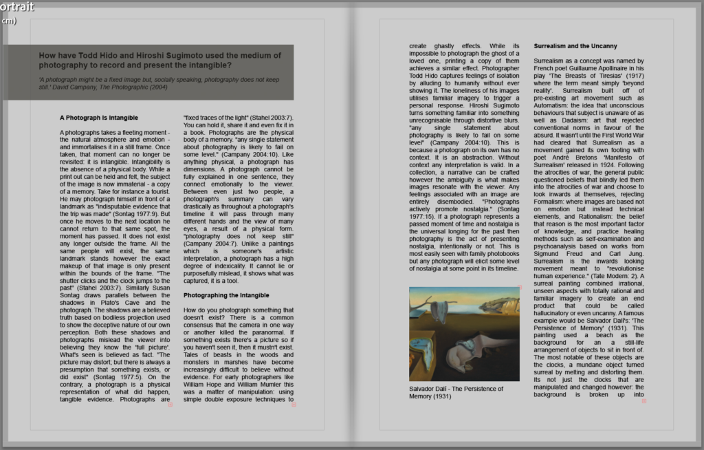
How has the evolution of fashion photography, from controlled studio setting to dynamic street environments, reflected a shift towards the aesthetic and principle of documentary photography?
“To collect photographs is to collect the world”, said critic and writer Susan Sontag in her influential book, On Photography. The main question is; which world do you want to capture. My main focus is to explore why photographers use a type of documentary photograph to express themselves, and why the documentary photography style has become more popular over the years. Each photographer has a different desire to capture different images, whether it’s to tell the truth or portray a lie. Looking at the influential photographer William Klein, a photographer, film maker, painter, writer, graphic designer and a maker of books. William Klein turned fashion photography into something much bigger than it was worshipped as, he took his ideas and made them alive, more vigorous. Fashion photography has always reflected social and artistic trends, creating an idealised, unblemished photograph, it was a way of expressing the ‘perfect’ truth. Fashion photography was out there to capture something beautiful but after the growth of street photography, the truth began to shift, and the crudeness of the world was starting to show. William Klein combined the two elements of fashion and street photography together to stay away from the controlled studio and conventional poses used by his models, he liked the idea of a chaotic environment interrupting his photographs. While looking at another photographer, Vivian Maier, she took candid images of people on the streets, no matter the circumstance. Maier was known to be very secretive and private and didn’t actually publish her photographs herself. Maier took her opportunity in life and made the most of it by capturing the world around her. ‘Well, I suppose nothing is meant to last forever. We have to make room for other people. It’s a wheel. You get on, you have to go to the end. And then somebody has the same opportunity to go to the end and so on.’ ( Vivian Maier), presenting herself as a selfless individual. Maier shows that she has a good eye on the essence of people’s everyday lives. Her photographs were more based on documenting social life rather than creating a fashion narrative. The evolution of fashion photography, from controlled studio settings to dynamic street environments, reflected a shift towards the aesthetic and principle of documentary photography through a cultural shift towards the real state of the world. Artists like Klein and Maier clasp the documentary aesthetic, challenging the norms of the world and making it bigger and more diverse for a wider community to use and understand .
Documentary Photography:
‘Documentary photography is a style of photography that provides a straightforward and accurate representation of people, places, objects and events’ (Tate, 2017)
A documentary is meant to tell a story, show a narrative or a certain point of view. Documentary photography is almost a type of proof or sign that something happened, it’s a guidance to evidence. ‘The simultaneous “it was there’ (the pro-photographic event) and ‘I was there (the photographer) effect of the photographic record of people and circumstances contributes to the authority of the photographic image.’ (Wells 1998) This was stated by Liz Wells in her third edition book ‘Photography: The critical introduction’, Liz Wells explains in very great detail the importance of documentary photograph as it tells a deeper story than a painting, it hold more information and more detail, its seen as a bigger deal and provides a higher deal of accuracy.
Danielle Macinnes, 2024
While searching for a definition of documentary photography I came across a short power point called Documentary photography, visual storytelling, one quote that I saw was ‘documentary photography gave the idea a new life and social function. Neither art nor advertising, documentary drew on the idea of information as a creative education about actuality, life itself’, this is a perfect definition of what documentary photography is, it’s telling a story without words, just by looking at one image, you can see a whole story. I was also able to acquire some cultural and historical facts on documentary photography thanks to this power point, for example the reason for the documentary photography to been develop was thanks to the development of print technology, it also started in 1920-30s when magazines and publications such as Life Magazine in the USA, Picture Post in Britain, Vu in France, and many others, these magazines used photos to tell story and help grow markets. Researching on documentary photography, the ‘Photography: A critical Introduction by Liz Wells book was very influential and helped me understand the motive of documentary photography. ‘Photography is not so much concerned with the development of a new aesthetic as with the construction of new kinds of knowledge as the ‘carrier’ of facts.’ (Wells 1998) A documentary photograph is not always meant to look aesthetically pleasing, it can look more like an urgent cry, it’s a way of spreading information fast, however it doesn’t always tell the truth. Some people can exaggerate the truth and make it look worse than it is. thought documentary images can inform an audience about the hidden corners of contemporary life and even become part of the historical record. That is why it is cherished upon; it holds a great amount of value.
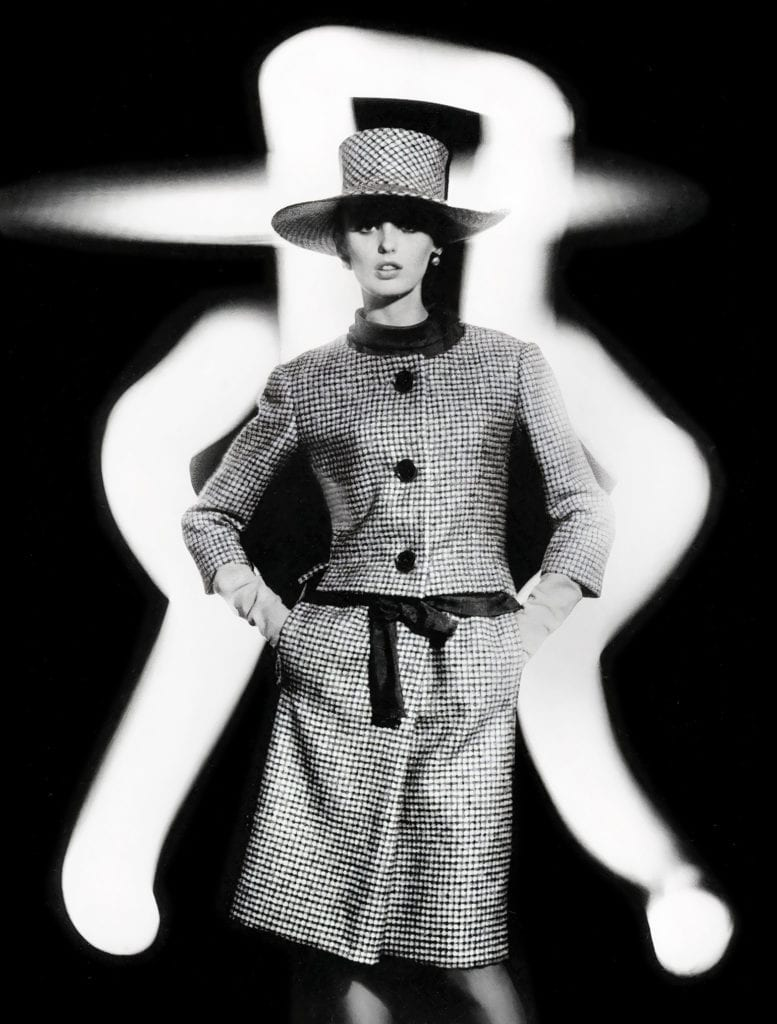
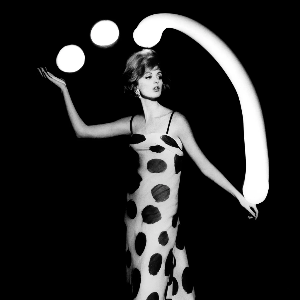
William Klein:
Dorothy and Light Face, by William Klein, 1962
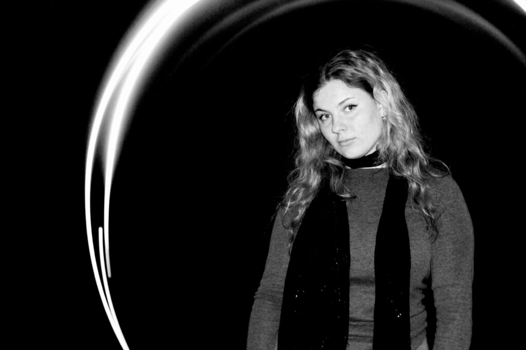
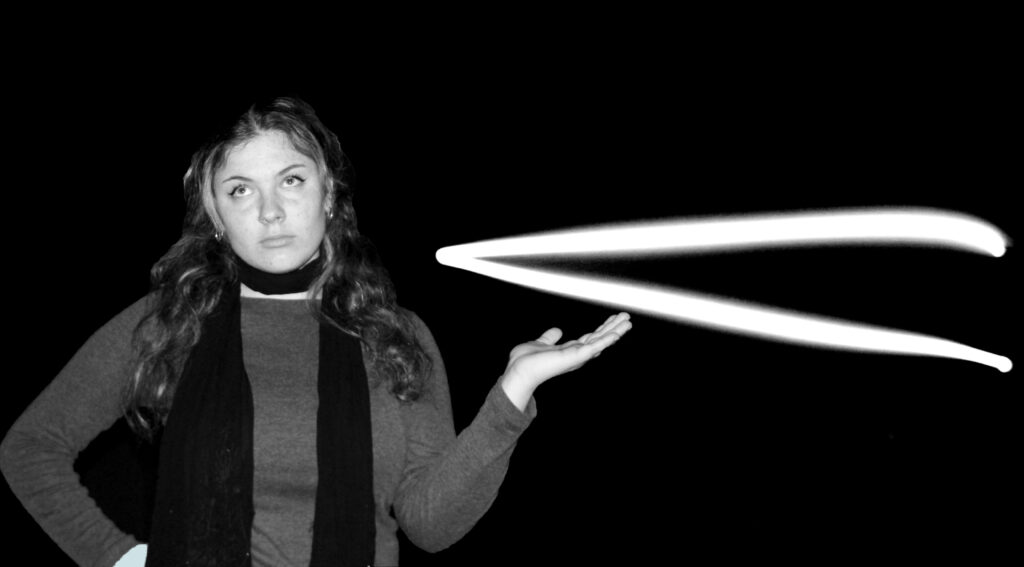
William Klein is a fashion photographer who exceeds with real talent, he is an American-born French photography who has an approach to both media and an extensive use of unusual photographic techniques in the context of photojournalism and fashion photography. William Klein’s techniques reach out to different surroundings, he doesn’t tend to stay in the studio while doing photoshoots, he explores the world, he has already been to New York, Tokyo, Paris and Rome, as he documented his surroundings, he has collected a range of images and has shown the cultural shift of the world. For example, how fashion has changed, it’s degraded, fashion is seen as a trend whereas Klein made it more of a desire. Although Klein’s photographs were staged, they still had factors of the environment and how it affected each country differently. Most of his fashion photoshoots used female models which could be part of the photographic gaze. Liz Wells, it describes the idea that women are put on show for male validation and enjoyment. ‘Images of women on screen are constructed for gratification for the male spectator’ (Wells 1998), it’s the idea of women being referred to as the pray, people admired women more on Vogue magazines and on display, they were the primary attention. This may be a reason William Klein used women in his fashion photography. Wells also states, ‘in patriarchal cultures the male I/eye is central within discourse and women is ‘other’; in psychoanalytic terms she is complexly constructed simultaneously the object of desire and a source of fears and insecurities’ (Wells 1998), women were more socially accepted as the cover of vogue, they represented the eye of fashion. It’s proven that women have historically made up the majority of the front-facing workforce at Vogue. Although they were never at the top of the market despite their efforts, they were always behind men. I don’t personally believe that William Klein meant to objectify women, but it could be seen as that problem. While looking more closely at Klein’s work I noticed that his work is very well linked with Henri Cartier Bresson theory of the decisive moment. Henri Cartier Bresson was known to be a humanist photographer, he more or less invented street photography and believes that there is a thing such as ‘decisive moment’, the perfect time to capture an image. Cartier Bresson described photography as a sense of hunting without killing, he is seeking to find the right people, place or time to capture an image that holds power. ‘His photographs may be summed up through a phrase of his own: “the decisive moment,’ the magical instant when the world falls into apparent order and meaning, and may be apprehended by a gifted photographer’ (reference source), while reading his bibliography, he stated that the world will fall into place to create an image that makes sense almost like putting all the pieces together to generate a meaning. Though some would say that these two artists are quite homogeneous, William Klein’s photographs are staged and don’t necessarily use the theory of the ‘decisive moment’. William tends to direct his own photos and knows what he is hunting for whereas Henri Cartier Bresson is hunting for whatever he is able to reach. William Klein does tend to use the streets when doing a documentary on fashion and achieves a great aesthetic of the dynamic street environment compared to the controlled studio settings.Klein showed to have an abstract background in art which helped to influence his fashion photography for vogue, he would experiment with light exposure, firstly he would capture photos of the model while the model holds a pose, then they would turn the lights off in the studio and someone would use flashlights to draw shapes in the air around the models body William Klein himself stated, ‘the result was terrific—it brought my early abstract experiments into my fashion work.’ (Klein) Overall, William Klein’s work was very successful and influenced a lot of people, he managed to collect raw, gritty, blurred, intensely emotional portraits of humanity that portrayed a side of America never seen on film and therefore became very important due to the documentary’s he had produced.
my examples:
Vivian Maier:
Vivian Maier was known as a street photographer but sadly was only discovered after her death. A Chicago collector, John Maloof oversaw Vivian’s photos, and his mission was to promote the work of Vivian Maier, and to safeguard the archive for the benefit of future generations. Maier also kept every negative she had ever shot; she believed that they were important and could be useful in the future. As Maier had passed away, her photographs were later published, her images were found at a local thrift auction house on Chicago’s Northwest side in 2007, where John Maloof had visited and found a box of negatives depicting Chicago on the 60’s. Maier’s tended to go out in big cities and capture random people in the streets, it was stated by Maloof that, ‘from what I know, she never had a love life. Photography was the only thing she had. And if you expose your only emotional outlet, it’s vulnerable’ (Maloof), which suggests that Maier wasn’t taking these photographs for fame, she has a passion for street photography and discovering the truth behind the world, she seemed to have a real big belief on sonder, that everyone has a different life and is going through something, everyone is different. Vivian Maier’s photographs have included the theory of Henri Cartier-Bresson as she tends to take photos of the moment. She creates these images to have a strong significant meaning without using any words, it’s like a story but only through the use of photos, which can be quite hard to narrate. Vivian Maier also used the black and white effect to her images that exhibit a rich tonal range and a strong sense of contrast. The monochromatic approach lends a timeless quality to her photographs, allowing the viewers to focus on the subject matter and composition. While learning about documentary photography I came across a book called ‘Photography’ by Stephen Bull which stated, ‘in 1861 the British critic Jabez Hughes noticed that photography was generally used as a document, asking ‘may it not aspire to delineate beauty too?’ (Bull) Documentary photography is generally used to capture a certain idea, something that can represent itself as history, not something we see every day, which is like what Maier did, she took quite basic pictures of people’s everyday life, but these people aren’t necessarily going to be see again, they are people who pass you and don’t tend to come back, it’s a sign of history. I like the way Maier took her photos, she used a Rolleiflix twin-lens reflex (TLR) camera which was very small and always held by Maier’s waist, this helped to make Maier’s photos more candid as nobody was paying attention to the camera and forcing a smile or pose, everyone was natural. Maier never got rid of her images and saw potential in every single one, her photos expressed things that she couldn’t do, the camera is almost like a mask, it covers her identity and only reveals what she wants herself to be revealed as. Maier quoted, ‘if you really have something to say better to be behind the camera than in front of it.’ (Maier) It helps to show that Vivian Maier was very curious, she wanted to know the world. She also described herself as a spy, which is quite true due to the fact that she hides behind a camera, observing people not wanting anything from them, this is very relevant to Henri Cartier-Bresson work, he didn’t go out to capture anything specific but he sue did want to find an answer to his questions and that is why a camera is great for documenting, Vivian’s photos evaluate how differently everyone dresses and how it has changed since then, how the ‘snowflake’ generation is changing and criticising the old fashion, it’s almost like the world is put in the wrong hands and everything is decaying. Maier managed to influence many people with the way she displayed her images, Maier used reflections, layering, and sophisticated composition in her images which lead to you discovering new layers of characters and emotions. Overall, I really like Vivian’s concept of street photography and how her work has influenced documentary photography.
Vivian Maier’s examples:
Conclusion:
Overall, both artists use a different approach to examine fashion photography and how it can be transformed into a documentary. Both artists have presented fashion photography as a well-known and successful theme used by Vogue and many other well-known companies. It could be quite hard for people to publish certain fashion categories as everyone has different taste in fashion and certain people may react differently if they see something that is not considered the norm but the way William Klein has presented his work shows that he isn’t bothered by how people present him to be. Whereas Vivian seems to be more hidden and doesn’t seem to be a fan of public appearances, she had never published her own work and if it wasn’t for Maloof, Vivian wouldn’t be a well-known photographer. I really like how fashion photography has been mixed with documentary photography as it really shows how fashion has evolved over the years and how the background of each photoshoot has changed. The background of each photoshoot has widened, a busy background is seen more and more in fashion photographs and a plain background could be considered boring. Willian Klein’s photographs portraythe banality of everyday life and the mundane actions undertaken by the people walking in the streets around the world, he tries to be a participant of the photo. Vivian Maier’s photos portrayed marginalised people, including racial minorities and the socially deprived, showing that everyone is different and they shouldn’t be judged for it, both artists took a very different approach towards fashion photography as Vivian is embracing people that are considered as ‘different’ in today’s society whereas William Klein is searching to find something’ perfect’ an idealised representation that the world admires. Klein took photos for vogue which only wants to display something that is exquisite. While doing my photoshoots inspired by Willian Klein, I realised that the photos I was capturing weren’t normal photographs, they had elements of fashion, with the clothes my model was wearing and is showed a side of documentary photography with the people in the background, what I found difficult was when I was capturing these images in the streets most people would avoid going past the camera as they thought they would be disturbing the photograph, that has changed through generation as in William Klein’s and Vivian Maier’s photos most people wouldn’t be bothered by the camera and would carry on with their normal lives.
Bibliography:
Sontag, S. (1977). In Plato’s Cave. [online] Available at: https://openlab.citytech.cuny.edu/chengphotoarth1100f2019/files/2018/02/Susan-Sontag-In-Platos-Cave.pdf.
Victoria and Albert Museum. (2021). 100 years of fashion photography · V&A. [online] Available at: https://www.vam.ac.uk/articles/100-years-of-fashion-photography?
Miralles, N.-S. (2021). Inside Vogue, where women have the top jobs but men still rule. [online] the Guardian. Available at: https://www.theguardian.com/fashion/2021/mar/21/inside-vogue-where-women-have-the-top-jobs-but-men-still-rule
Hackelbury Fine Art. (2025). William Klein – Works. [online] Available at: https://hackelbury.co.uk/artists/35-william-klein/works/18-fashion-light/
Wells L. (1998). ‘The Photographic Gaze’ in Photography: A Critical Introduction. London: Routledge.
Soccio, L. (2020). Henri Cartier-Bresson. [online] International Center of Photography. Available at: https://www.icp.org/browse/archive/constituents/henri-cartier-bresson?all/all/all/all/0.
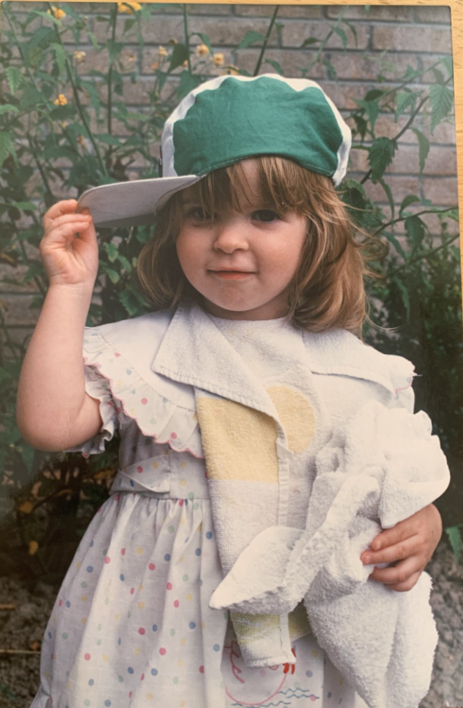
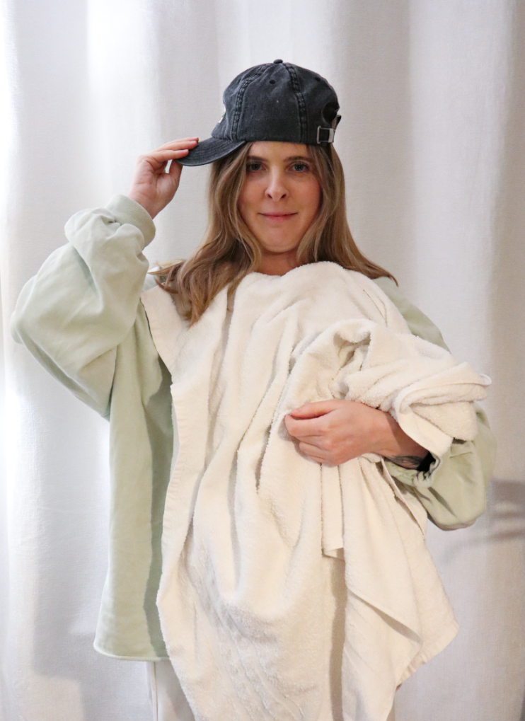
In this blog post I am going to be comparing the old images to the new images which I have created inspired by Irina Werning.
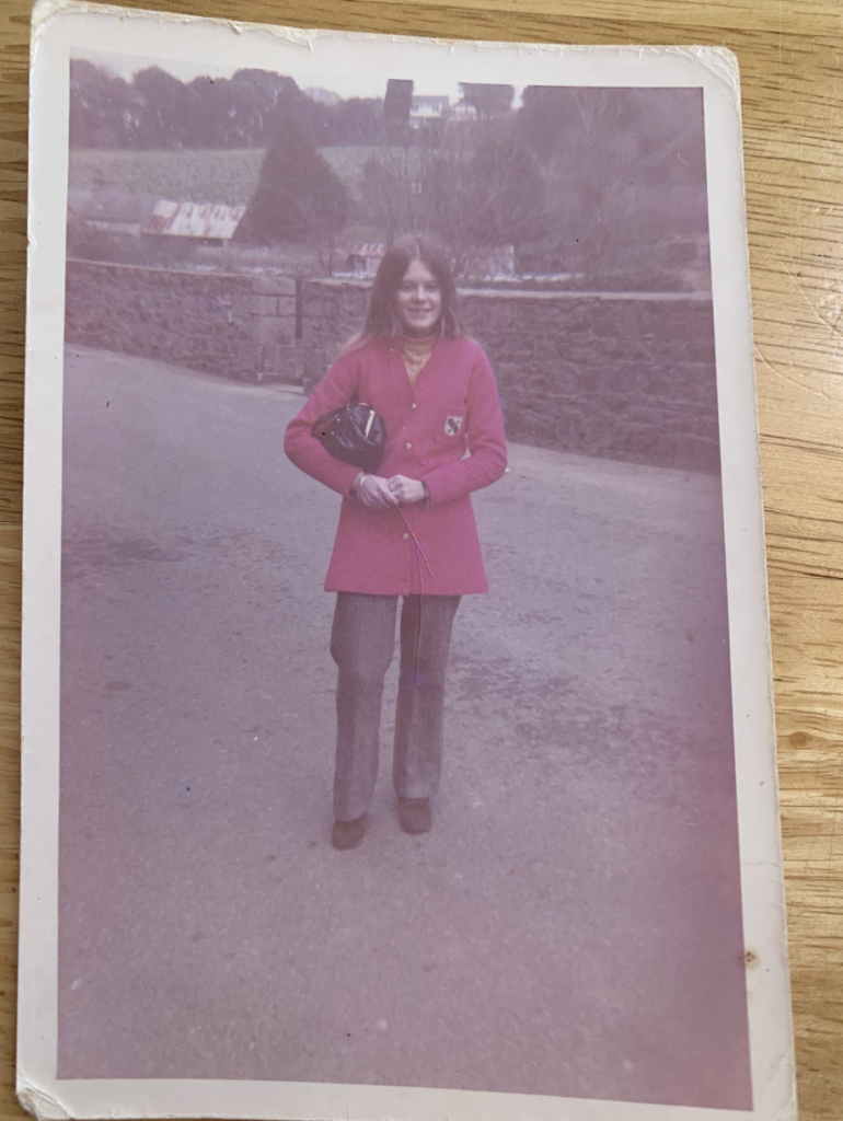
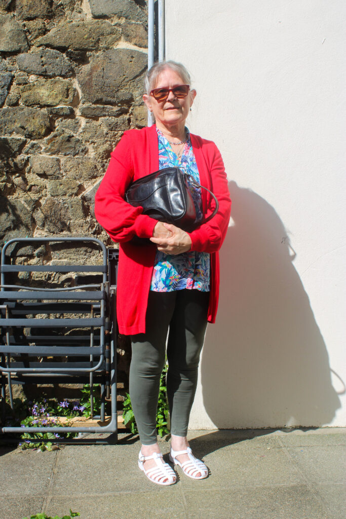
1: For this first image I took I photographed my grandmother in a red jacket similar to the original image which was taken when she was 16, and in the new image she is aged 71.
1968
2024
I think this image is successful as I was able to achieve some similar colours such as the red jacket and the handbag. I may try editing the new one to match the tone in the old one.
2:
3: To recreate this image I made sure to have the model wear dark clothes similar to the original image. She also pulled a similar face to the original one as well as crossing her arms.
4: This is one of my favourite images which I have recreated as I managed to capture the same purple/ pink tone of the old image using lightroom and adjusting the tint of the image.
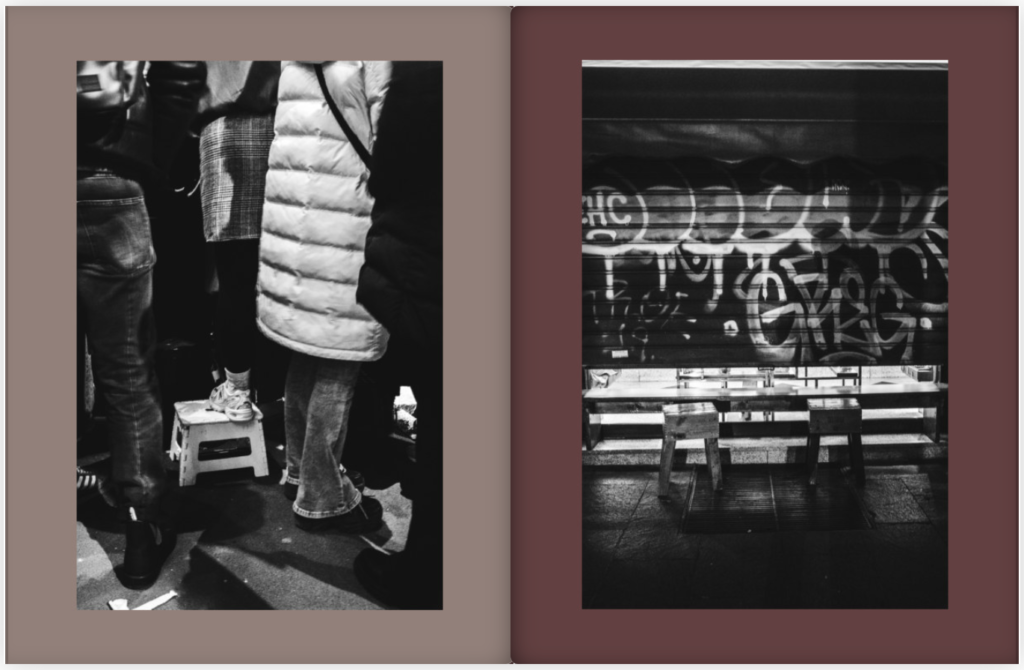
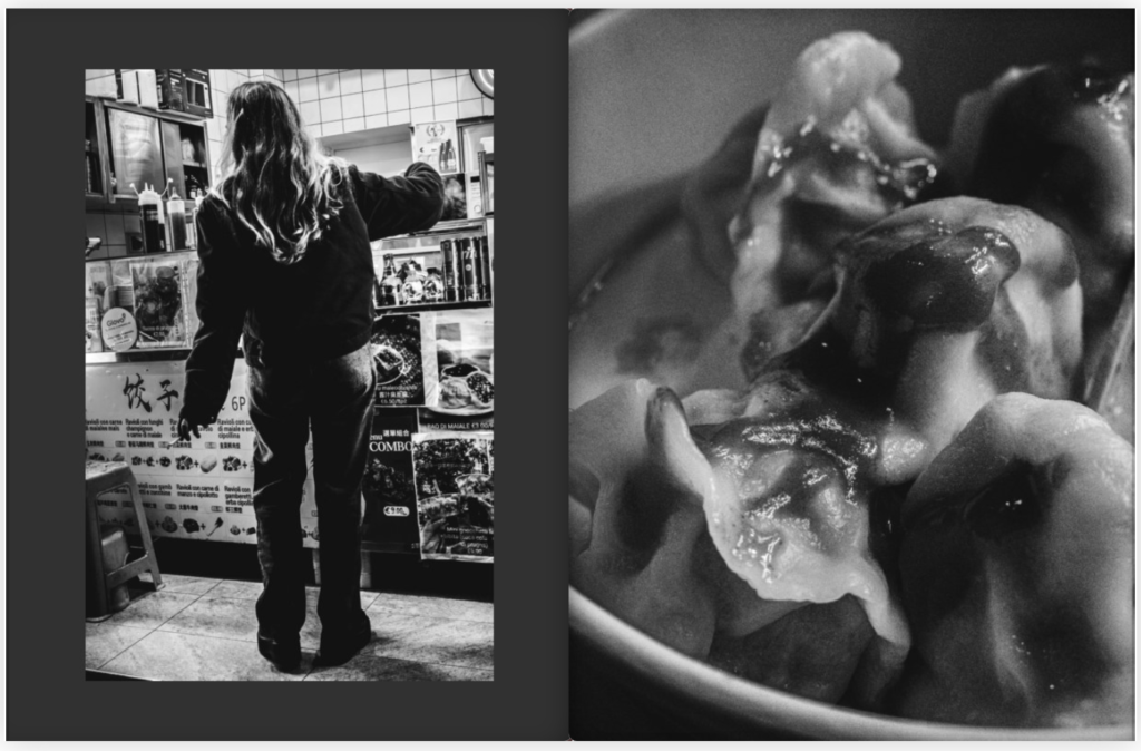
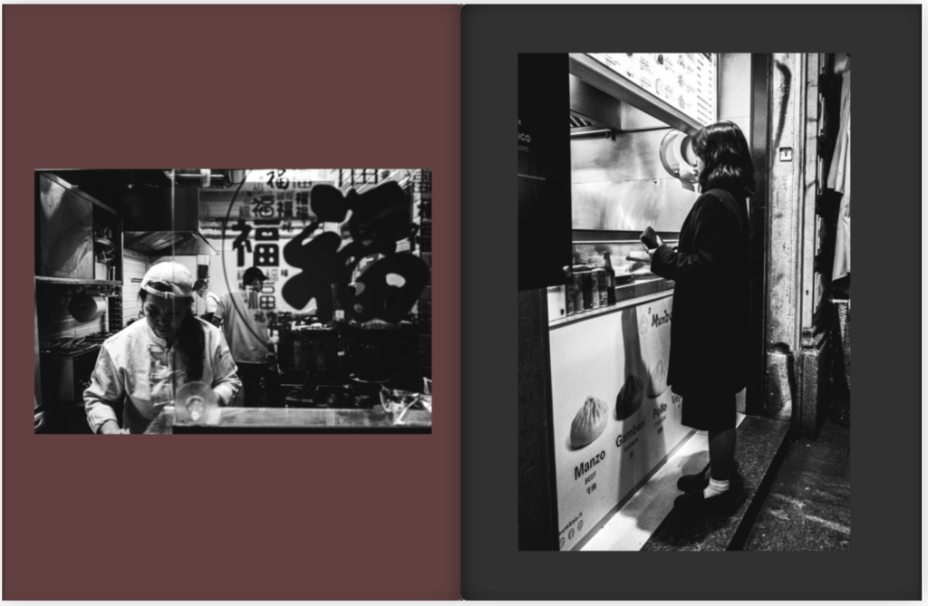
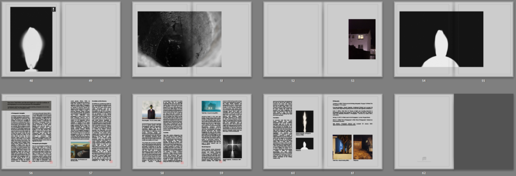
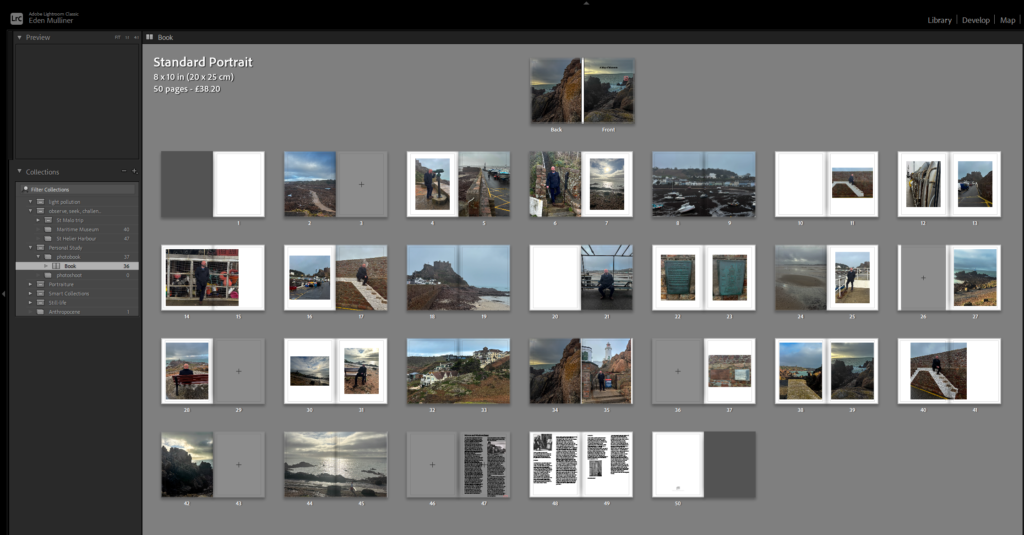
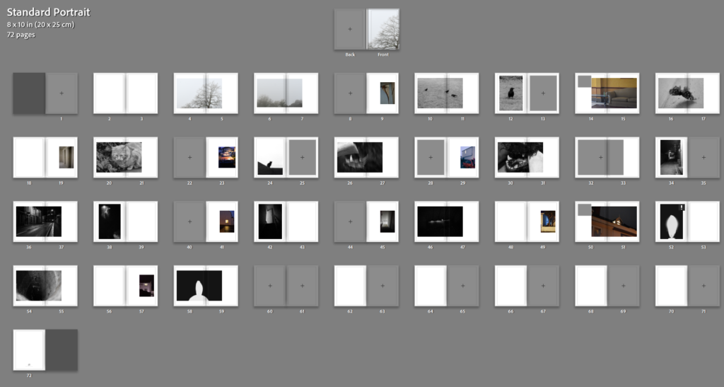
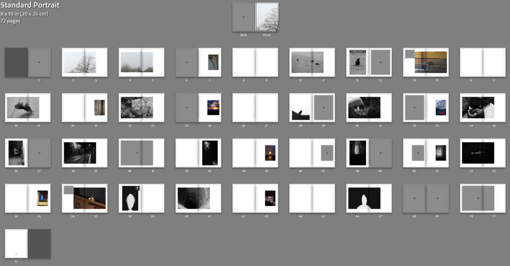
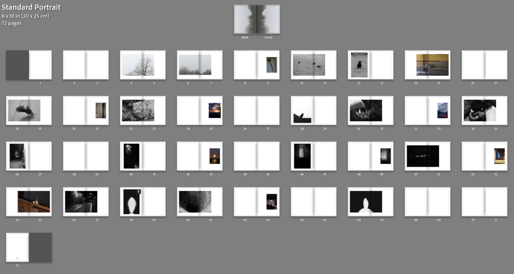
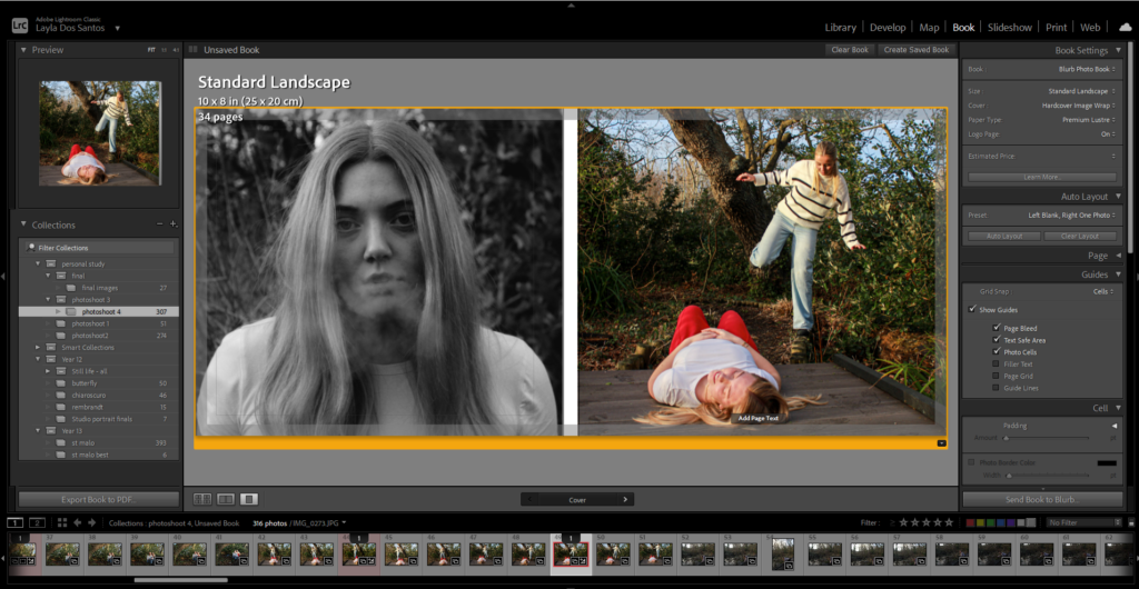
This is my photobook layout where I have carefully chosen the order of the images so that they help tell the story of the photos. I then added my essay into the back three pages of the book and added images to show the work of the artists.
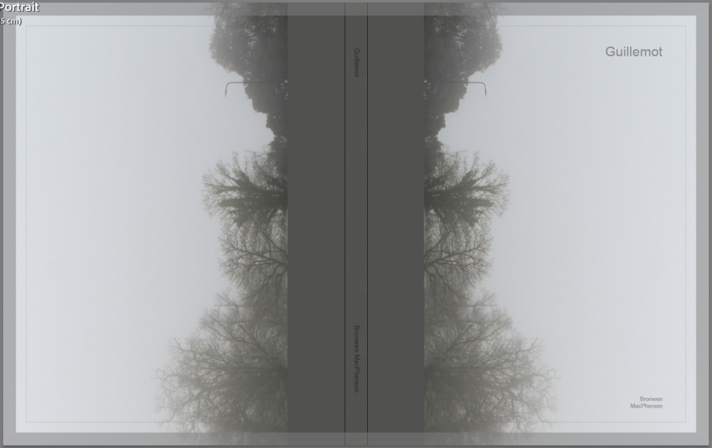
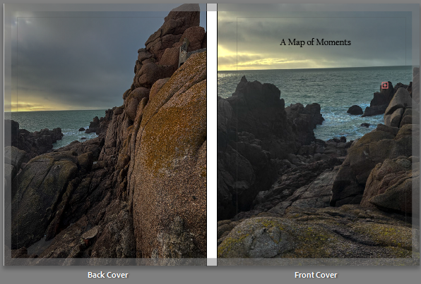
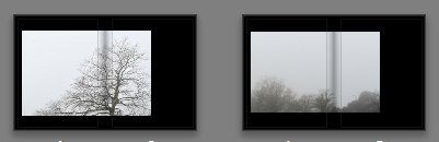
This is my front and back cover which suggests that the sun is my grandad looking out for us and has symbolic meaning which sets the narrative for the rest of the book. I wanted these images to be the front and back cover because they look the most aesthetic and make the book more eye catching for people to want to look through the book.
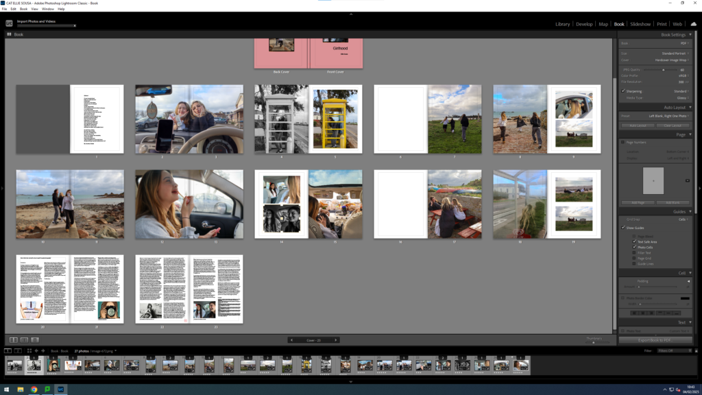
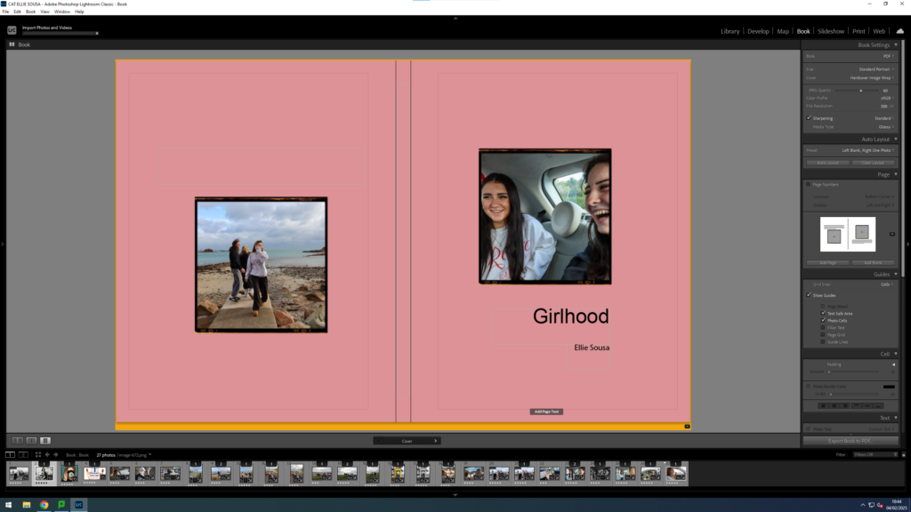
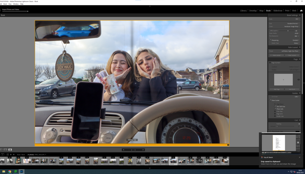
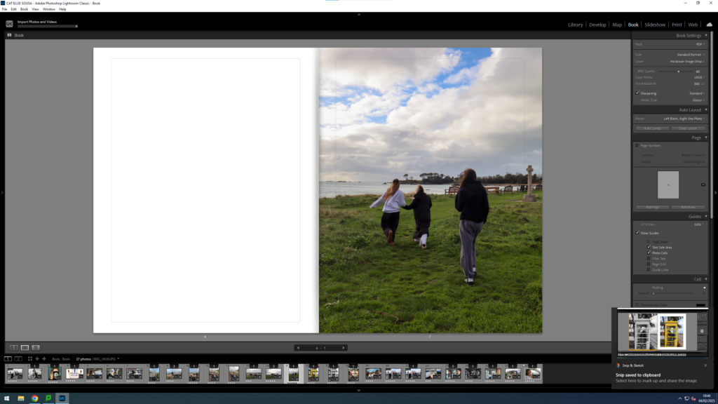
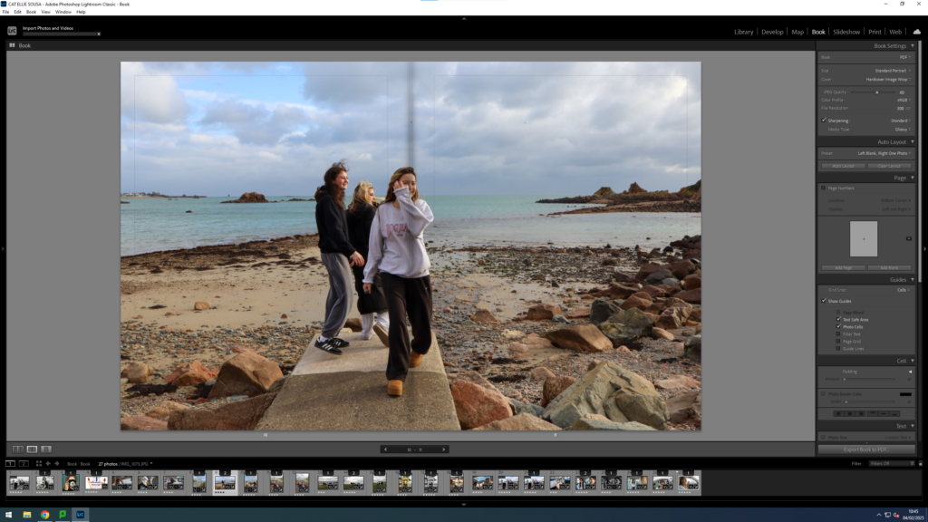
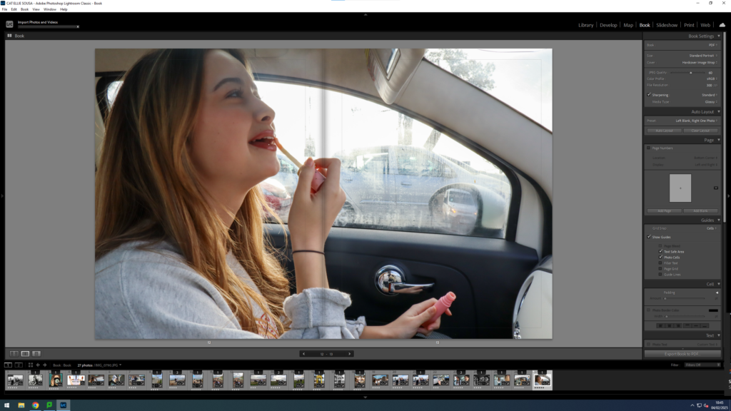
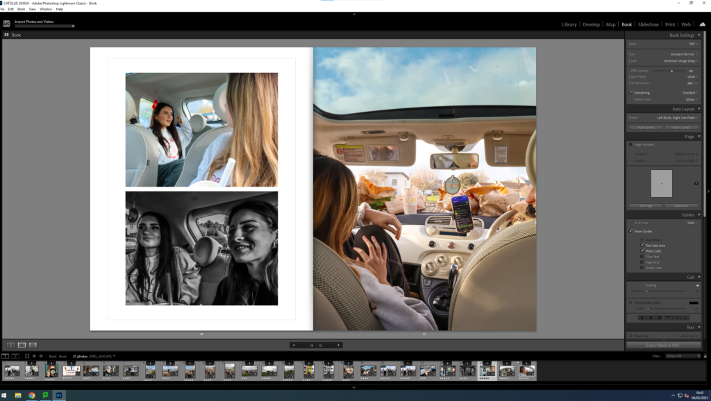
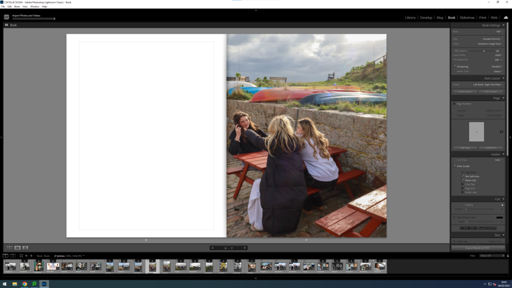
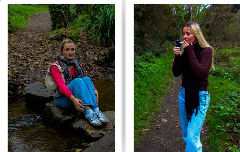
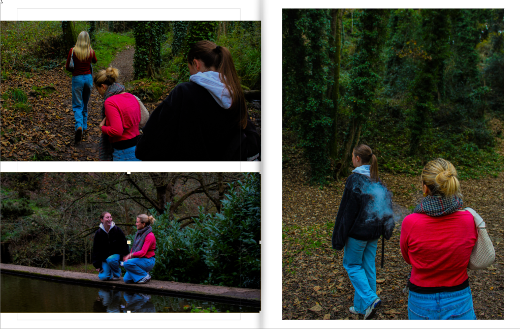
I really like the way the images are set out, I focused on capturing cute girly moments. I used to colour pink colour to show the ‘stereotypical’ girl type. There are different tones and settings, like the beach and a car where the girls are singing and eating food which I think captures the scene of girlhood, the girls are giggling and enjoying spending time together with no boys there. The images are set out in a certain way to try and capture this element of girlhood which adds value to the images.
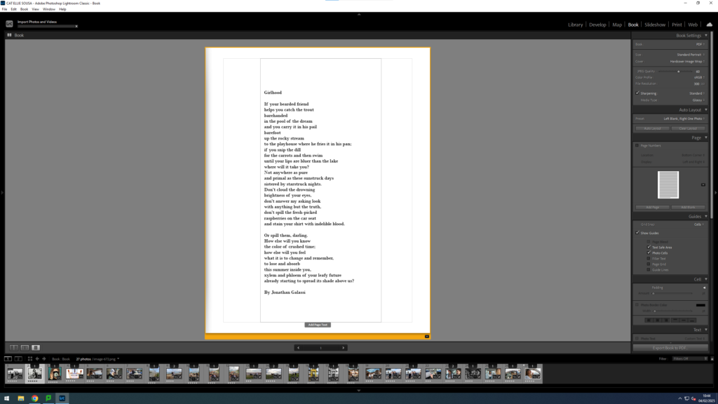
The lighting is natural with a warm colour temperature and the arrangement of the images is specific to try and capture each image by itself so nothing blends in. There is a sense of repetition within the images as they are all interlinked and are very similar. The idea behind this work is that Gen-Z have a very different lifestyle when growing up, therefore I’m trying to capture this within my images. The essay provides a detailed text of what my project is really about and its very important for my photograph’s and photobook.
1. Write a book specification and describe in detail what your book will be about in terms of narrative, concept and design with reference to the same elements of bookmaking as above.
Narrative:What is your story? Describe in:
3 words: exploration of fears
A sentence: I want to explore my own fears and how they can be presented in different ways.
A paragraph: Fear isn’t limited to one particular set of imagery. I want to explore the different ways to present the same few fears with both natural and urban backdrops.
Design: Consider the following
How you want your book to look and feel: I want my book to look like an old library book with a plain/basic hardcover.
Paper and ink: I will use plain white paper instead of black for the colour images.
Format, size and orientation: To create a library book I would have wanted an A5 portrait. Portrait would let me create full bleeds with any landscape images while also keeping some smaller images for variety.
Binding and cover: I want a plain cover either with a basic pattern and title or like the slip has been removed without much going on at all.
Title: I decided on ‘Guillemot’ like the bird black guillemot. I choose this because not only do I find large birds freaky but also because birds fly and rise above any difficulties. The black guillemot is a black and white bird which matches my black and white images too.
Design and layout: I will have two different sequences going at once so I will need to differentiate between the two by size or where they’re laid out on the page.
Editing and sequencing: The images will be arranged quite sporadically. I was contemplating arranging each image by photoshoot or if they’re all black and white in a gradient however I didn’t want to make a comforting sequence. I will either arrange each image in a random order or start mostly in some sequence and change it every few pages. Additionally most images are in black and white however I will make sure to place a few coloured ones in between.
Images and text: I don’t plan on having many bodies of text except for the essay at the end which will be arranged in columns with uniform text type and size.
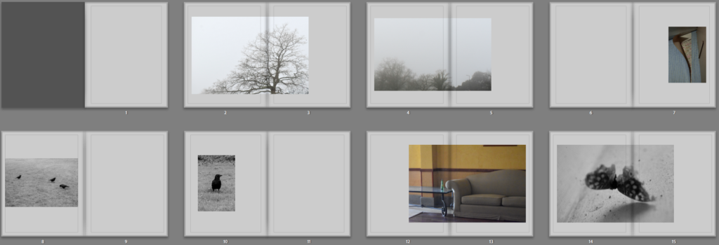
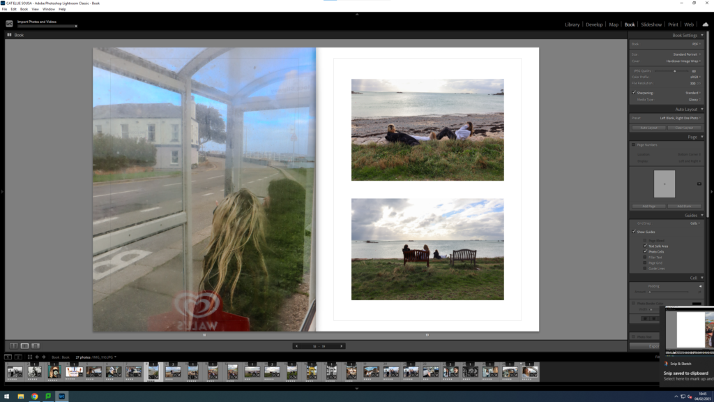
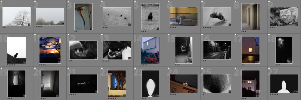
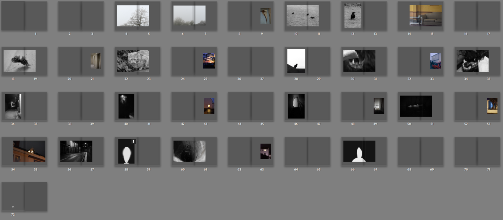
In terms of sequencing I sequenced all my black and white images and coloured ones separately before interspacing them. The black and white ones I tried matching with the one before going from a park outside through a street and into a dark room like walls gradually closing in on the viewer.
The coloured ones I did the opposite. I started closer and worked outwards from wallpaper and being inside to being isolated and left outside.
Then I interspaced the two different sequences.
I tried two different sequences. The first where I used the coloured images to split between images when they changed for instance birds > moth. While this made more sense I didn’t want to create any sense of comfort in predictability and tried one when the images are more sporadically spaced out:
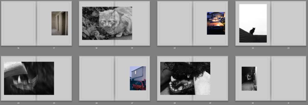
I liked how in particular the dog looks as though its trying to eat the cat since I find it quite funny. The beginning of the first one and the ending of the second one and decided to combine the two.
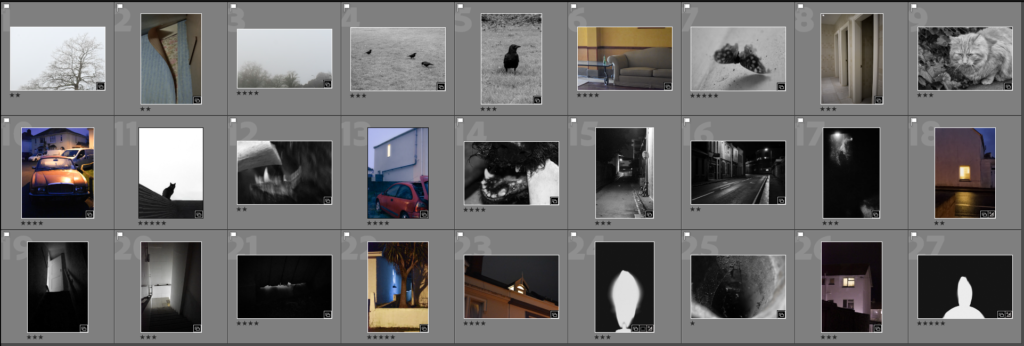
All the coloured images were laid out on the right side as its what’s seen second in either of these templates:
The black and white images were aligned on the left side as its what’s seen first in these 2 templates:
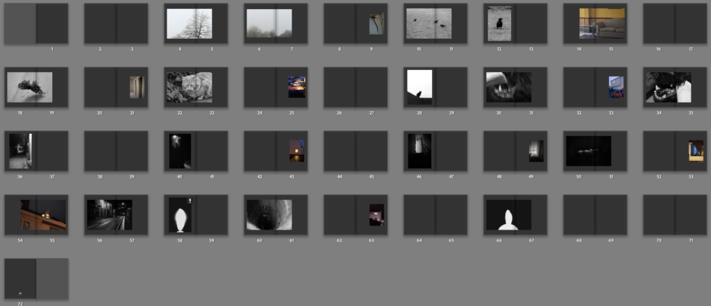
My initial layout looked like the following:
I knew I wanted the essay to fit in separate as a newspaper clipping attached separately to the back so I didn’t need the blank pages at the end. I wanted to add some blank pages throuhg out also which would be a good way to loose all the pages at the end.
In terms of the cover I was unsure wether to put an image on the back or not.
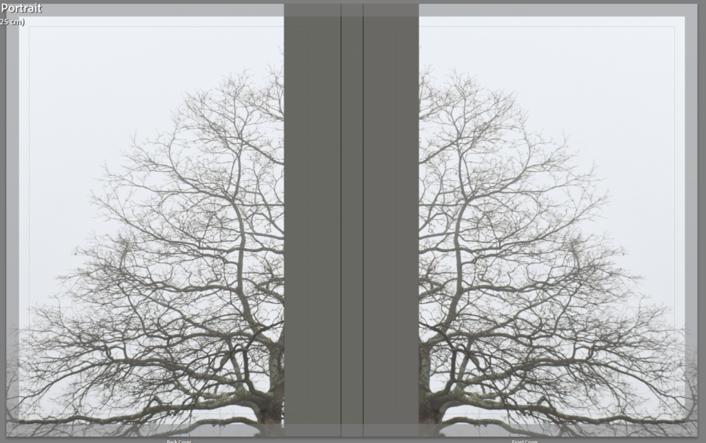
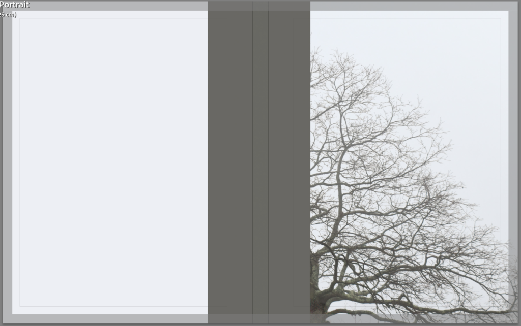
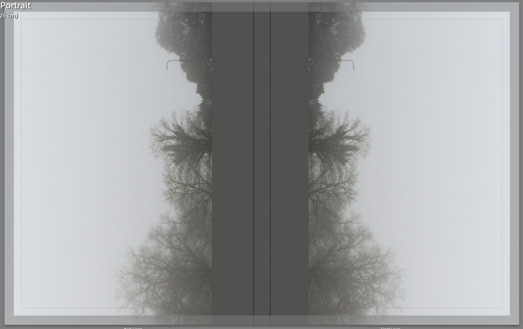
I think that the double looks better so I compared two different images on the cover. Since the book has a sequence going in both directions the same cover inverted like a mirror makes sense.
The single tree works best as portrait while the landscape looks better landscape or open. I decided on the landscape image instead.
I will insert my essay as a newspaper clipping between pages 68/69.
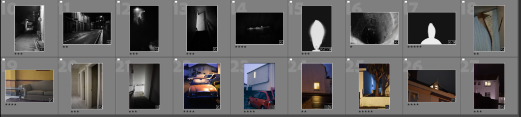
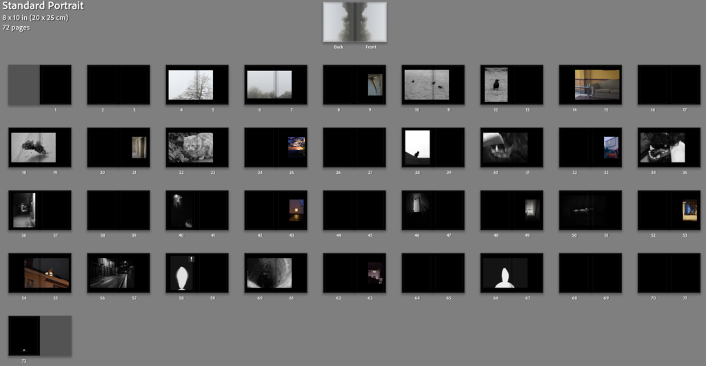
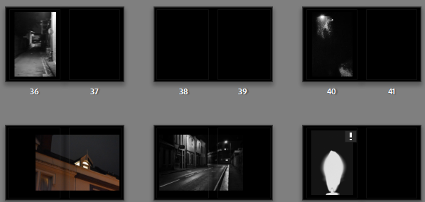
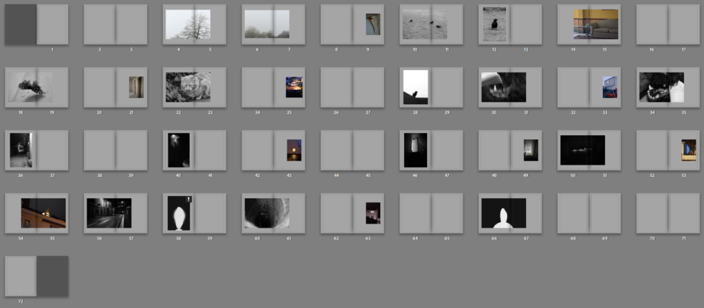
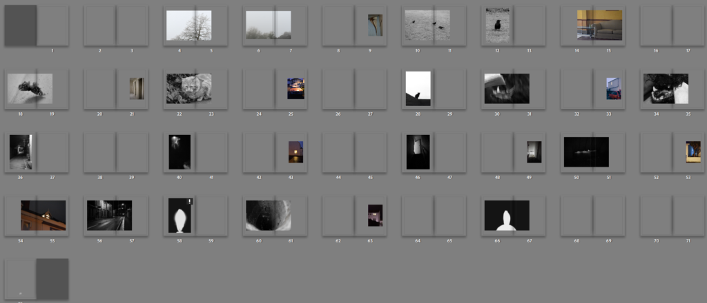
I tried with black pages and grey pages too.
Black pages create a much darker overall appearance. I like how this looks for the darker pictures like these^ however for lighter images like these I’m not so sure on the black pages:
Additionally i tried multiple shades of grey:
I think that the lighter grey works best because it matches with he cover as well as being darker than bright white for the dark images and light enough for the lighter images. I added the essay at the end in columns and added the title and name to the cover.
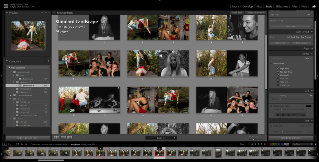
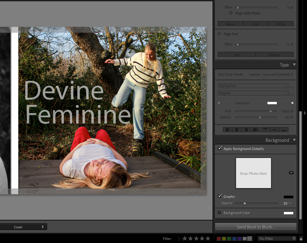
For my photobook, I chose these images as my front and back cover. I really like the contrast of the images from colour to black and white. I used my final images that I had edited on Lightroom to choose out of. On most of the pages there is an image of the girls playing in the woods, inspired by my first artist Justine Kurland, paired with a black and white portrait picture inspired by my second artist Mary Ellen Clark
The sequencing of my photobook is one in colour and one in black and white on most of the pages. One being girls having fun playing in a woodland type of area and the other being a portrait image of a girl. I have done this because I think it makes the book look more intriguing and interesting with the contrast of the two images. When putting the images onto the page, I ensured that the image was covering the whole page for each one. This was to eliminate all the white around the photograph. I think this looks good because it means that the whole page is covered with my images and it draws the viewers attention to the images. To cover the whole page, I used the “Zoom” tool to zoom in and out to make the image as big or as small as I needed. I made sure that the image was zoomed in enough so that none of the white on the page was showing.
When choosing my images, I ensured to choose ones that correlate with girlhood the most. I picked the images that were inspired by Justine Kurland to show the protection and care that girls have for each other and I wanted to show that through the images. I also chose to make the portrait pictures in black and white to make them dramatic and to add a sense of sadness to them which is inspired by Mary Ellen Marks photos.
The title of my image is called “Devine Feminine”, I like this title because it doesn’t give the viewer too much information as to what is in the book. However it may give the viewer an idea that it is about the empowerment that females have and the protection they have together as a society.
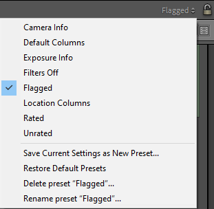
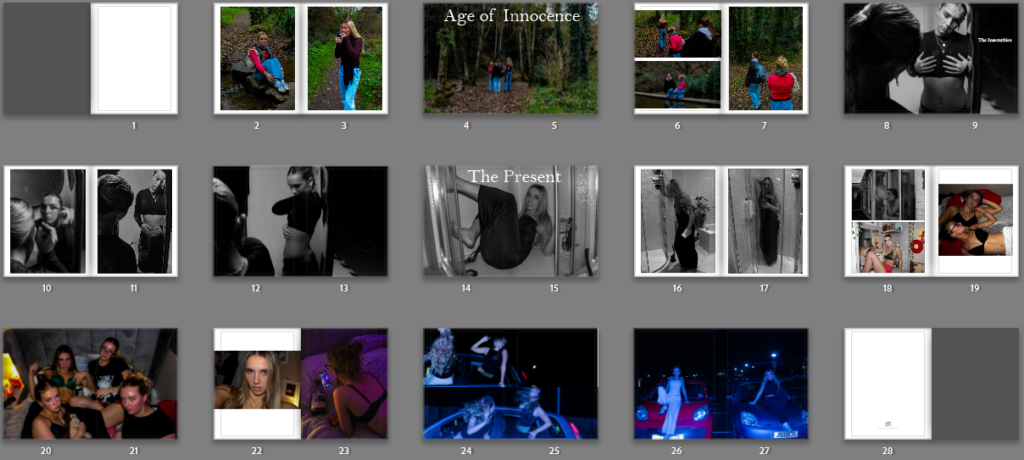
To start with this process, I carefully selected around 20-25 images I was sure I wanted to include in my photobook. To do this, I used the flagging system in Lightroom so it was clear which ones I would be using. I then transferred these images from my ‘Photobook’ folder to my ‘FINAL’ folder. To create my photobook I am using Adobe Lightroom Classic.
Front and back cover:
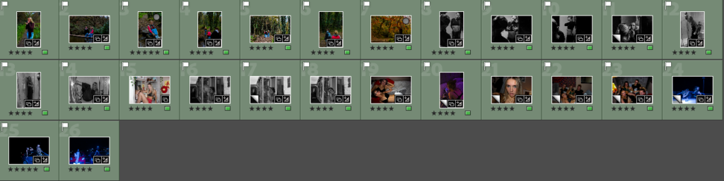
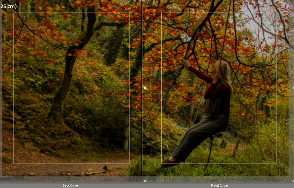
From these 26 final images, I chose which image I would like to use as my front and back cover. I picked an image which stood out to me as there is an array of vibrant colours and it can be stretched over the entire book cover.
Initial cover:
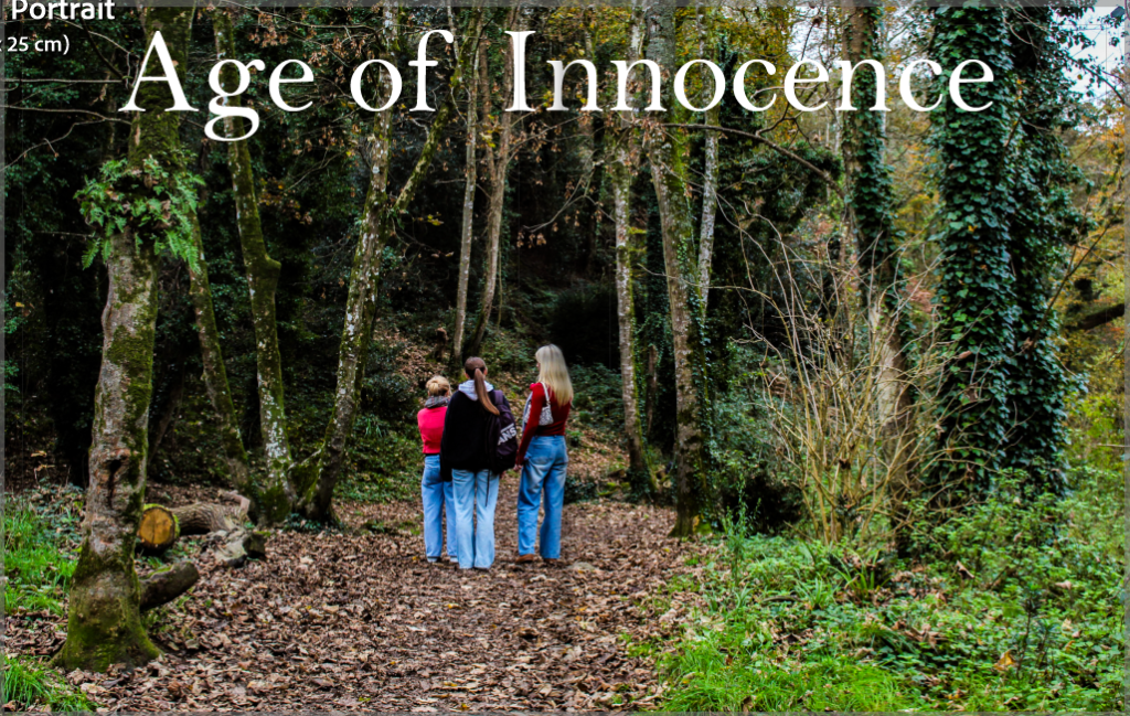
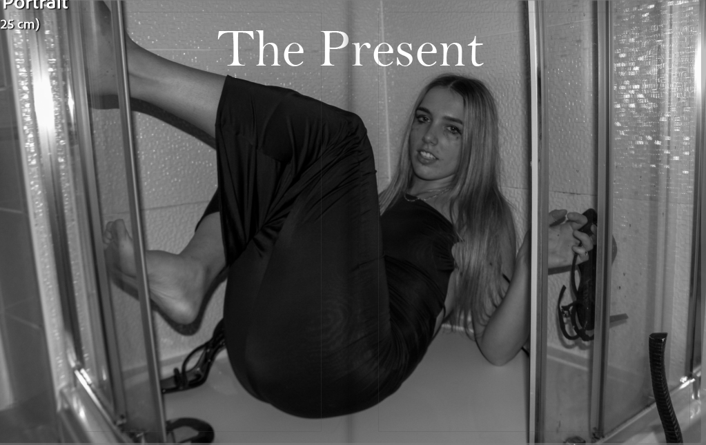
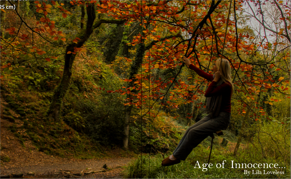
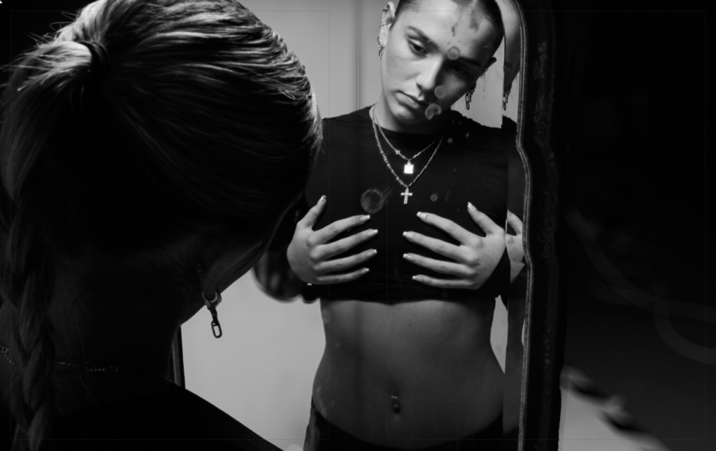
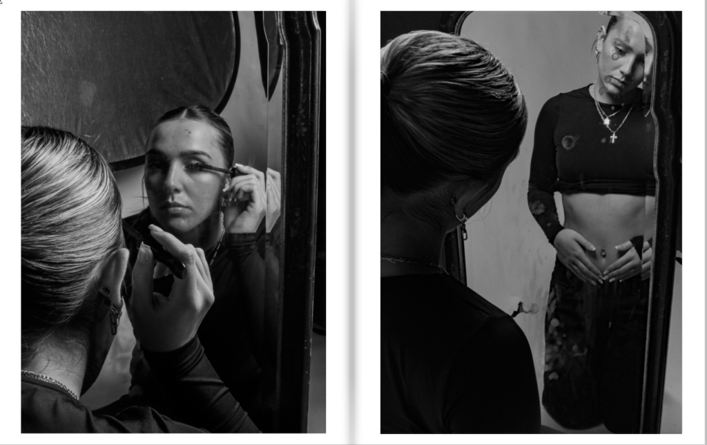
From this, I sorted my images into three sections. One as the beginning of my book under the title ‘Age of Innocence’. Second is the middle part of my book, which is completely black and white, under the title ‘The Insecurities’. Finally, the ending of my book which is under the title ‘The Present’. These sections represent the different narratives I am trying to present, which could be seen as a reflection of a teenage girls’ life. Viewers are able to create their own versions of the narrative, although I am aiming to create the main messages.
First draft of the three section’s front covers:
These are my initial ideas for the first photo in each section.
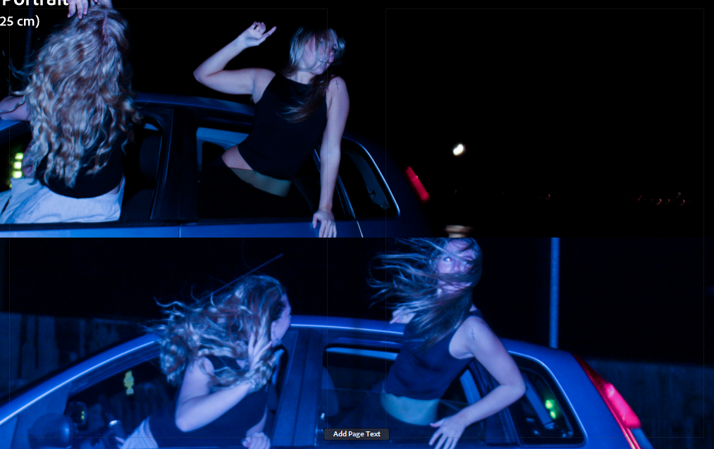
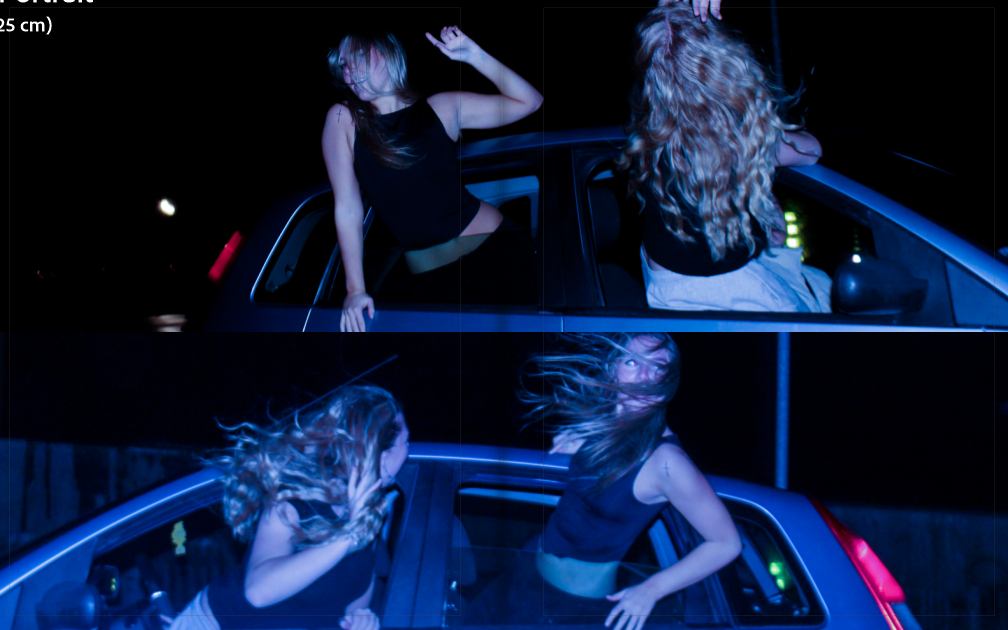
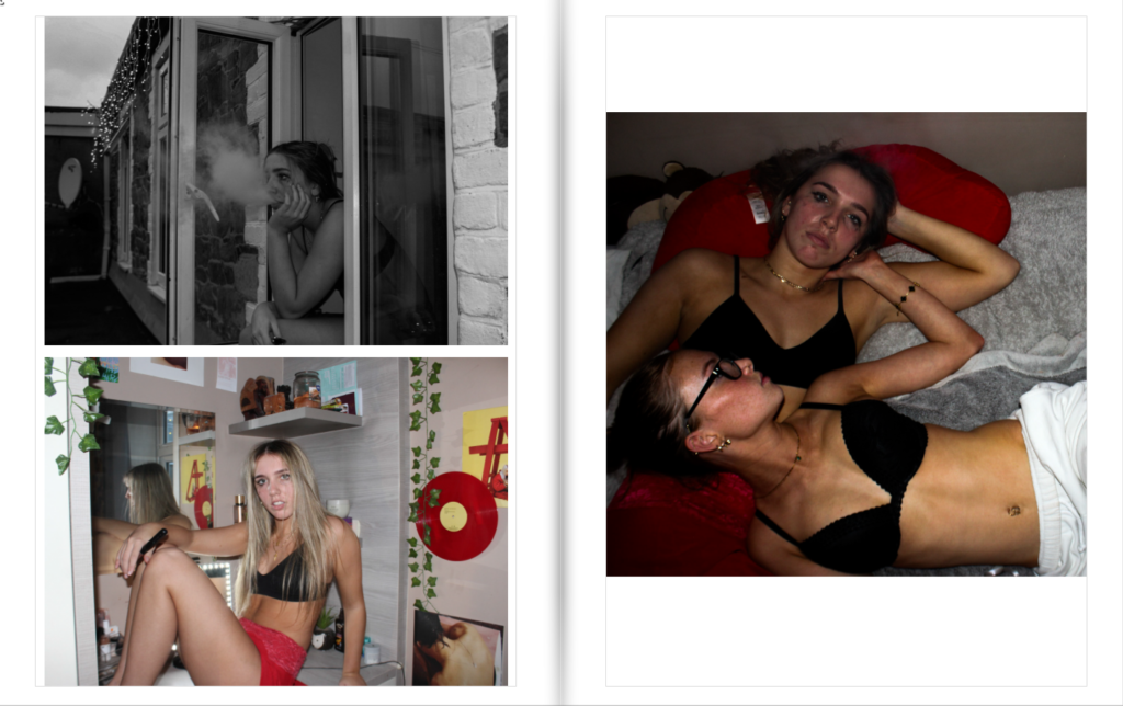
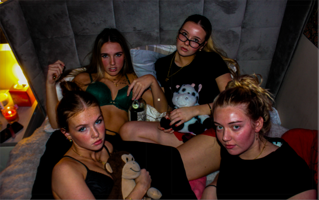
Throughout the photobook, I am hoping to present feelings connected to colours and tones of my images. For example, the entire ‘Age of Innocence’ section is beautifully colourful and bright, reflecting nature and happiness within the girls. This section metaphorically represents ‘time before social media’ for girls and how everyone was so carefree in society. The middle section, ‘The Insecurities’, is entirely black and white, to show how depressing and low girls feel when they gain insecurities, which could be from scrolling through social media and seeing numerous photos of other women who they may feel threatened by. Finally, the last section ‘The Present’ is an attempt to show the lives of girls that have gone a little bit off the rails with their friends, due to the effects of social media and it’s impact on how girls react to it.
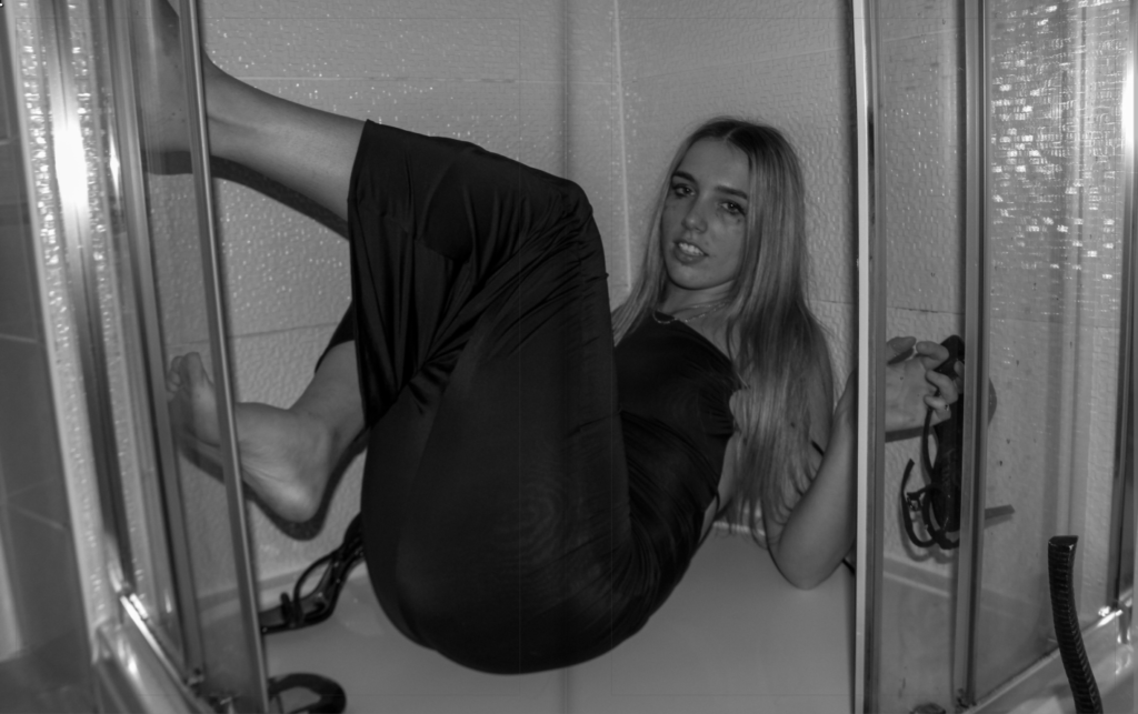
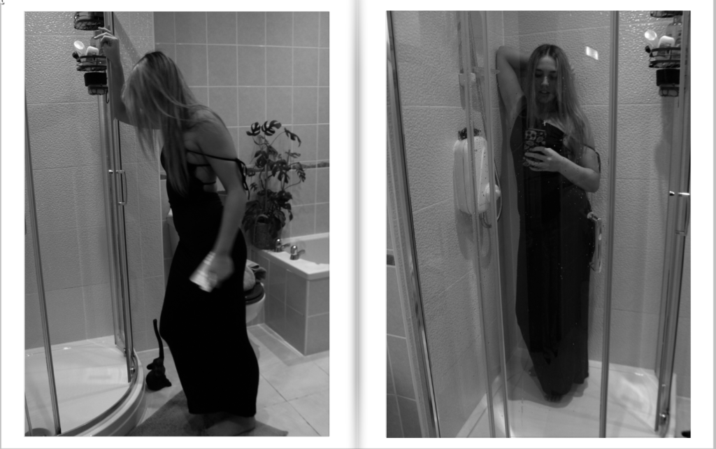
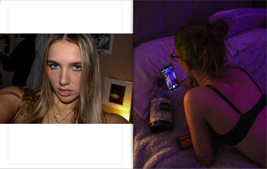
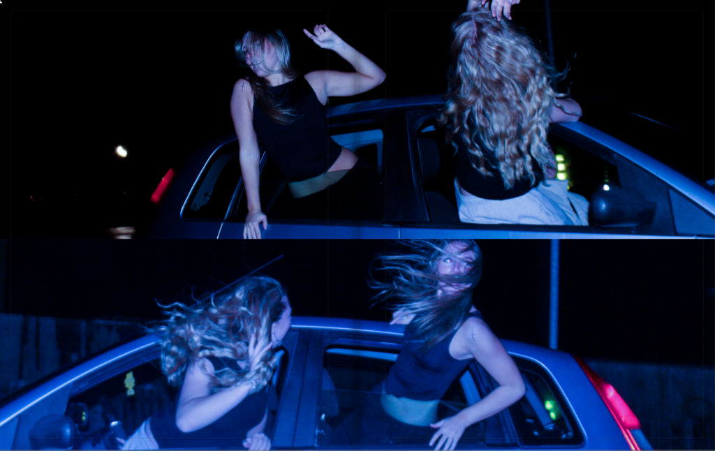
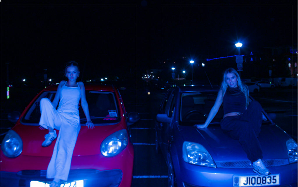
In the last section, I used a range of colours and tones to convey different moods of the photograph. For example, the black and white photos are representing a drunk, lonely girl, who is seen invested on her phone. The coloured images represent sensuality and an intimate feminine connection. Lastly, the bluey toned images convey freedom and rebellion, as we see the subjects hanging out of a moving car at night time.
Final front cover:
Final edits:
Initial:
Final:
Initially, I had both of these images their original way. I started experimenting and thought about flipping one of these images horizontally to make it inverted. I definitely preferred the inverted image as it made the whole photo look more central.
Initial layout:
Final Layout:
I decided to remove the subheadings for the start of each photoshoot as I felt it was more powerful without them and can leave viewers questioning on the narrative behind the images.