Photobook:

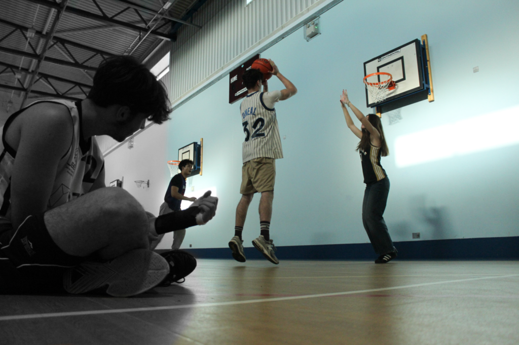
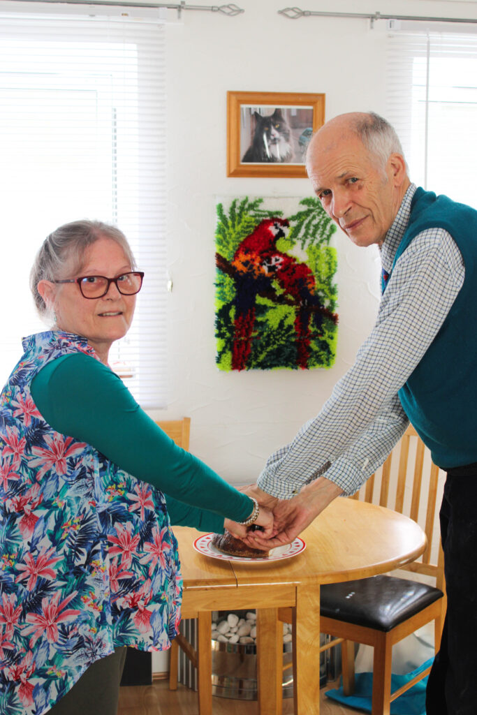
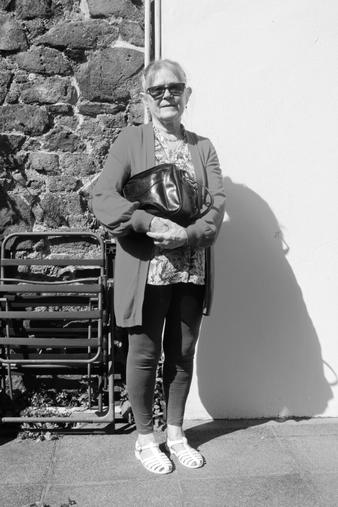
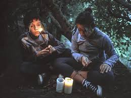
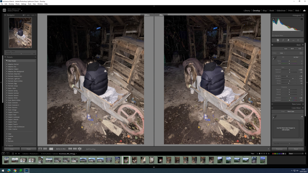
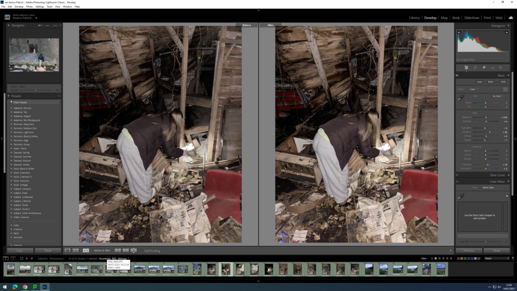
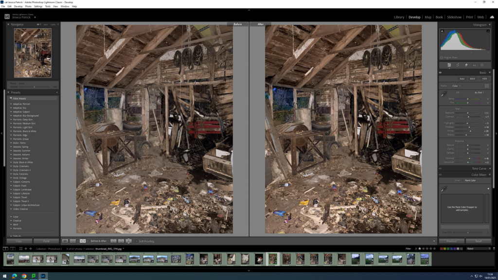
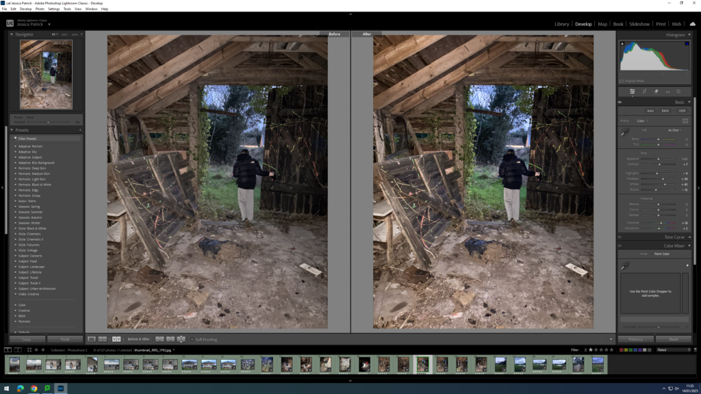
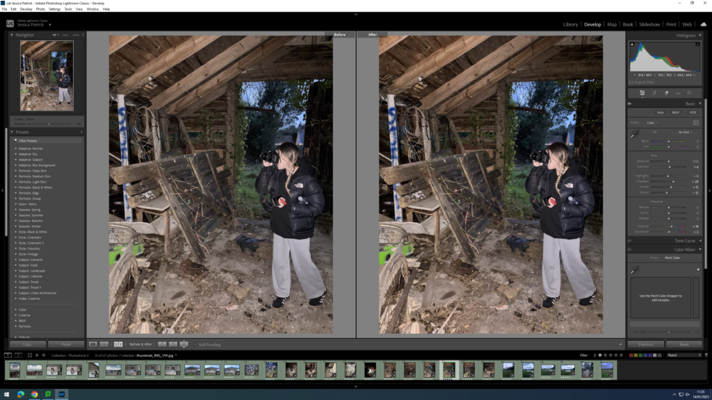
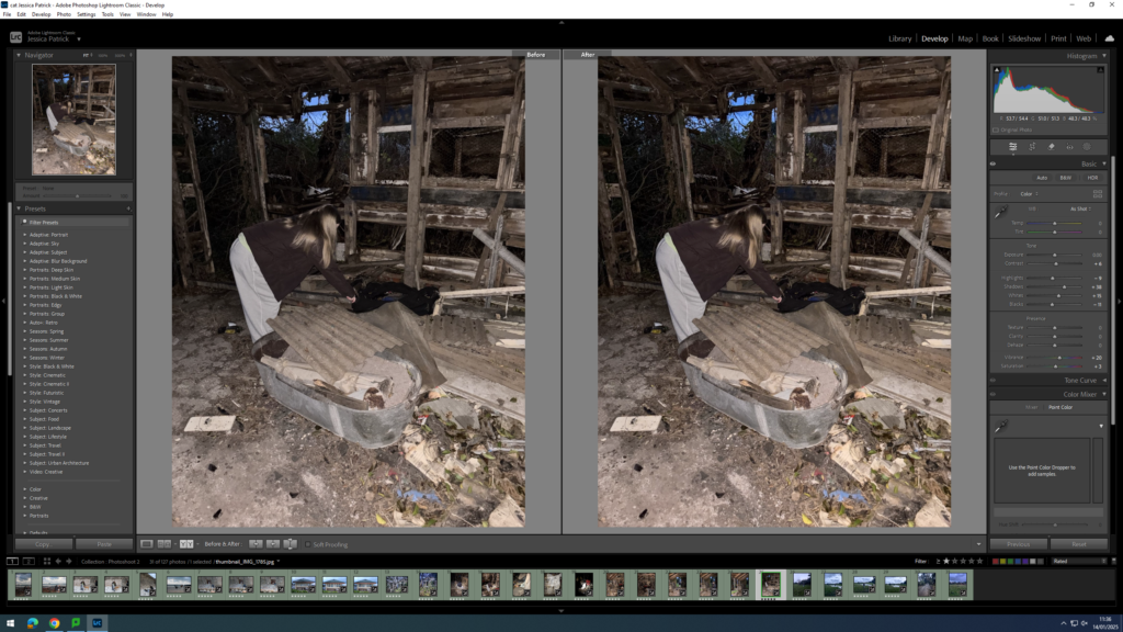
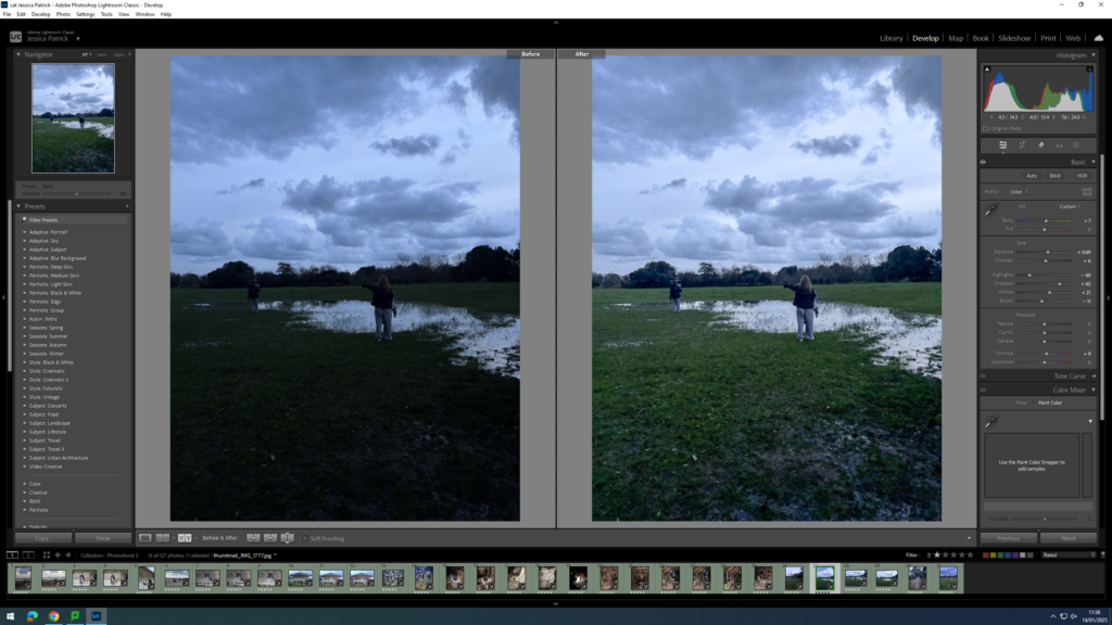
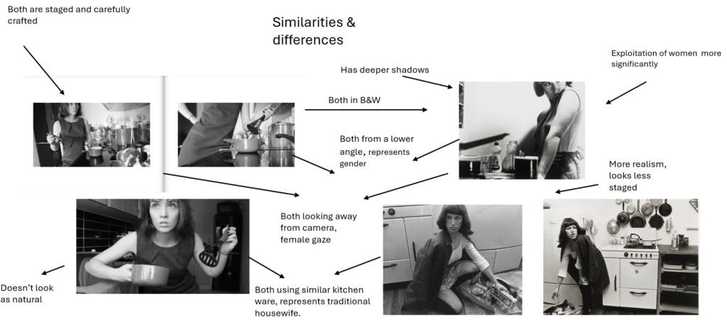
I chose to research and observe ‘ Shrinking violet’ by Shannon O’ Donnell expressing female expectations around the house, and the traditional role of women. These photos surround the theme of feminism and the inspiration from her mother. From what I take from this, she decided to take her images of herself on her own, similarly to Sherman’s work, she stood the camera up and posed with the correct props and clothing such as kitchenware and a dress and heels. Although the subject is expressing and revealing herself as being the traditional role in the house like a housewife, O’ Donnell making it look like she took these herself in her house creates an element of independency which clearly differs to the key stereotypical features of a woman.

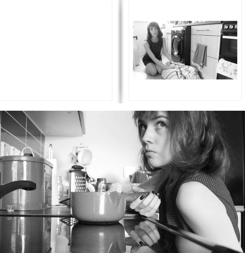
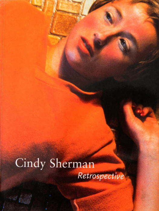
The photographer is Shannon O’Donnell who was inspired by her project of making a film of her mother, including documenting her daily life and her mothers role in the household. One of her main elements was to obtain sarcasm whilst mimicking the traditional housewife stereotype as gender defines everyone and at her belief, can be limiting at times. Her approach to image-making was to stage craft them herself and pose herself. The audience I would say is too target women specifically as it may motivate women who face inequality to this day and definitely expresses a narrative surrounding the theme of women. However, she was massively inspired by Cindy Sherman’s book ‘Retrospective’. Her collection ‘retrospective’ is at the Museum of Modern Art. For a time Cindy Sherman, Troy Brauntuch, Jack Goldstein, Sherrie Levine, and Robert Longo shared a Soho gallery. Did they ignite “The Pictures Generation”? Recalling a long tradition of self-portraiture and theatrical role-playing in art, Sherman utilises the camera and the various tools of the everyday cinema, such as makeup, costumes, and stage scenery, to recreate common illusions, or iconic “snapshots,” that signify various concepts of public celebrity, self-confidence, sexual adventure, entertainment, and other socially sanctioned, existential conditions. As though they constituted only a first premise, however, these images promptly begin to unravel in various ways that suggest how self-identity is often an unstable compromise between social dictates and personal intention.

Cindy Sherman is a contemporary master of socially critical photography. She is a key figure of the “Pictures generation,” a loose circle of American artists who came to artistic maturity and critical recognition during the early 1980s, a period notable for the rapid and widespread proliferation of mass media imagery. At first painting in a super-realist style in art school during the aftermath of American Feminism, Sherman turned to photography toward the end of the 1970s in order to explore a wide range of common female social roles, or personas. Sherman sought to call into question the seductive and often oppressive influence of mass-media over our individual and collective identities. Turning the camera on herself in a game of extended role-playing of fantasy Hollywood, fashion, mass advertising, and “girl-next-door” roles and poses, Sherman ultimately called her audience’s attention to the powerful machinery and make-up that lay behind the countless images circulating in an incessantly public, “plugged in” culture. Sexual desire and domination, the fashioning of self-identity as mass deception, these are among the unsettling subjects lying behind Sherman’s extensive series of self-portraiture in various guises. Sherman’s work is central in the era of intense consumerism and image proliferation at the close of the 20th century.

Maturing in the 1970s in the midst of the American Womens’ Movement, later known as the rise of Feminism, Sherman and her generation learned to see through mass media cliches and appropriate them in a satirical and ironic manner that made viewers self conscious about how artificial and highly constructed “female portraiture” could prove on close inspection.

Some critics criticize Sherman’s Film Stills for catering to the male gaze and perpetuating the objectification of women. Others, understand Sherman’s approach as critically-ironic parody of female stereotypes. Others still, assert that both cases are simultaneously true, with Sherman knowingly taking on stereotypical female roles in order to question their pervasiveness. At the same time her adoption of these roles inevitably leads her to be objectified further.

However, Sherman claims not to be a feminist which slightly changes the narrative.

The work is what it is and hopefully it’s seen as feminist work, or feminist-advised work, but I’m not going to go around espousing theoretical bullshit about feminist stuff.”

This slightly changes the narrative as it forces viewers to question, what was the purpose? and who was the audience targeted? Sherman’s photography is a depiction of the different ways culture defines “woman.” Her art plays on the feminist idea that gender arises exclusively within culture and deconstructs dominant gender ideologies, representing the underside of popular culture’s definition of “woman.”

Sherman recognizes those fixed identity concepts surrounding women, and she parodies the construction process and form of these symbolic myths, suggesting the possibility of women’s self-authorization in reality.

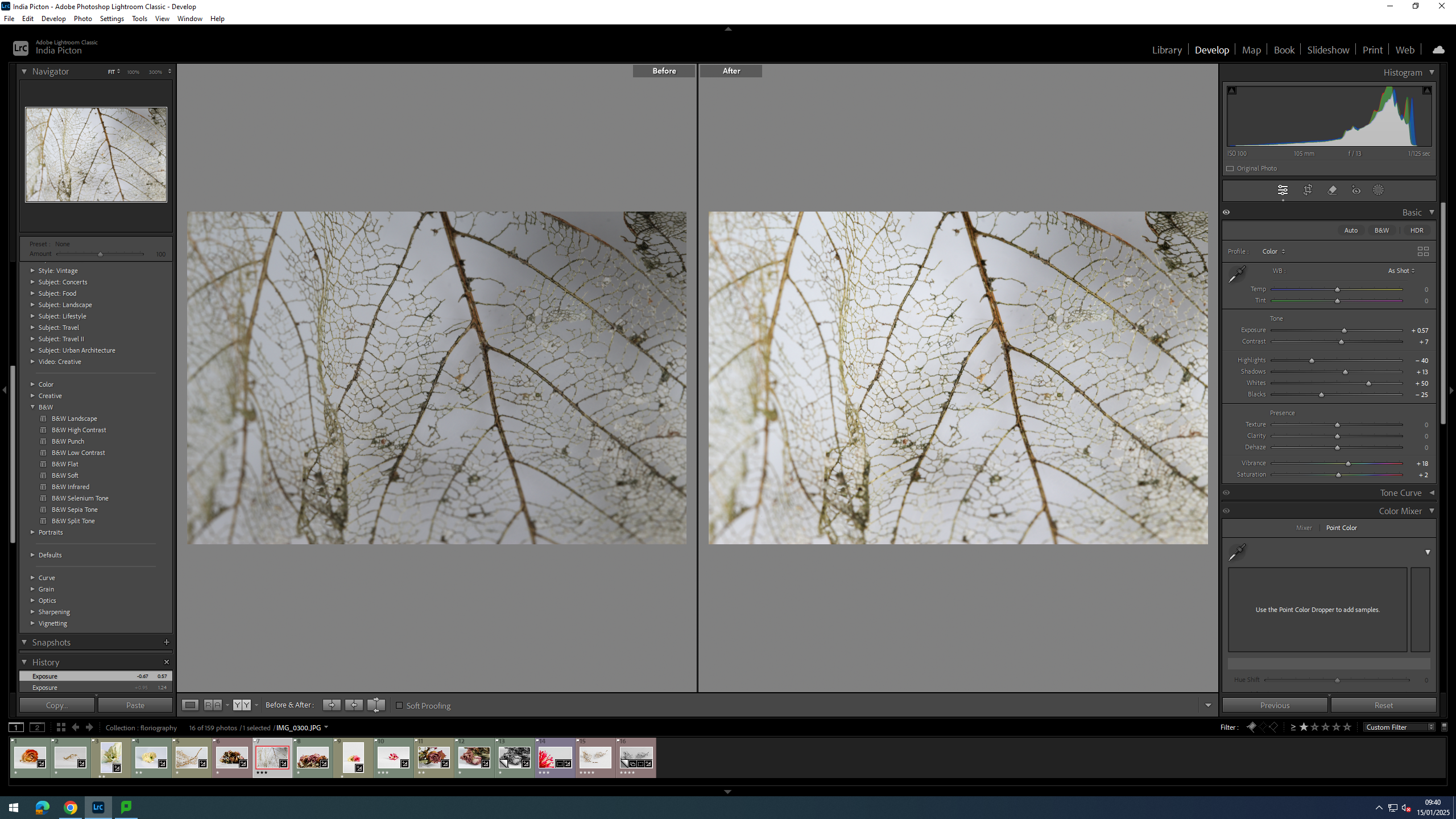
I personally like how it is a paper back however I prefer Shannon’s ‘ Shrinking violet’ being a hard back as it is more aesthetically pleasing. Sherman’s book is A4 where as Shannon’s is landscape, Sherman’s being portrait. Based off my images, I would typically decide portrait. Sherman’s book has 219 pages with lots of different collections. A lot of her images are in black and white, however her more modern images are in colour and are more unique ” Deconstructing a woman”. Whereas, Shannon’s are all in black and white. Shannon’s title being ‘Shrinking violet’ is rather poetic whereas Sherman’s is purely factual and based off her. I personally rather poetic titles as every individual can interpret it differently to them.

Both books effectively show a narrative and successful story telling within the same theme of women. Overall, they are very similar but at the same time different.

photoshoot 1

This shoot was completed over a lesson in the studio. I used the product table to get a clear image, I also liked the slight reflecting produced by the shine on the table in some of the images. I started out with 157 photos and widdled it down to 33.

Of those 33 I have chosen 12, out of those I have made two into black and white copies.

EDITS

For this photo I brought the exposer up to brighten it a little. Due to the fact that there is lots of texture and shape in the image, I have made a black on with copy of it.

for the two below, I brightened them up a little and made them a little more vibrant so that the colours popped out more.

FINAL PHOTOS

This is one of my favourites, it is of the skeleton of a leaf. The main vain that runs to the stem stands out and is in focus, where as where the leaf starts to curve towards the camera is out of focus, this adds an interesting depth of field to the image. The veins make a sort of maze for the viewer to follow with there eyes, adding a sort of mystique to and part of nature which most people would usually over look. this leaf has been give a sort of immortality through this photo, a second life, to live on in in a photo.

Photobook Specification

Narrative: What is your story?
Describe in:

  • 3 words – A false calling
  • A sentence – Someone seeking help from the supernatural and religion.
  • A paragraph – My story is about someone suffering from severe mental health issues, it starts with them breaking down, it then moves onto them looking for answers in object that may represent the supernatural or a deity. The story ends with them losing control and their sense of self after dedicating the rest of their mental sanity towards pleasing the beings in order to receive their help.

Design: Consider the following

  • How you want your book to look and feel – I want my book to maintain a unsettling vibe
  • Paper and ink – Matte paper with black and white ink
  • Format, size and orientation – Small 7 x 7 square format with around 60 pages or less
  • Binding and cover – Hardcover with image wrap
  • Title – “Phantasmagoria”
  • Structure and architecture – Unsure
  • Design and layout – Chaotic but uniform
  • Editing and sequencing – Follows a narrative story
  • Images and text – Images conveying what the selected words and definitions may look like in reality, e.g., mental deterioration with images following of what this may look like

Photoshoot 1 edits

For this photoshoot I focused on photographing my family in similar ways to old photos which I gathered from old family albums. I did this by using similar props to the old photos.

I went through my images and flagged the ones which are successful in a white flag, and the ones which arent as successful in a black flag. I also colour coded some images in blue, these are my best images which I am going to make edits of.

Best photos

Before and after edits:

Edit 1:

BEFORE

For my first edit I only made slight changes in the tone of the image, for example increasing the contrast which made the image look sharper and it make each feature stand out more.

AFTER

I also decided to create a black and white version as black and white images are largely linked to the past which I am trying to recreate through restaging old photos.

Edit 2:

For this image I did similar edits to the last one such as increasing contrast. I also decreased the saturation slightly as I found when I adjusted the other settings the colours became too vibrant.

Edit 3:

In the before photo the exposure is quite low as the face is quite dark compared to the background which is why I increased the exposure.

I prefer this edit in black and white as the bright white background doesn’t stick out as much as it does in the coloured version.

Edit 4:

Edit 5:

Evaluation:

I think this photoshoot was successful as I was able to recreate multiple of the old images in a similar way. My images I created represent the artist I responded to Irina Werning as I took them in a similar way to her, which is recreating old images in the same pose with the same props. I also created the same concept of her project ‘back to the future’, as all my images are recreations of old photos. Next I plan to recreate more images, I also plan on doing more portraits which I can combine with landscapes in a similar way to John Stezaker. I will do multiple photoshoots for my landscape images possibly in places which mean alot to each individual.

Statement of Intent

I want to explore the club and youth culture in Jersey. I want to explore this because as a part of the youth in Jersey I want to be able to express what young 18 year olds experience when they go out into town or to parties during the weekend. I also want to explore this topic because I like to go out and I want to be able to capture the moments of going out whether these images are raw or set up.

This topic matters to me because I am an 18 year old living in Jersey and being isolated on an island night life is so different here compared to places like England and around Europe. But living in Jersey gives us very different opportunities and lifestyles compared to how living in England would be, for example we get to go to the beach everyday during summer and then be able to go into town or to a party afterwards, whereas, that wouldn’t be a common thing to do in England.

I would like to present my photos in a photobook. I want to do this because it will look best presented in a photobook where its like a story and each page has either a new day or event on it, each event separated by a filler image where we are no longer at a party but just drunk or hungover.

I intend to begin my study with a few photoshoots around town and at different parties that I will go to, I want to take window images where they are not set up of the people that I go to the parties with, but I will have 1 set up photoshoot where the images are set up and my friends are acting out about being hungover and drunk, as filler images.

Essay Final

How is femininity shown through childhood, and stereotypically perceived through society?

Introduction –

Femininity is a very broad label to put on not just looks, but beliefs and speech. Femininity is the characteristics shown stereotypically by women and girls. As a female today, my views and beliefs have varied throughout the years of my childhood. Not just because of growing up, but social media played a very big part as well. Everyone telling you what you can and can’t do, wear and say, really affects a developing brain, especially in a world where all you want to do is fit in. A very big inspiration in not just my photography work but mindset too, is Cindy Sherman. She breaks social stereotypes and never adapted herself to norms all through her long career. My work reflects hers quite deeply, as well as showing my own personal hints throughout as well. My childhood came with a lot of emotions and cultures, growing up abroad and living with a strange environment, with my parents splitting and that changing my view on stereotypical love. I want to include all the messy and irregular things that have happened to me and show them to the world. By normalising the unnormal, it can reflect Sherman’s work perfectly, the abstract, unnormal and weird. My project will be mainly surrounded by the idea of femininity and masculinity, using my previous project on that topic as inspiration and almost like a baseline for help. I know that will benefit my overall outcome. I’ve photographed moments of love, lust, fun and danger, focusing solely on teenage life for my first couple of photoshoots, the fun memories and universal moments that teenagers all over the world could relate experience too. I want to finish photographing the other areas of my topic, the family and childhood aspects, which I hold dearly in my mind. I want to focus my nostalgic photos on natural light, the outdoors and nature in general. I feel like naturalistic light can bring copious amounts of nostalgia to a photoshoot and that is a very important aspect to my project.

Paragraph 1 –

Femininity and stereotypes have been judged and watched for centuries, artists and photographers have battled these negative connotations alongside all the change and disruption it has caused. From the suffragette movement to the recent pro-choice movements against abortion bans in the US, and the Taliban control over woman in Afghanistan, photographers have followed it all. These movements are very important to me not just as a photographer, but a young woman in this era of time. With almost all my rights no longer being mine in some parts of the world it takes all the hard work and effort woman have given to fight these issues back after almost 100 years. I want to not only share my childhood story and simple issues that I faced personally with my audience, but also include the issues women all over the world face. Woman have always been the underappreciated gender, through stereotypes, and social and societal norms, “take care of the kids, clean the house, cook the dinner” and those are only the superficial sayings. I want to look deeper into the suffragette movement as inspiration for my photoshoot, since I want to add in almost nostalgia, the idea of the pro-choice movement almost repeating history of the suffragette movement, links nicely to my idea of using old, archived photographs and polaroid photos. The movement also being so powerful in female history, gives not only an impactful connotation to my work, but also helps show the hardships that continue to ensure to this day. Even though the times have changed, the issues still commence, and I believe that focusing on that explanation and topic can impact my personal study immensely. The use of usually candid photographs that are taken of these movements, are very powerful, raw emotion and genuine expressions hold a lot of importance, so I want to include that aspect. I want to place photos that demonstrate issues women must face all over the world, next to innocent childhood photos and general childhood to adulthood moments and memories to show the contrast and the behind the scenes, of almost every girl’s life. With photos that depict party scenes, kindness and genuine friendship and love, contrasting with photos that depict hatred, maliciousness and hurt. I believe that everyone should have to see the life every woman lives, whether it is fitting into societal norms, or rooting into personal insecurity. Many people wrongly think that life as a woman is nothing but giggles and makeup, cooking and cleaning but the struggles that woman face hold an unmeasurable amount of weight on each and every one, including myself. I want to be able to open the eyes of the people who view my work, physically, emotionally and morally. I want them to not only feel emotion towards it, but feel the need to make change, to thank their mother, grandmother, sister and friend, for making it through to whatever stage they may be at in their life, a simple thank you and an I love you can really make the hardships worth it, when you hear it from someone you love. While I understand that the ‘normal’ woman may not understand or even be able to fathom half of the issues that some woman in Afghanistan, for example may be living with, everyone has their own hardships and with my work, I want to show the raw and sometimes hidden difficulties that come with life, and more importantly being a girl. Social media has not been around long enough for people who endured the suffragettes movement, I believe that with the power that social media holds over everyone on this earth, my work could reach just the right people, not just those who could do something about it, but those who need the hope of knowing someone is watching and noticing and wants to make a difference.

Paragraph 2 –

One photographer that I believe really resonates with my work is Bianka Schumann.

Her work focuses on the idea of memory, she explored this topic through two perspectives. The first reflects on adolescence, growing up and something that she calls ‘no mans land’. This is what she describes as the space between childhood and maturity. The awkward time frame where I sit now, you think you know everything there is to know but really, you have no clue. The second perspective being nostalgia, the memory of things that sometimes we don’t realise we remember. The secret memories hidden away that are enclosed by not just time but hurt too. These memories are usually deeply personal and some things that people don’t often feel the need to share.

Bianka uses a lot of natural light in her work, it gives an incredible idea of the instinctive and regular life through childhood. Using clever spacing and portrait she also brings unease and danger into her work slightly. I feel that this is symbolism of danger and unease could show the criticality of childhood, the importance of this time in every person’s life. Bianka also uses techniques in her photography like blurring. She often blurs backgrounds of photos, whether this is to bring more attention to the focal point or show a sense of desperation, a need to be seen. Many children have times where they don’t feel seen, and maybe this is how Bianka helps her inner child heal from not being seen. Bianka’s ideas of nostalgia and memory is something I really want to interpret into my personal project. My memories I have surrounding my childhood are very close to my heart, good or bad. So, including them is important for me. Since my main idea is to pursue the theme of childhood and growing up from the feminine perspective, I believe nostalgia can be a very powerful approach for expressive work as it resonates with a lot of different people, man or woman, from all over the world, in whatever way they want to portray it. I also would love to include Bianka’s use of natural light. I feel that is can emphasise meanings and symbolism throughout my work very easily. Studio lighting and artificial light can come across as too harsh in some respects. I want my photographs to not look staged, I want it to be as natural as it can. Obviously, I will need to think about staged ‘candid’ photos since it is difficult to capture photos in the style I’m looking for in natural scenarios, with completely natural lighting that is perfect for my photographs.

Paragraph 3 –

Another artist that resonates with me and my work is Catherine Panebianco, a photographer who resides from British Columbia, Canada.

Her work, similar to Bianka Schumann’s, focuses on memories, home and people she loves. Catherine’s work looks for a sense of belonging and place, a safe space some people may phrase it as. This really links to my work because of the idea of security, I wanted to include this in my project in the form of archived photos. In Catherine’s work, she used archived photos and the original place they were taken.

I believe that that holds a lot of power in reconnection with past memories and emotions and though I don’t want to use that exact idea, the concept I believe is very powerful. The technicalities of Catherine’s work varies from blurry background to natural light. Similar to Bianka’s work, it really encapsulates nostalgia, the use of this technique of naturality captures the ease and thought that links to nostalgia, no artificial memories, just raw. I believe that natural light can help develop or remind a person of memories and the undeniable link that holds with each individual, whether that’s fragile reminders or ones that bring someone the most comfort. Catherine’s use of blurs in her photos is also an extremely powerful tool id like to include in my work. It focuses the viewer on the spotlight of each photo, immediately retaining their attention and in Catherine’s case, the polaroid she uses in each of her photographs.

It shows the focal point immediately allowing the individual to focus on the centre of each photo, concluding their own story and interpretation of each photo. Focusing on the centre of the image, whilst the rest of the story comes in when they take a wider look at the artwork. I also really appreciate the personal feeling her work holds. The subtle inclusion of Catherine’s hand in each photo allows each viewer to have a separate and individual relationship with the art and the artist herself. I also believe that a small detail like this almost takes the serious connotation these types of photoshoots hold, and while Panebianco’s work is very well established, it allows a relaxing and calm nostalgic environment surround the piece. One aspect of Catherine’s work I definitely want to impact mine is the idea of a focal point, her use of a focal point really resonates with me. I want to bring that self-creating feel to my artwork, not just to interest my viewers, but to resonate emotionally with each and every individual. One photo alone can bring up so many emotions for someone and I feel like nostalgia is a universal part of that. Natural light, which I’ve mentioned countless times, is a serious technique I want to include. The comfort and natural feel it can bring to art is so powerful. It brings a general understanding to art and not just others but our self too. Natural light has a powerful way of bringing things together, in a technical way, it compliments everything in nature, the beauty and danger of it all. However, in an emotional way, it brings it together almost intertwining them as one. The memory of the warm sun and comforting, grounding feeling of outside, can bring thousands of memories form everyone all over the world together.

Conclusion –

Both artists explore a variety of different themes, techniques and approaches. While Bianka Schumann focuses on growth and maturity through approaches like adolescence and growing up, Catherine Panebianco focuses on memories, home and people she loves. Bianka pinpoints in on the journey and the growth, the experience that is needed to grow emotionally and spiritually as a person. She uses a lot of natural light, similar to Catherine’s work but they both use it so simply to produce completely different pieces of art, yet they build on the same emotions in each and every person. I believe that Bianka’s use of natural light help her explore the naturality of her emotions. The expression that she uses to impact her photography is seen clearly through all her work. Since her work resonates a lot with childhood the use of natural light has such a different impact and outcome overall then what you see with Catherine’s work, where it impacts clarity and feeling more overall. In Bianka’s work, the portrait photographing technique is very moving and impactful for her theme and production. With the inclusion of this technique, the technicality side of photography is really brought to light as well, as this is something you may not focus on as much with Catherine’s work which focus more and candid photos and archived polaroid pictures which create not just emotion but dimension. While Catherine uses proof of memories and archived photographs, Bianka takes hers from scratch. Personally, I believe that Catherine’s technique is sub sequentially more impactful emotionally, however some may argue that the use of fresh images may reach a lot more important subliminal messages to other people and allow individual emotions to manifest in each person. Up to now, my personal work I feel, has reflected a lot more of Bianka’s not just thought, but technique overall. The use of similar ideas she has included, my portrait photography and ‘canid’ moments caught through the lens, my reinvention of old memories, It all leads back to her work. While I love the ideas that is shown through Catherine’s work, the idea of including archived photography into my newly made photos has become more crowded than I have liked. I will be definitely be including the use of archived photos, but I believe that they give so much impact themselves that placing them into or on top of new photos can be almost overbearing in my project in particular due to the heavy theme I have dedicated my work too.

Bibliography –

Essay introduction

Colour photography is an area I have always wanted to explore, the use of colour (or the lack of it) can really define an image and be a great tool in creating beautiful, eye catching and exciting photographs. I feel like the world is becoming less colourful and more dull with most modern buildings being painted with colours such as dark greys and whites. Nowadays, cars too, are either coloured in white, back, grey and silver also logos are losing their colour and signage is becoming more dull. It does not help that the sky is usually overcast and grey which can dampen your mood.

I am not the only one who notices this with a study finding that three out of four manufactured cars are painted in monochrome and the most popular carpet colour is grey. Researchers from the science museum group also analysed thousands of photographs and found that in the 1800s monochrome colours only represented around 15% of all the items in the photographs, but nowadays that number has increased to around 60% of items being either black, white or grey (Aleksandra Pękala, April 2024).

To combat this, I want to show the importance of colour by creating colourful and vibrant photographs. A fun and effective area of this is painting with light because it has the potential to be creative and illustrative. The artists I want to analyse, both use light painting in their work as well as other photographic techniques such as long exposure and bracketing. Will Lakeman and Benoit Paillé, both create interesting and beautiful images with a dream like aesthetic through the use of colour photography, night photography and light painting. I want to respond to their style of work by capturing and trying to recreate the dream like effect their images have as well as the way they use colour to help compliment their work.

Essay Plan

Essay question

Opening Quote

Introduction: Once you have read some of key texts/ sources below reflect on them and incorporate quotes from text. Add to your introduction above that you will be studying examples of early color photography and developments, as well as Troy Pavia/ contemporary photographers using ‘painting with light’ techniques.

Pg 1: Historical/ theoretical: See book in class room History of Colour Photography
Johannes Ittens and colour theory

https://en.wikipedia.org/wiki/Johannes_Itten

https://www.theartstory.org/artist/itten-johannes

https://bauhauskooperation.com/wissen/das-bauhaus/koepfe/biografien/biografie-detail/person-Itten-Johannes-565

https://colorwithlara.wordpress.com/wp-content/uploads/2015/05/itten-projects.pdf

Early colour photography and first example of colour image in 1861 by James Clerk Maxwell and collobration with Thomas Sutton (lived in Jersey

https://timeline.photomuseumireland.ie/timeline/the-first-colour-photograph-as-opposed-to-a-painted-black-and-white-photo-was-created-by-james-clerk-maxwell-and-thomas-sutton/#:~:text=On%20May%2017%2C%201861%2C%20Scottish,Maxwell%20as%20early%20as%201855.

https://clerkmaxwellfoundation.org/html/first_colour_photographic_image.html

https://en.wikipedia.org/wiki/Thomas_Sutton_(photographer)

Pg 2: Artist Case study 1: Troy Pavia and ‘painting with light technique?

You need to find online/ literary sources on Troy Pavia and ‘painting with light techniques’

Pg 3: Artist Case study 2: ?

Conclusion: Draw parallels, explore differences/ similarities between artists/photographers and that of your own work that you have produced

Bibliography: List all relevant sources used.

References to be added to the bottom of essay: Pękala, A. (2024). Is the World Turning Gray? Why Colorful Objects Are on the Decline. [Blog] available at: https://medium.com/@aleksandrapekala/is-the-world-turning-gray-why-colorful-objects-are-on-the-decline-e799e15ccdc5 [Accessed 15 Jan. 2025]

Lowe, P. (2018). ‘Colour becomes Accepted Art’ in A Chronology of Photography. London: Thames & Hudson

Roberts, P. (2007). ‘What Came Before’ in The Genius of Colour Photography; From the Autochrome to the Digital Age. London: Goodman Carlton Publishing Group.

Personal Study- Photoshoot 2

In this photoshoot I went to the beach near kiosk, because this was a beach I used to go to very often when I was younger, and even up until last Summer. I also go to kiosk quite often, so this setting and the activities presented here represent my identity very well. We also visited a shed that we used to go to in Summer, but it has a lot of damage now, so I took photos of the setting and us exploring.

Contact Sheet

The images which are highlighted green are the photos that I have chosen to edit, because they represent my themes of youth and identity the best, and they have the best compositions and lighting.

Edits

I edited this image by increasing the exposure, contrast, shadows, whites, vibrancy and saturation, while decreasing the highlights and blacks. I did this, so that the image would slightly brighter and more vibrant.

I edited this image by increasing the exposure, contrast, shadows, whites and vibrancy, while decreasing the highlights and blacks. I did this, so that the image would be slightly more exposed, as the lighting was not the best, as it had started to get darker.

I edited this image by increasing the exposure, contrast, shadows, vibrancy and saturation, while decreasing the blacks. I did this, so that the image was slightly more exposed and slightly more vibrant.

I edited this image by increasing the contrast, shadows, vibrancy and saturation, while decreasing the highlights and blacks. I did this, so that the image would be slightly less exposed, as I has used the flash, so the lighting was not the best. I also wanted it to be slightly more vibrant, so that the colour of the rocks would pop more.

I edited this image by increasing the contrast, shadows, whites, vibrancy and saturation, while decreasing the highlights and blacks. I have done this, so that the image was less exposed, because the lighting was too harsh, due to me using the flash. I also wanted the colours of the rocks to be more vibrant.

I edited this image by increasing the contrast, shadows, whites, and vibrancy, while decreasing the highlights, saturation and blacks. I did this, so that the image was less exposed, because of the harsh lighting due to the flash being used.

I edited this image by increasing the exposure, contrast, shadows, whites, vibrancy and saturation, while decreasing the highlights and blacks. I did this, because it was very dark, so I needed the image to be more exposed. I also added a yellow tint to the image, because there was a lot of blue tones throughout the image.

I edited this image by increasing the exposure, contrast, shadows, whites, vibrancy and saturation, while decreasing the highlights and blacks. I did this, so that the image was slightly more exposed.

I edited this image by increasing the exposure, contrast, shadows, whites, vibrancy and saturation, while decreasing the highlights and blacks. I did this, so that the image was more exposed and more vibrant.

I edited this image by increasing the exposure, contrast, shadows, whites, vibrancy and saturation, while decreasing the highlights and blacks. I did this, so that the paper was less white and had more of a yellow tone, so that it would appear older.

I edited this image by increasing the exposure, contrast, shadows, vibrancy and saturation, while decreasing the highlights and whites. I did this, so that the image was more exposed, so that the subjects flash was brighter and more could be seen.

I edited this image by increasing the contrast, shadows, whites, vibrancy and saturation, while decreasing the highlights and blacks. I did this, so that the image was more vibrant and saturated.

I edited this image by increasing the contrast, shadows, whites, vibrancy and saturation, while decreasing the highlights and blacks. I did this, so that it is more vibrant.

I edited this image by increasing the contrast, shadows, whites, vibrancy and saturation, while decreasing the highlights and blacks. I did this, so that the image was slightly brighter and the paint splatters were more vibrant.

I edited this image by increasing the contrast, shadows, whites, vibrancy and saturation, while decreasing the highlights and blacks. I did this, so that the image had slightly warmer tones through it, rather than cool tones.

I edited this image by increasing the contrast, shadows, whites, vibrancy and saturation, while decreasing the highlights and blacks. I did this, so that the image was slightly brighter and the colours of the paint were more vibrant.

I edited this image by increasing the contrast, shadows, whites, vibrancy and saturation, while decreasing the highlights and blacks. I did this, so that the image was slightly brighter.

I edited this image by increasing the exposure, contrast, shadows, whites and vibrancy, while decreasing the highlights and blacks. I did this, so the image would be more exposed. I also added a yellow tint, because the image had lots of blue tones through it, so I wanted to cancel them out.

I edited this image by increasing the exposure, contrast, shadows, whites and vibrancy, while decreasing the saturation, highlights and blacks. I did this, so that the image was more exposed. I also added a yellow tint, because the image had lots of blue tones through it, so I wanted to cancel them out.

I edited this image by increasing the exposure, contrast, shadows and vibrancy, while decreasing the whites, saturation, highlights and blacks. I did this, so that so the image would be more exposed. I also added a yellow tint to this image, because there were lots of blue tone throughout it.

I edited this image by increasing the exposure, contrast, shadows and vibrancy, while decreasing the whites, saturation, highlights and blacks. I did this, so that the image was slightly more exposed. I also added a yellow tint to this image to cancel out the blue tones in it.

Photoshoot Conclusion

Overall, I think this photoshoot went well, because I was able to create and present different narratives of activities I used to do when I was younger. I was also able to experiment with shutter speed in this photoshoot, so I could create movement in my photos.

However, I thought the still image walking down the lane was more visually pleasing, but I am glad I experimented.

I was also able to get detail shots, which would be good to use in my photobook to break up my images a bit.

However, next photoshoot I would need to go out a bit earlier, as it started getting dark very early, meaning I had to use the flash, which didn’t create the best lighting for the images.