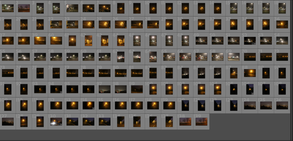
Personal Study: Photoshoot #3 – Loneliness Through The Morning Fog

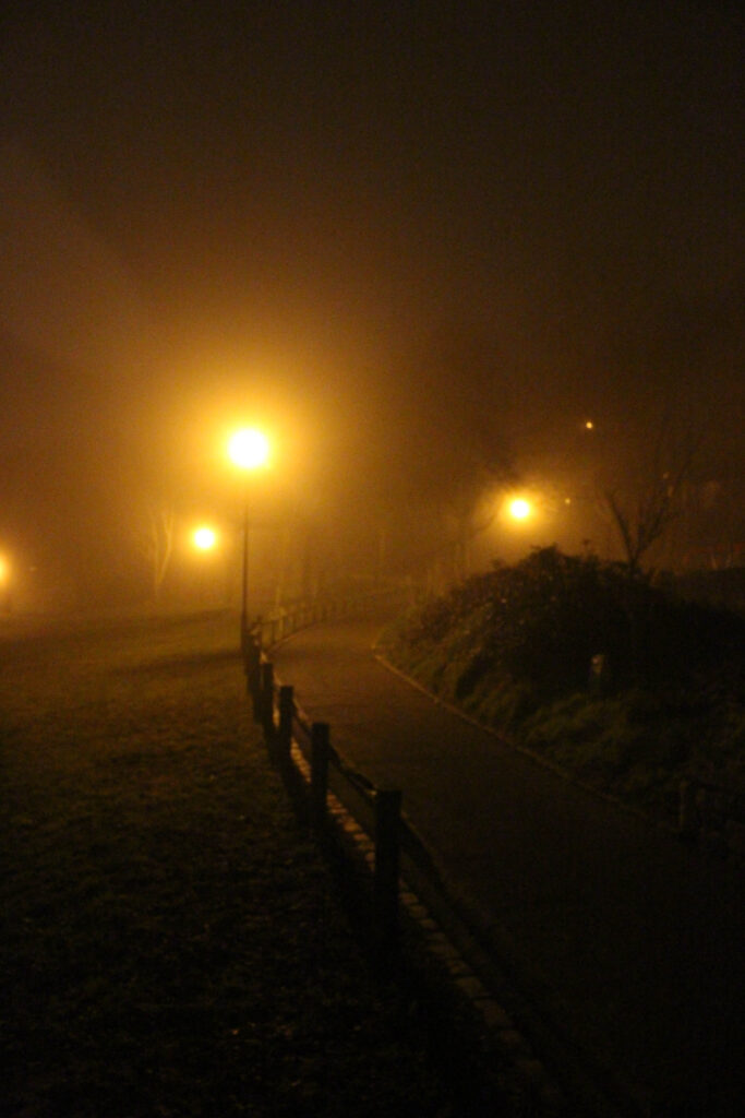
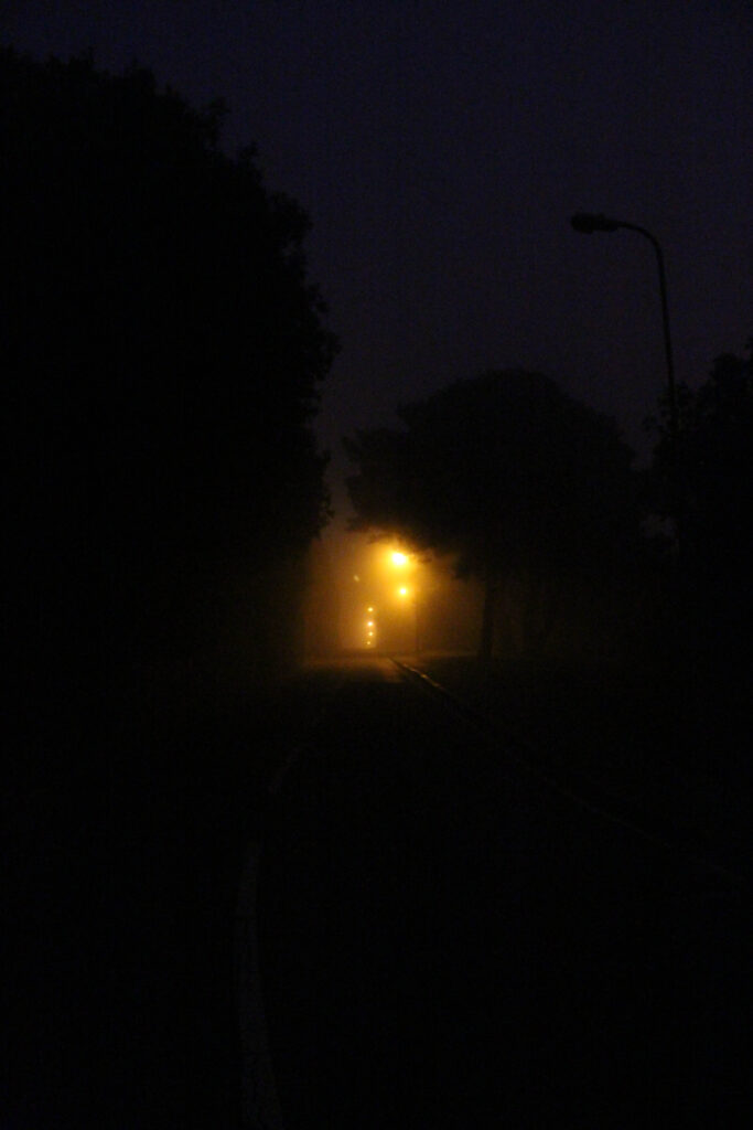
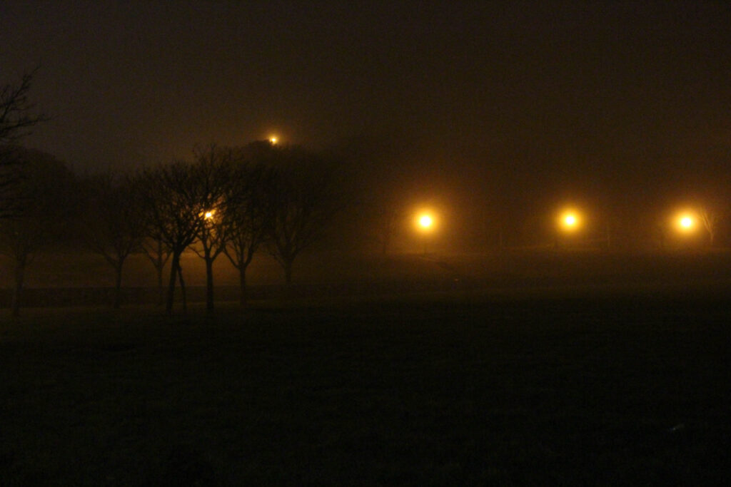
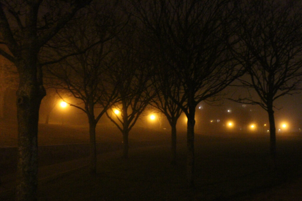
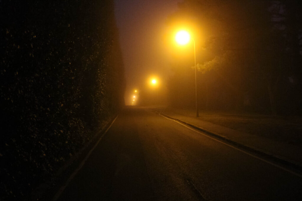
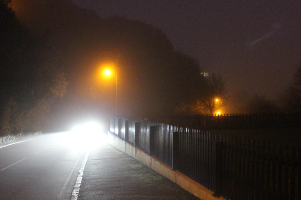
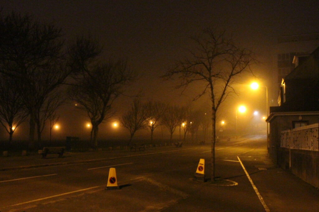
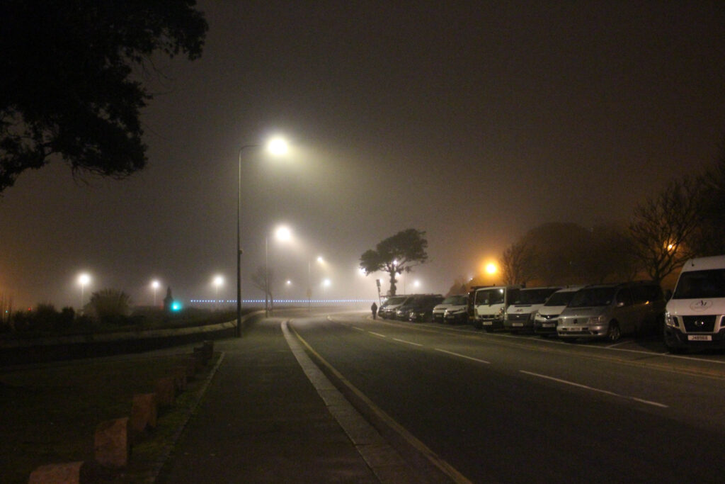
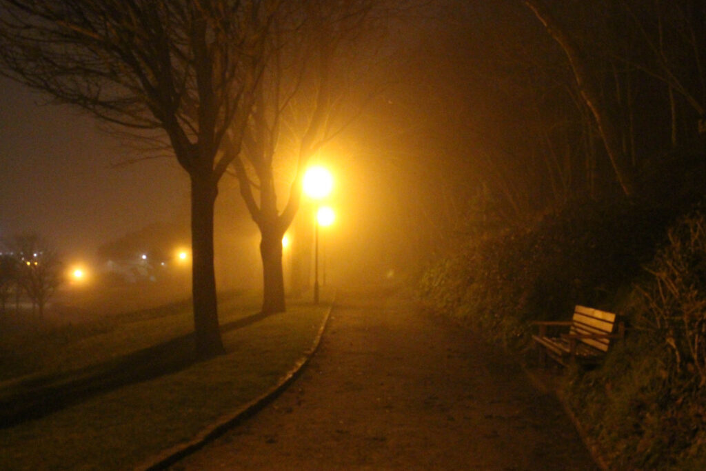
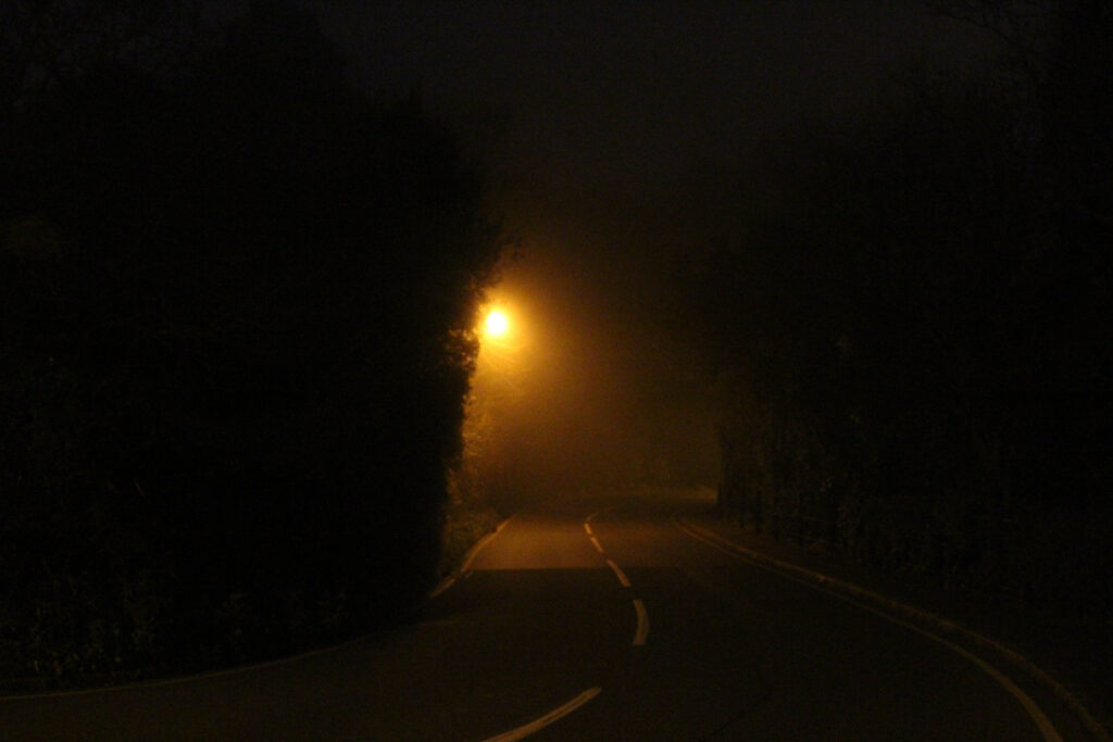
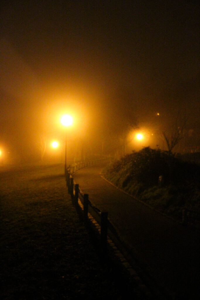
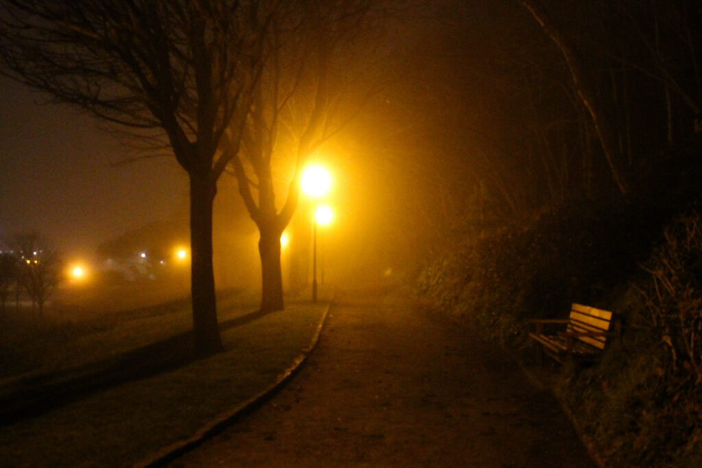
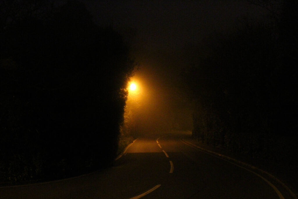
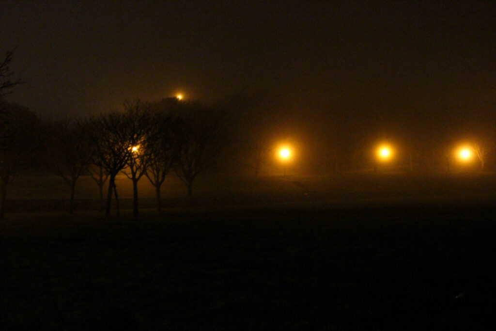
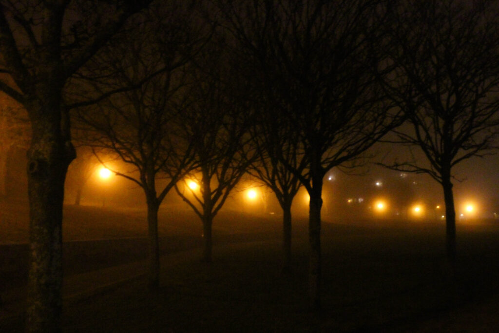
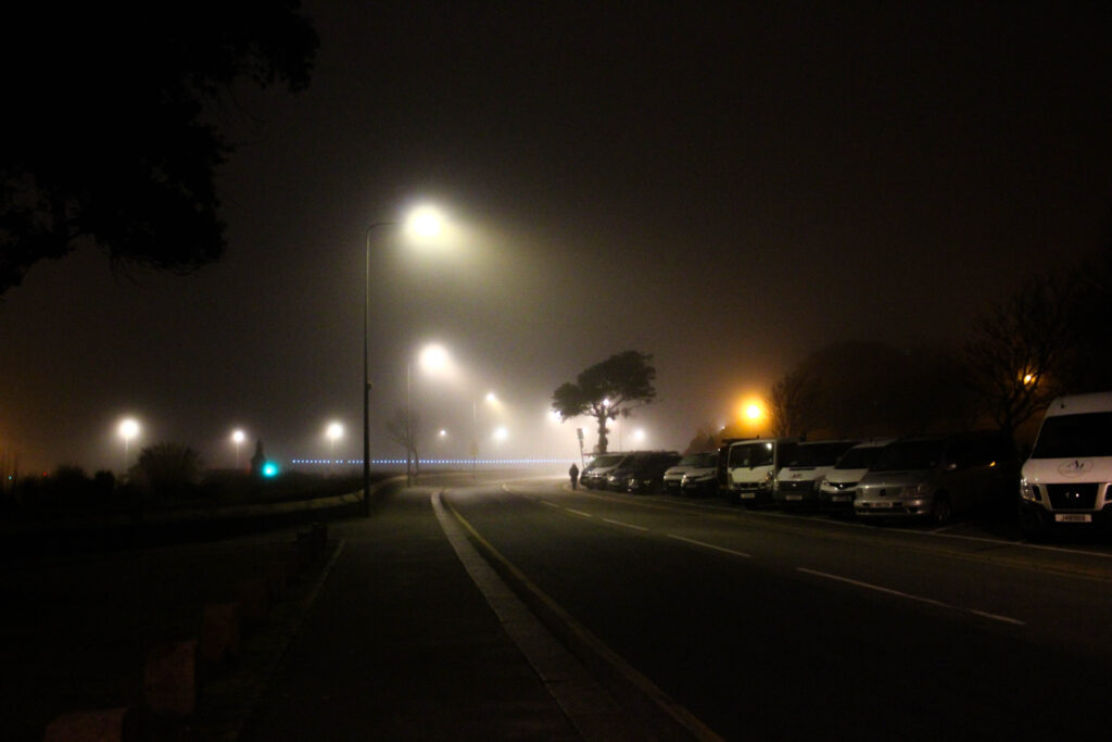
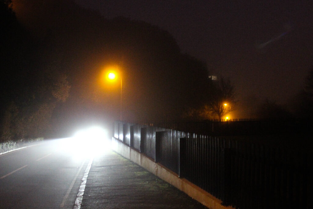
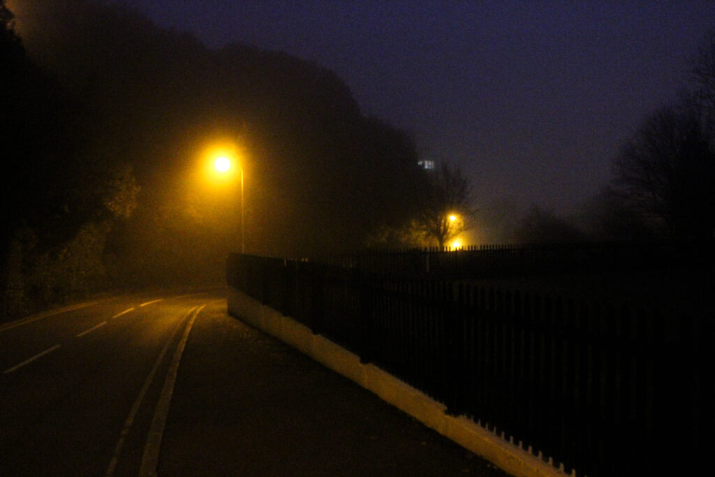
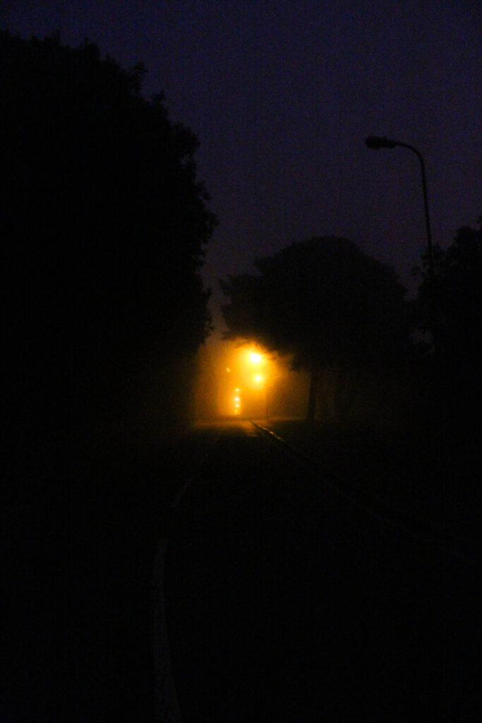
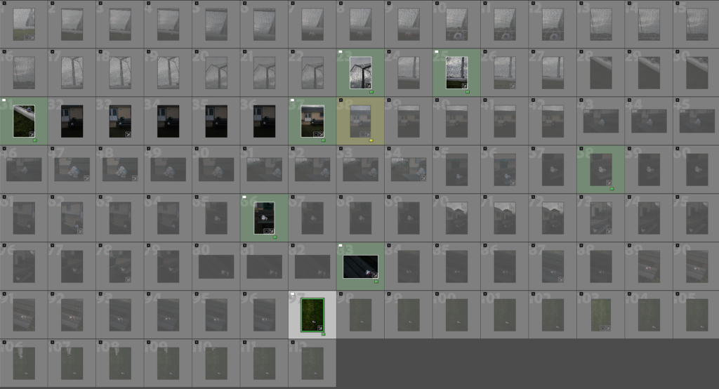
This was the initial contact sheet of every photo, for this photoshoot I went out in the early morning to capture the morning fog, as I want to explore how the mist/fog creates a dreamlike, unreal setting which alters the general landscape. When I went to capture this photoshoot, I had arrived at the originally planned location just as it was starting to become light outside, capturing the indistinct changes in how the location looked under the elegant smog. The morning fog not only dispersed the light, but also created this interesting beam effect around the lampposts within frame, making this the focal point in the majority of the images captured during this photoshoot. The beam of light poking through the fog added an unearthly quality to the setting, highlighting the sense of mystery and the transformation. The sense of loneliness is also found in this photoshoot, as I purposefully chose a time when few people would be out. the photographs show the empty, quiet landscapes with no signs of life which added to the feeling of abandonment and solitude, both being the emotional impacts I intended to showcase in my project. This photoshoot was shot handheld, using a high ISO to keep a faster shutter speed in the low light, I did this as a long shutter speed would often capture a moving car or people, taking away from the sense of solitude I was trying to convey. Even though using a high ISO meant that grain would be seen in my images, I find that the grain improves and highlights the overall mood I was intending for. The slight grain found within the images compliments the foggy, dreamlike sense of the morning as well as the contrast between the warm light and the cool fog. Overall I took 139 photographs during this photoshoot.
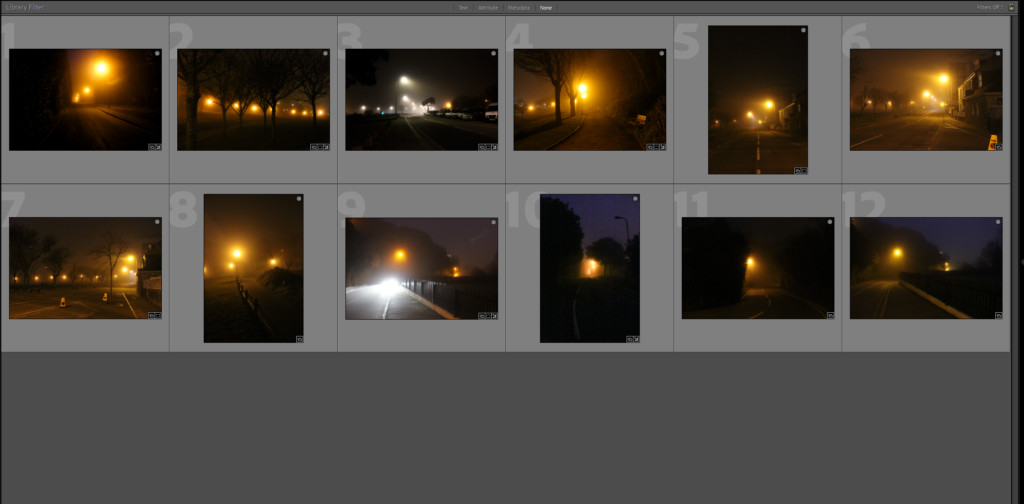
From the 139 photographs I captured during this early morning photoshoot, I selected 13 final images which I find best fits and showcases the themes and mood I am aiming for with this project. The process I went through to select these images, required me to review each image and focus on the ones that caught the interplay of light, setting and the feeling of loneliness I am aiming to acquire. I chose the photographs which highlighted the misty, unreal quality of the fog, the beam coming from the lampposts and the quietness which reflect the sense of isolation. These final images I have chosen show the emotional value and mood I hope to send throughout my photobook.

Final Image Selection – Unedited
These images showcased above are the 13 final photos in their raw, unedited state. These raw photographs show the contrasts, textures and the overall mood created by the darkness and the cloudy mist. Even though the photos already show off the emptiness, loneliness and the surreal, dreamlike effect that I intended on, the next task i will do is subtle editing to these images, improving the tones, changing the exposure and just perfect the overall mood of the collection of photographs. Editing these images will ensure that they fit in with the overall theme/story of my photobook.

Final Image Selection – Edited

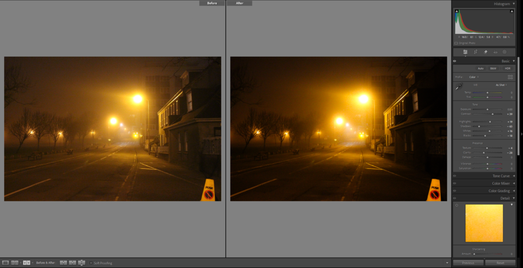
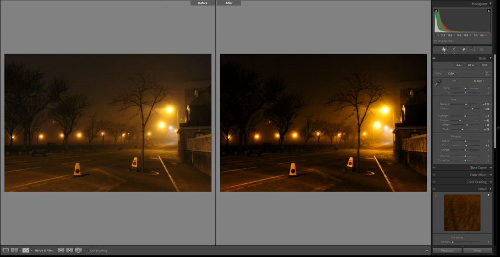
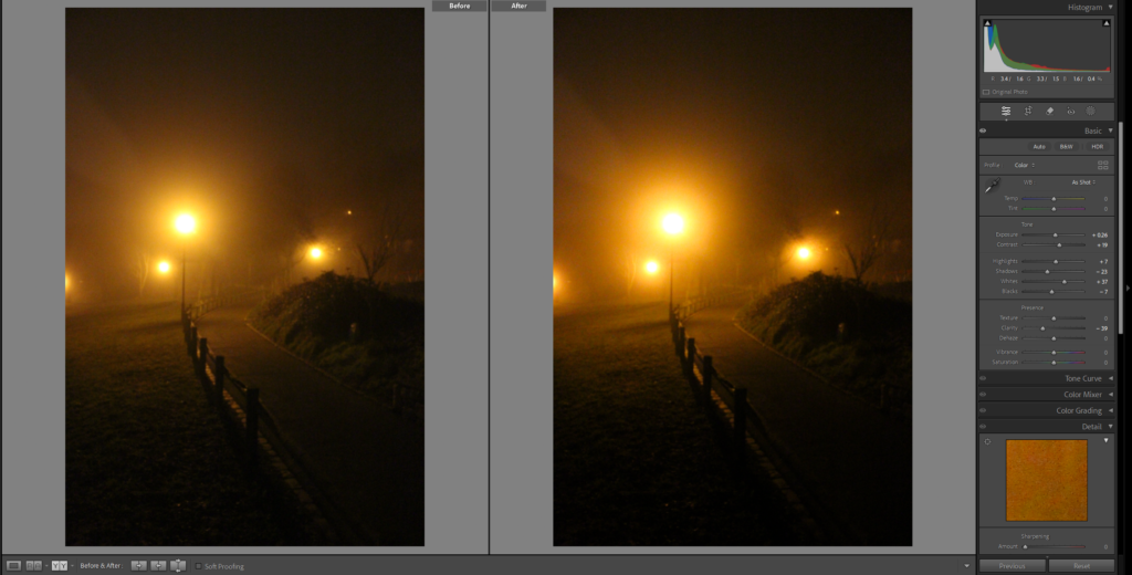
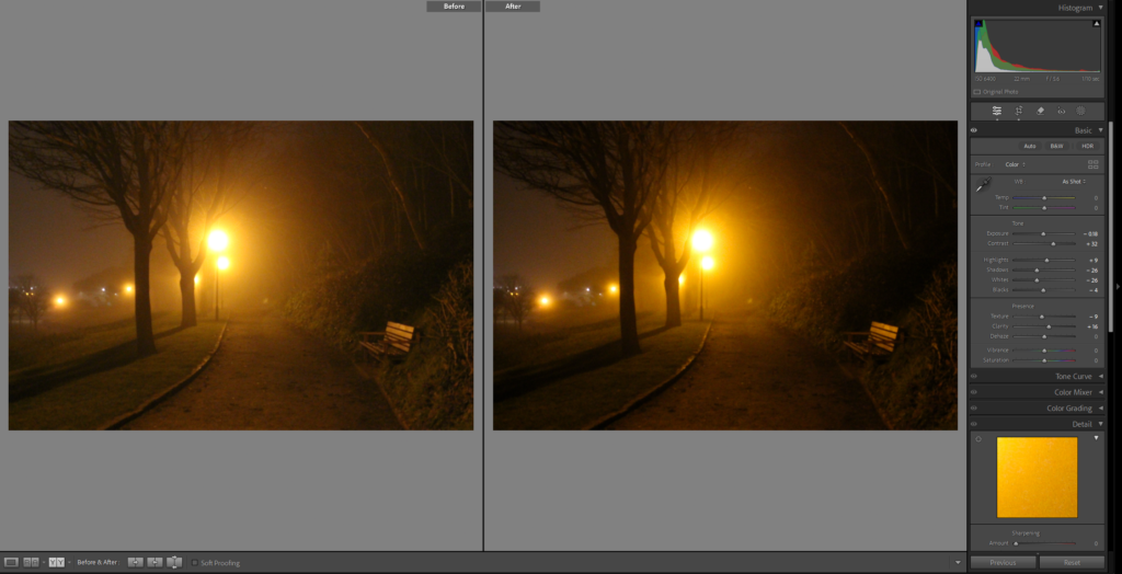
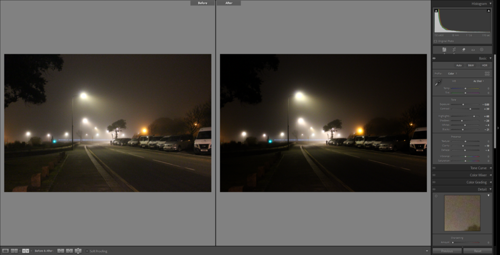
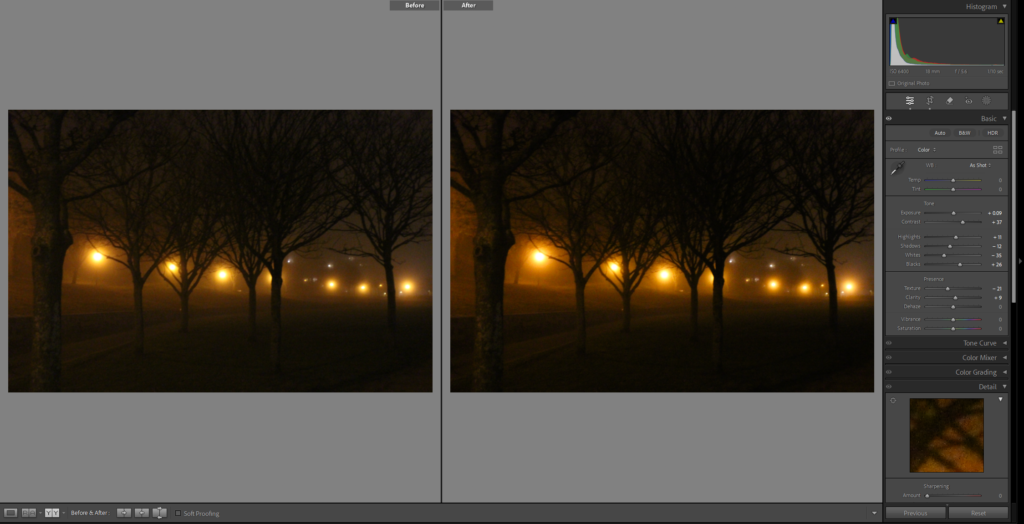
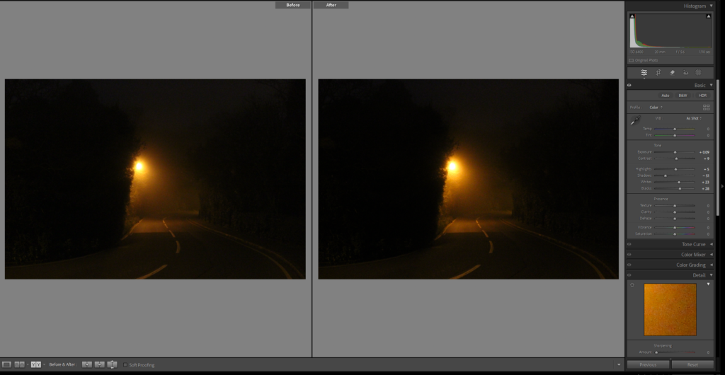
Once the 13 images were carefully chosen, I started editing them in order to enhance the overall mood and theme I am aiming for. My main target when editing was to highlight and show off the dreamlike qualities of the foggy morning whilst also improving the theme/mood of isolation. By altering the contrasts and highlights, I managed to find the perfect balance between the warm lamppost lights and the soft tones of the fog. Whilst editing I also brought out some miniscule details which might have gone unnoticed. These photographs below are the final, fully edited images for this photoshoot.
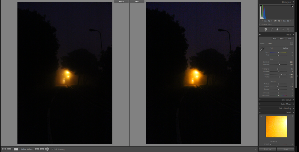
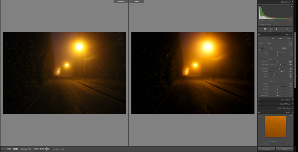
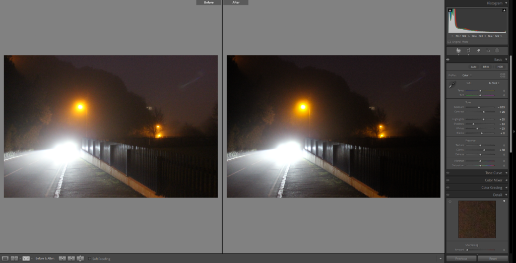
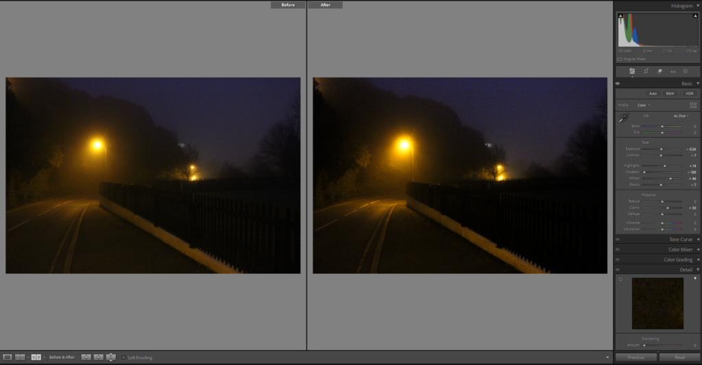
Final Image Selection – Before & After
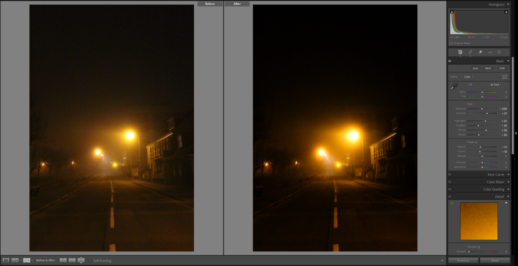
Image 1
Image 2
Image 3
Image 4
Image 5
Image 6
Image 7
Image 8
Image 9
Image 10
Image 11
Image 12
Image 13

As You can see for these images, I only did subtle adjustments to them. My goal when editing was not to dramatically change the raw photos, but to slightly improve them and to refine the overall mood of the images. Every edit had a high focus on perfecting the contrast, highlights and tweaking the shadows and whites, with most of the photographs, I increased the contrast to emphasize the quality of the fog. The purpose of altering the whites, blacks and shadows to bring out smaller details which were hidden behind darker areas. Overall, my choices when editing were done to keep the natural sense of the foggy night whilst also intensifying the feeling of solitude that the images show.

Favourite photographs from this photoshoot

Favourite Photograph #1

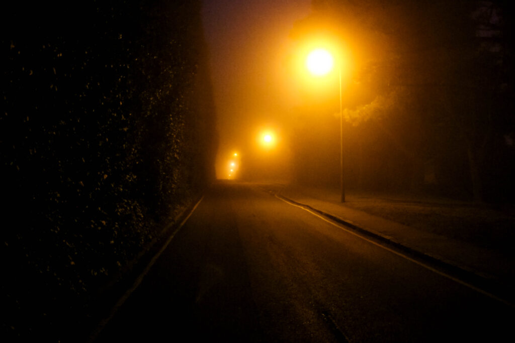
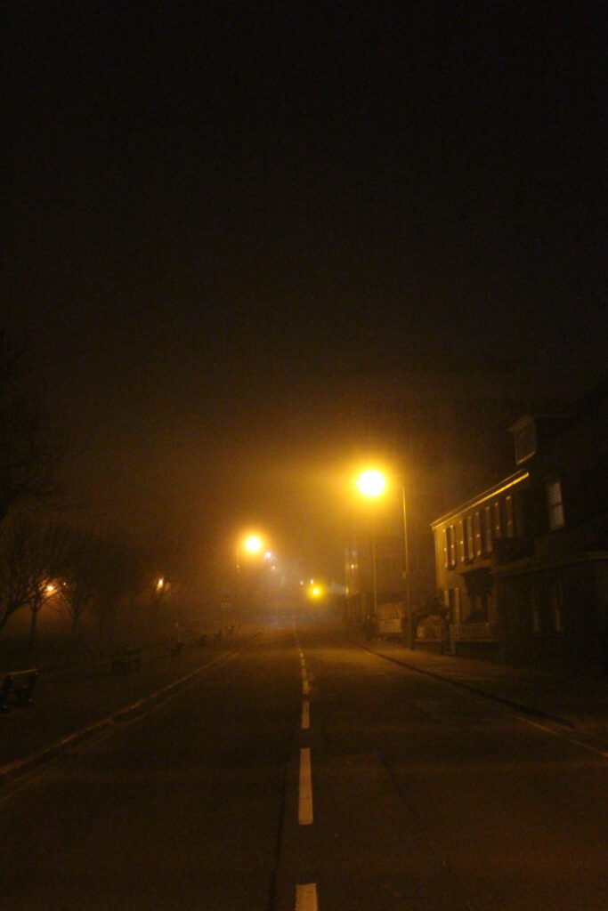
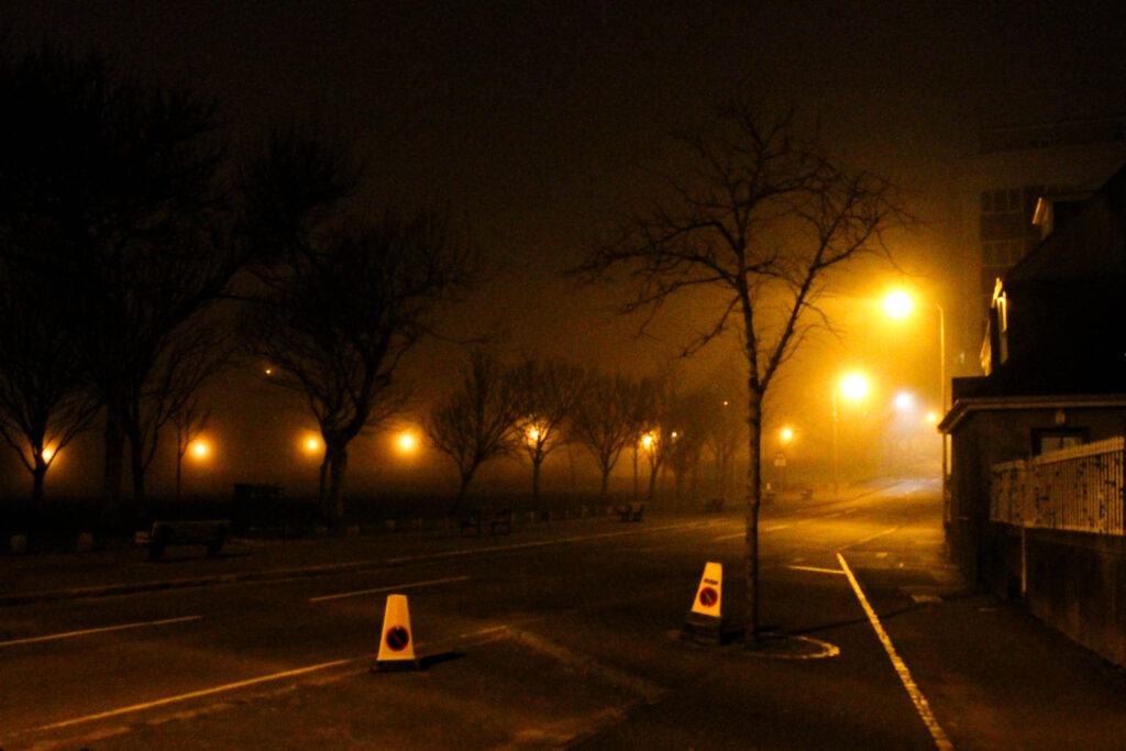
This image shows a long, desolate road being lit up by a warm glow from a row lampposts. The contrast between the left of the image being dark and the right side of the image having an intense amount of light, draws the viewers attention towards and through the road and pavement, almost like leading them into the unknown. My favourite aspect of this image is how it captures the sense of solitude, the empty road in this frame could suggest abandonment, however the working lamposts give an idea of life, fitting perfectly with my theme. This photo will be a main piece inside my photobook, as it clearly portrays the mysterious, lonely mood outlining the dichotomy between the day and the night.

Favourite Photograph #2

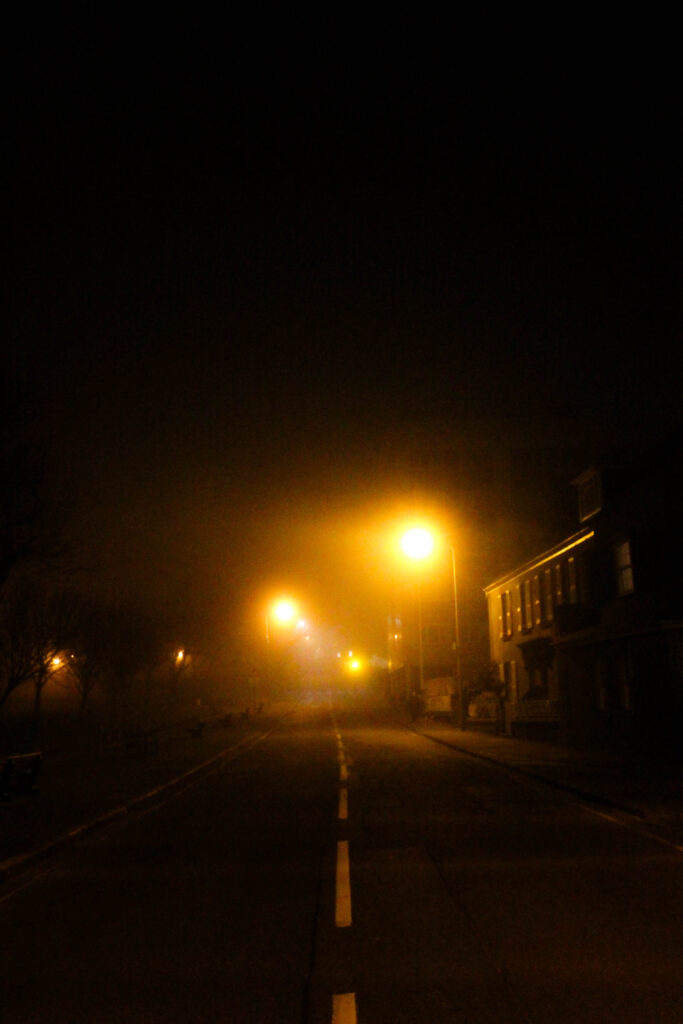
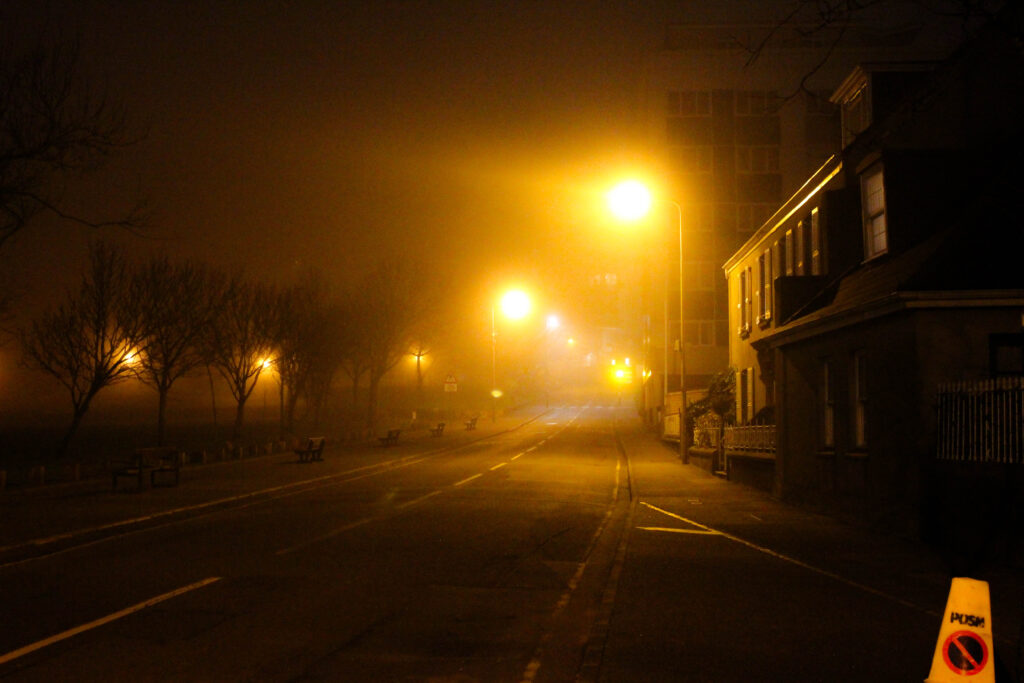
This photograph displays an urban landscape filled with mist, allowing the lampposts to scatter freely. The soft light turns into a warm glow which is complimented by the mist surrounding the lampposts, the leading lines on the road and the lights slowly fading into the distance, it entices the viewer to follow the path into the unknown, similarly to my other favourite image. In my opinion this image is the definition of the normal becoming abnormal, the emptiness of the urban setting mixed with the glow of the artificial lighting, creates a quiet narrative of walking through a place which feels both safe and uncomfortable at the same time. This photograph will also play a key role in my photobook as it reflects my theme clearly, showing how landscapes during the night become abnormal.

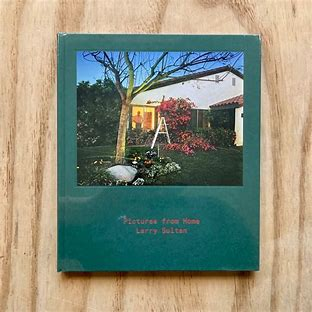
Deconstructed Photobook – personal project

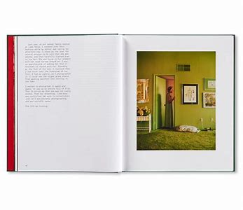
Pictures From Home – Larry Sultan – Deconstructed and Explained

Pictures from Home – Larry Sultan

Published in 1992 this book was an interesting combination of memories and current day scenes. An insight into an American lifestyle, originally based around the families political views however it became a passion project of sorts looking at how he saw his family, how his family saw themselves. Sultan himself said ‘I wanted to puncture this mythology of the family and to show what happens when we are driven by images of success. And I was willing to use my family to prove a point.’ Woven into the book are old family photos and stills from home videos. The current photos he took are of his parents enjoying their ‘American dream’ retired living how they would like to.

Why?

Sultan produced this photobook to show an American dream. -The “American Dream” is a phrase referring to a purported national ethos of the United States: that every person has the freedom and opportunity to succeed and attain a better life- the one of his parents and how they chose to live it, when retired. Sultan started the project with the idea of explaining politics or at least exploring his parents conservative views. However over the ten year production period it became focused on his family, old photos and videos. A desperate attempt to stop time in it’s place, capturing details forgotten over a day and details forgotten over years. It was received as such, with phrases like ‘One of the most incredible things about Pictures from Home is how vulnerable Sultan allows himself to be in the text, in which he confronts insecurities about himself and his work, brilliantly deconstructing the project and the challenges of making it.‘ and ‘Larry Sultan’s images and words were his reconciliation with the oedipal mess of the American Dream.‘  and ‘one of the most moving and indelible family portraits I’ve ever read‘. The book, moved people, a relatable attempt to store memories and explain ones life. It is an intense family portrait sublimated with snippets of conversation, tension and love, flaws and all is featured within this book.

Larry Sultan

Larry Sultan a widely known photographer. Having grown up in California this quickly became the main inspiration source for many of his projects. He has published books and photographs, combining documentary and staged photos to create his desired effect of heavy, psychological photos, depicting family life and everything around it. His most known project is ‘Pictures from Home’ published in 1992 having spent a decade creating and capturing photos and recordings. Sultan went onto create more photos and photo books all mainly in the same California setting, never straying to far from home.

How Sultan took the photos

Sultan took these photos by visiting his parents every few months armed with his camera gear. Spending a few days executing ideas while recording notes and conversations, completely confusing his parents. This was reflected upon within the book, in which his parents voiced their confusion and almost annoyance for the project, not understanding the purpose. One shot in particular had Sultan sneaking in while his mother was asleep and taking photos. This describes his approach to photography well, he uses the concept literally, trying to stop time in moments others might not notice and would be forgotten about.

The Book Itself

The book has a slightly rough feel, with a textured hardback cover and a smooth added photo onto both sides of the cover adding a preview into the book itself. There is indented text, the title in small on the cover and spine, simply stating the title and photographer. Within the book the photos themselves have been printed onto two types of paper, thick glossy photopaper for the bulk of the photos. But for the old family photos and video stills they are printed onto softer, non-glossy paper. A mixture of colour and black and white have been used, the black and white being old family photos taken in black and white originally. Sizing is important when it comes to producing books, as this one has many orientations of photos the book is 23x27cm a size similar to a4 but squarer. This allows different photos to fit while keeping the book portrait. Overall the book has 192 pages with 140 of these being black and white. The cover itself is a hardcover with a photo stuck placed in the upper half, giving the appearance it was stuck on, like a family photo album would have on the cover. The title is on the cover, ‘pictures from home’ a literal title describing the book. The story was originally based upon political views before switching to a documentation of a retired couple living their ‘American Dream’ and how the photographer is related, his views and relationship with the subjects, his parents. He tells the story through a series of documentary and posed photos of his parents in their home and enjoying their lives. Often using a deadpan approach. There is no specific layout, using double pages or full spreads for some and putting multiple photos on the next page. Creating an interesting, relatable, unpredictable family dynamic. Each photo is carefully selecting, relating to the text beside it or following on from the previous section of photos, by editing the photos in a, true to life, colour scheme. Using the bright, bold colours to keep a theme throughout the book, reminiscent of the time period in which the book was created. It appears Sultan has done the book in chronological order of his parents day, slotting in shots and conversations when it added to that part of the story.

Evaluation of photoshoot 3

My best images:

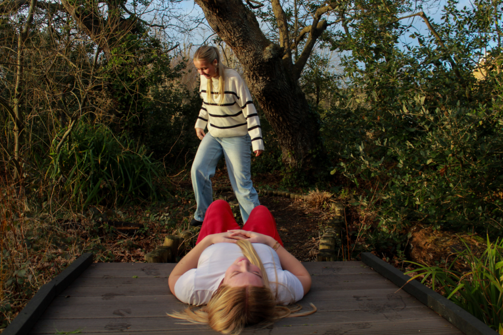
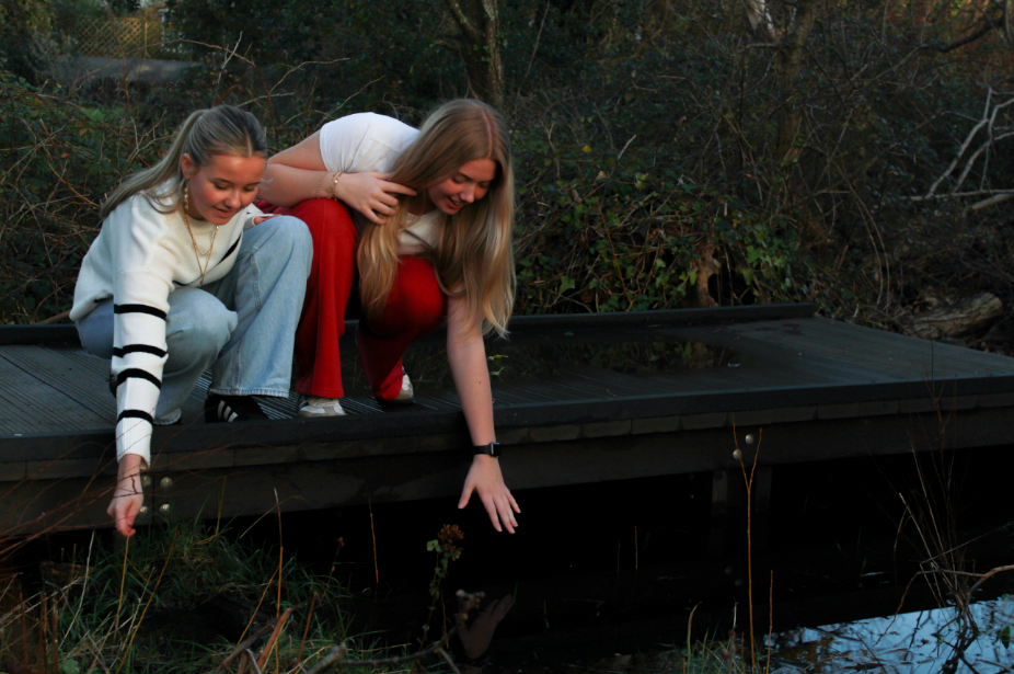
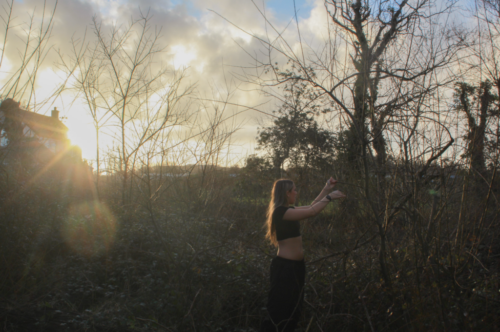
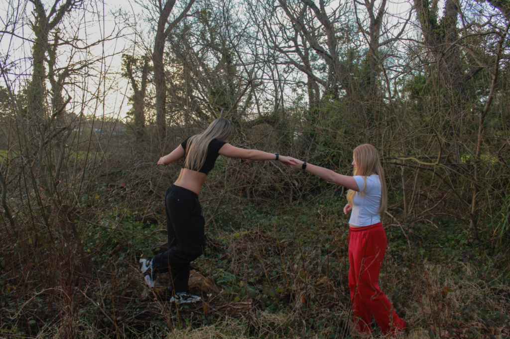
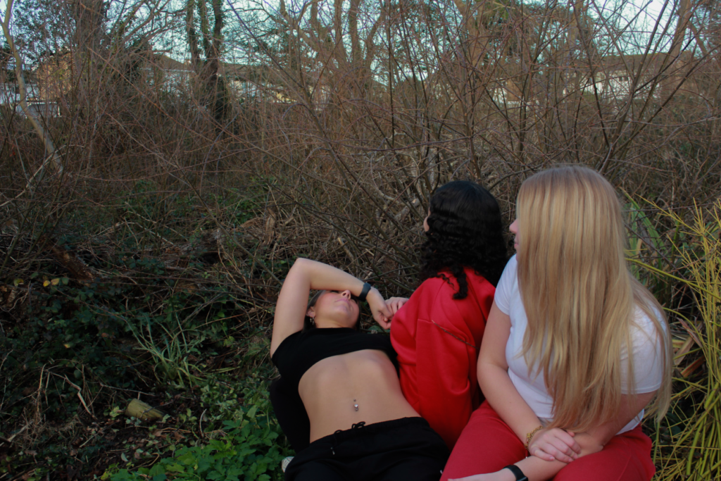
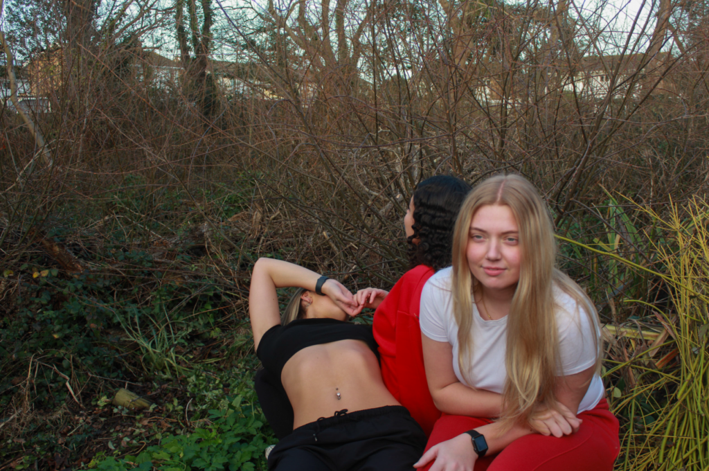
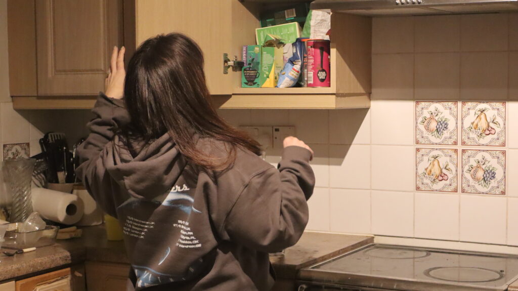
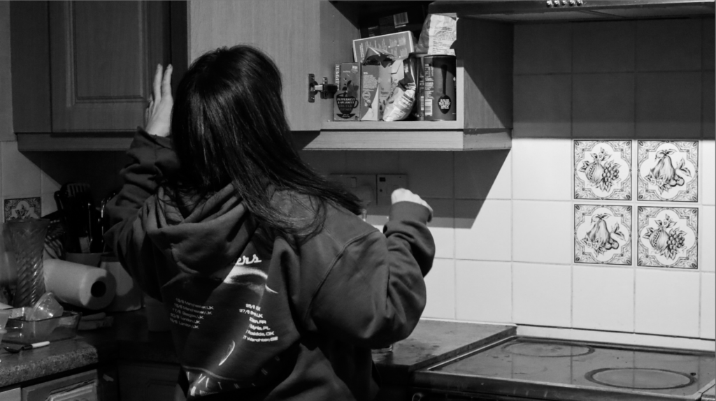
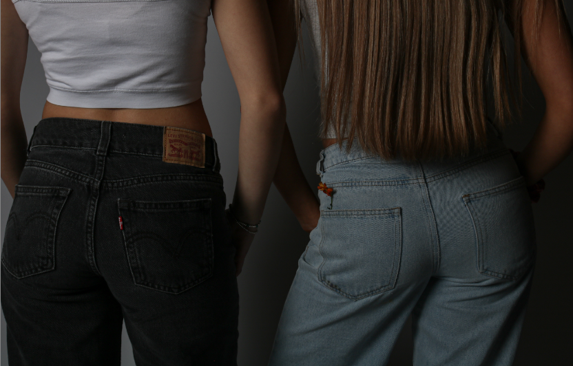
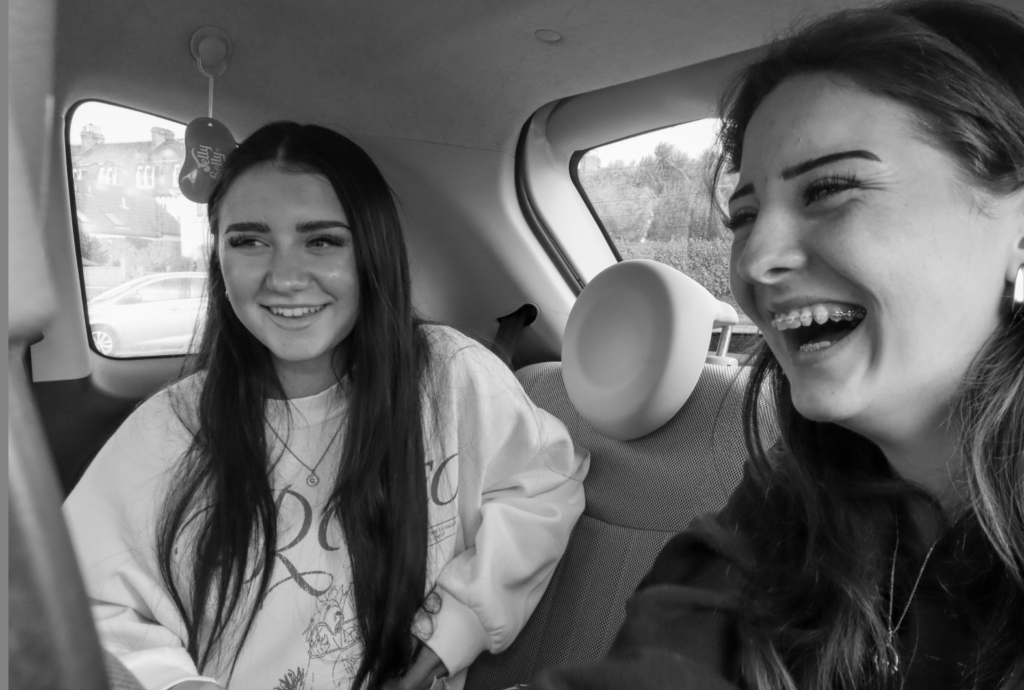
In conclusion, my third photoshoot for my personal study went successfully. I believe I carried out a similar approach to Kurland very well, and I think it will be easy for the viewer to interpret who my artist inspiration was. Each of my final outcomes were carefully chosen when I was editing, for the purpose of expressing different emotions and connections between the girls. I chose the ones that I think resembled Kurland’s series best, and highlight the overall themes of my project.

What I think went well:

  • Location of my photoshoot was good – different from the first shoot I executed inspired by Kurland
  • Lighting of my shoot – due to the time of day I took my photos, the overall lighting in all the images is perfect for my editing process.
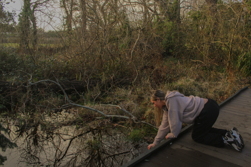
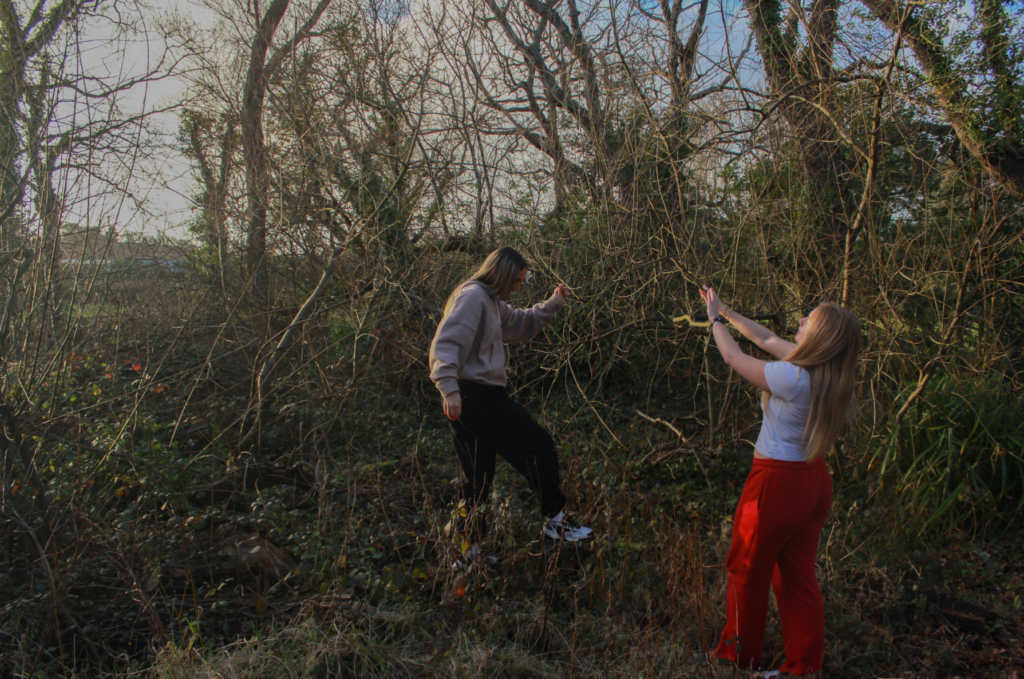
  • Subjects – they presented their roles and the relationships between them very well, similar to Kurland. For example, contact with each other and helping each other

What I think I could improve on:

  • Although the setting of this shoot was effective, I should have experimented with different scenery. For example, big empty roads to show that the girls are exploring alone
  • Camera settings – I did not adjust the shutter speed of the camera effectively, meaning some of my outcomes were not in full focus due to a moving subject

Photoshoot 2

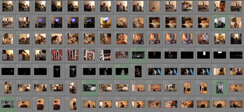
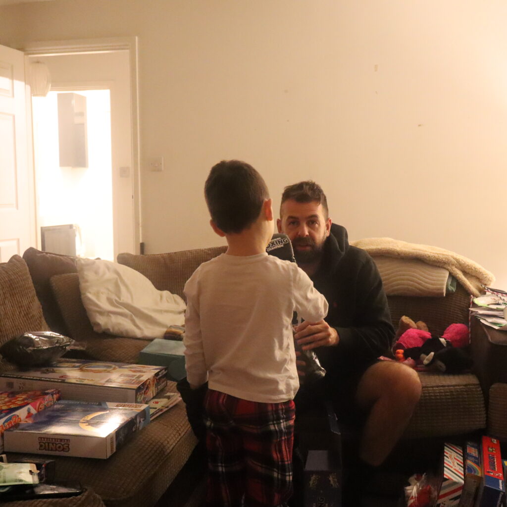
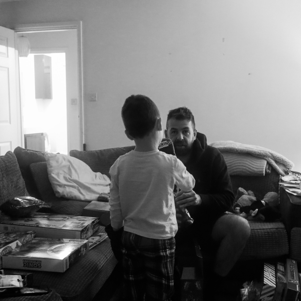
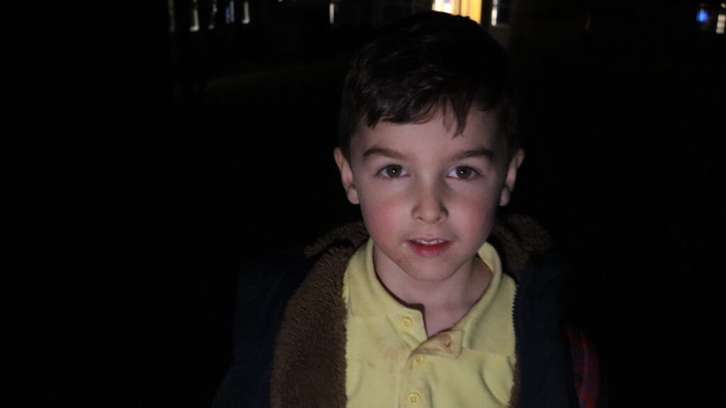
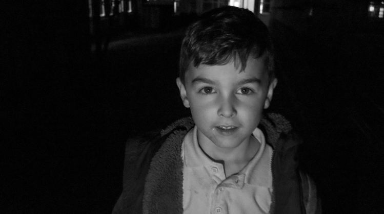
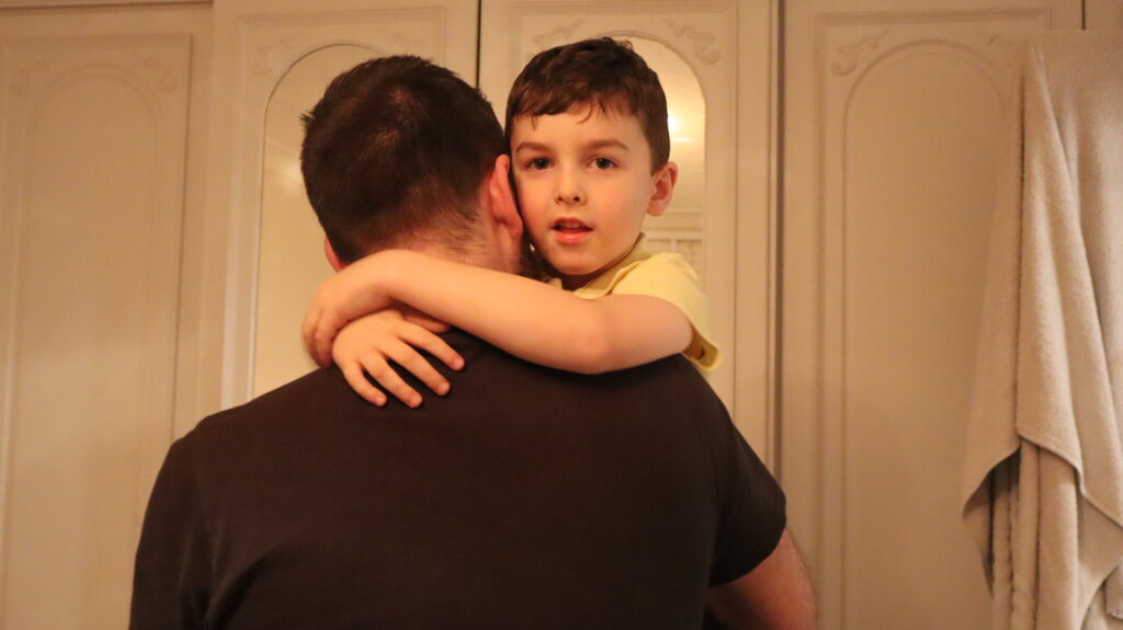
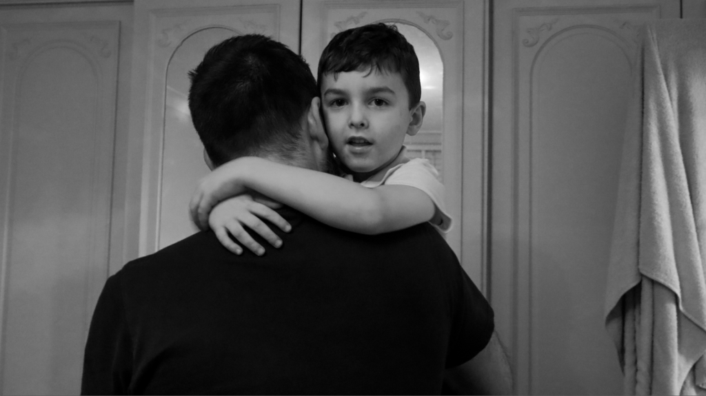
This photoshoot consists of images of my brother and family. I have images of my brother alone, with his dad and images of my mum. These photographs were taken both inside, the house, and outside, on the street and outside of his school.

My images before and after editing:

Before:

After:

Before:

After:

Before:

After:

Before:

After:

Photoshoot 3

In this photoshoot, I wanted to add an under-exposed aesthetic to my images as I have began thinking about the sequencing of my photobook as this is a key aspect in making sure the narrative is consistent. These images are related to those I took during my second photoshoot, however they are taken at differing times of day and weather.

My intentions with these photos is to sequence them with relevant archived family images which I have experimented with in Photoshop, for example pairing the images relevant to football with images of my brother from when he was younger.

I wanted to use a darker tone in my images this time through the use of the time of day and weather type because it will enable me to show the other side of reminiscing on childhood memories – this being the more negative side where I reflect on the implications my brother has faced due to his diagnosis and add a tone of solitude into the images instead of a happier composition where it connotes ideas of remembrance and hope.

I took this photoshoot at FB football fields as this is where my brothers passion and talent for football began and where I used to go and watch him play matches to support him. Since he became unwell, he hasn’t really continued with his football as he hasn’t really had the motivation to go, so in this photoshoot I wanted to represent how he gave up his love for football, alongside the idea of having childhood memories stuck here.

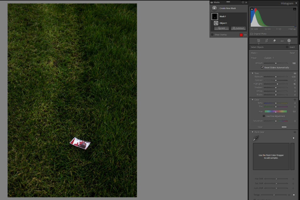
During my editing, I wanted to ensure that the image was still kept dark to represent emotions of grief, however I wanted to highlight the objects in the image to show small hints of my brothers memory. I did this by using the object masking tool and increasing the highlights or exposure of that particular item to make it stand out from the background and prevent it from blending in.

I also added a vignette to a majority of my best images just to reinforce the idea of seclusion and solitude as it darkens the edges so that not only the overall image appears sombre, but because it will create a more dramatic effect where the objects can be highlighted. This means that the viewer can really reflect on the comparison of the family image compared to these images as they become binary opposites being happy to sad.

Final Images:

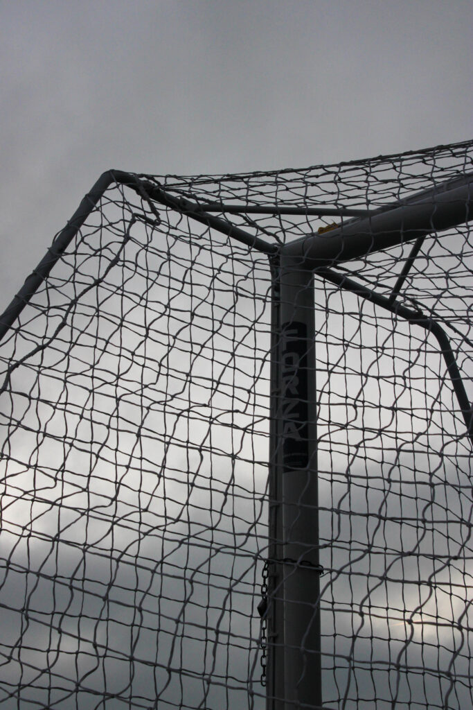
For this image, I shot with a low exposure in order to create this dark contrast. As it wasn’t great weather, the different tones of grey in the storm cloud can be seen to once again represent that fluidity of emotion that I as aiming to show in order to keep the narrative consistent on the various differing emotions surrounding my brothers mental health. I shot this from a low angle so that I could get the net of the goal to look similar to a cross-hatching pattern which I think has worked really well because this allows me to take images of sections of the landscape using formalism. Also, the more distinct straight lines add structure to the image in a more dramatic way which can connote feelings of seriousness and solemnity. The lock on the goal could be interpreted as if my brothers illness has locked away his passion and these certain memories that he may struggle to reflect on, restricting him from becoming the person he once was or growing from these experiences. The image didn’t require much editing as the natural sunlight was concealed by a cloud which meant that I could add a gloomy effect to really represent the morose tone in the atmosphere.

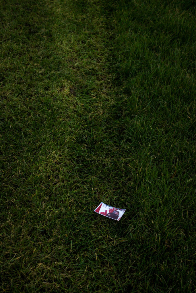
In this image, I placed down an image of me, my brother and my cousin from when we were in the UK at a photobooth. I noticed that the pitches had marks on them from the groundskeeper, so I used this as leading lines central to the image to symbolise how my brothers illness caused him to walk away from football. I wanted to add the image in as if he had left himself behind when his illness didn’t allow him to play football anymore because I thought that this would add a stronger emotive factor. I added a vignette because this helped me reinforce the feelings of desolation as it makes the edges of the image darker which denotes negative feelings. I took this image at a relatively low angle and pointed in diagonally so that the background of the image appeared smaller than the foreground. I feel that this enabled me to portray feelings of isolation and loneliness as there is nothing else in the image so that the viewer solely focuses on the concept behind the image rather than the technical aspects, making it more ambiguous. Also, the alternating directions and shades of the grass make the image look more chaotic as it adds movement and texture, which could be linked to the contradicting feelings that my brother feels about his ending of football.

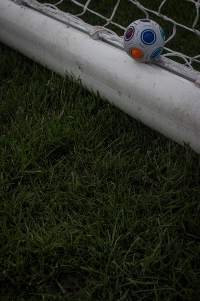
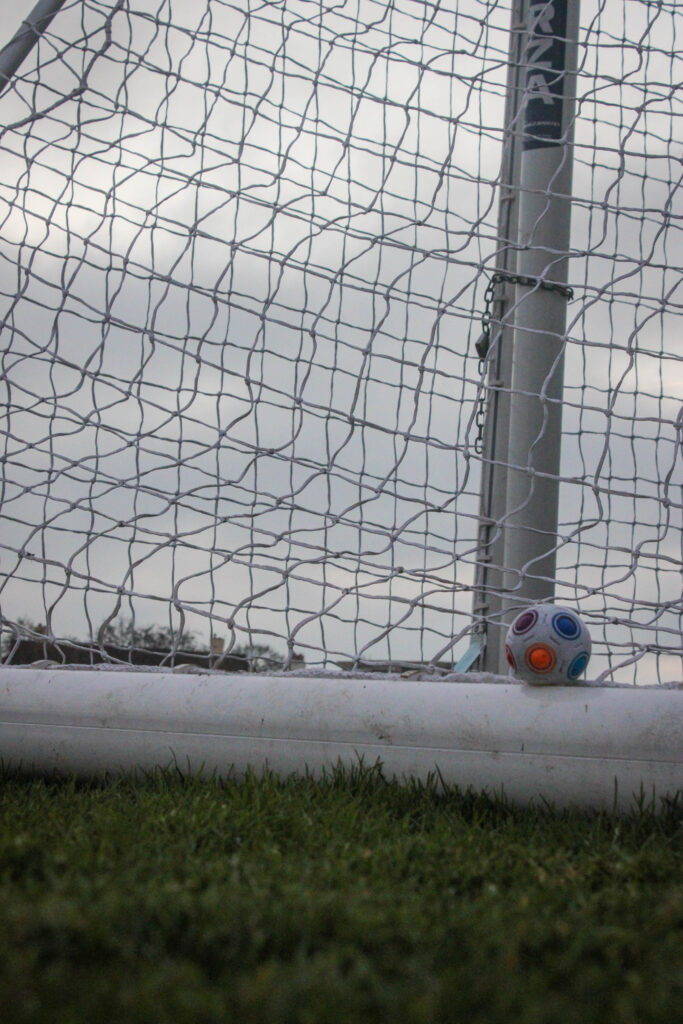
With these two images, I wanted to show the football left in the goal, untouched, as if it was representing the last time my brother played football. Instead of using a normal sized football, I used a smaller one as I wanted to show how young my brother started playing football and how this ended so abruptly when he reached the age of around 17 years old. I used a really small ball to add irony to the image through the dramatic difference in size between the ball and goal itself to make a implicit comparison to now, where the goal is now larger to resonate with how my brother has grown up, however the ball still remains small as his passion for football did not continue, hence why it has not increased in size.

In this image, I used the same angle as I did before however I bent down closer to the ground so I could get a more detailed image. I feel that there is a high contrast between the grass and the bar of the goal due to the vibrancy that works really well when using a low exposure because it adds drama to the image as the line is so defined. The way that the white of the bar is off-coloured, I feel that this could represent how my brothers main concern at the time was how well he played in a football match, something so innocent and pure, whereas now his priority is trying to get better from his bipolar which is a more difficult process, hence all of the marks on the goal. I used a vignette on this image to emphasize the dark tonal range which then meant that the ball looked brighter and would contribute to it being the focal point of the image. I used an angle that was diagonal to the goal which has created a straight line across the image to section it which adds structure and a more formatted aesthetic. The goal net itself does this too, however the curves of the lines create movement and shape.
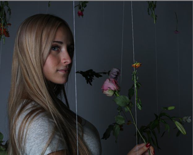
I used a similar approach in the image, however I put the camera on its side just about touching the grass which has meant that a lot of pieces are blurred in the foreground and look enlarged. I feel that this image looks like a combination of the previous images as this incorporates the stormy weather in the background to evoke feelings of gloom and despair, however this image uses a lot of lines such as the grass spiking up against the goal which may symbolise spikes in my brothers mental health in critical periods. The image was quite bright due to the weather being a large part of the image so I used a vignette on this image too as it allows me to darken the edges of the image, however I wanted to do this to emphasize the shadows made by the grass in the foreground as darkness evokes negativity which is relevant to my brothers emotions about this topic.

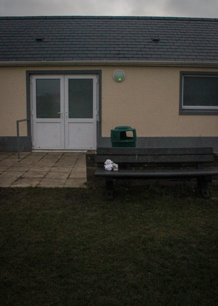
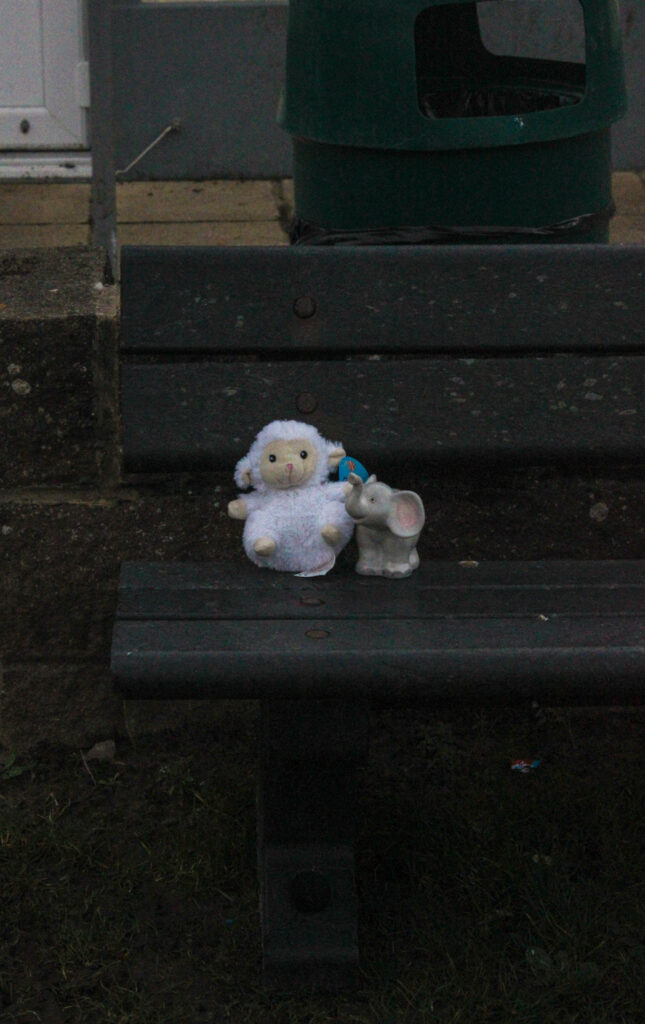
In my photobook, I am going to pair these images together as I feel the sequencing of them will be really effective. I took this image outside of the football changing rooms where I would always wait for my brother after his football matches as I was very young and would be ecstatic to congratulate him. For the first image, I stood quite far back and zoomed out the camera so that the objects looked far away, but could still be seen. I then moved closer, zoomed back in and bent down at a lower angle so that I could centralise the objects and take an image that was specifically looking into what they were. In my editing, I put the images side by side so that I could ensure both images had the same tonal range and looked as if they were exactly the same. I also used the object masking tool in order to brighten and highlight just the toys in a subtle way without altering the overall lighting because this meant that the objects wouldn’t disappear and blend into the background when they are the main focal point. I set them up on this bench as if they were waiting for somebody to collect them, as if they had been lost, in order to represent how I would sit and wait for my brother. I also think that this is effective due to the way the changing rooms look so dull and lifeless when paired with the muted greenery as the entire image looks depressing and lonely due to it being so empty. I think that this has portrayed how segments of both mine and my brothers childhood is left here as if it is left unsolved or unfinished as times changed so quickly once my brother became unwell.
Photoshoot 4

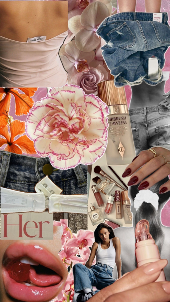
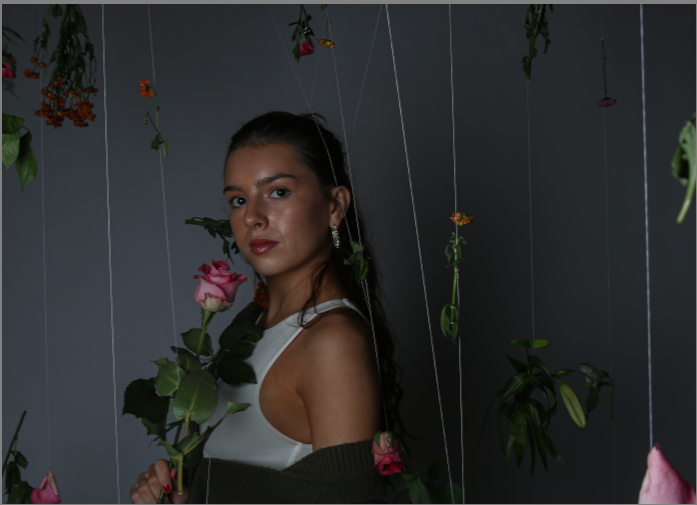
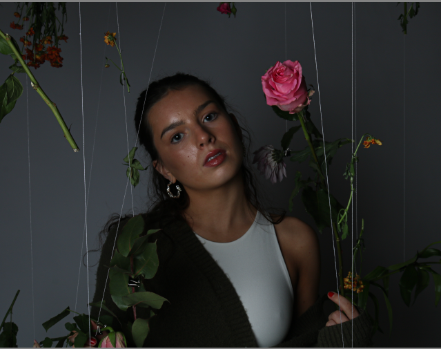
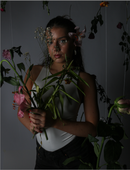
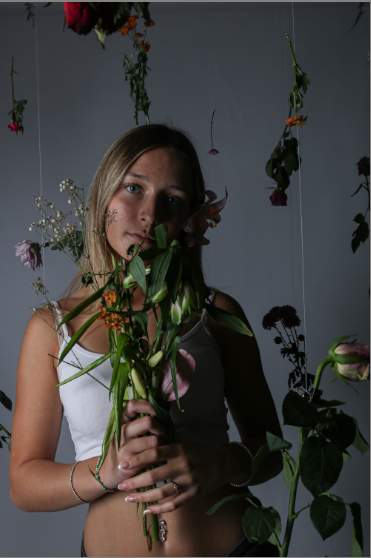
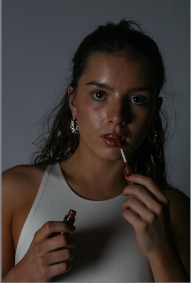
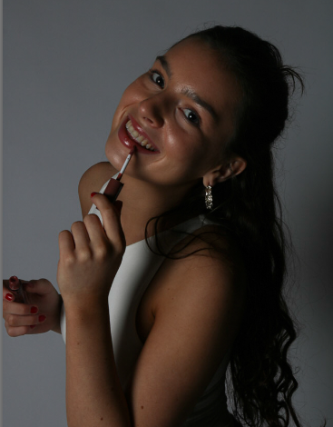
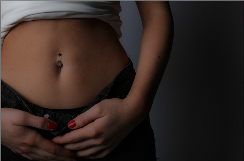
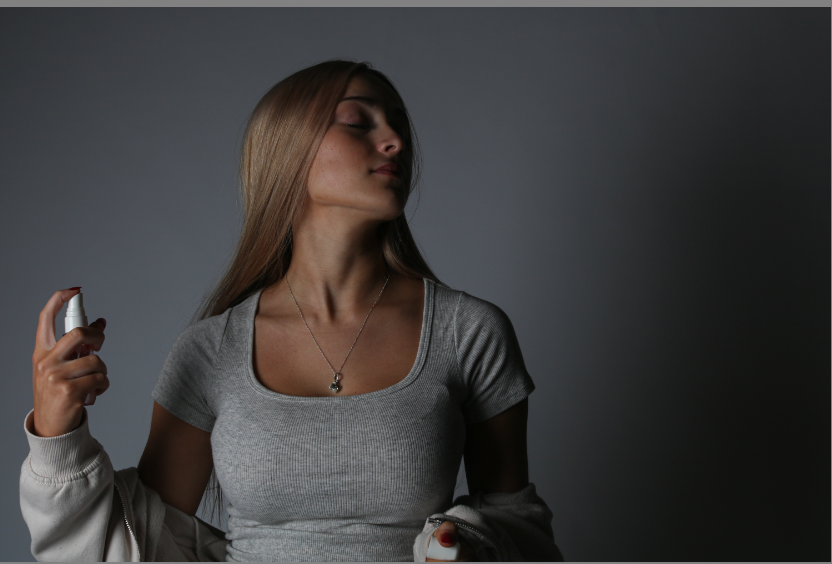
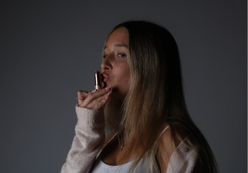
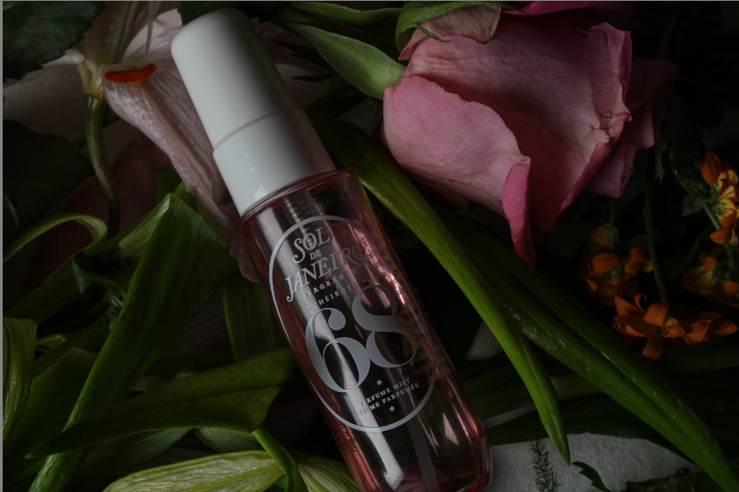
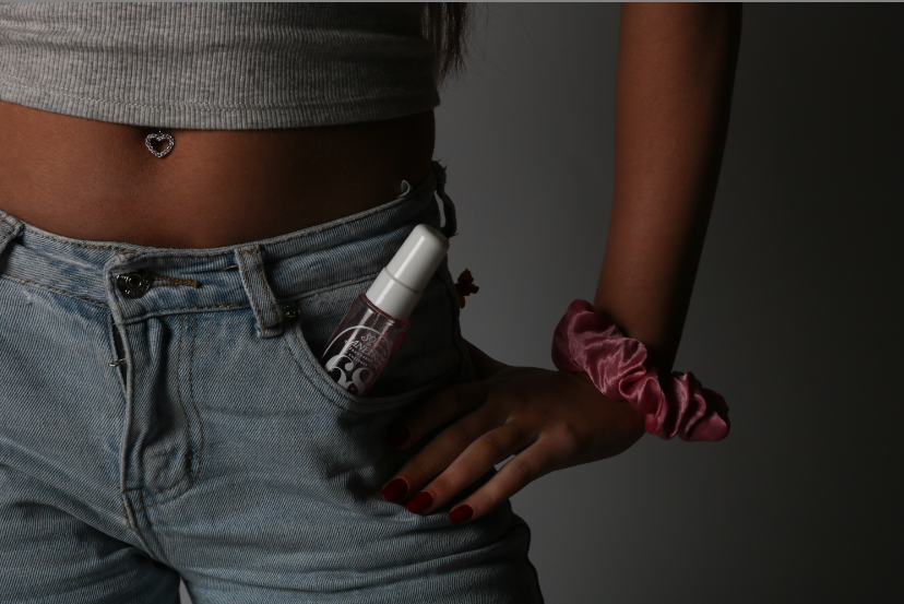
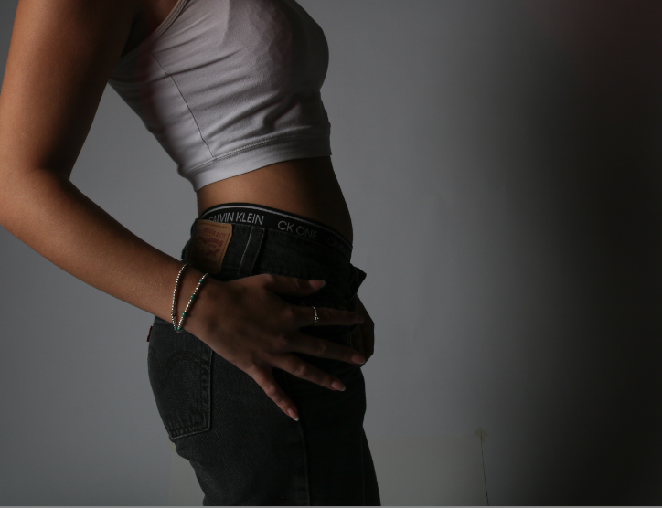
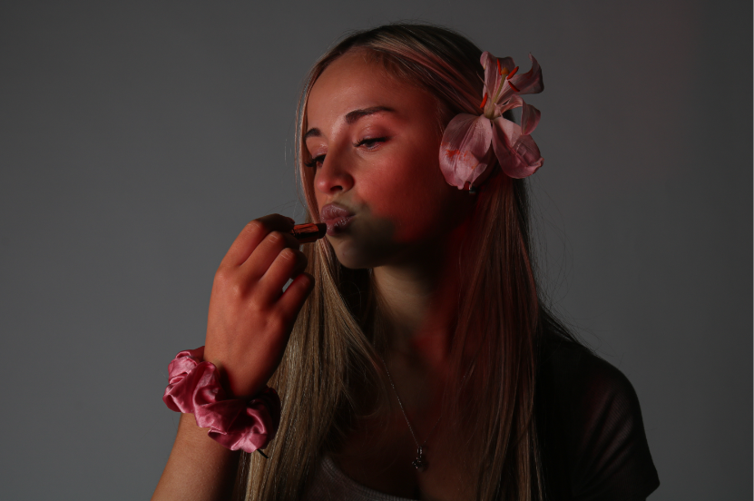
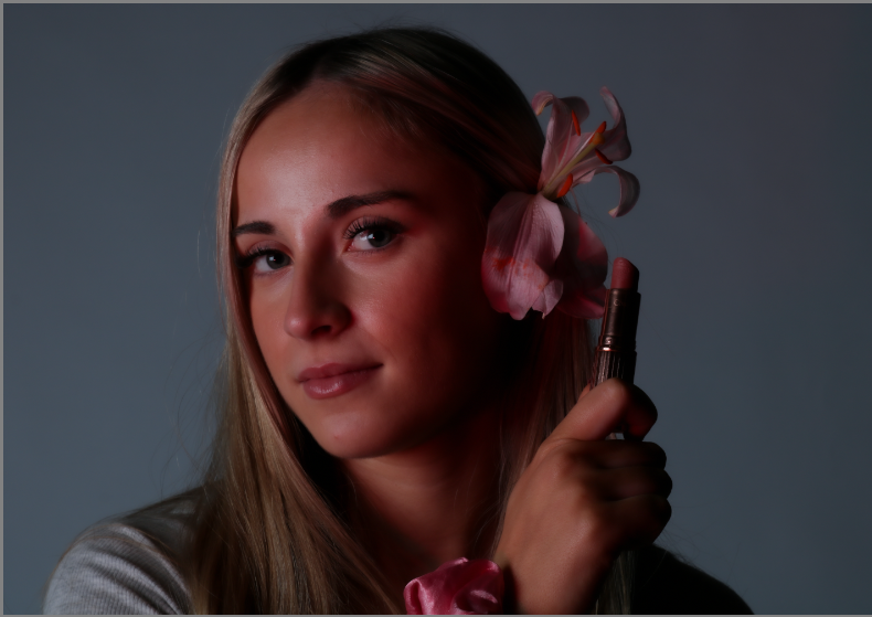
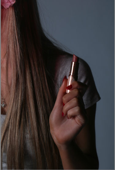
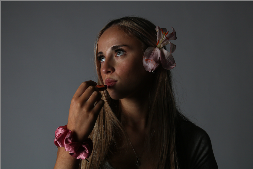
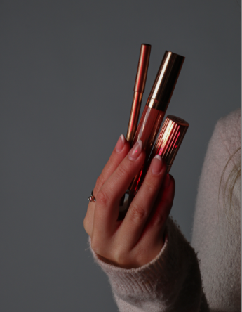
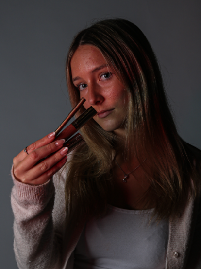
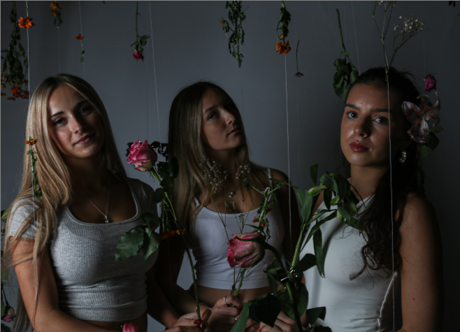
I decided to make a mood board for this photoshoot in order to gather ideas and inspiration for the type of images I would like to create. I wanted this photoshoot to be for the middle portion of my photo book and be for the promotion of products such as perfumes, makeup and clothing. I will be imitating different companies such as Mac, GUCCI and Charlotte Tilbury. I wanted to include lots of flowers in my photoshoot to demonstrate stereotypical female traits. I used 3 models for this photoshoot and focused on varying images from zoomed in, zoomed out or portrait and landscape to create images of different types. I wanted to include lots of flowers, makeup and stereotypical female colours such as red and pink which portrays an idealistic view of a women from the male gaze. I really like this mood board as it is eye-catching, girly and would draw in teens and women as it is an ideological aesthetic lifestyle they may want to relate to or aspire to live.
ALL PHOTOS:

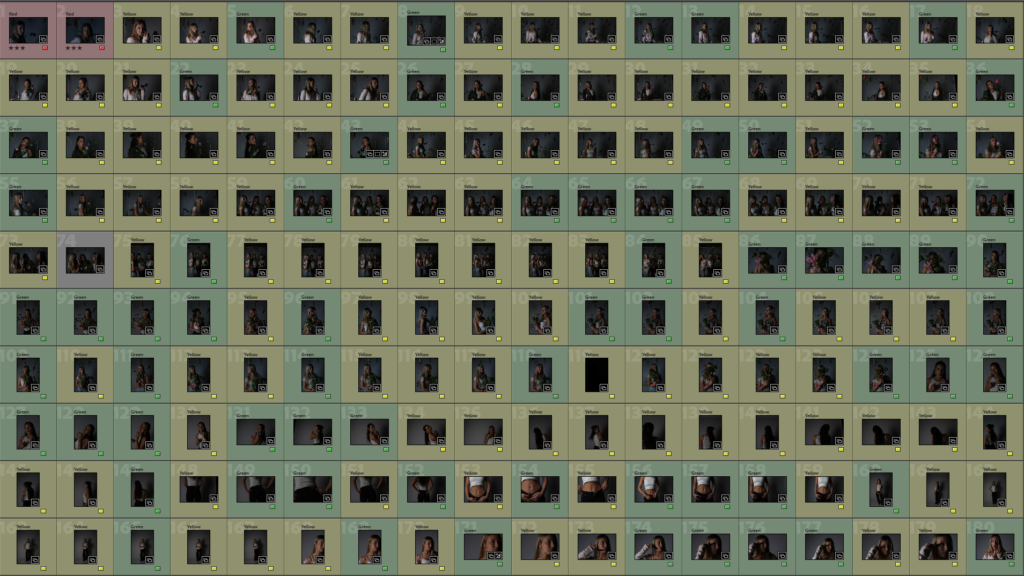
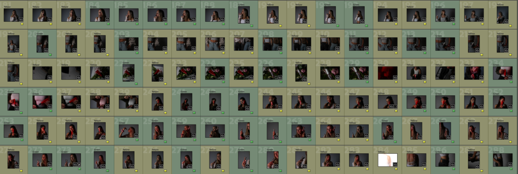
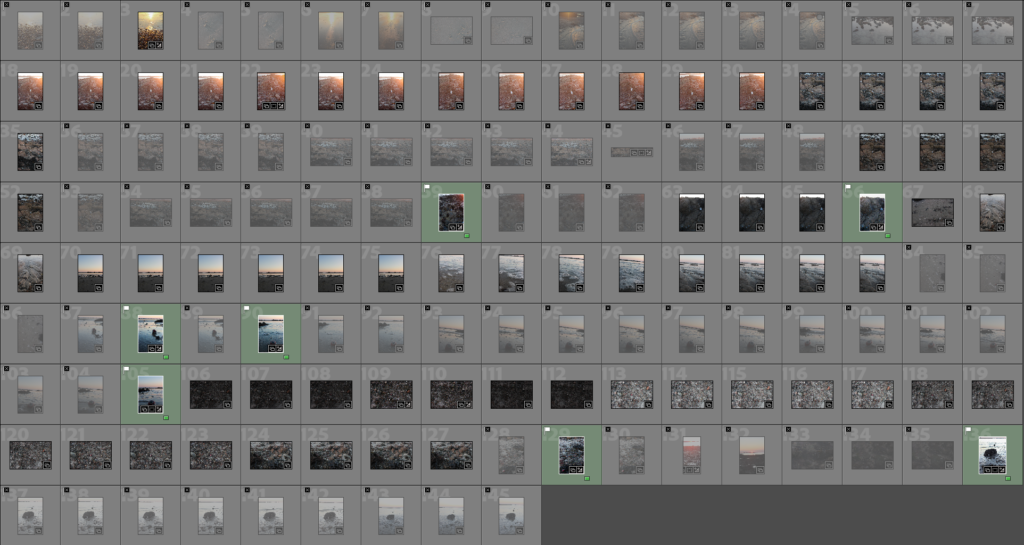
This is the contact sheet of all my images= 400 images. I feel 400 images Is a successful amount for me to categorise and edit in Lightroom to pick the strongest images to edit and use in my final photobook. I feel this is one of the most successful photoshoots I have done in this personal study project as I really liked the lighting and accessories and objects used to convey the subject I wanted to interpret. I liked how although the images were taken in the photography studio, they are still interesting and relevant however, more interesting and colourful backgrounds could’ve helped to escalate these images. However, I could also edit these images in Adobe Photoshop or Adobe Lightroom in order to make the background colourful or patterned. Although, I also believe that these flowers I used have helped to make my images more eye-catching and interesting. I feel there are many pictures to work with and edit to create advertisement style images. I feel what went well in this photoshoots are the lighting and camera settings to help my images look high-quality and detailed. My lighting has also helped to create a slight spotlight effect on my images to show that the model is the focal point of the images alongside the products. I also feel my models’ positioning and posing was something that was successful in this photoshoot as they are doing the correct facial expressions and body language to ‘sell products’. This consists of straight faces, laughing, smiling and looking directly at the reader in order for the viewer to feel targeted and draw them into purchasing the product being promoted. However, In this photoshoot I feel that the although the lighting is good as it is mysterious and interesting, some of the photos have come out dark, although this can be fixed in Adobe Lightroom by increasing the exposure and increasing the whites and contrast in settings.

My Best Photographs:

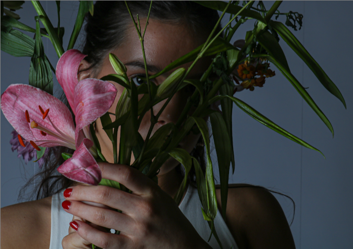
I first decided to experiment with flowers to demonstrate stereotypical femininity and flowers often symbolise grace, gentleness, and happiness which demonstrates an idealistic way that can interest females and make them look at an images and read about a product which encourages them to purchase it. I feel this aspect has also added to my photos as the flowers are bright and eye-catching. The expressions of happiness also capture ‘joyful moments’ which makes the viewer associate the feeling of happiness being created when this product is bought. By having creative and highly visual aspects such as bright colours and striking images, makes the images stand out to the viewer. The product I would like to ‘pretend to promote’ is a perfume named ‘Gucci bloom’ which is a range of perfumes by Gucci which represent floral smells and bright coloured flowery packaging which is a stereotypical product which expects women to want as they need to smell girly and like flowers in order to ‘be womanly’.

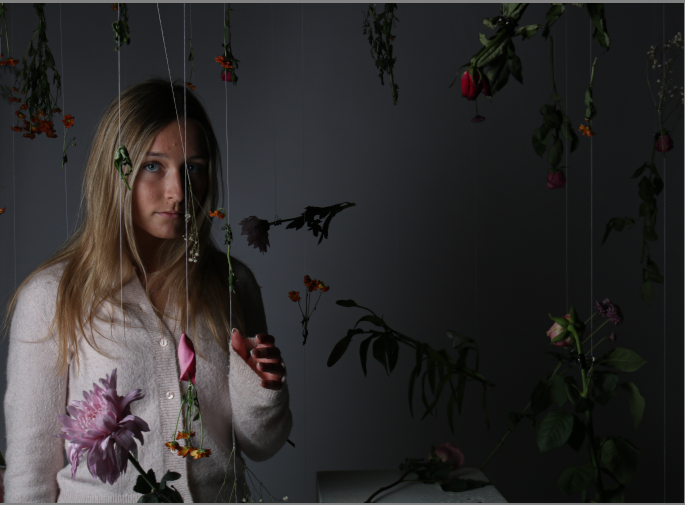
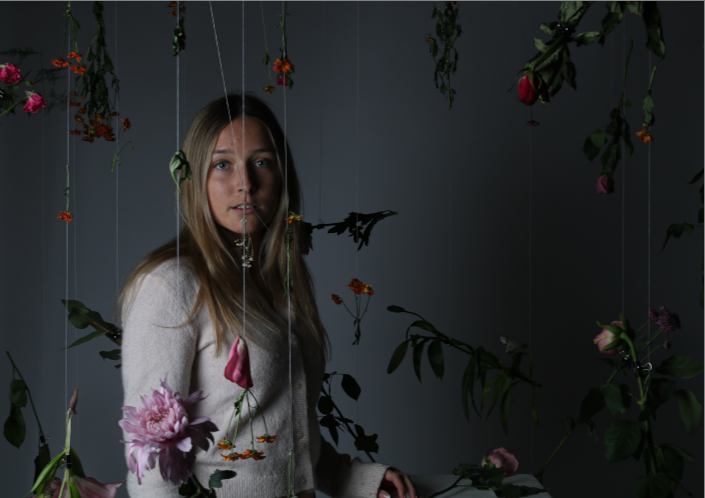
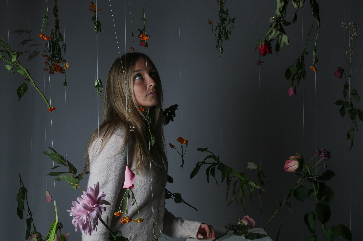
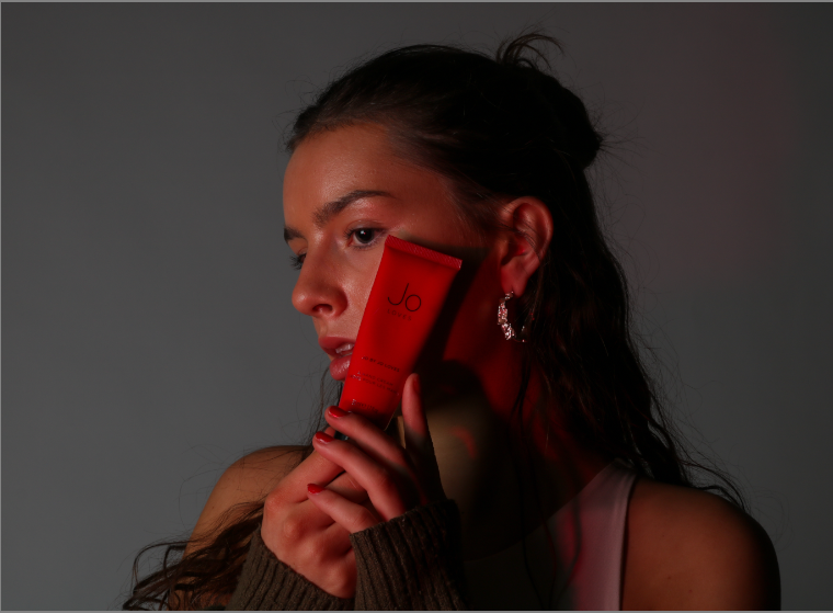
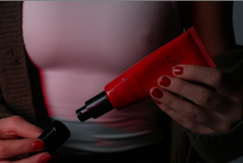
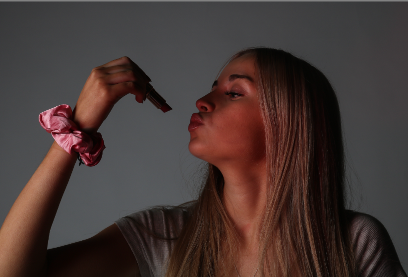
These are my best photographs from this photoshoot. I feel these are the photos with the best lighting and quality. I have edited these on Adobe Lightroom. These images are to be displayed in the middle portion of my photobook which displays a magazine from the modern day which consists of celebrity gossip, product promotion, advertisements and content for teens and young adults. This is to promote products such as perfumes, makeup products, lip products etc. I wanted to make a range of images displaying photographs for my second segment of my photobook. These images consist of images of my models holding the products, the products being displayed and my models posing for a photoshoot, to promote the product. This means that I can group these images together for different segments of this chapter of the book. There is also images of my model on their own which I wanted to photograph for any extra pages where my book may need pages filled with relevant photographs.

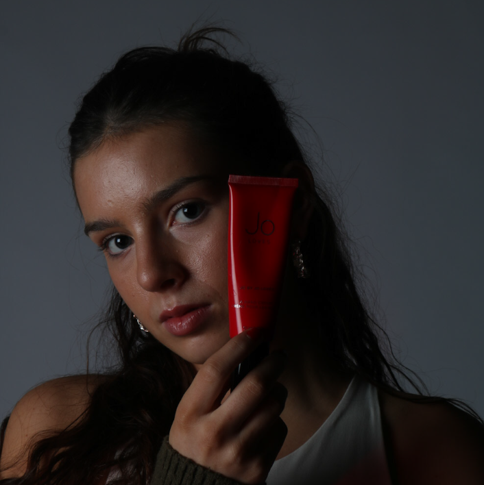
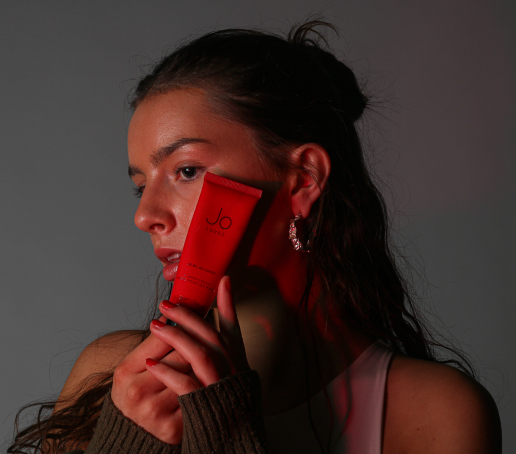
I feel this photoshoot was very successful as my models are young adults who are the target model age for my work and their clothing and settings match the aesthetic and message I would like to portray. I like the colours of my images and chose to add a coloured gel over my light in order to create hues of reds, purples and pink. For example.

IMAGE WITHOUT RED HUE FROM COLOURED GELS.
IMAGE WITH RED HUE FROM COLOURED GELS.

I feel like this small change in the image makes it look more high quality and also makes the image more interesting as the product is more eye catching and the model looks more bright which helps the image to stand out and look less flat. I feel this was a good decision to make in my photoshoot and Is something I wish I had included throughout the shoot and not just towards the end. I also believe I may need to do one more photoshoot for images for my photobook, however, I also feel that around 3-4 photoshoots have captured the types of images I wanted, however, I think that a wider range of images Is more reliable when choosing images for my photobook, but this means more products, logos and editing on Photoshop is needed to add these into the middle section of my photobook which may be time-consuming and difficult within my time frame.

Editing & Developing 6

I had an assortment of images that didn’t fit into any other photoshoot:

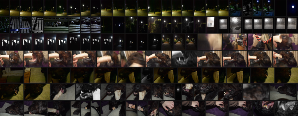
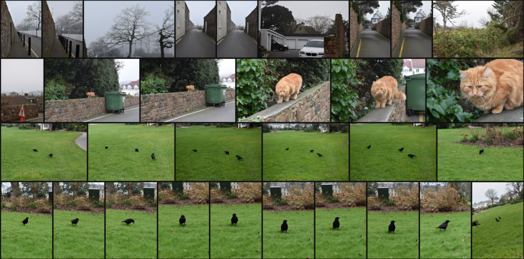
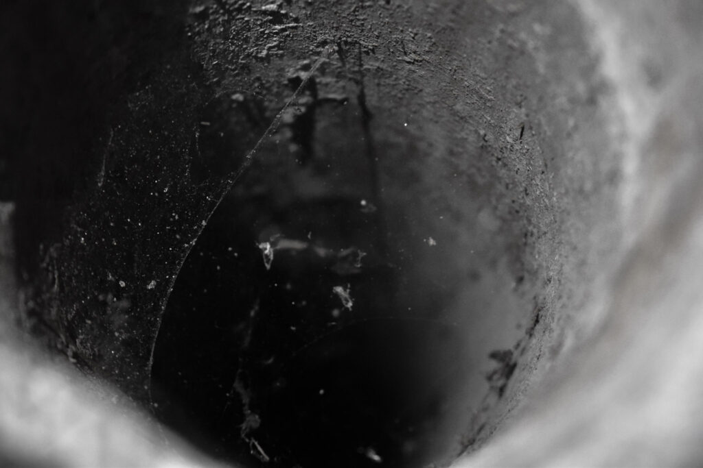
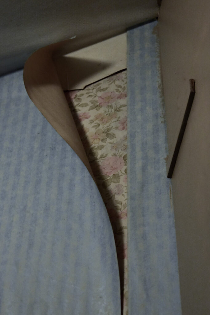
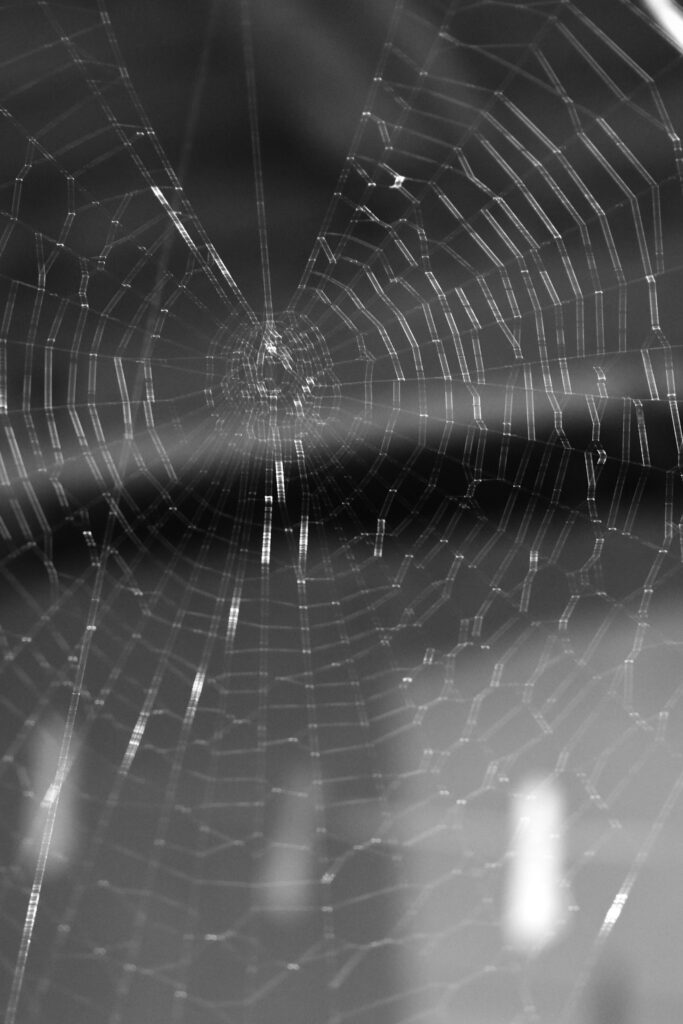
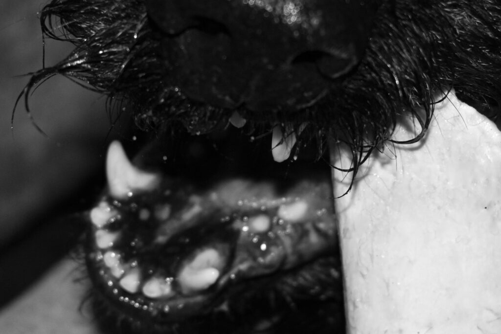
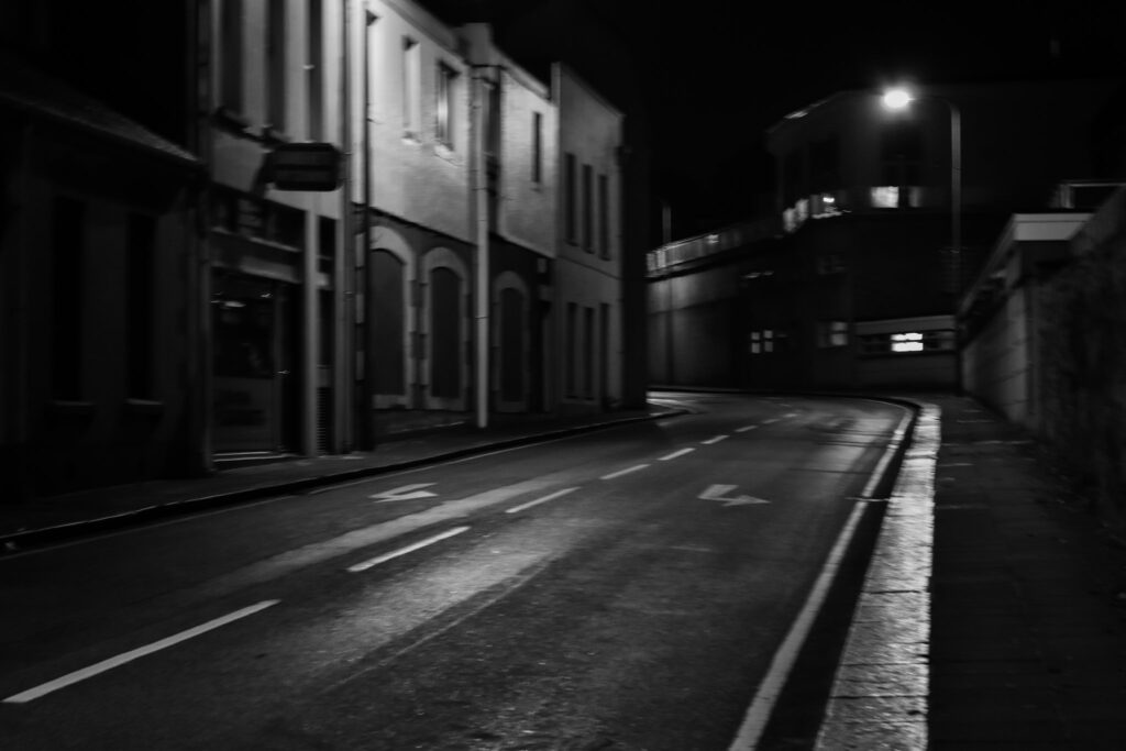
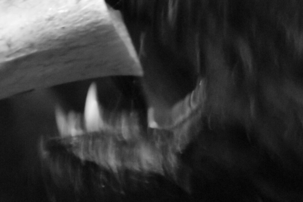
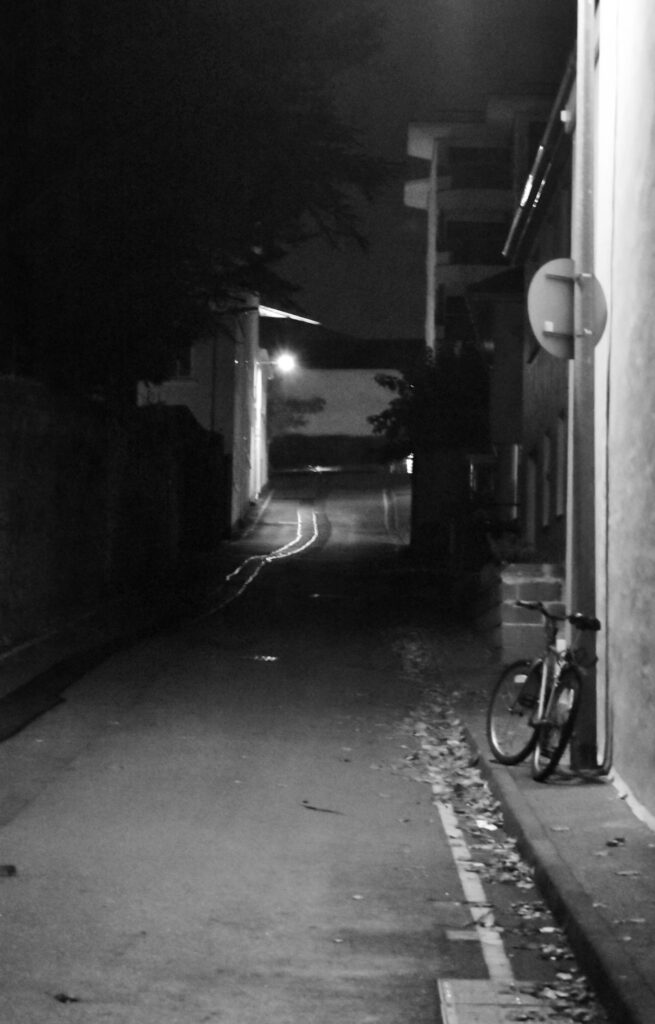
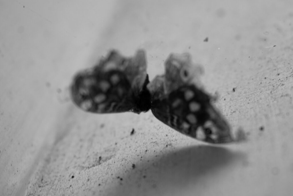
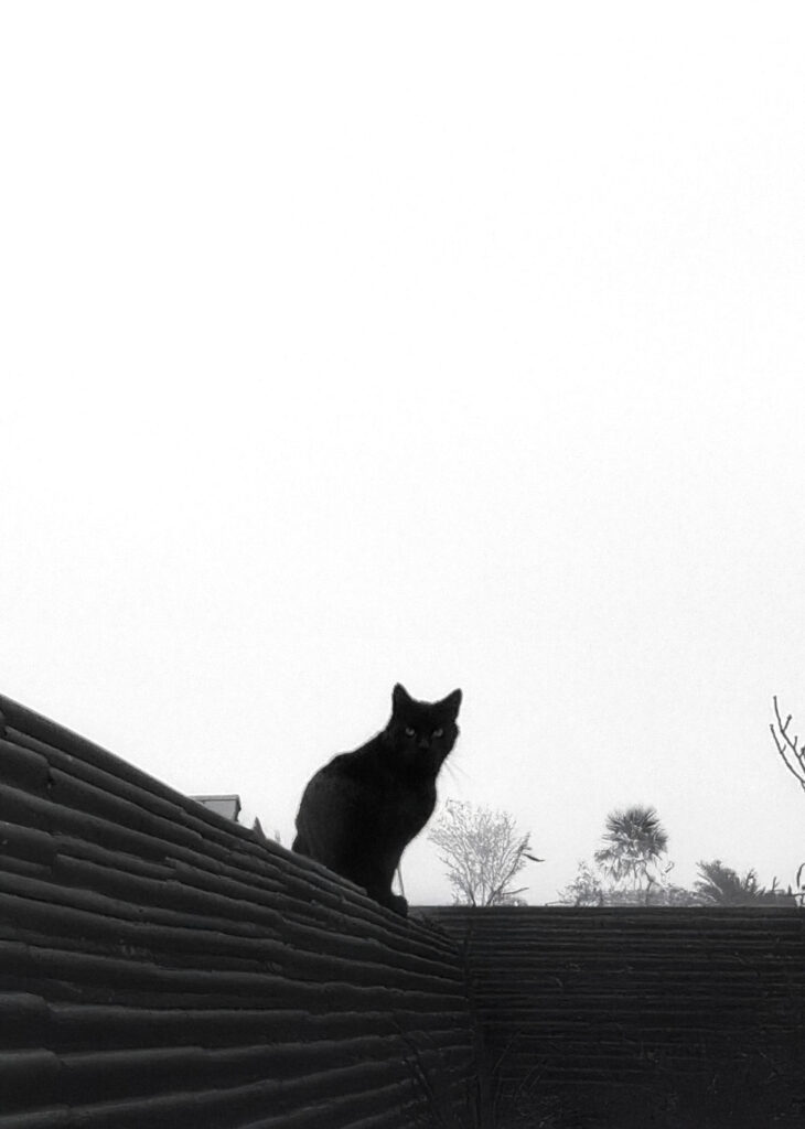
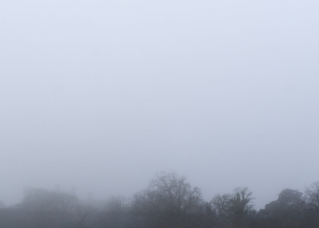
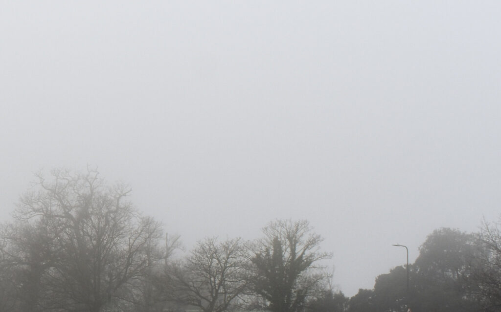
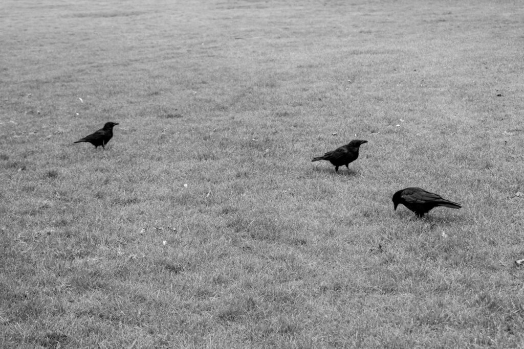
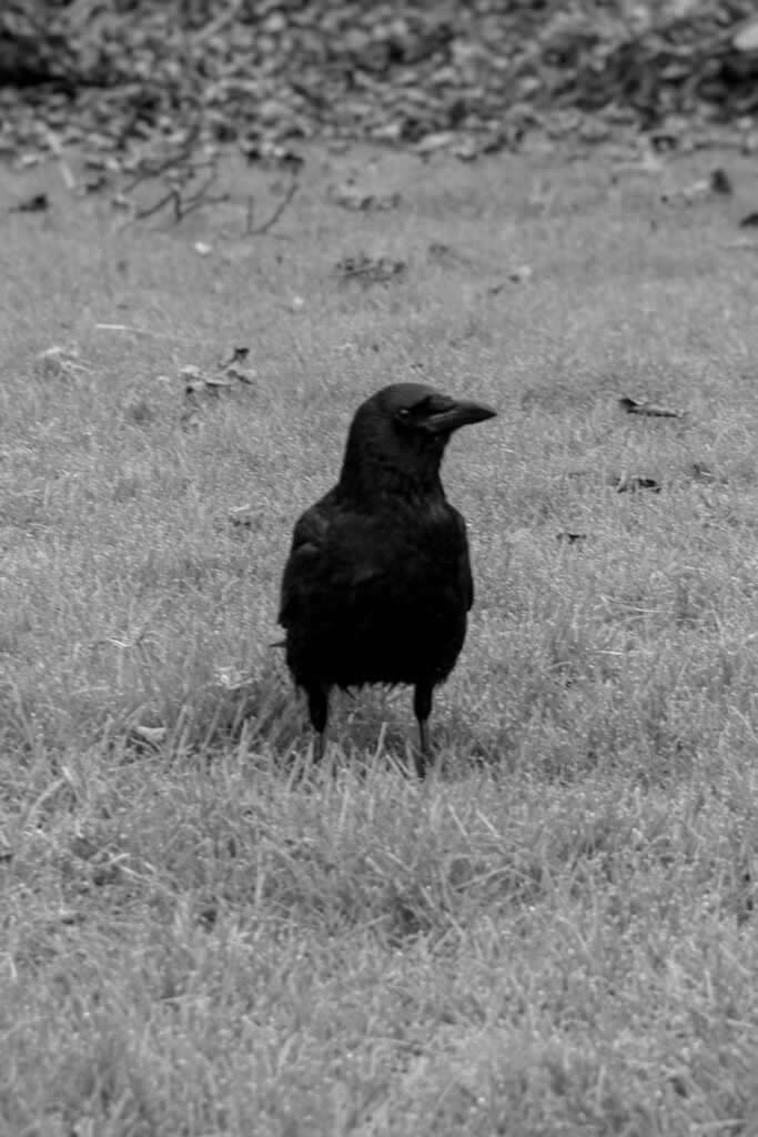
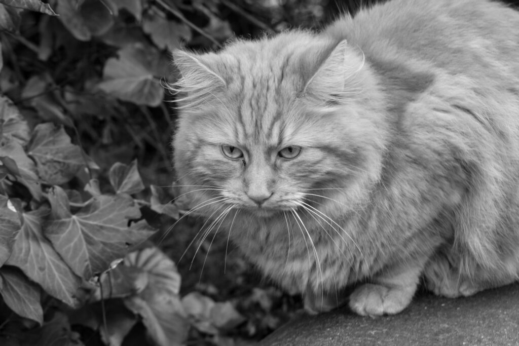
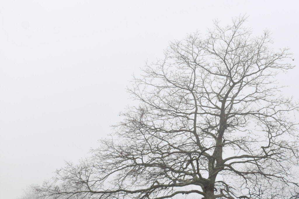
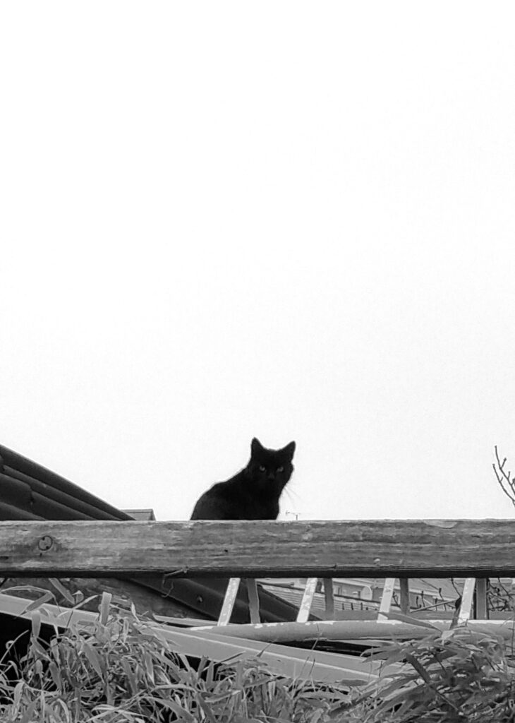
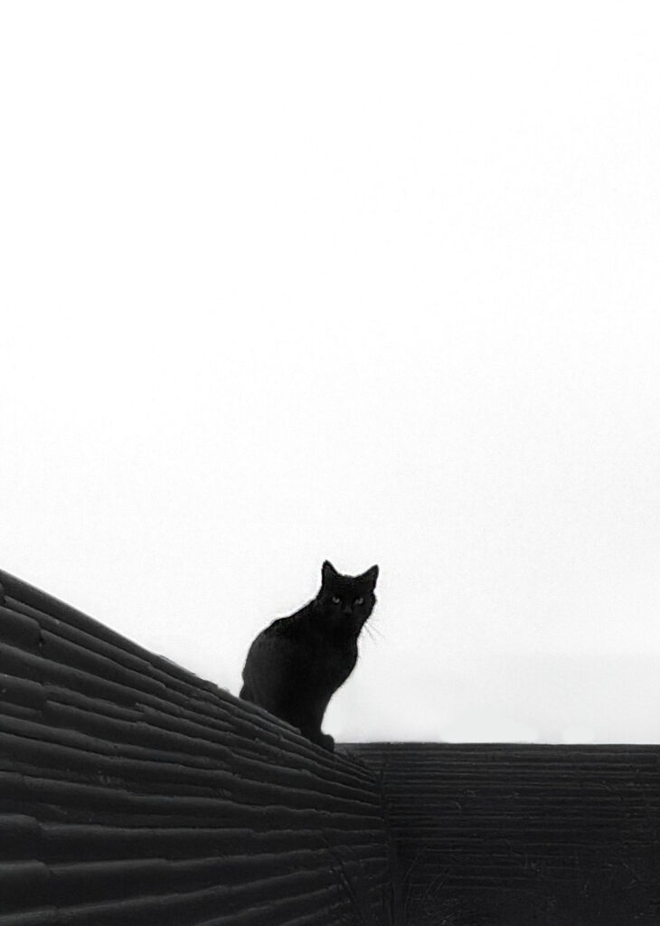
When photographing the animals I choose the black cat for its superstitious associations and the lighter cat for its wise appearance and closer ties to witchcraft. The birds again have superstitious associations and the moth is suspended in a spiders web having lost a wing. I think the moth is quite telling of fear in its place as opposed to creating fear. I photographed my dog eating a bone also as he’s a large dog with sharp teeth which can be dangerous. I like how the fog images are peaceful and relatively mysterious which is the same with the empty roads. I choose a few of my images which were out of focus because they create a hazy/confused appearance or one which looks like you’ve taken a quick glance. Additionally its messiness will be part of the overall unorganised book.

The cat image I edited in photoshop with generative fill. This one had the best angle of the few however I didn’t like how busy the foreground was. I selected the bottom of the image and told it to change the mess to a wall. The best outcome of the 3 was this one although it also added some trees in the background:

Photoshoot 2

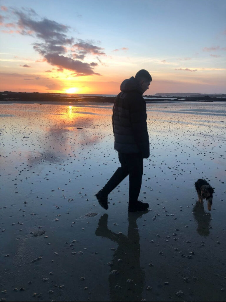
I wanted to experiment with ways on how to represent nostalgia, and how fragments of my brother remain in certain areas from my childhood where I have formed core memories with him or just areas near my house that he frequently enjoys going to. In this instance, I focused on La Mare beach which is a 5 minute walk from my house as my brother usually takes my dog for long walks here. I thought this would be an effective location too as this meant I could utilise the motion of the waves, rippling in and out, to add elements of fluidity to represent emotion.

For example, the tide swells in and out, and I feel that this is relative to the way that my brothers mental health fluctuates between the distinct line of ‘well’ and unwell. I like this metaphor because it subtly hints at the unpredictable nature of my brothers illness which I feel will be very powerful when I begin sequencing for my photo-book. As well as this, I used the sunset to create different reflections off the water to add vibrancy to my images.

I have began to think about my sequencing, and have collected archived images that link extremely well. For example:

Final Images:

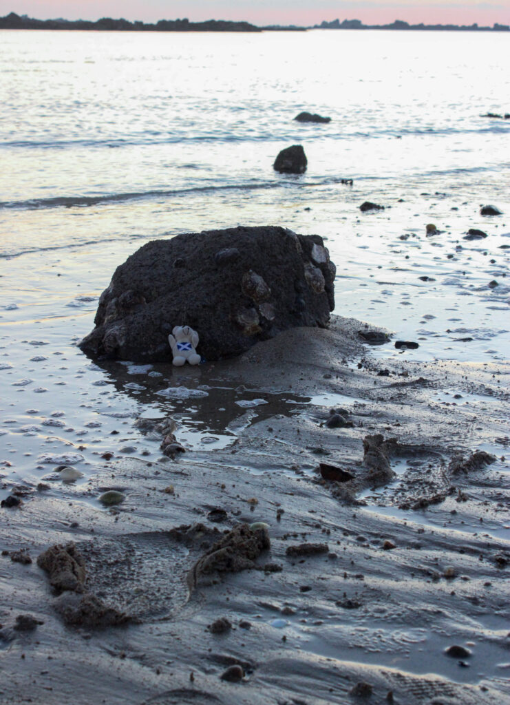
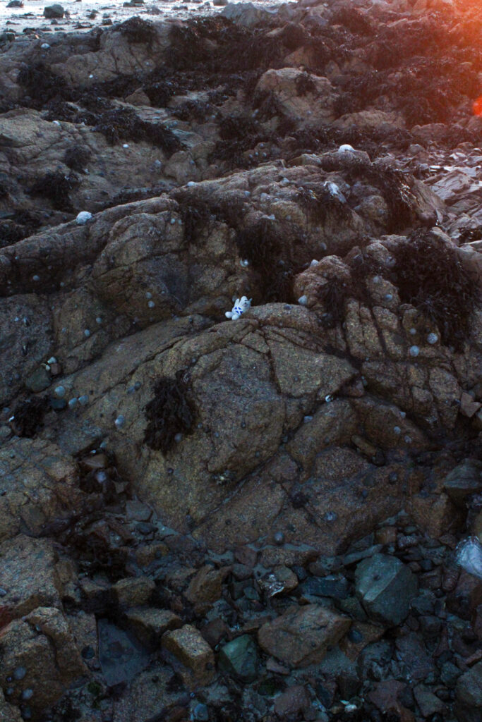
For this image I created my own fake footprints in the sand in order to make it appear as if someone is walking away from the teddy bear that I placed against the rock. The teddy bear is representative of my brother as he gave it to me when I was younger so I wanted to incorporate that sentimental value in the image. I wanted the image to appear as if someone is leaving the teddy bear behind because I feel that this is a good representation of how, this area specifically, is nostalgic for me due to the memories that me and my brother share. However, my intention is to convey the message that reminiscing over a person who does not exist anymore is a difficult thing, and sometimes the easiest thing to do is to walk away. The tide did swell in when I was taking this image, however I found this to be really effective because it is as if the tide is coming in to take the memories away, symbolising how my brothers illness may distort once pleasant memories or erase them. The sea looks as if its over-exposed in comparison to the rest of the image, however I do like this aspect because it makes the image have a higher contrast. As the tide is in the background of the composition, this could connote ideas of ‘the light at the end of the tunnel’, this being due to the section of the teddy being darker to represent how a once pleasant memory is now concerned with heavier issues. The footprints could also be associated with moving on from the childhood memories and coming to terms with reality and the harsh truth that things may not be the same again, however this is a time to make new memories in these locations and leave behind those that may not be as easily recalled by my brother anymore.

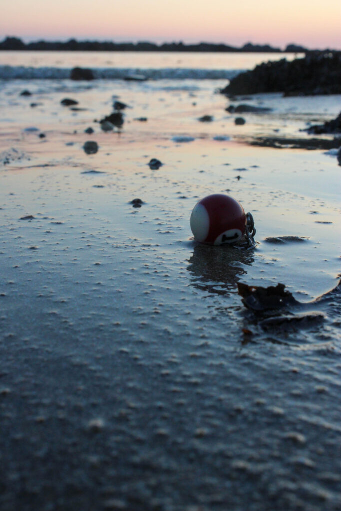
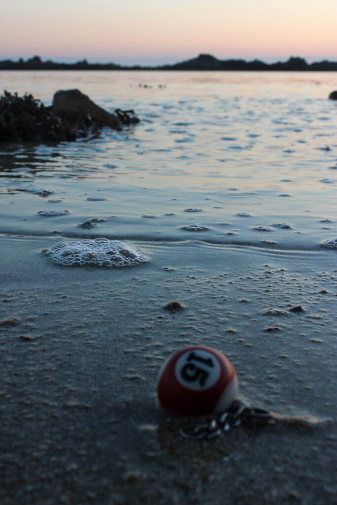
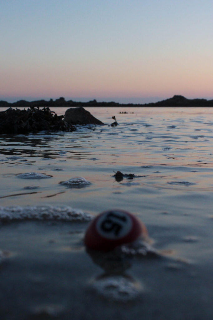
I chose to use this as my second object because my brother habitually plays pool with my dad and he has done since he was a child. I simply dropped the key ring from standing height and let it fall into a natural position, however I did this 3 times because I wanted to ensure that the viewer would know what it is. I used a very low angle, with the side of the camera touching the sand and pointing slightly up to the sky. I had to experiment with this as I obviously couldn’t see what the image would look like in the viewfinder, so I had many attempts. I used a short depth of field so that it would just be the keyring focused on as this is the main focal point of the image. I like the way that the keyring looks as if it’s just been discarded in a careless way because this shows how these memories are getting lost in the midst of his illness. I feel that the dramatic positioning of the keyring paired with the low angle is really effective here as it looks as if its been left behind and forgotten about. Also, the small lumps and bumps on the sand have created a lot of texture within the image due to the sand being so close to the lens of the camera which I think works really well when paired with the blurred and smoothed background as it is out of focus.

I wasn’t sure which one of these images I preferred as they were taken in the same multi-shot, however I liked how they both looked next to each other as it reinforces the concept of the sea swelling in and out just how mental health can fluctuate quickly between coping and struggling. I liked these images because the keyring is out of focus which contradicts my last image, however I liked this idea of almost ‘hiding in plain sight’ as if it is waiting to be revealed to the viewer. This is relative to nostalgia because it resonates with the idea that the memories of an area build up into a persons perception of that location. I like this idea of ‘seeking’ out different sections of memory as this could also be interpreted into how my brother may not be able to recall all of the memories that I do, therefore he has to pick apart the environment around him in order to remember. I feel that the muted pastel colours of the sunset connote feelings of reflection and hope as they stand out against the more negative blue tones in the foreground of the images. In the image of the tide surrounding the key ring, I feel that this could represent how these childhood memories may become ‘washed away’ due to my brothers illness and how he may not recognise himself anymore through things such as his hobbies.

The next 3:

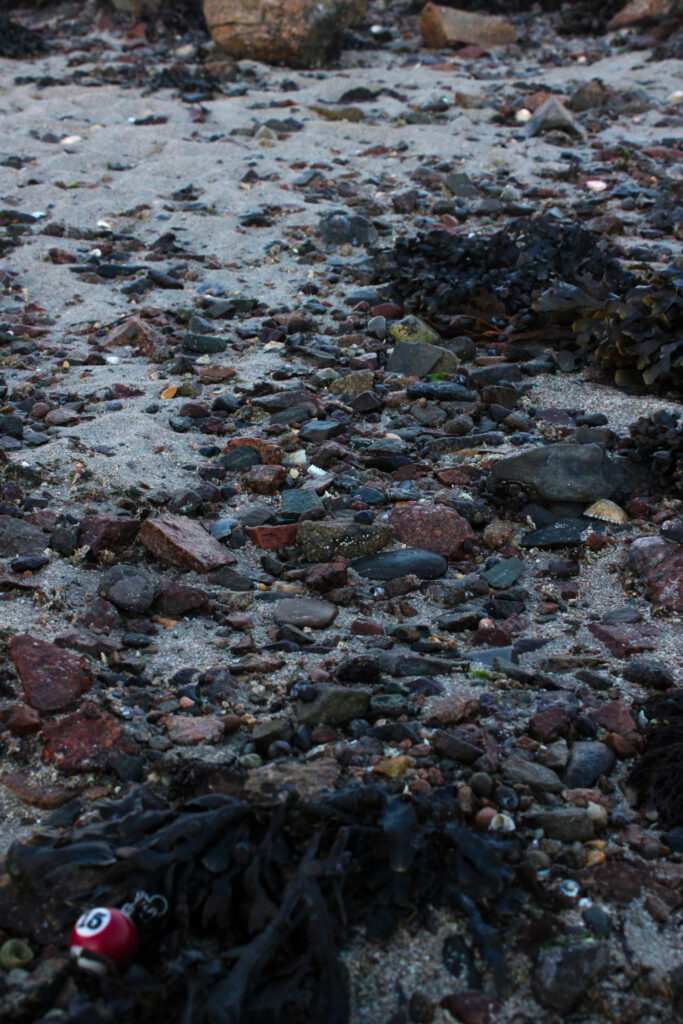
In each of the three images below I experimented with hiding the objects within the frame to show how small fragments of my brothers memory are hidden in this area and spread out to bring nostalgia at any time. I got this idea from the images before as I feel that this is a good way to represent how little sections of the memories we share can build up certain locations.

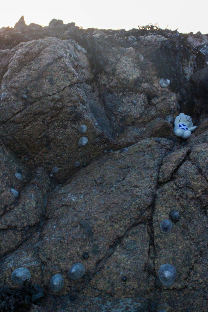
I added a blue tint to the image so that the blue on the teddy bear is reflected and echoed into the rest of the image to create a more depressing tone. I like the composition of this image as there is a lot of line and shape in the foreground that can act as leading lines up to the bear as many of the curves and grooves in the rocks are pointing towards it. I was happy with this result as I did want to incorporate some of the landscape however I wanted to do this using the formal elements in a more ambiguous tone which I think is successful here. I also increased the highlights in the image to brighten the teddy as I didn’t want it to be lost within the composition as it is quite busy, which also removed the orange tones from the background which could’ve confused the concept of the image as warmer colours are commonly associated with emotions of happiness and joy.

This image did not require much editing at all. Once again, I kept the key ring out of focus as I wanted to play on this idea on showing the memories in a subtle way. I am really pleased with this composition as the dark red of the keyring is repeated throughout by the rocks as the majority of these are a range of dark reds and burgundy. The seaweed also contributes to this as it not only amplifies the dark nature of the image, but also adds texture against the rocks. I feel that the two main sections of seaweed look at equal size which is aesthetically pleasing as it balances the foreground and background. Once again, I used a low angle so that I could make the key ring look enlarged so that the viewer doesn’t miss it. The focal point is the dark brown rock in the centre of my image so that the viewer has a middle point to them explore the image from in further detail. The angle that I have used has enabled me to inhabit a type of optical illusion where the objects in the foreground appear larger than they actually are, giving it a forced perspective.

I really liked this idea due to the high contrast that it inhabits through the randomised pattern of seaweed paired with the dramatic lines of the rocks because this adds texture to my images which in turn will make it look more 3D instead of becoming flat and lifeless. I took this image from a higher angle so that my photobook will incorporate different styles as this will make the images more interesting so that they don’t all look the same. I took this image facing the sunset instead to contrast my other images too as this allows me to gain different perspectives of the same location to tell a stronger visual story. Once again, I hid the teddy bear between a cluster of rocks so that the images still have a comparative and consistent aspect, placing it directly in the middle this time from a further distance. My favourite factor of this image is that I have caught the edge of the sunset on the side of the camera. I feel that this contributes to my research on vernacular photography as it gives the image a retro effect from vintage cameras.

For example:

I feel that this will link nicely with my archived pictures as I am keeping this element of ‘old images’ in the new images that I produce.

Deconstruct photo-book

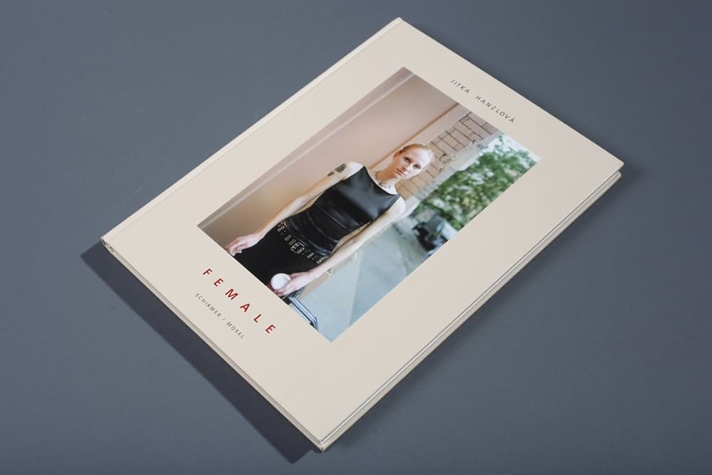
I choose the book “F E M A L E” by Jitka Hanzlova. This book has 115 pages with different women with different culture, background and everyone is unique in their own way including the background. It tells a story that everyone has there own little bubble and are just other people in peoples lives. Photography captures’ peoples lives and moments forever. I like this photobook because it tells a story from so many different perspectives and lives. There are younger kids, older women and overall a range of ages which shows the growing up and how people growing up in different generations can affect you as a person. Most people are pulling a straight or sad/mad face which you could say shows the rage and anger some women have to go through because of misogamy an what some men are like. Some women may be scared to leave the house and I think this book represents a lot of women in todays society. I have made some images similar revolving around girlhood and misogyny to try and raise awareness and show people that life can be tough and isn’t perfect. I think that Hanzlova tried to make elements of this in her photobook too.

The book “F E M A L E” by Jitka Hanzlova. Hanzlová grew up in Rokytník, a village in eastern Bohemia. She was initially interested in painting and drawing before discovering photography as an artistic medium in 1983. Inspired by the works of Diane Arbus[2] and the anonymous portraits of Walker Evans, she undertook her first trip to America in 1986. In 1987 she began studying visual communication at the University of Essen with a focus on photography, which she completed in 1994. In 1989, Stern published her first group of works under the title “Man Calls It School” about a school for asylum seekers.[3] After the fall of the Wall and the end of the communist regime, she travelled back to her Czech homeland for the first time. I think that she made the female book to raise awareness for women and show people how different we all are, we al need to stick together and be kind to each other. This book is for everyone to view and can change peoples perspectives on life. This book drew me in because it shows people how everyone’s life is so different and we all live in each others life like characters. It sends a message that says you should be kind and look out for everyone because you never know what people are going through at the end of the day, we are all beautiful and perfect in our own special ways.

The book female, its thick and heavy. It smells like an old book and there is a range of different colours. The book has 121 A4 pages that are white with the image in the middle on the right page, they feel smooth and soft with a hard cover on the front and back with a printed image on the front, a white female wearing all black with a coffee in her hand looing blankly at the camera which gives some insight on what the book may be about. The title is red and spaced out with normal font and her name is above the picture which is relevant when it comes to all the images in the book. I think that it tells a story of history, its not just images of loads of different women. its about culture and background. The realisation we all grew up differently and this plays a huge part in our life as women. We are all unique. It has this repeating idea of strength and culutre and this is why I think its about awareness and strength. She’s repeated pretty much everything in the mood and it has the same layout for the whole book which again repents the idea of repation.

Photobook: A Mini Story

The photobook I have decided to research is A Mini Story. This book is about the photographers life with grandad who died when he was 7 but the story is about the life his grandad lived and the influence he had in his life, like his interest in cars and how his grandad was in a mini club. The genre of this book would be about family, grief and inspiration. This is because of the images of his grandparents, then losing his grandad to cancer, and then finally taking inspiration from him and also getting a mini like his grandads and restoring it. The approach to image making is taking pictures of different areas in his life, like his grandparents house and garage, then older pictures of when he was younger with his grandad and then pictures of his dad, his mini and garage, then finally a picture of his grandads mini and his mini that he bought.

The photographer was a former student called M De Gruchy. He made it to show the life that his grandad lived and how it inspired him to have the same passion of Minis. He dedicated the book to his nan.

The book is hard cover made of cardboard, it uses the same paper throughout and all the pictures are in colour apart from three, his grandparents wedding picture, and two of his grandads old mini. This can symbolise the age of the images, where his grandparents got married in 1969 which was 56 years ago and then also showing the age of the old mini. The images are different sizes, some are single page, some are double page spread and there are multiple small images on one page. There is also text throughout the book linked to the images that give a description of the image and clarifies what the images are or what is happening in the image. it is a portrait book but the images vary between portrait and landscape on the double page spreads. The editing looks natural, some images have been edited to look old and vintage but the images look like they have not been edited much. The binding is saddle stitch the cover is cardboard and a printed image. The title is literal and relevant within the book. The story is about his grandad and his passion for Minis. It is told like a story of his grandad and growing up with him, then later losing him and following after his passion for minis. The structure is told as a consecutive story happening in order of what happened with his grandad and then after he died.