

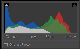
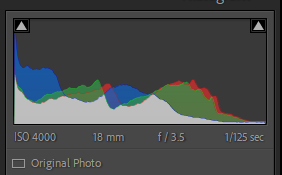
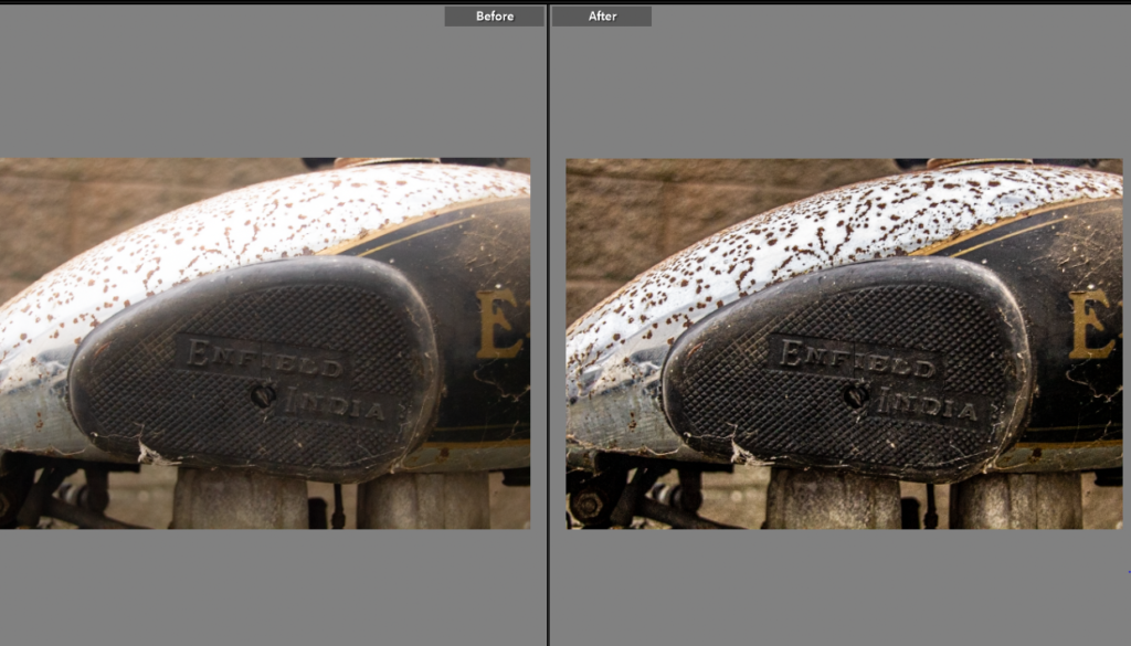
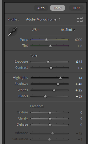
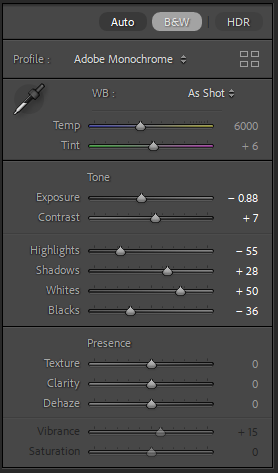
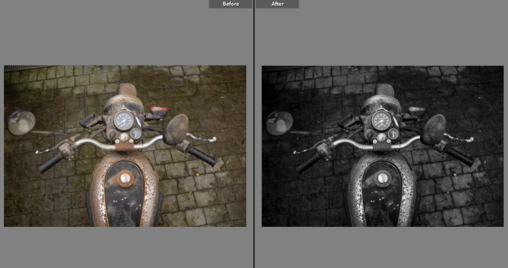
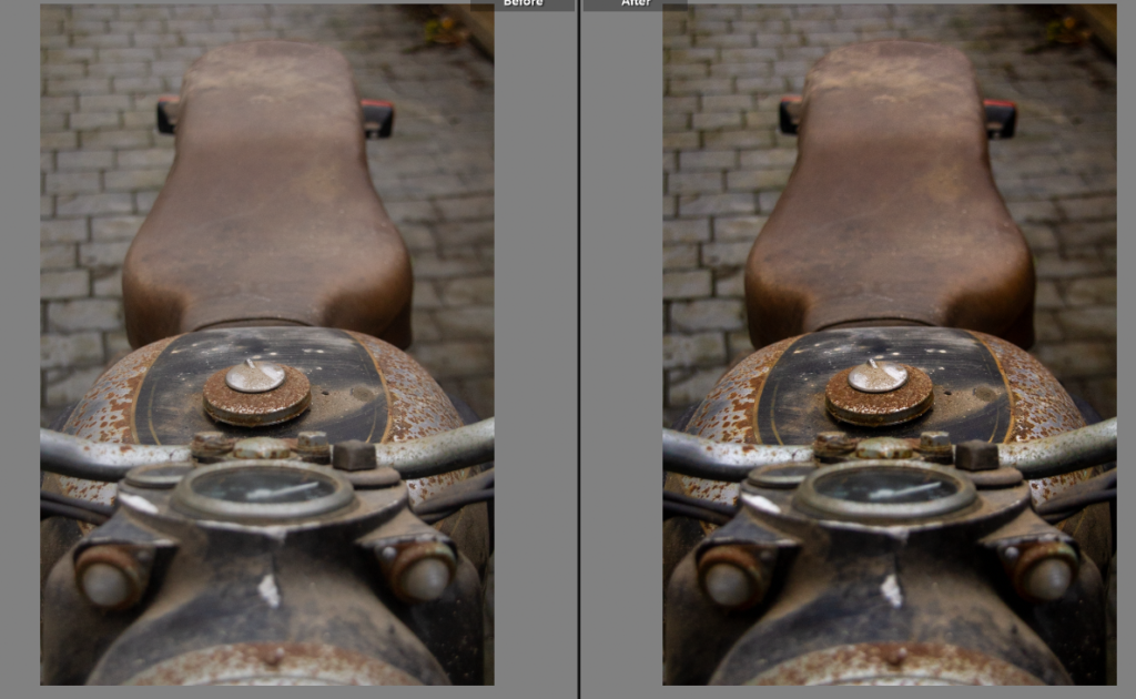
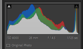
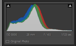
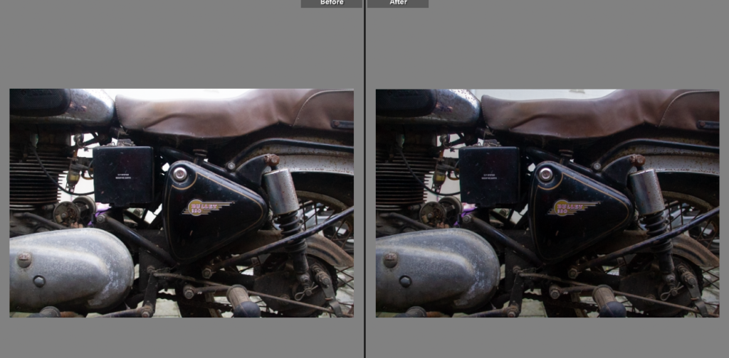
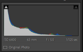
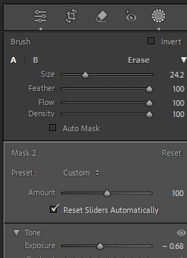
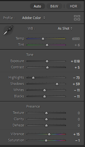
Edit One
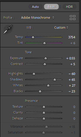
This shot was originally yellow from the garage lighting, I did manage to correct this using colour grading within Lightroom however, it didn’t match the rest of the photos. By choosing to turn the photo black and white I adjusted it to fit the other photoshoots. It has also helped highlight the texture from the rust and age of the bike, similar to the photoshoot with the ford.
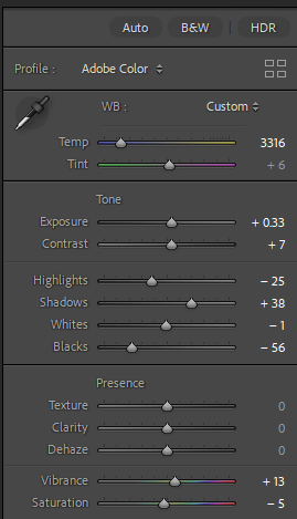
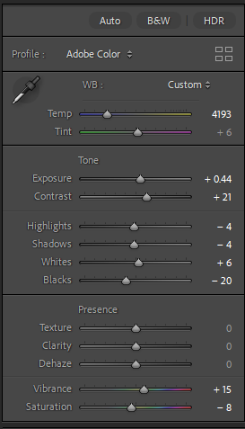
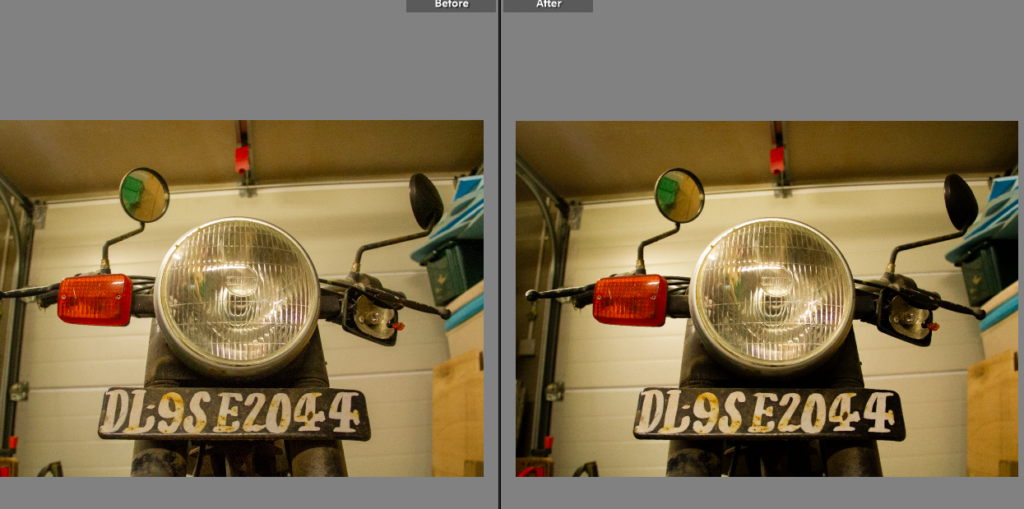
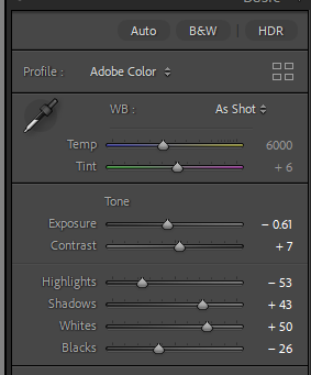
Edit Two

This photo had a similar issue, the lighting was too yellow. By moving the temp. slider down to a bluer tinge it has reduced the yellow lighting. I do like the photo now the tinge has been removed, it has allowed the bike to be seen within the garage context.
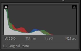
Edit Three
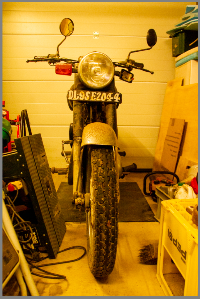
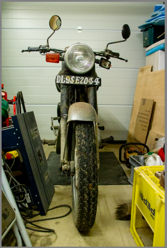
I did this edit in a similar way, adjusting the temperature to a suitable level of blue adjustment, allowing for the yellow tinge to be removed without changing the tint to blue. While the yellow tinge added to the age it did not fit with the rest of the photoshoots.
Edit Four
This photo is taken from an interesting angle, on a wide angle lens. I wanted to enhance the deep colours against the off white background. To do this I first adjusted the temp. slider before making small adjustments on the other sliders, enhancing the orange and blacks within the photo.
Edit Five
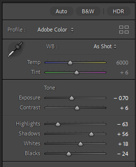
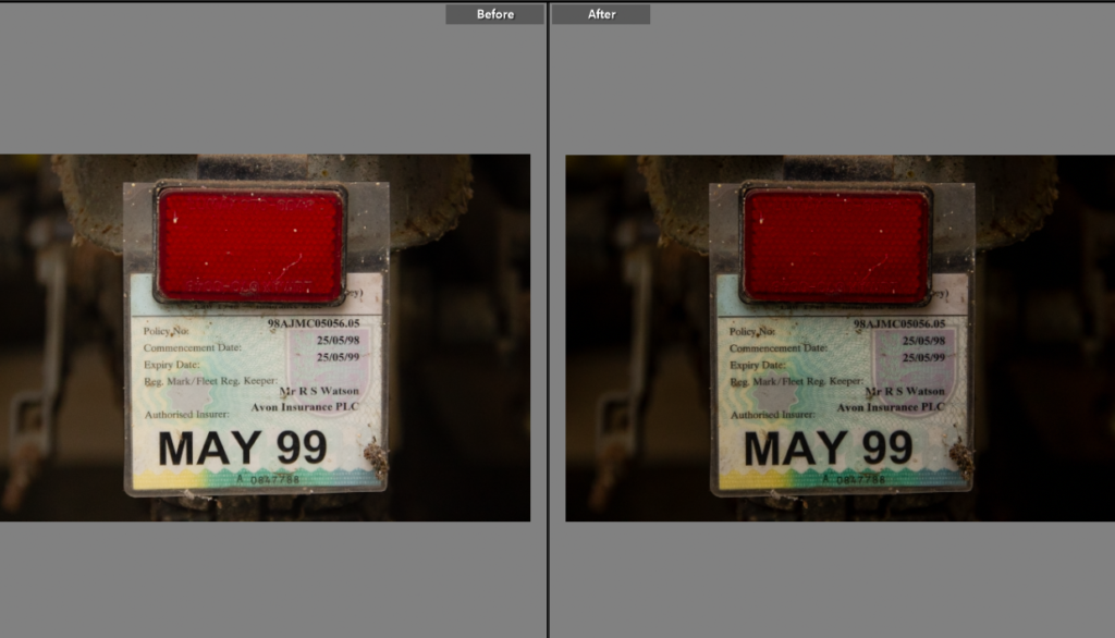
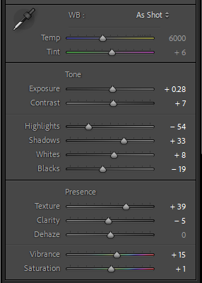
An insurance disc is something everyone knows, I wanted this shot as it shows the bike hasn’t been used for over 20 years, but still holds many memories. I originally thought I’d like this shot in black and white but I actually liked it in colour showing the typical insurance disc colourings. I decreased the exposure and highlights to bring out the pattern on the disc itself, which adds to the photo.
Edit Six
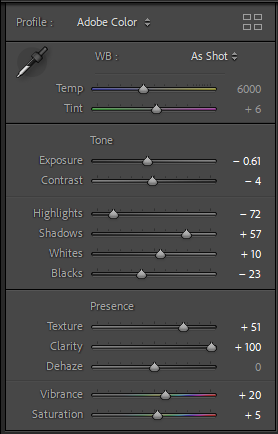
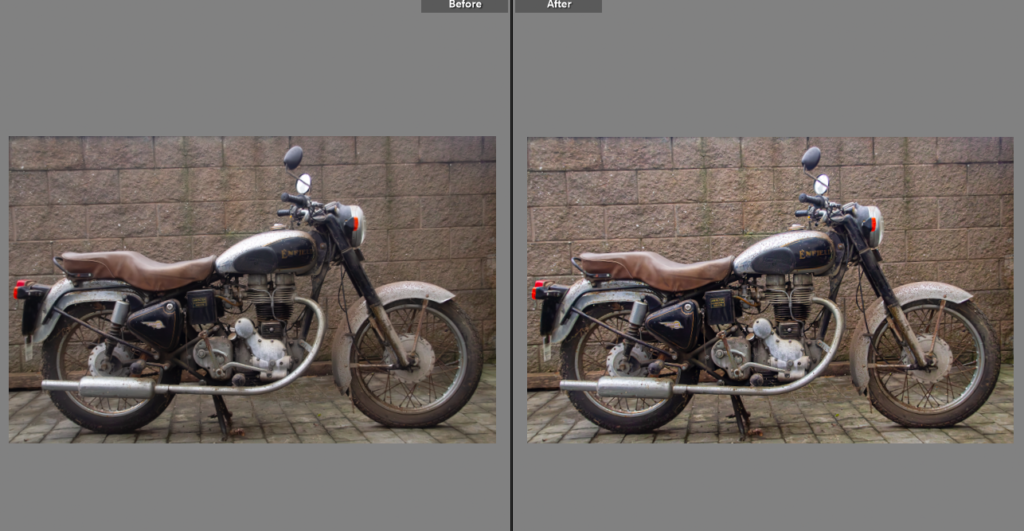
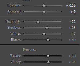
The texture on the tank from rust is something I wanted to highlight, adding back texture and increasing the clarity has done this. Alongside the decrease in exposure which brought out the slightly washed out colour. I took this using a 35mm zoom length so the focus was the writing rather than the rest of the bike, the writing being the brand name.
Edit Seven

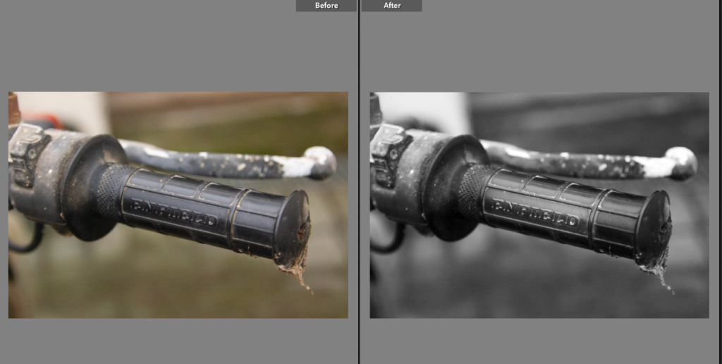
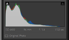
This shot will pair nicely with the previous one, adding to the idea on what the bike is, I preferred this shot in black and white to provide contrast with the textured, bold colour of the previous shot.
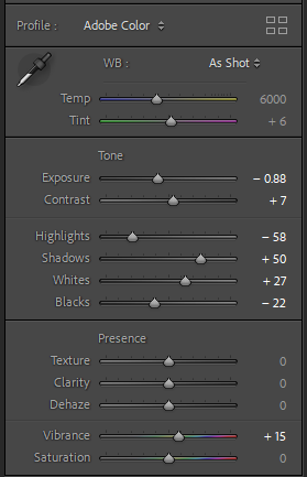
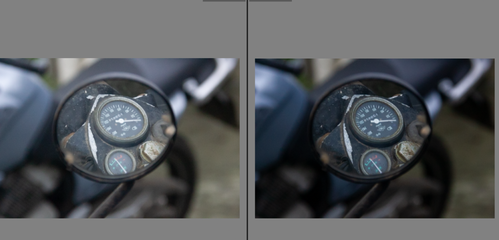
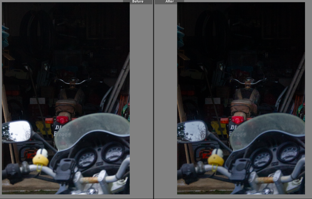
Edit Eight
Having heard many stories about this bike, but having never ridden it myself. I wanted to create the idea of what the bike would look like from the perspective of being ridden. While the world isn’t black and white so would not appear that way when riding, it forces the viewer to look at the details within the bike. The needles on the speedometer and temperature gauge showup better in the black and white version, it also helped remove the distraction of the floor from the shot.
Edit Nine
This shot is an interesting angle, I liked the comparison between the colour of the rust and the brown of the seat. Taken from through the handle bars it has a unique viewpoint on the bike.
Edit Ten
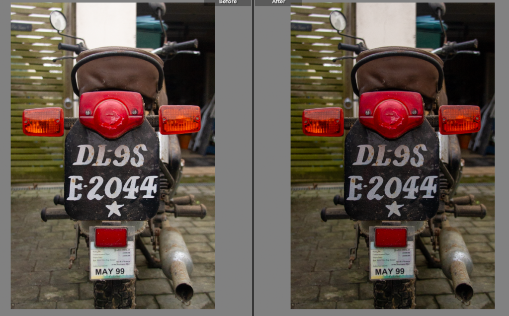
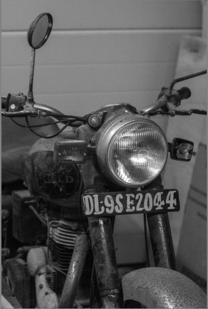
While I don’t think this shot is particularly great by itself I think the number plate plays an important part in the narrative of the book, I remember being told how the number plate was just a sheet of metal with paint on it. It also shows the bike is not from Jersey and adds to its story.
Edit Eleven
This shot is interesting as it shows the whole bike side on, giving a fuller picture of how it was used and how basic it is in comparison to it’s modern counterparts.
Edit Twelve
Compared to the rest of the shots, this photo is dynamic and interesting. While it doesn’t give a fuller picture like previous shots, it does make a comparison between new and old. The newer bike, my bike being in the background and the mirror of the older bike reflecting the older bike, my dads bike.
Edit Thirteen
I liked this shot because it had the name of the bike framed in the middle. I just did basic adjustments to add to the photo but I think I do have stronger photos.
Edit Fourteen
Similarly to the mirror shot, I loved the way this one had the old and the new, the two generations of the families bikes. I used masking overlays to create depth within the image, the background darker and increasing the exposure on the bikes adding more focus onto them.
Final Edits
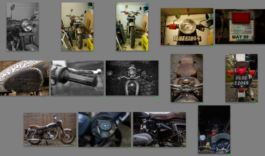
This photoshoot, produced a range of shots, from more contextual style shots to narrative enhancing shots. Each photo can be used in a specific way to benefit the books narrative. I also want to link these to archive photos of the trip done on this bike, adding comparisons and emotion to the photos. I have used a mixture of black and white editing alongside colour edits, to add depth and contrast within the final photos. I was limited with this shoot as the bike can’t move so I had to take the photos on the driveway but I think I have enough dynamic and interesting photos to make the intended impact. Having researched W Eugene Smith and his style I looked to add a human emotion element to the photos, which is tricky without a person in the photos but I looked for small details and otherwise unseen perspectives which created the strong range of images above.
Why I changed ideas
Firstly, I decided to change my exploration of racial injustices through women to domestic abuse. I changed this for many reasons. One reason was because my photoshoot exploring cultures and working- class women did not fit the sequencing of my photobook. This is because these photos were the opposite of staged and carefully crafted ultimately changing my theme. I did not begin to realise this until my photoshoot was completed, however I learnt through this and decided for my updated photoshoot to be of the same subject of my other photoshoots such as 1st and 2nd wave. To keep a seamless sequence in my photobook, I decided to explore domestic violence which a lot of women go through. This is shown statically. Globally, an estimated 736 million women—almost one in three—have been subjected to physical and/or sexual intimate partner violence, non-partner sexual violence, or both at least once in their life (30 per cent of women aged 15 and older). One of these women, including Nan Goldin, my other artist study. Nan Goldin was very open talking about her issues and her photoshoots taken in 1984, this significantly inspired me. I learnt that I wanted to mix both elements of Sherman and Nan Goldin by staging an abuse themed photoshoot, meanwhile maintaining an element of femininity and the traditional housewife. Although, my photos are not taken in the kitchen, they express the role of women serving for men in other ways, such as clothing and posing.
Ultimately, this was more inspiring to me as the 3rd wave feminism movement focuses o sexual harassment, domestic violence and abuse. Some people still believe we are still in the 3rd wave due to the fact there isn’t a massive shift or growth. This is because, to this day women still fight for their equality especially within this theme.
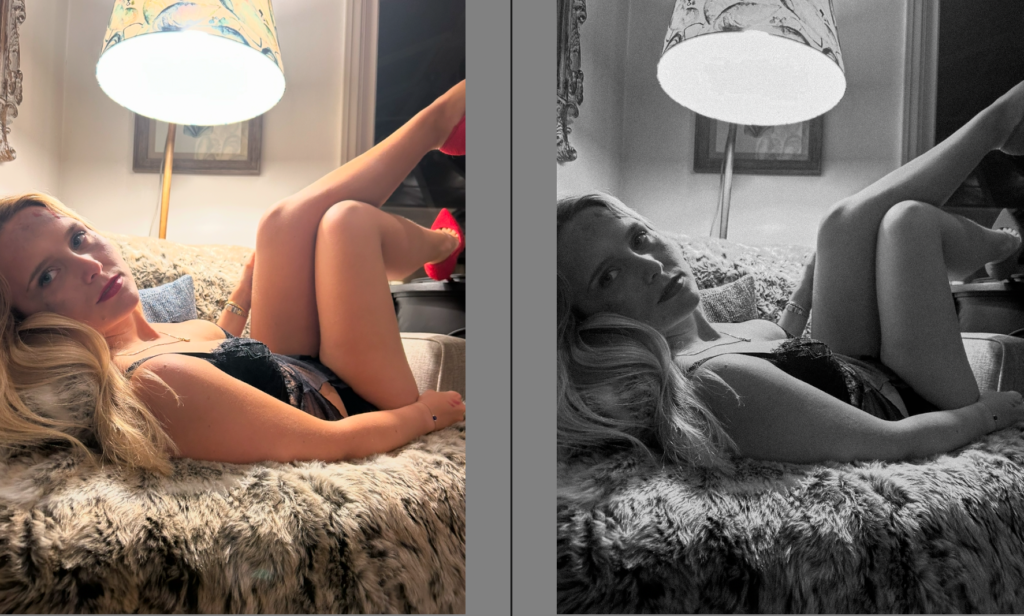
Contact sheet-
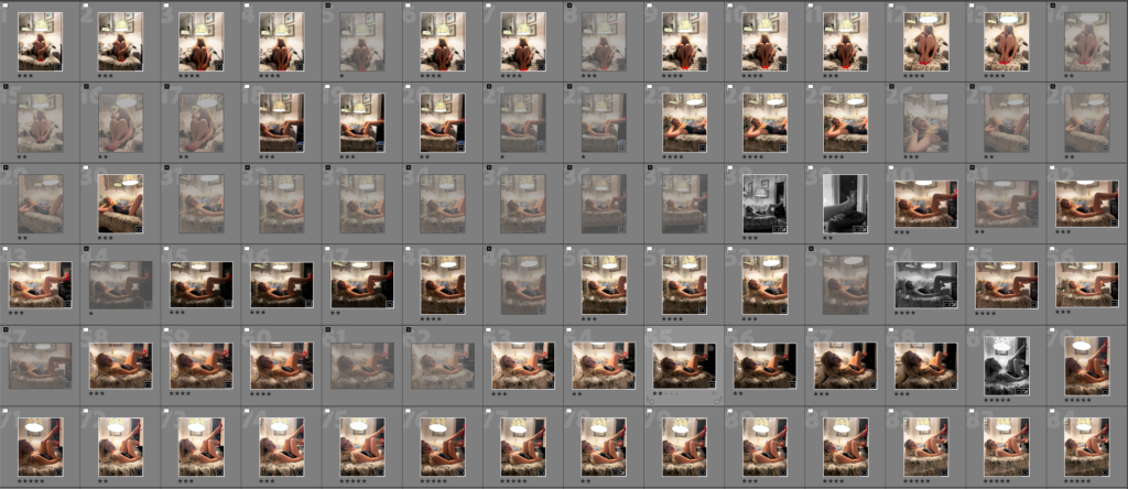
Filtering-
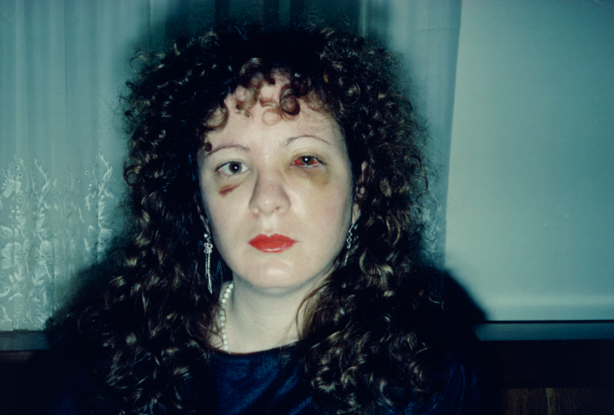
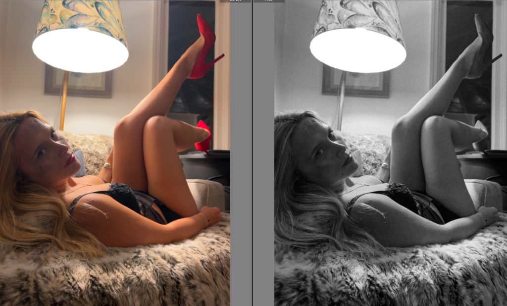
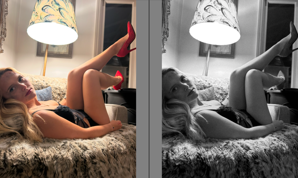
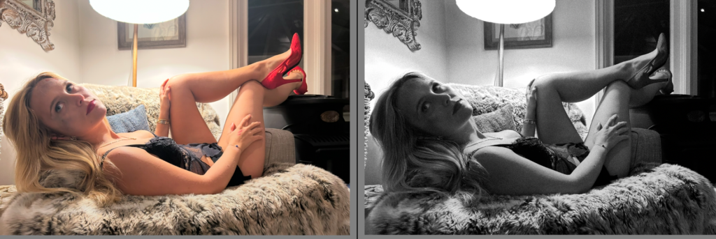
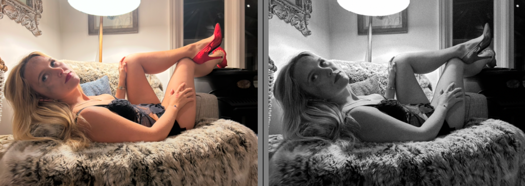
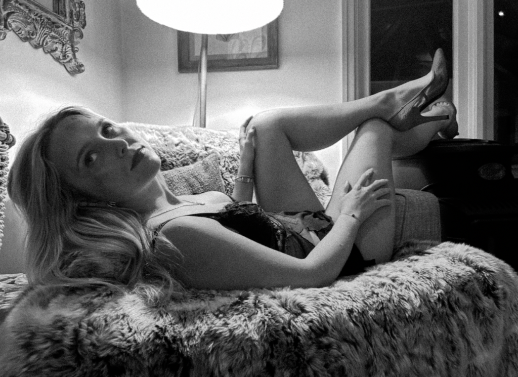
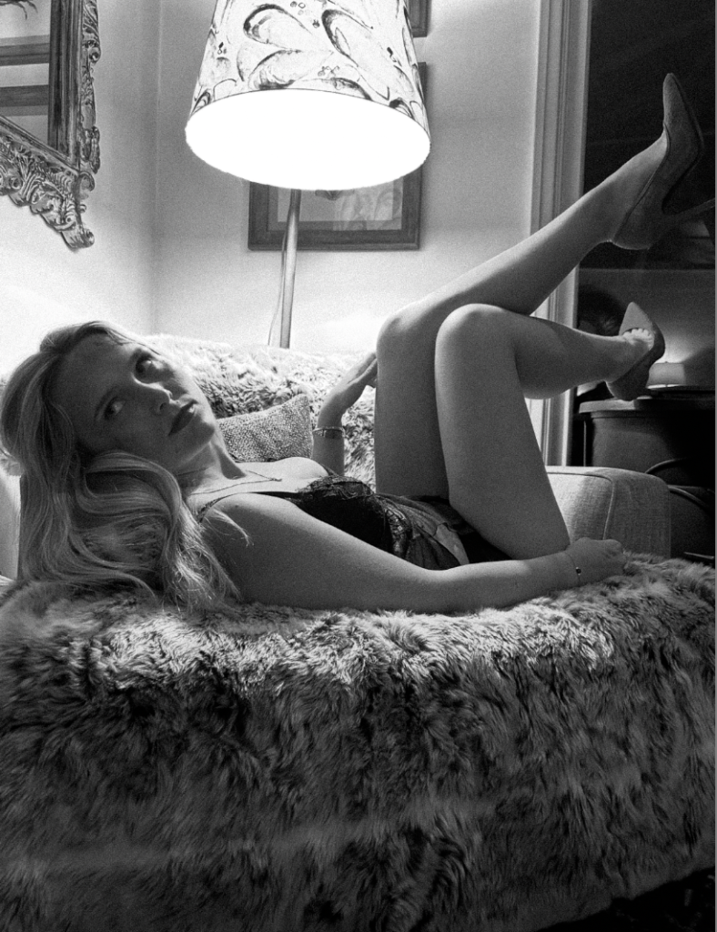
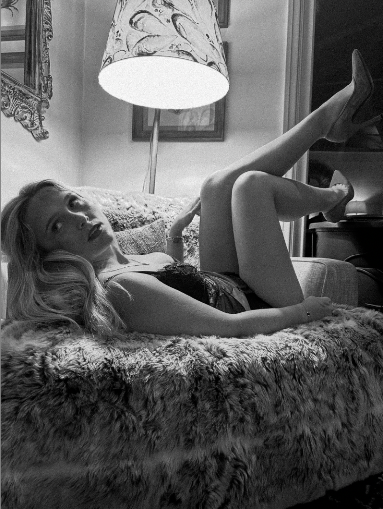
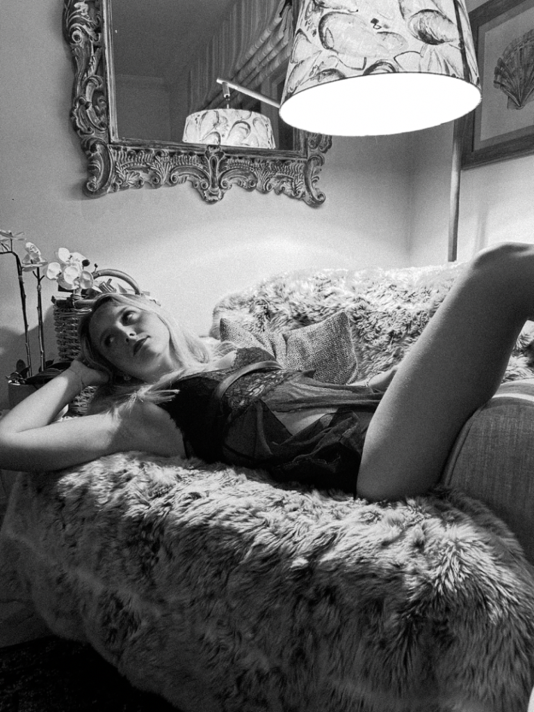
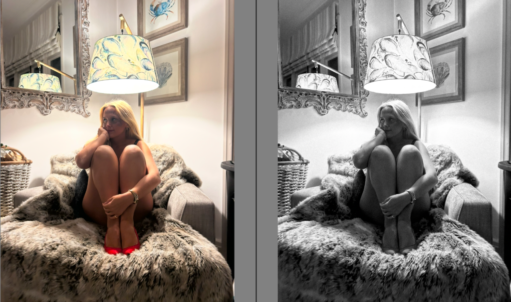
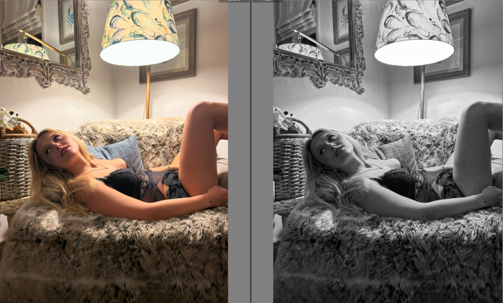
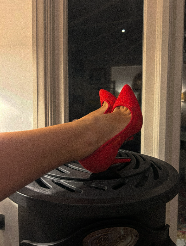
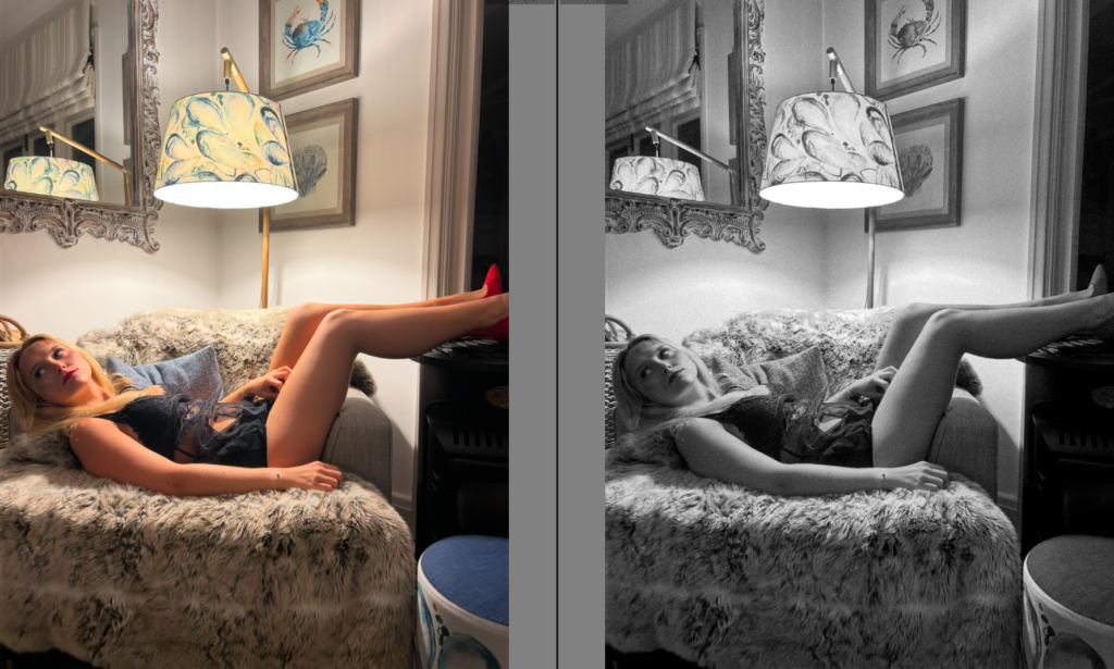
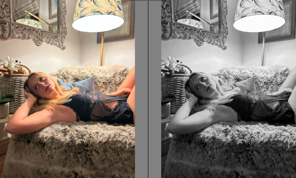
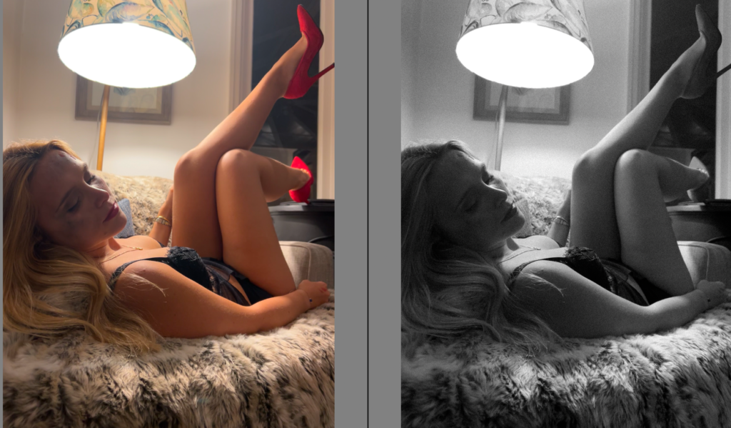
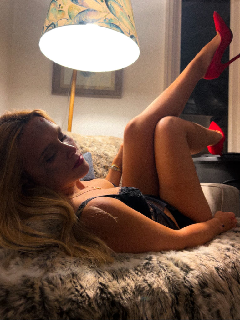
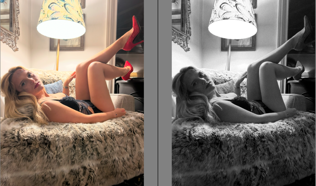
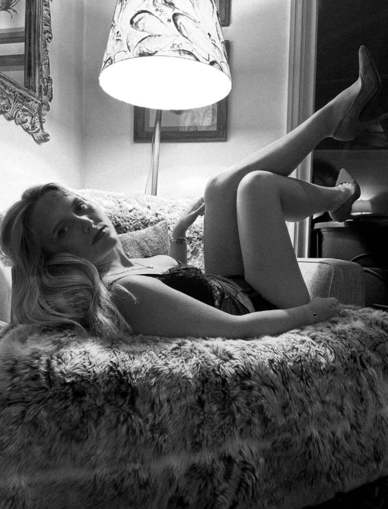
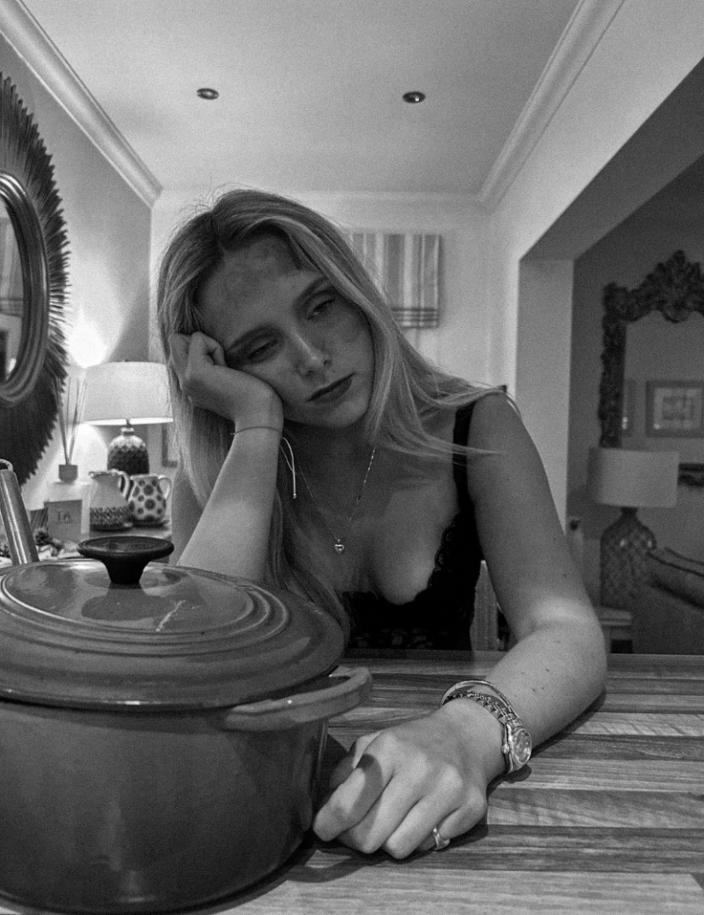
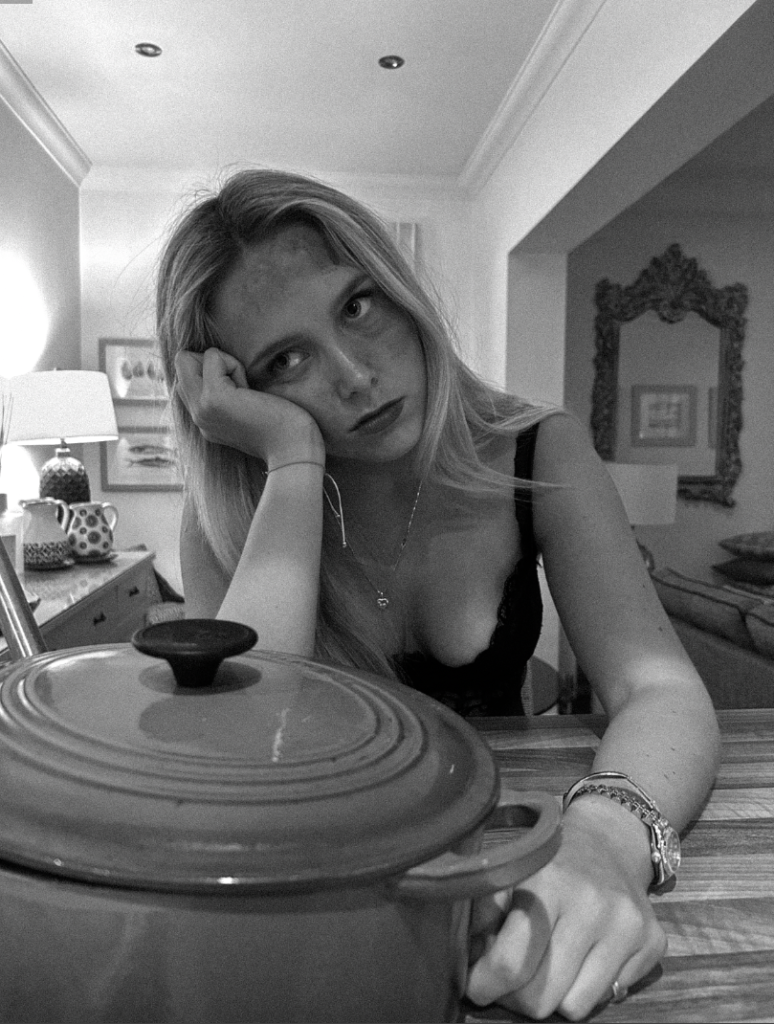
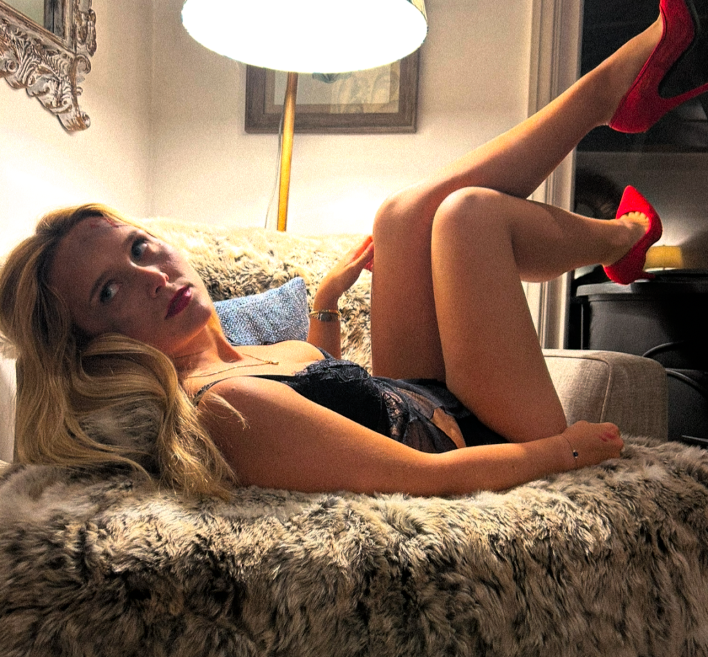
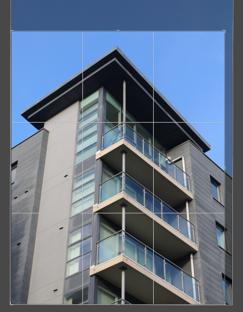
Firstly, I began by rated my images from 1-5 and either flagging or rejecting them. The main factors I took into account was lighting, posing, surroundings/props, and the gaze my subject executed. Before I began my filtering, I cropped every image therefore other things that were potentially taking the attention away from the main factor of the image, therefore I went through and cropped them to my preference before editing. This is a very efficient way of editing the images that are preferred and making your photoshoots organised and ready for editing. As this photoshoot is indoors, it was easier to get the correct lighting however my editing ability should be able to perfect any lighting inefficiencies. One final thing I took into account was how well you could see the subjects fake bruising and bleeding. This is because this photoshoot is to focus on domestic violence, therefore I put fake makeup on my subject to attempt to convey this element. However, it is not the only element I wanted to add. Overall, I wanted to add a sexual element linking to femininity stereotypes but also sexual harassment as the third wave focused on this just as much. I attempted to bring this sexualised element through the subjects clothes and red heels. Red can be a symbol of passion, confident, sexuality and love. This could ultimately signify the growth women fought for during these movements as they were encouraged confidently to fight for their passion and rights. This would significantly contrast to the clothing as women still felt as if they had to play a role in order to satisfy and serve men. This is interesting to me as it differs from my subjects face. This is because many women still stay (representing the clothing choice) even after circumstances (damage) which is a very big important contrast to these images. Lastly, I took into account the lamp facing down on her. I really like this touch as it keeps all attention on the subject which is exactly what I intended too, gives a spotlight effect.
Editing-
B&W-
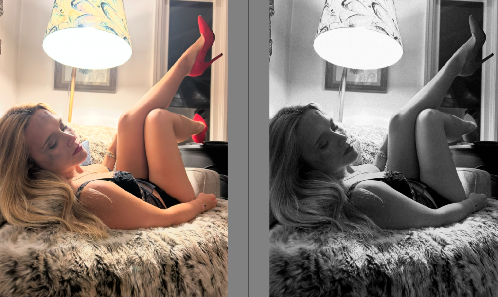
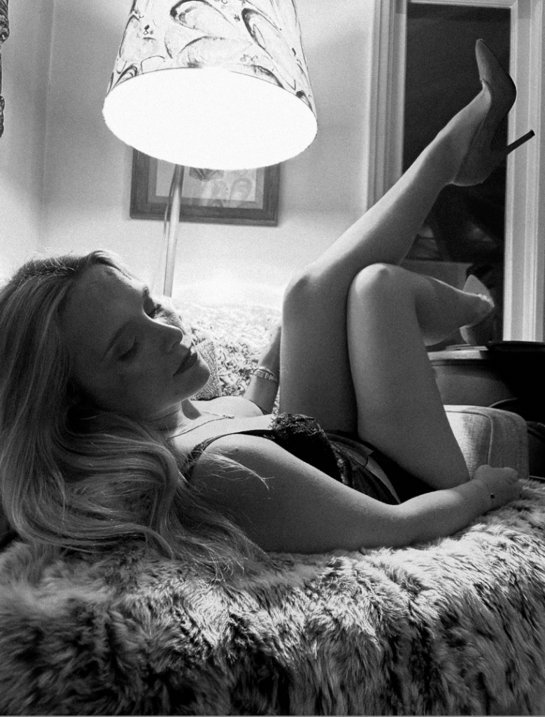
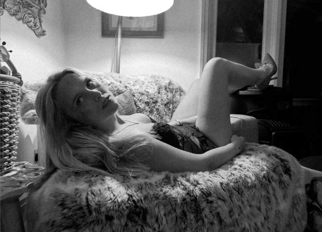
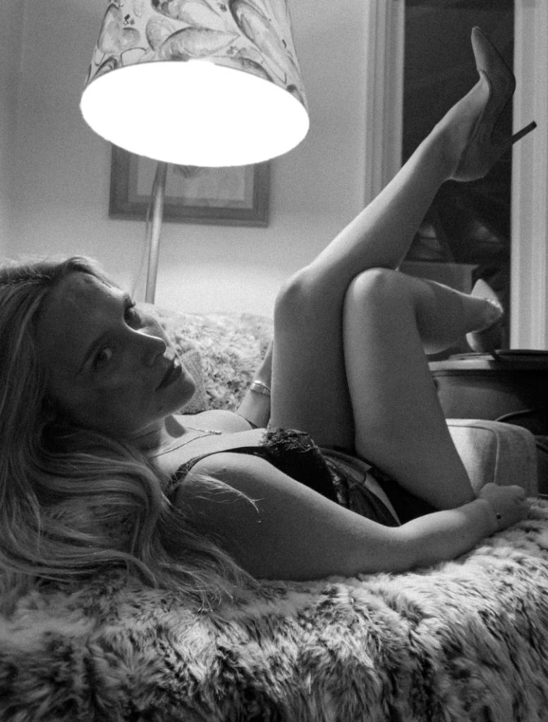
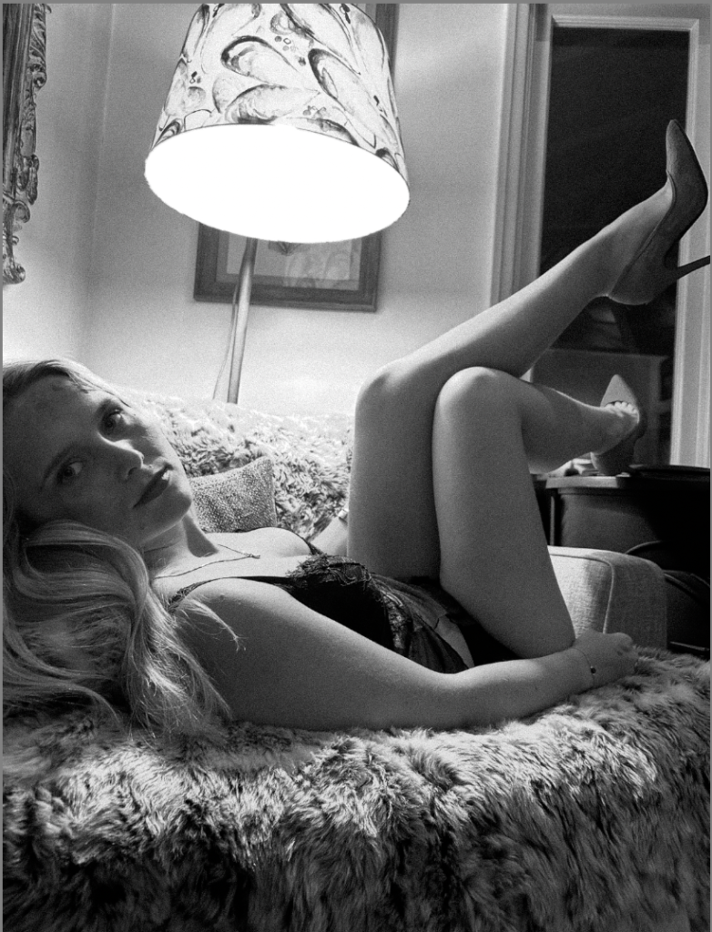
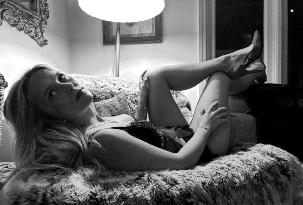
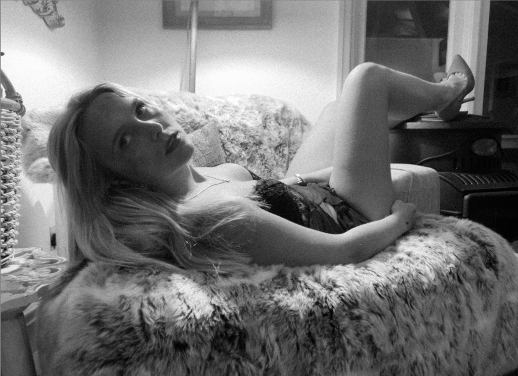
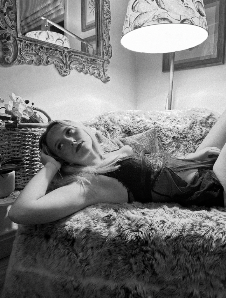
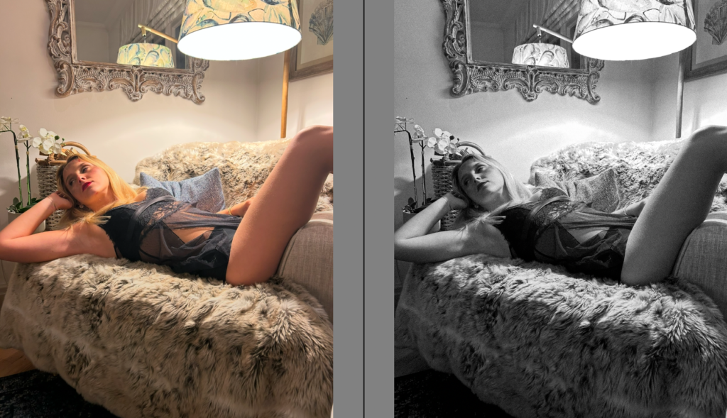
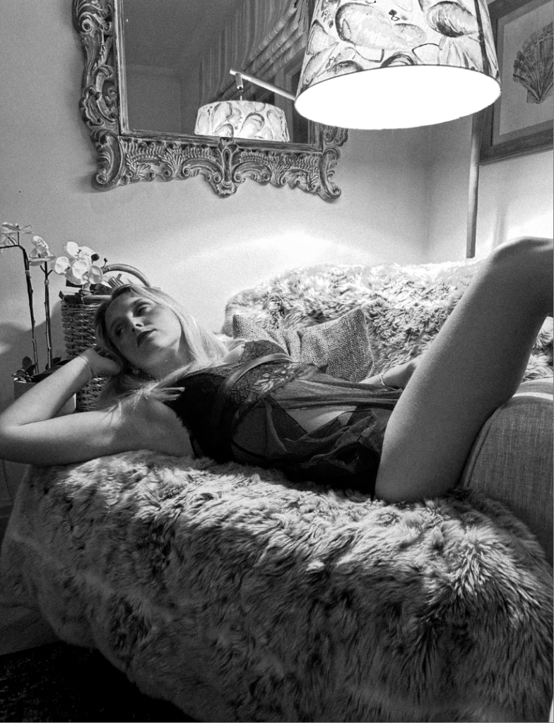
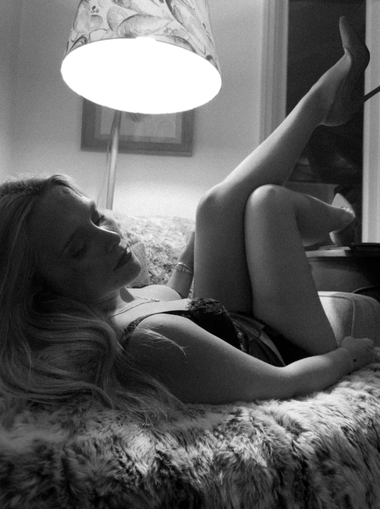
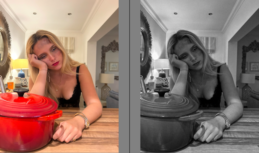
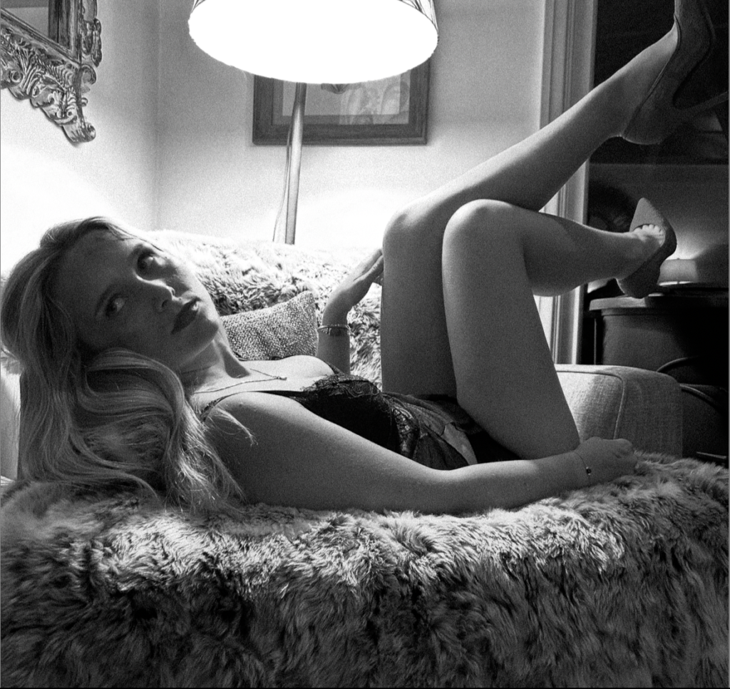
This image is one of my favourites within this photoshoot. This is because the lighting giving the spotlight effect with in depth shadows really sticks out to me. The deep shadows to me portrays an element of sexuality emphasizing by the heels which is what I ultimately intended too. Not only this, I like the image in black and white as it conveys this element but also adds a mystery element. One drawback is the fact that you cannot see the coloured heels and that the fake violence on her face is not as bright and obvious.

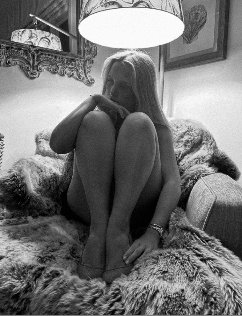
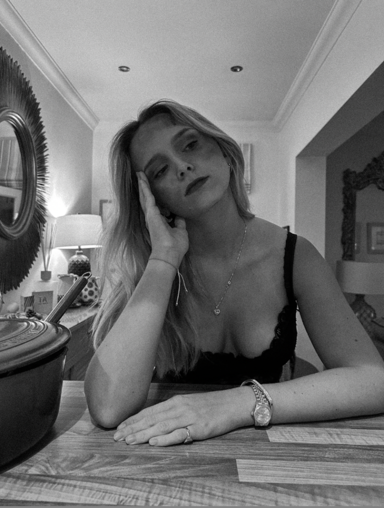
B&W:
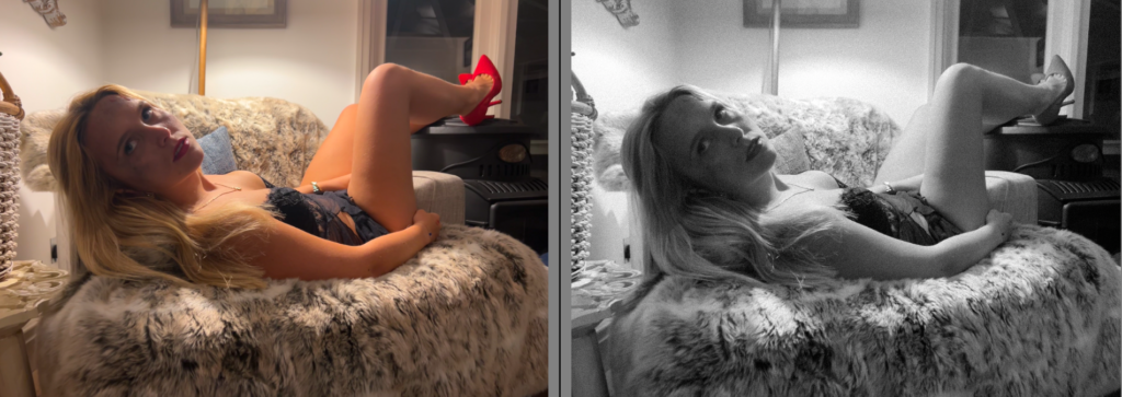
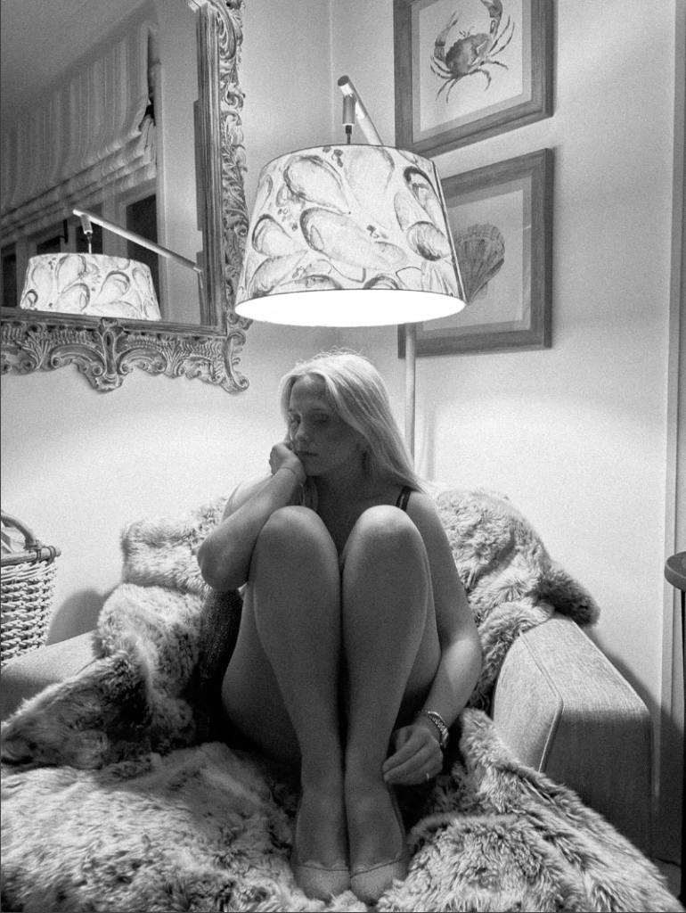
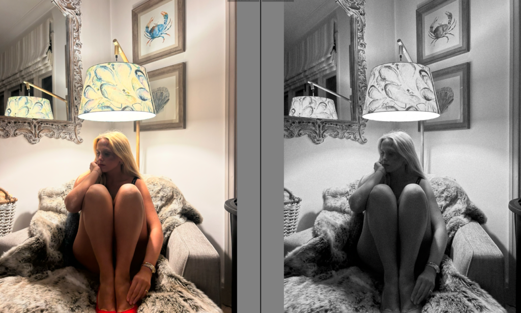
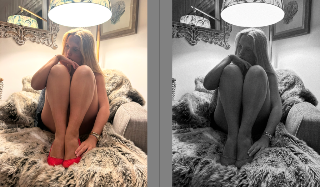
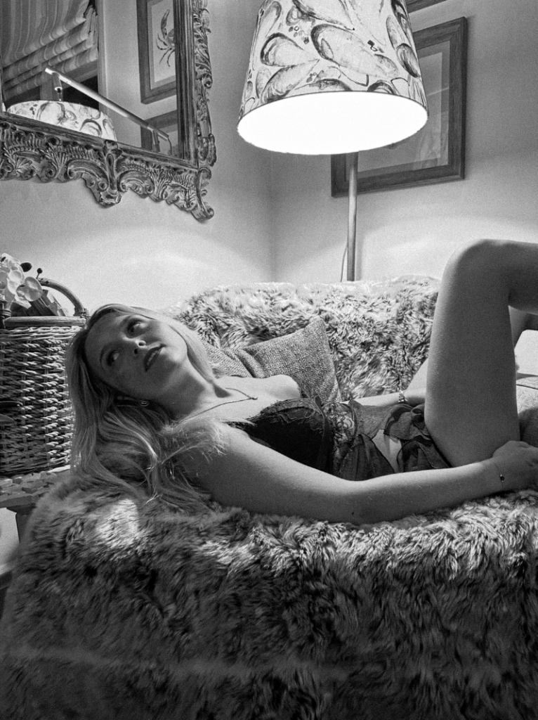
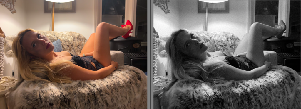
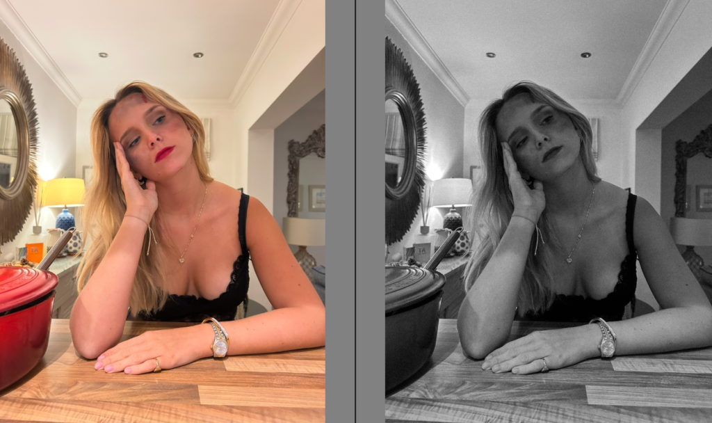
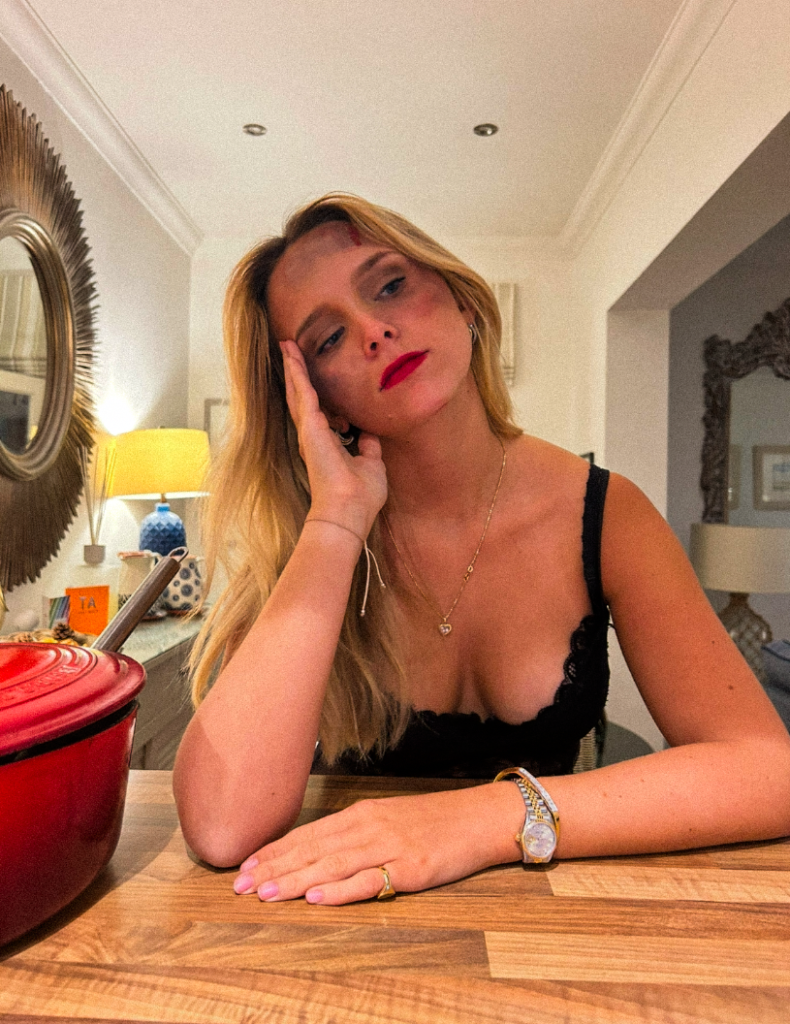
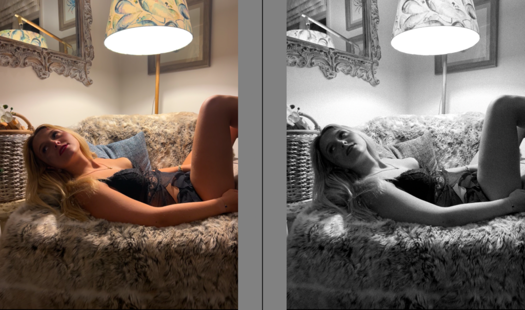
In colour: Potential front cover of photobook

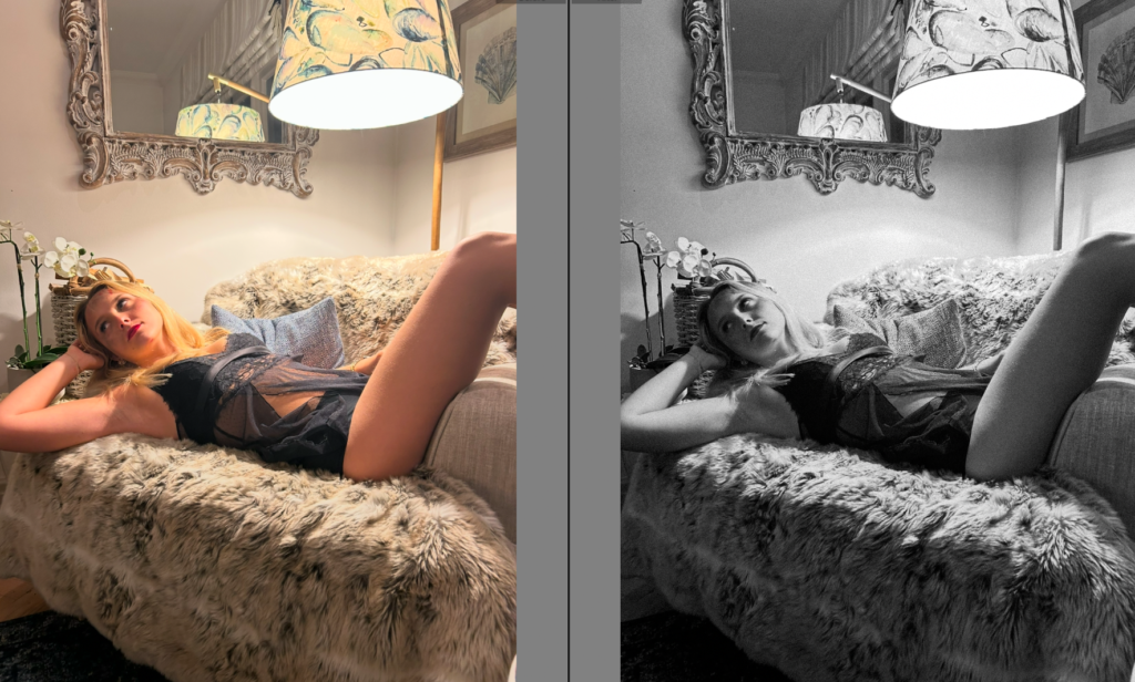
In colour:
In colour:
In colour:
In colour:
Evaluation and critique
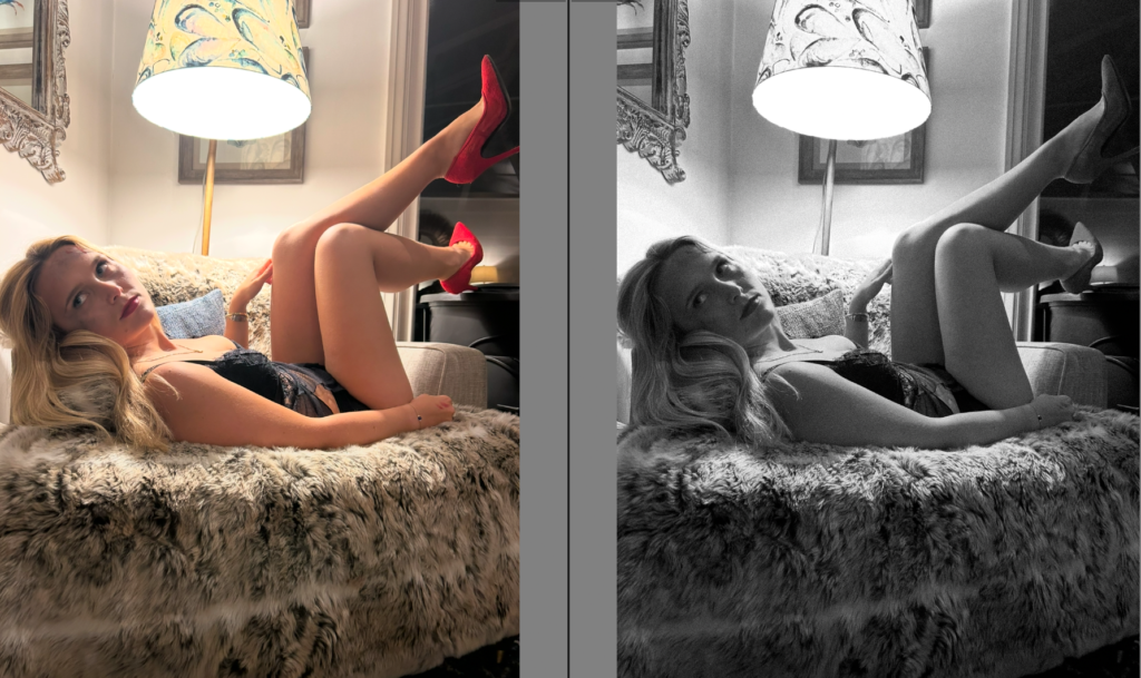
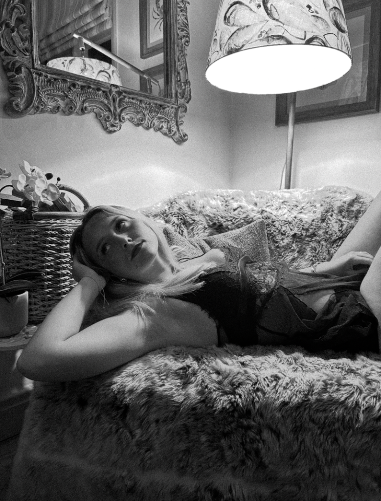
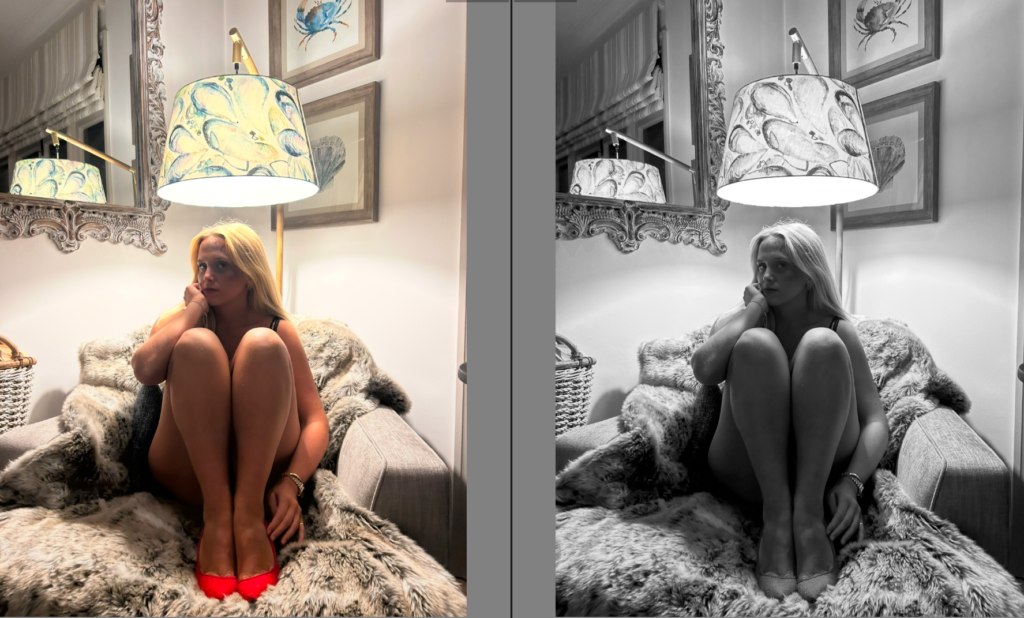
Overall, I like many factors of this photoshoot. One thing in particular that I like is the lighting, creating in-depth shadows which ultimately makes the image more eye catching. To emphasize this, I experimented by putting my photoshoots in black and white which I definitely prefer as it adds more of an vintage aesthetic I was aiming for as Nan Goldin’s images are taken in-between 1979 and 1986. Not only this, but black and white still shows the bold lipstick and makeup. However, the fake domestic violence is not as obvious and vibrant which is a potential drawback as that is what my photos are to be focused around. One thing I would change would be to put the fake bruising etc on the subjects right side of the face so the lighting would shine on it, allowing viewers to focus on it. This would definitely benefit my images as it will focus on the theme of sexual and domestic abuse. I found the type of posing very feminine emphasized by the ‘ female gaze’ which is ultimately signifying my overall theme of feminism and movements. Another draw back of having my images in black and white is that you cannot see the symbols included such as the red bold lipstick and high heels. However, this can be significantly fixed as I am thinking of this being my front cover in my photobook as it represents feminism and confidence ultimately representing the empowerment women felt through the movements.
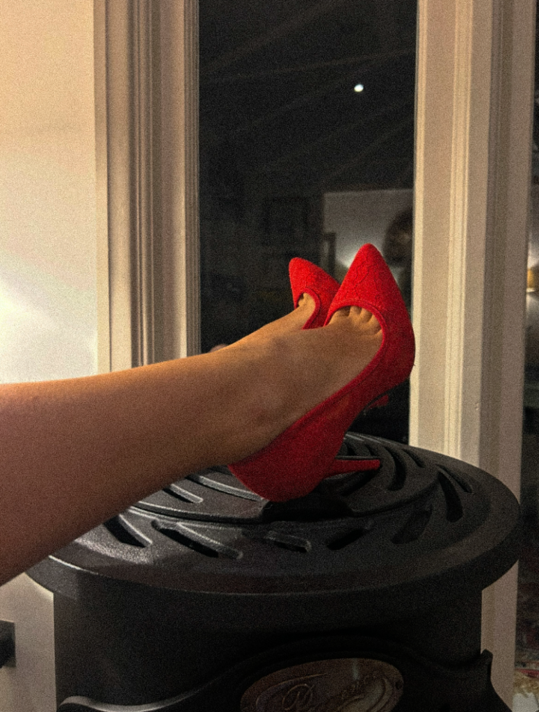
I would keep this in colour, meanwhile my book being in black and white. This is because red heels represents confidence, bold, sexuality and femininity, which ultimately covers my themes therefore tells the viewer from the front page what my book narrative is. Overall, I like this photoshoot and I think I executed it successfully.
This book – Girlhood, is all about what it’s really like to grow up as a girl, told through a series of raw, real photos that show both the strength and the tough moments we go through. It’s not just about looking pretty in pictures—it’s about the real stuff: dealing with a world that often tries to control or judge you. The photos capture those little moments of joy, rebellion, and the everyday struggle to just exist as a girl. It’s about how we’re expected to be one thing but are always trying to push back, balancing what the world wants from us and what we really are. It’s real, it’s messy, and it’s all us.
I want the book to be smooth and soft, small and not too big with black ink and a while boarder and white pages – inspired by the book FEMALE, with A4 pages and a hard cover.
The title is going to be Girlhood, with roughly 20 pages with one white on one side and the photo in the middle on the next page. There will be some words on some pages, not all – relating to the exact photograph.
There will be a range of different images, ranging from girlhood and trying to make awareness for misogyny, girlhood and what girls have to go through.
1. Write a book specification and describe in detail what your book will be about in terms of narrative, concept and design with reference to the same elements of bookmaking as above.
Narrative: What is your story?
Describe in:
My child hood.
My experience growing up, the good bad and interesting.
My story will portray the growth and understanding of my childhood. Exploring the hardships and importance of growing up and the individuality of each persons story.
Design: Consider the following
I want my book to be a hard cover book, I want it to be heavy too.
I want the paper on the inside of my book to be thick, durable and sturdy. Almost to symbolise skin, as weird as that sounds.
I want my book to be as big as an A4 sheet of paper, big enough to catch someone’s eye but not too big to bother.
I think my front cover should be a portrait photo, almost like a school photo or ‘mug shot’ of me, well not actually me but a model.
‘ROOTS’ – I had black hair growing up and since I’m naturally ginger, my roots would show as my hair grew. And since I’m talking about my childhood, my roots, I thought it was fitting.
I want there to be a photo on each page, each photo couple to contradict each other.
The title of each photograph will be in the bottom right corner of each page in small simple text.
‘The single photograph is always fragmentary, only part of the story it shows’ Henry Luce, the founder of LIFE magazine, personal take on the importance and need for the modern photo essay format. He suggested we can see much more of the story by using many powerful photos rather than one well taken photo. I will be looking at the development of the modern photo essay, specifically how W Eugene Smith was the pioneer of the modern photo essay. W Eugene Smith was the fundamental photographer when it came to the creation of the modern photo essay. It first became apparent after his ‘Country Doctor’ project, he spent 23 days photographing a local doctor in charge of caring for the entire ranching town. Smith created this project while working for LIFE magazine, one of the couple of large magazine firms he worked for, this being on of the most significant. Smith created one of the most known photo essays to exist even in modern day, having done this he quickly became associated with the modern day photo essay format. He captured the indexicality needed within a photo essay, the point of life, death, presence and absence needed to tell a story, bitter or joyous, through a photo essay.
The photo essay was a movement, with the invention of the handheld film camera and halftone printing, magazines were created. The starting point for the photo essay was the magazine, Life being the first one to make a significant impact with 50% of the American population reading the magazines. The idea of printing and linking photos with text seems obvious, a ‘magazine’ wouldn’t be overly successful if it was just text. As the magazine movement spread worldwide, more and more magazines started to introduce more photos and less text, simply using text to link the photos together. In 1931, the more illustrated style of magazine was dramatically increasing its popularity, right up until world war two. Within world war two, the production stopped, instead the printing presses were used to print German propaganda. LIFE magazine was quickly taking over in the world of photojournalism, having started before the war in 1936 and then continuing onwards after the war. The term ‘photo essay’ was coined by Henry Luce the owner of LIFE magazine, Kurt Korff an editor within the magazine was the one to introduce and trail a new magazine concept. The photo essay was born, leaving behind the previous formalism photography style for one that focused on raw emotions and reality, telling a story through powerful photos. This led to the founder realising people wanted a true sight with many photos rather than a well written article, they wanted something they could glance at and understand. In 1936, pre world war two is when Luce, the founder of LIFE, started to implement this within the magazine. The first copy, using this photo essay style, featured the Columbia river dam, a political, controversial, attention grabbing image. Commenting on America and its historical progress to be building this dam while encouraging people to pick up the magazine. And, inside the same issue of LIFE a photo of a new born baby, mere seconds after birth. This was something that wasn’t an average photo to be in a magazine let alone without an article, although this image did have a caption. The caption however, doesn’t describe the photo or the reason for it nor does the image illustrate what is being said in the text, these are revolutionary steps within the photo essay production. LIFE became the known source for unique, entertaining journalism, developing the photo essay as they went, until W Eugene Smith produced his own take on the photo essay within LIFE and this became the format we know today. It is worth noting, while W Eugene Smith is considered to be the pioneer of the modern photo essay, his style was heavily influenced by the original creators and his publisher, at the time, take on photo journalism.
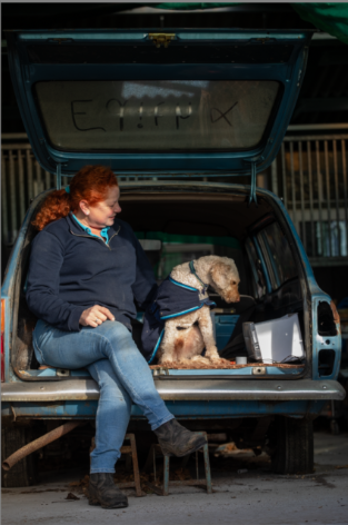
W Eugene Smith, was the driving force of the modern photo essay, his country doctor essay becoming the known standard and style for photo essays within photojournalism. Showcased within his work is sheer depth, looking into every element of life, forcing the viewers to acknowledge all the good but more over the less documented raw reality of some of the subjects, from war and all its atrocities to the bleak reality of a country town doctor pushed to his limits. Unlike previous photo essay structures Smith left no rock unturned taking photo journalism to a new level, showcasing a new photo essay style in which he pushed to the limits to get a true account, unlike previous styles that simply took some good formalist style photos and left it at that, providing biased, unrealistic images. Smith, focused the country doctor essay around a single rural country doctor, following him and creating the narrative we know to be the ‘Country Doctor’ photo essay. By shooting for days beforehand without film, understanding what he wanted the aesthetic of the shoot to be, how he felt he could best represent the never ending, gruesome job of the country doctor. Smith was a realist and dedicated his life to the craft of allowing others to see the true reality, within the country doctor photo essay there are photos of life, death and everything in between. This is reminiscent of Smith’s earlier work, becoming the first photographer to produce a photo of a man dying, forcing the world to see the war in its all. Add photo This shot wasn’t taken with the formal elements in mind, completely contrasting the previous ideas on how to shoot for a magazine, Smith crossed lines many daren’t to go near. Looking at this shot, the situations Smith put himself in for the photo he felt the world needed to see was unlike many others. It would be simply immoral to judge this photo on anything other than the story it’s telling and how it is telling it. Smith didn’t work in photos that had good technical elements; he wanted people to feel and experience a snapshot of the scene in a quick glance, expanding peoples worlds with a series of images. Within my own work I have composed shots, which does contrast Smith’s style, however I have considered what I wanted to show, how I can add text (captions) in the style of LIFE editorial style. Having noticed Smith uses largely human emotion of the subject within shots to convey his message, I have constructed photoshoots in which I can connect and capture the emotion between the car/bike and owner. Smith always shoots in an ‘environmental portrait’ style due to the task of photojournalism. I have kept the same theme, allowing the background to speak for me in my images. In particular I like the comparison of this image and ‘country doctor drinking coffee after a long surgery?’ They are wildly different images of Smith’s being associated with the pinnacle of life and death and mine being focused around a sentimental car. I like the similarity of lack of camera acknowledgement and emotion portrayed within both shots. Even the dog within my photo adds not only another element to the photo but provides another emotional element, the shape of the dog looking down suggesting the interest and confusion as to how the car is dearly loved but in the current condition its in. Similar to Smith’s photo in which the Doctor appears exhausted and overwhelmed, having completed a job in which not only is he essential but he must have had some love for to commit to.
In contrast to W Eugene Smith’s photo essay development, within LIFE magazine, LOOK magazine attempted to make a similar photo essay. However they took a different approach, LIFE used a more formalistic style, creating high quality, technical photos. This contrasted Smith’s style of the many, small insight photo styles. LOOK was often considered to use a picture story style rather than a photo essay as such, while they seem similar the photo essay is less focused on technical elements instead looking at emotion, reality, whereas picture stories look to tell a tale through good quality photography, using well composed shots. Within Smith’s photo essay development he produced hundreds of photos, he actually aimed to create projects too vast for a gallery. LOOK on the other hand, while is the most comparable in terms of photo essays, how they were used and how they were developed, actually focused more on the single shot. Within my own project I used Smith’s photo essay, creating hundreds of photos, choosing the ones that while not being the best single images, told the story I hoped to show. LOOK used dramatic single shots on the cover of their magazines, normally completely unrelated to the contents inside, completely contrasting Smith’s developed abundance of photos often complimented with large chunks of text, explicitly, his Country Doctor essay was a true display of the contrast and development of the photo essay. LOOK started producing their magazines in 1937 which was over ten years before Smith produced what is considered to be the modern photo essay, however even when this was released LOOK stuck to their picture story style, focusing on single shots.
Both LOOK and LIFE had a hand in developing the modern photo essay, but it is clear, truly W Eugene Smith was the developer of the modern photo essay format. His work is still known world wide to this day, even more so the historical impact of his work is something still deeply moving and eye opening to the modern viewer. This is largely due to his style but also the photo essay format, allowing the viewers to be transported to a new world, someone else’s life, good or bad. LOOK on the other hand, created world wide known work but it wasn’t revolutionary in style. Smith was the pioneer for the modern photo essay, in the format of large amounts of photos, not taken solely based on the formal elements, often complimented with text, but not describing the photos but trying to put the emotion and impact into words, further developing often already intense photos, forcing the point home. My style was similar to Smith’s to begin with creating photos ‘I could feel’ photos that others might not understand to begin with but hopefully once a collection of them are placed in front of them they can feel the impact and intention behind them. I love how Smith approached adding text into his work, further developing his photos rather than deconstructing them, making them devoid of meaning to a degree. Having said this, I have some photos I will add captions to explain the significance of the shot, as a few of my shoots are inanimate objects so need the explanation, alongside human elements in the others and following Smith’s idea of many good photos to tell a narrative rather than one which can be misleading and not allow people to truly understand.
Bibliography
Landwer-Johan, K. W. Eugene Smith – Master of the Photo Essay. [online] https://www.kevinlj.com/w-eugene-smith-master-of-the-photo-essay/ [accessed 7th Jan 2025]
Kaninsky, M. Eugene Smith -Country Doctor A Photo Essay By W. Eugene Smith [online] Country Doctor a Photo Essay by W. Eugene Smith [accessed 9th Jan 2025]
Khan, N W. Eugene Smith: HOW MINAMATA REDEFINED PHOTOJOURNALISM WITH A MORAL PURPOSE. [online] W. Eugene Smith: How Minamata Redefined Photojournalism with a Moral Purpose [08/16/2024]
Graf, C. The birth of the photo essay: The first issues of LIFE and LOOK [online] [accessed 28th Jan 2025] The birth of the photo essay: The first issues of LIFE and LOOK
Sutherland, P. The Photo Essay [online] [accessed 29th Jan 2025] 1 The Photo Essay Patrick Sutherland University of the Arts London Email
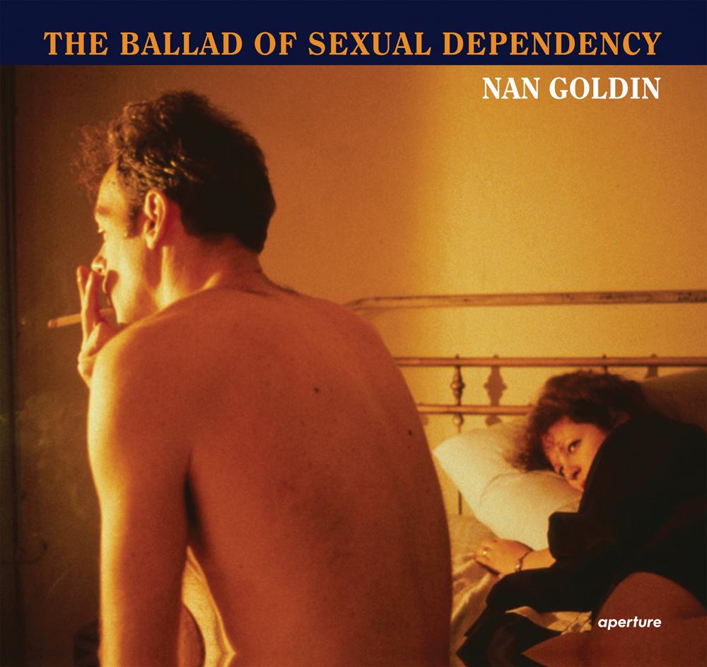
The photo book I chose to observe, research and take inspiration from primarily is The Ballad of Sexual Dependancy, by Nan Goldin.
Exhibition. Jun 11, 2016-Apr 16, 2017.
Details
Format: Hardback
Number of pages: 144
Publication date: 2012-10-31
Measurements: 10.28 x 9.37 x 0.73 inches
ISBN: 9781597112086
The Ballad of Sexual Dependancy by Nan Goldin was first produced in 1986, and is a photo book that holds over 700 images of the artist herself along with loved ones. Within the book, Goldin uses it as a diary to document the difficulties of intimacy, love and identity.
Nan Goldin was born in 1953 in Washington D.C. and was deeply affected by the suicide of her older sister, Barbara, at a young age. This early trauma shaped her artistic vision, as she later used photography to document moments of intimacy and connections between people. Goldin studied at the School of the Museum of Fine Arts in Boston, where she was introduced to photography and began capturing the lives of her friends, many of whom were part of the LGBTQ+ community, sex workers and drug abusers.
Goldin’s aesthetic is characterized by rich, warm colours, often enhanced by artificial lighting with a snapshot-like quality that gives her work an immediate unfiltered feel. The use of the flash in her photos creates a sense of realism, as it suggests that the photographer is interfering in a private moment. Overall, Nan Goldin’s work challenges societal norm by focusing on people and experiences often excluded from mainstream narratives.
The images in the photo book surround the theme of relationships, self-destruction and sub-cultural life. These themes influenced my focus on youth and femininity as Goldin shone light on similar narratives to what I am aiming to show, through capturing moments of vulnerability and reality without romanticisation. This immediately inspired me as the aim of my personal project is to show the reality of growing up as a young female, who has to follow specific expectations in order to be seen. I want to take a similar approach to Goldin by portraying an unfiltered and raw view on my key themes and apply them to my experiences.
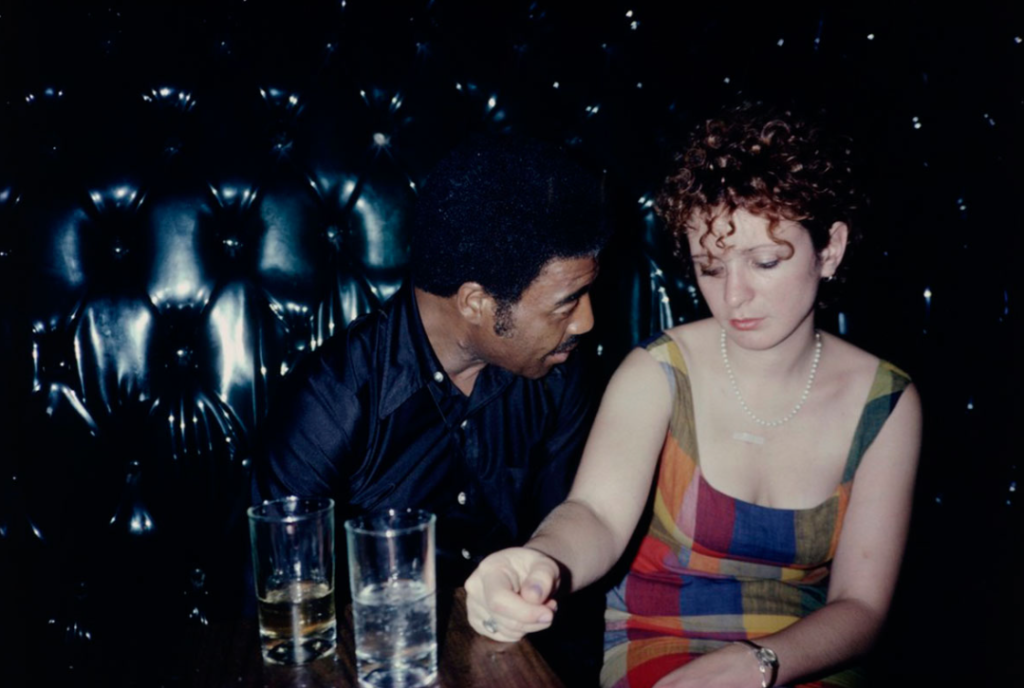
Many of Goldin’s images address the domestic violence she has faced, showing and sharing her experience with millions of other women who have faced the same thing, especially since her images were taken between 1979 and 1986. This was a time where women were devalued and dehumanised, due to the firm gender inequalities in society at the time. Therefore, her photo book tells a story which portrays conflict and increases awareness of the issues happening at the time.
“In part a love poem to the bohemian life style of young people in New York City, it is also a melancholy meditation on the joys and terrors of romantic relationships, both straight and gay.
” –The New York Times
This quote from The New York Times tells me that Goldin’s work is very inclusive when portraying love, through the end of the quote: “both straight and gay“. In the 1980s, LGBTQ relationships were not common and often removed from the mainstream culture, meaning that people of this culture would often keep quiet about their sexuality to conform to the societal norms. However, Goldin provided a realistic view on queer relationships. This is significant to me because through my photo book I am including aspects of female friendships and the importance of intimacy in them to develop healthy and comfortable bonds. “Joys and terrors” is a juxtaposing element in this quote that tells me Goldin incorporates both beauty and brutality in her work, showing she does not romanticise relationships as she focuses on the theme of love, yet also violence.
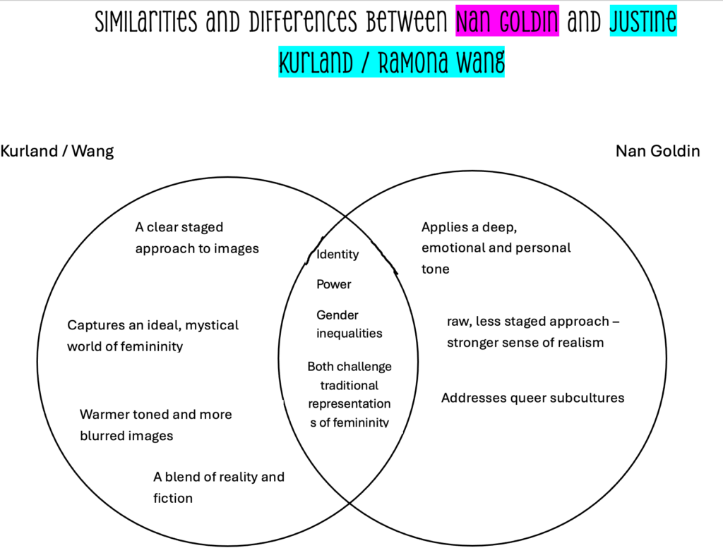
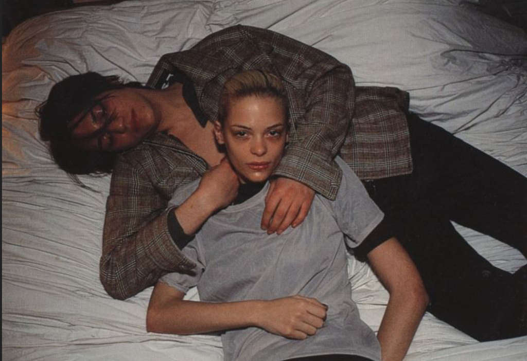
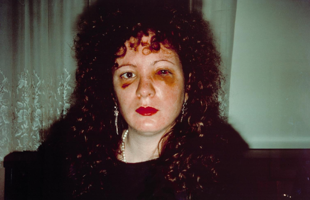
Image comparison between Justine Kurland and Nan Goldin:
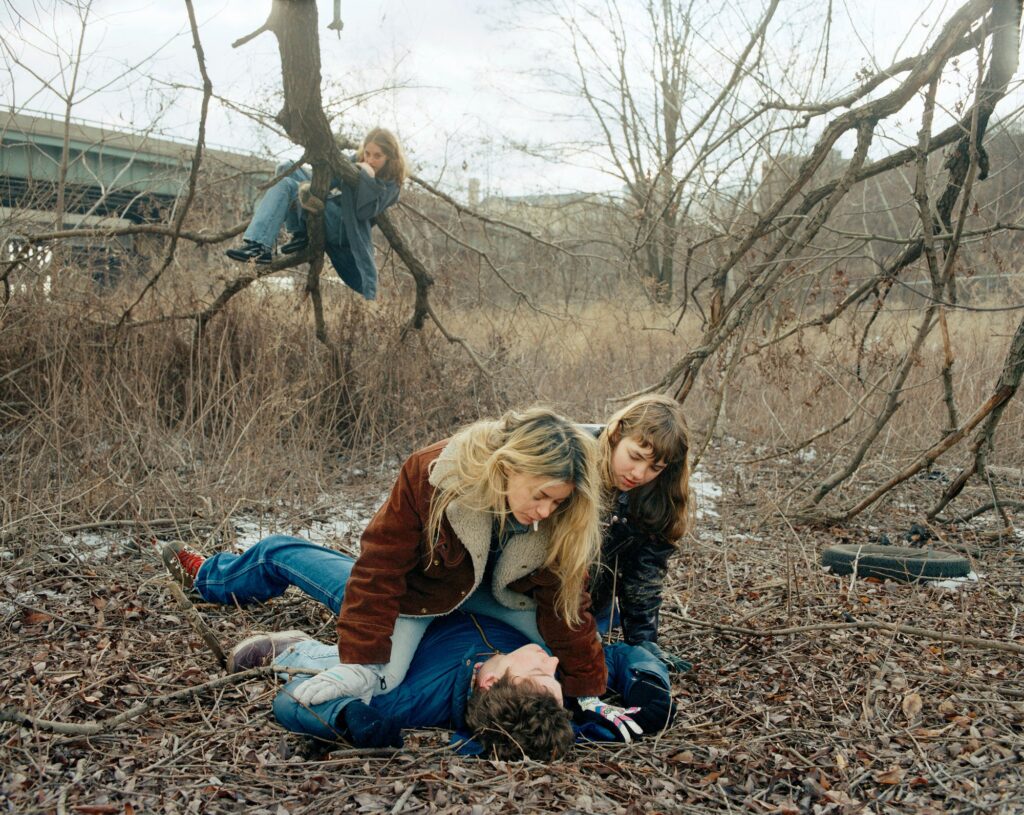
Justine Kurland and Nan Goldin both explore themes of identity and challenge traditional stereotypes of females. The aesthetic of Goldin’s image in particular has a more spontaneous effect due to the chaotic scene and a less staged approach. This contrasts to Kurland’s image because we can clearly tell its staged due to the subject in the background observing the 3 subjects in the foreground. Another main difference between the two images is the lighting and colour. Kurland uses natural daylight, and reimagines her photographs in a mythical way as they are carefully composed and cinematic, whereas Nan Goldin’s image is capturing a moment as it is happening.
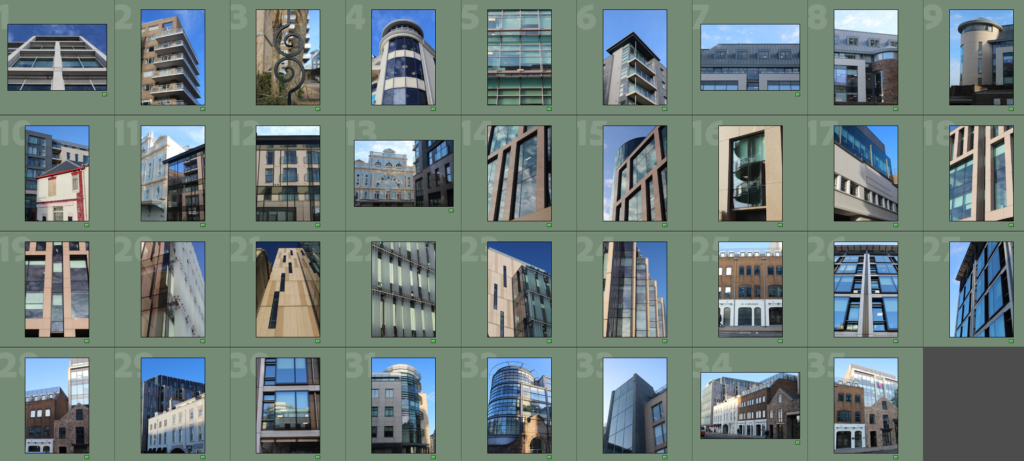
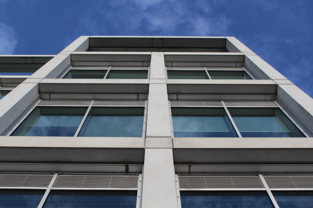
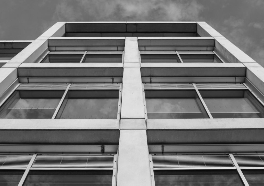
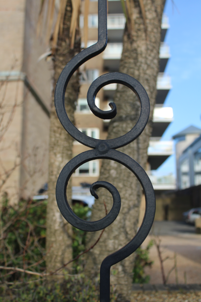
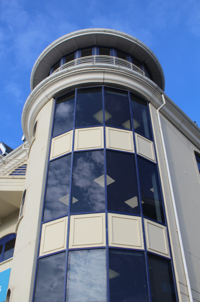
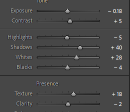
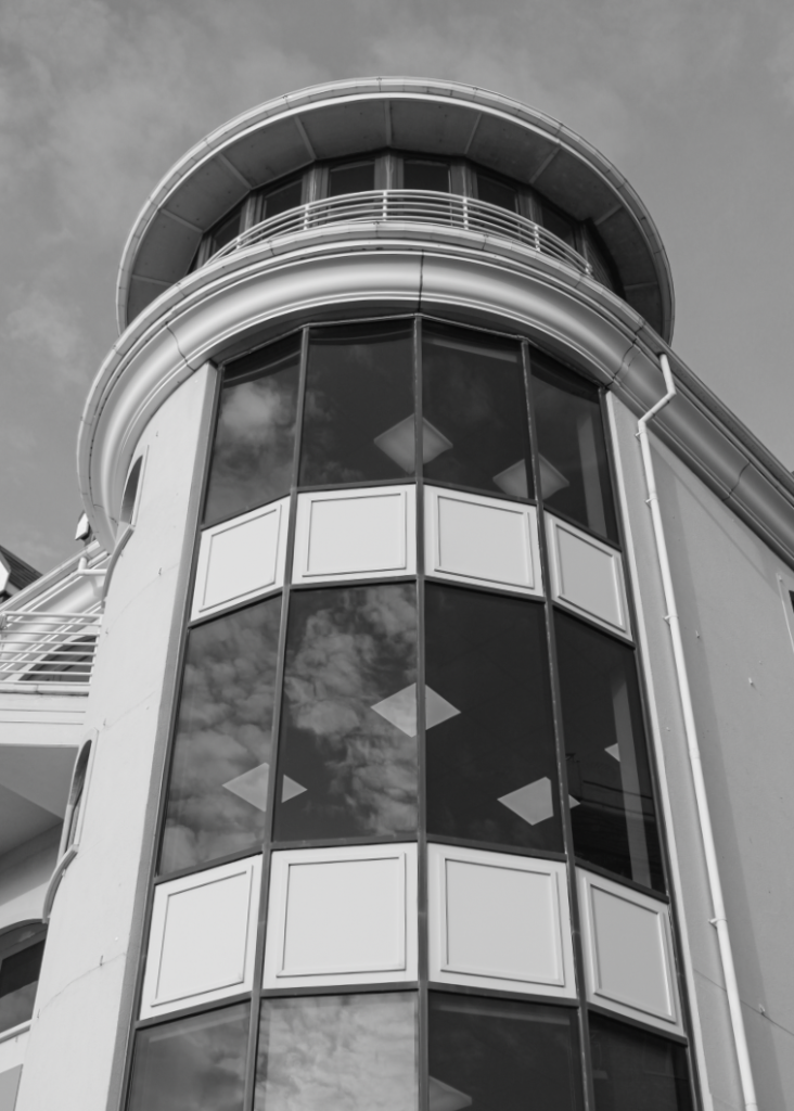
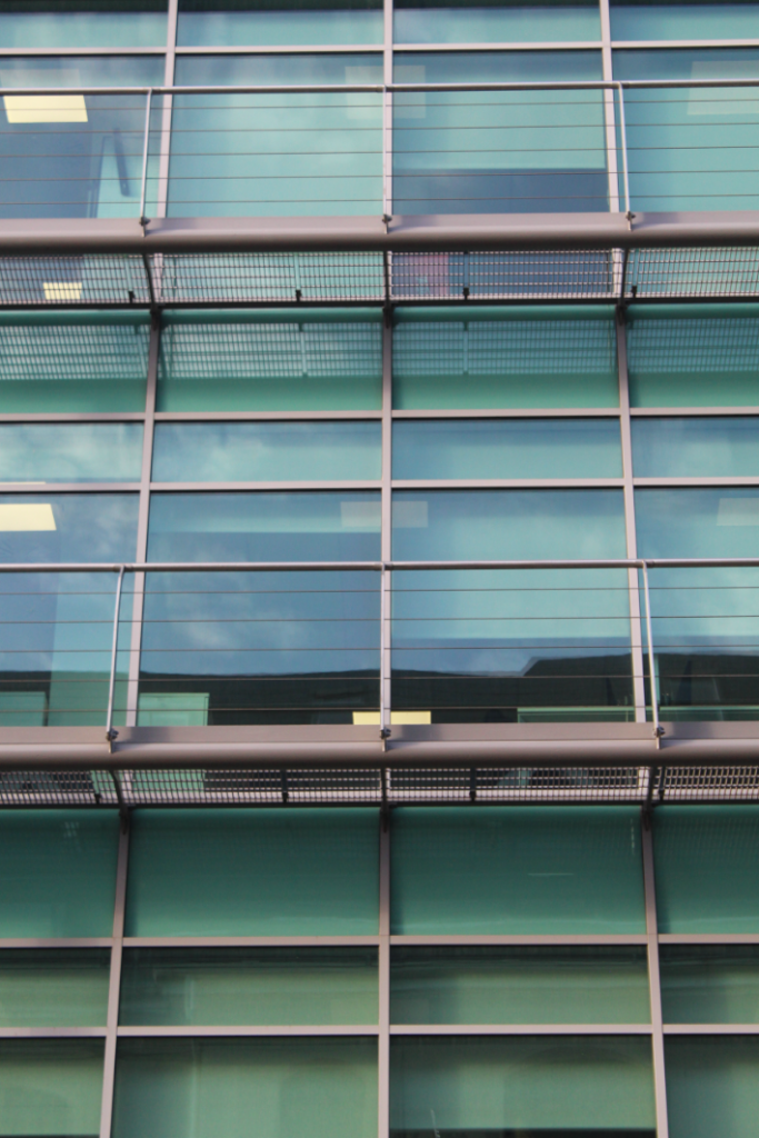
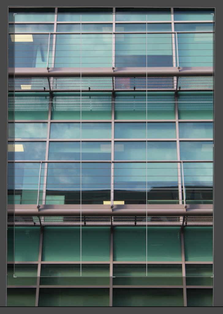
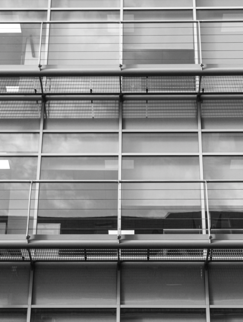
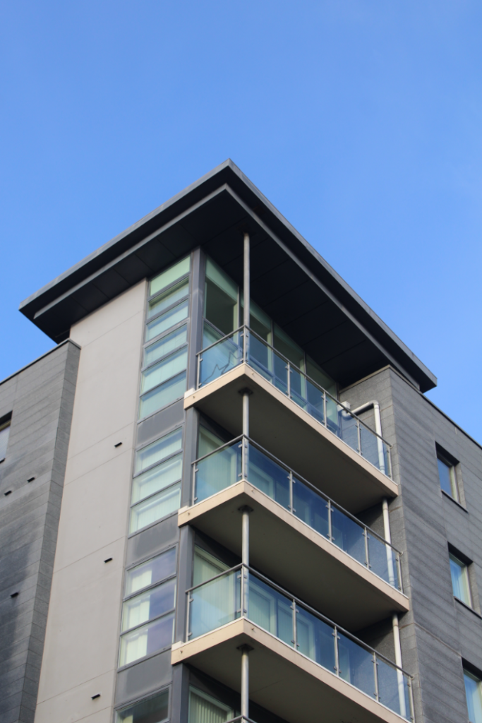
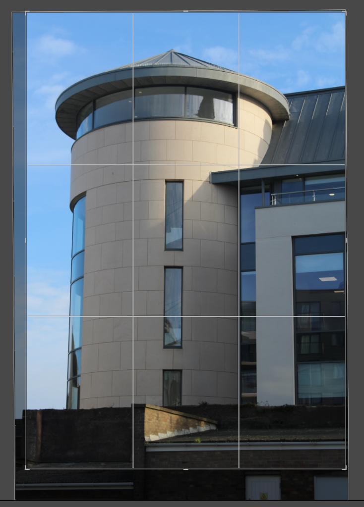
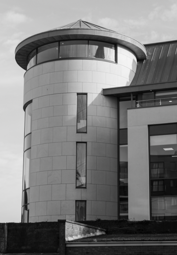
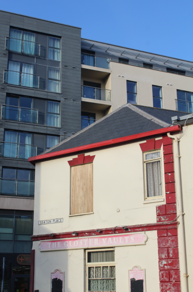
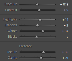
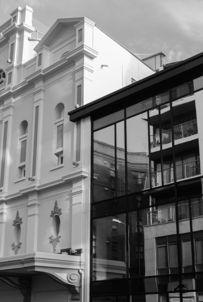
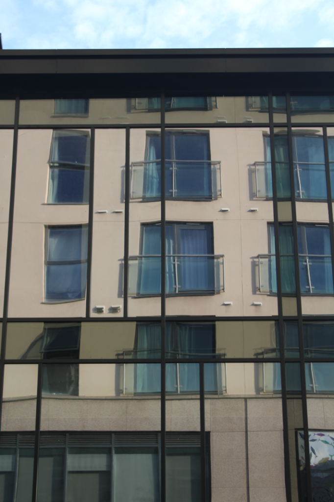
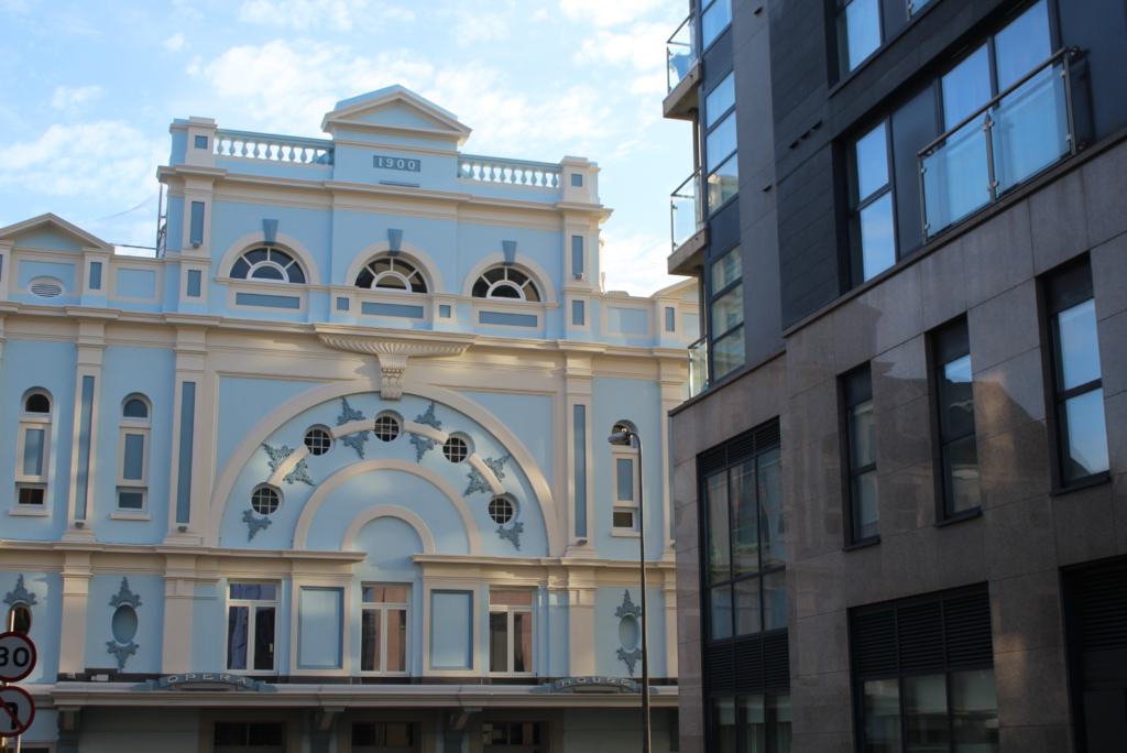
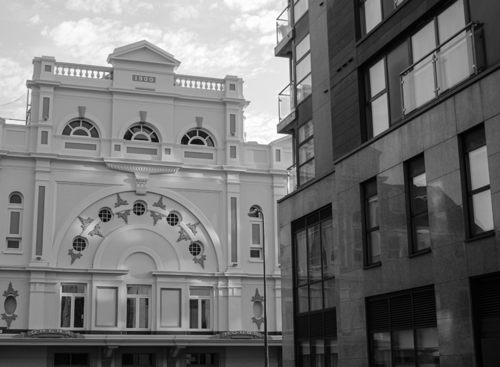
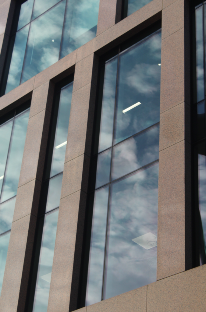
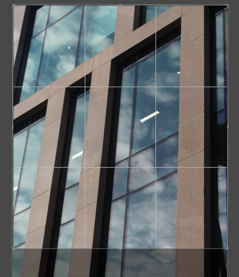
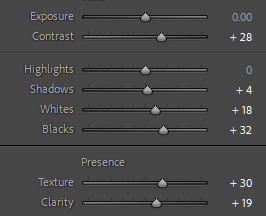
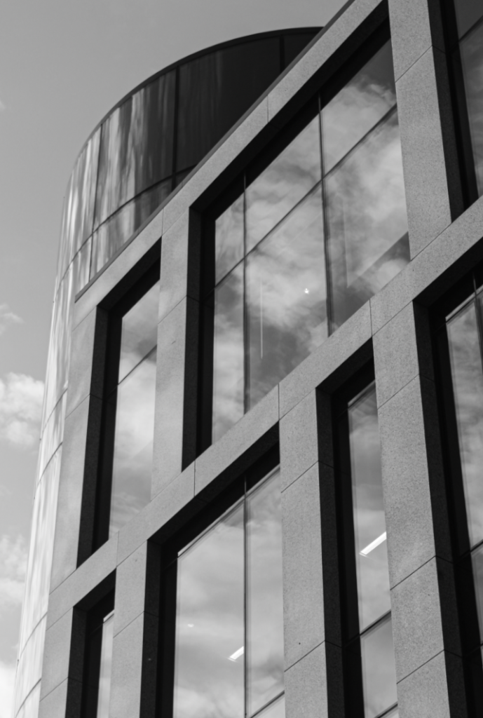
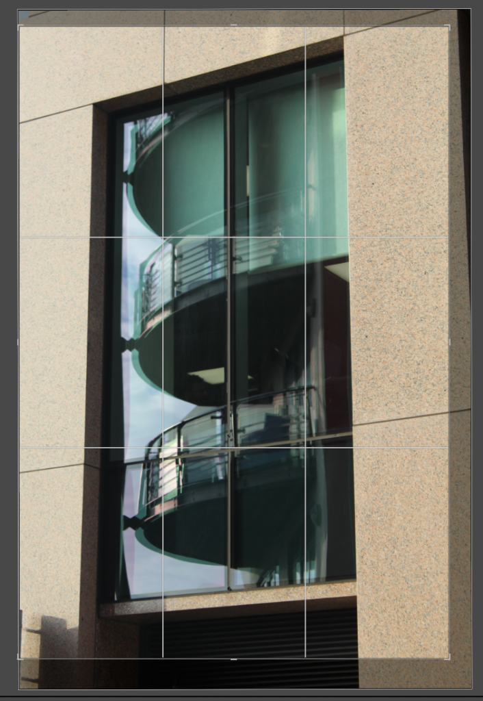
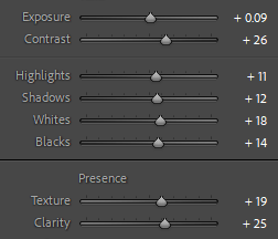
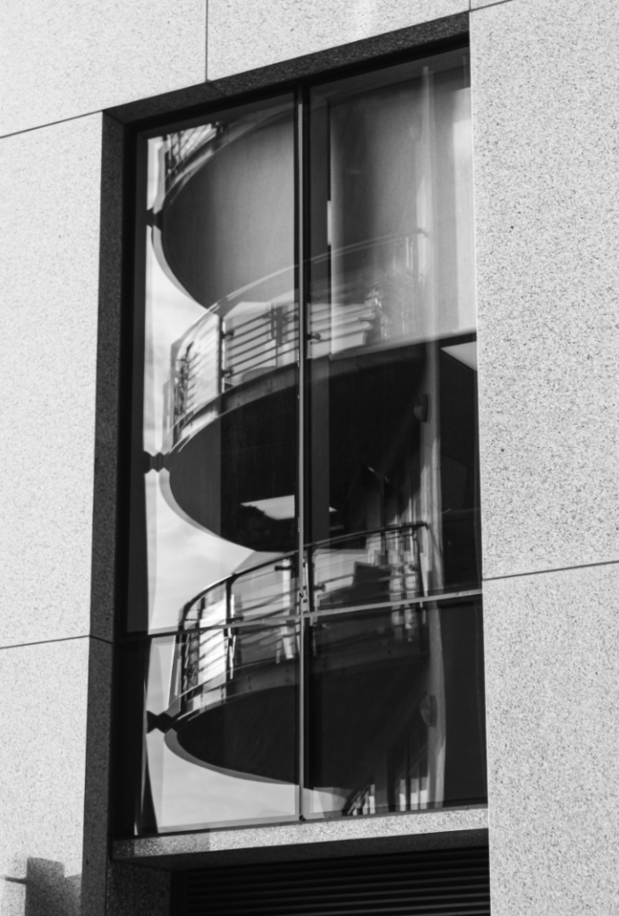
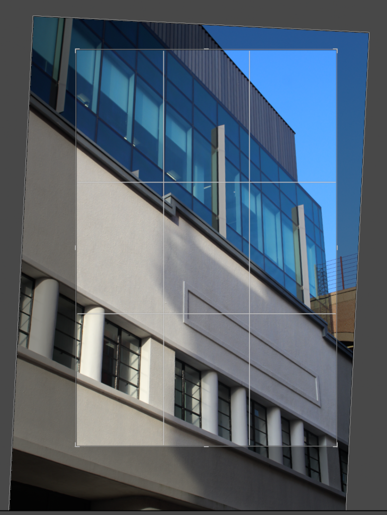
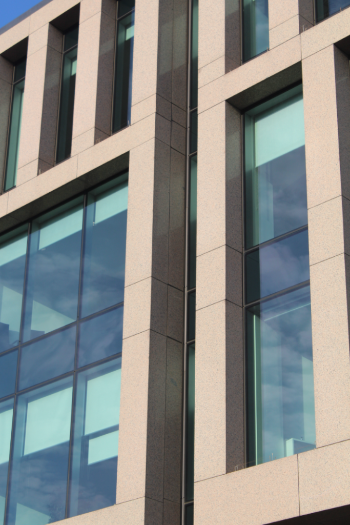
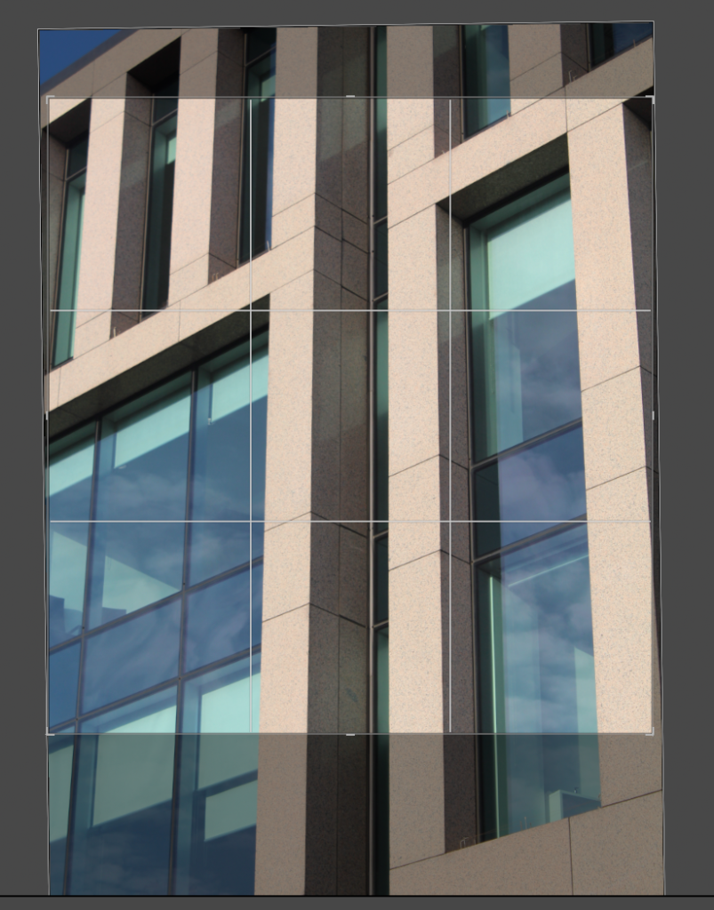
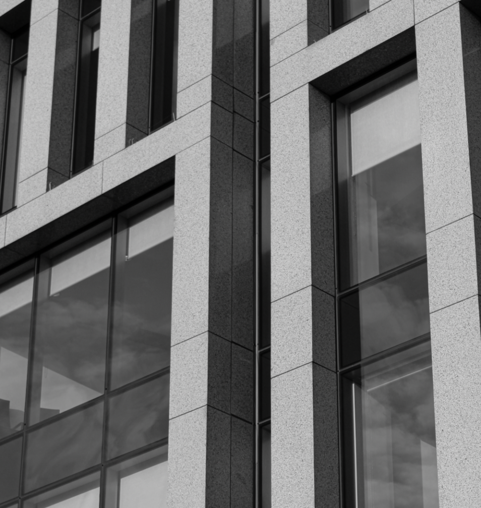
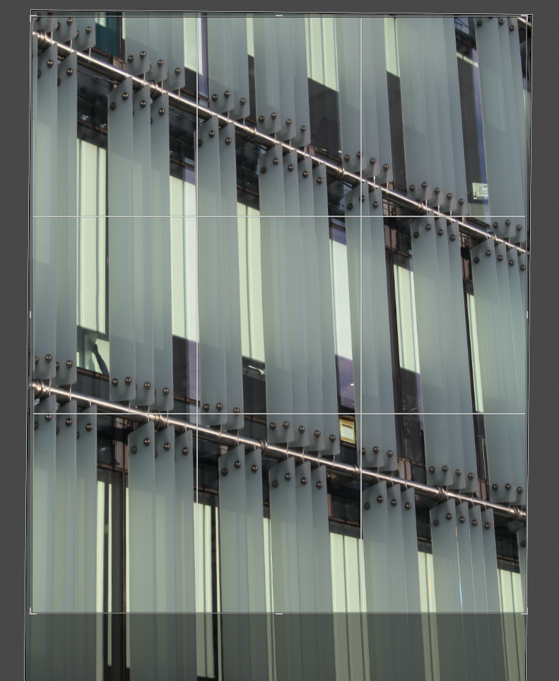
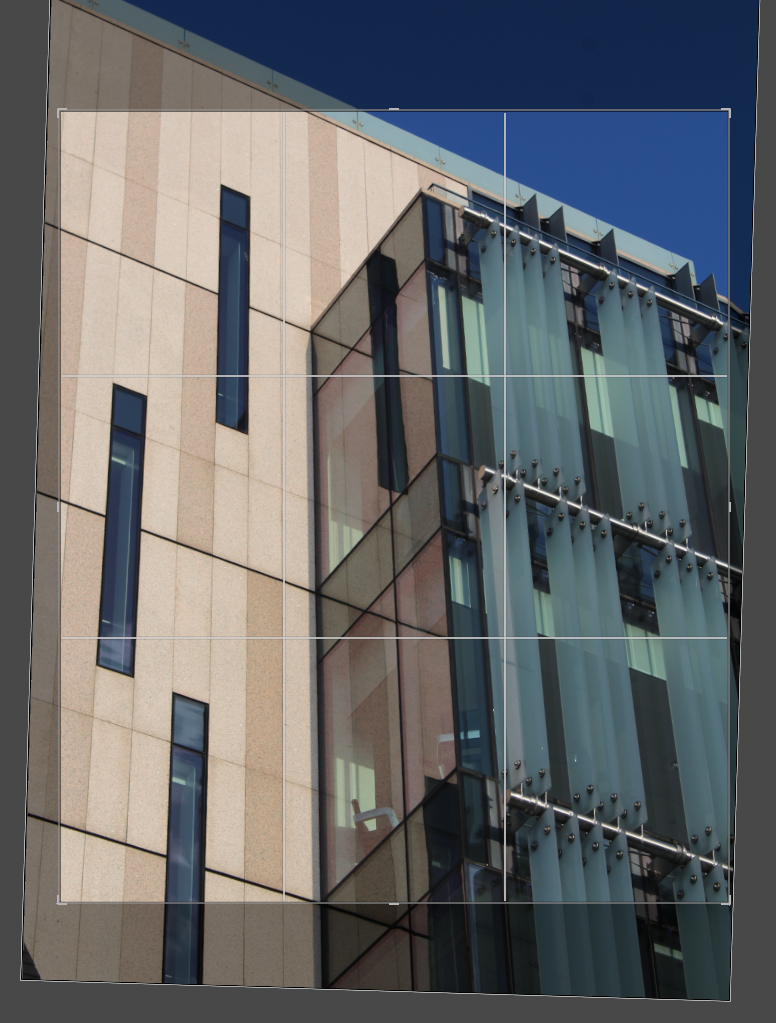
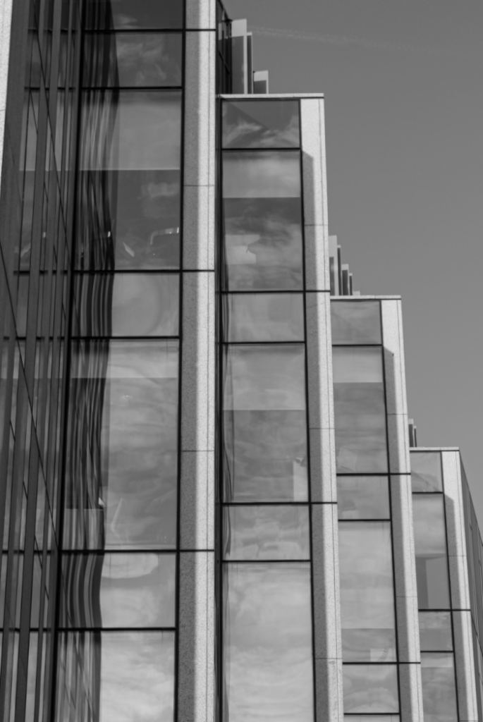
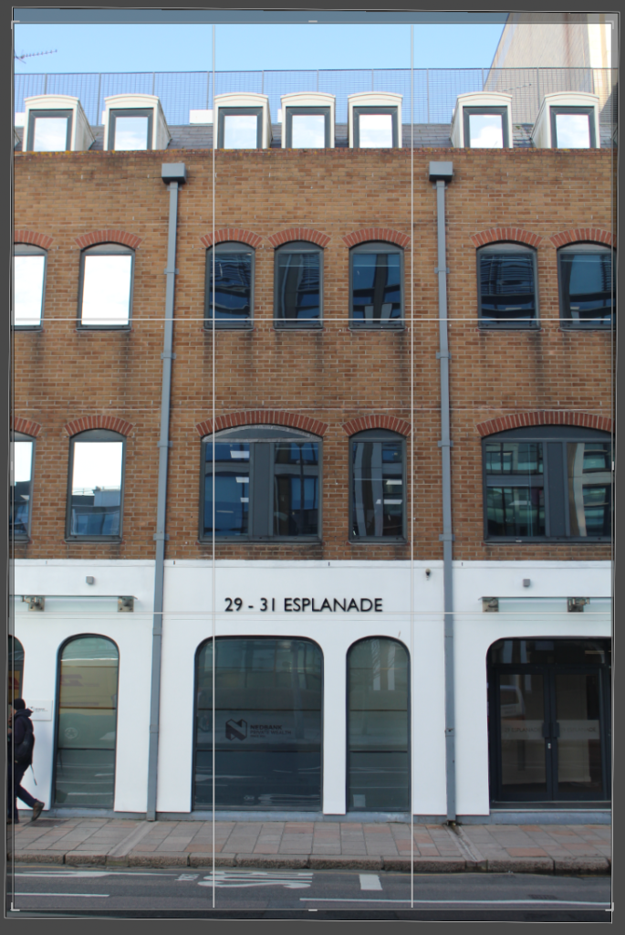
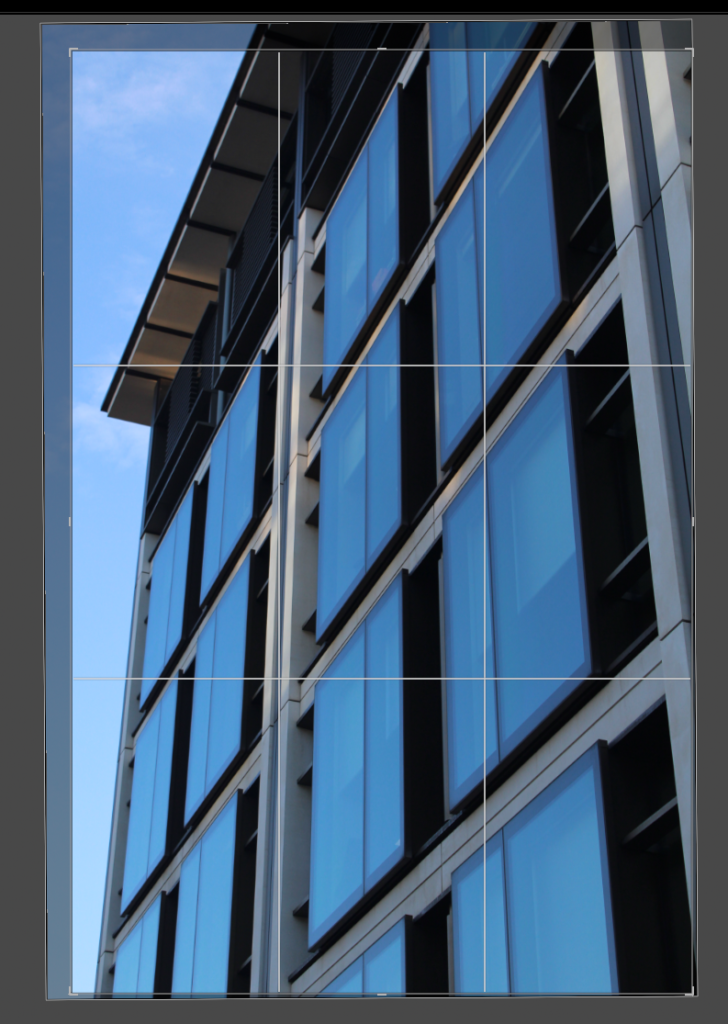
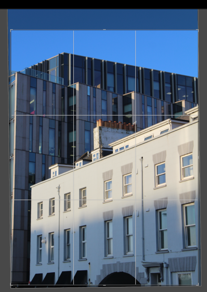
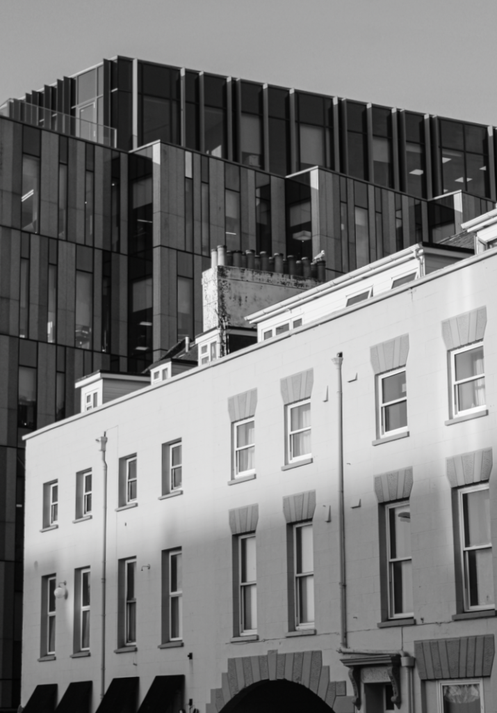
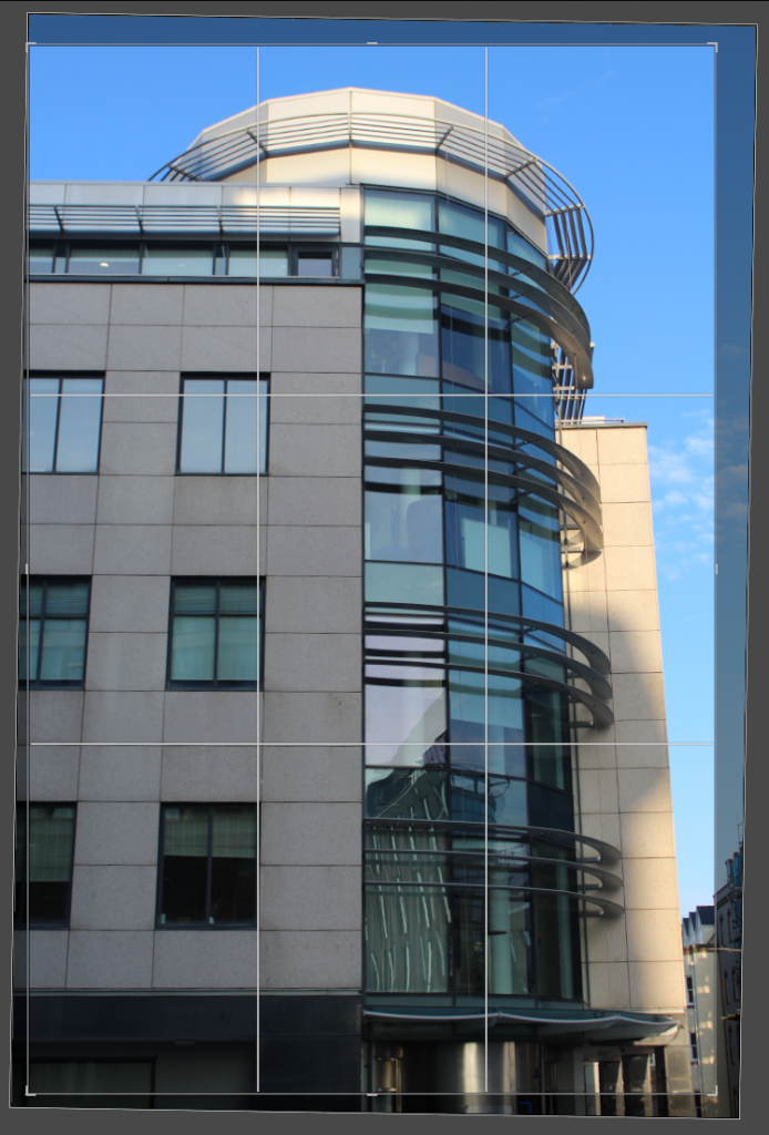
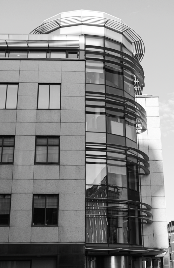
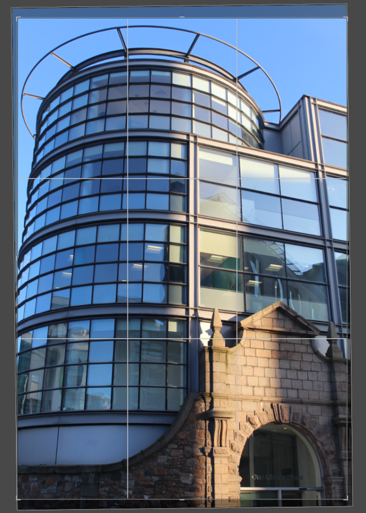
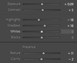
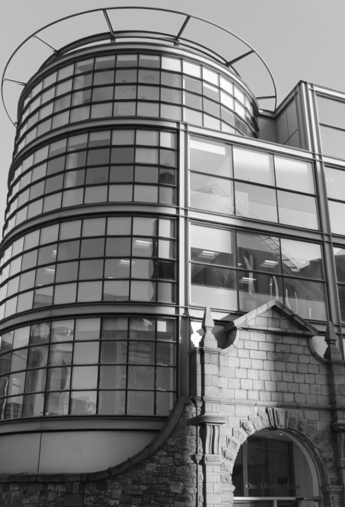
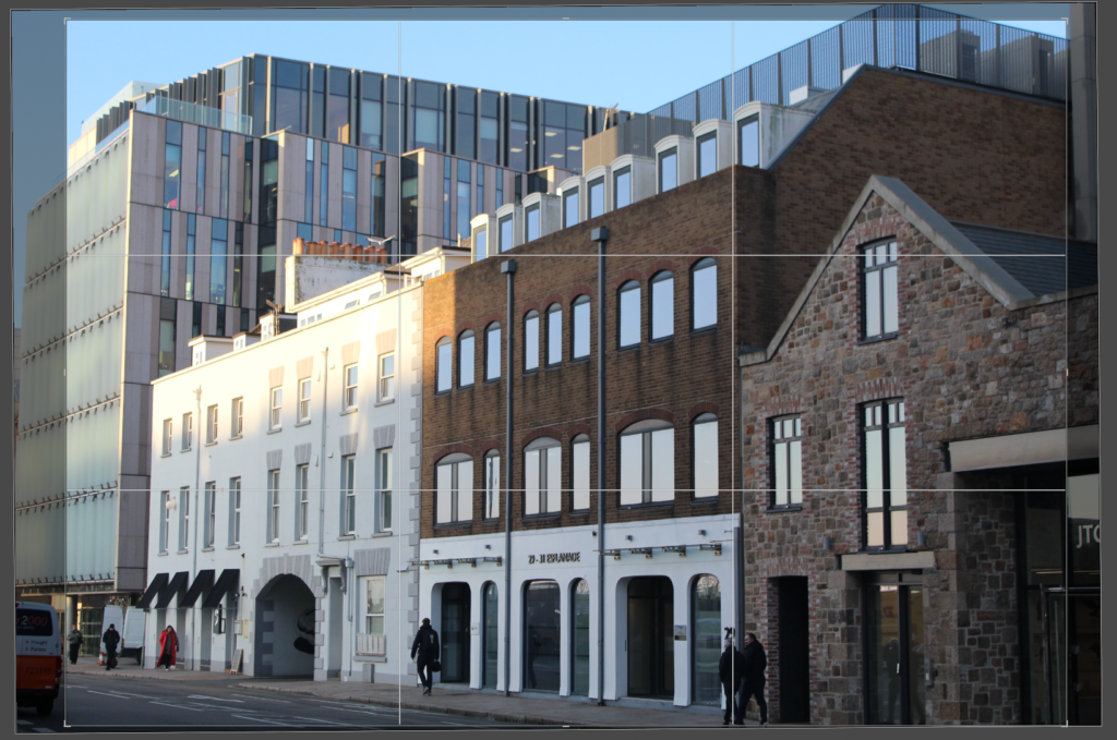
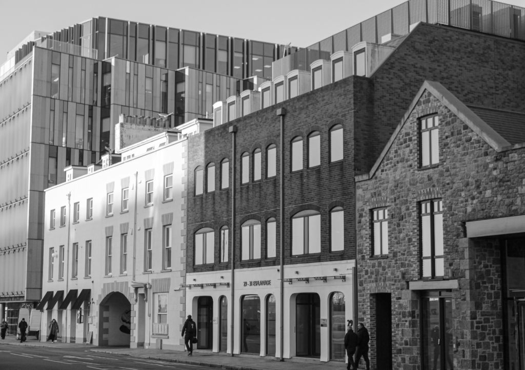
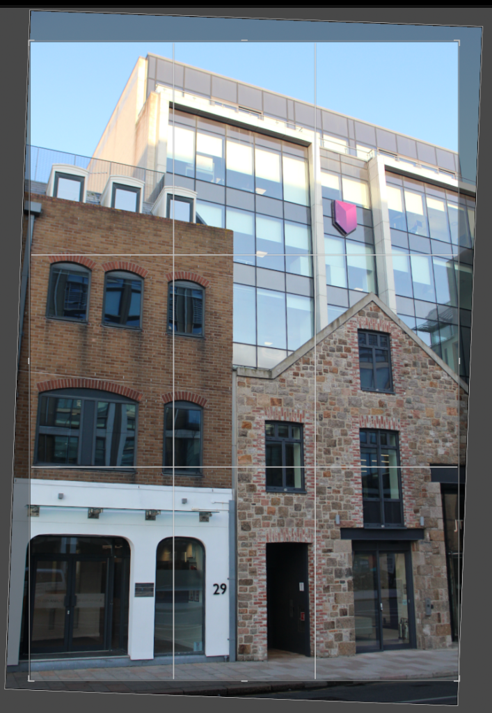
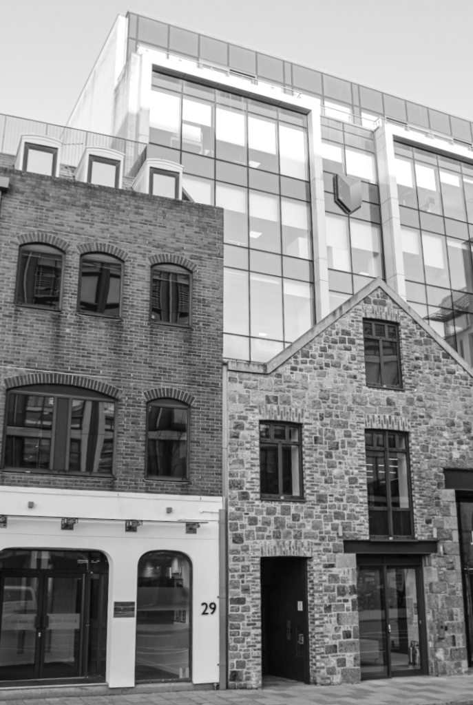
For this photoshoot, I walked around the finance and office area on the waterfront. I aimed to capture images similar to my artist reference, Alex Upton. I also attempted to get images of old and new buildings together so that I can have them in the middle of my photobook to link the two styles.
This was my route:
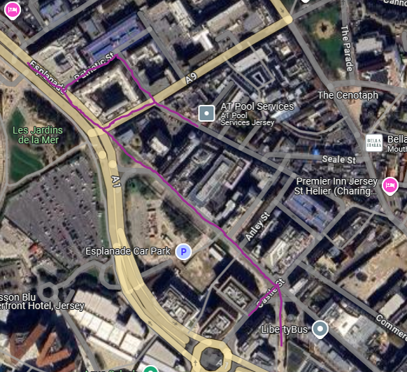
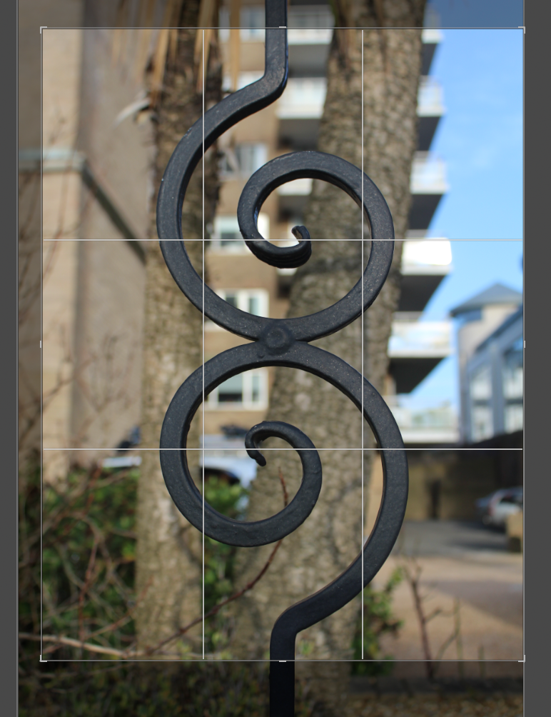
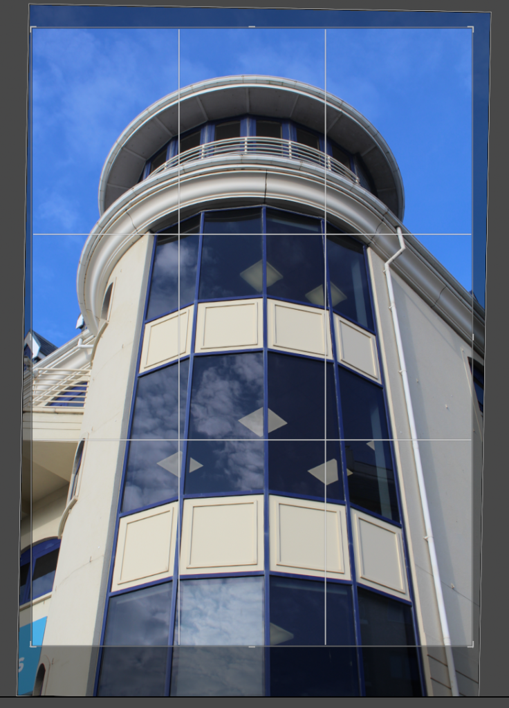
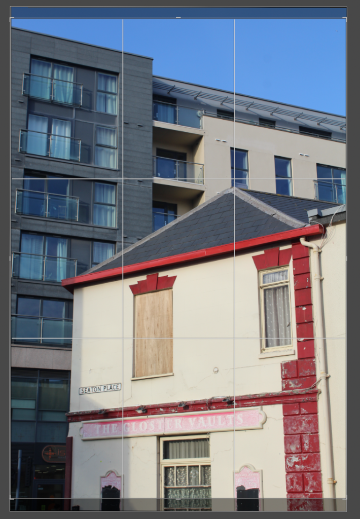
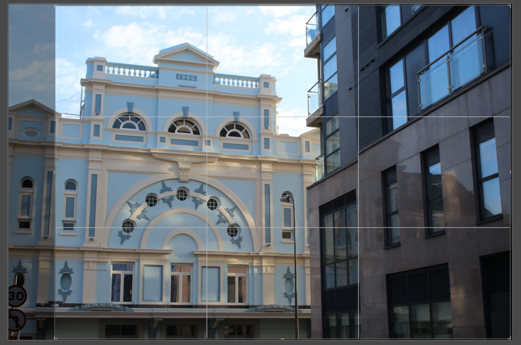
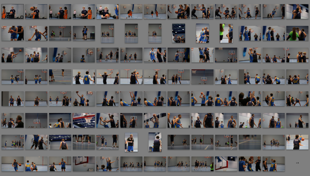
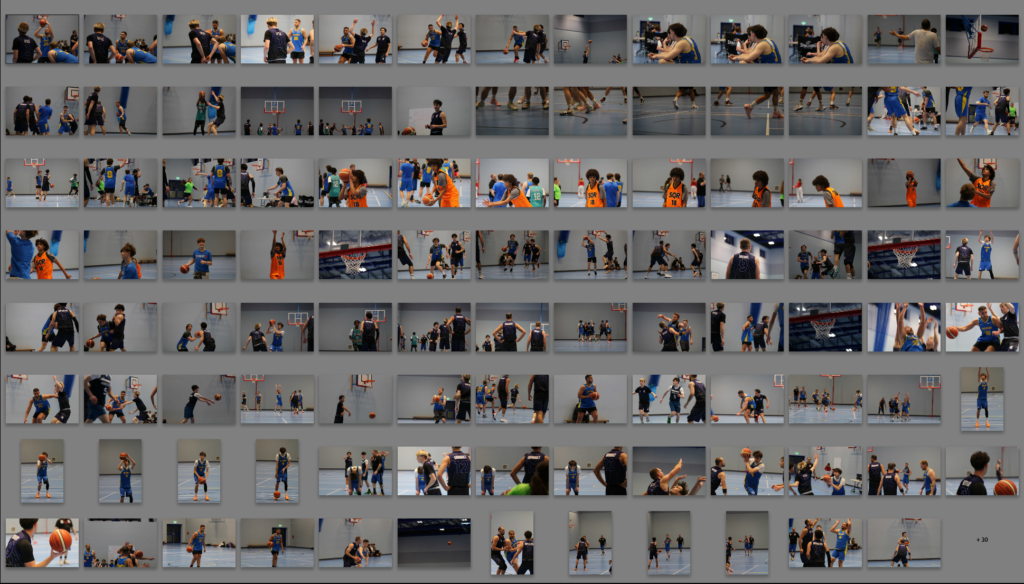
Photo Selection
Contact Sheet
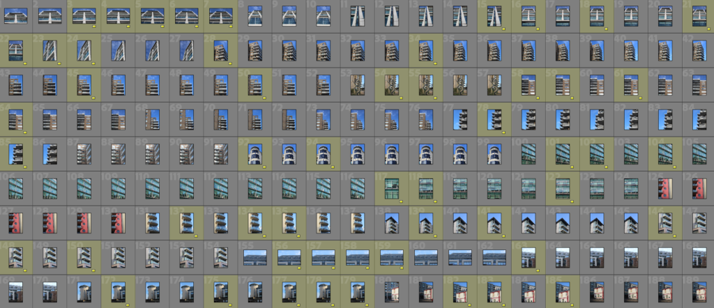
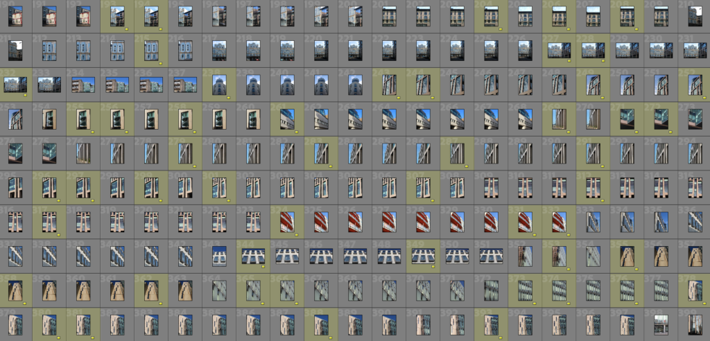
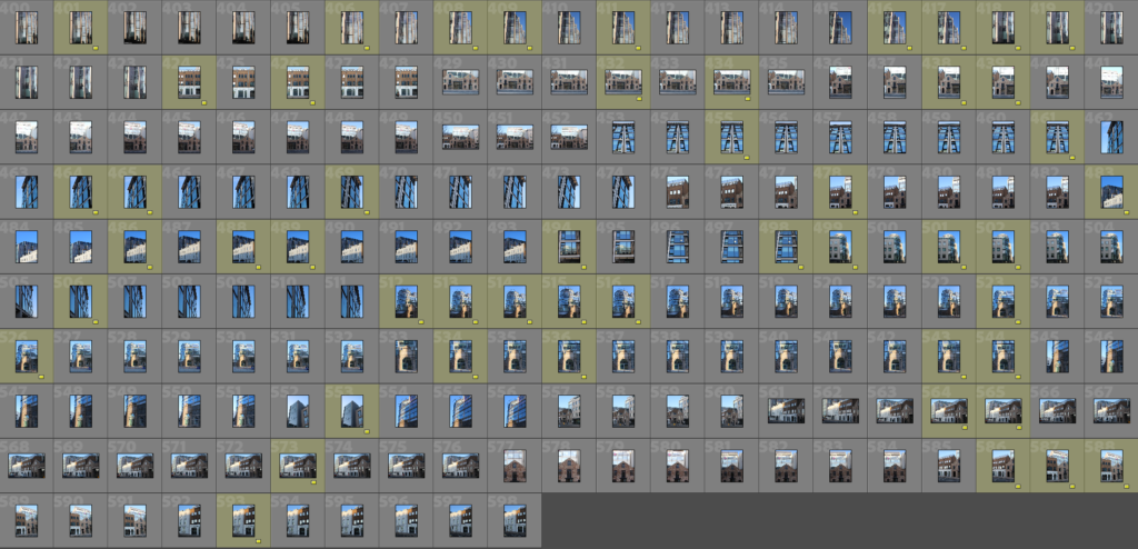
Image Selection
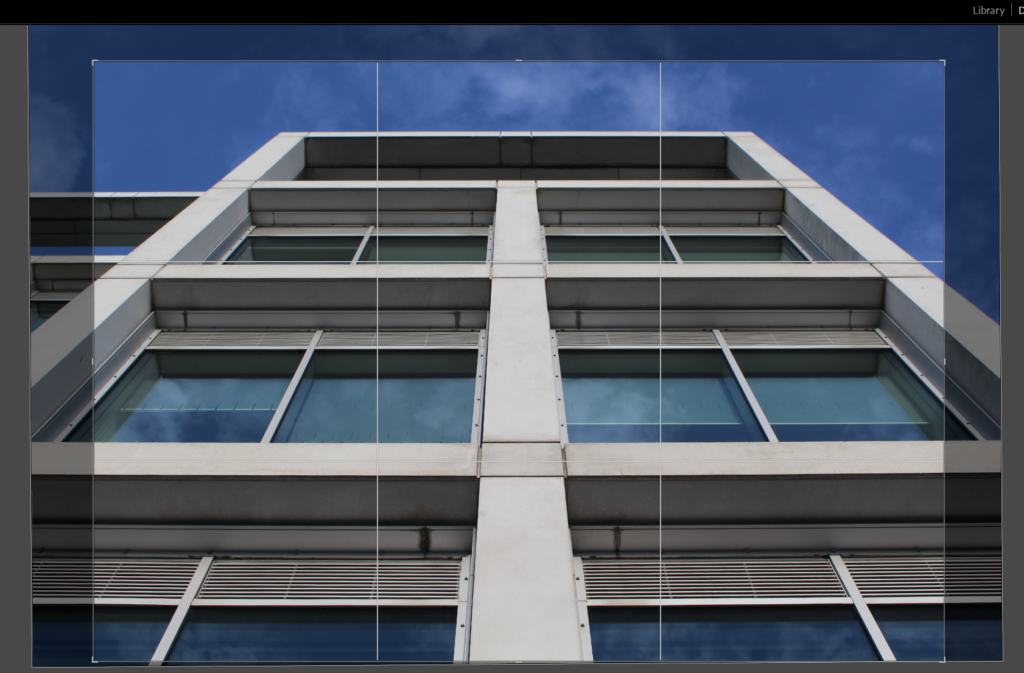
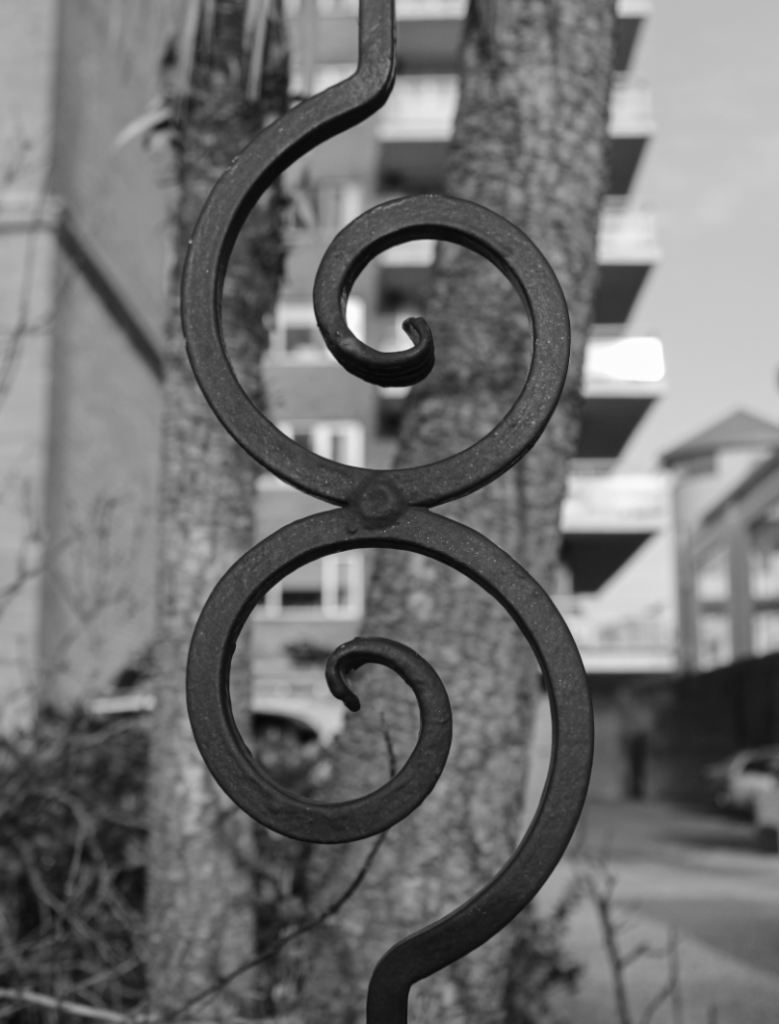
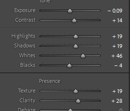
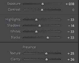
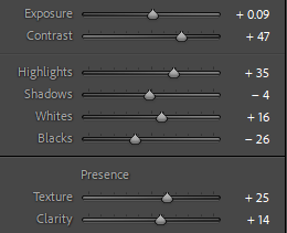
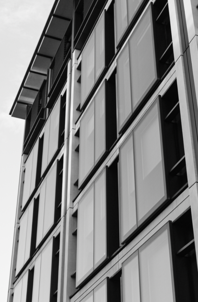
Edits
Edit 1
Edit 2
Edit 3
Edit 4
Edit 5
Edit 6
Edit 7
Edit 8
Edit 9
Edit 10
Edit 11
Edit 12
Edit 13
Edit 14
Edit 15

Edit 16
Edit 17
Edit 18
Edit 19
Edit 20
Edit 21
Edit 22
Edit 23
Edit 24
Edit 25
Edit 26
Edit 27
Edit 28
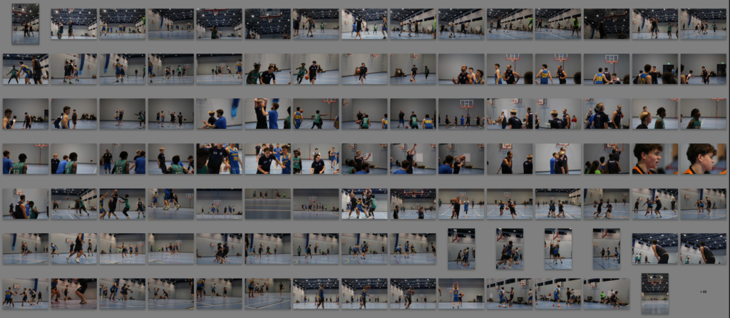
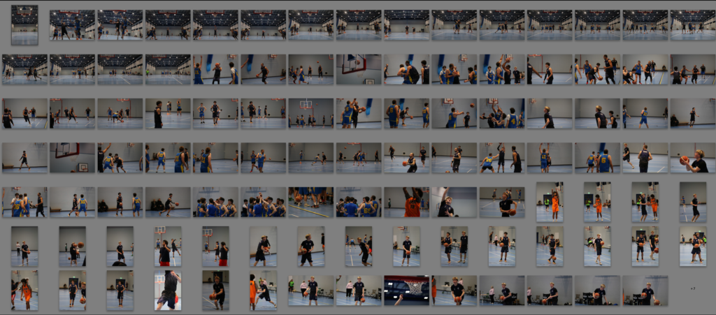
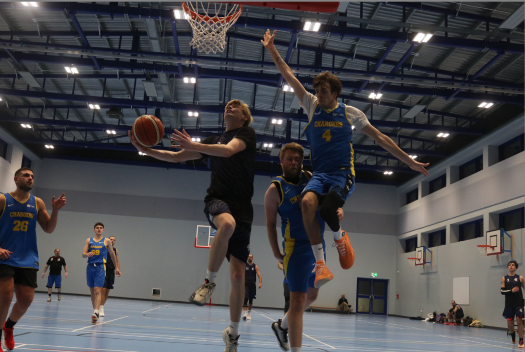
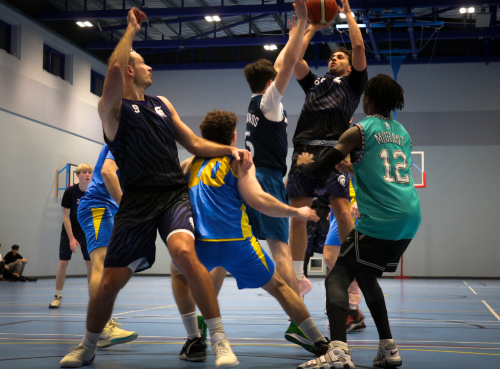
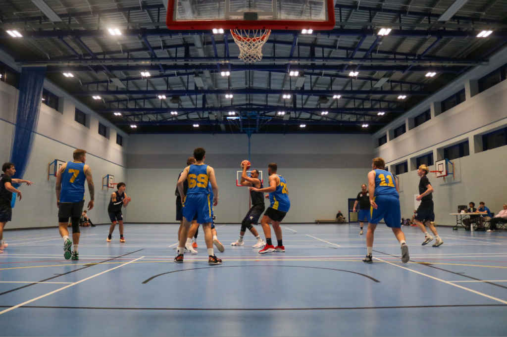
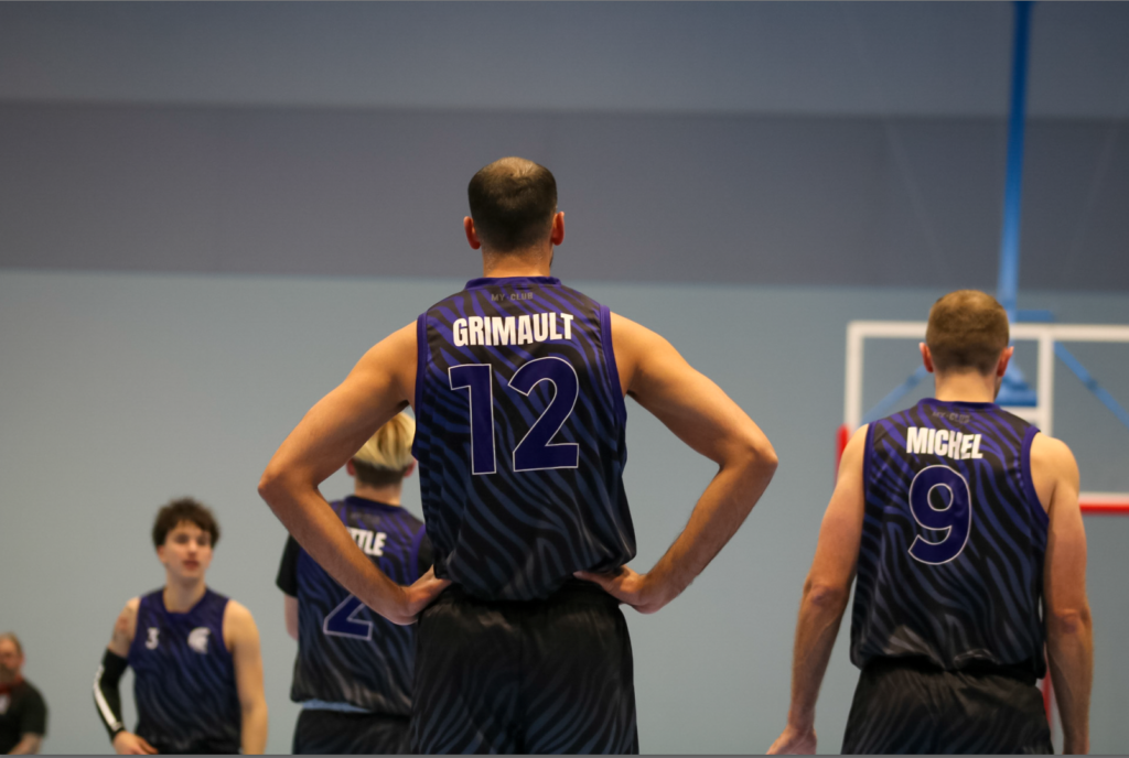
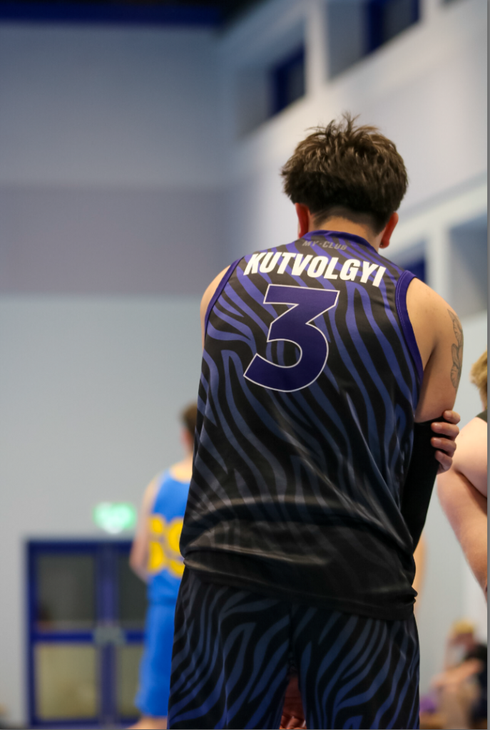
Here I tried takings some pictures of a D1 Jersey game using a long focal length (100mm), as well as switching to a shorter focal length to get a wide variety of different shots. For the first half of the game I used aperture priority with an F-stop of 2.8 to 5.6. However, I didn’t turn the ISO up enough, as well as decreasing the overall exposure causing a lot of the images to be blurry since its a fast paced game with lots of movement. So after half time I increased the ISO to 1600 and decreased the exposure to -1, giving me a shutter speed of around 1/1000, allowing me to capture better images in the game. Also at half time, I looked at some Neil Leafer images for inspiration and realised he often had a shorter focal length to capture more action instead of a single player. He also seems to wait for something interesting to happen before he would take the photo.
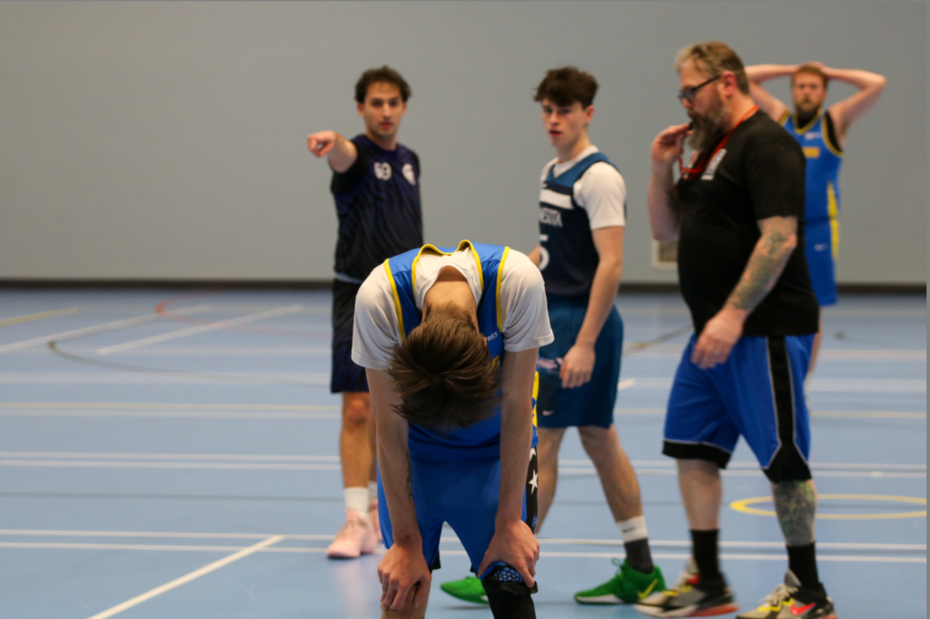
I changed the camera angle a lot, getting some shots from higher up and lower down. Shots coming from a lower angle are more traditional for sports photography in basketball since the photographers are usually sitting on the floor around court side to take the photos. I thinks shots from lower down created a much more dynamic image and add drama, since the legs of the athletes become the main focus, and it distorts the player in a way to make them look powerful and big and creates a perspective of grandeur. I often kept the rule of thirds in my mind to make sure the composition was on point, but sometimes I tried out different compositions to and more variety in this photoshoot. It seemed that taking photos when the players where running towards the camera leads to much better photos as the subjects faces are in frame, allowing viewers to make more of there own judgement on the image based on the players faces. It also adds more emotion when the players face is in frame.
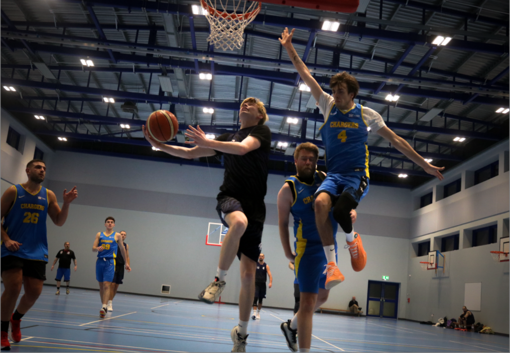
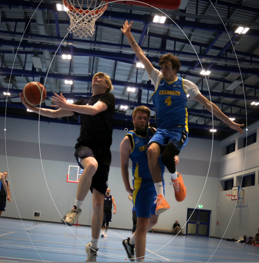
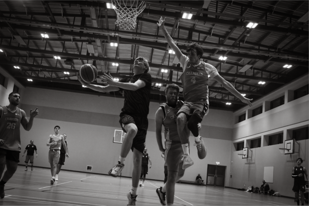
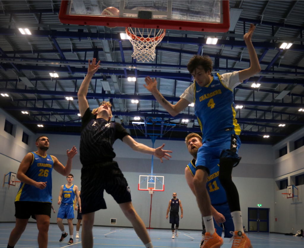
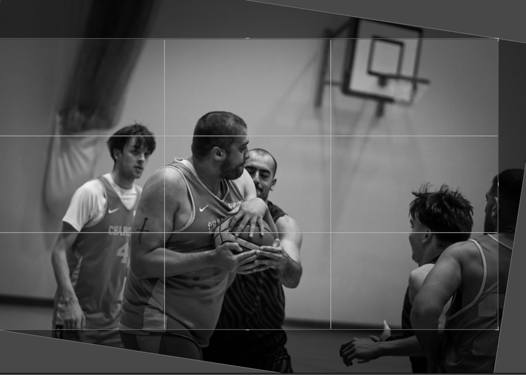
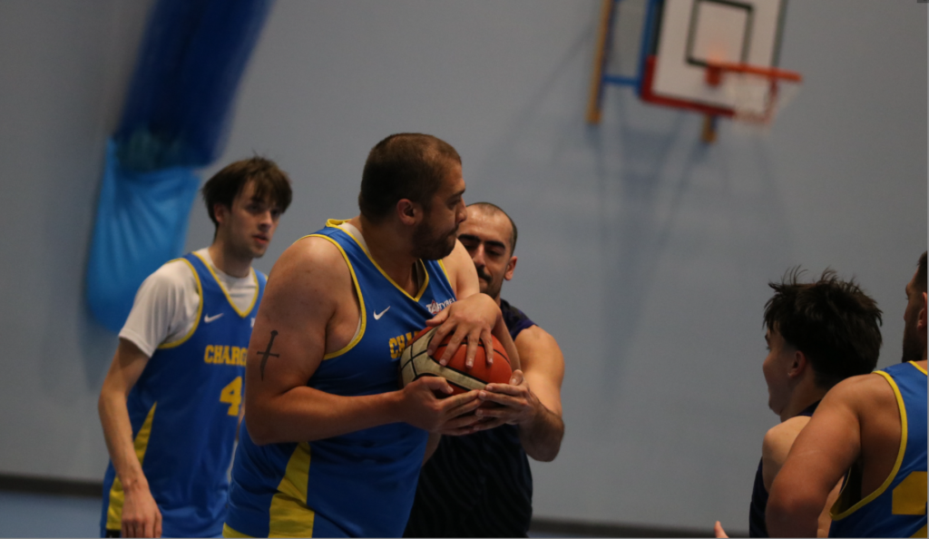
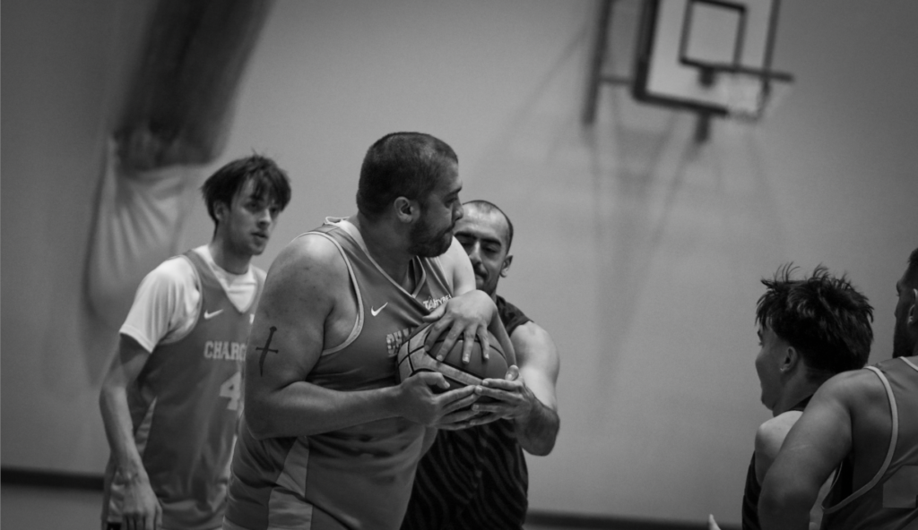
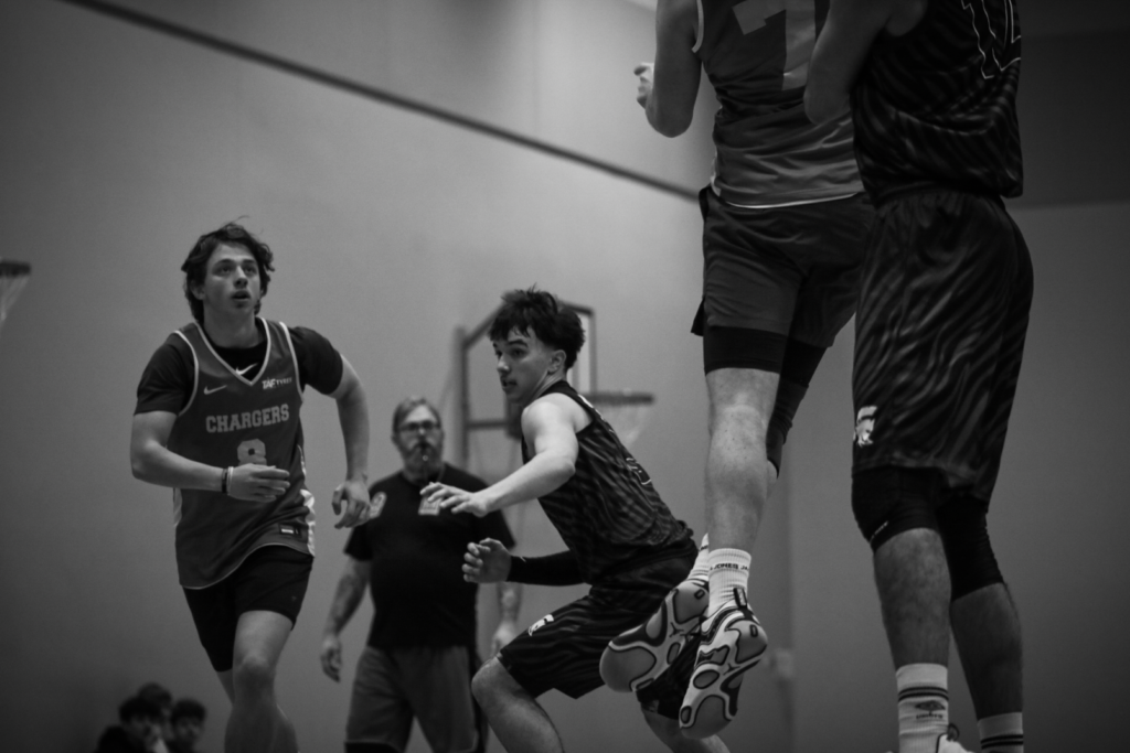
This was below was taken in the 2nd quarter just as tommy (the one in the dark navy) was going up for a layup. Unfortunate, since the photos where shot with a compressed file, it was hard to edit without the image becoming grainy. However, I still managed to add a vignette and rotated the image to make the subjects level and to make the image even more dynamic. I also added a layer mask to the subjects in the centre to draw the eyes towards it. Number 4 looks likes he’s being picked up by number 2, which makes this image more interesting a more amusing.
Below are some more photos edited in the same way:
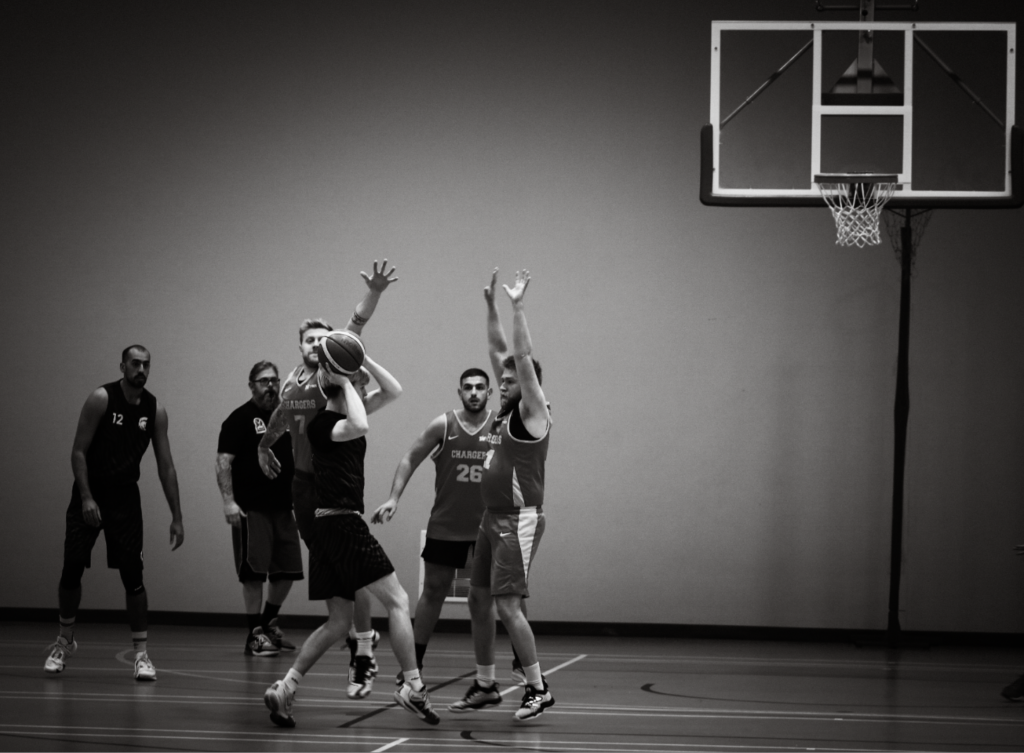
I thought this Image would look good in B&W
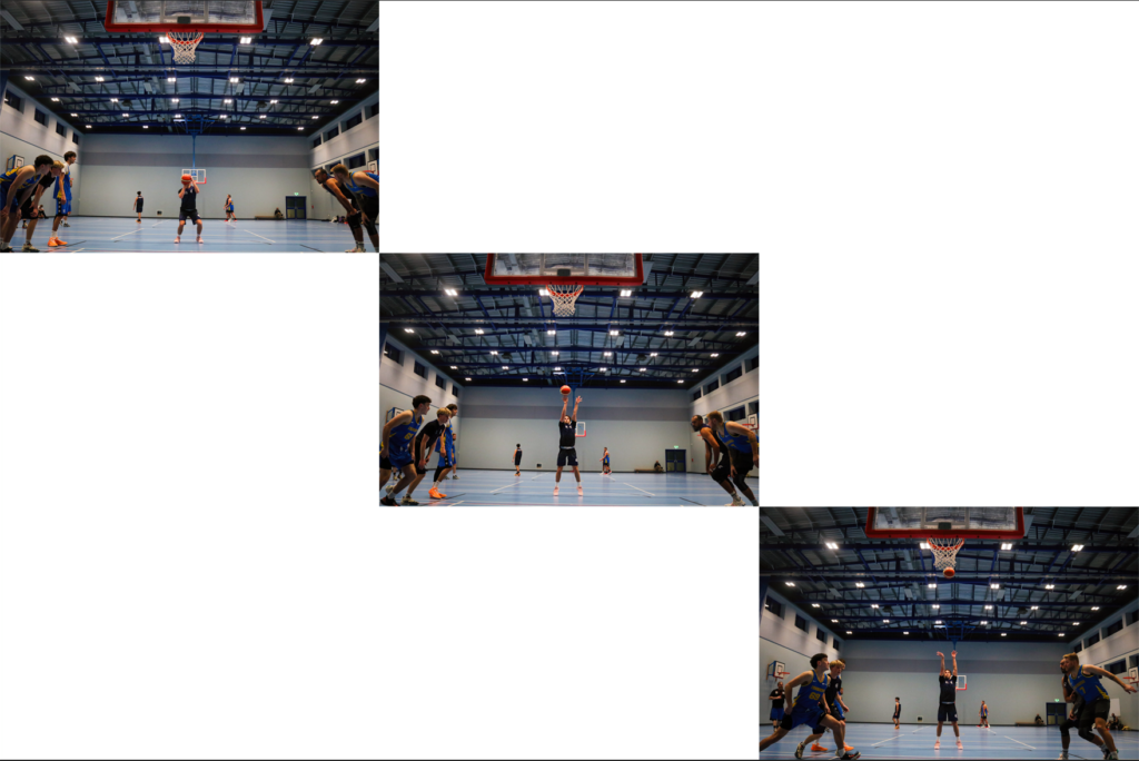
Below I tried a montage of 3 photos of a free throw. This was the second free throw so other players started running in to get the rebound. I used the wider angle lens to capture more action in the shot. I created three images to show the create a montage of players running towards the centre. Below you can see how I edited the image.
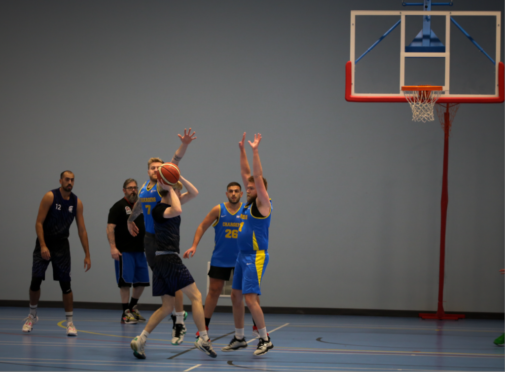
I like this image as the subject with the ball is in the centre, with other subjects evenly spread out around the image, giving it good composition.
For this image below I changed the angle to match the alignment of the face of the person holding the ball. It also makes the image look more dynamic which is what I want for a sporting image.
Below I montaged 3 images together that have a similar pattern (looking away from camera and focused on one player).

This image below was taken during a free throw shot that would tie the two teams. This obviously isn’t good for the team other team which is no longer ahead who this player was on. You can see the hope in his face that the free throw does not go in.
Since this is my first time doing sports photography, I made few mistakes, firstly when using the long focal length It was difficult for me to take photos of the action since it was so zoomed it, meaning I should of taken more photos from the other side of the court. Another issue was that a lot of my photos are fairly uninteresting, so I might try going closer to the court next time with a wide angle lens to capture action close up (which is how Neil leafer did it). Finally I think I could decrease the exposure even more and shoot with raw files allowing me to increase the shutter speed making the photos less blurry. I can increase the exposure in post production.
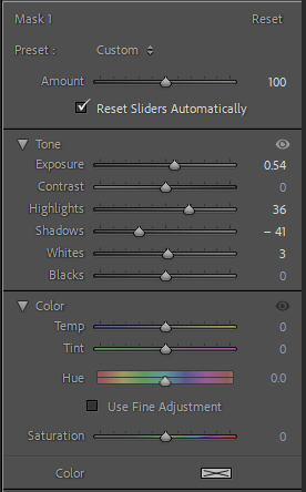
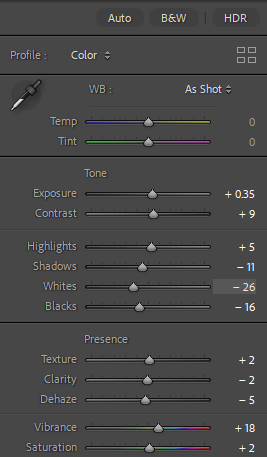
All these photos will indefinitely be edited the same. I want to make shadows a very prominent feature of the photos as well as keeping natural highlights one of the main focuses. I want to look at the vibrancy and saturation of each photo, focusing on levelling out colour and adapting each vibrancy to each individual photo.
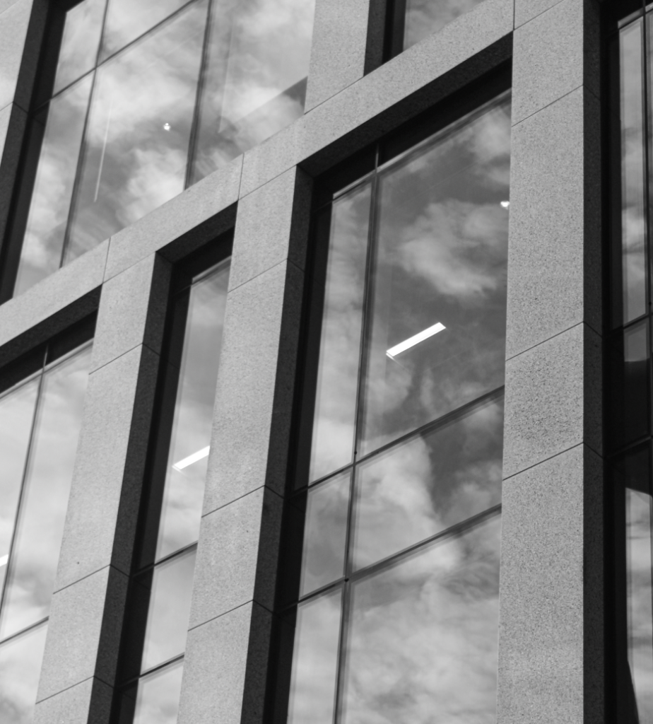
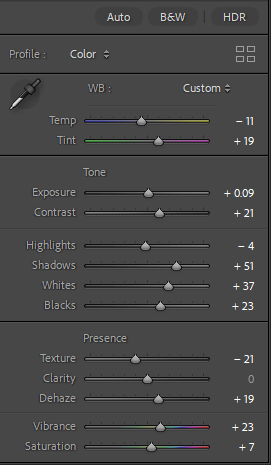
Photo 1 –
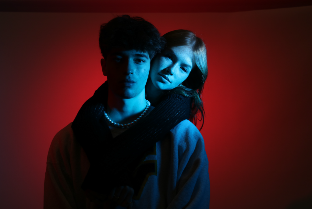
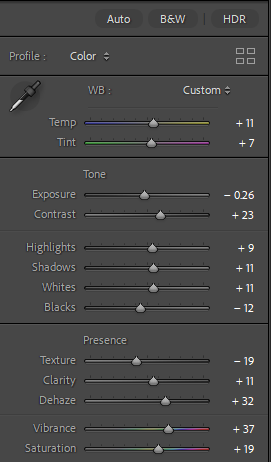
Final edit –
Photo 2 –
Final edit –
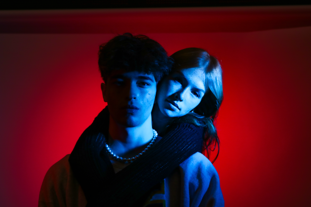
Photo 3 –
Final edit –
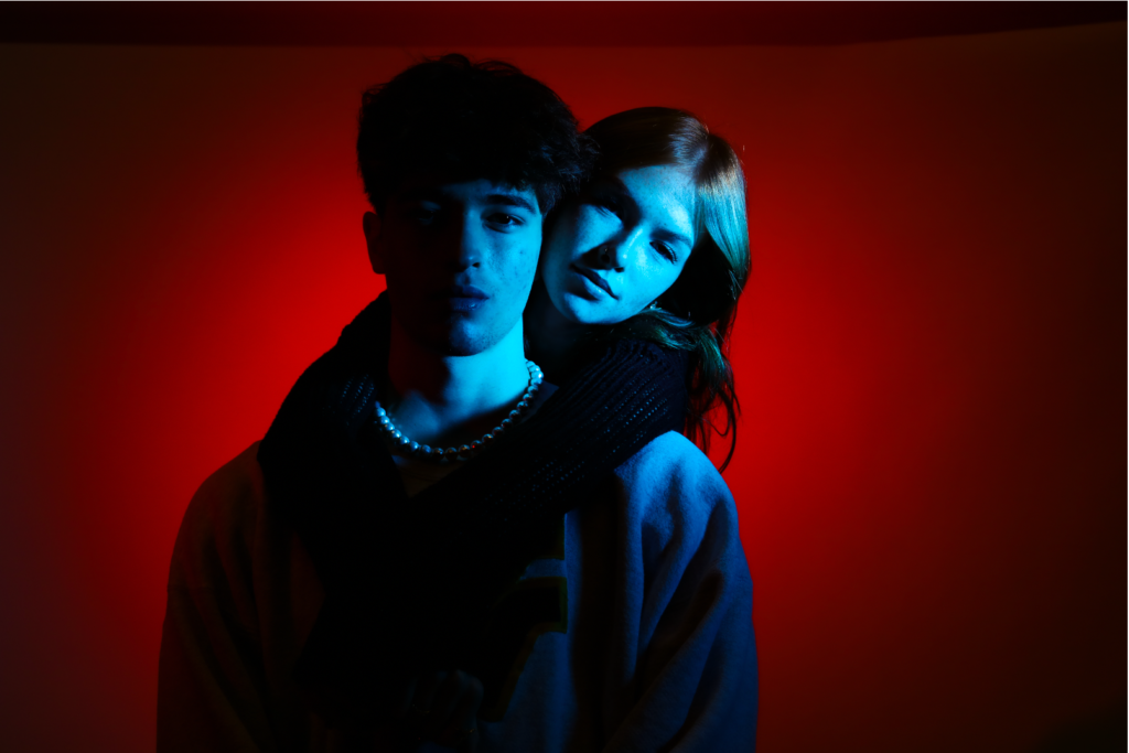
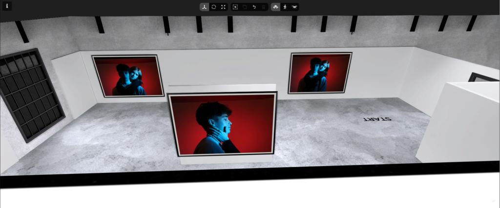
Virtual gallery –
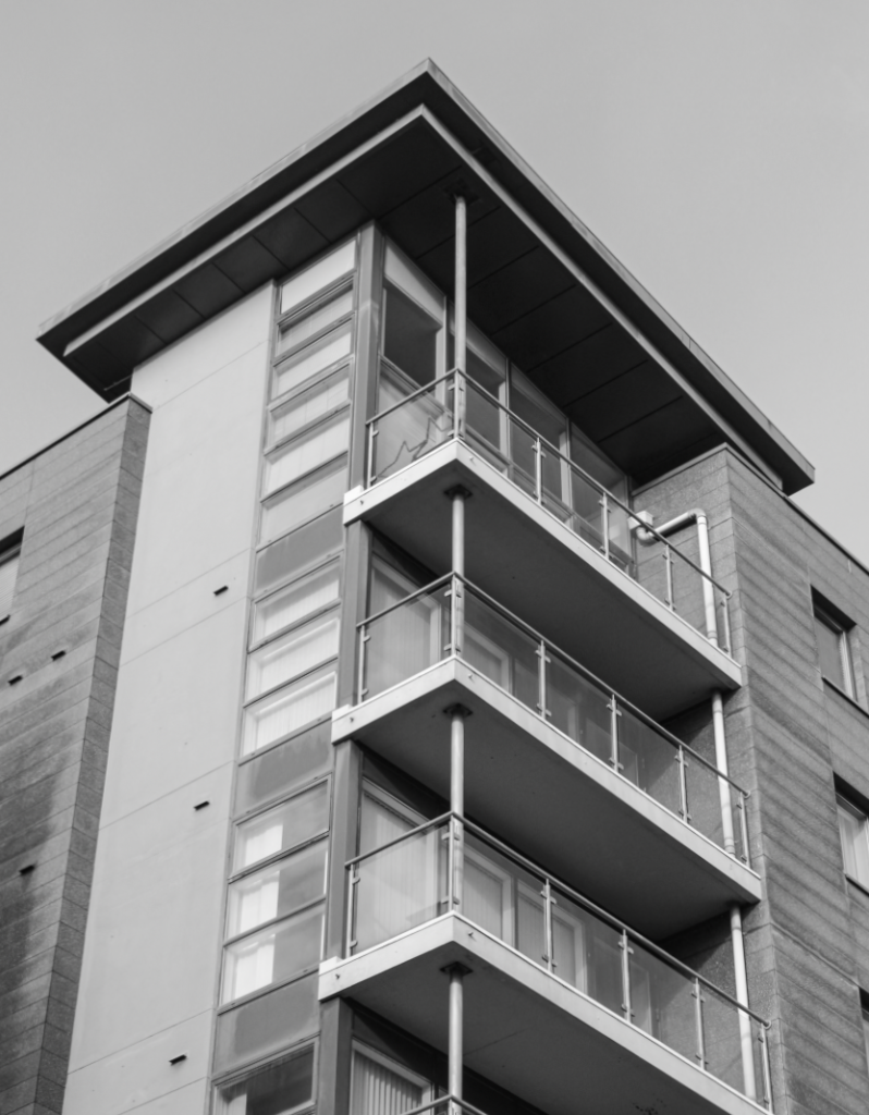
After a lot of development, I want to re-edit this photoshoot to black and white. This will make it fit my project and my other edits a lot more.
Photo 1 –
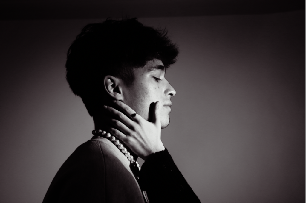
Photo 2 –
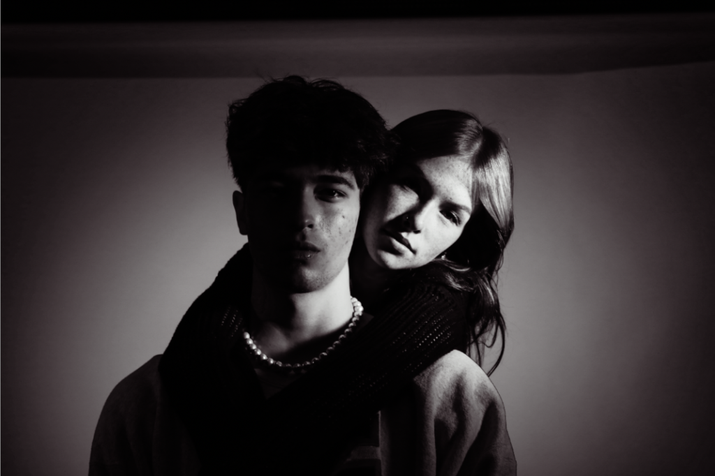
Photo 3 –