
Experimenting with different Styles & Layouts:
I began to by selecting my final images which I felt best worked together. Then started experimenting with how I could make the layouts very visual creating this aesthetic of colour, form, shape, and composition throughout.
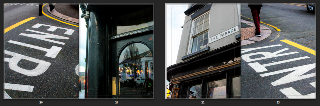
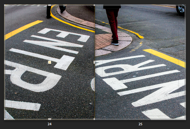
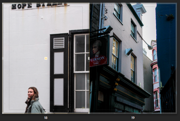
Here I was deciding the layout for these particular pages. I took these photos both in the same area but from different angles, which created this different confrontational effect. The writing could be presented and was displayed from different angles where the lines and formations of the pavements could be realised differently. I felt having both pictures on separate pages presented a nice flow as both achieved very similar yet different perspectives and angles. However I went with both images, presenting on a double page (side by side) as this revealed a much more unique composition. I found the abstract approach complemented the photos individually as your unsure yourself what the writing is suggesting or saying, instead we are drawn to the pigmented, sharp lines and shapes of colour that works well with the compositional arrangement of the streets. However, both photos complement one another, and they different versions of each other.
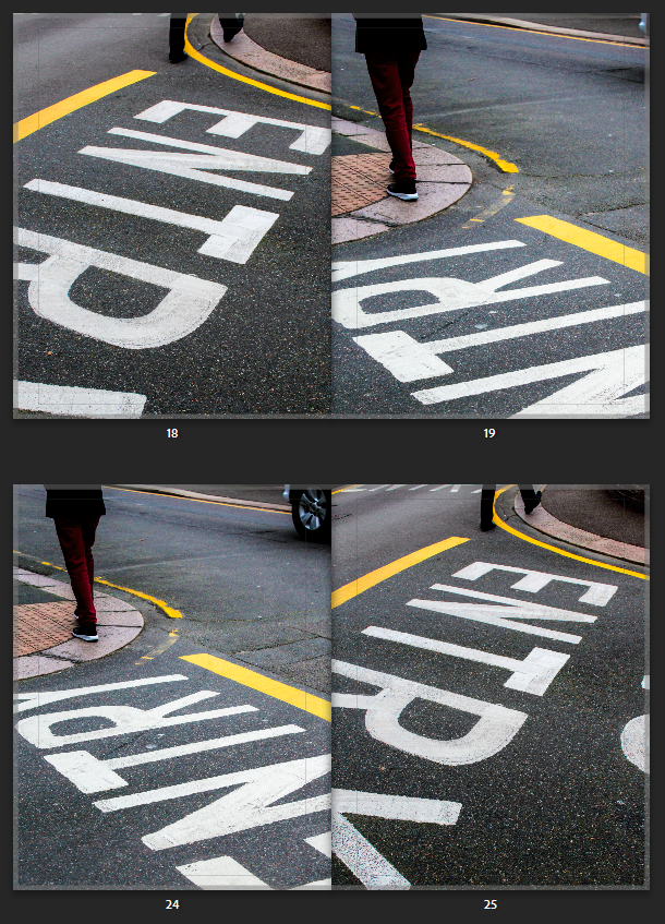
The second double page above was the composition I went with. I felt each photo displayed their own structural formation through the way the person is walking off the page, to the letters and coloured lines. Then the way the photos complement one another side by side, creates intense leading lines in-wards or into the page, instantly gripping your attention as your eyes follow this formation. This creates a slight symmetrical feature (although they aren’t identical images) from the way the photo is angled. The photos was taken from the same place, I stood in the middle then captured to the right of me then to the left of me, both including different people walking away. This creates a nice sequence, one that we wouldn’t notice, until after we notice the abstract feature. This creates even more diverse angles and compositions reiterating their juxtaposing effect side by side.
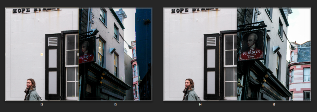
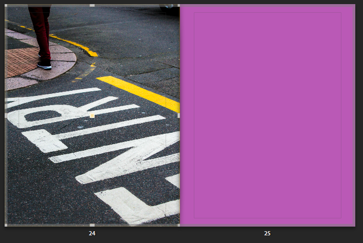
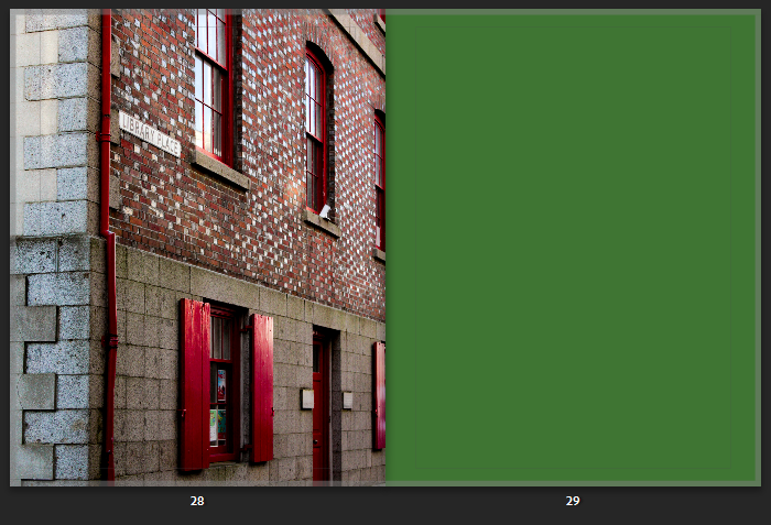
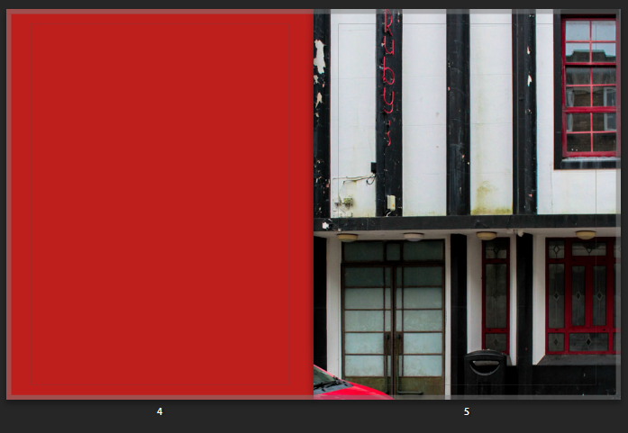
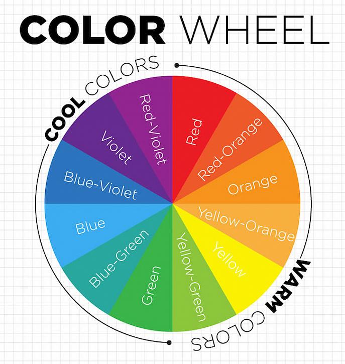
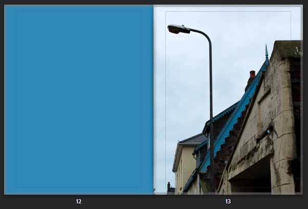
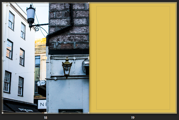
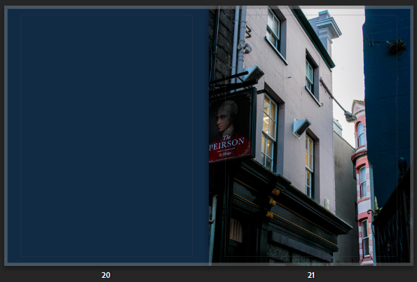
I then started playing around with adding a full colour page, which complemented a stoke/detail of colour I found in my image and wanted to emphasise further. Looking at the colour wheel as guidance this allowed me to easily see which colour complemented on another. For some pages, where you could only see a little detail of colour, I then matched the colour onto the next page, giving this unique relation and comparison. For example for the third photo below, you can see the intricate red detail from the outline/structure of the window and sign, which stands out against the alternating black and white background. So to express this feature further I wanted to bring this out, revealing the colour/ making it more visible as it is an interesting graphical feature- so I matched a whole page. In other photos where the colour was more visible through bold shapes and lines, I wanted to create a contrasting feature so used complementary colours instead as the whole page. I mimicked this particular technique Siegfried Hansen used, as I was automatically attracted to this feature presented in the book, Hold the Line, because it broke up the busyness/hectic feel you would be presented with otherwise, but also describing this interesting narrative throughout as you can see a deep connection in relation to the image.
For some photos I experimented further with Hansen’s technique of having a whole colour as a page, to then incorporating a more visual and structured version through my photos. I took inspiration from the singular, pigmented colour Hansen used, to then incorporating more than one to give this dynamic relationship, that I could further use to complement my other images (like the photo on the left). So throughout that photoshoot I noticed colourful buildings, and the particular shades of paint used that I could then use instead of editing a colour into the page on Lightroom. I felt this would give a much more interesting feature as I have taken the photo, and related this the image followed after or before.
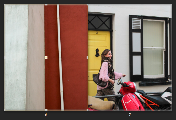
Like for these pages, I found this wall that already had contrasting features expressed by three two tones. I straight away noticed how the colours where presented through the composition and structure of the building, as you get the strand of white running through alongside the angles and three-dimensional feature. I like this A-symmetrical feature you get, which gives this particular character and interesting depth followed by how the lines are to an angle leading you into the composition. I felt the simplicity of this could relate and complement my other images in a different yet similar way, instead of using a single block colour. As you can See I have exaggerated and brought out the tones found within this image as you can see the texture and intricateness blemishes in the wall, which overall adds character. You can see the relation, as similar tones are displayed. I like how the tones aren’t the same which shows you they can still work together and complement one another as they bring out other features within the photo, such as the yellow coming from the door, and the pink jumper, but also the patterns revealed from the black and white building. It works well as the tone of white in both is highlighted throughout the double page.
Like-wise for some photos where I was not intending to express the colour, instead it was the formation and angle I took it from, the photograph still expressed the same effect as the full colour page, only adding in extra details and formations – which gave this passionate, energetic, expressive characteristic:
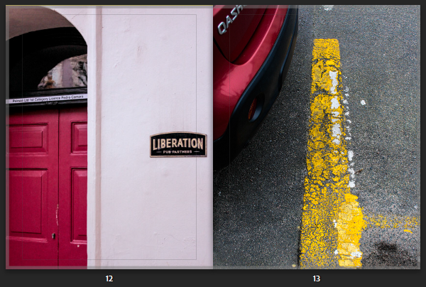
This mix of compositions reveals a similar effect followed by the dynamic structure of the road markings. The similar use of of compositions related to one another as they both express a very dramatic feeling.
Breaking up the pages with colour:
I realised my images were very intense – from colour and composition so I was influenced by the Book ‘Hold The Line’ by Seigfreid Hansen, to add in full coloured pages.
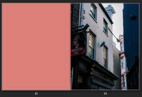
As you can this double age is very hectic and busy as their is lots of bold compositions. Although, I chose images that complemented one other through their colours and structural formations as their side by side, it still portrayed a very chaotic, intense double page – one that worked together but clashed. So increase the aesthetics I added in full coloured pages that broke this up, therefore creating this unique contrasting effect. The colours I chose for the pages complemented the photograph on page next to it, or very little of the colour was visible- therefore this brought the colour out making it visible. I kept the colour pallet simple using complementary colours or primary colours.
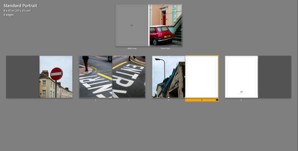
Front Page:
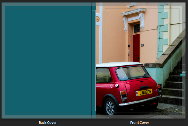
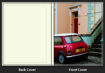
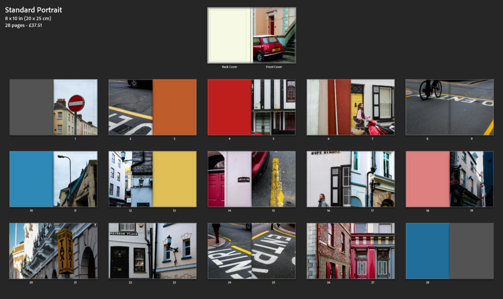
Final Book Layout
Evaluation:
- How successful was your final outcomes (book, film, prints etc)?
Overall, I think my final outcome of creating a book was successful. My aim was to create a book influenced exploring colour. Influencing specifically by the formalist style From this dynamic formations were revealed which is what I think make it unique. Similar to Hold the Line by Seigfried Hansen, the photobook doesn’t express an obvious narrative, instead its open for us to interpret one. I think this is a very clever and different way of expressing a series of images in a book, as we are confronted with different angles and approaches which makes up the narrative. Through an abstract approach that we are straight away confronted with forces you to look beyond, focusing in on the formations and and structural elements of patterns and colour.
- Did you realise your intentions?
- What references did you make to artists references?
comment on technical, visual, contextual, conceptual?
Both Saul Leiter and Seigfreid Hansen explore forms of colour which are defined through shapes and compositions. The similar yet different outcomes is what interested me the most. Seeing how moments and reality can be transformed into images which change your perspective, otherwise revealing moments you wouldn’t expect to see.
I captured the photographs in day light either when it was sunny or cloudy as this revealed two different effects expressed through the shadows and highlights. Focusing in on visual aspects such as colour, shape, pattern, line, texture and composition when out on photoshoots but also when making final edits. The visual elements all fitted together, complementing one another which is why I explored this abstract, confrontational effect. Seigfreid Hansen was my main influence, further shown in my final images in the photobook as he took everyday situations and moments and captured them in a way that revealed a type of structure defined with lines, patterns and colour. This then created contrast of colours and depth. Without expressing an initial narrative, it is left up to you how you interpret Hansen’s work. Leiter uses a similar approach, yet we soon figure out a narrative as subjects such as people interacting are captured. I tried to include this using people I know which created this staged look. In comparison, I then looked at Hansen’s style of abstract snapshots of particular moments, then created photographs in similar styles, with bike wheels and legs coming into the main photograph to give this contrasting narrative. My expliration of colour is expressed through different layouts which come together in the book, complementing one another. Using full coloured pages to break the caotic, intense images up, complemented slight details I wanted to enhance and make clear which would otherwise go unnoticed. Otherwise for some pages, I captured colours myself which included some lines and slight differences like the full coloured pages. This created the same effect as the full coloured pages yet made it more interesting.