In conclusion, my third photoshoot for my personal study went successfully. I believe I carried out a similar approach to Kurland very well, and I think it will be easy for the viewer to interpret who my artist inspiration was. Each of my final outcomes were carefully chosen when I was editing, for the purpose of expressing different emotions and connections between the girls. I chose the ones that I think resembled Kurland’s series best, and highlight the overall themes of my project.
What I think went well:
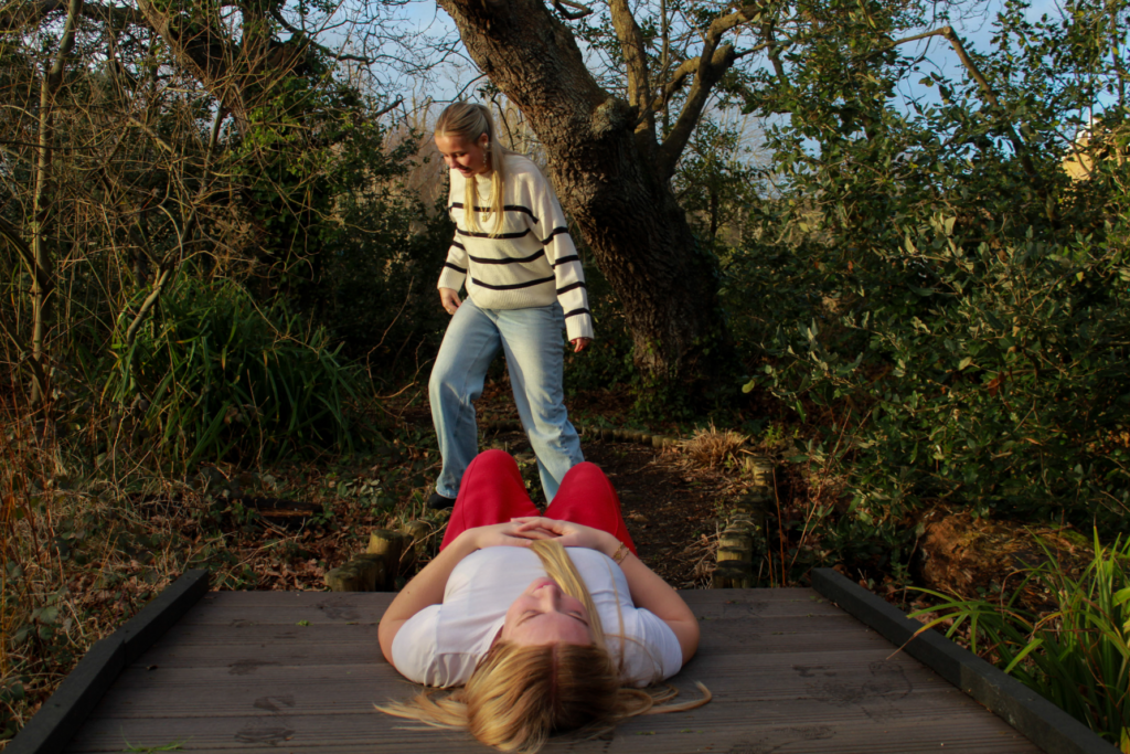
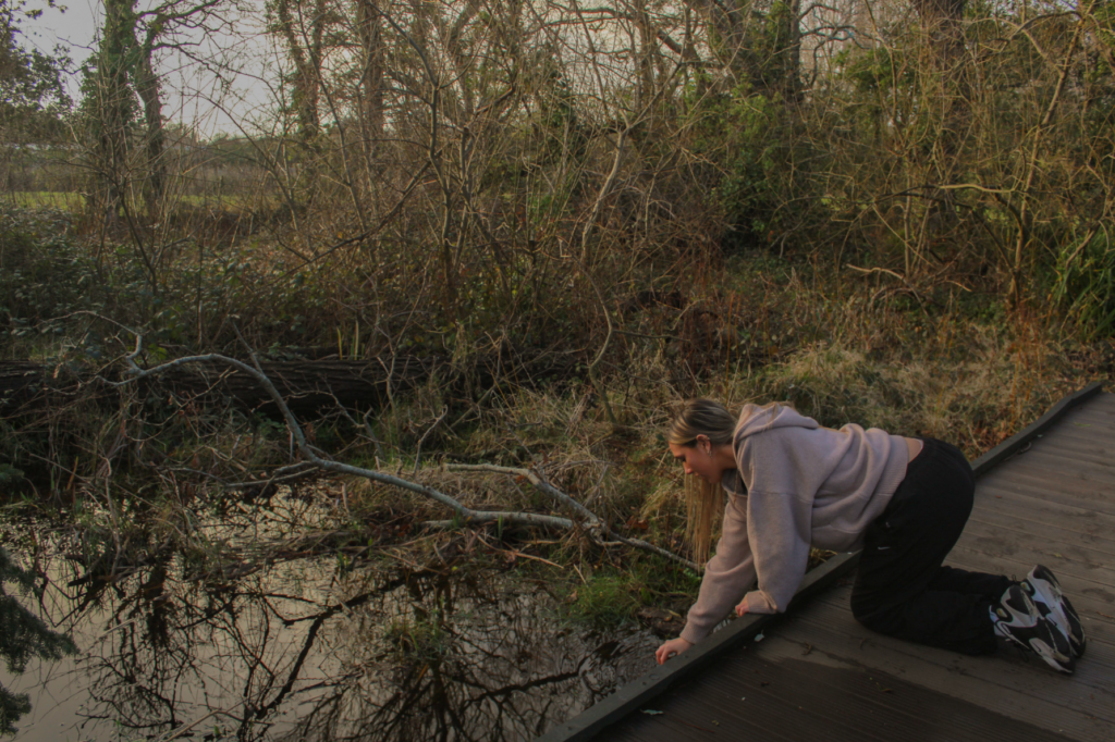
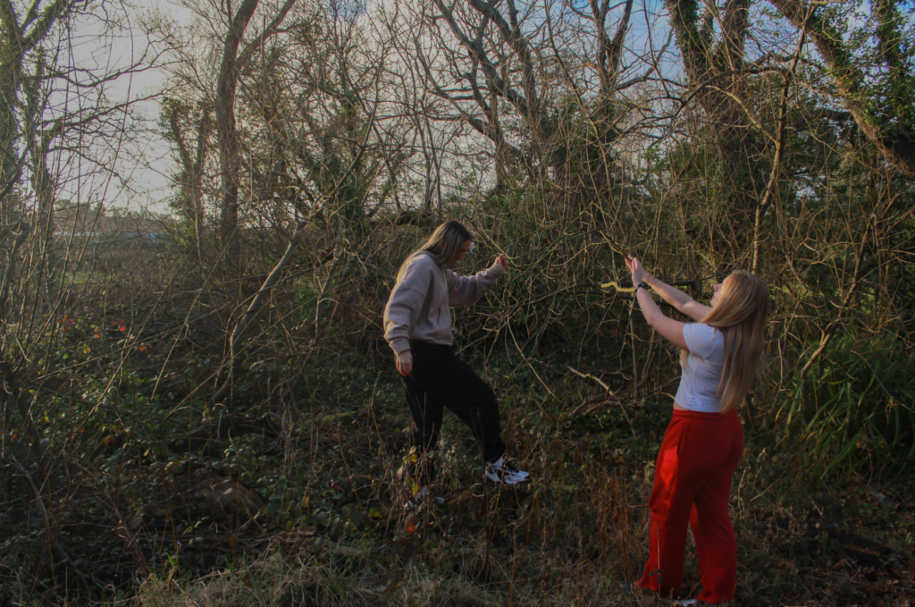
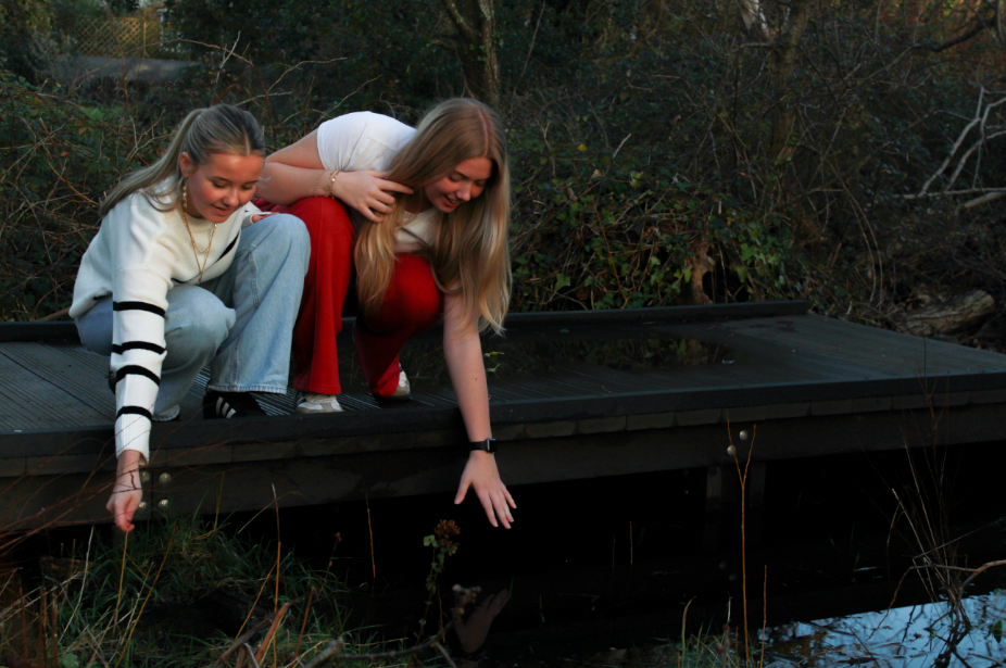
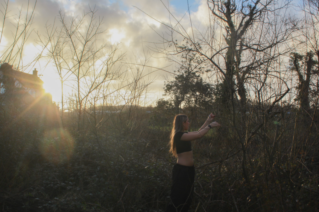
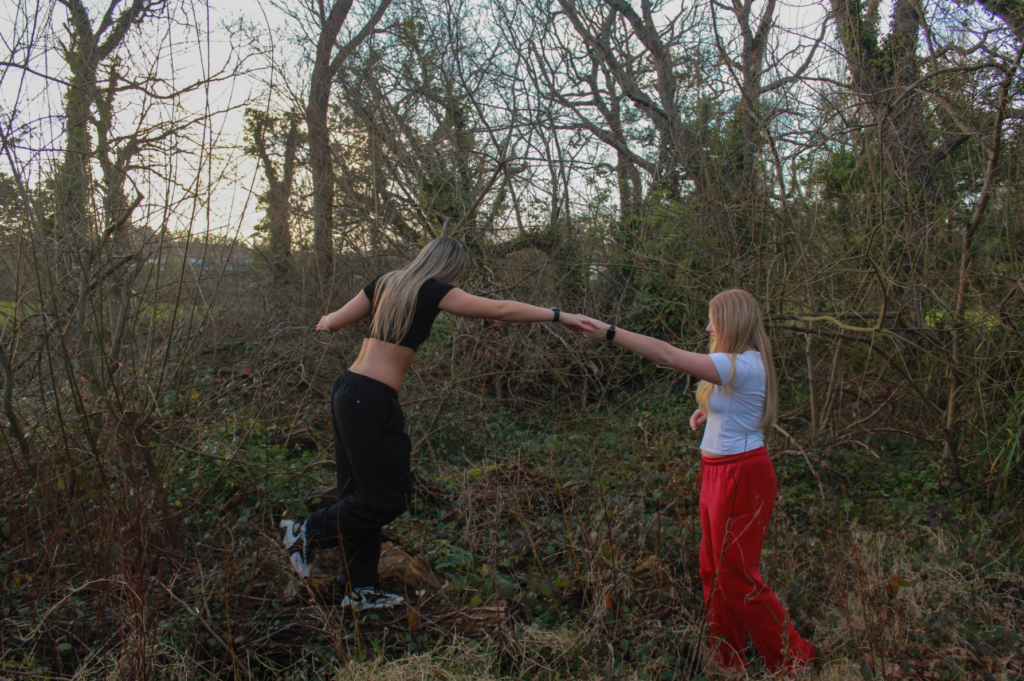
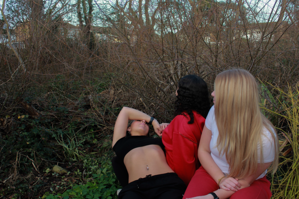
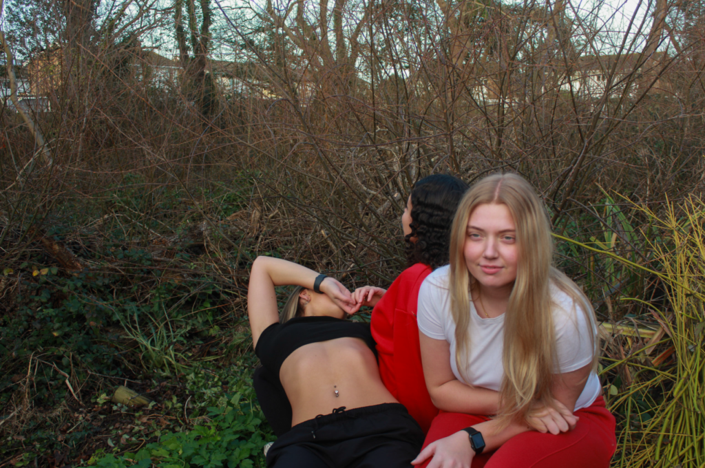
Location of my photoshoot was good – different from the first shoot I executed inspired by Kurland
Lighting of my shoot – due to the time of day I took my photos, the overall lighting in all the images is perfect for my editing process.
Subjects – they presented their roles and the relationships between them very well, similar to Kurland. For example, contact with each other and helping each other
What I think I could improve on:
Although the setting of this shoot was effective, I should have experimented with different scenery. For example, big empty roads to show that the girls are exploring alone
Camera settings – I did not adjust the shutter speed of the camera effectively, meaning some of my outcomes were not in full focus due to a moving subject
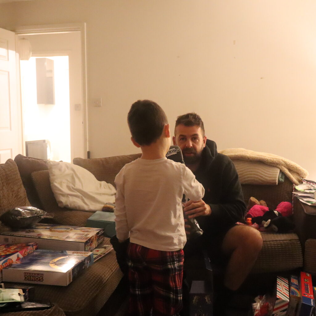
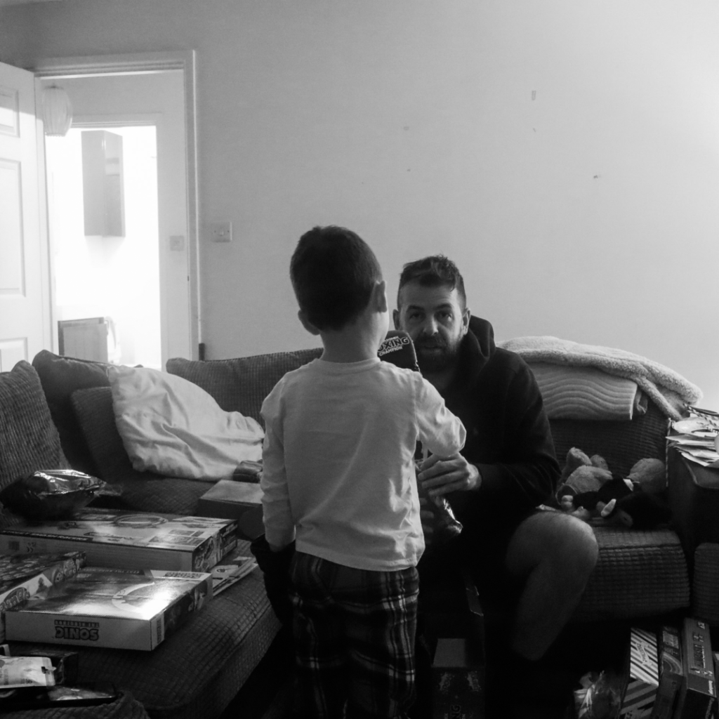
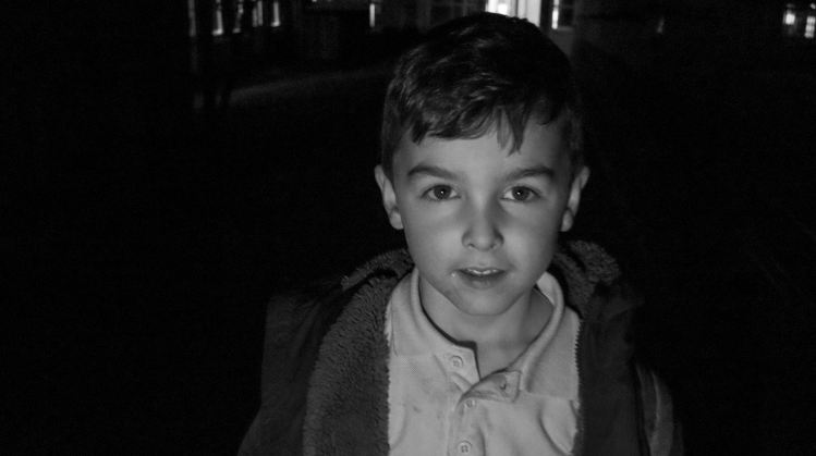
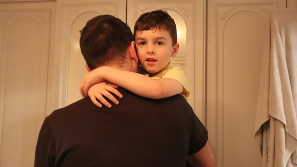
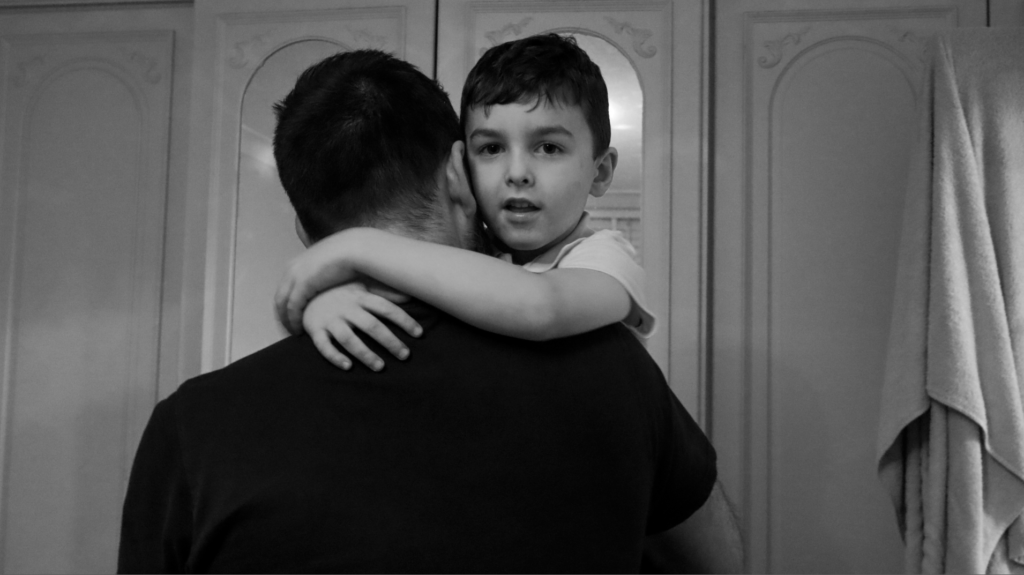
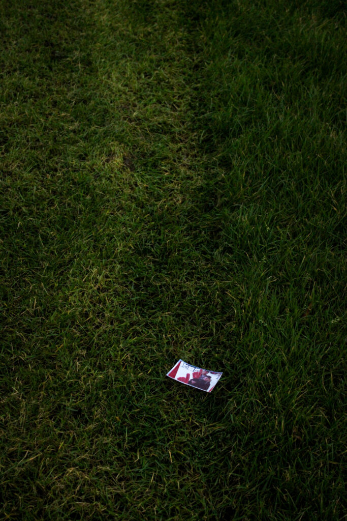
This photoshoot consists of images of my brother and family. I have images of my brother alone, with his dad and images of my mum. These photographs were taken both inside, the house, and outside, on the street and outside of his school.
My images before and after editing:
Before:
After:
Before:
After:
Before:
After:
Before:
After:
I think that this photoshoot didn’t capture as many good images as my first one, however there are still some images in this shoot that I think turned out well. Even though I find it wasn’t as successful, the images from this photoshoot followed my narrative as I had aimed so I will be able to incorporate the photographs that I do like, into my project.
In this photoshoot, I wanted to add an under-exposed aesthetic to my images as I have began thinking about the sequencing of my photobook as this is a key aspect in making sure the narrative is consistent. These images are related to those I took during my second photoshoot, however they are taken at differing times of day and weather.
My intentions with these photos is to sequence them with relevant archived family images which I have experimented with in Photoshop, for example pairing the images relevant to football with images of my brother from when he was younger.
I wanted to use a darker tone in my images this time through the use of the time of day and weather type because it will enable me to show the other side of reminiscing on childhood memories – this being the more negative side where I reflect on the implications my brother has faced due to his diagnosis and add a tone of solitude into the images instead of a happier composition where it connotes ideas of remembrance and hope.
I took this photoshoot at FB football fields as this is where my brothers passion and talent for football began and where I used to go and watch him play matches to support him. Since he became unwell, he hasn’t really continued with his football as he hasn’t really had the motivation to go, so in this photoshoot I wanted to represent how he gave up his love for football, alongside the idea of having childhood memories stuck here.
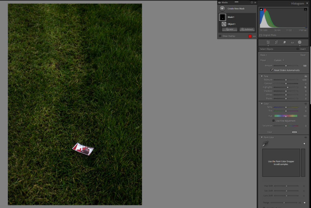
During my editing, I wanted to ensure that the image was still kept dark to represent emotions of grief, however I wanted to highlight the objects in the image to show small hints of my brothers memory. I did this by using the object masking tool and increasing the highlights or exposure of that particular item to make it stand out from the background and prevent it from blending in.
I also added a vignette to a majority of my best images just to reinforce the idea of seclusion and solitude as it darkens the edges so that not only the overall image appears sombre, but because it will create a more dramatic effect where the objects can be highlighted. This means that the viewer can really reflect on the comparison of the family image compared to these images as they become binary opposites being happy to sad.
Final Images:
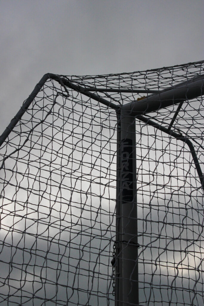
For this image, I shot with a low exposure in order to create this dark contrast. As it wasn’t great weather, the different tones of grey in the storm cloud can be seen to once again represent that fluidity of emotion that I as aiming to show in order to keep the narrative consistent on the various differing emotions surrounding my brothers mental health. I shot this from a low angle so that I could get the net of the goal to look similar to a cross-hatching pattern which I think has worked really well because this allows me to take images of sections of the landscape using formalism. Also, the more distinct straight lines add structure to the image in a more dramatic way which can connote feelings of seriousness and solemnity. The lock on the goal could be interpreted as if my brothers illness has locked away his passion and these certain memories that he may struggle to reflect on, restricting him from becoming the person he once was or growing from these experiences. The image didn’t require much editing as the natural sunlight was concealed by a cloud which meant that I could add a gloomy effect to really represent the morose tone in the atmosphere.
In this image, I placed down an image of me, my brother and my cousin from when we were in the UK at a photobooth. I noticed that the pitches had marks on them from the groundskeeper, so I used this as leading lines central to the image to symbolise how my brothers illness caused him to walk away from football. I wanted to add the image in as if he had left himself behind when his illness didn’t allow him to play football anymore because I thought that this would add a stronger emotive factor. I added a vignette because this helped me reinforce the feelings of desolation as it makes the edges of the image darker which denotes negative feelings. I took this image at a relatively low angle and pointed in diagonally so that the background of the image appeared smaller than the foreground. I feel that this enabled me to portray feelings of isolation and loneliness as there is nothing else in the image so that the viewer solely focuses on the concept behind the image rather than the technical aspects, making it more ambiguous. Also, the alternating directions and shades of the grass make the image look more chaotic as it adds movement and texture, which could be linked to the contradicting feelings that my brother feels about his ending of football.
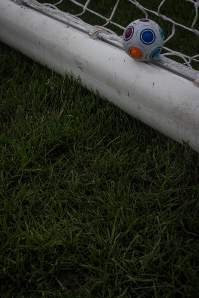
With these two images, I wanted to show the football left in the goal, untouched, as if it was representing the last time my brother played football. Instead of using a normal sized football, I used a smaller one as I wanted to show how young my brother started playing football and how this ended so abruptly when he reached the age of around 17 years old. I used a really small ball to add irony to the image through the dramatic difference in size between the ball and goal itself to make a implicit comparison to now, where the goal is now larger to resonate with how my brother has grown up, however the ball still remains small as his passion for football did not continue, hence why it has not increased in size.
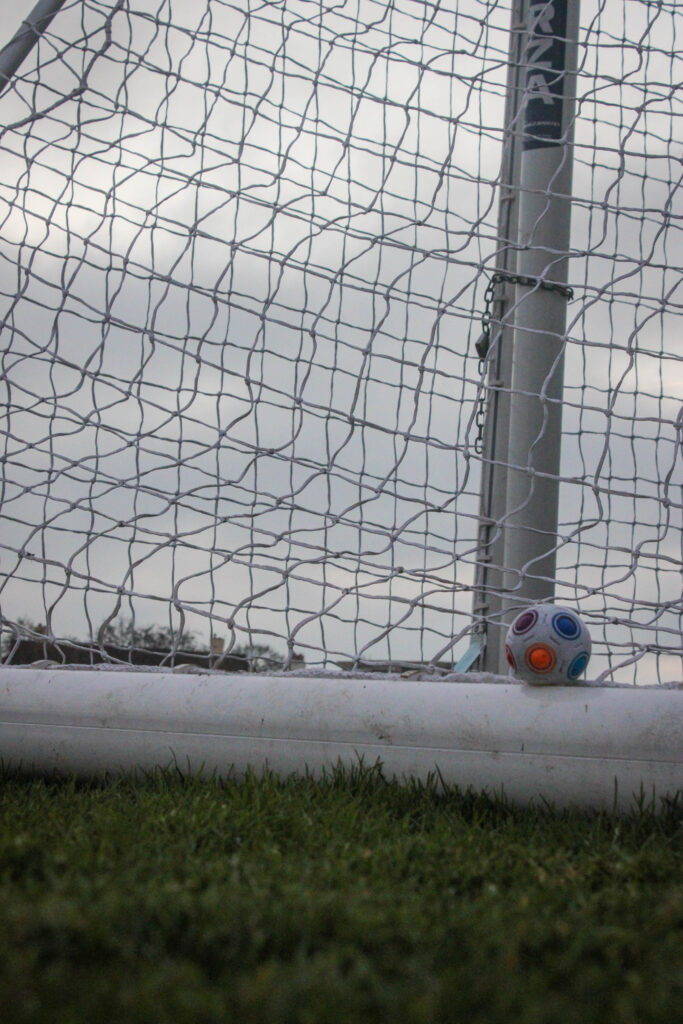
In this image, I used the same angle as I did before however I bent down closer to the ground so I could get a more detailed image. I feel that there is a high contrast between the grass and the bar of the goal due to the vibrancy that works really well when using a low exposure because it adds drama to the image as the line is so defined. The way that the white of the bar is off-coloured, I feel that this could represent how my brothers main concern at the time was how well he played in a football match, something so innocent and pure, whereas now his priority is trying to get better from his bipolar which is a more difficult process, hence all of the marks on the goal. I used a vignette on this image to emphasize the dark tonal range which then meant that the ball looked brighter and would contribute to it being the focal point of the image. I used an angle that was diagonal to the goal which has created a straight line across the image to section it which adds structure and a more formatted aesthetic. The goal net itself does this too, however the curves of the lines create movement and shape.
I used a similar approach in the image, however I put the camera on its side just about touching the grass which has meant that a lot of pieces are blurred in the foreground and look enlarged. I feel that this image looks like a combination of the previous images as this incorporates the stormy weather in the background to evoke feelings of gloom and despair, however this image uses a lot of lines such as the grass spiking up against the goal which may symbolise spikes in my brothers mental health in critical periods. The image was quite bright due to the weather being a large part of the image so I used a vignette on this image too as it allows me to darken the edges of the image, however I wanted to do this to emphasize the shadows made by the grass in the foreground as darkness evokes negativity which is relevant to my brothers emotions about this topic.
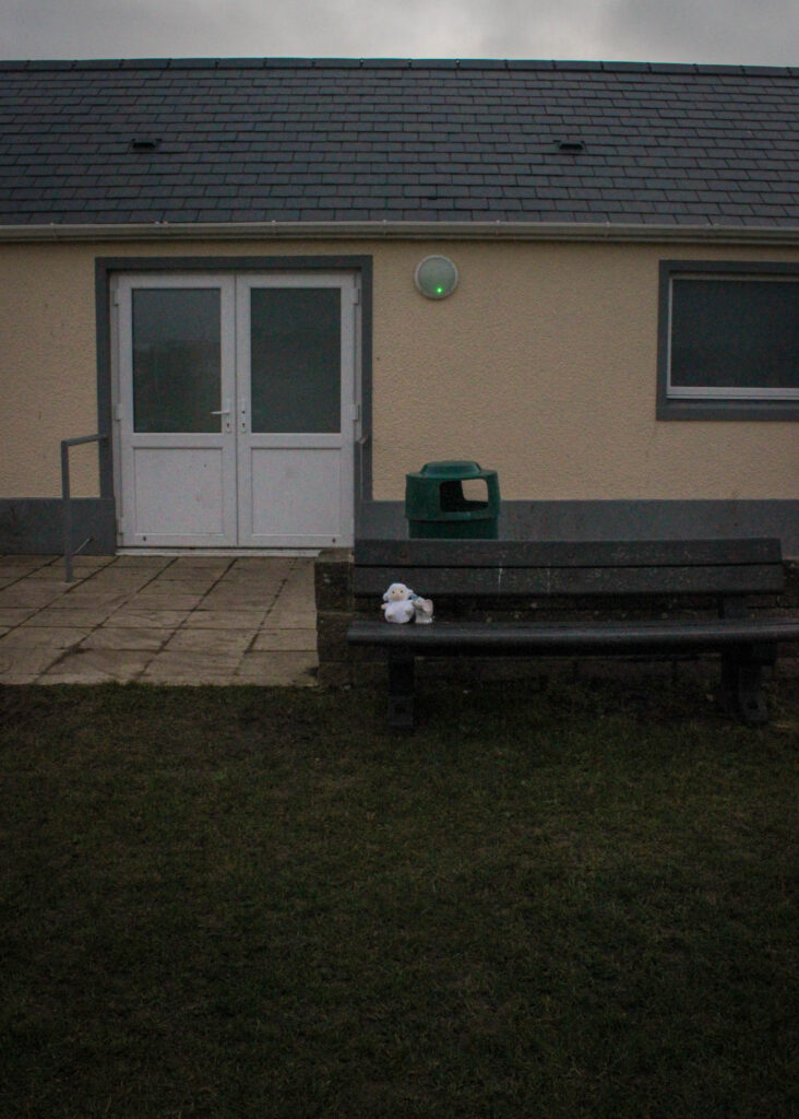
In my photobook, I am going to pair these images together as I feel the sequencing of them will be really effective. I took this image outside of the football changing rooms where I would always wait for my brother after his football matches as I was very young and would be ecstatic to congratulate him. For the first image, I stood quite far back and zoomed out the camera so that the objects looked far away, but could still be seen. I then moved closer, zoomed back in and bent down at a lower angle so that I could centralise the objects and take an image that was specifically looking into what they were. In my editing, I put the images side by side so that I could ensure both images had the same tonal range and looked as if they were exactly the same. I also used the object masking tool in order to brighten and highlight just the toys in a subtle way without altering the overall lighting because this meant that the objects wouldn’t disappear and blend into the background when they are the main focal point. I set them up on this bench as if they were waiting for somebody to collect them, as if they had been lost, in order to represent how I would sit and wait for my brother. I also think that this is effective due to the way the changing rooms look so dull and lifeless when paired with the muted greenery as the entire image looks depressing and lonely due to it being so empty. I think that this has portrayed how segments of both mine and my brothers childhood is left here as if it is left unsolved or unfinished as times changed so quickly once my brother became unwell.
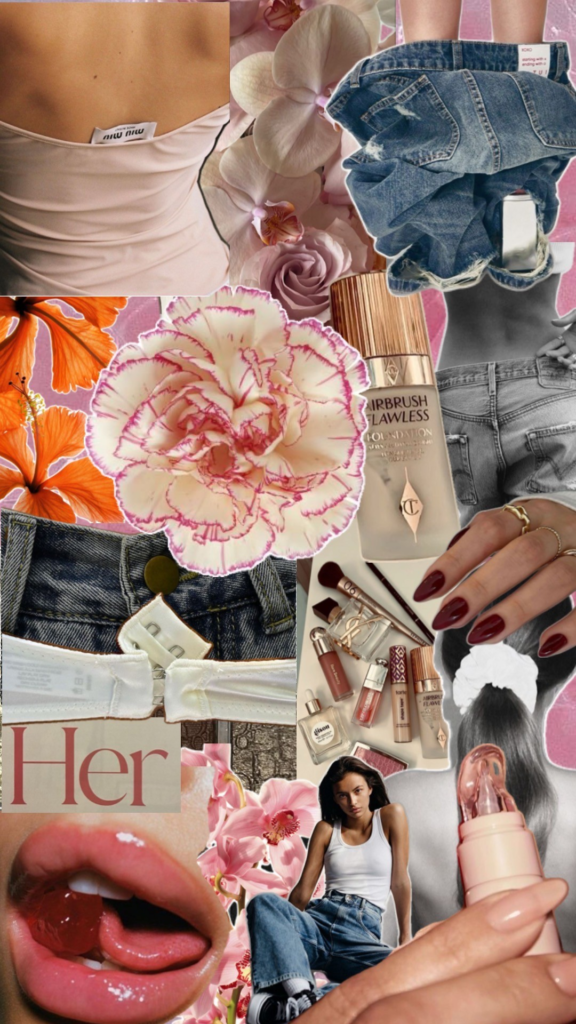
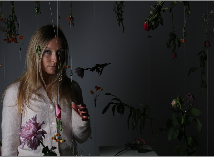
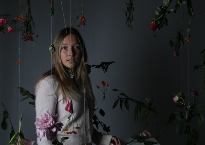
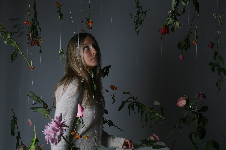
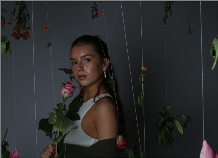
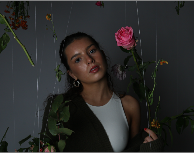
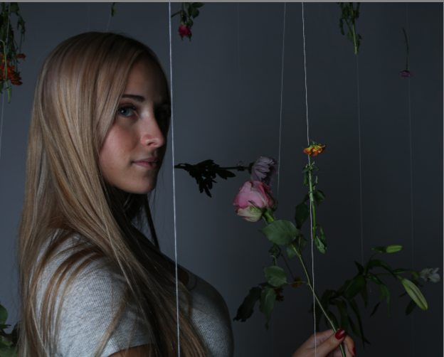
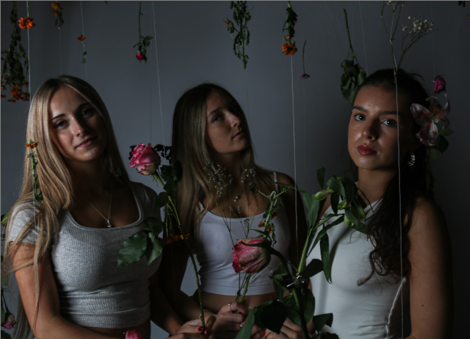
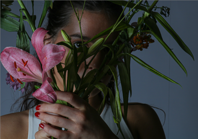
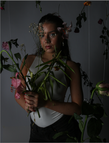
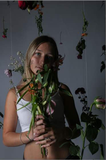
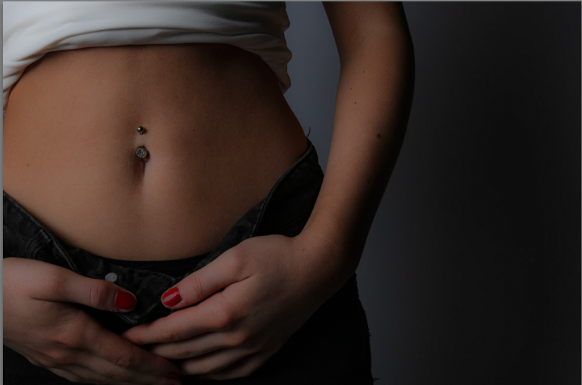
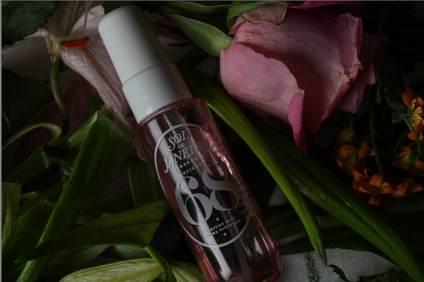
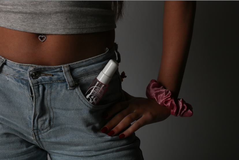
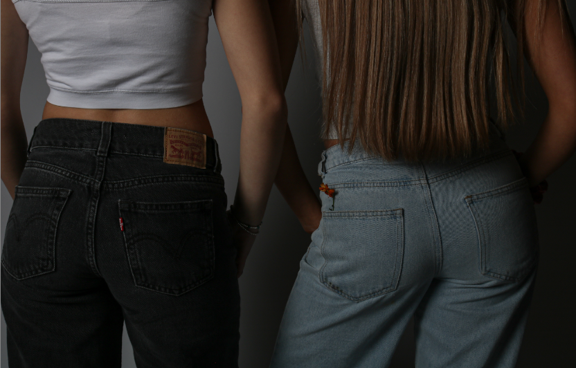
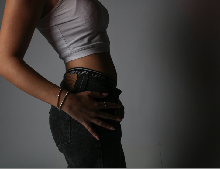
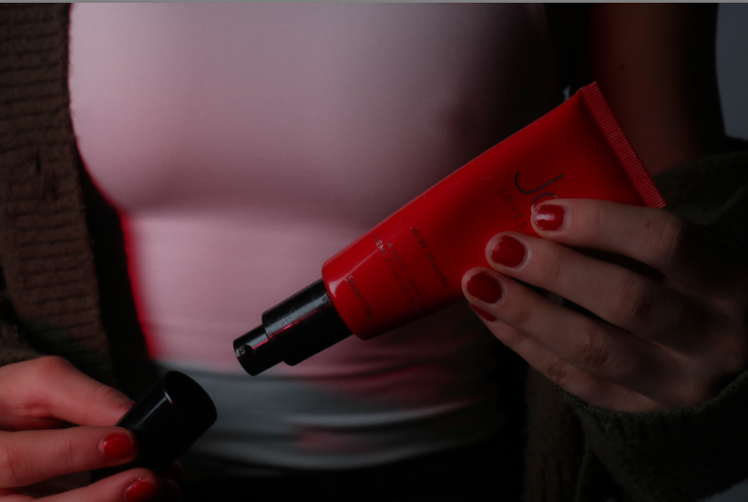
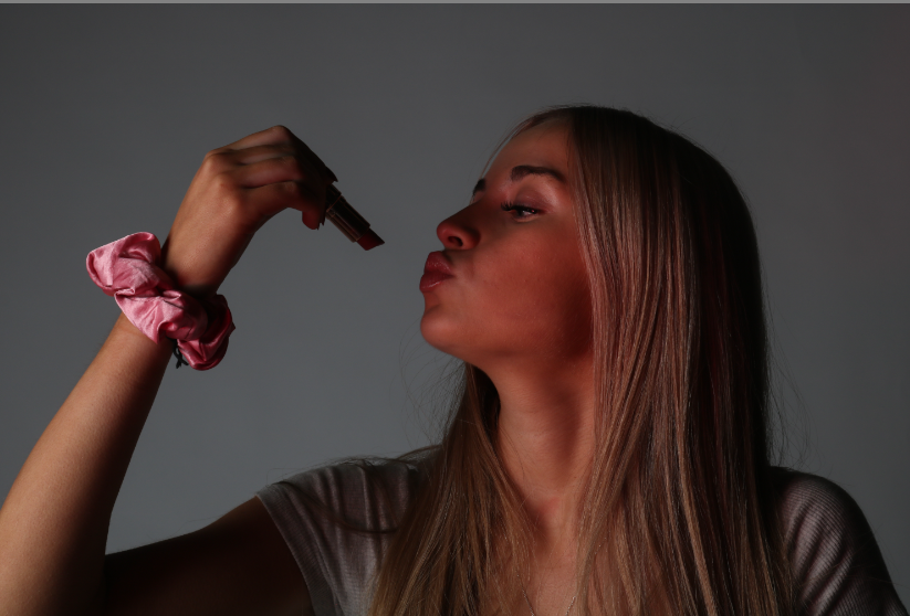
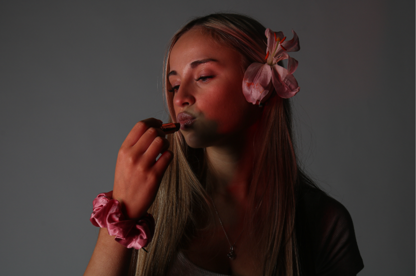
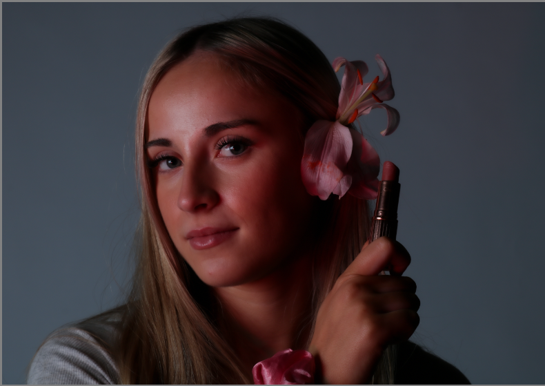
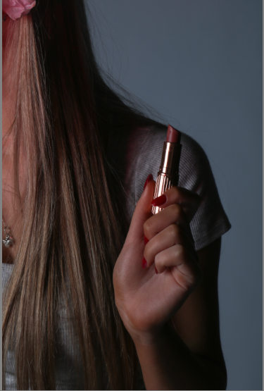
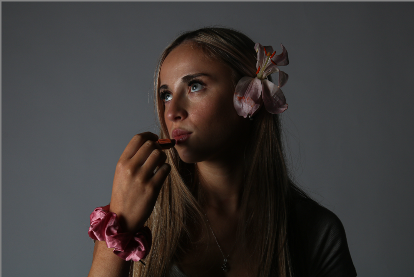
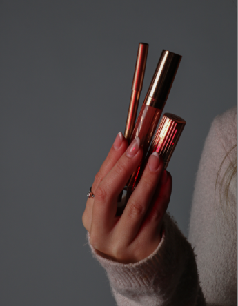
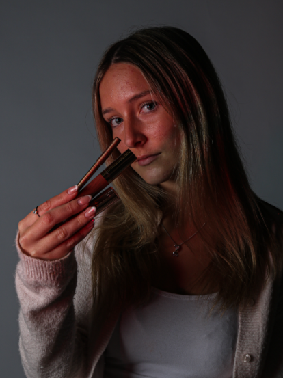
I decided to make a mood board for this photoshoot in order to gather ideas and inspiration for the type of images I would like to create. I wanted this photoshoot to be for the middle portion of my photo book and be for the promotion of products such as perfumes, makeup and clothing. I will be imitating different companies such as Mac, GUCCI and Charlotte Tilbury. I wanted to include lots of flowers in my photoshoot to demonstrate stereotypical female traits. I used 3 models for this photoshoot and focused on varying images from zoomed in, zoomed out or portrait and landscape to create images of different types. I wanted to include lots of flowers, makeup and stereotypical female colours such as red and pink which portrays an idealistic view of a women from the male gaze. I really like this mood board as it is eye-catching, girly and would draw in teens and women as it is an ideological aesthetic lifestyle they may want to relate to or aspire to live.
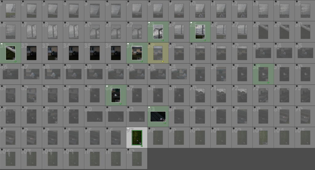
ALL PHOTOS:
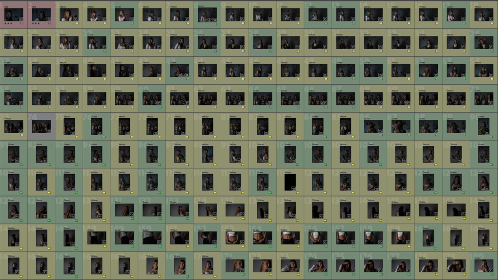
This is the contact sheet of all my images= 400 images. I feel 400 images Is a successful amount for me to categorise and edit in Lightroom to pick the strongest images to edit and use in my final photobook. I feel this is one of the most successful photoshoots I have done in this personal study project as I really liked the lighting and accessories and objects used to convey the subject I wanted to interpret. I liked how although the images were taken in the photography studio, they are still interesting and relevant however, more interesting and colourful backgrounds could’ve helped to escalate these images. However, I could also edit these images in Adobe Photoshop or Adobe Lightroom in order to make the background colourful or patterned. Although, I also believe that these flowers I used have helped to make my images more eye-catching and interesting. I feel there are many pictures to work with and edit to create advertisement style images. I feel what went well in this photoshoots are the lighting and camera settings to help my images look high-quality and detailed. My lighting has also helped to create a slight spotlight effect on my images to show that the model is the focal point of the images alongside the products. I also feel my models’ positioning and posing was something that was successful in this photoshoot as they are doing the correct facial expressions and body language to ‘sell products’. This consists of straight faces, laughing, smiling and looking directly at the reader in order for the viewer to feel targeted and draw them into purchasing the product being promoted. However, In this photoshoot I feel that the although the lighting is good as it is mysterious and interesting, some of the photos have come out dark, although this can be fixed in Adobe Lightroom by increasing the exposure and increasing the whites and contrast in settings.
My Best Photographs:
I first decided to experiment with flowers to demonstrate stereotypical femininity and flowers often symbolise grace, gentleness, and happiness which demonstrates an idealistic way that can interest females and make them look at an images and read about a product which encourages them to purchase it. I feel this aspect has also added to my photos as the flowers are bright and eye-catching. The expressions of happiness also capture ‘joyful moments’ which makes the viewer associate the feeling of happiness being created when this product is bought. By having creative and highly visual aspects such as bright colours and striking images, makes the images stand out to the viewer. The product I would like to ‘pretend to promote’ is a perfume named ‘Gucci bloom’ which is a range of perfumes by Gucci which represent floral smells and bright coloured flowery packaging which is a stereotypical product which expects women to want as they need to smell girly and like flowers in order to ‘be womanly’.
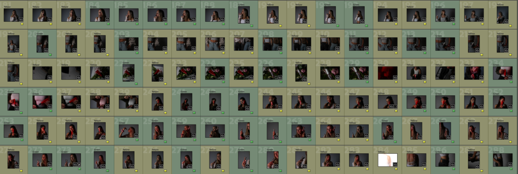
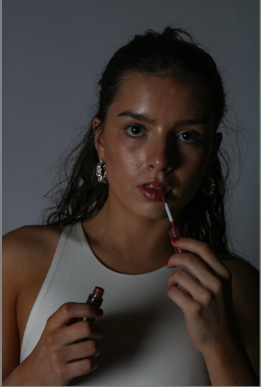
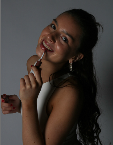
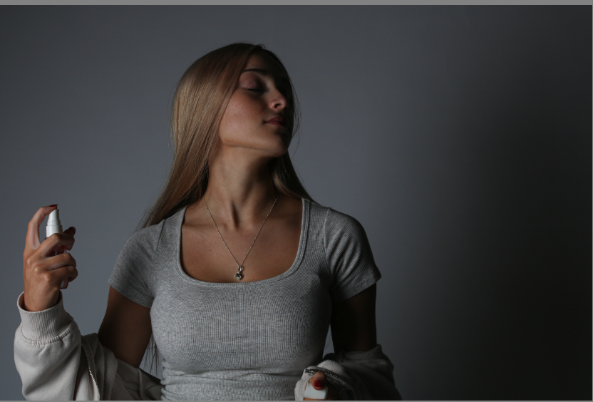
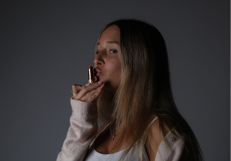
These are my best photographs from this photoshoot. I feel these are the photos with the best lighting and quality. I have edited these on Adobe Lightroom. These images are to be displayed in the middle portion of my photobook which displays a magazine from the modern day which consists of celebrity gossip, product promotion, advertisements and content for teens and young adults. This is to promote products such as perfumes, makeup products, lip products etc. I wanted to make a range of images displaying photographs for my second segment of my photobook. These images consist of images of my models holding the products, the products being displayed and my models posing for a photoshoot, to promote the product. This means that I can group these images together for different segments of this chapter of the book. There is also images of my model on their own which I wanted to photograph for any extra pages where my book may need pages filled with relevant photographs.
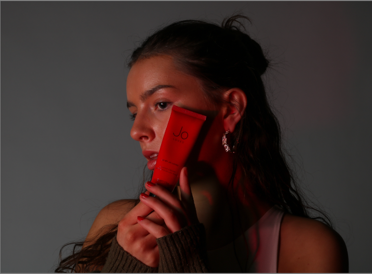
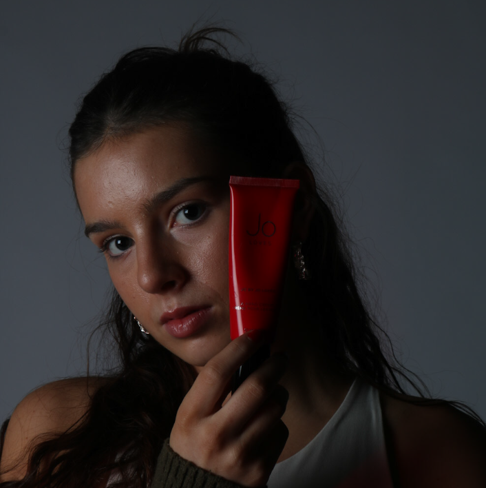
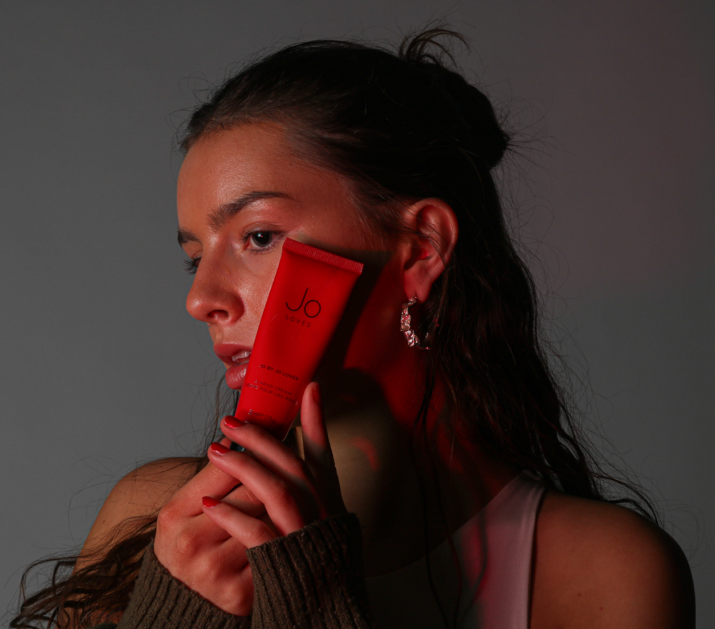
I feel this photoshoot was very successful as my models are young adults who are the target model age for my work and their clothing and settings match the aesthetic and message I would like to portray. I like the colours of my images and chose to add a coloured gel over my light in order to create hues of reds, purples and pink. For example.
IMAGE WITHOUT RED HUE FROM COLOURED GELS.
IMAGE WITH RED HUE FROM COLOURED GELS.
I feel like this small change in the image makes it look more high quality and also makes the image more interesting as the product is more eye catching and the model looks more bright which helps the image to stand out and look less flat. I feel this was a good decision to make in my photoshoot and Is something I wish I had included throughout the shoot and not just towards the end. I also believe I may need to do one more photoshoot for images for my photobook, however, I also feel that around 3-4 photoshoots have captured the types of images I wanted, however, I think that a wider range of images Is more reliable when choosing images for my photobook, but this means more products, logos and editing on Photoshop is needed to add these into the middle section of my photobook which may be time-consuming and difficult within my time frame.