1. Research a photo-book and describe the story it is communicating with reference to subject-matter, genre and approach to image-making.
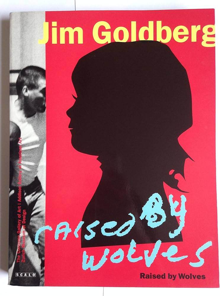
Jim Goldberg – raised by wolves
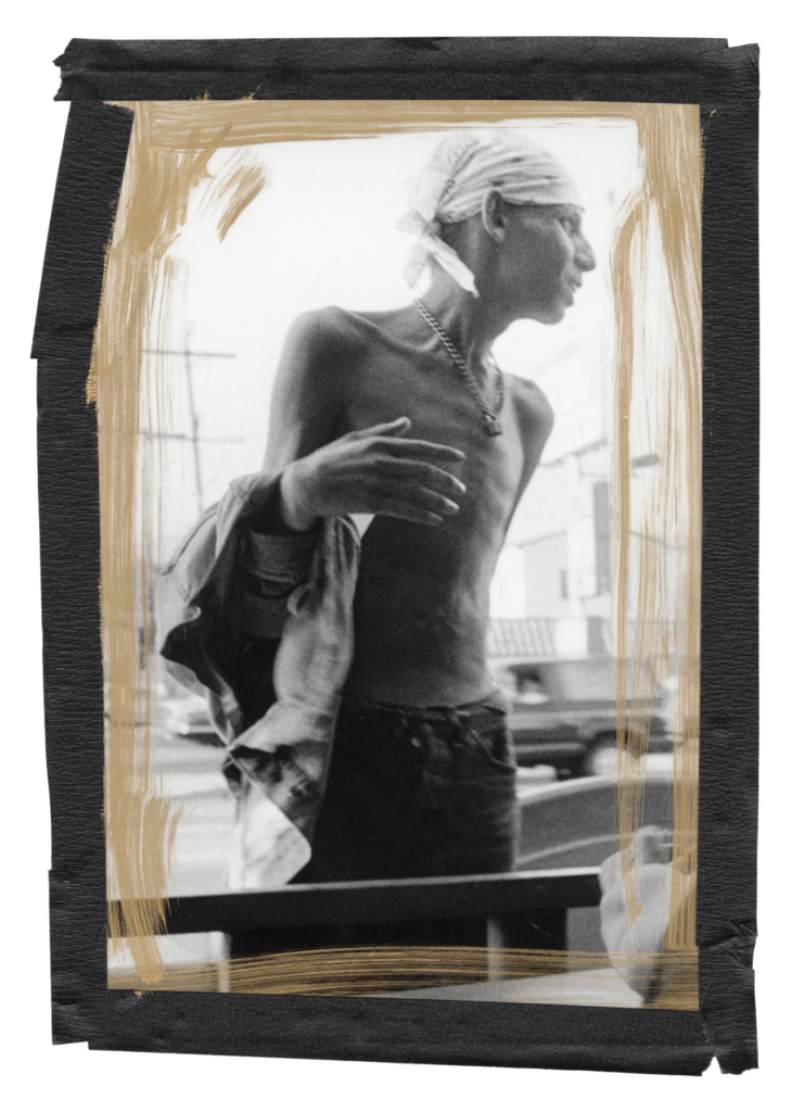
This book is about shedding light on kids without giving them labels like ” victims of abuse” or “drug addicts”, by people trying to classify them into neat groups. This book follows two “main” figures, Echo and Tweedy Dave, where there story is told without being “edited” or “manipulated” to fit with what the readers want. It contains mostly archives of Goldberg’s polaroid’s, and a few pages with interviews by the figures in the books, as well as notes and comments from Goldberg.
“when I thought of youth, I thought of my own teenagehood and childhood, and other people I knew who were often scapegoated, not appreciated, or not given a chance. The end result was trouble for them. I wanted to look at those people who were outsiders, like I felt I was.”

The photos are taken around the California streets, from Hollywood up to San Francisco and back. Many of the figures in the books start out fairly well, but as the book progresses, they slowly determinate and fall into bad habits. There is a lot of drugs and prostitution making it a very emotional book as it shows the difficulties of youth homelessness.
For the image making, he often took a abstract approach, with blurred and B&W images, or close ups of certain people, places or object that help add emotion or explain the story.
2. Who is the photographer? Why did he/she make it? (intentions/ reasons) Who is it for? (audience) How was it received? (any press, reviews, awards, legacy etc.)
Jim Goldberg’s reasons for creating this was to tell a story of kids in various Californian areas over a 11 year period of interviews and photos. It’s also partial, rearranged, taken out of context, romanticized, subjective, and, therefore is as much about Goldberg’s making of the project as it is about the kids. I think the main audience is for other photographers and people who have the money to spend on a book like this.
ZHodl and the other subjects of “Raised by Wolves” are deep in their subcultural world, and Goldberg is, too. Indeed, he’s a most original photo documentarian. He immersed himself in a work of teenage runaways, getting them to write in there own hand writing, and gets up and personal to the subject.
It has a 4.71/5 star rating on good reads, and has been received very positively by the press
3. Deconstruct the narrative, concept and design of the book and apply theory above when considering:
- Book in hand: how does it feel?
The book has a heavy weight to it, as well as feeling flimsy and a need to be looked after.
- Paper and ink: use of different paper/ textures/ colour or B&W or both.
The whole book is the same texture, but printed like its a personal diary, with fake texture added to the pages. There’s also a lot of colour and and B&W areas creating a contrast through the book.
- Format, size and orientation: portraiture/ landscape/ square/ A5, A4, A3 / number of pages.
The format is portrait, size 23 x 30 cm and 314 pages. So it is quite a big book, which makes since considering how much is in it, and how much is needed to tell stories of lots of youths.
- Title: literal or poetic / relevant or intriguing.
The title ‘raised by wolves’ suggests that they are growing up in there own way and that they don’t fit what’s expected upon them by society. People often use the term ‘you’ve been raised by a wolf’ to suggest they are acting in a wild and uncivilised manner with a lack of basic manners or social norms.
- Structure and architecture: how design/ repeating motifs/ or specific features develops a concept or construct a narrative.
Its structured with mostly Images, some interviews with fake textures added, and the real handwriting of the people inside the book.
- Design and layout: image size on pages/ single page, double-spread/ images/ grid, fold- outs/ inserts.
This can vary a lot, including almost every kind of design and layout. I think this was done to make it seem handcrafted like a diary.
- Editing and sequencing: selection of images/ juxtaposition of photographs/ editing process.
The editing seems limited, but the way the images are shot can be very abstract. I saw a few Juxtaposition of Images as well.
- Images and text: are they linked? Introduction/ essay/ statement by artists or others. Use of captions (if any.)
The images and texts are linked very closely. The Images are usually there to explain some text or add more detail that can be difficult to explain through text, e.g. showing a subject, where they like to go, ext.
