
Burnthouse Lane- Michelle Sank

1. Research a photo-book and describe the story it is communicating with reference to subject-matter, genre and approach to image-making.
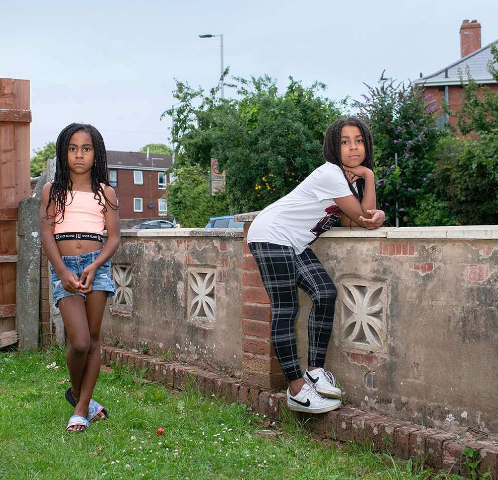
Michelle Sank’s photo book Burnthouse Lane explores themes of working-class life, youth culture, and the socio-economic landscape of a specific community in England. The book focuses on the lives of teenagers growing up in a town characterised by a sense of isolation and stagnation. Through her portraits and intimate images, she aims to convey the complexity of identity, youth experience, and the struggles faced by young people in areas marked by limited opportunities and social disillusionment. The subjects seen in her images are portrayed in intimate, unguarded settings, providing a raw and authentic look into their lives.
The title Burnthouse Lane refers to a specific street in the area, and the book takes the viewer through various aspects of daily life, including the personal challenges and moments of vulnerability that these young people experience. It’s both a documentation of a community and a poignant commentary on the broader socio-political issues affecting that group. Ultimately, Sank’s work tells a story of resilience and the search for meaning in difficult circumstances, emphasising the human side of life in a place often overlooked by mainstream narratives.
Her approach to creating Burnthouse Lane was deeply immersive and observational, with a focus on building trust and establishing a personal connection with her subjects. She spent significant time in the community, getting to know the teenagers she photographed, which allowed her to capture intimate, candid moments. Her approach was not merely about documenting the external world but also about delving into the internal worlds of the individuals she photographed.
2. Who is the photographer? Why did he/she make it? (intentions/ reasons) Who is it for? (audience) How was it received? (any press, reviews, awards, legacy etc.)
Michelle Sank decided to create Burnthouse Lane in order to explore and shed light on the often overlooked lives of young people growing up in working-class, economically disadvantaged areas. Her motivation stemmed from a desire to understand and portray the nuanced experiences of adolescents in communities that may be stereotyped or misunderstood in mainstream narratives. She was particularly interested in the intersection of personal identity, socio-economic challenges, and youth culture, and how these factors shape the lives of young people. She wanted to go beyond surface-level representations of these teenagers and to counteract the negative stereotypes often associated with working-class youth, offering a more empathetic and complex portrayal.
She received positive feedback from the public for her book’s sensitive, empathetic portrayal of young people living in a working-class community. Critics and viewers praised the book for its raw honesty and the emotional depth with which it depicted the lives of its teenage subjects. Sank’s intimate, humanising approach to photography was particularly noted for capturing the vulnerability, strength, and complexity of adolescence in a way that felt authentic and not exploitative.
3. Deconstruct the narrative, concept and design of the book and apply theory above when considering:
- Book in hand: how does it feel? Smell, sniff the paper.Paper and ink: use of different paper/ textures/ colour or B&W or both
The pages have a smooth, thick, slightly matte texture, which enhances the richness of the images without being overly glossy or commercial. Burnthouse Lane primarily features colour images. The colour in this book serves to highlight the emotional depth of the portraits, with the vibrant hues of the teenagers’ clothes, the environment, and their facial expressions contributing to the overall narrative. The colour captures the gritty, lived-in quality of the community and the personal vibrancy of the youth she portrays. The book also feels quite heavy due to hardback cover, giving the book a more premium feeling.
- Format, size and orientation: portraiture/ landscape/ square/ A5, A4, A3 / number of pages.
Michelle Sank’s burnthouse lane book is a landscape, rectangular book, with pages slightly wider than A4 piece of paper but the length is smaller than that of an A4 piece of paper. This allows for an immersive experience from the viewer as their attention is solely directed towards the images.
- Binding, soft/hard cover. image wrap/dust jacket. saddle stitch/swiss binding/ Japanese stab-binding/ leperello
This book has a case bound binding. This is useful as it helps to maintain the integrity of the pages over time, especially since the book contains large, full-bleed photographs that deserve to be preserved in the best possible condition. The binding allows the pages to lay flat when opened, which is essential for a seamless viewing experience, especially for double-page spreads. The hard cover also provides protection to the pages, ensuring that the book can withstand handling and wear over time.
- Cover: linen/ card. graphic/ printed image. embossed/ debossed. letterpress/ silkscreen/hot-stamping.
Burnthouse Lane has a linen cover with an image of a girl on it. This material gives the book a tactile, premium feel, making it both visually appealing and durable.
- Title: literal or poetic / relevant or intriguing.
The title Burnthouse Lane is more poetic than literal, though it does have a literal reference to a specific place. Burnthouse Lane is the name of a street in a working-class area in the UK, and the title clearly grounds the book in a real location. However, the way Michelle Sank uses the title is more metaphorical, reflecting the broader themes of the book—identity, isolation, and the environment in which these young people live.
- Narrative: what is the story/ subject-matter. How is it told?
Burnthouse Lane portrays the lives of teenagers in an isolated, economically disadvantaged area. Sank is interested in how these young people navigate their daily lives, deal with the limitations of their environment, and form their identities. The teenagers are not depicted as victims of their circumstances but as individuals with dreams, conflicts, and complex emotions. The images reflect moments of vulnerability, camaraderie, defiance, and introspection. She tells this story primarily through her photography, using a mix of portraits and candid shots that emphasise the rawness and authenticity of her subjects.
Rather than using text to directly explain the story, Sank’s photographs convey the emotions and experiences of the teenagers. The book does not rely on captions or heavy narration. Instead, the images themselves serve as the storytelling medium.
- Structure and architecture: how design/ repeating motifs/ or specific features develops a concept or construct a narrative.
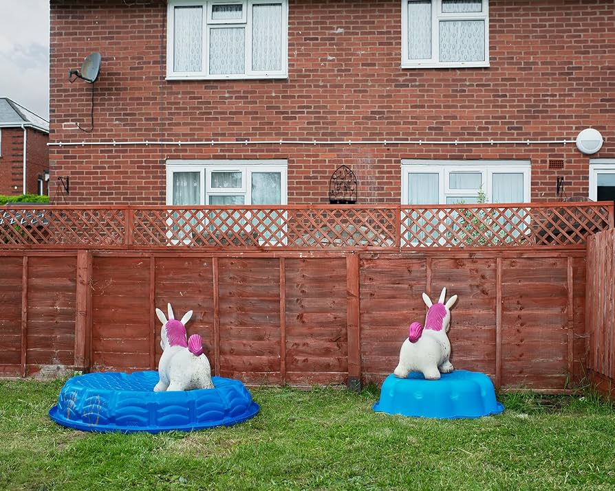
The book is structured in a series of photographic sequences, rather than a strict linear or chronological format. It moves through various moments in the lives of the teenagers, often focusing on small, intimate details that capture the essence of their experiences. The absence of text or captions means that each image stands on its own, yet they are all interconnected, building a complex portrayal of youth, identity, and the impact of socio-economic conditions. The specific, thought out pacing of the images allows the viewer to linger on individual portraits or group shots, giving the photographs time to evoke emotional responses. The book switches between portraits and photographs of the environment.
- Design and layout: image size on pages/ single page, double-spread/ images/ grid, fold- outs/ inserts.
Many of the images are presented as full-page shots, which allows the viewer to focus deeply on individual subjects and moments. These single-page images often create a powerful, intimate connection with the viewer. The sequencing of images in the book is done in a way that builds a visual narrative. While the book does not follow a strictly linear or chronological order, the flow from one image to the next creates a sense of progression. There’s a careful balance of emotional highs and lows—some moments of stillness or reflection followed by more active, expressive shots. This sequencing guides the viewer through different aspects of the teenagers’ lives, gradually revealing the complexity of their experiences. Sometimes the left page is left completely blank this is because as viewers, our attention normally goes straight to right page. So, Michelle Sank may have wanted the viewer to focus on specific images and so put them on a page alone.
- Editing and sequencing: selection of images/ juxtaposition of photographs/ editing process.
There’s lots of juxtaposition of photographs seen throughout her book; specifically on doubles pages. For example, on one double page there was an image of a house with toy unicorns outside and then the image on the other side had a toy dinosaur in it (these are typically opposite interests seen in children, with girls liking unicorns and boys like dinosaurs). On next page, there’s picture of a man with a watering can and then on the other side of the page there’s a lady with a hose (both doing gardening and so she put them on the same page). I also noticed that when a page has an object on the floor, the person in the image next to it is typically sitting down. She does this to link them together by having them at similar heights. It is evident that Michelle Sank carefully looked at ways her images match/ juxtapose one another and designed the layout of the book in a way to accommodate those different images.
- Images and text: are they linked? Introduction/ essay/ statement by artists or others. Use of captions (if any.)
Michelle Sank’s decision to exclude text from Burnthouse Lane is a deliberate artistic choice that serves multiple purposes. By not using captions, narratives, or explanatory text, Sank allows the photographs to speak for themselves, encouraging a deeper, more personal engagement with the images. It also makes the book more universal as the images, free from specific context or explanation, invite viewers from diverse backgrounds to connect with the emotions and experiences of the subjects.