To what extent are Saul Leiter and Seigfried Hansen influenced by Formalism in their work?
Introduction
“I happen to believe in the beauty of simple things. I believe that the most uninteresting thing can be very interesting,” (Saul Leiter: line 16)
Saul Leiter suggest that what goes unnoticed is in fact the most exciting. The fact that we are almost unaware our surroundings of unique shapes and formations, with the only way that we truly see it is through abstract approaches. Throughout my personal study I aim to investigate street photography and how it can be portrayed through various ways and approcahes. I believe there is more to street photography and that it’s not just a standard photograph of a building, it’s in fact different visual elements such as vibrant colours, unusual shadows, textures, and patterns, to diverse formations and compositions that all intertwine, overall creating these contrasting effects. All these visual elements are otherwise known as formalism, compared to what we see on the streets it shows a very similar effect. The way colours are distinguished between more colours, separated by distinct lines is further represented within the streets whether we notice it or not. My aim is to bring this to life, presenting this through very abstract and diverse approaches, which makes you question the photo as it is so unrecognisable. Siegfried Hansen perfectly describes formalism. His similar approach overall achieves abstract, unrecognisable images, that are so bold, full of colour and life it changes our perspective of our surroundings – viewing things for their details and unique features that define them. Saul Leiter expresses this more excitingly, expressing very hectic and caotic images, however when stepping away they are clearly defined through formations, colours, and shadows. I aim to investigate various visual elements such as colour, formations and shadows and how they present their own narrative as we engage in different ways. Producing my own response in a formalist way, will create depth and meaning behind what I capture. More meaning will be revealed as I capture things in an abstract approach for example the colours chosen and formation expressing how uninteresting images can be made more interesting.
P1
Formalism is a study of art, where compositional elements are presented to us through elements of colour, line, shape, and texture. Rather than focusing on a specific meaning, reason of creation, historical background or context within the photo, (that goes unnoticed), we therefore consider the medium used or visual elements that is presented to us through such expressive and dynamic formations. The colour wheel perfectly represents this, as it greatly impacts formalism. The small sections of colour work together in an orderly way, complementing one another, therefore showing very visual relations between one another. This reveals such intriguing image because you are shown something through the ways in which colour is presented to us. ‘Aestetic pleasure was to be found in the painting itself not its subject,’ stated Mauris Denic (tate: line 8:1890), post-impressionist painter and writer on art.
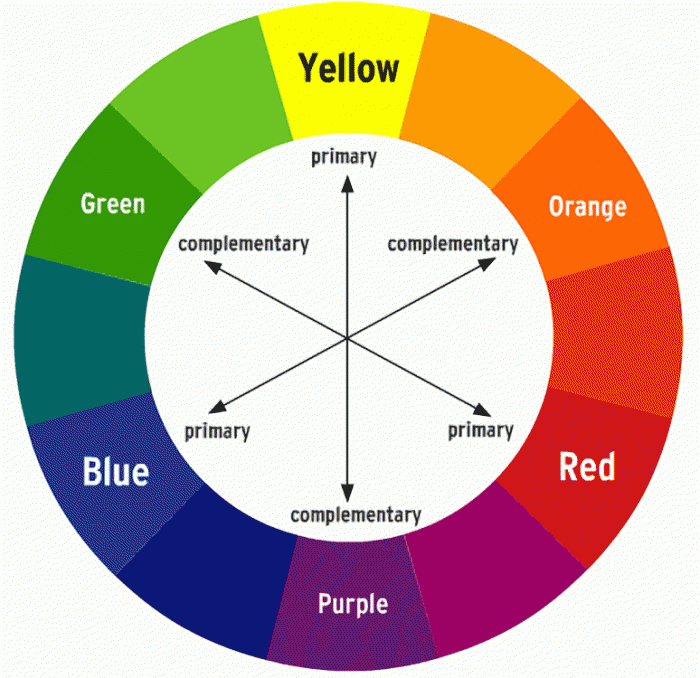
Formalism is the most important aspect of art, presented through visual aspects rather than narrative content -connecting closely to the outside world. Within this we see a dynamic relationship of colour, brushstroke, line and composition.Isaac Newton developed the colour wheel based on his findings. Proving that white light was not a single entity, instead it was composed of a spectrum of colour combining to make white, suggesting white is a source of colour. Newton’s experiment consisted with passing a thin beam of sunlight through a prism which produced a spectrum of colours – red, orange, yellow, green, blue, indigo and violet. Then by placing an inverted prism in the path of the coloured light beams, which combined the colours producing white once more.
During the early 20th century, Piet Mondrian incorporated an art movement that allowed him to work around his abstract works, which formed a reductive theory – meaning a focus on simplicity rather than intricate/ detailed paintings. Stating in 1914, Mondrian said ‘Art is higher than reality and has know direct relation to reality.’ Describing through his style Mondrian shifted from figurative works to abstract art, explaining how art can reveal a type of reality through dynamic formations and variations, with one being formalism. Mondrian limited his colour use, to the three primary colours; blue, red and yellow, whilst still incorporating black, white and grey which was used as his base/background colours that brough the piece together. Alongside this Mondrian worked in two directions; horizontal and vertical. A confrontational effect is expressed through his art, shown through the specific, orderly layouts to the colours that are filled within each shape which work together to reveal a certain narrative, perhaps one we don’t understand as its just shapes and colour, so therefore it’s open for us to interpret. For me I think it is a very intelligent way of working. From working figuratively to then evolving into very abstract, structured, simple, limited use of colour type of work, but then still painting in a type of way to match the style of his reality (inspiration) I think is really effective as we learn his interpretation and perspective on his world- making it clear that art is higher than reality.

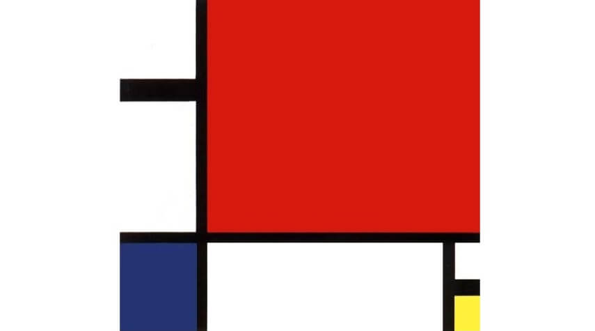
Piet Mondrian proposed a style called Neo-plasticism in which consisted of his own abstract style – primary colours, and horizontal and verical lines.
Mondrian was greatly inspired by impressionist techniques, in which he used particular techniques within his own work – in his own style. During the early 20th century, Mondrian evolved his work by using pointillist and cubist styles, also including other abstract mediums, followed by other techniques he had learnt. Mondrian stated, ‘the more basic the colour, the more inward, the more pure.’ (Piet Mondrian, openign statement) From visualising Mondrians work we notice this more and more, through the abstract use of bold, pigmented colour which perhaps suggests the term basic is in fact the most revealing and captivating form. It is inward in the sense you have to look into it, noticing the true beauty of the dynamic compositions of line, shape and colour, but also pure in the sense of its simple forms.
p2
“Seeing is a neglected enterprise” Saul Leiter (video, first quote)
Immersed within painting and photography since a teenager, Leiter found ways to incorporate both within his work, however his aim was never to create an obvious connection between them as they are still two separate works of art. ‘Photography is about finding things… Painting is different. It’s about making something.’ (Stated Saul Leiter, video) Leiter enjoyed using a brush, making a mark, then another, describing it to be a bit like ‘Jazz’ (Saul Leiter, Video)- you don’t know what your going to do next. In relation to formalism, (expressed through the defining abstract strokes of colour, outlined my more shapes and marks of colour, which instantly lures you in), Leiter expresses this through his own style expressing unique features creating a similar approach as you don’t know what to expect next. The loose strokes of colour creates a similar, mesmerising relationship- a bit like formalism describing how blocks of colour can be fitted together, to reveal an intense yet in-depth image.
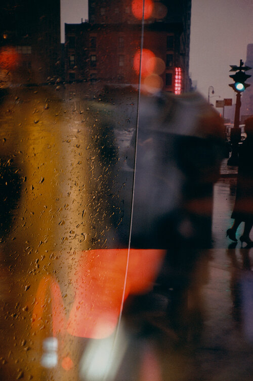
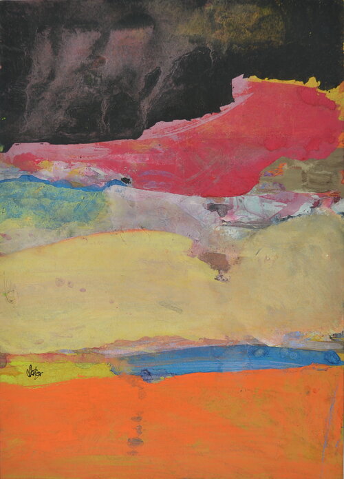
An obvious relation is presented through his paintings and photographs, yet his aim is never to create an obvious connection. We can see his style of loose strokes of colour painted compared to what he looks for and how he captures his photos, both achieving very similar, abstract effects. The photographs look like strokes of colour, expressing a painted quality, whilst on the other-hand the paintings create this abstract up-close complexion of colour, making us ‘look twice’ at what it is we are seeing, as the colours and shapes are ‘merged’ together creating a similar feature seen in the photographs. From Similar perspectives, Leiter’s very prominent and abstract marks of colour create an interesting feature that strangely lures you in, as you wouldn’t expect strange (unsymmetrical) highly pigmented strokes of colour to be that engaging. Instead it is the hidden details and minor features, that entices you in – automatically making you see things differently from what they are. This effect continues throughout his photographs, as we’re presented with a confrontational perspective, where unique angles are expressed. It is clear Leiter’s work has a close connection to formalism. The colour creates very contrasting features as there is little of them, and they complement one another. Alongside the riveting lines, shapes, and patterns which are revealed, this therefore creates a captivating aesthetic because you wouldn’t expect all of these different features to work together and reveal hidden effects. It expresses street photography in a different light, meaning it attracts you. Leiter returned to New York in 1940, where he began experimenting with colour photography using slide film such as Kodachrome. Quickly becoming one of the most popular materials used for film; being lightweight, affordable, quick exposures allowed for producing brilliant, intense coloured images. ‘Leiter’s use of colour was subtle, yet impactful,’(Pioneering colour photography- line 4) .This further outlined that only a few colours were in fact needed to create contrasting visual effects. It shows how Leiter had an ability to use little colours, and through his painting knowledge of expressive marks to bold brush strokes further enables him to look at the streets differently -noticing lights, people, or just anything that he came into contact with, that act as his colours.
P3
Siegfried Hansen is a contemporary street photographer focusing on visual links to formalism; colour, geometry, abstraction and cityscape. Hansen looks through these visual compositions focusing on the graphics and colours found within the street. Hansen doesn’t focus on capturing people, instead he looks at the formations and relations found elsewhere, “It shows the Aesthetics of coincidence in a public area, which is full of surprises.” (Seigfried Hansen, line 2) The specific way coincidental features take form within the images, is exactly what makes them so intriguing, creating this sense of depth which forms a narrative. The diversity between the lines, structures, and signs combine with the architectural features, complementing one another whilst adapting to his abstract and graphical way of seeing. Hansen has this unique way of revealing surfaces, shapes and colour that would once go unnoticed, to now often being described as ‘poetic.’ (Leica Camera blog, line 6) Our attention is brought to unique perspectives and angles which would otherwise go unseen, creating a similar narrative and purpose, the same way a poem does – as the words are so powerful it makes you think twice of whats being described. In Hansen’s photographs the structure and bold shapes/ outlines create similar effects as we are confronted with it, resulting in us thinking twice. The abstraction within the photographs, confronts us with a new light relating to to a poem. Perhaps amplifying the fact that new things are constantly being revealed to us, explaining Hansen’s perspective of the world around him which could be different to ours.
Seigfreid Hansen takes photographs intuitively, using his ability to anticipate unusual situations then transforming them into multi facetted images. Further displayed in Hansen’s book ‘Hold The Line,’ we are confronted with abstract, unusual perspectives of a situation we aren’t normally shown, displaying a clear link to formalism. Rather than creating a specific meaning or narrative within the photo book, we are instead shown through visuals aspects of colour, composition, pattern, line and space which all work together achieving a formalist style. In response to Hansen’s style I created images with the same abstract, yet defined or structured way.
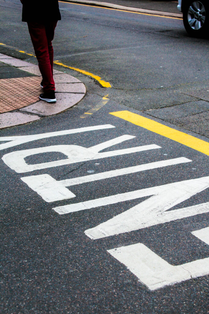
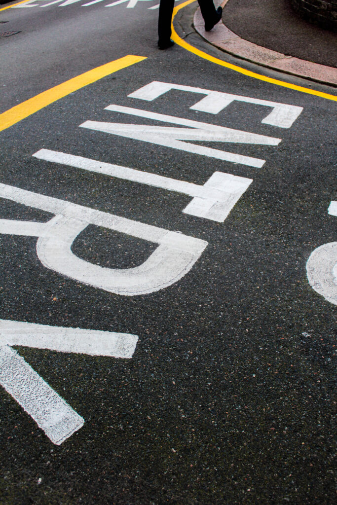
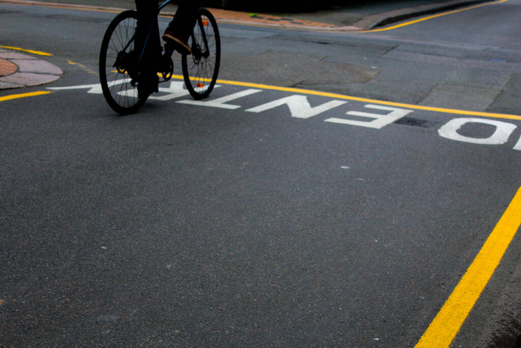
Within this photoshoot I liked this idea of road markings, then further increasing the vibrancy and saturation of colour when editing. Overall revealing unexpected angles and formations, especially as you wouldn’t normally choose to focus on the street ground. Instead this expressed an interesting distraction as shadows of people walking, bike wheels, legs and cars also came into the photograph.
Conclusion
Saul Leiter and Seigfried Hansen both interpret the theme formalism through their photographic responses in similar yet unique ways. A similarity being shown through how colour and composition is interpreted. Saul Leiter creates very hectic images, filled with life that overall creates this confrontational yet abstract effect making you question what is being photographed. Before photography took over, Leiter was an artist with his main inspiration comming from impressionism. Working with loose strokes of colour and marks that came together creating this abstract composition of colour, it was still present in his photography as similar techniques and skills were used. Followed by the colour came a structural element of lines and shapes which outlined and made the colour more prominent. Whether it being shadows, reflections, people or just interesting formations, they always without fail make to you look twice as it’s never obvious what is being presented. This is enhanced through a layered effect giving depth as when you look into the photo, because a lot is going on, you notice even more interactions of people and geometry that subtly fills the image. This creates a narrative as everything is connecting in ways you wouldn’t know until its being revealed to you.
On the other hand Seigfreid Hansen expresses colour and compositions in a similar way, but instead it’s more simplistic and refined. Hansen automatically focuses in on geometry and graphical elements that form the street, widening our vision of the streets. Hansen’s images display an obvious connection to formalism through this style of simplicity. He takes inspiration from your typical formalist painting, then expresses it in his own style of being found within the streets.
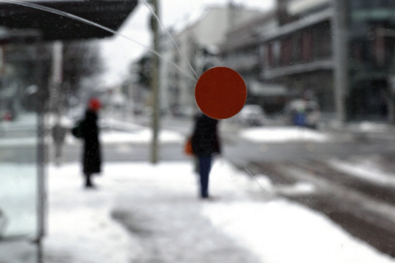

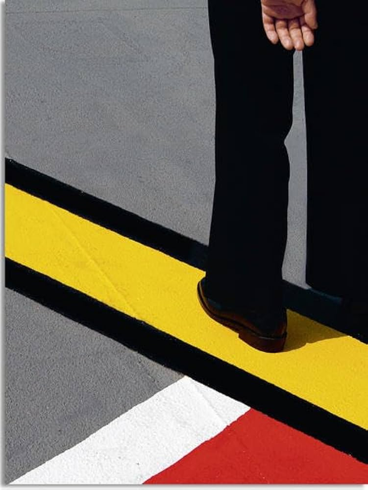
The simple use of colour, is further expressed within the photographs in a structured form. Capturing from abstract angles gives this direct approach, one you wouldn’t know before its photographed.
Bibliography:
(Saul Leiter: line 16) https://www.saulleiterfoundation.org/biography
Mauris Denic (tate: line 8:1890) Published manifesto titled: Definition of Neo traditionalism https://www.tate.org.uk/art/art-terms/f/formalism
1914 Piet Mondrian stated (line 10) https://en.wikipedia.org/wiki/Piet_Mondrian
Peit Mondrian – Evening:Red Tree Gemeentemuseum den Haag, Hague, Netherlands https://www.ideelart.com/magazine/piet-mondrian-artwork
Piet Mondrian – Composition II in Red, Blue, Yellow National Museum, Belgrade, Serbia https://www.ideelart.com/magazine/piet-mondrian-artwork
(Piet Mondrian, openign statement) https://www.piet-mondrian.org/
Saul Leiter (video, first quote) https://www.saulleiterfoundation.org/
Saul Leiter (video) https://www.saulleiterfoundation.org/
Saul leiter (video) https://www.saulleiterfoundation.org/
(Pioneering colour photography- line 4) https://proedu.com/blogs/photographer-spotlight/saul-leiter-master-of-color-in-street-photography-a-pioneers-urban-palette?srsltid=AfmBOopX8LW-V_29lHSs0z5jH_pYfF2itOAX582cDeEaF1q5LsumReP8
(Seigfried Hansen, line 2) https://siegfried-hansen.de/en/about-english-2/
(Leica Camera blog, line 6) https://leica-camera.blog/2021/03/29/the-flow-of-the-lines/
