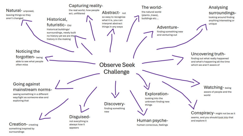
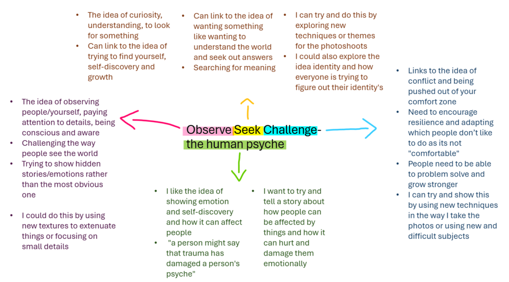
Recording 1st photoshoot: First wave feminism

Filtering

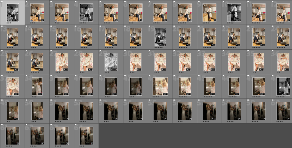
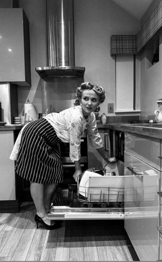
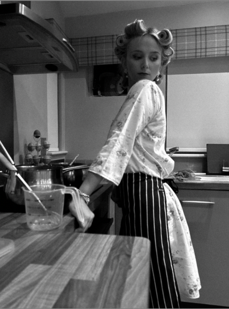
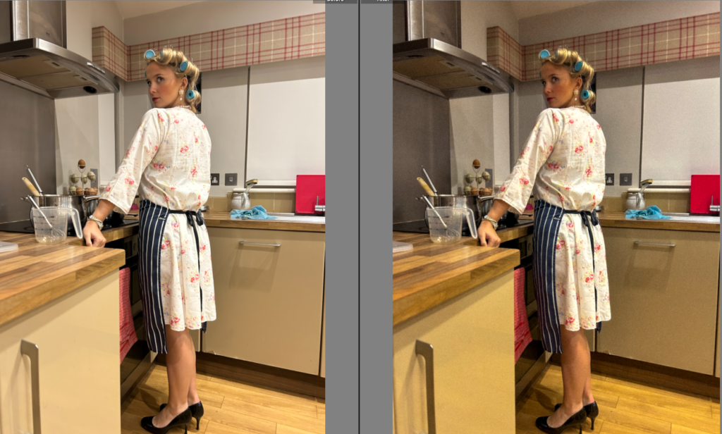
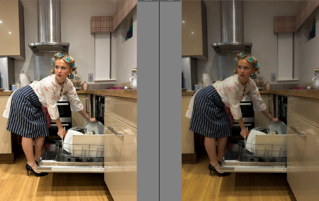
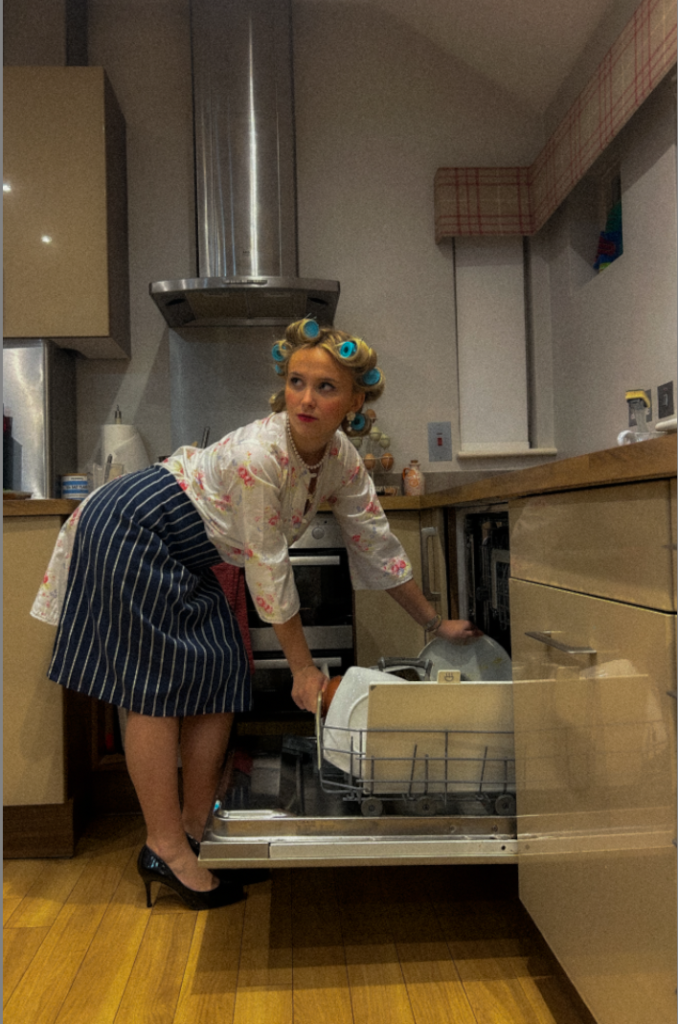
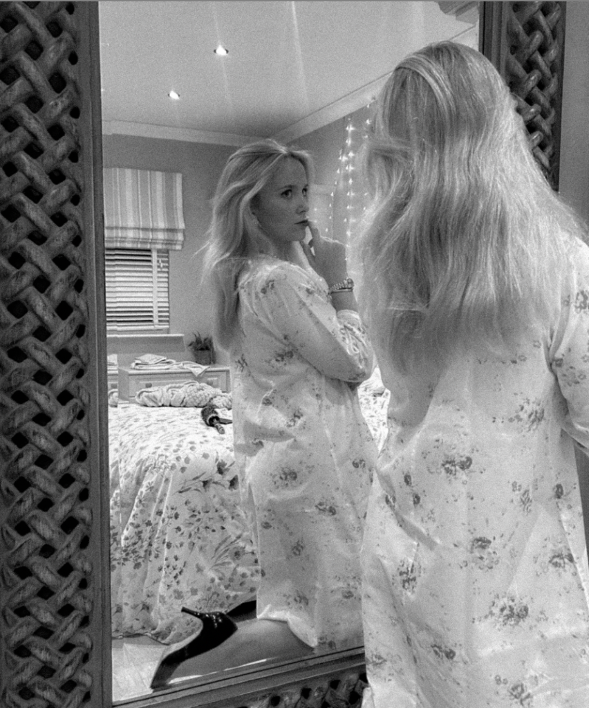
Firstly, I began by rating all my images from 0-5 and either flagging or rejecting them. The main factors I took into account was lighting, posing, surroundings/props, and the gaze my subject executed. Some images had unwanted kitchenware or other things that were potentially taking the attention away from the main factor of the image, therefore I went through and cropped them to my preference before editing.

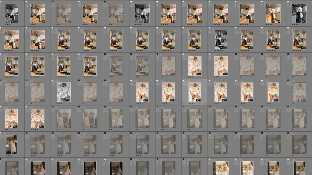
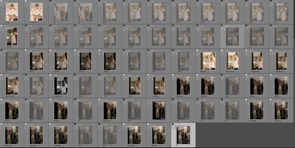
After doing this, I filtered my images and ignored the ones I rejected so I knew the most efficient way to edit the ones I preferred.

Editing

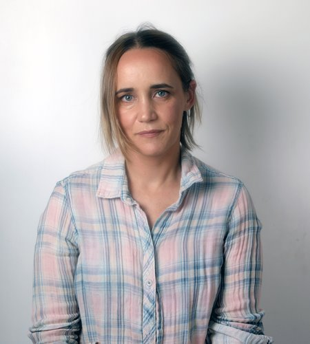
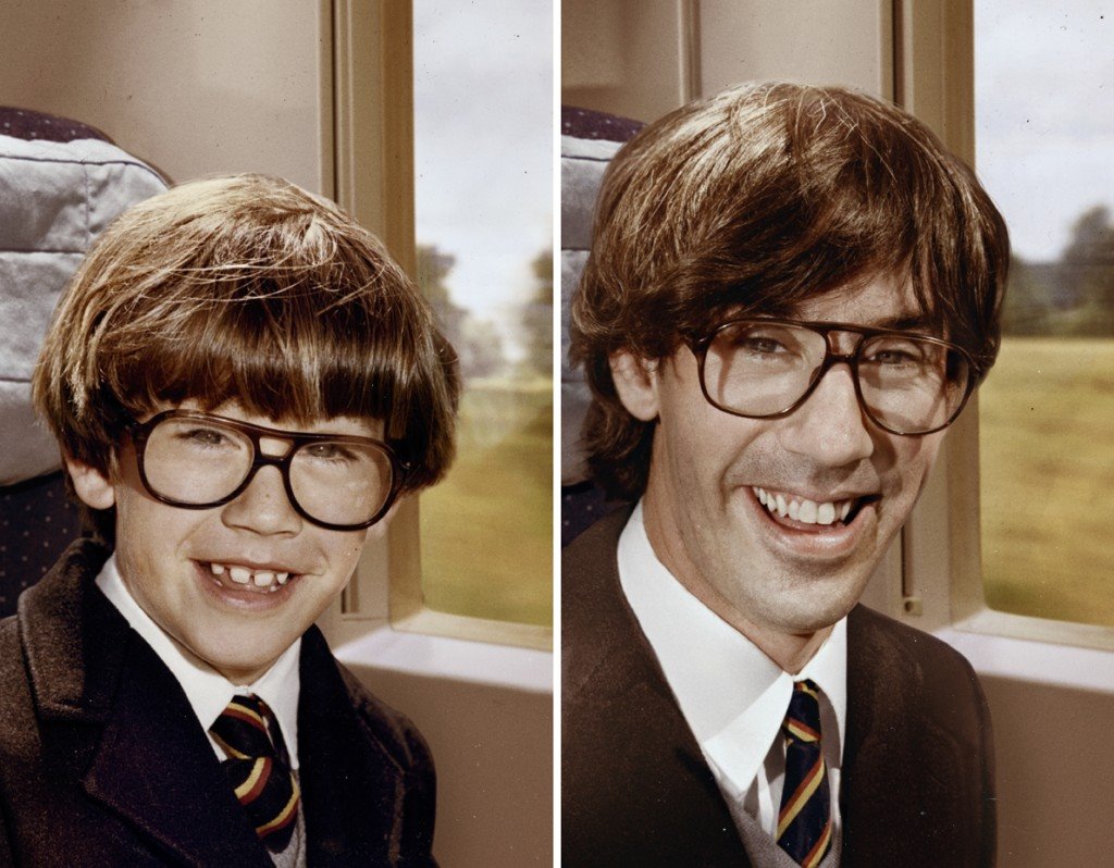
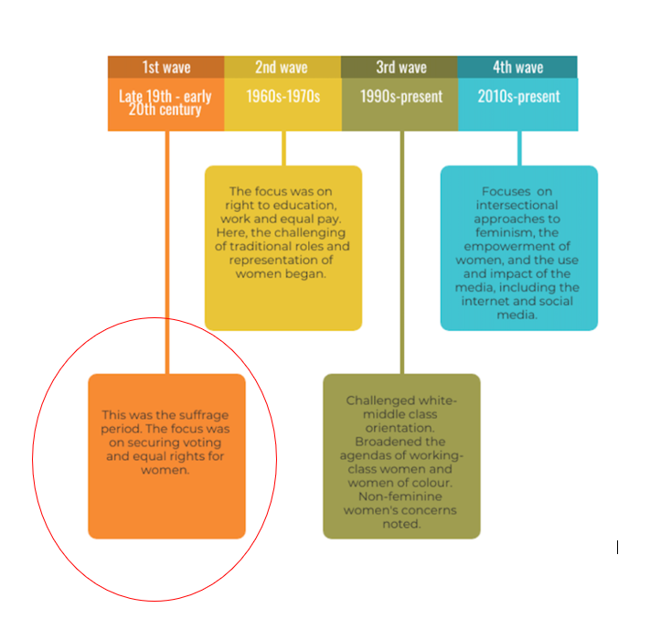
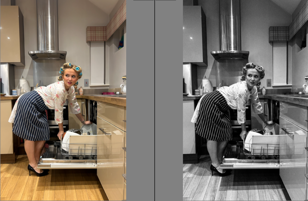
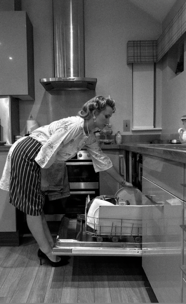
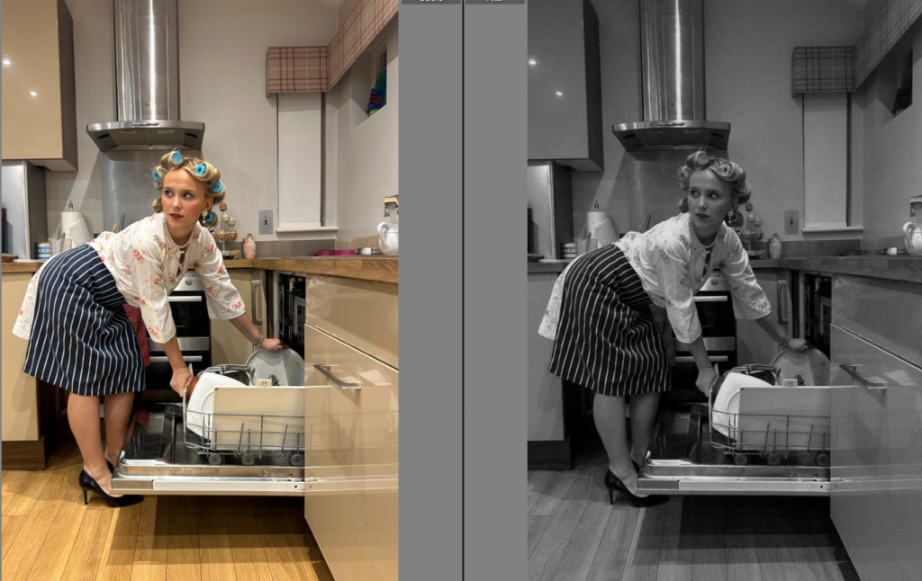
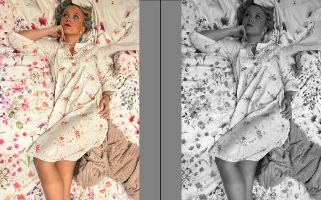
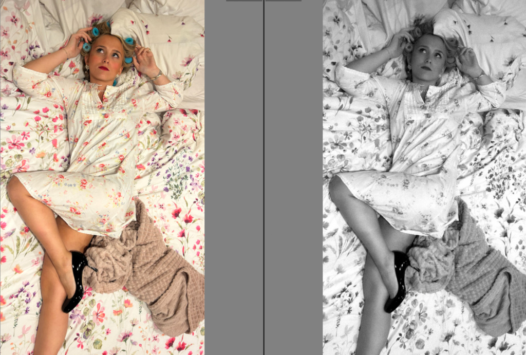
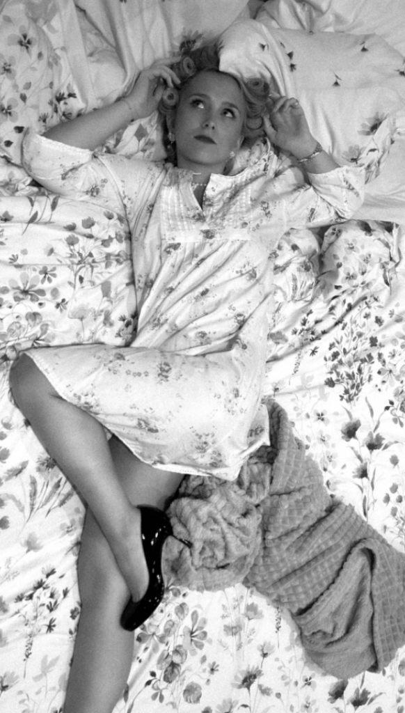
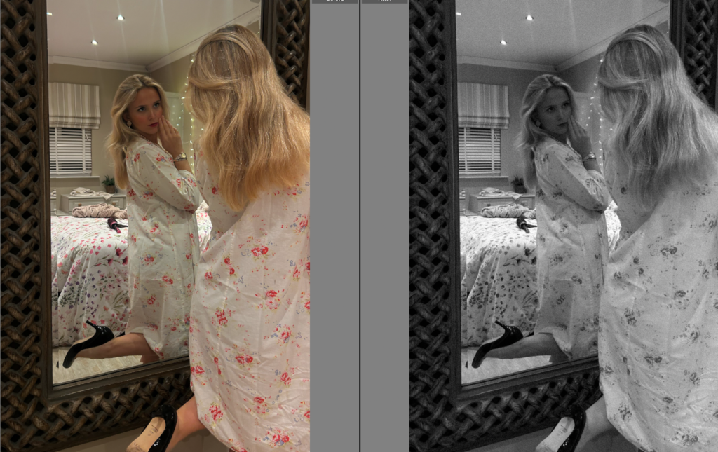
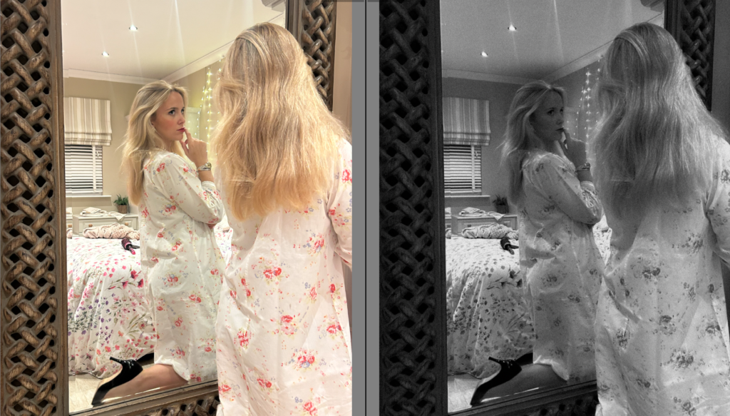
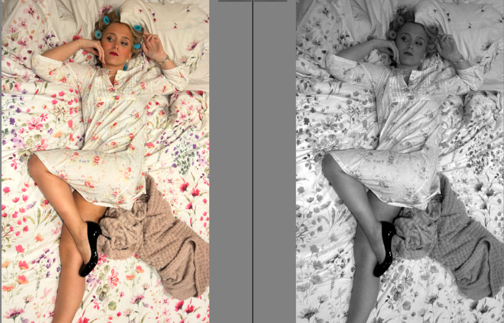
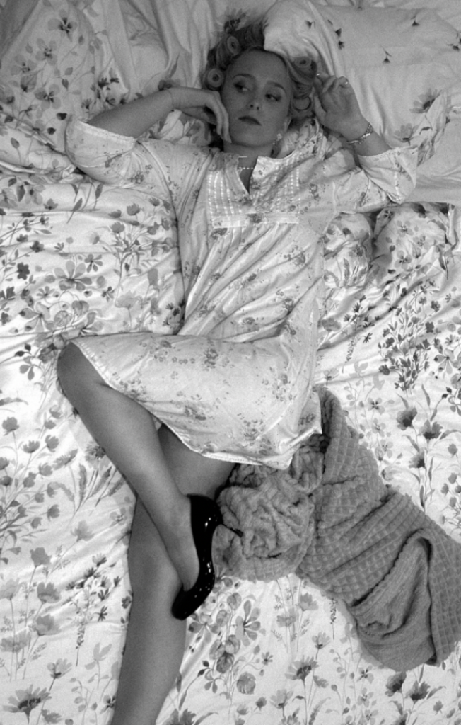
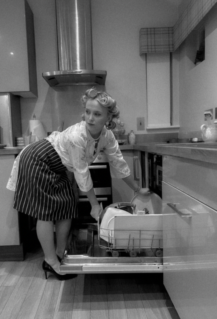
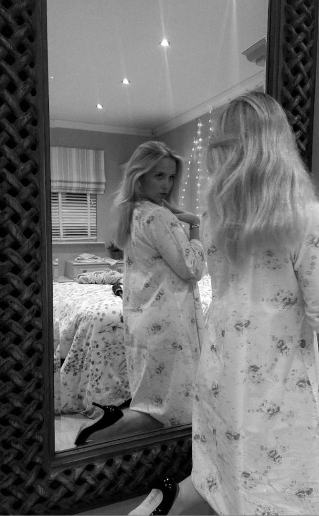
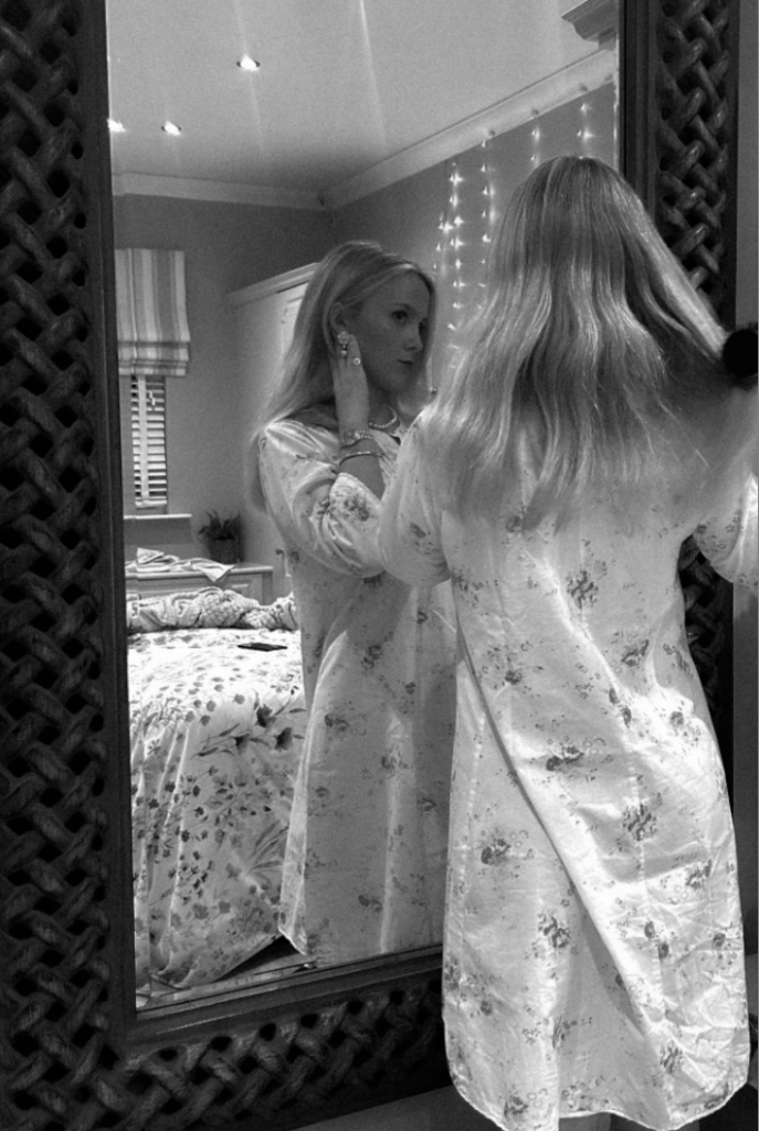
I knew before editing, my objective was to put them all in black and white due to being inspired by Sherman. Not only because of my inspiration, I also think it creates a vintage aesthetic which is my aim as I am aiming to aim in the time period of the 1950’s as this was when the traditional housewife stereotype began as well as educational rights. Therefore, using black and white and heavy grain age should signify this time period. As well as this, I hope to decrease the texture level to make the subject more or less of the stereotypical ‘ perfection’ as this is what women were expected to be.

Experimenting in B&W

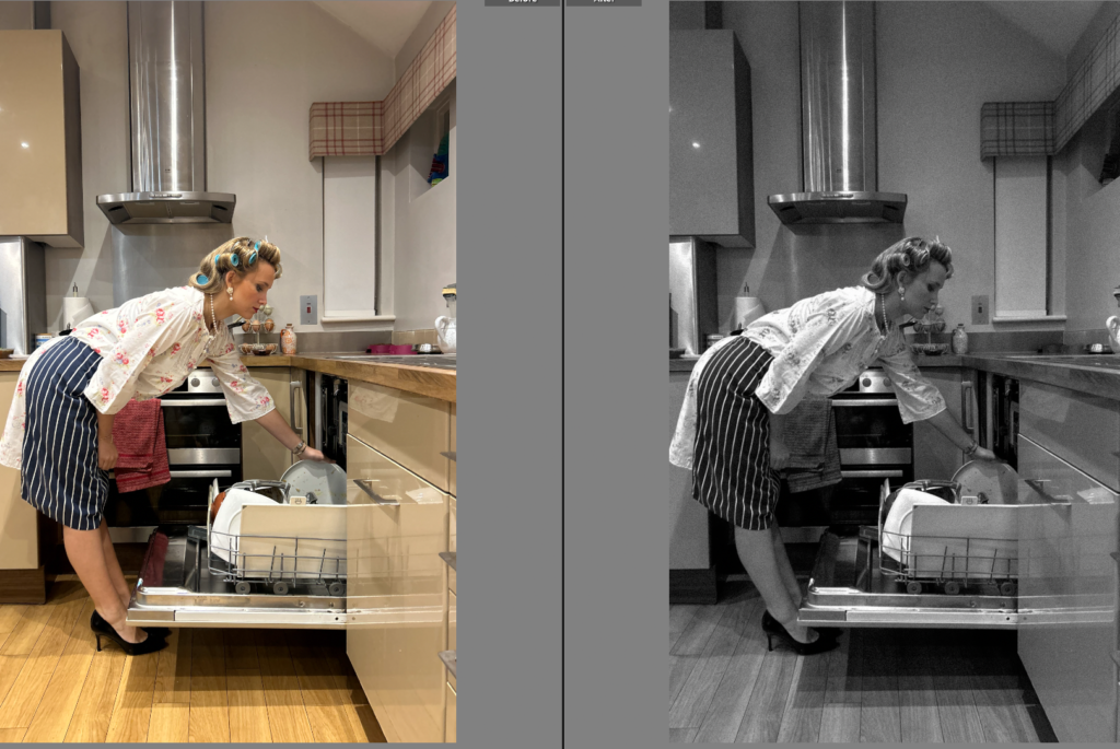
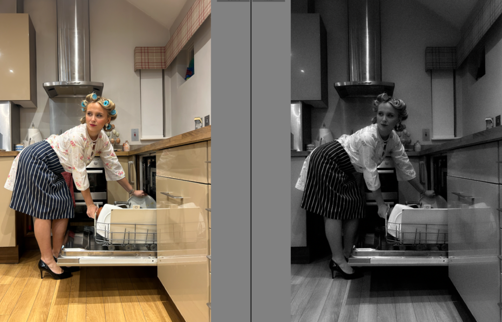
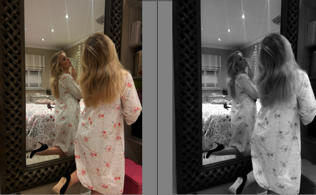
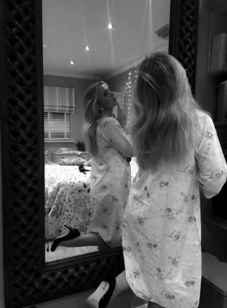
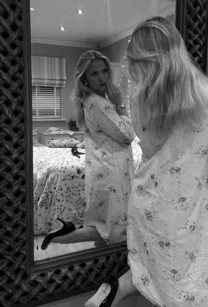
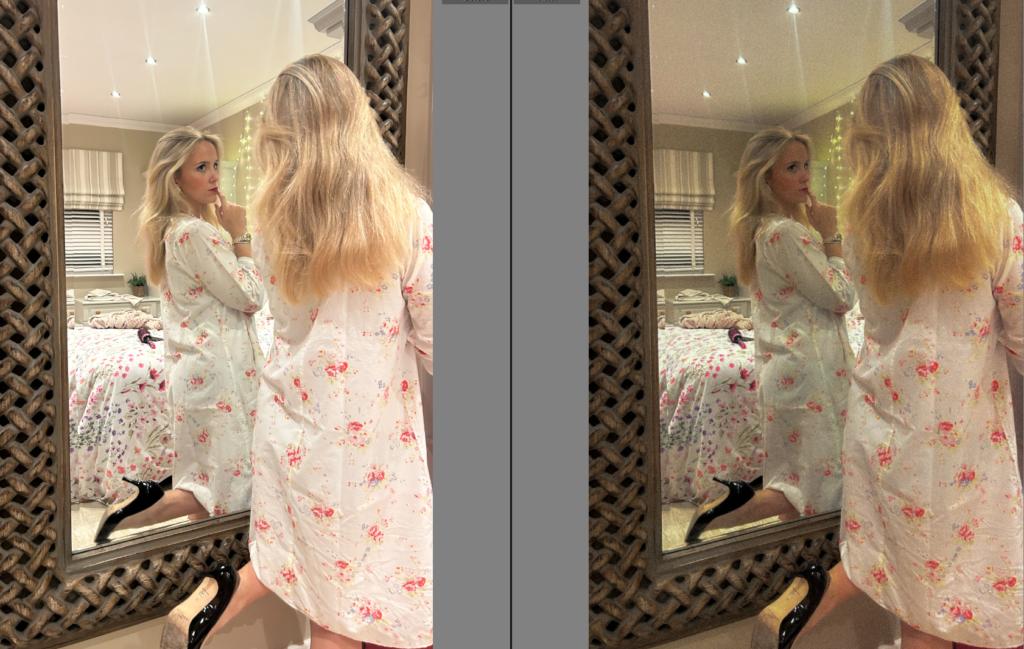
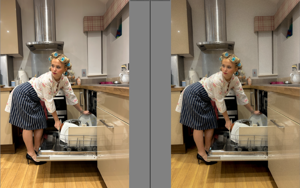
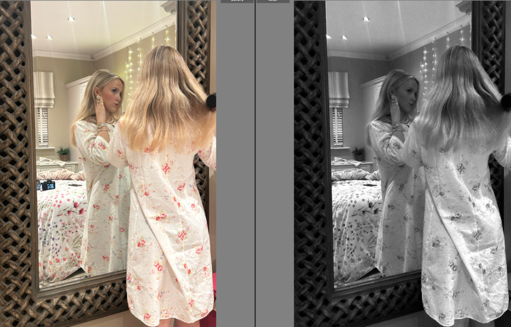
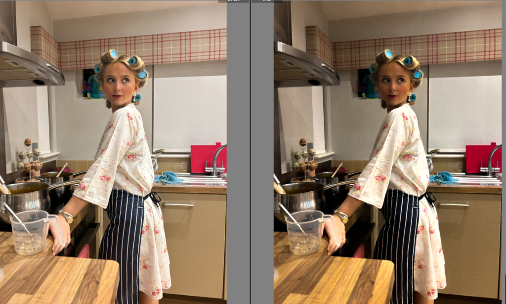
Within this image, there was a camera in the frame which I felt ruined the image. Therefore, I used an AI tool to get rid of that item to benefit my image.

Overall-

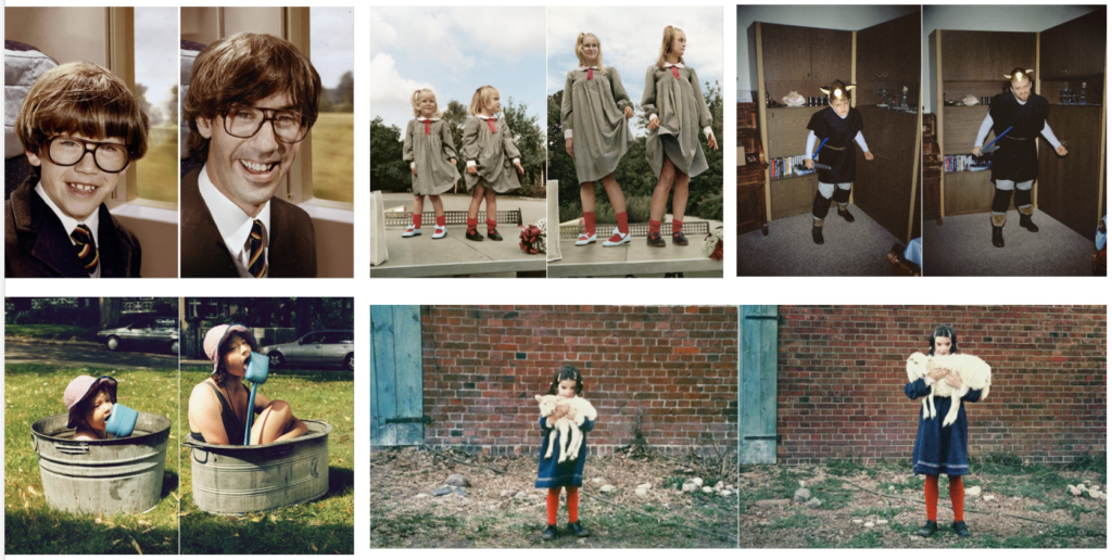
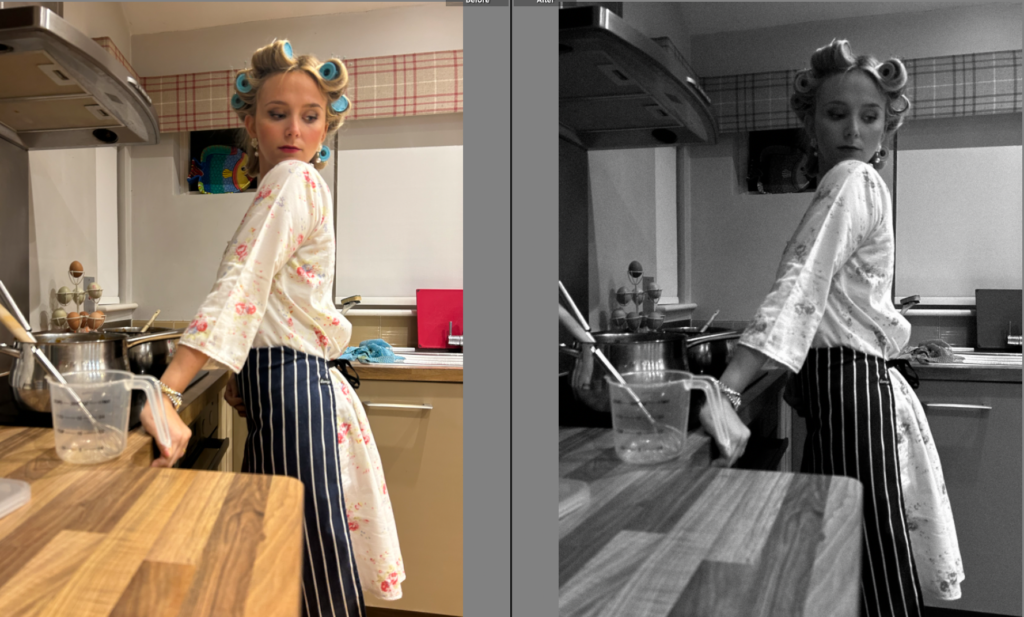
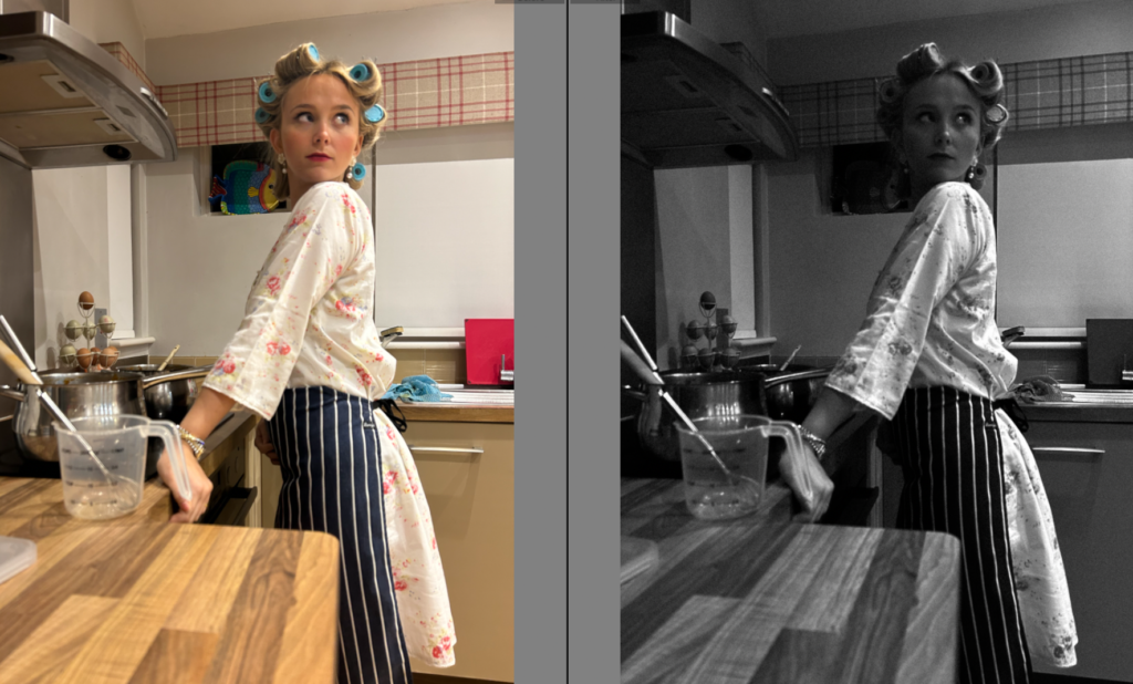
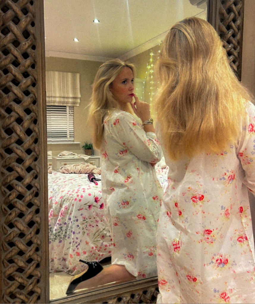
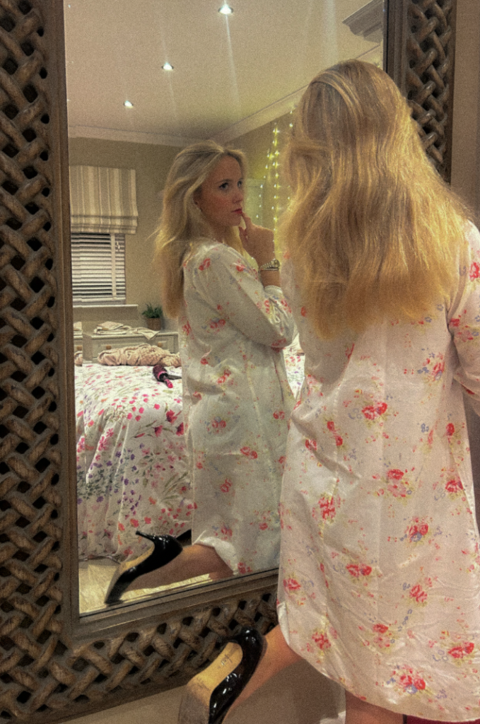
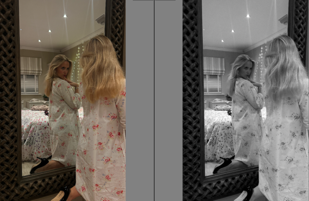
Overall, within my editing I chose to experiment and variate my images through colour and black and white. However, my main objective ultimately is to create a theme of a vintage aesthetic, specifically targeting the 1950’s stereotype and first wave feminism. Because of this, I mostly decreased the exposure and increased the contrast but mostly experimented with each image to what fitted each image best. This is because there are different settings and lighting which definitely impacts an image. Although, mostly I preferred my images in black and white as I personally think they look better, especially with the images of my subject on the bed as the clothing and the bed sheets I feel clash. Moreover, I did not put every image in black and white however similarly I put every image with a heavy grain as I felt as if it successfully fitted the theme of my images. If needed, I edited objects out as well as putting props in when I originally took this photoshoot. I used certain props to emphasize the ‘traditional stereotype’ such as hair rollers, apron, black high heels, a lot of jewellery, a heavy amount of makeup and pearls. One of the reasons pearls have become such an iconic symbol of style and elegance is their association with some of Hollywood’s most famous actresses. From Audrey Hepburn to Grace Kelly, pearls have been a staple accessory for many of the most famous leading ladies in film history. These images are definitely suppose to look staged and thought out, which I believe the props did successfully.

Irina Werning

Irina Werning is a freelance photojournalist who focuses on personal long-term projects. She is based in Argentina and has a bachelor’s degree in economics, a master’s degree in history and a master’s in photojournalism. Werning won the Ian Parry Scholarsip in 2006, the Emerging photographer fund in 2012, and he first place Sony world photography award for portraiture in 2012.

Back to the Future

Irina Werning became world-famous as a result of her project ‘Back to the Future’. In this project Werning photographed people as they reenacted their childhood portraits. This unique series shows how people look and feel 20 years after their childhood portraits, Werning took her camera and portrayed hundreds of people as they go back to their future. She was inspired to create this project after she scanned some older photos and after she ended up in one of the locations where one of these photos had been shot. I find this project interesting as your able to see how people change overtime.

Photos from Irina Werning’s ‘Back to the Future’ project.

Analysis


This photograph by Werning shows the way that the subject has grown since the original photo. It has been well done as she was able to position the new photograph in the exact same way the old one was taken, including the same object in the background and view in the window. They also paid attention to detail by using the same clothing and almost identical glasses.

How will I respond?

Irina Werning will be my main inspiration when creating images . I will find old photos of my family members in photo albums and then I will select ones which I plan to recreate. I will recreate these images using similar props, clothes, and poses/ expressions. I will also edit these images in similar tones and crop them in similar ways.

Photoshoot Planning

For my first photoshoot, I am going to be taking pictures that is inspired by Aneta Ivanova. I will do this by first going into the studio and taking pictures of a model. I will place the lighting in the studio in front of the model to ensure that she is fully visible and clear. I will aim to get photographs of the model in a variety of different positions typically seen in Aneta Ivaonva’s images. For example, the model holding her hands up to her chest and facing the the side looking upwards. I will then focus on the images seen inside the subject, which typically consists of a natural environment photograph. To make my photoshoot more personal and about identity, I will ask the subject some questions about where her favourite places in Jersey is and what things make her happy. I will then photograph different things based on her answer to these questions. Once I have my two sets of images, I will then use Photoshop to merge the two together as seen in Aneta Ivanova’s work. I chose this artist as I thought I could make my final outcome link to identity by using images that had personal meaning to the subject eg her favourite place in Jersey.

For my second photoshoot, I am going to be trying to replicate the work of Manny Robertson. In order to do this, I will go into the studio and take pictures using the studio lights to make the images and face well lit. I will focus on taking images where the head is the main feature of the image and show less of the body in the photographs as I want the attention to be on the face rather than anything else. I am going to get my model to pose in different ways as seen in Manny Robertson’s work eg looking up the side and her head tilted to the side. I will then upload these photos and use Photoshop to draw on the face in order to create the illusion of stitching on the face. I chose to replicate the work of this artist as I believe his pieces link to the theme of identity as you can see a mask like cut out being stitched to a face which to me portrays the idea of people constantly having a mask up around people and hiding who they truly are in order to fit in to society.

My next photoshoot will be inspired by Brno Del Zou and David Hockney. These artists create a fragmented image using boxes to distort the original image. I will do this by going into the studio and placing a light source directly in front of the model and getting her to stand quite close to the camera. This will allow me to pick up different details of her face eg her lips, eyes etc. I will take pictures of the model’s face from a variety of angles eg straight on and to the side. Then I will use photoshop to cut out different parts of the images to create a whole image of distorted facial parts. I decided to replicate the work of these artists as it links to the theme of identity as you cant see the person as a whole: they’re distorted. This represents how people often struggle with their identity and may feel like the final fragmented image as a result of it.

For my final photoshoot, I am going to replicate the work of Marcelo Monreal. I think this will be a good photoshoot to finish off my theme as it represents/ looks as if the persons true personality/ identity is blooming out of them as they accept who they are. I think this will create a meaningful and optimistic end to my photoshoots as it expresses to the viewer that its okay to be yourself and there’s beauty in embracing your unique identity. Additionally, the bright background colour contrasts with the other artist photoshoots where the background is just white, symbolising the colour coming back into ones life when they accept and embrace who they are. I will recreate this idea by going into the studio and taking photographs of a model that shows her face and shoulders in the image. I will make her sit looking to the side slightly. This will make it so I’m able to make a cut out of her face and drag it to the side slightly. I will then use images of flowers from google to add behind the face cut out. I will make my image more personal and about identity by making the flowers the colour of the flag where the person is from. This will mean my image links to the theme of identity as a person heritage is a part of their identity.

Personal Study – Statement of Intent

Statement of Intent

For my project, I would like to explore personal identity and the visual elements of abstraction and imperfection within a photograph which is taken spontaneously; as a response to things around me, a collection of portraits, landscapes, and objects as a way of documentary and observational ‘snapshot aesthetic’ photography. I would like to present my images taken of my friends, myself, my family, and various locations and objects with a photobook. In this book, I could possibly present these photos alongside accompanying text or a notebook page, and manipulation or change of my photographs, either by applying paint, ripping/tearing/burning them, cutting a subject or something out, or re-joining the same or a different photograph with thread. Another way I could possibly change the photographs is merging or overlaying these photos digitally to create a blurry effect in certain areas.

To develop my project, I have looked closely at the photographs and books of Nan Goldin, Ed van der Elsken, Cindy Sherman, Francesca Woodman, and Josh Kern, to inspire the way I take and present my own photos. Goldin’s intention especially behind taking her photographs resonates with how I feel about capturing photographs for this project, where for a part of it, not entirely planning who I will photograph and where – instead the people I am with at a certain time and observe where I see a photograph opportunity, or not, and making it appear somewhat randomised, focusing on the disjunctions and juxtapositions of the individual photographs.

These types of candid, documentary photographs can only be genuinely captured through carrying a camera around with me in order to capture unexpected moments, in a variety of different locations, both inside and outside. Because of this, some photographs will be captured on my small digital camera, for times I don’t have my digital film camera. Although, I will have some photographs which are staged, I would like them to still have an almost spontaneous appearance, and these ‘photoshoots’ of a subject in an environment may not initially be planned beforehand. This take of impetuosity on these photographs links back to the ‘abstract’ part of my mind map – for example, a use of abstraction of portraits with parts of the body blurred, obstruction between the subject and the camera, imperfections in the photo, camera movement/slower shutter speed, or flash photography.

I may also sequence frames from videos taken on my small digital camera and present them as a small component of my book, an idea I have is through a film strip layout. By aligning the photographs in this way, I’ll be displaying both the clear and blurry frames side by side as a juxtaposition, along with presenting an object (e.g. film strip, receipts, or any ‘rubbish’ I have collected from when I am out taking these photos) through possibly photocopying them or editing them in digitally to the layout. The layout of my other photographs will be presented differently from image to image, as some might be a double page spread, or one photo on its own, two beside each other, or in a grid sequence showing ‘unused’ photographs (crossed out with pen, depicted as a physical contact sheet), etc. This decision to include multi-media and text into the project I believe will make it more personal to me, as I can directly express more through how my images are presented.

Personal Study: Artist Case Studies

Keith Dotson

Some photos by Keith Dotson:

Keith Dotson is a fine art photographer who specialises in black and white photography. Keith was born in Texas, where he later graduated college and worked as a professional art director. He then went on to teach Art and Design in various colleges, before moving to Nashville, Tennessee. Although he is settled in Nashville, Keith loves to travel and capture photographs, his favourite subjects being landscapes, cityscapes and nature. Keith is drawn to historic and/or abandoned places and said that he prefers to take his photographs on gloomy days, when there is soft natural light. Keith presents his images in black and white which allows the drama and mood of the subject to shine. I personally really like his photographic style and believe that it is similar to what I try to achieve when I take my own photographs. Specifically, I am inspired by Keith Dotson’s Architectural Photography. I particularly like how he captures the details of various buildings and structures. I also like how his images have high texture and clarity.

These are some other images by Keith Dotson. I would also like to also produce detail shots like these:

Image Analysis

This is an image by Keith Dotson. This image has been taken in natural light and is displayed in black and white with great tonal range. The features in this image are sharp and detailed, with high texture and clarity. Furthermore, this image looks as if it would have been taken from a ladder or a heightened surface from the ground as it is almost deadpan, however, at a bit of a lower angle. When taken this image, it looks like Keith Dotson would have used a low aperture for a large depth of field and a quick shutter speed as the image is clear and not too over-exposed. Moreover, this image is aligned through the middle and looks like it uses the rule of thirds as the middle windows would made the middle horizontal third. The 2 horizontal lines above and below the middle windows draw your eyes to the windows as they sit between them. Finally, I believe that Keith Dotson has taken this image to highlight the detail of the building as all of its features are very detailed, even the roof tiles. I really like this image because I think that it has been beautifully designed and the image is very aesthetically pleasing to look at.

Alex Upton

Some photos by Alex Upton:

Alex Upton is a photographer who is based in London. He specialises in photographing the built environment and interiors. Alex got a first-class honours degree in Fine Arts at University of the Arts London and, since, has been working on Architectural Photography for several years. Through studying Fine Arts, Alex enhanced his attention to detail and understanding of form, space, composition and materials in relation to Architecture. To this day, he is constantly gaining knowledge and experience as his client base increases. Alex’s work covers everything from the initial stages of construction to the completion of a building. I am specifically inspired by Alex Upton’s Detail images. These images form a collection within his Portfolio and they are each presented as abstract images of buildings, with a range of shapes, colours and textures. I really like the way he takes these images as its like he views them from a different, artistic perspective than what you typically would see when you look at the building.

Image Analysis

This is an image by Alex Upton. This image looks like it would have been taken in natural light with a fast shutter speed and a low aperture. Rather than black and white like Keith Dotson’s images, this image is in colour. The colours in this image are contrasting as there are both cool and warm tones and a combination as the colours are red, blue, white and purple. Furthermore, this image looks as if it has been taken from the ground, pointing the camera up at the building from an angle. The glass of the façade in this image is creating a reflection of another building nearby and it creates a sense of perspective as it appears smaller as it gets further away, towards the right side of the images. The curve of this façade leads your eyes to the main focal point which is the left side of the image, where you can see the reflections of the other building. This building appears to be an older, not modern building which I believe adds more effect in the photo as it creates juxtaposition between the architectural styles. That is why I chose this specific image to analyse as I believe it fits well with my project. Moreover, this photograph, at first glance, looks like a pattern which starts in the top right corner and is curves which get further apart each time with lines within them. Finally, I don’t think that this image follows the rule of thirds as it is abstract because it focuses on the colour, shape and lines of the building.

Comparison of Photographers

The key similarity between these photographers is that they pay close attention towards the composition of their images and the angle at which they depict the buildings from. Specifically, Keith Dotson often takes his images straight on from the building to highlight the key details, whereas Alex Upton will often approach the building from the side/at a diagonal for a more abstract approach. They key difference between these photographers is that Keith Dotson captures the details of historical and derelict buildings, however, Alex Upton captures the geometric shapes, patterns and forms of modern architecture. Furthermore, unlike Keith Dotson, Alex Upton displays his images in colour to draw your attention to the focal points and to make the images more interesting. Altogether, the work of each of these photographers have a very different approach and subject matter, creating juxtaposition when paired together.

Other Photographers

Nick Frank

Some photos by Nick Frank:

I like the style of Nick Frank’s photographs as an idea for for further experimentation. I could create photographs similar to these by using my unedited photos of buildings, opening them in photoshop and cropping out the building to paste it onto a coloured background. I could then get an image of the colour of the background and lay it on top of the entire thing, including my building, then lower the opacity.

Bernd and Hilla Becher

Some photos by Bernd and Hilla Becher:

Another idea for further experimentation is to present my images as typologies. I could do this in many ways such as arranging images of buildings from the same age or creating a typology of buildings from different ages. This may make it look more like a photo story as it will illustrate the change in architectural styles over time.

Statement Of Intent

For my project, I am focussing on the male gaze. However I’m not just going to show what that looks like, I want to show the effects it can have on women. I’m doing this because everyone’s heard about how objectification and the “male gaze” is wrong but that doesn’t seem to be enough. So hopefully by showing how being mistreated in that way can destroy someone from the inside the message will be more successful and impactful.

In order to show this, I’m planning on using makeup to show cracking on the model to try and symbolise her breaking down, I’ve kind of taken inspiration from percaline dolls and how they are an object and have cracked skin. so I’m trying to recreate that through the more woman are objectified the more the models starts to crack/break.

I’ve chosen this theme for the project because I feel these kinds of social issues are very relevant. One of the reasons for this is due to the recent US election where Donald Trump is now president once again and with this, he plans on banning abortions in the states. That action alone is starting to strip women of their rights. Although women now have a lot more rights compared to in the 1800’s it almost feels like we are taking a step back. Women are sexualized more than ever in the media.

I’m planning to present my work in a photo With that I find that presenting work in books tends to accentuate any flaws within the work. Therefore, I need to make sure I focus and take time considering my layout (rule of thirds, Fibonacci spiral). It will also be important to try and focus on lighting and weather this is because I wanted to do lots of photoshoots outside. Therefore different weather conditions will create very different vibes for the image.

I have a very specific way I would like to present/start the picture book. My first and last picture in the book will be from the same photoshoot to achieve a cyclical narrative style. I think this will be very effective for the storytelling of the projects and the contrast as you will be able to look back at the first page and see how much the model and changed and been destroyed as it may be subtle between each page but hopefully the change the first page compared to the last will be drastic.

Photoshoots

Photoshoot 1 – Roses by Jenna Raine

Inspiration:

Birds are singin’
La-da-da, da-da-dee
Yesterday is dead to me
I feel the ground beneath my feet

When I say, ooh
Don’t go killin’ all my roses
‘Cause I’ve only started growin’
Ooh
Don’t go rain on my parade
I’m just tryna have a good, good day

Plan: I’m going to by some roses and get some photos in my dining room as it has some really nice natural light as there is a massive window. This will now have to be shot in the morning or early afternoon due to the early sunset. I would also like to experiment with different lighting techniques in the studio and create some more staged experimental pieces.

Photoshoot 2 – song for nobody by Thomas Merton

Inspiration:

A yellow flower
(Light and spirit)
Sings by itself
For nobody.

A golden spirit
(Light and emptiness)
Sings without a word
By itself.

Let no one touch this gentle sun
In whose dark eye
Someone is awake.

(No light, no gold, no name, no colour
And no thought:
O, wide awake!)

A golden heaven
Sings by itself
A song to nobody.

Plan: I’m going to by some daisies or other from of yellow flower and get some photos in my dining room as it has some really nice natural light as there is a massive window. This will now have to be shot in the early afternoon due to the early sunset. I would like to create some photos similar to Josef Seduks still life’s. I also would like to create some images that reflect the overall tone of the poem

Photoshoot 3 – withering lilies by Robert Leighton

Inspiration:

And must ye pass away,
Yellow waving lilies?
Greener grow the woodland alleys,
Greener, greener every day;
Summer’s coming up the valleys–
Yet ye will not stay!
I come at morn and even,
This green bank my cushion;
And I worship, in a fashion,
From the lilies up to Heaven:
God, accept my earnest passion,
Be it rudely given!
I bless the time of flowers,
And kneel with each new comer.
My heart’s a temple all the Summer,
Visited through all its hours,
Choir’d by every little hummer
Of the leafy bowers.

plan: I’m going to get some lilies and wait for them to wilt a bit before I take photos. I’m going to get images of the wilting process. I’m going to recreate images similar to Josef Sudek’s but at different times through out the day. I am also going to bring them into the studio in school and get some images that are more staged and play around with lighting techniques.

Photoshoot 4 –

Photoshoot 5 – To a vase of flowers by C. B. Langston

Inspiration:

Are they sighs of sorrow, my sweet flowers!
That with your fragrant breath you waft me up?
You never more will see day’s sunny hours,
But languish life away in that fair cup.

With loving, eager hand I snapt your stems,
With all their blossoms wet with dew of morn,
Nor deemed the trembling drops like flashing gems,
Were tears of silent grief that you were torn.

Sweet flowers!–ah, many maids there are like you,
Snatched from their native shades, that for a while
Drink deep of pleasure’s gilded cup, and rue
The false allurement of her fatal smile!

Then ’tis not due to me such incense sweet,
‘Twas I who caused your drooping forms to mourn,
Who thought your bright eyes glistened to entreat,
That I would bear your boughs my room t’ adorn.

Oh! you are like fair martyrs in your death,
Bowing your lovely heads to those who slay;
Returning good for ill, with latest breath,
And, with your souls serene, passing away.

vaseeee

INCOMPLETE

Jersey’s Maritime History

What was the involvement of Jersey mariners in the Canadian cod-fisheries and the Transatlantic carrying trade?

Since the beginning of the construction of Jersey’s harbour in the early 1700s, it has been a vital part in creating many of the industries that Jersey thrives on today, including the large finance and agriculture industries. Being an island surrounded by miles of water, the harbour was unimaginably beneficial for creating wealth in the island.

Most of this wealth was originally created by merchants who had collectively formed networks of markets across both coasts of the Atlantic ocean, from European countries such as England or Russia, all the way to countries in the newly found Americas, such as Honduras or Canada.

Canada’s fishing industry had been thriving since the discovery of the Americas, especially in the aptly named ‘Newfoundland’ on the east coast. This is because of the large cod that was abundant in the region, which soon became a commodity for the Europeans after its discovery in the 1500s.

By 1530, there was evidence to suggest that Jerseymen had been to Newfoundland, and in 1582 there was a reference to people from Jersey opening fish markets and selling fish in Newfoundland. In the year 1600, Sir Walter Raleigh obtained a Grant of Application in Newfoundland for a colony, and persuaded seamen from Jersey to set up fisheries there, which would later trade deeper into the Americas, all the way down to the Caribbean Islands. A quote from official letters at the time state, “He certainly encouraged the trade nascent between Jersey and Newfoundland”. A few Jersey families from this trading group were later named ‘master traders’, which hints at Jersey becoming a significant trader during this time. These families supposedly brought back cod fish, skins, furs, sugar and tobacco (among other items) to Jersey, which would have provided these families with a large amount of wealth.

Which ports did Jersey ships sail to and trade with?

Over the next 100 years, the industry continued to grow and more Jersey merchant families and fishermen travelled to the American coast to fish and trade. Jersey began building ships in the late 18th century thanks to the completion of South Pier in 1765, with the requirement that the ships would be build larger than fishing boats. This was so that Jerseymen could travel across the Atlantic and join the Transatlantic trade. Below is a demonstration of the trade that Jersey merchants created soon after.

This diagram provides us with a lot of information, not just about what was traded and where, but how Jersey became a hub for trade along the European coast once it had a functioning harbour. A number of significant Jersey cod merchants began trading during this time, including Charles Robin, who founded the most successful trade firm on the Gaspé coast in 1766. The diagram above is roughly what this trade looked like at its height.

What type of goods did Jersey merchants exchange for cod-fish?

Essentially, how this ‘Merchant Triangle’ worked was: the fish caught in Canada were traded with the Europeans, as well as manufactured goods and other items that were from Canada also. Merchants would then trade wine and fruits with Portugal, Spain and Italy, and various grains with countries in central Europe, such as Denmark. With the wealth that this created, the desire for luxury furniture in the island grew also, and mahogany wood from Honduras was brought over to Jersey, which was then used to create household items such as wardrobes and stair railings.

To what extent, has the island of Jersey benefitted from its constitutional relationship with Britain and the legacies of colonialism based on a slave plantation economy during the first Industrial Revolution (1760-1840)?

Self Study Project: Observe Seek Challenge introduction


Observe Seek Challenge-

The theme of observe seek challenge I have linked it towards the idea of watching. whether that’s watching people or your surroundings. However I like the idea of almost being hyper aware.

I also like the idea of focusing on the male gaze. And how women are constantly being objectified whether that be in media or in life.

So I would like to combine both ideas and show the objectification of women and how it effects them on an emotional level.

I really like the idea of using clay and having this cracked effect as in my research I have seen lots of things like “the soul, mind, spirit, or invisible animating entity which occupies the physical body.” and  “a person might say that trauma has damaged a person’s psyche “so I thought slay would be a perfect way of trying to show someone’s emotion’s and how things can effect them and slowly start to break them.

I like the idea of showing the inside on the outside which is what South African artist Walter Oltmann choose to do. He was more inspired by the human body and he was famous for pieces like the Bleeder.

I think I would like to use makeup in order to try and show this I could potentially use some sort of clay to symbolise someone breaking but show it on the outside.


Statement Of Intent

Statement of intent –

  • What you want to explore?
  • Why it matters to you?
  • How you wish to develop your project?
  • When and where you intend to begin your study?

Personal:

Within my work, I aim to explore the concept of identity through photography. Due to my deep interest in this subject, I believe I can create personal and expressive representations of self-portraits that capture my sense of self, as well as the way others perceive me differently. I find that no one truly knows me because I present a different version of myself depending on the people I am with. This is something that everyone experiences, as we all shift and adapt our personalities in various contexts. For me, identity in photography offers an insight into the photographer’s deeper understanding of themselves. Photography allows for multiple ways to explore identity visually, creating lasting images that resonate in a viewer’s mind. A photograph captures a more direct and immediate sense of who people are compared to written words or books. From my own personal experiences, I feel that developing my portrait skills, along with my interest in identity, provides an opportunity to delve into the truth of who we are. Whether through a self-portrait or a colorful image that reflects personality, my goal is to visually convey the essence of human identity. Through this creative photographic process, I hope to educate others about how everyone is unique yet shares similar experiences. I aim to highlight the significance of these differences and commonalities, using photography to foster understanding, connection, and awareness. My work seeks to create a space where individuals can express themselves, relate to others, and find meaning in their own experiences.

I wish to develop my project by exploring visualizations of identity, incorporating elements like tableaux, but through the medium of documentary photography. However, in my work, I will stage these images to replicate the effect of a tableau, with the goal of creating an immersive atmosphere that encourages viewers to reflect on the multiple identities they embody. By staging these photographs in a controlled environment, I aim to capture the complexity of identity, inviting viewers to connect with the idea that, like myself, we all navigate different roles and personas depending on our surroundings and relationships.

Photographing myself, I believe, will better replicate the relatability of these experiences. The process of self-portraiture will allow me to convey the nuanced way in which we shape our identities in different contexts. Using both studio lighting and outdoor settings, I plan to photograph myself in a variety of situations—with friends, family, strangers, and also alone. The use of these different environments will help illustrate the contrasts between how we present ourselves in private and public spheres. By incorporating a tripod, I can take control of the framing and composition, enabling me to directly engage with the process and capture the intimate aspects of identity from various perspectives.

In combining these settings and interactions, my intention is to create a series of images that visually explore how identity is not fixed but is fluid and influenced by the people around us and the environments we inhabit. Through these photographs, I hope to evoke a sense of personal reflection in my audience, encouraging them to consider the many identities they embody throughout their lives.

Project:

Due to my strong interest in the concept of identity, I feel that exploring this theme through a personal, documentary approach will make for an engaging and insightful project. I aim to create a series of visual representations that delve into the complexities of identity, focusing on how people express different facets of themselves depending on context, relationships, and personal experiences. Drawing inspiration from my own experiences and observations, I will base my work on the idea that identity is fluid and constantly evolving.

With access to various subjects—friends, family, strangers, and personal encounters—I plan to explore identity from multiple angles, capturing different personalities, moods, and interactions. I believe that photographing people in different settings and with varying degrees of intimacy will help highlight the diverse roles we play in our daily lives. Using a mix of staged and candid imagery, I will aim to depict the complexity of identity through visual storytelling, showing how people project different versions of themselves based on the environment and relationships they are part of.

My work will also draw upon written accounts and personal stories from the individuals I photograph, incorporating their own reflections on identity and self-perception. I will use a combination of studio lighting and natural settings, such as outdoor locations or familiar environments, to further emphasize the contrast between the private and public aspects of identity. Through this approach, I hope to create a deeper understanding of how identity is shaped by our surroundings and interactions, offering a more personal and immersive experience for viewers.

This project serves not only as a reflection on my own understanding of identity but also as an exploration of how others navigate the complex and ever-changing nature of who they are. By documenting these different perspectives, I aim to share a multifaceted view of identity that resonates with anyone who has ever questioned or reflected upon their own sense of self. Ultimately, I hope this project fosters a greater awareness of the importance of self-expression and how our identities are shaped by the diverse roles we take on in life.